vuetify

Vuetify Progress Circular: How to Create Circular Progress Bars

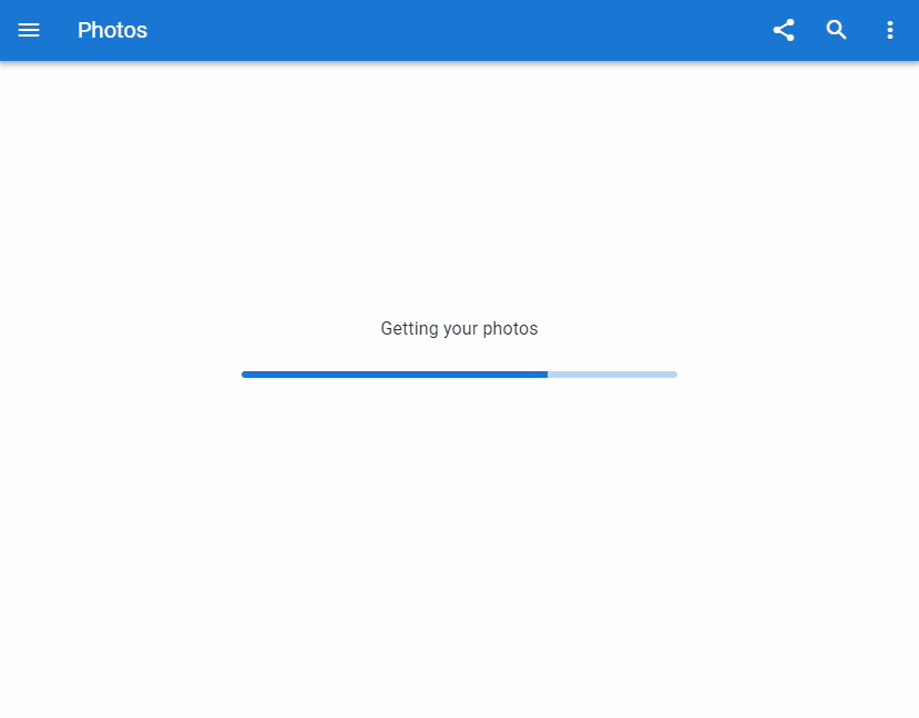
A circular progress bar is used to pass on information to the user about some ongoing operation. Just like horizontal progress bars, they visually signify how far the operation has advanced. Read on to learn about the Vuetify progress circular component and the various ways in which we can customize it.

The Vuetify Progress Circular Component

Vuetify provides the v-progress-circular component for creating circular progress bars. We use the value prop to set the progress bar value to a number between 0 and 100 inclusive.

<template>
  <v-app>
    <div class="d-flex justify-center ma-4">
      <div class="d-flex justify-space-between" style="width: 60%">
        <v-progress-circular></v-progress-circular>

        <v-progress-circular :value="20"></v-progress-circular>

        <v-progress-circular :value="40"></v-progress-circular>

        <v-progress-circular :value="60"></v-progress-circular>

        <v-progress-circular :value="80"></v-progress-circular>

        <v-progress-circular :value="100"></v-progress-circular>
      </div>
    </div>
  </v-app>
</template>

<script>
export default {
  name: 'App',
};
</script>
Vuetify progress circular components.

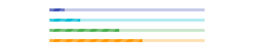
Circular Progress Bar Colors in Vuetify

The Vuetify progress circular component provides the color prop for customizing the color of the circular progress bar.

<template>
  <v-app>
    <div class="d-flex justify-center ma-4">
      <div class="d-flex justify-space-between" style="width: 60%">
        <v-progress-circular :value="20" color="green"></v-progress-circular>

        <v-progress-circular :value="40" color="primary"></v-progress-circular>

        <v-progress-circular :value="60" color="red"></v-progress-circular>

        <v-progress-circular
          :value="80"
          color="purple accent-4"
        ></v-progress-circular>

        <v-progress-circular
          :value="100"
          color="yellow darken-3"
        ></v-progress-circular>
      </div>
    </div>
  </v-app>
</template>

<script>
export default {
  name: 'App',
};
</script>
Customizing circular progress bar colors in Vuetify.

Indeterminate Circular Progress Bars in Vuetify

Similar to the Vuetify progress linear component, v-progress-circular can be set to an indeterminate mode. It animates continuously when indeterminate:

<template>
  <v-app>
    <div class="d-flex justify-center ma-4">
      <div class="d-flex justify-space-between" style="width: 60%">
        <v-progress-circular indeterminate color="lime"></v-progress-circular>

        <v-progress-circular indeterminate color="red"></v-progress-circular>

        <v-progress-circular
          indeterminate
          color="primary"
        ></v-progress-circular>

        <v-progress-circular
          indeterminate
          color="yellow darken-3"
        ></v-progress-circular>

        <v-progress-circular
          indeterminate
          color="purple accent-4"
        ></v-progress-circular>
      </div>
    </div>
  </v-app>
</template>

<script>
export default {
  name: 'App',
};
</script>
Indeterminate progress circular components.

Vuetify Progress Circular Rotate

The rotate prop allows us to customize the origin of the circular progress bar.

<template>
  <v-app>
    <div class="d-flex justify-center ma-4">
      <div class="d-flex justify-space-between" style="width: 60%">
        <v-progress-circular
          :rotate="360"
          :size="100"
          :width="15"
          :value="value"
          color="purple accent-4"
        >
          {{ value }}
        </v-progress-circular>

        <v-progress-circular
          :rotate="-90"
          :size="100"
          :width="15"
          :value="value"
          color="primary"
        >
          {{ value }}
        </v-progress-circular>

        <v-progress-circular
          :rotate="90"
          :size="100"
          :width="15"
          :value="value"
          color="green"
        >
          {{ value }}
        </v-progress-circular>

        <v-progress-circular
          :rotate="180"
          :size="100"
          :width="15"
          :value="value"
          color="red accent-2"
        >
          {{ value }}
        </v-progress-circular>
      </div>
    </div>
  </v-app>
</template>

<script>
export default {
  name: 'App',
  data() {
    return {
      interval: {},
      value: 0,
    };
  },
  beforeDestroy() {
    clearInterval(this.interval);
  },
  mounted() {
    this.interval = setInterval(() => {
      this.value = this.value === 100 ? 0 : this.value + 10;
    }, 1000);
  },
};
</script>
Using the rotate prop on the Vuetify progress circular component.

Vuetify Progress Circular Size and Thickness

The size prop of v-progress-circular allows us to modify the height of the circular progress bar, while the width prop enables customization of the thickness of the progress bar.

<template>
  <v-app>
    <div class="d-flex justify-center ma-4">
      <div class="d-flex justify-space-between align-center" style="width: 60%">
        <v-progress-circular
          :size="50"
          color="red accent-2"
          indeterminate
        ></v-progress-circular>

        <v-progress-circular
          :width="3"
          color="primary"
          indeterminate
        ></v-progress-circular>

        <v-progress-circular
          :size="70"
          :width="9"
          color="orange"
          indeterminate
        ></v-progress-circular>

        <v-progress-circular
          :width="3"
          color="green"
          indeterminate
        ></v-progress-circular>

        <v-progress-circular
          :size="50"
          color="purple accent-4"
          indeterminate
        ></v-progress-circular>
      </div>
    </div>
  </v-app>
</template>

<script>
export default {
  name: 'App',
  data() {
    return {
      interval: {},
      value: 0,
    };
  },
  beforeDestroy() {
    clearInterval(this.interval);
  },
  mounted() {
    this.interval = setInterval(() => {
      this.value = this.value === 100 ? 0 : this.value + 10;
    }, 1000);
  },
};
</script>
Customizing the size and thickness of circular progress bars.

Conclusion

A circular progress bar conveys information to the user about the current progress on an ongoing process in an application. Use the Vuetify progress circular component (v-progress-circular) to create and customize circular progress bars.

Vuetify Progress Linear: How to Create Horizontal Progress Bars

Progress bars are used in an interface to pass on information to users related to the known progression of a certain operation. They visually signify how far the operation has advanced and can be circular or horizontal. They can also be indefinite to indicate the loading or processing of data. In this article, we’re going to learn how to create a horizontal progress bar with the Vuetify progress linear component.

The v-progress-linear Component

Vuetify provides the v-progress-linear component for creating a horizontal progress bar.

<template>
  <v-app>
    <v-progress-linear></v-progress-linear>
  </v-app>
</template>

<script>
export default {
  name: 'App',
};
</script>
Creating a horizontal progress bar with the Vuetify progress linear component.

Progress Bar Value

The progress linear component comes with the value prop that we can use to set the progress bar to a determinate value between 0 and 100 inclusive:

<template>
  <v-app>
    <v-row justify="center" class="ma-4">
      <v-col sm="6">
        <v-progress-linear value="40"></v-progress-linear>
      </v-col>
    </v-row>
  </v-app>
</template>

<script>
export default {
  name: 'App',
};
</script>
Setting a progress bar value.

Progress Linear v-model

We can set up a two-way binding between the value of the progress bar and a variable using v-model:

<template>
  <v-app>
    <v-row justify="center" class="ma-4">
      <v-col sm="6">
        <v-progress-linear v-model="value"></v-progress-linear>
      </v-col>
    </v-row>
  </v-app>
</template>

<script>
export default {
  name: 'App',
  data: () => ({
    value: 30,
  }),
};
</script>
Using v-model with the progress linear component.

To see this two-way binding in action, let’s create two buttons to change the progress bar value and some text to display this value. We spaced the buttons apart with one of the Vuetify spacing helper classes (ma-2).

<template>
  <v-app>
    <v-row justify="center" class="ma-4">
      <v-col sm="6">
        <v-row>
          <v-progress-linear v-model="value"></v-progress-linear>
        </v-row>
        <v-row justify="center">{{ value }}%</v-row>
        <v-row justify="center">
          <v-btn class="ma-2" @click="value -= 10" color="red" dark>
            -10
          </v-btn>
          <v-btn class="ma-2" @click="value += 10" color="green" dark>
            +10
          </v-btn>
        </v-row>
      </v-col>
    </v-row>
  </v-app>
</template>

<script>
export default {
  name: 'App',
  data: () => ({
    value: 30,
  }),
};
</script>
Using v-model to show and change the value of the progress bar.

Progress Linear Buffer Value

A buffer state simultaneously represents two values. The primary value is controlled by v-model, while the buffer value is controlled by the buffer-value prop:

<template>
  <v-app>
    <v-row justify="center" class="ma-4">
      <v-col sm="8">
        <v-progress-linear
          v-model="value"
          :buffer-value="bufferValue"
        ></v-progress-linear>
        <br />
        <v-progress-linear
          v-model="value"
          :buffer-value="bufferValue"
          color="green"
        ></v-progress-linear>
        <br />
        <v-progress-linear
          v-model="value"
          :buffer-value="bufferValue"
          color="orange"
        ></v-progress-linear>
        <br />
        <v-progress-linear
          v-model="value"
          :buffer-value="bufferValue"
          color="purple accent-4"
        ></v-progress-linear>
      </v-col>
    </v-row>
  </v-app>
</template>

<script>
export default {
  name: 'App',
  data() {
    return {
      value: 10,
      bufferValue: 20,
      interval: 0,
    };
  },

  watch: {
    value(val) {
      if (val < 100) return;

      this.value = 0;
      this.bufferValue = 10;
      this.startBuffer();
    },
  },

  mounted() {
    this.startBuffer();
  },

  beforeDestroy() {
    clearInterval(this.interval);
  },

  methods: {
    startBuffer() {
      clearInterval(this.interval);

      this.interval = setInterval(() => {
        this.value += Math.random() * (15 - 5) + 5;
        this.bufferValue += Math.random() * (15 - 5) + 6;
      }, 1000);
    },
  },
};
</script>
Setting a buffer value on the progress linear component.

Progress Bar Custom Colors

The Vuetify progress linear component comes with a color prop that allows us to customize the color of the horizontal progress bar:

<template>
  <v-app>
    <v-row justify="center" class="ma-4">
      <v-col sm="8">
        <v-progress-linear
          background-color="blue"
          color="red accent-2"
          value="20"
        ></v-progress-linear>
        <br />
        <v-progress-linear
          background-color="grey"
          color="yellow"
          value="40"
        ></v-progress-linear>
        <br />
        <v-progress-linear
          background-color="green lighten-3"
          color="green"
          value="60"
        ></v-progress-linear>
      </v-col>
    </v-row>
  </v-app>
</template>

<script>
export default {
  name: 'App',
};
</script>
Customizing the colors of progress bars.

Progress Linear Indeterminate

We can display an indeterminate progress bar with the indeterminate prop.

<template>
  <v-app>
    <v-row justify="center" class="ma-4">
      <v-col sm="8">
        <v-progress-linear indeterminate color="red"></v-progress-linear>
        <br />
        <v-progress-linear indeterminate color="primary"></v-progress-linear>
        <br />
        <v-progress-linear indeterminate color="green"></v-progress-linear>
      </v-col>
    </v-row>
  </v-app>
</template>

<script>
export default {
  name: 'App',
};
</script>

The progress bar will animate continuously when indeterminate:

Indeterminate progress linear components.

Reversed Progress Bar

Setting the reverse prop to true will display a reversed progress bar (right to left in LTR mode and left to right in RTL).

<template>
  <v-app>
    <v-row justify="center" class="ma-4">
      <v-col sm="8">
        <v-progress-linear
          color="indigo"
          value="15"
          reverse
        ></v-progress-linear>

        <br />

        <v-progress-linear
          color="teal"
          indeterminate
          reverse
        ></v-progress-linear>

        <br />

        <v-progress-linear
          buffer-value="55"
          color="red accent-2"
          reverse
          stream
          value="30"
        ></v-progress-linear>

        <br />

        <v-subheader
          >In specific cases you may want progress to display in left-to-right
          mode regardless of the application direction (LTR or
          RTL):</v-subheader
        >

        <v-progress-linear
          :reverse="$vuetify.rtl"
          value="15"
          color="yellow darken-3"
        ></v-progress-linear>
      </v-col>
    </v-row>
  </v-app>
</template>

<script>
export default {
  name: 'App',
};
</script>
Reversed progress bar.

Progress Linear Rounded

We can add a border radius to the Vuetify progress linear component by setting the rounded prop to true:

<template>
  <v-app>
    <v-row justify="center" class="ma-4">
      <v-col sm="8">
        <v-progress-linear
          color="blue accent-2"
          rounded
          value="100"
        ></v-progress-linear>

        <br />

        <v-progress-linear color="pink" rounded value="100"></v-progress-linear>

        <br />

        <v-progress-linear
          color="orange"
          rounded
          value="100"
        ></v-progress-linear>

        <br />

        <v-progress-linear
          color="purple accent-4"
          rounded
          value="100"
        ></v-progress-linear>
      </v-col>
    </v-row>
  </v-app>
</template>

<script>
export default {
  name: 'App',
};
</script>
Rounded progress linear components.

Progress Bar Stream

The stream prop works with buffer-value to inform the user that some action is taking place.

<template>
  <v-app>
    <v-row justify="center" class="ma-4">
      <v-col sm="8">
        <v-progress-linear
          color="yellow darken-3"
          buffer-value="0"
          stream
        ></v-progress-linear>
        <br />
        <v-progress-linear
          color="primary"
          buffer-value="0"
          value="20"
          stream
        ></v-progress-linear>
        <br />
        <v-progress-linear
          buffer-value="50"
          stream
          color="red"
        ></v-progress-linear>
        <br />
        <v-progress-linear
          buffer-value="60"
          value="40"
          stream
          color="green"
        ></v-progress-linear>
      </v-col>
    </v-row>
  </v-app>
</template>

<script>
export default {
  name: 'App',
};
</script>
Using the stream prop on horizontal progress bars.

Striped Progress Bar

The striped prop applies a striped background over the value portion of the horizontal progress bar.

<template>
  <v-app>
    <v-row justify="center" class="ma-4">
      <v-col sm="8">
        <v-progress-linear
          color="indigo"
          height="10"
          value="10"
          striped
        ></v-progress-linear>
        <br />
        <v-progress-linear
          color="cyan"
          height="10"
          value="20"
          striped
        ></v-progress-linear>
        <br />
        <v-progress-linear
          height="10"
          value="45"
          striped
          color="green"
        ></v-progress-linear>
        <br />
        <v-progress-linear
          value="60"
          height="10"
          striped
          color="orange"
        ></v-progress-linear>
      </v-col>
    </v-row>
  </v-app>
</template>

<script>
export default {
  name: 'App',
};
</script>
Striped horizontal progress bars.

Default Slot

With the default slot of the progress linear component, we can display custom components inside the progress bar.

<template>
  <v-app>
    <v-row justify="center" class="ma-4">
      <v-col sm="8">
        <v-progress-linear
          :indeterminate="query"
          :query="true"
          height="25"
          value="30"
        >
          <template v-slot:default="{ value }">
            <strong>{{ value }}%</strong>
          </template>
        </v-progress-linear>
      </v-col>
    </v-row>
  </v-app>
</template>

<script>
export default {
  name: 'App',
  data: () => ({
    query: false,
  }),
};
</script>

Here, we simply display the progress bar value as a percentage:

Using the progress linear component default slot

Using a Progress Bar as a Loading Indicator

One instance where the progress linear component is useful is in communicating to the user that a response is pending. Like when fetching the user’s photos from a server in a sample photo app.

<template>
  <v-app>
    <v-app-bar app color="primary" dark>
      <v-app-bar-nav-icon></v-app-bar-nav-icon>
      <v-toolbar-title>Photos</v-toolbar-title>
      <v-spacer></v-spacer>
      <v-btn icon>
        <v-icon>mdi-share-variant</v-icon>
      </v-btn>
      <v-btn icon>
        <v-icon>mdi-magnify</v-icon>
      </v-btn>
      <v-btn icon>
        <v-icon>mdi-dots-vertical</v-icon>
      </v-btn>
    </v-app-bar>
    <v-container style="flex: 1">
      <v-row class="fill-height" align-content="center" justify="center">
        <v-col class="text-subtitle-1 text-center" cols="12">
          Getting your photos
        </v-col>
        <v-col cols="6">
          <v-progress-linear
            color="primary"
            indeterminate
            rounded
            height="6"
          ></v-progress-linear>
        </v-col>
      </v-row>
    </v-container>
  </v-app>
</template>

<script>
export default {
  name: 'App',

};
</script>
Using a progress bar as a loading indicator.

Using a Progress Bar as an App Bar Loader

A progress bar can also function as an app bar loader. With the absolute and bottom props, we can position it at the bottom of the app bar and control its visibility with the active prop:

<template>
  <v-app>
    <v-system-bar>
      <v-spacer></v-spacer>
      <v-icon>mdi-square</v-icon>
      <v-icon>mdi-circle</v-icon>
      <v-icon>mdi-triangle</v-icon>
    </v-system-bar>

    <v-app-bar app color>
      <v-btn icon>
        <v-icon>mdi-arrow-left</v-icon>
      </v-btn>

      <v-toolbar-title>Books</v-toolbar-title>

      <v-progress-linear
        :active="loading"
        :indeterminate="loading"
        absolute
        bottom
        color="indigo"
      ></v-progress-linear>

      <v-spacer></v-spacer>

      <v-btn icon>
        <v-icon>mdi-magnify</v-icon>
      </v-btn>

      <v-btn icon>
        <v-icon>mdi-dots-vertical</v-icon>
      </v-btn>
    </v-app-bar>

    <v-container style="flex: 1">
      <v-row class="fill-height" align="center" justify="center">
        <v-scale-transition>
          <div v-if="!loading" class="text-center">
            <v-btn color="indigo" dark @click="loading = true">
              Start loading
            </v-btn>
          </div>
        </v-scale-transition>
      </v-row>
    </v-container>
  </v-app>
</template>

<script>
export default {
  name: 'App',
  data: () => ({
    loading: false,
  }),
  watch: {
    loading(val) {
      if (!val) return;

      setTimeout(() => (this.loading = false), 3000);
    },
  },
};
</script>
Using a progress bar as an app bar loader.

Conclusion

A progress bar conveys information to the user about the current progress of an ongoing event in an application. Use the Vuetify progress linear component (v-progress-linear) and its various props to create and customize horizontal linear progress bars.

How to Easily Create Versatile Menus in Vuetify

A menu is a versatile component in a user interface. It shows a popover that can serve various functions, such as displaying a list of options. They can be used with other components like a toolbar, app bar, or a button. In this article, we’re to learn how to create and customize a menu in Vuetify.

The v-menu Component

Vuetify provides the v-menu component for creating a menu. We use the activator slot to set the component that will activate the menu when clicked. We set it to a button in this example:

<template>
  <v-app>
    <div class="text-center ma-4">
      <v-menu offset-y>
        <template v-slot:activator="{ on, attrs }">
          <v-btn color="primary" dark v-bind="attrs" v-on="on">
            Dropdown
          </v-btn>
        </template>
        <v-list>
          <v-list-item v-for="index in 4" :key="index">
            <v-list-item-title>Item {{ index }}</v-list-item-title>
          </v-list-item>
        </v-list>
      </v-menu>
    </div>
  </v-app>
</template>

<script>
export default {
  name: 'App',
};
</script>

Clicking the button will display the popover menu:

Creating a menu in Vuetify.

Creating an Absolute Menu in Vuetify

We can place a menu on the top of the element in the activator slot with the absolute prop.

<template>
  <v-app>
    <div class="d-flex justify-center ma-4">
      <v-menu offset-y absolute>
        <template v-slot:activator="{ on, attrs }">
          <v-card
            class="portrait"
            img="https://picsum.photos/1920/1080?random"
            height="300"
            width="600"
            v-bind="attrs"
            v-on="on"
          ></v-card>
        </template>
        <v-list>
          <v-list-item v-for="index in 4" :key="index">
            <v-list-item-title>Item {{ index }}</v-list-item-title>
          </v-list-item>
        </v-list>
      </v-menu>
    </div>
  </v-app>
</template>

<script>
export default {
  name: 'App',
};
</script>
Creating an an absolute menu in Vuetify.

Absolute Menu without Activator

We can also use a menu without an activator by using absolute together with the position-x and position-y props. This is useful for creating a context menu:

<template>
  <v-app>
    <div>
      <div class="d-flex justify-center ma-4">
        <v-card
          :ripple="false"
          class="portrait"
          img="https://picsum.photos/1920/1080?random"
          height="300"
          width="600"
          @contextmenu="show"
        ></v-card>
      </div>
      <v-menu
        v-model="showMenu"
        :position-x="x"
        :position-y="y"
        absolute
        offset-y
      >
        <v-list>
          <v-list-item v-for="index in 4" :key="index">
            <v-list-item-title>Option {{ index }}</v-list-item-title>
          </v-list-item>
        </v-list>
      </v-menu>
    </div>
  </v-app>
</template>

<script>
export default {
  name: 'App',
  data: () => ({
    showMenu: false,
    x: 0,
    y: 0,
  }),

  methods: {
    show(e) {
      e.preventDefault();
      this.showMenu = false;
      this.x = e.clientX;
      this.y = e.clientY;
      this.$nextTick(() => {
        this.showMenu = true;
      });
    },
  },
};
</script>
Displaying a menu without an activator.

Closing the Menu on Click

The close-on-click prop determines whether the menu closes when it loses focus or not.

<template>
  <v-app>
    <div class="text-center ma-4">
      <v-menu offset-y :close-on-click="true">
        <template v-slot:activator="{ on, attrs }">
          <v-btn color="primary" dark v-bind="attrs" v-on="on">
            Dropdown
          </v-btn>
        </template>
        <v-list>
          <v-list-item v-for="index in 4" :key="index">
            <v-list-item-title>Item {{ index }}</v-list-item-title>
          </v-list-item>
        </v-list>
      </v-menu>
    </div>
  </v-app>
</template>

<script>
export default {
  name: 'App',
};
</script>

Here close-on-click is set to true, so clicking on another element will close the menu:

Setting the close-on-click prop to true

If we set it to false:

<template>
  <v-app>
    <div class="text-center ma-4">
      <v-menu offset-y :close-on-click="false">
        <template v-slot:activator="{ on, attrs }">
          <v-btn color="primary" dark v-bind="attrs" v-on="on">
            Dropdown
          </v-btn>
        </template>
        <v-list>
          <v-list-item v-for="index in 4" :key="index">
            <v-list-item-title>Item {{ index }}</v-list-item-title>
          </v-list-item>
        </v-list>
      </v-menu>
    </div>
  </v-app>
</template>

<script>
export default {
  name: 'App',
};
</script>

It will remain open even when we click on another element or remove its focus:

Setting the close-on-click prop to false.

Close Menu on Content Click

We can use the close-on-content-click prop to determine whether the menu should be closed when its content is clicked.

Setting close-on-content-click to true:

<template>
  <v-app>
    <div class="text-center ma-4">
      <v-menu offset-y :close-on-content-click="true">
        <template v-slot:activator="{ on, attrs }">
          <v-btn color="purple accent-4" dark v-bind="attrs" v-on="on">
            Dropdown
          </v-btn>
        </template>
        <v-list>
          <v-list-item v-for="index in 4" :key="index">
            <v-list-item-title>Item {{ index }}</v-list-item-title>
          </v-list-item>
        </v-list>
      </v-menu>
    </div>
  </v-app>
</template>

<script>
export default {
  name: 'App',
};
</script>
Setting close-on-content-click to true on a menu.

Setting close-on-content-click to false:

<template>
  <v-app>
    <div class="text-center ma-4">
      <v-menu offset-y :close-on-content-click="false">
        <template v-slot:activator="{ on, attrs }">
          <v-btn color="purple accent-4" dark v-bind="attrs" v-on="on">
            Dropdown
          </v-btn>
        </template>
        <v-list>
          <v-list-item v-for="index in 4" :key="index">
            <v-list-item-title>Item {{ index }}</v-list-item-title>
          </v-list-item>
        </v-list>
      </v-menu>
    </div>
  </v-app>
</template>

<script>
export default {
  name: 'App',
};
</script>
Setting close-on-content-click to false on a menu.

Disabled Menu

We can prevent a menu from being opened with the disabled prop:

<template>
  <v-app>
    <div class="text-center ma-4">
      <v-menu offset-y disabled>
        <template v-slot:activator="{ on, attrs }">
          <v-btn color="green" dark v-bind="attrs" v-on="on"> Dropdown </v-btn>
        </template>
        <v-list>
          <v-list-item v-for="index in 4" :key="index">
            <v-list-item-title>Item {{ index }}</v-list-item-title>
          </v-list-item>
        </v-list>
      </v-menu>
    </div>
  </v-app>
</template>

<script>
export default {
  name: 'App',
};
</script>
A disabled menu.

Offset X

We can use the offset-x prop to offset the menu by the X-axis to make the activator visible.

<template>
  <v-app>
    <div class="text-center ma-4">
      <v-menu offset-x>
        <template v-slot:activator="{ on, attrs }">
          <v-btn color="primary" dark v-bind="attrs" v-on="on">
            Dropdown
          </v-btn>
        </template>
        <v-list>
          <v-list-item v-for="index in 4" :key="index">
            <v-list-item-title>Item {{ index }}</v-list-item-title>
          </v-list-item>
        </v-list>
      </v-menu>
    </div>
  </v-app>
</template>

<script>
export default {
  name: 'App',
};
</script>
Using the offset-x prop on a menu.

Offset Y

We can also offset the menu by the Y-axis to make the activator visible.

<template>
  <v-app>
    <div class="text-center ma-4">
      <v-menu offset-y>
        <template v-slot:activator="{ on, attrs }">
          <v-btn color="primary" dark v-bind="attrs" v-on="on">
            Dropdown
          </v-btn>
        </template>
        <v-list>
          <v-list-item v-for="index in 4" :key="index">
            <v-list-item-title>Item {{ index }}</v-list-item-title>
          </v-list-item>
        </v-list>
      </v-menu>
    </div>
  </v-app>
</template>

<script>
export default {
  name: 'App',
};
</script>
Setting offset-y on a menu.

Offset X and Offset Y

We can also combine these two props:

<template>
  <v-app>
    <div class="text-center ma-4">
      <v-menu offset-x offset-y>
        <template v-slot:activator="{ on, attrs }">
          <v-btn color="primary" dark v-bind="attrs" v-on="on">
            Dropdown
          </v-btn>
        </template>
        <v-list>
          <v-list-item v-for="index in 4" :key="index">
            <v-list-item-title>Item {{ index }}</v-list-item-title>
          </v-list-item>
        </v-list>
      </v-menu>
    </div>
  </v-app>
</template>

<script>
export default {
  name: 'App',
};
</script>
Combining the v-menu offset-x and offset-y props.

Open Menu on Hover

Setting the open-on-hover prop to true will make the menu open when its activator is hovered over.

<template>
  <v-app>
    <div class="text-center ma-4">
      <v-menu open-on-hover offset-y>
        <template v-slot:activator="{ on, attrs }">
          <v-btn color="teal" dark v-bind="attrs" v-on="on"> Dropdown </v-btn>
        </template>
        <v-list>
          <v-list-item v-for="index in 4" :key="index">
            <v-list-item-title>Item {{ index }}</v-list-item-title>
          </v-list-item>
        </v-list>
      </v-menu>
    </div>
  </v-app>
</template>

<script>
export default {
  name: 'App',
};
</script>
Making a menu open on hover in Vuetify.

Creating a Rounded Menu in Vuetify

The rounded prop allows us to customize the border-radius of a menu.

Setting it to 0 will remove the border-radius:

<template>
  <v-app>
    <div class="text-center ma-4">
      <v-menu offset-y rounded="0">
        <template v-slot:activator="{ on, attrs }">
          <v-btn color="blue" dark v-bind="attrs" v-on="on">
            Removed Radius
          </v-btn>
        </template>
        <v-list>
          <v-list-item v-for="index in 4" :key="index">
            <v-list-item-title>Item {{ index }}</v-list-item-title>
          </v-list-item>
        </v-list>
      </v-menu>
    </div>
  </v-app>
</template>

<script>
export default {
  name: 'App',
};
</script>
Removing the menu radius with Vuetify.

We can give the menu a large border-radius by setting rounded to true:

<template>
  <v-app>
    <div class="text-center ma-4">
      <v-menu offset-y rounded="lg">
        <template v-slot:activator="{ on, attrs }">
          <v-btn color="indigo" dark v-bind="attrs" v-on="on">
            Large Radius</v-btn
          >
        </template>
        <v-list>
          <v-list-item v-for="index in 4" :key="index">
            <v-list-item-title>Item {{ index }}</v-list-item-title>
          </v-list-item>
        </v-list>
      </v-menu>
    </div>
  </v-app>
</template>

<script>
export default {
  name: 'App',
};
</script>
Setting a large menu border radius with Vuetify.

We can also specify a custom border-radius, for example:

<template>
  <v-app>
    <div class="text-center ma-4">
      <v-menu offset-y rounded="b-xl">
        <template v-slot:activator="{ on, attrs }">
          <v-btn color="red" dark v-bind="attrs" v-on="on">
            Custom Radius</v-btn
          >
        </template>
        <v-list>
          <v-list-item v-for="index in 4" :key="index">
            <v-list-item-title>Item {{ index }}</v-list-item-title>
          </v-list-item>
        </v-list>
      </v-menu>
    </div>
  </v-app>
</template>

<script>
export default {
  name: 'App',
};
</script>
Setting a custom menu border radius with Vuetify.

Using a Menu with a Tooltip

We can also display a tooltip for a menu. We do this by nesting activator slots with the v-slot syntax and attaching the props of the slots to the same activator component (a button in this case).

<template>
  <v-app>
    <div class="text-center ma-4">
      <v-menu>
        <template v-slot:activator="{ on: menu, attrs }">
          <v-tooltip bottom>
            <template v-slot:activator="{ on: tooltip }">
              <v-btn
                color="primary"
                dark
                v-bind="attrs"
                v-on="{ ...tooltip, ...menu }"
              >
                Dropdown w/ Tooltip</v-btn
              >
            </template>
            <span>This is a tooltip</span>
          </v-tooltip>
        </template>
        <v-list>
          <v-list-item v-for="index in 4" :key="index">
            <v-list-item-title>Item {{ index }}</v-list-item-title>
          </v-list-item>
        </v-list>
      </v-menu>
    </div>
  </v-app>
</template>

<script>
export default {
  name: 'App',
};
</script>
Using a dropdown with a tooltip.

Custom Menu Transitions in Vuetify

We can also customize the transition that the menu will use to open and close. Vuetify comes with three standard transitions: scale, slide-x and slide-y.

Scale Transition

The scale-transition makes the menu grow in size when opening, and shrink back when closing:

<template>
  <v-app>
    <div class="text-center ma-4">
      <v-menu transition="scale-transition" origin="center center" bottom>
        <template v-slot:activator="{ on, attrs }">
          <v-btn color="primary" dark v-bind="attrs" v-on="on">
            Scale Transition</v-btn
          >
        </template>
        <v-list>
          <v-list-item v-for="index in 4" :key="index">
            <v-list-item-title>Item {{ index }}</v-list-item-title>
          </v-list-item>
        </v-list>
      </v-menu>
    </div>
  </v-app>
</template>

<script>
export default {
  name: 'App',
};
</script>
Setting the menu transition to scale-transition.

Slide X Transition

The slide-x-transition makes the menu slide in from the left when opening, and slide back out when closing:

<template>
  <v-app>
    <div class="text-center ma-4">
      <v-menu transition="slide-x-transition" bottom right>
        <template v-slot:activator="{ on, attrs }">
          <v-btn color="primary" dark v-bind="attrs" v-on="on">
            Slide X Transition</v-btn
          >
        </template>
        <v-list>
          <v-list-item v-for="index in 4" :key="index">
            <v-list-item-title>Item {{ index }}</v-list-item-title>
          </v-list-item>
        </v-list>
      </v-menu>
    </div>
  </v-app>
</template>

<script>
export default {
  name: 'App',
};
</script>
Setting the menu transition to slide-x-transition.

Slide Y Transition

The slide-y-transition makes the menu slide in from the top when opening, and slide back out when closing:

<template>
  <v-app>
    <div class="text-center ma-4">
      <v-menu transition="slide-y-transition" bottom>
        <template v-slot:activator="{ on, attrs }">
          <v-btn color="primary" dark v-bind="attrs" v-on="on">
            Slide X Transition</v-btn
          >
        </template>
        <v-list>
          <v-list-item v-for="index in 4" :key="index">
            <v-list-item-title>Item {{ index }}</v-list-item-title>
          </v-list-item>
        </v-list>
      </v-menu>
    </div>
  </v-app>
</template>

<script>
export default {
  name: 'App',
};
</script>
Setting the menu transition to slide-y-transition.

Using a Menu with an App Bar

We can use a menu with a toolbar or app bar:

<template>
  <v-app>
    <v-app-bar app color="deep-purple accent-4" dark>
      <v-app-bar-nav-icon> </v-app-bar-nav-icon>
      <v-toolbar-title>Coding Beauty</v-toolbar-title>
      <v-spacer></v-spacer>
      <v-btn icon> <v-icon> mdi-heart </v-icon> </v-btn>
      <v-btn icon>
        <v-icon>mdi-magnify</v-icon>
      </v-btn>
      <v-menu left bottom>
        <template v-slot:activator="{ on, attrs }">
          <v-btn icon v-bind="attrs" v-on="on">
            <v-icon>mdi-dots-vertical</v-icon>
          </v-btn>
        </template>

        <v-list>
          <v-list-item v-for="n in 4" :key="n" @click="() => {}">
            Option {{ n }}
          </v-list-item>
        </v-list>
      </v-menu>
    </v-app-bar>
  </v-app>
</template>

<script>
export default {
  name: 'App',
};
</script>
Using a menu with an app bar.

Conclusion

A menu is a versatile user interface component in a user interface that shows a popover that we can use for a variety of purposes. It can work with a button, a toolbar or an app bar. Vuetify provides the v-menu component for creating and customizing menus.

How to Easily Create Beautiful App Bars in Vuetify

An app bar is an important part of every user interface and is typically the primary source of site navigation. Like a toolbar, it is displayed at the top of the screen and can be combined with a navigation drawer or tabs. In this article, we’re going to learn how to create and customize app bars with Vuetify.

The v-app-bar Component

Vuetify provides the v-app-bar component for creating app bars. We use the app prop on the component to make Vuetify consider the app bar when dynamically sizing other components, such as v-main.

<template>
  <v-app>
    <v-app-bar app></v-app-bar>
  </v-app>
</template>

<script>
export default {
  name: 'App',
};
</script>
An app bar.

App Bar Title

We can use the v-toolbar-title component to set the app bar title.

<template>
  <v-app>
    <v-app-bar app>
      <v-toolbar-title>Coding Beauty</v-toolbar-title>
    </v-app-bar>
  </v-app>
</template>

<script>
export default {
  name: 'App',
};
</script>
An app bar with a title.

Note: While we could use the v-app-bar-title component to set the app bar title, the Vuetify team does not recommend using it without the shrink-on-scroll prop (discussed later in this article), as it would add an unnecessary resize watcher and additional calculations.

App Bar Nav Icon

v-app-bar-nav-icon is a styled icon button component created specifically for use with a toolbar or app bar. An app bar nav icon is typically placed on the left side of the toolbar or app bar as a hamburger menu, and is often used to control the state of a navigation drawer. We can customize the icon and function of this component with the default slot.

<template>
  <v-app>
    <v-app-bar app>
      <v-app-bar-nav-icon> </v-app-bar-nav-icon>
      <v-toolbar-title>Coding Beauty</v-app-bar-title>
    </v-app-bar>
  </v-app>
</template>

<script>
export default {
  name: 'App',
};
</script>
An app bar with a nav icon.

App Bar Colors

The app bar component comes with the color prop for customizing the color of the app bar. The dark prop makes the color of the text white

<template>
  <v-app>
    <v-app-bar app color="green" dark>
      <v-app-bar-nav-icon> </v-app-bar-nav-icon>
      <v-app-bar-title>Coding Beauty</v-app-bar-title>
    </v-app-bar>
  </v-app>
</template>

<script>
export default {
  name: 'App',
};
</script>
Customizing the app bar color.

Collapsed App Bar

Setting the collapse prop to true on the v-app-bar will collapse the app bar at all times:

<template>
  <v-app>
    <v-app-bar app color="primary" dark collapse>
      <v-app-bar-nav-icon> </v-app-bar-nav-icon>
      <v-app-bar-title>Collapsing Bar</v-app-bar-title>
    </v-app-bar>
  </v-app>
</template>

<script>
export default {
  name: 'App',
};
</script>
A collapsed app bar.

Collapse on Scroll

We can decide to use the collapse-on-scroll prop to collapse the app bar only when the user scrolls.

<template>
  <v-app>
    <v-app-bar app color="primary" dark collapse-on-scroll>
      <v-app-bar-nav-icon> </v-app-bar-nav-icon>
      <v-toolbar-title>Collapsing Bar</v-toolbar-title>
    </v-app-bar>
    <v-sheet>
      <v-container style="height: 1000px"> </v-container>
    </v-sheet>
  </v-app>
</template>

<script>
export default {
  name: 'App',
};
</script>

An app bar that collapses on scroll.

App Bar Actions

We can add functionality to the app bar that we want to be easily accessible to the user with icon buttons.

<template>
  <v-app>
    <v-app-bar app color="yellow accent-3">
      <v-app-bar-nav-icon> </v-app-bar-nav-icon>
      <v-toolbar-title>Coding Beauty</v-toolbar-title>
      <v-spacer></v-spacer>
      <v-btn icon> <v-icon> mdi-heart </v-icon> </v-btn>
      <v-btn icon>
        <v-icon>mdi-magnify</v-icon>
      </v-btn>
    </v-app-bar>
  </v-app>
</template>

<script>
export default {
  name: 'App',
};
</script>
Adding functionality to the app bar with icon buttons.

App Bar Menu

We can also extend the functionality of the app bar with a menu component (v-menu).

<template>
  <v-app>
    <v-app-bar app color="deep-purple accent-4" dark>
      <v-app-bar-nav-icon> </v-app-bar-nav-icon>
      <v-toolbar-title>Coding Beauty</v-toolbar-title>
      <v-spacer></v-spacer>
      <v-btn icon> <v-icon> mdi-heart </v-icon> </v-btn>
      <v-btn icon>
        <v-icon>mdi-magnify</v-icon>
      </v-btn>
      <v-menu left bottom>
        <template v-slot:activator="{ on, attrs }">
          <v-btn icon v-bind="attrs" v-on="on">
            <v-icon>mdi-dots-vertical</v-icon>
          </v-btn>
        </template>

        <v-list>
          <v-list-item v-for="n in 4" :key="n" @click="() => {}">
            Option {{ n }}
          </v-list-item>
        </v-list>
      </v-menu>
    </v-app-bar>
  </v-app>
</template>

<script>
export default {
  name: 'App',
};
</script>
An app bar with a menu.

Clicking the menu icon button will display the popup containing the options we added:

Clicking the menu displays popup containing the options.

Dense App Bar

We can use the dense prop to make an app bar dense. A dense app bar has a lower height than a regular one.

<template>
  <v-app>
    <v-app-bar app color="deep-purple accent-4" dark dense>
      <v-app-bar-nav-icon> </v-app-bar-nav-icon>
      <v-toolbar-title>Coding Beauty</v-toolbar-title>
      <v-spacer></v-spacer>
      <v-btn icon> <v-icon> mdi-heart </v-icon> </v-btn>
      <v-btn icon>
        <v-icon>mdi-magnify</v-icon>
      </v-btn>
      <v-menu left bottom>
        <template v-slot:activator="{ on, attrs }">
          <v-btn icon v-bind="attrs" v-on="on">
            <v-icon>mdi-dots-vertical</v-icon>
          </v-btn>
        </template>

        <v-list>
          <v-list-item v-for="n in 4" :key="n" @click="() => {}">
            Option {{ n }}
          </v-list-item>
        </v-list>
      </v-menu>
    </v-app-bar>
  </v-app>
</template>

<script>
export default {
  name: 'App',
};
</script>
A dense app bar.

Elevate on Scroll

When we set the elevate-on-scroll prop to true, the app bar will rest at an elevation of 0dp until the user begins to scroll down. The elevation raises to 4dp once scrolling begins.

<template>
  <v-app>
    <v-app-bar app color="white" elevate-on-scroll>
      <v-app-bar-nav-icon> </v-app-bar-nav-icon>
      <v-toolbar-title>Coding Beauty</v-toolbar-title>
      <v-spacer></v-spacer>
      <v-btn icon> <v-icon> mdi-heart </v-icon> </v-btn>
      <v-btn icon>
        <v-icon>mdi-magnify</v-icon>
      </v-btn>
      <v-menu left bottom>
        <template v-slot:activator="{ on, attrs }">
          <v-btn icon v-bind="attrs" v-on="on">
            <v-icon>mdi-dots-vertical</v-icon>
          </v-btn>
        </template>

        <v-list>
          <v-list-item v-for="n in 4" :key="n" @click="() => {}">
            Option {{ n }}
          </v-list-item>
        </v-list>
      </v-menu>
    </v-app-bar>
    <v-sheet>
      <v-container style="height: 1000px"> </v-container>
    </v-sheet>
  </v-app>
</template>

<script>
export default {
  name: 'App',
};
</script>
Making an app bar elevate on scroll.

Extending the App Bar with Tabs

We can extend the app bar with tabs by including the tabs in the extension slot of v-app-bar:

<template>
  <v-app>
    <v-app-bar app color="primary" dark>
      <v-app-bar-nav-icon> </v-app-bar-nav-icon>
      <v-toolbar-title>Coding Beauty</v-toolbar-title>
      <v-spacer></v-spacer>
      <v-btn icon>
        <v-icon>mdi-magnify</v-icon>
      </v-btn>
      <v-menu left bottom>
        <template v-slot:activator="{ on, attrs }">
          <v-btn icon v-bind="attrs" v-on="on">
            <v-icon>mdi-dots-vertical</v-icon>
          </v-btn>
        </template>
      </v-menu>

      <template v-slot:extension>
        <v-tabs align-with-title>
          <v-tab>Tab 1</v-tab>
          <v-tab>Tab 2</v-tab>
          <v-tab>Tab 3</v-tab>
        </v-tabs>
      </template>
    </v-app-bar>
  </v-app>
</template>

<script>
export default {
  name: 'App',
};
</script>
Extending the app bar with tabs.

Prominent App Bar

Setting the prominent prop to true will increase its height.

<template>
  <v-app>
    <v-app-bar app color="primary" dark prominent>
      <v-app-bar-nav-icon> </v-app-bar-nav-icon>
      <v-toolbar-title>Title</v-toolbar-title>
      <v-spacer></v-spacer>
      <v-btn icon>
        <v-icon>mdi-magnify</v-icon>
      </v-btn>
      <v-menu left bottom>
        <template v-slot:activator="{ on, attrs }">
          <v-btn icon v-bind="attrs" v-on="on">
            <v-icon>mdi-dots-vertical</v-icon>
          </v-btn>
        </template>
      </v-menu>

      <template v-slot:extension>
        <v-tabs align-with-title>
          <v-tab>Tab 1</v-tab>
          <v-tab>Tab 2</v-tab>
          <v-tab>Tab 3</v-tab>
        </v-tabs>
      </template>
    </v-app-bar>
  </v-app>
</template>

<script>
export default {
  name: 'App',
};
</script>
A prominent app bar.

Shrink on Scroll

With the shrink-on-scroll prop, we can a prominent app bar reduce in height as the user scrolls down. This allows for a smooth transition to taking up less visual space when the user is scrolling through content.

<template>
  <v-app>
    <v-app-bar app color="primary" dark prominent shrink-on-scroll>
      <v-app-bar-nav-icon> </v-app-bar-nav-icon>
      <v-toolbar-title>Title</v-toolbar-title>
      <v-spacer></v-spacer>
      <v-btn icon>
        <v-icon>mdi-magnify</v-icon>
      </v-btn>
      <v-menu left bottom>
        <template v-slot:activator="{ on, attrs }">
          <v-btn icon v-bind="attrs" v-on="on">
            <v-icon>mdi-dots-vertical</v-icon>
          </v-btn>
        </template>
      </v-menu>

      <template v-slot:extension>
        <v-tabs align-with-title>
          <v-tab>Tab 1</v-tab>
          <v-tab>Tab 2</v-tab>
          <v-tab>Tab 3</v-tab>
        </v-tabs>
      </template>
    </v-app-bar>
    <v-sheet>
      <v-container style="height: 1000px"></v-container>
    </v-sheet>
  </v-app>
</template>

<script>
export default {
  name: 'App',
};
</script>
Making an app bar shrink on scroll.

App Bar Images

We can display background images on the app bar with the src prop. When we set an image, the color prop acts as a fallback color that the app bar will display when the image has not yet loaded or fails to load.

<template>
  <v-app>
    <v-app-bar
      app
      color="primary"
      dark
      prominent
      src="https://picsum.photos/1920/1080?random"
    >
      <v-app-bar-nav-icon> </v-app-bar-nav-icon>
      <v-toolbar-title>Title</v-toolbar-title>
      <v-spacer></v-spacer>
      <v-btn icon>
        <v-icon>mdi-magnify</v-icon>
      </v-btn>
      <v-menu left bottom>
        <template v-slot:activator="{ on, attrs }">
          <v-btn icon v-bind="attrs" v-on="on">
            <v-icon>mdi-dots-vertical</v-icon>
          </v-btn>
        </template>
      </v-menu>

      <template v-slot:extension>
        <v-tabs align-with-title>
          <v-tab>Tab 1</v-tab>
          <v-tab>Tab 2</v-tab>
          <v-tab>Tab 3</v-tab>
        </v-tabs>
      </template>
    </v-app-bar>
  </v-app>
</template>

<script>
export default {
  name: 'App',
};
</script>
Displaying an image on the app bar.

Fade Image on Scroll

We might want to make the background image on the app bar fade as the user scrolls down. We can do this with the fade-img-on-scroll prop. As we scroll, the image reduces in opacity until it totally fades away and we can only see the background color.

<template>
  <v-app>
    <v-app-bar
      app
      color="grey"
      dark
      prominent
      src="https://picsum.photos/1920/1080?random"
      fade-img-on-scroll
    >
      <v-app-bar-nav-icon> </v-app-bar-nav-icon>
      <v-app-bar-title>Title</v-app-bar-title>
      <v-spacer></v-spacer>
      <v-btn icon>
        <v-icon>mdi-magnify</v-icon>
      </v-btn>
      <v-menu left bottom>
        <template v-slot:activator="{ on, attrs }">
          <v-btn icon v-bind="attrs" v-on="on">
            <v-icon>mdi-dots-vertical</v-icon>
          </v-btn>
        </template>
      </v-menu>

      <template v-slot:extension>
        <v-tabs align-with-title>
          <v-tab>Tab 1</v-tab>
          <v-tab>Tab 2</v-tab>
          <v-tab>Tab 3</v-tab>
        </v-tabs>
      </template>
    </v-app-bar>
    <v-sheet>
      <v-container style="height: 1000px"> </v-container>
    </v-sheet>
  </v-app>
</template>

<script>
export default {
  name: 'App',
};
</script>
Making the background image of the app bar fade on scroll.

Hide on Scroll

We can hide the app bar when the user starts to scroll with the hide-on-scroll prop.

<template>
  <v-app>
    <v-app-bar app color="teal" dark hide-on-scroll>
      <v-app-bar-nav-icon> </v-app-bar-nav-icon>
      <v-app-bar-title>Title</v-app-bar-title>
      <v-spacer></v-spacer>
      <v-btn icon>
        <v-icon>mdi-magnify</v-icon>
      </v-btn>
      <v-menu left bottom>
        <template v-slot:activator="{ on, attrs }">
          <v-btn icon v-bind="attrs" v-on="on">
            <v-icon>mdi-dots-vertical</v-icon>
          </v-btn>
        </template>
      </v-menu>
    </v-app-bar>
    <v-sheet>
      <v-container style="height: 1000px"> </v-container>
    </v-sheet>
  </v-app>
</template>

<script>
export default {
  name: 'App',
};
</script>
Making the app bar hide on scroll.

Inverted Scroll

When the inverted-scroll prop is set to true, the app bar will hide until the user scrolls past the designated threshold. Once past the threshold, the app bar will continue to display until the user scrolls up past the threshold. If the scroll-treshold prop is not set, a default value of 0 will be used.

<template>
  <v-app>
    <v-app-bar app color="primary" dark inverted-scroll>
      <v-app-bar-nav-icon> </v-app-bar-nav-icon>
      <v-app-bar-title>Coding Beauty</v-app-bar-title>
      <v-spacer></v-spacer>
      <v-btn icon>
        <v-icon>mdi-magnify</v-icon>
      </v-btn>
      <v-menu left bottom>
        <template v-slot:activator="{ on, attrs }">
          <v-btn icon v-bind="attrs" v-on="on">
            <v-icon>mdi-dots-vertical</v-icon>
          </v-btn>
        </template>
      </v-menu>
    </v-app-bar>
    <v-sheet>
      <v-container style="height: 1000px"> </v-container>
    </v-sheet>
  </v-app>
</template>

<script>
export default {
  name: 'App',
};
</script>
Setting inverted scroll on an app bar.

Using an App Bar with a Navigation Drawer

We can add a navigation drawer to our user interface and use the functional v-nav-bar-icon component on the app bar to toggle its visibility.

<template>
  <v-app>
    <v-app-bar app color="green" dark>
      <v-app-bar-nav-icon @click="drawer = true"> </v-app-bar-nav-icon>
      <v-toolbar-title>Coding Beauty</v-toolbar-title>
    </v-app-bar>
    <v-navigation-drawer v-model="drawer" absolute temporary>
      <v-list nav dense>
        <v-list-item-group
          v-model="group"
          active-class="deep-purple--text text--accent-4"
        >
          <v-list-item>
            <v-list-item-icon>
              <v-icon>mdi-home</v-icon>
            </v-list-item-icon>
            <v-list-item-title>Home</v-list-item-title>
          </v-list-item>

          <v-list-item>
            <v-list-item-icon>
              <v-icon>mdi-account</v-icon>
            </v-list-item-icon>
            <v-list-item-title>Account</v-list-item-title>
          </v-list-item>
        </v-list-item-group>
      </v-list>
    </v-navigation-drawer>
  </v-app>
</template>

<script>
export default {
  name: 'App',
  data: () => ({
    drawer: false,
    group: null,
  }),
};
</script>
Using an app bar with a navigation drawer.

Conclusion

We can add an app bar to a user interface for quick and easy navigation. Vuetify provides the v-app-bar component for creating and customizing the behaviour and appearance of an app bar.

Vuetify Typography: How to Style Text with Vuetify

Every user interface contains some text. Different texts have different styles according to their purpose in the UI. Vuetify provides various classes that we can use to control various text properties such as size, alignment, wrapper, overflow and transforms. We’re going to learn about these typography helper classes in this article.

Font Size

Vuetify comes with classes for modifying the font size and style of a text. They are of the following formats:

  • .text-{value} for the xs breakpoint.
  • .text-{breakpoint}-{value} for the sm, md, lg and xl breakpoints.

The value can be any of the following:

  • h1
  • h2
  • h3
  • h4
  • h5
  • h6
  • subtitle-1
  • subtitle-2
  • body-1
  • body-2
  • button
  • caption
  • overline
<template>
  <v-app>
    <div class="ma-4">
      <div class="text-h1">Heading 1</div>
      <div class="text-h2">Heading 2</div>
      <div class="text-h3">Heading 3</div>
      <div class="text-h4">Heading 4</div>
      <div class="text-h5">Heading 5</div>
      <div class="text-subtitle-1">Subtitle 1</div>
      <div class="text-subtitle-2">Subtitle 2</div>
      <div class="text-body-1">Body 1</div>
      <div class="text-body-2">Body 2</div>
      <div class="text-button">Button</div>
      <div class="text-caption">Caption</div>
      <div class="text-overline">Overline</div>
    </div>
  </v-app>
</template>

<script>
export default {
  name: 'App',
};
</script>
Vuetify typography classes.

Font Emphasis

Vuetify also provides typography classes that control the font emphasis of the text. Material Design supports italicized text and font weights of 100, 300, 400, 500, 700 and 900.

<template>
  <v-app>
    <div class="ma-4">
      <div class="font-weight-black">Black text</div>
      <div class="font-weight-bold">Bold text</div>
      <div class="font-weight-medium">Medium weight text</div>
      <div class="font-weight-regular">Normal weight text</div>
      <div class="font-weight-light">Light weight text</div>
      <div class="font-weight-thin">Thin weight text</div>
      <div class="font-italic">Italic text</div>
    </div>
  </v-app>
</template>

<script>
export default {
  name: 'App',
};
</script>
Font emphasis.

Text Alignment

text-left, text-center, and text-right are typography classes used to set the alignment of text:

<template>
  <v-app>
    <div class="ma-4">
      <p class="text-left">Left aligned text on all viewport sizes.</p>
      <p class="text-center">Center aligned text on all viewport sizes.</p>
      <p class="text-right">Right aligned text on all viewport sizes.</p>
    </div>
  </v-app>
</template>

<script>
export default {
  name: 'App',
};
</script>
Setting text alignment.

Just like with font weights, Vuetify also comes with typography classes for targeting certain viewport width ranges. They include:

  • text-sm-{value}
  • text-md-{value}
  • text-lg-{value}
  • text-xl-{value}

value can be left, center or right.

Text Decoration

In addition, Vuetify has typography classes for adding text decorations. There are of the form text-decoration-{value}, where value can be none, overline, underline or line-through.

<template>
  <v-app>
    <div class="ma-4">
      <p class="text-decoration-overline">Overline text</p>
      <p class="text-decoration-underline">Underline text</p>
      <p class="text-decoration-line-through">Line-through text</p>
      <a href="#" class="text-decoration-none">Non-underlined link</a>
    </div>
  </v-app>
</template>

<script>
export default {
  name: 'App',
};
</script>
Setting text decoration.

Text Opacity

Opacity typography helper classes are another handy way of adjusting text emphasis with Vuetify. text--primary has the same opacity as default text, text--secondary is used for hints and helper text. De-emphasize text with text--disabled.

<template>
  <v-app>
    <div class="ma-4">
      <p class="text--primary">
        High-emphasis has an opacity of 87% in light theme and 100% in dark.
      </p>
      <p class="text--secondary">
        Medium-emphasis text and hint text have opacities of 60% in light theme
        and 70% in dark.
      </p>
      <p class="text--disabled">
        Disabled text has an opacity of 38% in light theme and 50% in dark.
      </p>
    </div>
  </v-app>
</template>

<script>
export default {
  name: 'App',
};
</script>
Setting text opacity.

Text Transform

We can transform text with Vuetify using the text capitalization typography classes. They are text-lowercase, text-uppercase, and text-capitalize.

<template>
  <v-app>
    <div class="ma-4">
      <p class="text-lowercase">Lowercased text</p>
      <p class="text-uppercase">Uppercased text</p>
      <p class="text-capitalize">CapiTaliZed text</p>
    </div>
  </v-app>
</template>

<script>
export default {
  name: 'App',
};
</script>
Setting text transform.

Wrapping and Overflow

The text-no-wrap typography class allows us to prevent text wrapping:

<template>
  <v-app>
    <div class="text-no-wrap blue ma-4" style="width: 8rem">
      This text should overflow the parent.
    </div>
  </v-app>
</template>

<script>
export default {
  name: 'App',
};
</script>
Preventing text wrapping.

Summary

Typography is an important aspect of every user interface. Vuetify provides various helper classes to allow us easily modify text properties.

Vuetify Alert: How to Notify Users with Alerts

We use an alert to pass on important information to users by using contextual icons and colors. The icon and color match the type of message it conveys to the user. In this article, we’re going to learn how to create and customize alert notifications with the Vuetify alert component.

The Vuetify Alert Component (v-alert)

Vuetify provides the v-alert component for creating alerts:

<template>
  <v-app>
    <div class="d-flex justify-center ma-4">
      <v-alert> Alert Component </v-alert>
    </div>
  </v-app>
</template>

<script>
export default {
  name: 'App',
};
</script>

Using v-alert without any props creates a simple alert containing the text, without any color, border or icon:

A simple Vuetify alert component.

Vuetify Alert Colors

The color prop of v-alert allows us to customize the color of an alert component.

<template>
  <v-app>
    <div class="d-flex justify-center ma-4">
      <v-col sm="6">
        <v-alert color="indigo" dark> Alert Component </v-alert>
      </v-col>
    </div>
  </v-app>
</template>

<script>
export default {
  name: 'App',
};
</script>
Customizing the color of the Vuetify alert component.

Vuetify Alert Border

The border prop adds a border to one of the 4 sides of the alert. They are four possible values for each of the sides: top, bottom, left, and right.

<template>
  <v-app>
    <div class="d-flex justify-center ma-4">
      <v-col sm="6">
        <v-alert border="top" color="red lighten-2" dark>
          I'm an alert with a top border and red color
        </v-alert>
        <v-alert border="right" color="green" dark>
          I'm an alert with a right border and green color
        </v-alert>
        <v-alert border="bottom" color="pink darken-1" dark>
          I'm an alert with a bottom border and pink color
        </v-alert>
        <v-alert border="left" color="indigo" dark>
          I'm an alert with a left border and indigo color
        </v-alert>
      </v-col>
    </div>
  </v-app>
</template>

<script>
export default {
  name: 'App',
};
</script>
Alert components with borders.

Vuetify Alert Colored Border

The colored-prop will remove the alert background in order to emphasize the border, whose color is set to the value of the color prop:

<template>
  <v-app>
    <div class="d-flex justify-center ma-4">
      <v-col sm="6">
        <v-alert border="left" color="indigo" colored-border elevation="2">
          An alert with a colored border
        </v-alert>
      </v-col>
    </div>
  </v-app>
</template>

<script>
export default {
  name: 'App',
};
</script>
An alert with a colored border.

Dense Alert

Setting the dense prop to true on the v-alert will make it more compact by decreasing its height.

<template>
  <v-app>
    <div class="d-flex justify-center ma-4">
      <v-col sm="6">
        <v-alert dense type="info">
          Dense alert of type info
        </v-alert>
      </v-col>
    </div>
  </v-app>
</template>

<script>
export default {
  name: 'App',
};
</script>
A dense alert.

When a border is set, the border thickness will be decreased to stay consistent with the dense style:

<template>
  <v-app>
    <div class="d-flex justify-center ma-4">
      <v-col sm="6">
        <v-alert dense type="info" border="right">
          Dense alert of type info
        </v-alert>
      </v-col>
    </div>
  </v-app>
</template>

<script>
export default {
  name: 'App',
};
</script>
A dense alert with a border.

Vuetify Alert Dismissable

The dimissable prop adds a close icon button at the end of the alert component.

<template>
  <v-app>
    <div class="d-flex justify-center ma-4">
      <v-col sm="6">
        <v-alert border="top" color="green" dismissible dark>
          Dismissable alert
        </v-alert>
      </v-col>
    </div>
  </v-app>
</template>

<script>
export default {
  name: 'App',
};
</script>
A dismissable alert.

Clicking the close button will set the alert value to false, which will hide the alert:

The alert is no longer visible.

Vuetify Alert v-model

We can also directly control the visibility of the alert from code by using v-model to create a two-way binding between a variable and the alert value.

To see how to do this in practice, let’s create a button below the now hidden alert from our previous code sample. We’ll also set up the two-way binding between an alert variable and the visibility of the alert.

<template>
  <v-app>
    <div class="d-flex justify-center ma-4">
      <v-col sm="6">
        <v-alert border="top" color="green" dismissible dark v-model="alert">
          Dismissable alert
        </v-alert>
      </v-col>
    </div>
    <div class="d-flex justify-center ma-4">
      <v-btn color="primary" @click="alert = true">Reset</v-btn>
    </div>
  </v-app>
</template>

<script>
export default {
  name: 'App',
  data: () => ({
    alert: true,
  }),
};
</script>
A button below the now hidden alert.

Clicking the button will set alert to true, which will restore the visibility of the alert.

Restoring the alert visibility.
Restoring the visibility of the alert.

Alert Icons

We can include an icon at the beginning of an alert with the icon prop.

<template>
  <v-app>
    <div class="d-flex justify-center ma-4">
      <v-col sm="6">
        <v-alert border="top" color="red accent-2" dark icon="mdi-star">
          An alert with an icon
        </v-alert>
      </v-col>
    </div>
  </v-app>
</template>

<script>
export default {
  name: 'App',
};
</script>
An alert with an icon.

Vuetify Alert Elevation

We can customize the amount of elevation an alert component has using the elevation prop. This prop can take any value between 0 and 24.

<template>
  <v-app>
    <div class="d-flex justify-center ma-4">
      <v-col sm="6">
        <v-alert border="top" color="orange" colored-border elevation="5">
          Elevated alert
        </v-alert>
      </v-col>
    </div>
  </v-app>
</template>

<script>
export default {
  name: 'App',
};
</script>
An alert with elevation.

Vuetify Alert Outlined

Setting the outlined prop to true will display the outlined variant of an alert. This outlined style makes the alert background transparent and sets the color of its border and text to the value of the color prop.

<template>
  <v-app>
    <div class="d-flex justify-center ma-4">
      <v-col sm="6">
        <v-alert color="green" outlined> Outlined alert </v-alert>
      </v-col>
    </div>
  </v-app>
</template>

<script>
export default {
  name: 'App',
};
</script>
An outlined alert.

Vuetify Alert Prominent

The prominent prop makes the alert more pronounced by increasing the height and applying a halo to the icon:

<template>
  <v-app>
    <div class="d-flex justify-center ma-4">
      <v-col sm="6">
        <v-alert color="red accent-2" prominent icon="mdi-school" dark>
          Prominent alert
        </v-alert>
      </v-col>
    </div>
  </v-app>
</template>

<script>
export default {
  name: 'App',
};
</script>
A prominent alert.

Text Alert

The text alert variant has a reduced background opacity. We can set an alert to this alternative style with the text prop:

<template>
  <v-app>
    <div class="d-flex justify-center ma-4">
      <v-col sm="6">
        <v-alert color="teal" text> Text alert </v-alert>
      </v-col>
    </div>
  </v-app>
</template>

<script>
export default {
  name: 'App',
};
</script>
A text alert.

Vuetify Alert Shaped

Setting the shaped prop to true on an alert will add a border-radius at the top-left and bottom-right of the alert:

<template>
  <v-app>
    <div class="d-flex justify-center ma-4">
      <v-col sm="6">
        <v-alert color="blue" shaped dark> Shaped alert </v-alert>
      </v-col>
    </div>
  </v-app>
</template>

<script>
export default {
  name: 'App',
};
</script>
A shaped alert.

Vuetify Alert Custom Transitions

We can customize the transition an alert shows when toggling its visibility, using the transition prop. For example, in the code below we set the transition prop to scale-transition, which will make the alert display a scale transition when it is being hidden or shown.

<template>
  <v-app>
    <div class="d-flex justify-center ma-4">
      <v-btn color="primary" @click="alert = !alert"> Toggle </v-btn>
    </div>
    <div class="d-flex justify-center ma-4">
      <v-col sm="6">
        <v-alert
          color="indigo"
          dark
          transition="scale-transition"
          v-model="alert"
        >
          Shaped alert
        </v-alert>
      </v-col>
    </div>
  </v-app>
</template>

<script>
export default {
  name: 'App',
  data: () => ({
    alert: false,
  }),
};
</script>

Vuetify Alert Type

v-alert comes with a type prop which provides 4 styles that modify the icon and color of the alert. These styles are success, info, warning, and error.

<template>
  <v-app>
    <div class="d-flex justify-center ma-4">
      <v-col sm="6">
        <v-alert type="success"> I'm a success alert. </v-alert>
        <v-alert type="info"> I'm an info alert. </v-alert>
        <v-alert type="warning"> I'm a warning alert. </v-alert>
        <v-alert type="error"> I'm an error alert. </v-alert>
      </v-col>
    </div>
  </v-app>
</template>

<script>
export default {
  name: 'App',
};
</script>
Alert components of different types.

Summary

An alert is useful for conveying important information to our users using contextual icons and colors. Vuetify provides the v-alert component for creating and customizing alerts.

How to Use the Vuetify Chip Component

Chips are used to pass on small amounts of information to users. They can be interactive and perform certain actions when clicked like buttons, or we can use them to display selected data in a select field. In this article, we’ll learn how to create and customize chips with Vuetify.

The v-chip Component

Vuetify provides the v-chip component for creating a chip.

<template>
  <v-app>
    <v-row class="ma-4" justify="center">
      <v-chip>Chip Component </v-chip>
    </v-row>
  </v-app>
</template>
<script>
export default {
  name: 'App',
};
</script>
The Vuetify chip component.

Closable Chip

We can make a chip closable by setting the close prop to true and listening for a @click:close event.

<template>
  <v-app>
    <v-row class="ma-4" justify="center">
      <v-chip v-if="chip1" class="ma-2" close @click:close="chip1 = false"
        >Chip 1</v-chip
      >
      <v-chip v-if="chip2" class="ma-2" close @click:close="chip2 = false"
        >Chip 2</v-chip
      >
      <v-chip v-if="chip3" class="ma-2" close @click:close="chip3 = false"
        >Chip 3</v-chip
      >
    </v-row>
  </v-app>
</template>
<script>
export default {
  name: 'App',
  data: () => ({
    chip1: true,
    chip2: true,
    chip3: true,
  }),
};
</script>

In the code above, we’ve created three closable chips. Three variables control the visibility of the chips with v-if:

Three closable chips.

Clicking the close button of a chip, say “Chip 2”, will set its visibility variable to false and hide it:

Clicking the close button of a chip hides the chip.

Chip Colors

Like many Vuetify components, v-chip comes with the color prop, which we can use to customize its color. We can use any color from the Material Design palette.

<template>
  <v-app>
    <v-row class="ma-4" justify="center">
      <v-chip class="ma-2">Default</v-chip>
      <v-chip class="ma-2" color="green" dark>Green</v-chip>
      <v-chip class="ma-2" color="primary">Primary</v-chip>
      <v-chip class="ma-2" color="red" dark>Red</v-chip>
    </v-row>
  </v-app>
</template>
<script>
export default {
  name: 'App',
};
</script>
Customizing the chip color.

Draggable Chips

To make a chip draggable, set the draggable prop of the v-chip to true:

<template>
  <v-app>
    <v-row class="ma-4" justify="center">
      <v-chip class="ma-2" draggable>Draggable</v-chip>
    </v-row>
  </v-app>
</template>
<script>
export default {
  name: 'App',
};
</script>
A draggable chip.

Now it can be dragged around with the mouse:

The chip can be dragged with a mouse.

Active Chip Filters

The v-chip component comes with a filter prop that when set to true, will show an icon on the chip if the chip is active. You can make a chip active by setting its input-value prop to true:

<template>
  <v-app>
    <v-row class="ma-4" justify="center">
      <v-chip class="ma-2" filter :input-value="true">Active Chip</v-chip>
    </v-row>
  </v-app>
</template>
<script>
export default {
  name: 'App',
};
</script>
An active chip.

The default icon is a checkmark, but we can customize it with the filter-icon prop.

<template>
  <v-app>
    <v-row class="ma-4" justify="center">
      <v-chip class="ma-2" filter :input-value="true" filter-icon="mdi-plus"
        >Active Chip</v-chip
      >
    </v-row>
  </v-app>
</template>
<script>
export default {
  name: 'App',
};
</script>
Customizing the filter icon of the chip.

Label Chips

Setting the label prop to true on the v-chip will change its border-radius to that of a card component (v-card):

<template>
  <v-app>
    <v-row class="ma-4" justify="center">
      <v-chip class="ma-2" label>Label 1</v-chip>
      <v-chip class="ma-2" label color="yellow">Label 2</v-chip>
      <v-chip class="ma-2" label color="primary">Label 3</v-chip>
    </v-row>
  </v-app>
</template>
<script>
export default {
  name: 'App',
};
</script>
Label chips

Button Chips

We can make a chip act like a button with the link prop:

<template>
  <v-app>
    <div class="d-flex justify-center align-center ma-4">
      <v-chip class="ma-2" link>
        Chip Component
      </v-chip>
    </div>
  </v-app>
</template>
<script>
export default {
  name: 'App',
};
</script>

Now the chip will visually respond and display a ripple when clicked.

The chip displays a ripple when clicked.

Removing the Ripple from a Chip

Setting the ripple prop to false will remove the ripple from a chip button.

<template>
  <v-app>
    <div class="d-flex justify-center align-center ma-4">
      <v-chip class="ma-2" link :ripple="false">
        Chip Component
      </v-chip>
    </div>
  </v-app>
</template>
<script>
export default {
  name: 'App',
};
</script>

Now a ripple doesn’t show when the chip button is clicked:

A ripple doesn't show when the chip is clicked.

Outlined Chips

We display the outlined variant of a chip by setting the outlined prop to true. Outlined chips inherit their border color from the current text color.

<template>
  <v-app>
    <v-row class="ma-4" justify="center">
      <v-chip class="ma-2" outlined color="green">Outlined 1</v-chip>
      <v-chip class="ma-2" outlined color="red">Outlined 2</v-chip>
      <v-chip class="ma-2" outlined color="indigo">Outlined 3</v-chip>
    </v-row>
  </v-app>
</template>
<script>
export default {
  name: 'App',
};
</script>
Outlined chips.

Custom Chip Sizes

The v-chip component comes with props for customizing its size. They are x-small, small, large, and x-large.

<template>
  <v-app>
    <div class="d-flex justify-center align-center ma-4">
      <v-chip class="ma-2" x-small> x-small chip </v-chip>
      <v-chip class="ma-2" small> small chip </v-chip>
      <v-chip class="ma-2"> Default </v-chip>
      <v-chip class="ma-2" large> large chip </v-chip>
      <v-chip class="ma-2" x-large> x-large chip </v-chip>
    </div>
  </v-app>
</template>
<script>
export default {
  name: 'App',
};
</script>
Chips of different sizes.

Chip Icons

We can display any icon from the Material Icons font library in a chip:

<template>
  <v-app>
    <div class="d-flex justify-center align-center ma-4">
      <v-chip class="ma-2" color="primary">
        Premium
        <v-icon right> mdi-star </v-icon>
      </v-chip>
      <v-chip class="ma-2" color="green accent-4" dark>
        <v-icon left> mdi-checkbox-marked-circle </v-icon>
        Confirmed
      </v-chip>
      <v-chip class="ma-2">
        <v-icon left>mdi-alarm</v-icon>
        7:00 AM
      </v-chip>
    </div>
  </v-app>
</template>
<script>
export default {
  name: 'App',
};
</script>
Displaying icons in a chip.

Summary

Chips are useful for conveying small pieces of information to users. Vuetify provides the v-chip component for creating a chip with various props for customization.

How to Use the Vuetify Carousel Component

A carousel is useful for displaying many images in a cyclic view. It comes with functionality that allows users to view the images one after the other. It allows multiple pieces of related visual content to occupy the same screen space. In this article, we’re to learn how to create and customize carousels using Vuetify.

The v-carousel component

Vuetify provides the v-carousel component for creating carousels. We can create a slide in the carousel by adding a new v-carousel-item component to the v-carousel. Here we’re creating 7 slides, each for a color of the rainbow.

<template>
  <v-app>
    <v-carousel>
      <v-carousel-item v-for="color in colors" :key="color">
        <v-sheet :color="color" height="100%" tile>
          <v-row class="fill-height" align="center" justify="center">
            <div class="text-h2">
              {{ color }}
            </div>
          </v-row>
        </v-sheet>
      </v-carousel-item>
    </v-carousel>
  </v-app>
</template>
<script>
export default {
  name: 'App',
  data: () => ({
    colors: ['red', 'orange', 'yellow', 'green', 'blue', 'indigo', '#7f00ff'],
  }),
};
</script>

The carousel will always show the first slide by default:

Creating a carousel.

We can change the current slide with the displayed arrows. The left arrow will show the previous slide, while the right arrow will show the next slide:

Clicking the right arrow on the carousel to display the next slide.

The carousel comes with delimiters that indicate the number of slides the carousel has and the one it is currently showing. v-carousel comes with the delimiter-icon prop which allows us to customize the delimiter icons with any of the available icons.

<template>
  <v-app>
    <v-carousel delimiter-icon="mdi-minus">
      <v-carousel-item v-for="color in colors" :key="color">
        <v-sheet :color="color" height="100%" tile>
          <v-row class="fill-height" align="center" justify="center">
            <div class="text-h2">
              {{ color }}
            </div>
          </v-row>
        </v-sheet>
      </v-carousel-item>
    </v-carousel>
  </v-app>
</template>
<script>
export default {
  name: 'App',
  data: () => ({
    colors: ['red', 'orange', 'yellow', 'green', 'blue', 'indigo', '#7f00ff'],
  }),
};
</script>
Using custom carousel delimiter icons.

Use the transition prop to customize the transition the carousel uses to display the next image.

<template>
  <v-app>
    <v-carousel>
      <v-carousel-item
        v-for="color in colors"
        :key="color"
        transition="fade-transition"
      >
        <v-sheet :color="color" height="100%" tile>
          <v-row class="fill-height" align="center" justify="center">
            <div class="text-h2">
              {{ color }}
            </div>
          </v-row>
        </v-sheet>
      </v-carousel-item>
    </v-carousel>
  </v-app>
</template>
<script>
export default {
  name: 'App',
  data: () => ({
    colors: ['red', 'orange', 'yellow', 'green', 'blue', 'indigo', '#7f00ff'],
  }),
};
</script>

You can also change the transition the carousel uses to display the previous image, with the reverse-transition prop:

<template>
  <v-app>
    <v-carousel>
      <v-carousel-item
        v-for="color in colors"
        :key="color"
        transition="fade-transition"
        reverse-transition="fade-transition"
      >
        <v-sheet :color="color" height="100%" tile>
          <v-row class="fill-height" align="center" justify="center">
            <div class="text-h2">
              {{ color }}
            </div>
          </v-row>
        </v-sheet>
      </v-carousel-item>
    </v-carousel>
  </v-app>
</template>
<script>
export default {
  name: 'App',
  data: () => ({
    colors: ['red', 'orange', 'yellow', 'green', 'blue', 'indigo', '#7f00ff'],
  }),
};
</script>

Cycle

Setting the cycle prop to true on a v-carousel will make it automatically transition to the next slide after a set amount of time.

<template>
  <v-app>
    <v-carousel cycle>
      <v-carousel-item
        v-for="color in colors"
        :key="color"
      >
        <v-sheet :color="color" height="100%" tile>
          <v-row class="fill-height" align="center" justify="center">
            <div class="text-h2">
              {{ color }}
            </div>
          </v-row>
        </v-sheet>
      </v-carousel-item>
    </v-carousel>
  </v-app>
</template>
<script>
export default {
  name: 'App',
  data: () => ({
    colors: ['red', 'orange', 'yellow', 'green', 'blue', 'indigo', '#7f00ff'],
  }),
};
</script>

Interval

By default, the carousel shows each slide for an interval of 6 seconds before automatically transitioning to the next slide when the cycle prop is set to true. We can modify this interval with the interval prop.

<template>
  <v-app>
    <v-carousel cycle interval="1000">
      <v-carousel-item v-for="color in colors" :key="color">
        <v-sheet :color="color" height="100%" tile>
          <v-row class="fill-height" align="center" justify="center">
            <div class="text-h2">
              {{ color }}
            </div>
          </v-row>
        </v-sheet>
      </v-carousel-item>
    </v-carousel>
  </v-app>
</template>
<script>
export default {
  name: 'App',
  data: () => ({
    colors: ['red', 'orange', 'yellow', 'green', 'blue', 'indigo', '#7f00ff'],
  }),
};
</script>

Hiding navigation controls

We can hide the navigation controls of the carousel by setting the show-arrows prop to false:

<template>
  <v-app>
    <v-carousel :show-arrows="false">
      <v-carousel-item v-for="color in colors" :key="color">
        <v-sheet :color="color" height="100%" tile>
          <v-row class="fill-height" align="center" justify="center">
            <div class="text-h2">
              {{ color }}
            </div>
          </v-row>
        </v-sheet>
      </v-carousel-item>
    </v-carousel>
  </v-app>
</template>
<script>
export default {
  name: 'App',
  data: () => ({
    colors: ['red', 'orange', 'yellow', 'green', 'blue', 'indigo', '#7f00ff'],
  }),
};
</script>
Hiding carousel navigation controls.

We might want to have the carousel only display its navigation controls when the mouse hovers over it. We can do this by setting the show-arrows-on-hover prop to true:

<template>
  <v-app>
    <v-carousel :show-arrows-on-hover="true">
      <v-carousel-item v-for="color in colors" :key="color">
        <v-sheet :color="color" height="100%" tile>
          <v-row class="fill-height" align="center" justify="center">
            <div class="text-h2">
              {{ color }}
            </div>
          </v-row>
        </v-sheet>
      </v-carousel-item>
    </v-carousel>
  </v-app>
</template>
<script>
export default {
  name: 'App',
  data: () => ({
    colors: ['red', 'orange', 'yellow', 'green', 'blue', 'indigo', '#7f00ff'],
  }),
};
</script>

Now it’s only when you hover over the carousel with the mouse that you see its controls:

Making the carousel only display its arrows on hover.

Customized arrows

We can customize the carousel arrows with the prev and next slots.

<template>
  <v-app>
    <v-carousel>
      <template v-slot:prev="{ on, attrs }">
        <v-btn color="green" v-bind="attrs" v-on="on"> Previous </v-btn>
      </template>
      <template v-slot:next="{ on, attrs }">
        <v-btn color="blue" v-bind="attrs" v-on="on">Next</v-btn>
      </template>
      <v-carousel-item v-for="color in colors" :key="color">
        <v-sheet :color="color" height="100%" tile>
          <v-row class="fill-height" align="center" justify="center">
            <div class="text-h2">
              {{ color }}
            </div>
          </v-row>
        </v-sheet>
      </v-carousel-item>
    </v-carousel>
  </v-app>
</template>
<script>
export default {
  name: 'App',
  data: () => ({

    colors: ['red', 'orange', 'yellow', 'green', 'blue', 'indigo', '#7f00ff'],
  }),
};
</script>
Customize the carousel arrows.

Setting the hide-delimiters prop to true will hide the bottom controls of the carousel.

<template>
  <v-app>
    <v-carousel hide-delimiters>
      <v-carousel-item v-for="color in colors" :key="color">
        <v-sheet :color="color" height="100%" tile>
          <v-row class="fill-height" align="center" justify="center">
            <div class="text-h2">
              {{ color }}
            </div>
          </v-row>
        </v-sheet>
      </v-carousel-item>
    </v-carousel>
  </v-app>
</template>
<script>
export default {
  name: 'App',
  data: () => ({
    colors: ['red', 'orange', 'yellow', 'green', 'blue', 'indigo', '#7f00ff'],
  }),
};
</script>
Hiding the carousel delimiters.

Two-way binding with v-model

We can use v-model on the v-carousel to set up a two-way binding between the current carousel slide and a variable. In the code below, we create a carousel and some text below it that displays the index of the current slide with the carousel variable:

<template>
  <v-app
    <v-carousel v-model="carousel">
      <v-carousel-item v-for="color in colors" :key="color">
        <v-sheet :color="color" height="100%" tile>
          <v-row class="fill-height" align="center" justify="center">
            <div class="text-h2">
              {{ color }}
            </div>
          </v-row>
        </v-sheet>
      </v-carousel-item>
    </v-carousel>
    <div class="d-flex justify-center mt-2">Slide: {{ carousel }}</div>
  </v-app>
</template>
<script>
export default {
  name: 'App',
  data: () => ({
    carousel: 0,
    colors: ['red', 'orange', 'yellow', 'green', 'blue', 'indigo', '#7f00ff'],
  }),
};
</script>
Displaying the index of the currently displayed slide of the carousel.

Changing the displayed carousel slide updates carousel, which updates the text:

Change the currently displayed carousel slide updates the text.

Now let’s add two buttons below the text to change the displayed carousel slide:

<template>
  <v-app>
    <v-carousel v-model="carousel">
      <v-carousel-item v-for="color in colors" :key="color">
        <v-sheet :color="color" height="100%" tile>
          <v-row class="fill-height" align="center" justify="center">
            <div class="text-h2">
              {{ color }}
            </div>
          </v-row>
        </v-sheet>
      </v-carousel-item>
    </v-carousel>
    <div class="d-flex justify-center mt-2">Slide: {{ carousel }}</div>
    <div class="d-flex justify-center mt-2">
      <v-btn class="mr-2" color="green" dark @click="carousel--"
        >Previous</v-btn
      >
      <v-btn class="ml-2" color="blue" dark @click="carousel++">Next</v-btn>
    </div>
  </v-app>
</template>
<script>
export default {
  name: 'App',
  data: () => ({
    carousel: 0,
    colors: ['red', 'orange', 'yellow', 'green', 'blue', 'indigo', '#7f00ff'],
  }),
};
</script>
Adding two buttons to change the carousel slide.

The “Previous” button decrements carousel which takes the carousel to the previous slide, while the “Next” button increments carousel to transition the carousel to the next slide:

Clicking the "Next" button transitions the carousel to the next slide.

Conclusion

We use a carousel in a user interface to display a number of related visual content in the same screen space. Use the v-carousel and v-carousel-item components to create a carousel and customize its behavior and appearance.

How to Use the Vuetify Date Picker Component

We use a date picker to let users select a date or a range of dates. In this article, we’re going to learn about the Vuetify date picker component and how it lets us create and customize date pickers.

The v-date-picker Component

Vuetify provides the v-date-picker component for creating date pickers.

<template>
  <v-app>
    <div class="d-flex justify-center mt-2">
      <v-date-picker></v-date-picker>
    </div>
  </v-app>
</template>

<script>
export default {
  name: 'App',
};
</script>

The current date is shown by default:

A date picker.

We can select this current date if we want:

Selecting the current date in a date picker.

Or another date:

Select another date in the date picker.

Two-way Binding with v-model

We can use v-model on the date picker component to set up a two-way binding between the picker and a variable. In the code below, we create a date picker and add some text below it to display the value of the date variable, which is the date selected on the picker.

<template>
  <v-app>
    <div class="d-flex justify-center mt-2">
      <v-date-picker v-model="date"></v-date-picker>
    </div>
    <div class="d-flex justify-center mt-2">Date: {{ date || 'No date' }}</div>
  </v-app>
</template>

<script>
export default {
  name: 'App',
  data: () => ({
    date: null,
  }),
};
</script>

Initially, date is null, meaning that no date has been selected. We display a text “No date” to indicate this:

Initially, no date is selected on the date picker.

Once we select a date, date is updated by the binding and the text shows it. The date is set to a string in the YYYY-MM-DD format:

The text shows the selected date in the YYYY-MM-DD format

Allowed Dates

We can specify allowed dates on the date picker with the allowed-dates prop. Here, we’re passing a function to it that takes the string value of the date and returns a boolean value that indicates whether the date should be allowed or not.

<template>
  <v-app>
    <div class="d-flex justify-center mt-2">
      <v-date-picker
        v-model="date"
        :allowed-dates="allowedDates"
      ></v-date-picker>
    </div>
  </v-app>
</template>

<script>
export default {
  name: 'App',
  data: () => ({
    date: null,
  }),
  methods: {
    allowedDates: (val) => parseInt(val.split('-')[2], 10) % 2 === 1,
  },
};
</script>

The function we wrote will only allow a date with an odd day to be selectable on the picker:

Only dates with an odd day are selectable on the date picker.

Date Picker Colors

We can customize the color of the date picker with the color and header-color props.

<template>
  <v-app>
    <div class="d-flex justify-center mt-2">
      <v-date-picker v-model="date" color="green"></v-date-picker>
    </div>
  </v-app>
</template>

<script>
export default {
  name: 'App',
  data: () => ({
    date: null,
  }),
};
</script>

We don’t specify a header-color in the code above, so the header color will be set to the value of the color prop:

Customizing the date picker color.

Here we do set a header-color, and the color of the date picker reflects this:

<template>
  <v-app>
    <div class="d-flex justify-center mt-2">
      <v-date-picker
        v-model="date"
        color="green"
        header-color="primary"
      ></v-date-picker>
    </div>
  </v-app>
</template>

<script>
export default {
  name: 'App',
  data: () => ({
    date: null,
  }),
};
</script>

Customizing the date picker header color.

Date Picker Elevation

We can set the elevation of a date picker with the elevation prop. The v-date-picker component supports elevation up to a maximum of 24.

<template>
  <v-app>
    <div class="d-flex justify-center mt-2">
      <v-date-picker v-model="date" elevation="20"></v-date-picker>
    </div>
  </v-app>
</template>

<script>
export default {
  name: 'App',
  data: () => ({
    date: null,
  }),
};
</script>
Customizing the date picker elevation.

Date Picker Icons

We can override the default icons the date picker uses with the year-icon, prev-icon and next-icon props.

<template>
  <v-app>
    <div class="d-flex justify-center mt-2">
      <v-date-picker
        v-model="date"
        year-icon="mdi-calendar-blank"
        prev-icon="mdi-skip-previous"
        next-icon="mdi-skip-next"
      ></v-date-picker>
    </div>
  </v-app>
</template>

<script>
export default {
  name: 'App',
  data: () => ({
    date: null,
  }),
};
</script>
Customizing date picker icons.

Multiple Selection

We use the multiple prop to allow users to select multiple dates from the picker. When the multiple prop is set to true, the date picker component will expect the variable passed to its v-model to be an array.

<template>
  <v-app>
    <div class="d-flex justify-center mt-2">
      <v-date-picker v-model="dates" multiple></v-date-picker>
    </div>
    <div class="d-flex justify-center">Selected: {{ dates }}</div>
  </v-app>
</template>

<script>
export default {
  name: 'App',
  data: () => ({
    dates: [],
  }),
};
</script>
A date picker with no dates selected.
A date picker with 4 dates selected.

picker-date Sync

We can use the .sync modifier to watch the picker-date, which is the displayed month/year (depending on the picker type and active view). In the code below, we create a date picker and text below it that displays pickerDate, a variable synced to the picker-date prop using picker-date.sync.

<template>
  <v-app>
    <div class="d-flex justify-center mt-2">
      <v-date-picker
        v-model="date"
        :picker-date.sync="pickerDate"
      ></v-date-picker>
    </div>
    <div class="d-flex justify-center">Month: {{ pickerDate }}</div>
  </v-app>
</template>

<script>
export default {
  name: 'App',
  data: () => ({
    date: null,
    pickerDate: null,
  }),
};
</script>
Using the picker-date prop

When we change the month on the date picker (using the arrows), pickerDate is updated:

The pickerDate variable is updated when we change the month.

Date Picker Range

Use the range prop on a date picker component to allow users select a range of dates from it. When using the range prop, v-date-picker expects the value passed to its v-model to be an array of length 2 or empty.

<template>
  <v-app>
    <div class="d-flex justify-center mt-2">
      <v-date-picker v-model="dates" range></v-date-picker>
    </div>
    <div class="d-flex justify-center">Model: {{ dates }}</div>
  </v-app>
</template>

<script>
export default {
  name: 'App',
  data: () => ({
    dates: ['2022-03-05', '2022-03-15'],
  }),
};
</script>
Selecting a range of dates on the date picker.

We can select another date range if we want:

Selecting another date range on the date picker.

Readonly Date Picker

We can use the readonly prop to turn off interactivity with a date picker:

<template>
  <v-app>
    <div class="d-flex justify-center mt-2">
      <v-date-picker v-model="date" readonly></v-date-picker>
    </div>
  </v-app>
</template>

<script>
export default {
  name: 'App',
  data: () => ({
    date: null,
  }),
};
</script>

Here’s how it looks when its readonly and you try to pick another date, say March 16:

Attempting to pick a date on a readonly date picker.

Show Current

By default, the date picker indicates the current date with the outline of a circle:

The date picker indicates the current date with the outline of a circle.

We can remove this outline by setting the show-current prop to false:

<template>
  <v-app>
    <div class="d-flex justify-center mt-2">
      <v-date-picker v-model="date" :show-current="false"></v-date-picker>
    </div>
  </v-app>
</template>

<script>
export default {
  name: 'App',
  data: () => ({
    date: null,
  }),
};
</script>

We can also make the date picker indicate another date as the current date. We do this by setting the show-current prop to a date string in the YYYY-MM-DD format:

Indicating another date as the current date on a date picker.

Showing Sibling Months

By default, days from the previous and next months are not visible. Use the show-adjacent-months prop to display them:

<template>
  <v-app>
    <div class="d-flex justify-center mt-2">
      <v-date-picker v-model="date" show-adjacent-months></v-date-picker>
    </div>
  </v-app>
</template>

<script>
export default {
  name: 'App',
  data: () => ({
    date: null,
  }),
};
</script>
Showing sibling months on the date picker.
Days from February and April are displayed on the date picker.

Customizing the Date Picker Width

We can customize the width of the date picker using the width prop:

<template>
  <v-app>
    <div class="d-flex justify-center mt-2">
      <v-date-picker v-model="date" width="400"></v-date-picker>
    </div>
  </v-app>
</template>

<script>
export default {
  name: 'App',
  data: () => ({
    date: null,
  }),
};
</script>
Setting a custom date picker width.

Full Width

We can also use the full-width prop to make the date picker take up all the available width of its parent:

Date Picker Event Dates

We can specify events by assigning arrays, objects or functions to the events prop. And we can the event-color prop to change the default color of the mark the date picker uses to indicate the events. Here, we set events to all the odd number days in the month of March 2022 to mark them.

<template>
  <v-app>
    <div class="d-flex justify-center mt-2">
      <v-date-picker
        v-model="date"
        :events="eventDates"
        event-color="green"
      ></v-date-picker>
    </div>
  </v-app>
</template>

<script>
export default {
  name: 'App',
  data: () => ({
    date: null,
    eventDates: null,
  }),
  mounted() {
    this.eventDates = [...Array(31)]
      .map((value, index) => index + 1)
      .filter((value) => value % 2 === 0)
      .map((value) => {
        const date = new Date();
        date.setDate(value);
        return date.toISOString().substr(0, 10);
      });
  },
};
</script>
Setting event dates on the date picker.

Summary

We use date pickers to allow users select a date or a range of dates. Vuetify provides the v-date-picker component for creating and customizing date pickers.

How to Use the Vuetify Switch Component

A switch allows a user to choose between two distinct values.

You can use them in place of a checkbox in your UI.

In this article, we’re going to learn about the Vuetify switch component and the different ways of customizing it.

The v-switch component

v-switch is the name of the component Vuetify provides for creating a switch:

<template>
  <v-app>
    <div class="d-flex justify-center mt-2">
      <v-switch></v-switch>
    </div>
  </v-app>
</template>

<script>
export default {
  name: 'App',
};
</script>
A switch turned off.

Clicking the switch turns it on:

A switch turned on.

Two-way binding with v-model

We can set up a two-way binding between the value of the switch and a variable with v-model. In the code below, we’ve created a switch and a button below it for turning it off. We added a click handler to the button that will set switch1 to false, which will turn the switch off due to the v-model. The two-way binding also ensures that toggling the switch in the user interface will update switch1.

<template>
  <v-app>
    <div class="d-flex justify-center mt-2">
      <v-switch v-model="switch1"></v-switch>
    </div>
    <div class="d-flex justify-center mt-2">
      <v-btn color="primary" @click="switch1 = false">Turn off</v-btn>
    </div>
  </v-app>
</template>

<script>
export default {
  name: 'App',
  data: () => ({
    switch1: false,
  }),
};
</script>
A switch and a button to turn it off.

Clicking the button turns off the switch:

Clicking the button turns off the switch:

Switch labels

We can explain the function of a switch to users with the label prop:

<template>
  <v-app>
    <div class="d-flex justify-center mt-2">
      <v-switch
        v-model="switch1"
        :label="`Switch: ${switch1 ? 'on' : 'off'}`"
      ></v-switch>
    </div>
  </v-app>
</template>

<script>
export default {
  name: 'App',
  data: () => ({
    switch1: false,
  }),
};
</script>
A turned off switch with a label.

Custom HTML labels

To include HTML in the label of a switch, use the label slot:

<template>
  <v-app>
    <div class="d-flex justify-center mt-2">
      <v-switch v-model="switch1">
        <template v-slot:label>
          Switch:
          <b :class="{ 'primary--text': switch1 }">{{
            switch1 ? 'on' : 'off'
          }}</b>
        </template>
      </v-switch>
    </div>
  </v-app>
</template>

<script>
export default {
  name: 'App',
  data: () => ({
    switch1: false,
  }),
};
</script>

Custom colors

Like many other Vuetify components, v-switch comes with the color prop which allows us to set a custom color:

<template>
  <v-app>
    <div class="d-flex justify-center mt-2">
      <v-col sm="4" class="d-flex justify-center"
        ><v-switch color="red" label="red"></v-switch>
      </v-col>
      <v-col sm="4" class="d-flex justify-center"
        ><v-switch color="primary" label="primary"></v-switch>
      </v-col>
      <v-col sm="4" class="d-flex justify-center"
        ><v-switch color="green" label="green"></v-switch>
      </v-col>
    </div>
  </v-app>
</template>

<script>
export default {
  name: 'App',
};
</script>
Switch components with custom colors.

Flat switch

We can use the flat prop to remove the elevation on the thumb of a switch.

<template>
  <v-app>
    <div class="d-flex justify-center mt-2">
      <v-switch
        v-model="switch1"
        :label="`Switch: ${switch1 ? 'on' : 'off'}`"
        flat
      ></v-switch>
    </div>
  </v-app>
</template>

<script>
export default {
  name: 'App',
  data: () => ({
    switch1: false,
  }),
};
</script>
A flat switch turned off.
A flat switch turned on.

Switch in inset mode

To render a switch in inset mode, set the inset prop to true:

<template>
  <v-app>
    <div class="d-flex justify-center mt-2">
      <v-switch
        v-model="switch1"
        :label="`Switch: ${switch1 ? 'on' : 'off'}`"
        inset
      ></v-switch>
    </div>
  </v-app>
</template>

<script>
export default {
  name: 'App',
  data: () => ({
    switch1: false,
  }),
};
</script>
A turned off switch in inset mode.
A turned on switch in inset mode.

Pass array to v-model

We can pass a shared array variable to the v-models of multiple switch components.

<template>
  <v-app>
    <div class="d-flex justify-center mt-2">
      {{ people }}
    </div>

    <div class="d-flex justify-center mt-2">
      <v-switch
        v-model="people"
        color="primary"
        label="Peter"
        value="Peter"
      ></v-switch>
    </div>
    <div class="d-flex justify-center mt-2">
      <v-switch
        v-model="people"
        color="primary"
        label="Daniel"
        value="Daniel"
      ></v-switch>
    </div>
  </v-app>
</template>

<script>
export default {
  name: 'App',
  data: () => ({
    people: [],
  }),
};
</script>
Switch components sharing a single array variable.

Toggling any one of the switches will update the array:

Toggling one of the switch components will update the array.

Disabled switch

We can use the disabled prop to disable a switch:

<template>
  <v-app>
    <div class="d-flex justify-center mt-2">
      <v-switch label="off disabled" :value="false" disabled></v-switch>
    </div>
    <div class="d-flex justify-center mt-2">
      <v-switch label="on disabled" :value="true" disabled></v-switch>
    </div>
  </v-app>
</template>

<script>
export default {
  name: 'App',
};
</script>
Disabled switch components.

Switch in loading state

Use the loading prop to set a switch to the loading state:

<template>
  <v-app>
    <div class="d-flex justify-center mt-2">
      <v-switch label="off loading" :value="false" loading="primary"></v-switch>
    </div>
    <div class="d-flex justify-center mt-2">
      <v-switch label="on loading" :value="true" loading="primary"></v-switch>
    </div>
  </v-app>
</template>

<script>
export default {
  name: 'App',
};
</script>
Switch components in the loading state.

Key takeaways

Switches are useful for taking boolean input from users.

Use the v-switch component and its various props to create and customize them.