
Dropdown lists are useful for getting user input from a known group of options, e.g., selecting a country among all the countries in the world, or choosing the hour of the day for an alarm. There are also known as select fields. In this article, we’re going to learn how use the Vuetify Select component to start creating dropdown lists in our apps.
The v-select Component
Vuetify provides the v-select component for creating select fields:
<template>
  <v-app>
    <v-row justify="center">
      <v-col sm="6"><v-select></v-select></v-col>
    </v-row>
  </v-app>
</template>

<script>
export default {
  name: 'App',
};
</script>

Vuetify Select Field Labels
We can describe a dropdown list with the label prop of v-select. We are going to be display a list of colors, so let’s label it “Color”:
<template>
  <v-app>
    <v-row justify="center" class="ma-2">
      <v-col sm="6"><v-select label="Color"></v-select></v-col>
    </v-row>
  </v-app>
</template>

<script>
export default {
  name: 'App',
};
</script>

Vuetify Select Field Items
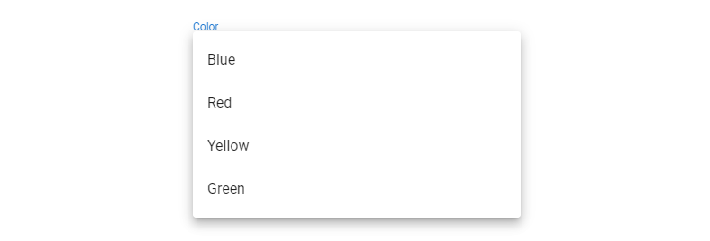
There are not options to select from in the dropdown list yet. Here’s what shows up when you click it:

We can add items by assigning an array to the items prop. The items will be a group of colors.
<template>
  <v-app>
    <v-row justify="center" class="ma-2">
      <v-col sm="6"
        ><v-select label="Color" :items="items"></v-select
      ></v-col>
    </v-row>
  </v-app>
</template>

<script>
export default {
  name: 'App',
  data: () => ({
    items: ['Blue', 'Red', 'Yellow', 'Green'],
  }),
};
</script>
Now there are options in the dropdown list.
We can now choose one of the options:

Vuetify Select Set Default Value
To set a default value for a dropdown list, we can use v-model to create a two-way binding between the current value of the dropdown list and a variable. The initial value of this variable will be the default value of the select field:
<template>
  <v-app>
    <v-row justify="center" class="ma-2">
      <v-col sm="6"
        ><v-select
          label="Color"
          :items="items"
          v-model="defaultSelection"
        ></v-select
      ></v-col>
    </v-row>
  </v-app>
</template>

<script>
export default {
  name: 'App',
  data: () => ({
    defaultSelection: 'Yellow',
    items: ['Blue', 'Red', 'Yellow', 'Green'],
  }),
};
</script>

Vuetify Select Field Filled Variant
We can set an alternative filled variant for a select field with the filled prop:
<template>
  <v-app>
    <v-row justify="center" class="ma-2">
      <v-col sm="6"
        ><v-select label="Color" :items="items" filled></v-select
      ></v-col>
    </v-row>
  </v-app>
</template>

<script>
export default {
  name: 'App',
  data: () => ({
    items: ['Blue', 'Red', 'Yellow', 'Green'],
  }),
};
</script>

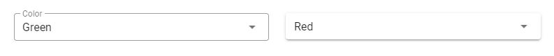
Vuetify Select Field Outlined Variant
We can also use an alternative outlined style, by setting the outlined prop of v-select to true:
<template>
  <v-app>
    <v-row justify="center" class="ma-2">
      <v-col sm="6"
        ><v-select label="Color" :items="items" outlined></v-select
      ></v-col>
    </v-row>
  </v-app>
</template>

<script>
export default {
  name: 'App',
  data: () => ({
    items: ['Blue', 'Red', 'Yellow', 'Green'],
  }),
};
</script>

Vuetify Select Field Solo Variant
We can use the solo variant with the solo prop:
<template>
  <v-app>
    <v-row justify="center" class="ma-2">
      <v-col sm="6"
        ><v-select label="Color" :items="items" solo></v-select
      ></v-col>
    </v-row>
  </v-app>
</template>

<script>
export default {
  name: 'App',
  data: () => ({
    items: ['Blue', 'Red', 'Yellow', 'Green'],
  }),
};
</script>

Dense Select Fields
Setting the dense prop to true on a v-select will compact the dropdown list:
<template>
  <v-app>
    <v-row justify="center" class="ma-2">
      <v-col sm="6"
        ><v-select label="Color" :items="items" outlined dense></v-select
      ></v-col>
      <v-col sm="6"
        ><v-select label="Color" :items="items" solo dense></v-select
      ></v-col>
    </v-row>
  </v-app>
</template>

<script>
export default {
  name: 'App',
  data: () => ({
    items: ['Blue', 'Red', 'Yellow', 'Green'],
  }),
};
</script>
Disabled Select Fields
To prevent interactivity with a select field, use the disabled prop:
<template>
  <v-app>
    <v-row justify="center" class="ma-2">
      <v-col sm="6"
        ><v-select label="Color" :items="items" disabled></v-select
      ></v-col>
    </v-row>
  </v-app>
</template>

<script>
export default {
  name: 'App',
  data: () => ({
    items: ['Blue', 'Red', 'Yellow', 'Green'],
  }),
};
</script>

Select Field Icons
The prepend-icon prop allows us to prepend an icon to a dropdown list. Here we’re displaying a palette icon to represent color:
<template>
  <v-app>
    <v-row justify="center" class="ma-2">
      <v-col sm="6"
        ><v-select
          label="Color"
          :items="items"
          prepend-icon="mdi-palette"
        ></v-select
      ></v-col>
    </v-row>
  </v-app>
</template>

<script>
export default {
  name: 'App',
  data: () => ({
    items: ['Blue', 'Red', 'Yellow', 'Green'],
  }),
};
</script>

Similarly, we can use the append-icon prop to append an icon to a select field:
<template>
  <v-app>
    <v-row justify="center" class="ma-2">
      <v-col sm="6"
        ><v-select
          label="Color"
          :items="items"
          append-icon="mdi-palette"
        ></v-select
      ></v-col>
    </v-row>
  </v-app>
</template>

<script>
export default {
  name: 'App',
  data: () => ({
    items: ['Blue', 'Red', 'Yellow', 'Green'],
  }),
};
</script>

Multi Select Dropdown Lists in Vuetify
In instances where we want users to be able to select more than one option, we can use the multiple prop
<template>
  <v-app>
    <v-row justify="center" class="ma-2">
      <v-col sm="6"
        ><v-select
          label="Color"
          :items="items"

          multiple
        ></v-select
      ></v-col>
    </v-row>
  </v-app>
</template>

<script>
export default {
  name: 'App',
  data: () => ({
    items: ['Blue', 'Red', 'Yellow', 'Green'],
  }),
};
</script>
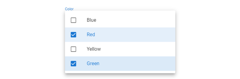

Displaying Chips in Multi Select Dropdown Lists
We can display the options as a group of chips instead of comma-separated values. We do this with the chips prop:
<template>
  <v-app>
    <v-row justify="center" class="ma-2">
      <v-col sm="6"
        ><v-select
          label="Color"
          :items="items"

          multiple
          chips
        ></v-select
      ></v-col>
    </v-row>
  </v-app>
</template>

<script>
export default {
  name: 'App',
  data: () => ({
    items: ['Blue', 'Red', 'Yellow', 'Green'],
  }),
};
</script>

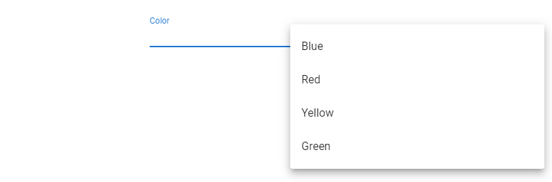
Customizing Select Field Menu Props
We can customize certain properties of the menu that pops up when the dropdown list is clicked. Modifiable properties include top, bottom, offsetX and offsetY.
<template>
  <v-app>
    <v-row justify="center" class="ma-2">
      <v-col sm="6"
        ><v-select
          label="Color"
          :items="items"
          :menu-props="{ offsetX: true }"
        ></v-select
      ></v-col>
    </v-row>
  </v-app>
</template>

<script>
export default {
  name: 'App',
  data: () => ({
    items: ['Blue', 'Red', 'Yellow', 'Green'],
  }),
};
</script>
Summary
Dropdown lists come in handy when we want to provide a finite list of known options to the user to choose from. Vuetify provides the v-select component to create and customize them in diverse ways.
11 Amazing New JavaScript Features in ES13
This guide will bring you up to speed with all the latest features added in ECMAScript 13. These powerful new features will modernize your JavaScript with shorter and more expressive code.
