
A checkbox allows a user to select between two values. They are useful for getting boolean input (true or false), perhaps checking off a task in a to-do list app to show completion or deciding whether or not to accept a license agreement during software installation. In this article, we’re going to learn how to create a checkbox in Vuetify.
The v-checkbox Component
Vuetify provides the v-checkbox component for creating a checkbox:
<template>
  <v-app>
    <v-row class="ma-2" justify="center">
      <v-checkbox></v-checkbox>
    </v-row>
  </v-app>
</template>

<script>
export default {
  name: 'App',
};
</script>
Clicking the checkbox will toggle its checked state:

Setting a Checkbox value
Use the value prop to set the checked state of the checkbox.
<template>
  <v-app>
    <v-row class="ma-2" justify="center">
      <v-checkbox :value="true"></v-checkbox>
      <v-checkbox :value="false"></v-checkbox>
    </v-row>
  </v-app>
</template>

<script>
export default {
  name: 'App',
};
</script>

Vuetify Checkbox Labels
We can label a Vuetify checkbox with the label prop:
<template>
  <v-app>
    <v-row class="ma-2" justify="center">
      <v-checkbox v-model="checked" label="Coding Beauty"></v-checkbox>
    </v-row>
  </v-app>
</template>

<script>
export default {
  name: 'App',
  data: () => ({
    checked: false,
  }),
};
</script>

Vuetify Checkbox Label Slot
To include HTML content in a checkbox label, we can put it in the label slot:
<template>
<v-app>
<v-row class="ma-2" justify="space-around">
<v-checkbox color="indigo" input-value="true">
<template v-slot:label>
Visit the
<a
target="_blank"
href="https://codingbeautydev.com"
@click.stop
v-on="on"
>
Coding Beauty website
</a>
</template>
</v-checkbox>
</v-row>
</v-app>
</template>
<script>
export default {
name: 'App',
};
</script>

Vuetify Checkbox Boolean v-model
To control the current value of the checkbox, we can use v-model to create a two-way binding between the v-checkbox and a boolean variable.
Here, we create a checkbox and a button below it to toggle the state of the checkbox. We indicate this state with some text in the label prop.
<template>
  <v-app>
    <div class="ma-2 d-flex justify-center">
      <v-checkbox v-model="checked" :label="`Checked: ${checked}`"></v-checkbox>
    </div>
    <div class="ma-2 d-flex justify-center">
      <v-btn color="indigo" dark @click="checked = !checked">{{
        checked ? 'Uncheck' : 'Check'
      }}</v-btn>
    </div>
  </v-app>
</template>

<script>
export default {
  name: 'App',
  data: () => ({
    checked: false,
  }),
};
</script>
Clicking the button will negate checked, and this will reflect on the checkbox and its label:

Vuetify Checkbox Array v-model
We can pass an array to v-model to allow multiple checkbox components to share the same variable used for the two-way binding:
<template>
  <v-app>
    <v-container fluid>
      <p>Selected: {{ selected }}</p>
      <v-checkbox
        v-model="selected"
        label="JavaScript"
        value="javascript"
      ></v-checkbox>
      <v-checkbox
        v-model="selected"
        label="TypeScript"
        value="typescript"
      ></v-checkbox>
    </v-container>
  </v-app>
</template>

<script>
export default {
  name: 'App',
  data: () => ({
    selected: [],
  }),
};
</script>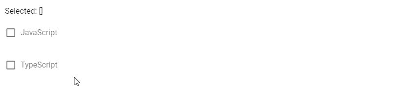
Customizing Checkbox Color in Vuetify
The color prop allows us to set the color of the checkbox background when checked:
<template>
  <v-app>
    <v-row justify="space-around" class="ma-4">
      <v-checkbox color="primary" label="primary"></v-checkbox>
      <v-checkbox color="green" label="green"></v-checkbox>
      <v-checkbox color="yellow darken-3" label="yellow darken-3"></v-checkbox>
      <v-checkbox color="red" label="red"></v-checkbox>
    </v-row>
  </v-app>
</template>

<script>
export default {
  name: 'App',
};
</script>

Disabled Checkbox
We can turn off checkbox interactivity with the disabled prop. It will no longer accept input when disabled.
<template>
  <v-app>
    <v-row class="ma-2" justify="space-around">
      <v-checkbox
        label="on disabled"
        color="green"
        input-value="true"
        disabled
      ></v-checkbox>
      <v-checkbox
        label="off disabled"
        color="green"
        disabled
      ></v-checkbox>
    </v-row>
  </v-app>
</template>

<script>
export default {
  name: 'App',
};
</script>

Indeterminate Checkbox
We can make the checkbox indeterminate by using the indeterminate prop on the v-checkbox:
<template>
  <v-app>
    <v-row class="ma-2" justify="space-around">
      <v-checkbox label="indeterminate" color="red" indeterminate></v-checkbox>
    </v-row>
  </v-app>
</template>

<script>
export default {
  name: 'App',
};
</script>

Summary
We can use a checkbox when we need to accept boolean input. Vuetify provides the v-checkbox component to create it and provides various props for customization.
Every Crazy Thing JavaScript Does
A captivating guide to the subtle caveats and lesser-known parts of JavaScript.
