A floating action button (FAB) is used to signify the primary action to be taken on a particular screen. In this post, we’re going to learn how to use the button component (v-btn) to create FABs.
v-btn fab Prop
We can create an FAB by setting the fab prop of the button component to true:
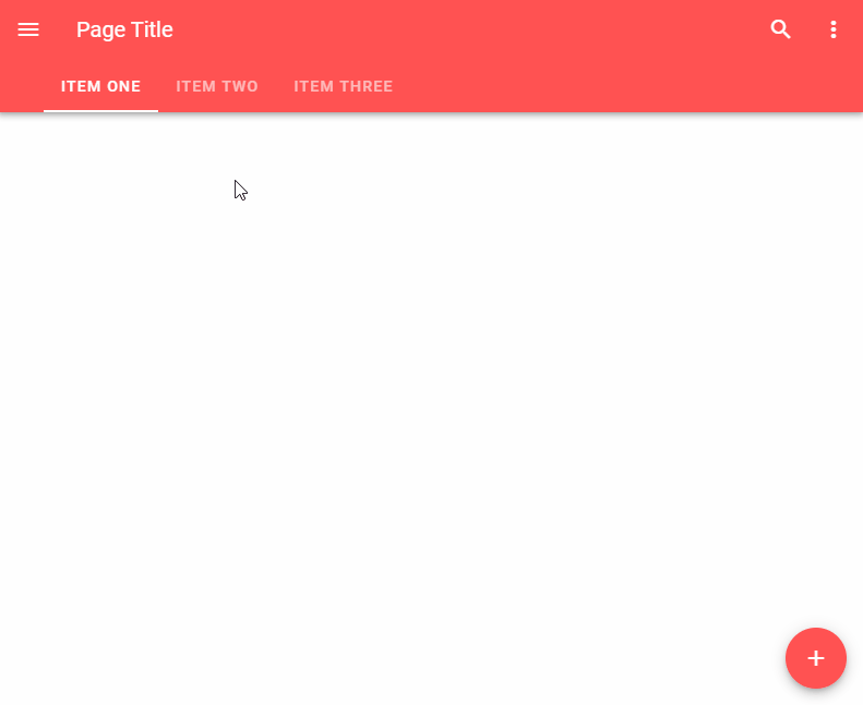
With the speed dial component (v-speed-dial), an FAB can emit a stack of related actions when pressed:
<template>
  <v-app>
    <v-speed-dial
      v-model="fab"
      direction="top"
      transition="slide-y-reverse-transition"
      absolute
      bottom
      right
    >
      <template v-slot:activator>
        <v-btn
          v-model="fab"
          color="blue darken-2"
          dark
          fab
        >
          <v-icon v-if="fab"> mdi-close </v-icon>
          <v-icon v-else> mdi-image </v-icon>
        </v-btn>
      </template>
      <v-btn
        fab
        small
      >
        <v-icon>mdi-pencil</v-icon>
      </v-btn>
      <v-btn
        fab
        small
      >
        <v-icon>mdi-plus</v-icon>
      </v-btn>
      <v-btn
        fab
        small
      >
        <v-icon>mdi-star</v-icon>
      </v-btn>
    </v-speed-dial>
  </v-app>
</template>

<script>
export default {
  name: 'App',
  data: () => ({
    fab: false,
  }),
};
</script>
Using FABs in Lateral Screens
There are certain instances where we have FABs with different actions on screens next to each other, like the content screens of a set of tab items. We can display a transition to signify the change of action with the fab-transition component. fab-transition works with the key prop of the v-btn. It triggers the transition when the FAB key changes.
A floating action button (FAB) is used to indicate the main action to be performed on a screen. We can use the fab prop of the v-btn component in combination with various other props to create and customize FABs.
The Vuetify rating component is useful for collecting user feedback. Users can use it to indicate their level of satisfaction with certain content. Read on to find out more about this component and the various ways in which we can customize it.
We can use v-model to set up a two-way binding between the value of the v-rating and a variable. In the code example below, we use v-model to create a rating component with text below it displaying the current value:
We can use the Vuetify rating component (v-rating) in our application to collect user feedback. This component comes with various props and slots that allow customization.
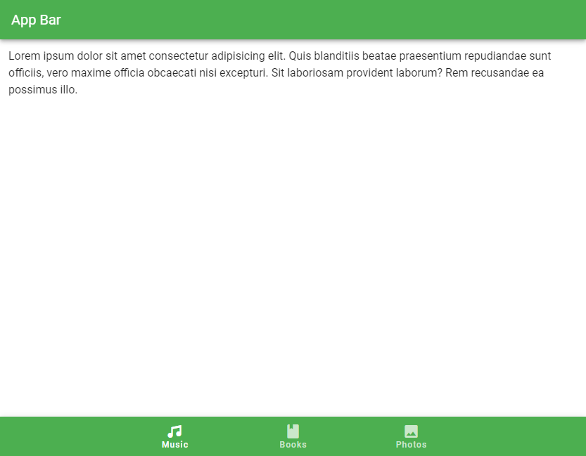
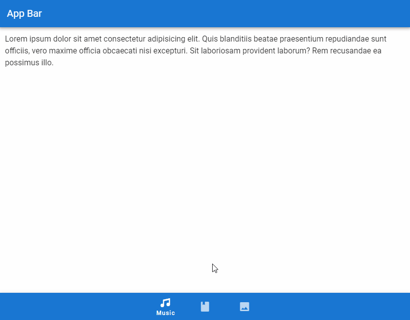
A bottom navigation bar is an alternative to a sidebar or navigation drawer. It is used mainly in mobile applications and enables quick navigation to the top-level destinations of an app. In this article, we’re going to learn about the Vuetify bottom navigation component and how we can use it to easily create and customize bottom navigation bars.
The Vuetify Bottom Navigation Component (v-bottom-navigation)
Vuetify provides the v-bottom-navigation component for creating bottom navigation bars. It includes a set of v-btns for navigation. We can use the value prop of v-bottom-navigation to set the currently active button programmatically. The button with a matching value prop will be made active. By default, the value of each button is set to its zero-based index in the set of buttons on the bottom navigation bar, i.e., the first button has its value set to 0, the second button to 1, the third to 2, and so on. But we can set a custom value to the value prop of a v-btn to change this.
<template>
  <v-app>
    <v-app-bar
      color="primary"
      app
      dark
    >
      <v-toolbar-title>App Bar</v-toolbar-title>
    </v-app-bar>
    <v-main>
      <v-container
        >Lorem ipsum dolor sit amet consectetur adipisicing
        elit. Quis blanditiis beatae praesentium repudiandae
        sunt officiis, vero maxime officia obcaecati nisi
        excepturi. Sit laboriosam provident laborum? Rem
        recusandae ea possimus illo.</v-container
      >
    </v-main>
    <v-bottom-navigation
      v-model="value"
      app
    >
      <v-btn
        value="music"
        height="100%"
      >
        <span>Music</span>
        <v-icon>mdi-music</v-icon>
      </v-btn>

      <v-btn
        value="books"
        height="100%"
      >
        <span>Books</span>
        <v-icon>mdi-book</v-icon>
      </v-btn>

      <v-btn
        value="photos"
        height="100%"
      >
        <span>Photos</span>
        <v-icon>mdi-image</v-icon>
      </v-btn>
    </v-bottom-navigation>
  </v-app>
</template>

<script>
export default {
  name: 'App',
  data: () => ({ value: 'music' }),
};
</script>
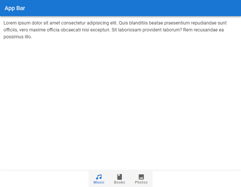
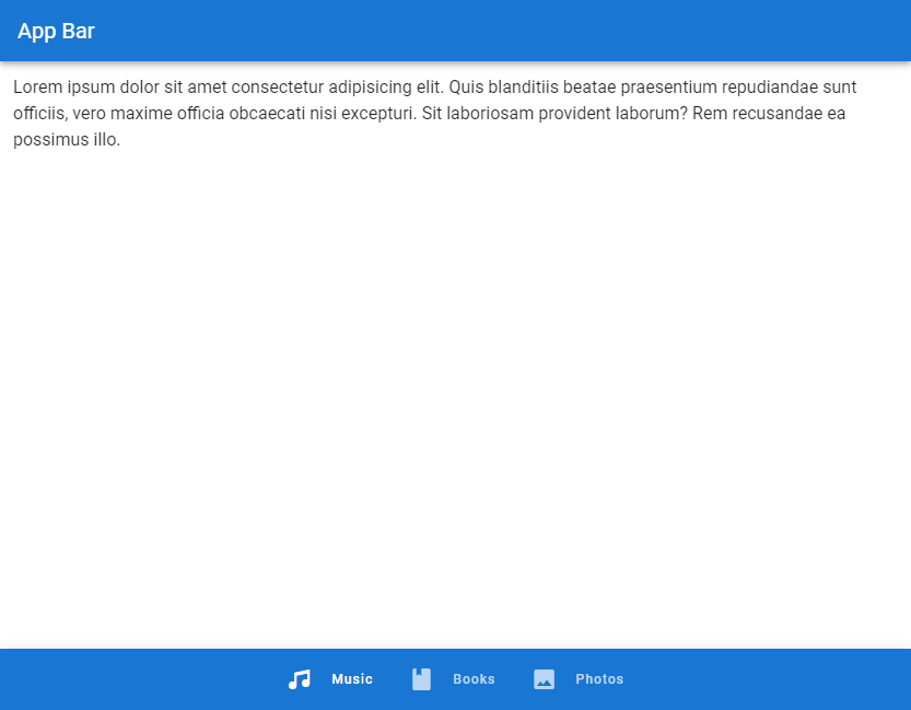
Vuetify Bottom Navigation Color
We can use the color prop of v-bottom-navigation to set the color of the active button on the bottom navigation bar. We can use any color from the Material Design specs.
<template>
  <v-app>
    <v-app-bar
      color="primary"
      app
      dark
    >
      <v-toolbar-title>App Bar</v-toolbar-title>
    </v-app-bar>
    <v-main>
      <v-container
        >Lorem ipsum dolor sit amet consectetur adipisicing
        elit. Quis blanditiis beatae praesentium repudiandae
        sunt officiis, vero maxime officia obcaecati nisi
        excepturi. Sit laboriosam provident laborum? Rem
        recusandae ea possimus illo.</v-container
      >
    </v-main>
    <v-bottom-navigation
      v-model="value"
      app
      color="primary"
    >
      <v-btn
        value="music"
        height="100%"
      >
        <span>Music</span>
        <v-icon>mdi-music</v-icon>
      </v-btn>

      <v-btn
        value="books"
        height="100%"
      >
        <span>Books</span>
        <v-icon>mdi-book</v-icon>
      </v-btn>

      <v-btn
        value="photos"
        height="100%"
      >
        <span>Photos</span>
        <v-icon>mdi-image</v-icon>
      </v-btn>
    </v-bottom-navigation>
  </v-app>
</template>

<script>
export default {
  name: 'App',
  data: () => ({ value: 'music' }),
};
</script>
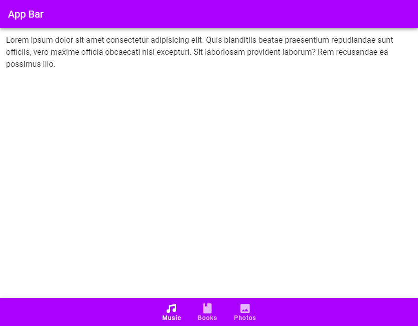
Background Color
Use the background-color prop to set the background color of the bottom navigation bar.
<template>
  <v-app>
    <v-app-bar
      :color="color"
      app
      dark
    >
      <v-toolbar-title>App Bar</v-toolbar-title>
    </v-app-bar>
    <v-main>
      <v-container
        >Lorem ipsum dolor sit amet consectetur adipisicing
        elit. Quis blanditiis beatae praesentium repudiandae
        sunt officiis, vero maxime officia obcaecati nisi
        excepturi. Sit laboriosam provident laborum? Rem
        recusandae ea possimus illo.</v-container
      >
    </v-main>
    <v-bottom-navigation
      v-model="value"
      app
      :background-color="color"
      dark
    >
      <v-btn
        value="music"
        height="100%"
        :color="color"
      >
        <span>Music</span>
        <v-icon>mdi-music</v-icon>
      </v-btn>

      <v-btn
        value="books"
        height="100%"
        :color="color"
      >
        <span>Books</span>
        <v-icon>mdi-book</v-icon>
      </v-btn>

      <v-btn
        value="photos"
        height="100%"
        :color="color"
      >
        <span>Photos</span>
        <v-icon>mdi-image</v-icon>
      </v-btn>
    </v-bottom-navigation>
  </v-app>
</template>

<script>
export default {
  name: 'App',
  data: () => ({
    value: 'music',
    color: 'purple accent-4',
  }),
};
</script>
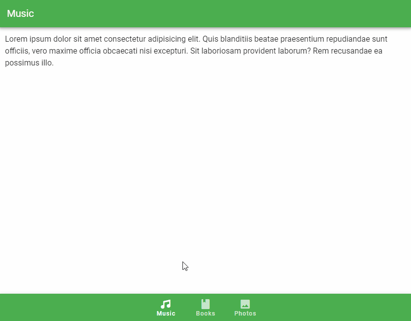
v-model
We can use v-model to set up a two-way binding between the currently active button and a variable. In the code example below, we change the title of the app bar to the text of the button that becomes active when clicked.
<template>
  <v-app>
    <v-app-bar
      :color="color"
      app
      dark
    >
      <v-toolbar-title>
        {{ capitalize(value) }}
      </v-toolbar-title>
    </v-app-bar>
    <v-main>
      <v-container
        >Lorem ipsum dolor sit amet consectetur adipisicing
        elit. Quis blanditiis beatae praesentium repudiandae
        sunt officiis, vero maxime officia obcaecati nisi
        excepturi. Sit laboriosam provident laborum? Rem
        recusandae ea possimus illo.</v-container
      >
    </v-main>
    <v-bottom-navigation
      v-model="value"
      app
      :background-color="color"
      dark
    >
      <v-btn
        value="music"
        height="100%"
        :color="color"
      >
        <span>Music</span>
        <v-icon>mdi-music</v-icon>
      </v-btn>

      <v-btn
        value="books"
        height="100%"
        :color="color"
      >
        <span>Books</span>
        <v-icon>mdi-book</v-icon>
      </v-btn>

      <v-btn
        value="photos"
        height="100%"
        :color="color"
      >
        <span>Photos</span>
        <v-icon>mdi-image</v-icon>
      </v-btn>
    </v-bottom-navigation>
  </v-app>
</template>

<script>
export default {
  name: 'App',
  data: () => ({
    value: 'music',
    color: 'green',
  }),
  methods: {
    capitalize(str) {
      return str.charAt(0).toUpperCase() + str.slice(1);
    },
  },
};
</script>
Vuetify Bottom Navigation Grow
We can set the grow prop to true on the v-bottom-navigation to force the v-btn components to fill all the available space. The buttons can have a maximum width of 168px, according to the Bottom Navigation Material Design specs.
<template>
  <v-app>
    <v-app-bar
      :color="color"
      app
      dark
    >
      <v-toolbar-title> App Bar </v-toolbar-title>
    </v-app-bar>
    <v-main>
      <v-container
        >Lorem ipsum dolor sit amet consectetur adipisicing
        elit. Quis blanditiis beatae praesentium repudiandae
        sunt officiis, vero maxime officia obcaecati nisi
        excepturi. Sit laboriosam provident laborum? Rem
        recusandae ea possimus illo.</v-container
      >
    </v-main>
    <v-bottom-navigation
      v-model="value"
      app
      :background-color="color"
      dark
      grow
    >
      <v-btn
        value="music"
        height="100%"
        :color="color"
      >
        <span>Music</span>
        <v-icon>mdi-music</v-icon>
      </v-btn>

      <v-btn
        value="books"
        height="100%"
        :color="color"
      >
        <span>Books</span>
        <v-icon>mdi-book</v-icon>
      </v-btn>

      <v-btn
        value="photos"
        height="100%"
        :color="color"
      >
        <span>Photos</span>
        <v-icon>mdi-image</v-icon>
      </v-btn>
    </v-bottom-navigation>
  </v-app>
</template>

<script>
export default {
  name: 'App',
  data: () => ({
    value: 'music',
    color: 'green',
  }),
};
</script>
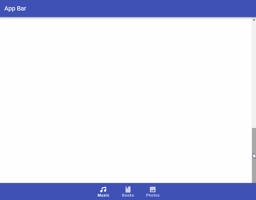
Vuetify Bottom Navigation Hide on Scroll
The hide-on-scroll prop hides the bottom navigation bar when scrolling up, and displays it when scrolling down. This is similar to the scrolling techniques supported by the v-app-bar component.
<template>
  <v-app>
    <v-app-bar
      :color="color"
      app
      dark
    >
      <v-toolbar-title> App Bar </v-toolbar-title>
    </v-app-bar>
    <v-main>
      <v-responsive
        max-height="600"
        id="hide-on-scroll-example"
        class="overflow-y-auto"
      >
        <v-responsive
          height="1500"
          class="ma-4"
        >
          Lorem ipsum dolor sit amet consectetur adipisicing
          elit. Quis blanditiis beatae praesentium
          repudiandae sunt officiis, vero maxime officia
          obcaecati nisi excepturi. Sit laboriosam provident
          laborum? Rem recusandae ea possimus illo.
        </v-responsive>
      </v-responsive>
    </v-main>
    <v-bottom-navigation
      v-model="value"
      app
      :background-color="color"
      dark
      hide-on-scroll
      scroll-target="#hide-on-scroll-example"
    >
      <v-btn
        value="music"
        height="100%"
        :color="color"
      >
        <span>Music</span>
        <v-icon>mdi-music</v-icon>
      </v-btn>

      <v-btn
        value="books"
        height="100%"
        :color="color"
      >
        <span>Books</span>
        <v-icon>mdi-book</v-icon>
      </v-btn>

      <v-btn
        value="photos"
        height="100%"
        :color="color"
      >
        <span>Photos</span>
        <v-icon>mdi-image</v-icon>
      </v-btn>
    </v-bottom-navigation>
  </v-app>
</template>

<script>
export default {
  name: 'App',
  data: () => ({
    value: 'music',
    color: 'indigo',
  }),
};
</script>
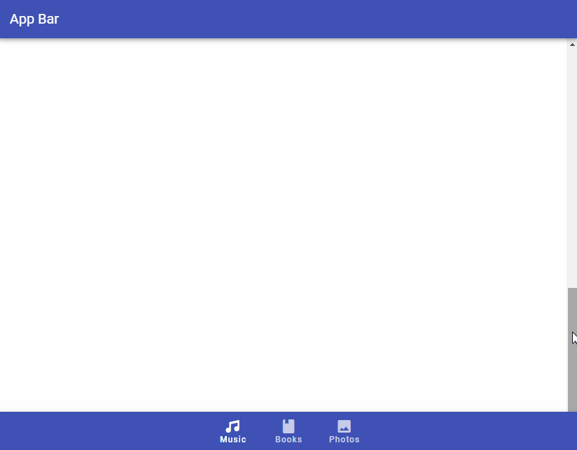
Vuetify Bottom Navigation Scroll Threshold
The scroll-threshold prop sets the distance a user must scroll up to before the bottom navigation bar is hidden. For example, setting scroll-treshold to 0 means the v-bottom-navigation will only get hidden when the user scrolls up to the very top of the page:
<template>
  <v-app>
    <v-app-bar
      :color="color"
      app
      dark
    >
      <v-toolbar-title> App Bar </v-toolbar-title>
    </v-app-bar>
    <v-main>
      <v-responsive
        max-height="600"
        id="hide-on-scroll-example"
        class="overflow-y-auto"
      >
        <v-responsive
          height="1500"
          class="ma-4"
        >
          Lorem ipsum dolor sit amet consectetur adipisicing
          elit. Quis blanditiis beatae praesentium
          repudiandae sunt officiis, vero maxime officia
          obcaecati nisi excepturi. Sit laboriosam provident
          laborum? Rem recusandae ea possimus illo.
        </v-responsive>
      </v-responsive>
    </v-main>
    <v-bottom-navigation
      v-model="value"
      app
      :background-color="color"
      dark
      hide-on-scroll
      scroll-target="#hide-on-scroll-example"
      scroll-threshold="0"
    >
      <v-btn
        value="music"
        height="100%"
        :color="color"
      >
        <span>Music</span>
        <v-icon>mdi-music</v-icon>
      </v-btn>

      <v-btn
        value="books"
        height="100%"
        :color="color"
      >
        <span>Books</span>
        <v-icon>mdi-book</v-icon>
      </v-btn>

      <v-btn
        value="photos"
        height="100%"
        :color="color"
      >
        <span>Photos</span>
        <v-icon>mdi-image</v-icon>
      </v-btn>
    </v-bottom-navigation>
  </v-app>
</template>

<script>
export default {
  name: 'App',
  data: () => ({
    value: 'music',
    color: 'indigo',
  }),
};
</script>
Vuetify Bottom Navigation Horizontal
With the horizontal prop, we can position the button text inline with the provided v-icon.
<template>
  <v-app>
    <v-app-bar
      :color="color"
      app
      dark
    >
      <v-toolbar-title> App Bar </v-toolbar-title>
    </v-app-bar>
    <v-main>
      <v-container>
        Lorem ipsum dolor sit amet consectetur adipisicing
        elit. Quis blanditiis beatae praesentium repudiandae
        sunt officiis, vero maxime officia obcaecati nisi
        excepturi. Sit laboriosam provident laborum? Rem
        recusandae ea possimus illo.
      </v-container>
    </v-main>
    <v-bottom-navigation
      v-model="value"
      app
      :background-color="color"
      dark
      horizontal
    >
      <v-btn
        value="music"
        height="100%"
        :color="color"
      >
        <span>Music</span>
        <v-icon>mdi-music</v-icon>
      </v-btn>

      <v-btn
        value="books"
        height="100%"
        :color="color"
      >
        <span>Books</span>
        <v-icon>mdi-book</v-icon>
      </v-btn>

      <v-btn
        value="photos"
        height="100%"
        :color="color"
      >
        <span>Photos</span>
        <v-icon>mdi-image</v-icon>
      </v-btn>
    </v-bottom-navigation>
  </v-app>
</template>

<script>
export default {
  name: 'App',
  data: () => ({
    value: 'music',
    color: 'primary',
  }),
};
</script>
Vuetify Bottom Navigation Shift
We can the shift prop to hide the text of the navigation bar buttons that are not active.
<template>
  <v-app>
    <v-app-bar
      :color="color"
      app
      dark
    >
      <v-toolbar-title> App Bar </v-toolbar-title>
    </v-app-bar>
    <v-main>
      <v-container>
        Lorem ipsum dolor sit amet consectetur adipisicing
        elit. Quis blanditiis beatae praesentium repudiandae
        sunt officiis, vero maxime officia obcaecati nisi
        excepturi. Sit laboriosam provident laborum? Rem
        recusandae ea possimus illo.
      </v-container>
    </v-main>
    <v-bottom-navigation
      v-model="value"
      app
      :background-color="color"
      dark
      shift
    >
      <v-btn
        value="music"
        height="100%"
        :color="color"
      >
        <span>Music</span>
        <v-icon>mdi-music</v-icon>
      </v-btn>

      <v-btn
        value="books"
        height="100%"
        :color="color"
      >
        <span>Books</span>
        <v-icon>mdi-book</v-icon>
      </v-btn>

      <v-btn
        value="photos"
        height="100%"
        :color="color"
      >
        <span>Photos</span>
        <v-icon>mdi-image</v-icon>
      </v-btn>
    </v-bottom-navigation>
  </v-app>
</template>

<script>
export default {
  name: 'App',
  data: () => ({
    value: 'music',
    color: 'primary',
  }),
};
</script>
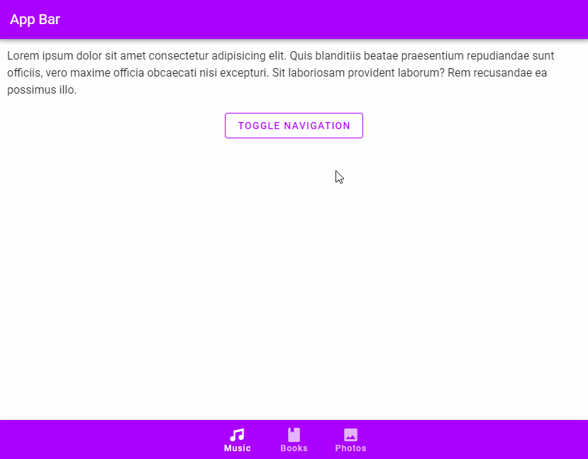
Vuetify Bottom Navigation Toggle
We can use the input-value prop of v-bottom-navigation to toggle the visibility of the bottom navigation bar:
<template>
  <v-app>
    <v-app-bar
      :color="color"
      app
      dark
    >
      <v-toolbar-title> App Bar </v-toolbar-title>
    </v-app-bar>
    <v-main>
      <v-container>
        Lorem ipsum dolor sit amet consectetur adipisicing
        elit. Quis blanditiis beatae praesentium repudiandae
        sunt officiis, vero maxime officia obcaecati nisi
        excepturi. Sit laboriosam provident laborum? Rem
        recusandae ea possimus illo.
        <v-row justify="center">
          <v-btn
            class="ma-8"
            outlined
            :color="color"
            @click="active = !active"
          >
            Toggle Navigation
          </v-btn>
        </v-row>
      </v-container>
    </v-main>
    <v-bottom-navigation
      v-model="value"
      app
      :background-color="color"
      dark
      :input-value="active"
    >
      <v-btn
        value="music"
        height="100%"
        :color="color"
      >
        <span>Music</span>
        <v-icon>mdi-music</v-icon>
      </v-btn>

      <v-btn
        value="books"
        height="100%"
        :color="color"
      >
        <span>Books</span>
        <v-icon>mdi-book</v-icon>
      </v-btn>

      <v-btn
        value="photos"
        height="100%"
        :color="color"
      >
        <span>Photos</span>
        <v-icon>mdi-image</v-icon>
      </v-btn>
    </v-bottom-navigation>
  </v-app>
</template>

<script>
export default {
  name: 'App',
  data: () => ({
    value: 'music',
    color: 'purple accent-4',
    active: true,
  }),
};
</script>
Conclusion
We can use a bottom navigation bar in place of a sidebar or navigation drawer for quick and easy navigation to important destinations in our app. Vuetify provides the bottom navigation component (v-bottom-navigation) for creating bottom navigation bars.
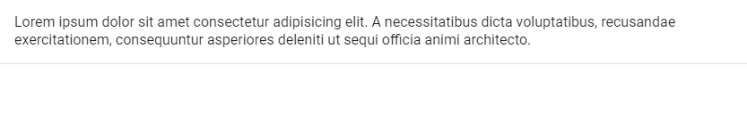
We can use a banner to display a message to the user with one or two related actions. It can be single-line or multi-line and can contain icons that fit in with the message and actions. Read on to find out more on how to create and customize banners with the Vuetify banner component.
The Vuetify Banner Component (v-banner)
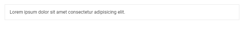
We can use the v-banner component from Vuetify to create a banner. It is multi-line by default.
<template>
  <v-app>
    <v-banner>
      Lorem ipsum dolor sit amet consectetur adipisicing
      elit. A necessitatibus dicta voluptatibus, recusandae
      exercitationem, consequuntur asperiores deleniti ut
      sequi officia animi architecto.
    </v-banner>
  </v-app>
</template>

<script>
export default {
  name: 'App',
};
</script>
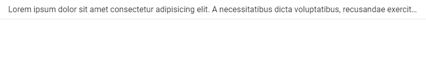
Single Line Banner
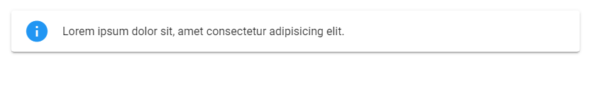
Use the single-line prop on a v-banner to make the message on the banner occupy only one line. It will be truncated with an ellipsis if it’s too long.
<template>
  <v-app>
    <v-banner single-line>
      Lorem ipsum dolor sit amet consectetur adipisicing
      elit. A necessitatibus dicta voluptatibus, recusandae
      exercitationem, consequuntur asperiores deleniti ut
      sequi officia animi architecto.
    </v-banner>
  </v-app>
</template>

<script>
export default {
  name: 'App',
};
</script>
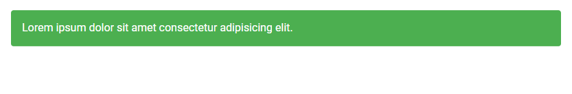
Vuetify Banner Color
Vuetify allows us to customize the color of the v-banner component with the color prop. We can use any color from the Material Design spec.
<template>
  <v-app>
    <v-banner
      color="primary"
      dark
      class="ma-4"
    >
      Lorem ipsum dolor sit amet consectetur adipisicing
      elit. A necessitatibus dicta voluptatibus, recusandae
      exercitationem, consequuntur asperiores deleniti ut
      sequi officia animi architecto.
    </v-banner>
  </v-app>
</template>

<script>
export default {
  name: 'App',
};
</script>
Vuetify Banner Sticky
The sticky prop sets the position CSS property of the banner element to sticky.
<template>
  <v-app>
    <div
      style="max-height: 400px"
      class="overflow-y-auto"
    >
      <v-banner
        sticky
        color="white"
      >
        Sticky banner
      </v-banner>
      Lorem ipsum dolor sit amet, consectetur adipisicing
      elit. Dicta voluptatibus maxime ullam cum quasi ad
      placeat qui ipsa odit quam sit nemo, laborum fuga enim
      saepe dolorum ex aperiam tempora? Lorem ipsum dolor
      sit amet consectetur adipisicing elit. Quasi iste
      earum nihil? Distinctio natus in cumque tempora veniam
      placeat consectetur, consequatur recusandae quaerat
      qui impedit ea cum, perferendis ipsum excepturi. Lorem
      ipsum dolor sit amet consectetur adipisicing elit.
      Libero impedit quo doloremque perferendis odit
      consequuntur maxime iure sint vel autem ipsa, eveniet
      dolore exercitationem, perspiciatis porro numquam
      earum laudantium laborum. Lorem, ipsum dolor sit amet
      consectetur adipisicing elit. Totam ducimus laborum
      suscipit distinctio tempore alias quos quasi eius
      praesentium itaque quas error fugit numquam, beatae
      sint dolor quis, officiis dignissimos. Lorem ipsum
      dolor sit amet consectetur adipisicing elit. Quas
      aliquid quia fugiat repudiandae ea, autem commodi
      praesentium obcaecati, corrupti sed ipsum dolores
      illum sit cum, officiis esse! Culpa, temporibus minus!
      Lorem ipsum dolor sit amet consectetur adipisicing
      elit. Sint placeat animi omnis nemo possimus quam
      optio earum ut amet aspernatur, consectetur nesciunt
      rem. Earum exercitationem, tempora blanditiis tenetur
      nemo magnam. Lorem ipsum dolor sit amet consectetur
      adipisicing elit. Nulla quisquam possimus officia,
      doloremque dolorum facere perspiciatis eaque rem
      quibusdam pariatur, laborum quod similique eius
      eligendi vero dicta ipsam iusto amet! Lorem ipsum
      dolor sit amet consectetur adipisicing elit. Pariatur
      ad labore doloribus voluptatem esse necessitatibus
      totam eaque fugit. Libero dolore autem totam sed
      possimus iure aspernatur dolorum voluptate odit
      laborum? Lorem ipsum dolor sit amet consectetur
      adipisicing elit. Quidem distinctio necessitatibus
      optio, quos id sint eius cupiditate. Itaque ipsum
      atque ad hic officiis vero earum, voluptatum debitis
      consectetur dolore unde. Lorem ipsum dolor sit amet
      consectetur, adipisicing elit. Eaque ullam cumque
      quasi unde illum, dolorem vel vero veritatis magnam
      consequatur commodi consectetur architecto dicta
      expedita ducimus officiis facilis sed ab. Lorem ipsum
      dolor sit, amet consectetur adipisicing elit. Minima
      veritatis neque quaerat fuga qui iste consectetur, in
      ab facilis quia laudantium voluptatum iusto ratione
      aliquid necessitatibus ipsam aspernatur sit
      dignissimos. Lorem ipsum dolor sit amet consectetur
      adipisicing elit. A ipsa pariatur modi, exercitationem
      minus quo dolorem reiciendis deserunt iste quod
      provident porro praesentium at sequi laboriosam qui
      cum saepe sint. Lorem, ipsum dolor sit amet
      consectetur adipisicing elit. Eum ab obcaecati
      perferendis. Deleniti modi eaque saepe inventore, a
      non officia ut quisquam illo fuga natus temporibus.
      Aliquid ab veritatis eius? Lorem ipsum dolor sit amet
      consectetur adipisicing elit. Sed ipsam iste laborum
      minima debitis modi corrupti, eos obcaecati aut magni,
      quod earum quaerat nobis esse eveniet omnis eligendi
      aspernatur voluptate! Lorem ipsum dolor sit amet
      consectetur, adipisicing elit. Nesciunt facilis fuga
      quas sed autem eligendi rerum dolorem optio. Nulla
      obcaecati veniam sunt ipsa exercitationem reiciendis
      totam dolorem tenetur fuga provident. Lorem ipsum
      dolor sit amet consectetur adipisicing elit.
      Temporibus ratione magni ipsam iure minima modi
      obcaecati nihil tempora debitis, quaerat corporis
      ipsum assumenda maiores nisi laboriosam doloremque.
      Ab, sapiente fuga! Lorem, ipsum dolor sit amet
      consectetur adipisicing elit. Tempore non voluptate
      quisquam quod, aliquam sequi maiores dolorum minima
      dolorem! Distinctio autem quaerat accusamus iusto
      beatae laudantium dicta omnis cum fuga. Lorem ipsum
      dolor sit amet, consectetur adipisicing elit. Quas,
      aspernatur sint maxime officiis cumque inventore, amet
      illum, soluta eum necessitatibus iure deleniti natus
      aut deserunt vitae vel facilis quod voluptatem.
    </div>
  </v-app>
</template>

<script>
export default {
  name: 'App',
};
</script>
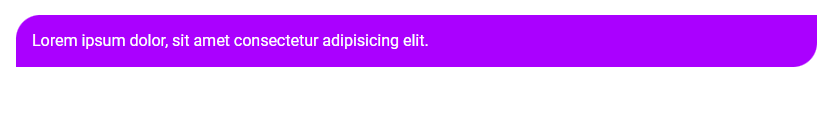
Vuetify Banner Outlined
We can add an outline to a banner with the outlined prop:
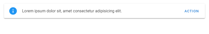
v-banner also comes with an actions slot that we can use display actions on the banner that the user can take. We use it to place functional buttons on the banner.
The actions slot has a dismiss function in its scope that we can use to hide the banner.
<template>
  <v-app>
    <v-banner
      single-line
      class="ma-4"
      elevation="2"
      color="red"
      rounded
      dark
    >
      No internet connection

      <template v-slot:actions="{ dismiss }">
        <v-btn
          text
          @click="dismiss"
        >
          Dismiss
        </v-btn>

        <v-btn text>Retry</v-btn>
      </template>
    </v-banner>

  </v-app>
</template>
<script>
export default {
  name: 'App',
};
</script>
Conclusion
A banner can be used to display messages to the user with one or two actions. We can use the Vuetify banner component (v-banner) to create banners. This component comes with various props and slots for customizing its appearance and behaviour.
One of the first components you encounter when first getting started with Vuetify is v-app. The Vuetify v-app component is required for all applications created with Vuetify. It enables many of the functionality that Vuetify provides. With v-app, child components can access global data from Vuetify, like the application theme colors or the theme variant (light/dark). v-app also ensures proper cross-browser compatibility, such as support for certain click events in browsers like Safari. We can use the app prop on other components like v-navigation-drawer, v-app-bar and v-footer and more, to help set up our application with proper sizing around the v-main component. This way, we can focus on building our application without needing to manually manage layout sizing.
Vuetify Application Markup with v-app and v-main
Thanks to automatic layout sizing, we can place our major layout elements anywhere in our markup, as long we set the app prop to true. The v-main component is important for making our page content work properly with our layout elements. v-main will be dynamically sized based on the structure of layout elements that have the app prop applied.
Here’s an example of typical Vuetify application markup:
<!-- App.vue -->

<v-app>
  <v-navigation-drawer app>
    <!-- -->
  </v-navigation-drawer>

  <v-app-bar app>
    <!-- -->
  </v-app-bar>

  <!-- Sizes your content based upon application components -->
  <v-main>

    <!-- Provides the application the proper gutter -->
    <v-container fluid>

      <!-- If using vue-router -->
      <router-view></router-view>
    </v-container>
  </v-main>

  <v-footer app>
    <!-- -->
  </v-footer>
</v-app>
Note: Applying the app prop automatically applies sets the position CSS property of the element to fixed. If we want absolute positioning, you can overwrite this functionality with the absolute prop.
Vuetify Application Components
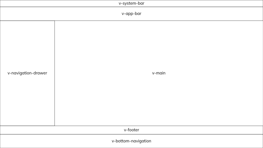
Here is the list of all the Vuetify components that support automatic layout sizing with the app prop:
v-app-bar: The app bar component is always placed at the top of an application with a lower priority than v-system-bar.
v-bottom-navigation: The bottom navigation component is always placed at the bottom of an application with a higher priority than v-footer.
v-footer: The footer component is always placed at the bottom of an application with a lower priority than v-bottom-navigation.
v-navigation-drawer: The navigation drawer component can be placed on the left or right side of an application and can be configured to sit next to or below v-app-bar
v-system-bar: The system bar component is always placed at the top of an application with a higher priority than v-app.
Layout placement of the Vuetify application components.
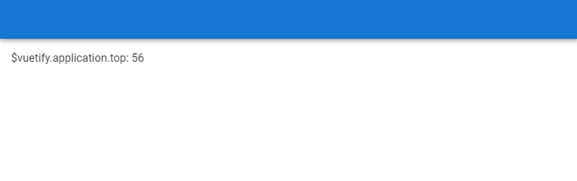
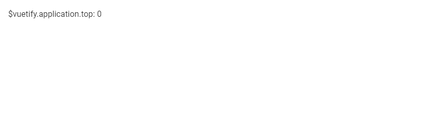
Vuetify Application Service
We can configure our layout with the Vuetify application service. The service communicates with the v-main component so that it’s able to properly size the application content. It comes with a number of accessible properties:
{
  bar: number
  bottom: number
  footer: number
  insetFooter: number
  left: number
  right: number
  top: number
}
These properties are readonly, so we can’t edit them. We can access them from the application property of the $vuetify object. The service uses them for the layout sizing of our main content and automatically updates them when we add or remove one of the application components with the app prop applied. For example, the top property changes when v-app-bar is added or removed from the markup:
The Vuetify v-app component is an essential component and required in all applications made with the framework. It provides features such as automatic layout sizing, theming functionality and cross-browser compatibility.
A flexbox layout simplifies the process of designing a flexible and responsive page layout structure without using float or manual positioning. It allows responsive elements within a container to be automatically arranged depending on the size of the viewport. In this article, we’re going to learn about the various helper classes Vuetify provides to control the layout of flex containers with alignment, justification, wrapping, and more.
Vuetify Flexbox Container
Applying the d-flex helper class to an element sets its display to flex, which turns it into a flexbox container transforming its direct children into flex items. As we’ll see later on, we can customize the interaction of these child elements with additional flex property utilities.
We can also customize the flex utilities to apply only for specific breakpoints with the following classes:
d-sm-flex
d-sm-inline-flex
d-md-flex
d-md-inline-flex
d-lg-flex
d-lg-inline-flex
d-xl-flex
d-xl-inline-flex
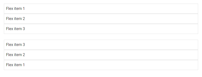
Vuetify Flex Direction
Vuetify provides flex helper classes for specifying the direction of the flex items within the container. These classes modify the flex-direction CSS property of the element. They are:
flex-row
flex-row-reverse
flex-column
flex-column-reverse
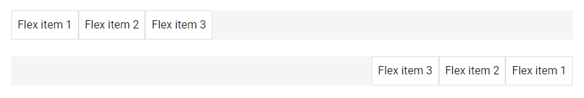
flex-row and flex-row-reverse
The flex-row utility class displays the flexible items horizontally, as a row. flex-row-reverse does the same, but in reverse order:
There are also responsive variations of these classes that set the flex-direction property for certain breakpoints.
flex-sm-row
flex-sm-row-reverse
flex-sm-column
flex-sm-column-reverse
flex-md-row
flex-md-row-reverse
flex-md-column
flex-md-column-reverse
flex-lg-row
flex-lg-row-reverse
flex-lg-column
flex-lg-column-reverse
flex-xl-row
flex-xl-row-reverse
flex-xl-column
flex-xl-column-reverse
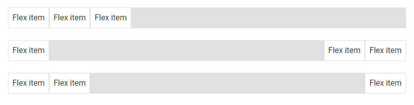
Flex Justify Classes
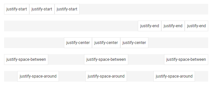
We can modify the justify-content flex property of the flexible container with the flex justify classes from Vuetify. justify-content modifies the flexbox items on the x-axis or y-axis for a flex-direction of row or column respectively. The helper classes can set justify-content to start (browser default), end, center, space-between, or space-around. They are:
There are also responsive variations of these classes that set the justify-content property for certain breakpoints:
justify-sm-start
justify-sm-end
justify-sm-center
justify-sm-space-between
justify-sm-space-around
justify-md-start
justify-md-end
justify-md-center
justify-md-space-between
justify-md-space-around
justify-lg-start
justify-lg-end
justify-lg-center
justify-lg-space-between
justify-lg-space-around
justify-xl-start
justify-xl-end
justify-xl-center
justify-xl-space-between
justify-xl-space-around
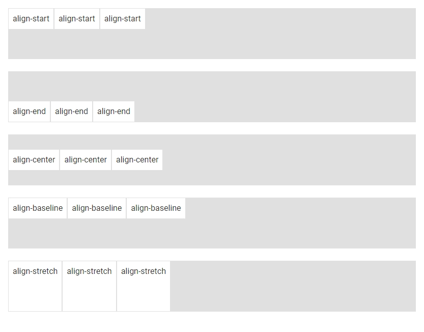
Vuetify Flex Align Classes
We also have flex utility classes from Vuetify that modify the align-items CSS property of the flex container. align-items modifies the flexbox items on the y-axis or x-axis for a flex-direction of row or column respectively. The helper classes can set align-items to start, end, center, baseline or stretch (browser default). They are:
They are also responsive variations of these classes that set the align-items property for certain breakpoints:
align-sm-start
align-sm-end
align-sm-center
align-sm-baseline
align-sm-stretch
align-md-start
align-md-end
align-md-center
align-md-baseline
align-md-stretch
align-lg-start
align-lg-end
align-lg-center
align-lg-baseline
align-lg-stretch
align-xl-start
align-xl-end
align-xl-center
align-xl-baseline
align-xl-stretch
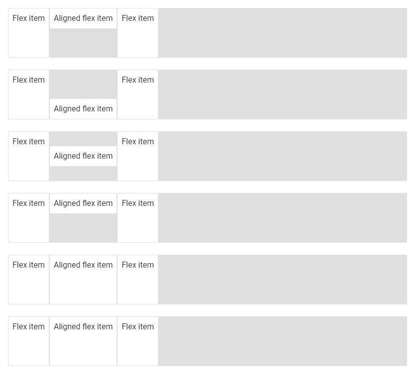
Flex Align Self Classes
We use the flex align self helper classes to modify the align-self flex property of the element. align-self modifies the flexbox items on the x-axis or y-axis for a flex-direction of row or column respectively. The helper classes can set align-self to start, end, center, baseline or stretch (browser default). They are:
Vuetify also provides responsive variations of these classes that set the align-self property for certain breakpoints:
align-self-sm-start
align-self-sm-end
align-self-sm-center
align-self-sm-baseline
align-self-sm-auto
align-self-sm-stretch
align-self-md-start
align-self-md-end
align-self-md-center
align-self-md-baseline
align-self-md-auto
align-self-md-stretch
align-self-lg-start
align-self-lg-end
align-self-lg-center
align-self-lg-baseline
align-self-lg-auto
align-self-lg-stretch
align-self-xl-start
align-self-xl-end
align-self-xl-center
align-self-xl-baseline
align-self-xl-auto
align-self-xl-stretch
Auto Margins
We can apply one of the margin helper classes from Vuetify to a flex container to control the positioning of flex items on the x-axis or y-axis for a flex direction of row or column respectively.
If we set flex-direction to column and specify a value for align-items, we can use either the mb-auto or mt-auto helper class to adjust flex item positioning:
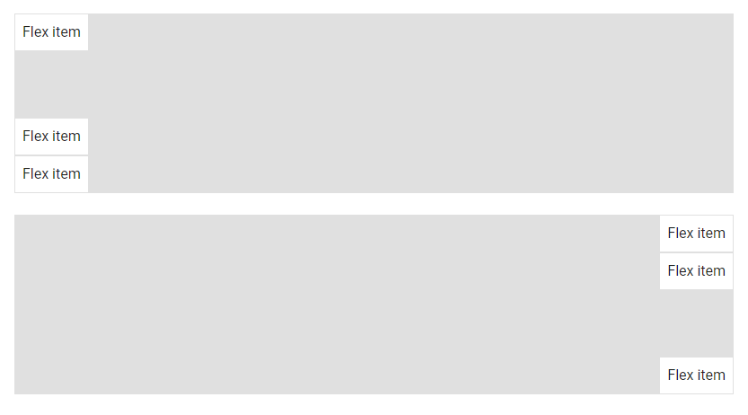
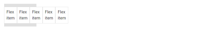
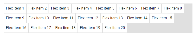
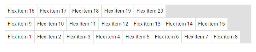
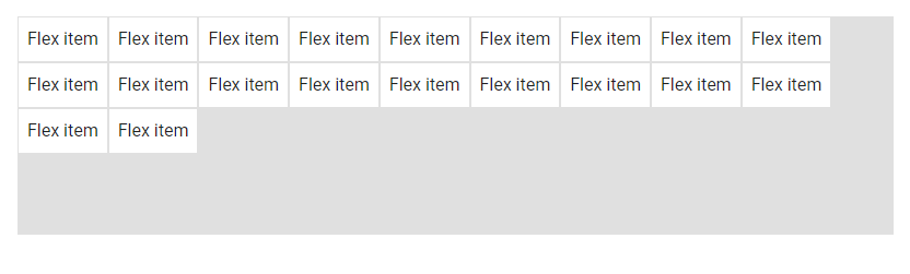
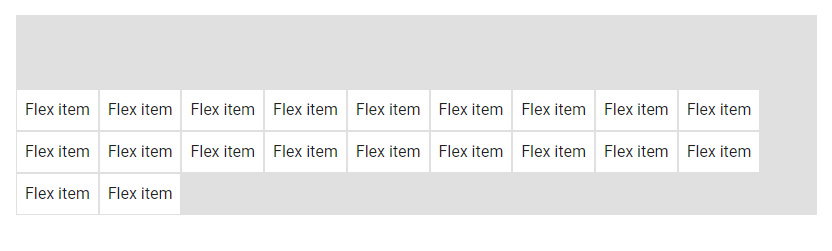
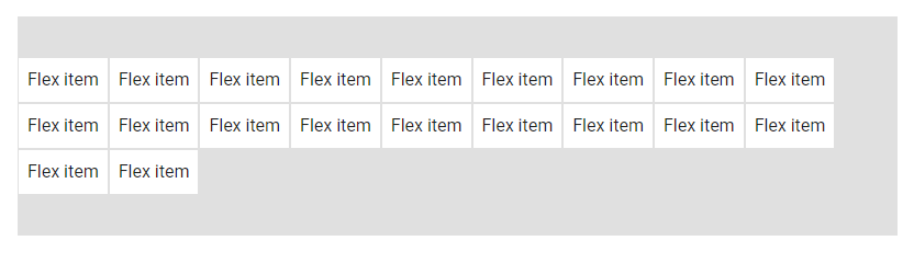
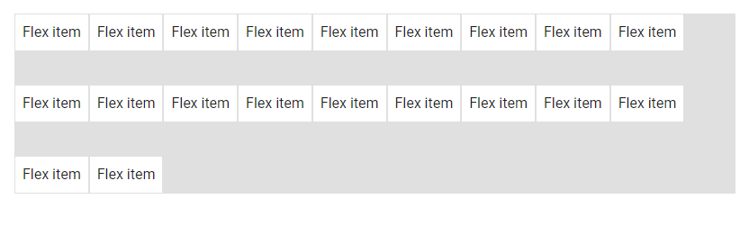
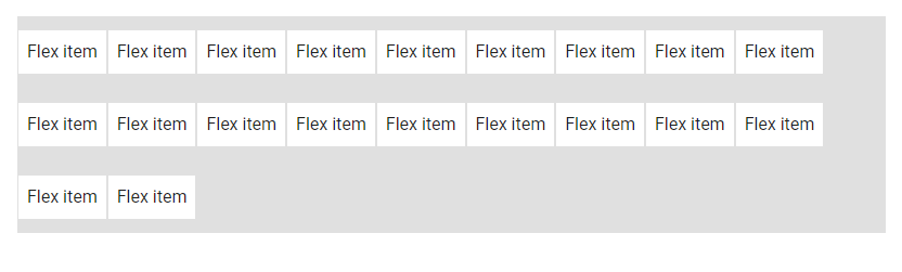
By default, the d-flex class does not provide wrapping (it behaves similar to setting flex-wrap to nowrap). We can change this by applying one of the flex-wrap helper classes to the container. The classes are:
flex-nowrap
flex-wrap
flex-wrap-reverse
flex-nowrap
flex-nowrap specifies that the items should not wrap.
These classes set the order flex property of the container. They are:
order-first
order-0
order-1
order-2
order-3
order-4
order-5
order-6
order-7
order-8
order-9
order-10
order-11
order-12
order-last
Vuetify also provides responsive variants of these classes that set the order property for certain breakpoints:
order-sm-first
order-sm-0
order-sm-1
order-sm-2
order-sm-3
order-sm-4
order-sm-5
order-sm-6
order-sm-7
order-sm-8
order-sm-9
order-sm-10
order-sm-11
order-sm-12
order-sm-last
order-md-first
order-md-0
order-md-1
order-md-2
order-md-3
order-md-4
order-md-5
order-md-6
order-md-7
order-md-8
order-md-9
order-md-10
order-md-11
order-md-12
order-md-last
order-lg-first
order-lg-0
order-lg-1
order-lg-2
order-lg-3
order-lg-4
order-lg-5
order-lg-6
order-lg-7
order-lg-8
order-lg-9
order-lg-10
order-lg-11
order-lg-12
order-lg-last
order-xl-first
order-xl-0
order-xl-1
order-xl-2
order-xl-3
order-xl-4
order-xl-5
order-xl-6
order-xl-7
order-xl-8
order-xl-9
order-xl-10
order-xl-11
order-xl-12
order-xl-last
Vuetify Flex Align Content
Vuetify provides flex align content classes that we can use to set the align-content CSS property of the flex container. The align-content modifies the flexbox items on the x-axis or y-axis for a flex-direction of row or column respectively. The helper classes can set align-content to start (browser default), end, center, between, around or stretch. They are:
There are also responsive variations of theses classes that set the align-content property for certain breakpoints:
align-sm-content-start
align-sm-content-end
align-sm-content-center
align-sm-content-space-between
align-sm-content-space-around
align-sm-content-stretch
align-md-content-start
align-md-content-end
align-md-content-center
align-md-content-space-between
align-md-content-space-around
align-md-content-stretch
align-lg-content-start
align-lg-content-end
align-lg-content-center
align-lg-content-space-between
align-lg-content-space-around
align-xl-content-start
align-xl-content-end
align-xl-content-center
align-xl-content-space-between
align-xl-content-space-around
align-xl-content-stretch
Vuetify Flex Grow and Shrink Classes
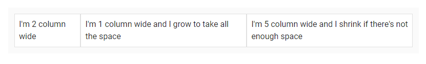
Vuetify also comes with helper classes that set the flex-grow and flex-shrink of a flexbox container. These utility classes are in the form flex-{condition}-{value}, where condition can be either grow or shrink and value can be either 0 or 1. The grow condition will allow an element to grow to fill available space, while shrink will allow an element to shrink down only to the space needed for its contents if there is not enough space in its container. The value 0 will prevent the condition from happening, while 1 will allow it. The classes are:
flex-grow-0
flex-grow-1
flex-shrink-0
flex-shrink-1
<template>
  <v-app>
    <div class="ma-4">
      <v-container class="grey lighten-5">
        <v-row
          no-gutters
          style="flex-wrap: nowrap"
        >
          <v-col
            cols="2"
            class="flex-grow-0 flex-shrink-0"
          >
            <v-card
              class="pa-2"
              outlined
              tile
            >
              I'm 2 column wide
            </v-card>
          </v-col>
          <v-col
            cols="1"
            style="min-width: 100px; max-width: 100%"
            class="flex-grow-1 flex-shrink-0"
          >
            <v-card
              class="pa-2"
              outlined
              tile
            >
              I'm 1 column wide and I grow to take all the
              space
            </v-card>
          </v-col>
          <v-col
            cols="5"
            style="min-width: 100px"
            class="flex-grow-0 flex-shrink-1"
          >
            <v-card
              class="pa-2"
              outlined
              tile
            >
              I'm 5 column wide and I shrink if there's not
              enough space
            </v-card>
          </v-col>
        </v-row>
      </v-container>
    </div>
  </v-app>
</template>

<script>
export default {
  name: 'App',
};
</script>
There are also responsive variations of these classes that set the flex-grow and flex-shrink properties for certain breakpoints:
flex-sm-grow-0
flex-sm-grow-1
flex-sm-shrink-0
flex-sm-shrink-1
flex-md-grow-0
flex-md-grow-1
flex-md-shrink-0
flex-md-shrink-1
flex-lg-grow-0
flex-lg-grow-1
flex-lg-shrink-0
flex-lg-shrink-1
flex-xl-grow-0
flex-xl-grow-1
flex-xl-shrink-0
flex-xl-shrink-1
Conclusion
Flexbox layouts allow responsive items inside a container to be automatically arranged depending on the screen size. Vuetify comes with various flexbox utility classes for controlling the layout of flex containers with alignment, justification, wrapping, and more.
Breadcrumbs are navigation helpers that allow users to keep track and maintain awareness of their location within a website. They serve as a navigational aid that enables the user to understand the relation between the current page and higher-level pages. In this article, we’re going to learn how to create breadcrumbs with the Vuetify breadcrumbs component.
The Vuetify Breadcrumbs Component (v-breadcrumbs)
Vuetify provides the v-breadcrumbs component for creating and displaying breadcrumbs. The breadcrumbs component comes with an items prop that takes an array containing information about each item of the breadcrumbs. Each array element is an object that represents one item. Here are some of the properties of this object that we can set:
text: sets the text that will be displayed for that item.
href: sets the location that the user can navigate to by clicking on the breadcrumbs item.
disabled: determines whether the user can click on the breadcrumb to navigate to the location specified with href.
We can increase the font size of the breadcrumbs by setting the large prop to true. large increases the font-size of each item from the default 14px to 16px.
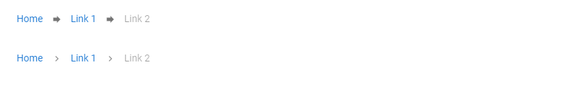
We can use the divider slot of v-breadcrumbs to display custom HTML between each item of the breadcrumbs. For example, we can display any of the icons from Material Design Icons with the Vuetify icon component (v-icon):
Breadcrumbs serve as a navigation aid that helps users to maintain awareness of their location within a website. We can the Vuetify breadcrumbs component (v-breadcrumbs) to create breadcrumbs.
In web development, lazy loading is a practice of deferring the loading or initialization of the resources of a web page until they’re actually needed. It is a useful technique for reducing page load times, saving system resources, and improving performance. In this article, we’re going to learn how to implement lazy loading and speed up our web pages with the Vuetify lazy component.
The Vuetify Lazy Component (v-lazy)
Vuetify provides the v-lazy component for dynamically loading a UI element based on its visibility. In this example, we’ll be lazy loading a card:
<template>
  <v-app>
    <v-responsive class="overflow-y-auto" max-height="400">
      <div class="pa-6 text-center">Scroll down</div>

      <v-responsive height="200vh" class="text-center pa-2">
        <v-responsive min-height="50vh"></v-responsive>
        <div class="text-center text-body-2 mb-12">
          The card will appear below:
        </div>

        <v-lazy min-height="200" :options="{ threshold: 0.5 }">
          <v-card class="mx-auto" max-width="336" color="indigo" dark>
            <v-card-title>Card Title</v-card-title>

            <v-card-text>
              Lorem ipsum dolor sit amet, consectetur adipisicing elit. Ducimus
              totam aperiam, necessitatibus facilis vitae, ratione officiis
              animi earum veritatis repellat enim, dolore sed atque vero?
              Aliquid, pariatur. Cumque, ad voluptate! Lorem ipsum dolor sit
              amet consectetur adipisicing elit. Error vitae, illo tempore
              quisquam velit distinctio ullam illum sint atque impedit suscipit?
              Modi magni quae accusantium iusto ut explicabo sit facere?
            </v-card-text>
          </v-card>
        </v-lazy>
      </v-responsive>
    </v-responsive>
  </v-app>
</template>
<script>
export default {
  name: 'App',
};
</script>
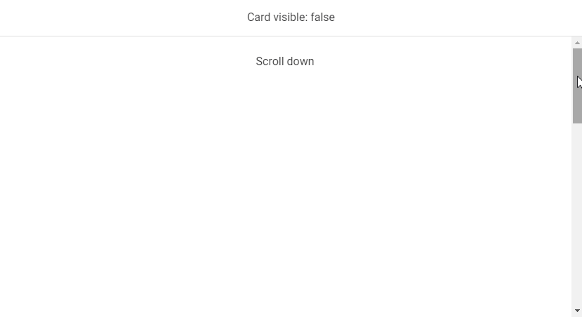
v-model
We can use v-model to set up a binding between the render visibility of the root element of v-lazy and a variable. In this code example below, the variable (cardVisible) will be set to true when the card comes into view.
<template>
  <v-app>
    <v-banner class="text-center">Card visible: {{ cardVisible }} </v-banner>
    <v-responsive class="overflow-y-auto" max-height="400">
      <div class="pa-6 text-center">Scroll down</div>

      <v-responsive height="200vh" class="text-center pa-2">
        <v-responsive min-height="50vh"></v-responsive>
        <div class="text-center text-body-2 mb-12">
          The card will appear below:
        </div>

        <v-lazy
          min-height="200"
          v-model="cardVisible"
          :options="{ threshold: 0.5 }"
        >
          <v-card class="mx-auto" max-width="336" color="green" dark>
            <v-card-title>Card Title</v-card-title>

            <v-card-text>
              Lorem ipsum dolor sit amet, consectetur adipisicing elit. Ducimus
              totam aperiam, necessitatibus facilis vitae, ratione officiis
              animi earum veritatis repellat enim, dolore sed atque vero?
              Aliquid, pariatur. Cumque, ad voluptate! Lorem ipsum dolor sit
              amet consectetur adipisicing elit. Error vitae, illo tempore
              quisquam velit distinctio ullam illum sint atque impedit suscipit?
              Modi magni quae accusantium iusto ut explicabo sit facere?
            </v-card-text>
          </v-card>
        </v-lazy>
      </v-responsive>
    </v-responsive>
  </v-app>
</template>
<script>
export default {
  name: 'App',
  data: () => ({
    cardVisible: false,
  }),
};
</script>
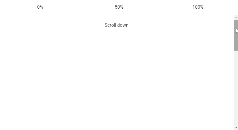
Vuetify Lazy Threshold
The Vuetify lazy component comes with the options prop for customizing its behaviours. These options are passed to the constructor of the Intersection Observer class that v-lazy uses internally. One of such options is threshold. We can set threshold to a number to indicate how much of the root element of v-lazy should come into the viewport before it is displayed. The default threshold is 0, which means that the element will be rendered as soon as even a single pixel enters the viewport.
<template>
  <v-app>
    <v-banner class="text-center">
      <v-row>
        <v-col> 0% </v-col>
        <v-col> 50% </v-col>
        <v-col> 100% </v-col>
      </v-row>
    </v-banner>
    <v-responsive class="overflow-y-auto" max-height="400">
      <div class="pa-6 text-center">Scroll down</div>
      <v-responsive height="200vh" class="text-center pa-2">
        <v-responsive min-height="50vh"></v-responsive>
        <div class="text-center text-body-2 mb-12">
          The cards will appear below:
        </div>
        <v-row>
          <v-col>

            <v-lazy min-height="200" :options="{ threshold: 0 }">
              <v-card class="mx-auto" color="red" dark>
                <v-card-title>Card Title</v-card-title>

                <v-card-text>
                  Lorem ipsum dolor sit amet, consectetur adipisicing elit.
                  Ducimus totam aperiam, necessitatibus facilis vitae, ratione
                  officiis animi earum veritatis repellat enim, dolore sed atque
                  vero? Aliquid, pariatur. Cumque, ad voluptate!
                </v-card-text>
              </v-card>
            </v-lazy>

          </v-col>
          <v-col>

            <v-lazy min-height="200" :options="{ threshold: 0.5 }">
              <v-card class="mx-auto" color="yellow darken-3" dark>
                <v-card-title>Card Title</v-card-title>

                <v-card-text>
                  Lorem ipsum dolor sit amet, consectetur adipisicing elit.
                  Ducimus totam aperiam, necessitatibus facilis vitae, ratione
                  officiis animi earum veritatis repellat enim, dolore sed atque
                  vero? Aliquid, pariatur. Cumque, ad voluptate!
                </v-card-text>
              </v-card>
            </v-lazy>

          </v-col>
          <v-col>

            <v-lazy min-height="200" :options="{ threshold: 1 }">
              <v-card class="mx-auto" color="blue" dark>
                <v-card-title>Card Title</v-card-title>

                <v-card-text>
                  Lorem ipsum dolor sit amet, consectetur adipisicing elit.
                  Ducimus totam aperiam, necessitatibus facilis vitae, ratione
                  officiis animi earum veritatis repellat enim, dolore sed atque
                  vero? Aliquid, pariatur. Cumque, ad voluptate!
                </v-card-text>
              </v-card>
            </v-lazy>

          </v-col>
        </v-row>
      </v-responsive>
    </v-responsive>
  </v-app>
</template>
<script>
export default {
  name: 'App',
};
</script>
Custom Transition
v-lazy also comes with the transition prop that we can use to customize the transition the root element uses to come into view (the default is a fade-transition). For example, we can set a scale-transition to make it grow into view:
<template>
  <v-app>
    <v-responsive class="overflow-y-auto" max-height="400">
      <div class="pa-6 text-center">Scroll down</div>
      <v-responsive height="200vh" class="text-center pa-2">
        <v-responsive min-height="50vh"></v-responsive>
        <div class="text-center text-body-2 mb-12">
          The card will appear below:
        </div>
        <v-lazy
          min-height="200"
          :options="{ threshold: 1 }"
          transition="scale-transition"
        >
          <v-card class="mx-auto" color="purple accent-4" dark max-width="300">
            <v-card-title>Card Title</v-card-title>

            <v-card-text>
              Lorem ipsum dolor sit amet, consectetur adipisicing elit. Ducimus
              totam aperiam, necessitatibus facilis vitae, ratione officiis
              animi earum veritatis repellat enim, dolore sed atque vero?
              Aliquid, pariatur. Cumque, ad voluptate!
            </v-card-text>
          </v-card>
        </v-lazy>
      </v-responsive>
    </v-responsive>
  </v-app>
</template>
<script>
export default {
  name: 'App',
};
</script>
Conclusion
Lazy loading is a useful technique for reducing page loading times and optimizing performance. We can use the Vuetify lazy component (v-lazy) to implement lazy loading.
Tooltips are useful for passing on information when a user hovers over an element in an interface. When a tooltip is activated, it displays a text label that identifies its associated element, for example, describing its function. Read on to find out more about the Vuetify tooltip component and the different customization options provided.
The v-tooltip Component
Vuetify provides the v-tooltip component for creating a tooltip. v-tooltip can wrap any element.
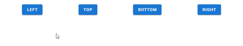
We can use one of the position props (top, bottom, left, or right) of the v-tooltip component to set the tooltip alignment. Note that it is required to set one of these props.
<template>
  <v-app>
    <div class="d-flex ma-4 justify-space-around">
      <v-tooltip left>
        <template v-slot:activator="{ on, attrs }">
          <v-btn color="primary" dark v-bind="attrs" v-on="on"> Left </v-btn>
        </template>
        <span>Left tooltip</span>
      </v-tooltip>

      <v-tooltip top>
        <template v-slot:activator="{ on, attrs }">
          <v-btn color="primary" dark v-bind="attrs" v-on="on"> Top </v-btn>
        </template>
        <span>Top tooltip</span>
      </v-tooltip>

      <v-tooltip bottom>
        <template v-slot:activator="{ on, attrs }">
          <v-btn color="primary" dark v-bind="attrs" v-on="on"> Bottom </v-btn>
        </template>
        <span>Bottom tooltip</span>
      </v-tooltip>

      <v-tooltip right>
        <template v-slot:activator="{ on, attrs }">
          <v-btn color="primary" dark v-bind="attrs" v-on="on"> Right </v-btn>
        </template>
        <span>Right tooltip</span>
      </v-tooltip>
    </div>
  </v-app>
</template>

<script>
export default {
  name: 'App',
};
</script>
Vuetify Tooltip Colors
Like many other components in Vuetify, the v-tooltip component comes with the color prop for customizing the color of the tooltip.
Using v-model on a v-tooltip allows us to set up a two-way binding between the visibility of the tooltip and a variable. For example, in the code below, we’ve created a button and a tooltip below it. Clicking the button will negate the show variable and toggle the visibility of the tooltip.
A tooltip is useful for conveying information when the user hovers over an element. Use the Vuetify tooltip component (v-tooltip) and its various props to create and customize tooltips.
Images are an indispensable part of every user interface. They improve the user experience and increase engagement. An image can be used along with text to explain a concept or convey information quickly, as people tend to process visual information faster. In this article, we’re going to learn how to display an image in Vuetify with the v-img component.
The Vuetify Image Component
Vuetify provides the v-img component for presenting an image. This component comes with various props to customize the appearance of the image.
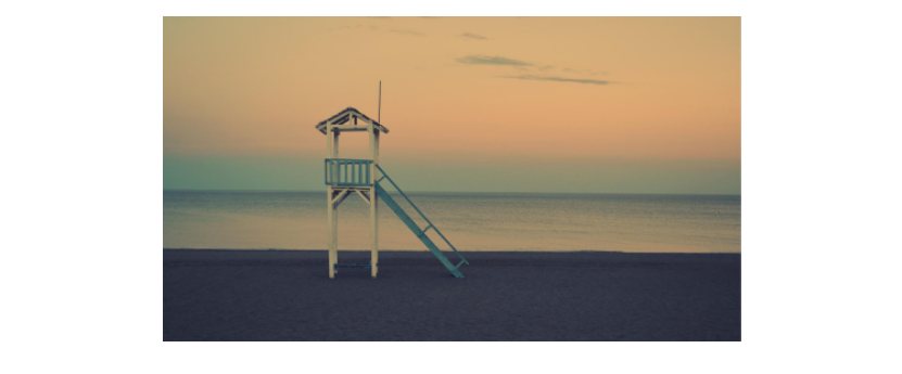
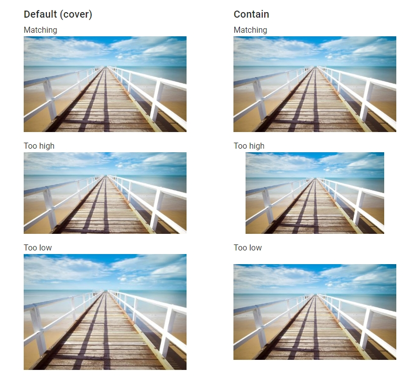
Use the aspect-ratio prop of the v-img component to set a fixed aspect ratio. The ratio between the height and width stays the same when the image is resized.
When the provided aspect ratio doesn’t match that of the actual image, the v-img component will fill as much space and clip the sides of the image. Setting the contain prop to true will stop this from happening, but will result in empty space at the sides.
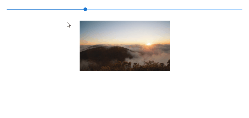
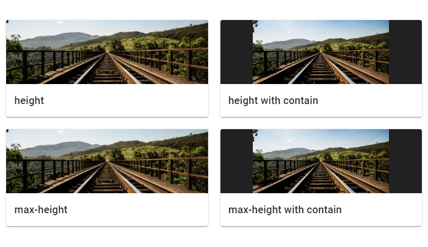
The Vuetify image component automatically grows to the size of its src and preserves the correct aspect ratio. We can use the height and max-height props to limit this:
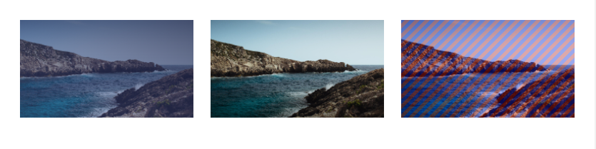
We can use the v-img placeholder slot to display custom content while the image is loading. The image in the example below has a bad src and it won’t load so we can see the placeholder.
Images are an important part of every interface that can help to increase engagement, decorate the UI and enable users to process information faster. We can use the Vuetify image component (v-img) to show images and customize the way they are displayed.