
Designing a great user interface from scratch can take a lot of effort. Apart from the skill required for constructing a delightful user experience, you’ll have to worry about things like creating your own design system —with its own icons, colour combinations, typography, etc. while ensuring that the system is fairly consistent with what your users are used to so they don’t get disoriented with the style. Of course, you’ll also have to remember to make sure your apps are mobile responsive so they remain functional and aesthetically pleasing on devices of all sizes.
Luckily there are tons of CSS UI libraries that help simplify this process and work with different JavaScript frameworks. For Vue.js in particular, Vuetify is one of the most popular frameworks out there that you can use to quickly build good-looking and responsive applications.
Introducing Vuetify
Vuetify is an open-source UI component library that allows you to create web apps with stunning visuals without much effort. You can easily add common UI features such as carousels, toolbars, navigation drawers, dialogs, cards, and tables, that already look great to your app. such It has over 33,000 stars on GitHub and is frequently updated by developers. It is based on the well-known Material Design system developed by Google and used by the company in practically all its apps and websites. As stated on its official website:
Material is an adaptable system of guidelines, components, and tools that support the best practices of user interface design. Backed by open-source code, Material streamlines collaboration between designers and developers, and helps teams quickly build beautiful products.
That says it all. Using Material Design for your websites and apps would be a smart move indeed. It has been the design language of every major non-customized version of Android since Android Lollipop (5.1), which was released as far back as 2014. Because of its popularity, adopting the Material Design guidelines will give your apps a consistent design that a huge number of people out there are already familiar with.
Creating the app
In this tutorial, we’re going to be getting started with Vuetify by creating a simple Vue.js project which makes use of some features the framework provides. Here’s what our homepage is going to look like when we’re done:
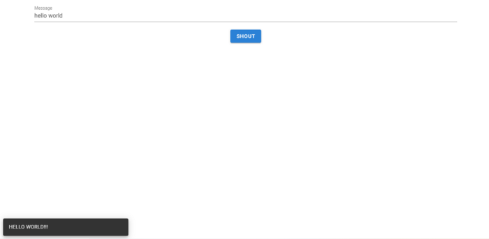
When the user enters a message and clicks the Shout button, a notification will appear with a shouty form of the message.
Creating a new project
To get started, use the Vue CLI to create a new Vue project in a shell window. Let’s call it vuetify-app:
vue create vuetify-appLet’s move to our project directory in the shell using this command:
cd vuetify-appLet’s add Vuetify to our project using the Vue CLI. While there are other ways to include Vuetify in a Vue.js app, this is one of the easiest and most straightforward:
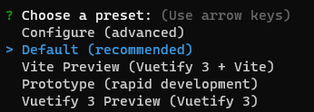
vue add vuetifyWhen asked to choose a preset, choose Default. This preset is okay and recommended for most projects, including the one we’ll be building.
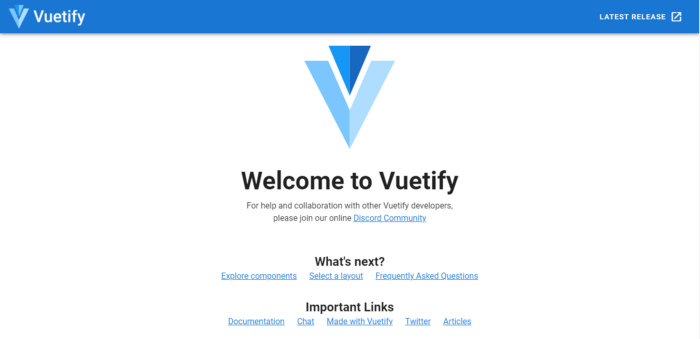
After installing Vuetify, run the project using npm start or yarn start and navigate to localhost:8080 in a new tab in your browser. You’ll see that the standard Vue.js boilerplate has been altered to the one of Vuetify:
Let’s open up src/App.vue in our project directory and clear out this boilerplate until we’re left with this:
src/App.vue

<template>
  <v-app>
    <v-main>
    </v-main>
  </v-app>
</template>

<script>
export default {
  name: 'App',
  data: () => ({
    //
  }),
};
</script>
The v-app component is now the root of our application. It replaced the default Vue entry point (which was <div id=”app”> in the Vue.js boilerplate). The v-main component is supposed to serve as the root of the main content of our app — just like the main HTML element.
One thing you notice right away is the v- prefix in the component names. All the components that come from Vuetify have this prefix. This is the naming convention used to indicate that the components are part of its library, similar to how custom directives are named in Vue.
Let’s add a text field to the app, using the v-text-field component. We’ll use the label property to set a placeholder value. We also create a message property for a two-way input binding with the text field, so whenever a user edits the text in the text field, message will be updated accordingly. This variable will come in handy for eventually displaying the notification.
src/App.vue

<template>
  <v-app>
    <v-main>
      <v-container>
        <v-text-field label="Message" v-model="message"></v-text-field>
      </v-container>
    </v-main>
  </v-app>
</template>

<script>
export default {
  name: 'App',
  data: () => ({
    message: '',
  }),
};
</script>
Notice we wrapped v-text-field in a v-container component. v-container adds some padding between its children components and other components outside it.
Adding the Button and the Snackbar
Next, let’s add a button using the v-btn component. We’ll center this element by wrapping it in a div and assigning a text-center class to the div. This class is made available by Vuetify for centering text, as the name implies. We’ll supply a method named shout() to handle clicks on the button.
We’ll also add a snackbar for the notifications using the v-snackbar component. In the shout() click handler, we’ll set a new showSnackbar property to true. v-snackbar is bound to this property. Setting it to true will make the snackbar pop up. After a few seconds, v-snackbar will set this variable back to false so the snackbar can be hidden again.
src/App.vue
<template>
  <v-app>
    <v-main>
      <v-container>
        <v-text-field label="Message" v-model="message"></v-text-field>
        <div class="text-center">
          <v-btn color="primary" @click="shout">Shout</v-btn>
        </div>
      </v-container>
    </v-main>
    <v-snackbar v-model="showSnackbar"></v-snackbar>
  </v-app>
</template>
<script>
export default {
  name: 'App',
  data: () => ({
    message: '',
    showSnackbar: false,
  }),
  methods: {
    shout() {
      this.showSnackbar = true;
    },
  },
};
</script>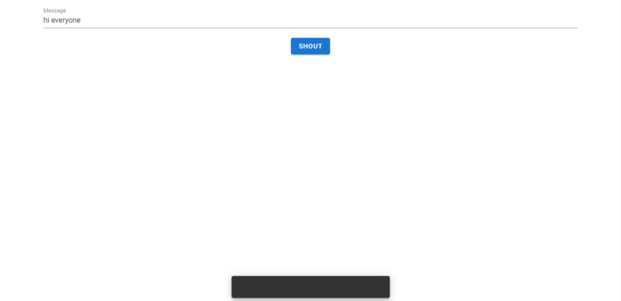
Displaying the Shouty Message
Right now, clicking the button just displays an empty notification. To make the snackbar show the shouty version of the message the user entered, we’ll create a new variable, loudMessage . In the shout() click handler, we’ll set this variable to the capitalized form of the value of message using the JavaScript toUpperCase() string method, and concatenate it with three exclamation marks. We’ll make this message a text child of the v-snackbar element.
src/App.vue
<template>
  <v-app>
    <v-main>
      <v-container>
        <v-text-field label="Message" v-model="message"></v-text-field>
        <div class="text-center">
          <v-btn color="primary" @click="shout">Shout</v-btn>
        </div>
      </v-container>
    </v-main>
    <v-snackbar v-model="showSnackbar">{{loudMessage}}</v-snackbar>
  </v-app>
</template>
<script>
export default {
  name: 'App',
  data: () => ({
    message: '',
    showSnackbar: false,
    loudMessage: '',
  }),
  methods: {
    shout() {
      this.loudMessage = `${this.message.toUpperCase()}!!!`;
      this.showSnackbar = true;
    },
  },
};
</script>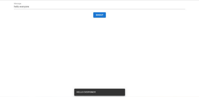
Changing the Snackbar Transition and Position
Let’s customize the snackbar. Currently, it fades in at the bottom centre of the screen. Let’s make it slide in from the bottom left by modifying some properties of the element. There are many other values we could set the transition property to, but for our purposes, we need to set it to slide-y-reverse-transition . To move the snackbar to left we’ll set the left property to true. Notice we use a colon (: ) before left so that true gets evaluated as the boolean value true, instead of the string “true”.
src/App.vue
<template>
  <v-app>
    <v-main>
      <v-container>
        <v-text-field label="Message" v-model="message"></v-text-field>
        <div class="text-center">
          <v-btn color="primary" @click="shout">Shout</v-btn>
        </div>
      </v-container>
    </v-main>
    <v-snackbar
      v-model="showSnackbar"
      transition="slide-y-reverse-transition"
      :left="true"
      >{{ loudMessage }}</v-snackbar
    >
  </v-app>
</template>
...
And our Vuetify app is complete!
Even with this small app, I hope you’ve been able to see for yourself how much work UI libraries like Vuetify can save you. Without using any CSS or custom styles we’ve been able to design a nice-looking and fully functional web app in a short time.
Every Crazy Thing JavaScript Does
A captivating guide to the subtle caveats and lesser-known parts of JavaScript.
