
In web development, lazy loading is a practice of deferring the loading or initialization of the resources of a web page until they’re actually needed. It is a useful technique for reducing page load times, saving system resources, and improving performance. In this article, we’re going to learn how to implement lazy loading and speed up our web pages with the Vuetify lazy component.
The Vuetify Lazy Component (v-lazy)
Vuetify provides the v-lazy component for dynamically loading a UI element based on its visibility. In this example, we’ll be lazy loading a card:
<template>
  <v-app>
    <v-responsive class="overflow-y-auto" max-height="400">
      <div class="pa-6 text-center">Scroll down</div>

      <v-responsive height="200vh" class="text-center pa-2">
        <v-responsive min-height="50vh"></v-responsive>
        <div class="text-center text-body-2 mb-12">
          The card will appear below:
        </div>

        <v-lazy min-height="200" :options="{ threshold: 0.5 }">
          <v-card class="mx-auto" max-width="336" color="indigo" dark>
            <v-card-title>Card Title</v-card-title>

            <v-card-text>
              Lorem ipsum dolor sit amet, consectetur adipisicing elit. Ducimus
              totam aperiam, necessitatibus facilis vitae, ratione officiis
              animi earum veritatis repellat enim, dolore sed atque vero?
              Aliquid, pariatur. Cumque, ad voluptate! Lorem ipsum dolor sit
              amet consectetur adipisicing elit. Error vitae, illo tempore
              quisquam velit distinctio ullam illum sint atque impedit suscipit?
              Modi magni quae accusantium iusto ut explicabo sit facere?
            </v-card-text>
          </v-card>
        </v-lazy>
      </v-responsive>
    </v-responsive>
  </v-app>
</template>
<script>
export default {
  name: 'App',
};
</script>

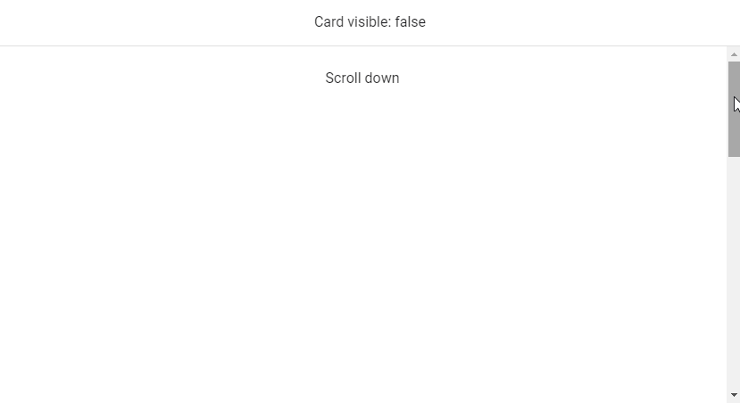
v-model
We can use v-model to set up a binding between the render visibility of the root element of v-lazy and a variable. In this code example below, the variable (cardVisible) will be set to true when the card comes into view.
<template>
  <v-app>
    <v-banner class="text-center">Card visible: {{ cardVisible }} </v-banner>
    <v-responsive class="overflow-y-auto" max-height="400">
      <div class="pa-6 text-center">Scroll down</div>

      <v-responsive height="200vh" class="text-center pa-2">
        <v-responsive min-height="50vh"></v-responsive>
        <div class="text-center text-body-2 mb-12">
          The card will appear below:
        </div>

        <v-lazy
          min-height="200"
          v-model="cardVisible"
          :options="{ threshold: 0.5 }"
        >
          <v-card class="mx-auto" max-width="336" color="green" dark>
            <v-card-title>Card Title</v-card-title>

            <v-card-text>
              Lorem ipsum dolor sit amet, consectetur adipisicing elit. Ducimus
              totam aperiam, necessitatibus facilis vitae, ratione officiis
              animi earum veritatis repellat enim, dolore sed atque vero?
              Aliquid, pariatur. Cumque, ad voluptate! Lorem ipsum dolor sit
              amet consectetur adipisicing elit. Error vitae, illo tempore
              quisquam velit distinctio ullam illum sint atque impedit suscipit?
              Modi magni quae accusantium iusto ut explicabo sit facere?
            </v-card-text>
          </v-card>
        </v-lazy>
      </v-responsive>
    </v-responsive>
  </v-app>
</template>
<script>
export default {
  name: 'App',
  data: () => ({
    cardVisible: false,
  }),
};
</script>
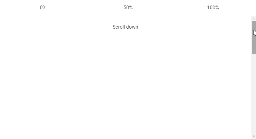
Vuetify Lazy Threshold
The Vuetify lazy component comes with the options prop for customizing its behaviours. These options are passed to the constructor of the Intersection Observer class that v-lazy uses internally. One of such options is threshold. We can set threshold to a number to indicate how much of the root element of v-lazy should come into the viewport before it is displayed. The default threshold is 0, which means that the element will be rendered as soon as even a single pixel enters the viewport.
<template>
  <v-app>
    <v-banner class="text-center">
      <v-row>
        <v-col> 0% </v-col>
        <v-col> 50% </v-col>
        <v-col> 100% </v-col>
      </v-row>
    </v-banner>
    <v-responsive class="overflow-y-auto" max-height="400">
      <div class="pa-6 text-center">Scroll down</div>
      <v-responsive height="200vh" class="text-center pa-2">
        <v-responsive min-height="50vh"></v-responsive>
        <div class="text-center text-body-2 mb-12">
          The cards will appear below:
        </div>
        <v-row>
          <v-col>

            <v-lazy min-height="200" :options="{ threshold: 0 }">
              <v-card class="mx-auto" color="red" dark>
                <v-card-title>Card Title</v-card-title>

                <v-card-text>
                  Lorem ipsum dolor sit amet, consectetur adipisicing elit.
                  Ducimus totam aperiam, necessitatibus facilis vitae, ratione
                  officiis animi earum veritatis repellat enim, dolore sed atque
                  vero? Aliquid, pariatur. Cumque, ad voluptate!
                </v-card-text>
              </v-card>
            </v-lazy>

          </v-col>
          <v-col>

            <v-lazy min-height="200" :options="{ threshold: 0.5 }">
              <v-card class="mx-auto" color="yellow darken-3" dark>
                <v-card-title>Card Title</v-card-title>

                <v-card-text>
                  Lorem ipsum dolor sit amet, consectetur adipisicing elit.
                  Ducimus totam aperiam, necessitatibus facilis vitae, ratione
                  officiis animi earum veritatis repellat enim, dolore sed atque
                  vero? Aliquid, pariatur. Cumque, ad voluptate!
                </v-card-text>
              </v-card>
            </v-lazy>

          </v-col>
          <v-col>

            <v-lazy min-height="200" :options="{ threshold: 1 }">
              <v-card class="mx-auto" color="blue" dark>
                <v-card-title>Card Title</v-card-title>

                <v-card-text>
                  Lorem ipsum dolor sit amet, consectetur adipisicing elit.
                  Ducimus totam aperiam, necessitatibus facilis vitae, ratione
                  officiis animi earum veritatis repellat enim, dolore sed atque
                  vero? Aliquid, pariatur. Cumque, ad voluptate!
                </v-card-text>
              </v-card>
            </v-lazy>

          </v-col>
        </v-row>
      </v-responsive>
    </v-responsive>
  </v-app>
</template>
<script>
export default {
  name: 'App',
};
</script>
Custom Transition
v-lazy also comes with the transition prop that we can use to customize the transition the root element uses to come into view (the default is a fade-transition). For example, we can set a scale-transition to make it grow into view:
<template>
  <v-app>
    <v-responsive class="overflow-y-auto" max-height="400">
      <div class="pa-6 text-center">Scroll down</div>
      <v-responsive height="200vh" class="text-center pa-2">
        <v-responsive min-height="50vh"></v-responsive>
        <div class="text-center text-body-2 mb-12">
          The card will appear below:
        </div>
        <v-lazy
          min-height="200"
          :options="{ threshold: 1 }"
          transition="scale-transition"
        >
          <v-card class="mx-auto" color="purple accent-4" dark max-width="300">
            <v-card-title>Card Title</v-card-title>

            <v-card-text>
              Lorem ipsum dolor sit amet, consectetur adipisicing elit. Ducimus
              totam aperiam, necessitatibus facilis vitae, ratione officiis
              animi earum veritatis repellat enim, dolore sed atque vero?
              Aliquid, pariatur. Cumque, ad voluptate!
            </v-card-text>
          </v-card>
        </v-lazy>
      </v-responsive>
    </v-responsive>
  </v-app>
</template>
<script>
export default {
  name: 'App',
};
</script>
Conclusion
Lazy loading is a useful technique for reducing page loading times and optimizing performance. We can use the Vuetify lazy component (v-lazy) to implement lazy loading.
Every Crazy Thing JavaScript Does
A captivating guide to the subtle caveats and lesser-known parts of JavaScript.
