vuetify

How to Use the Vuetify Parallax Component

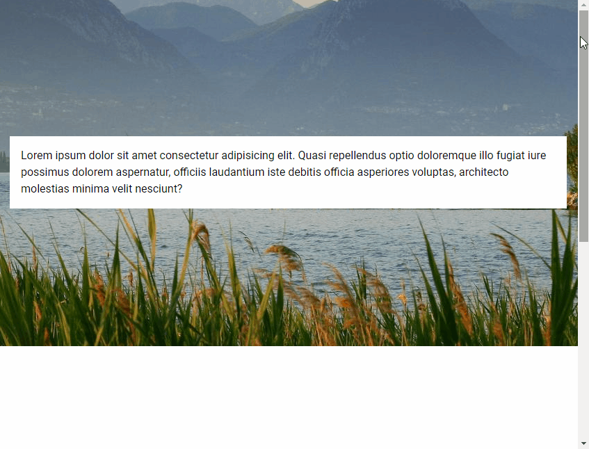
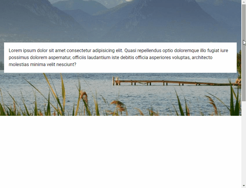
Parallax scrolling is a visual effect used on web pages where the background content moves at a slower rate than the foreground content. In this article, we’re going to learn how to use the parallax component from Vuetify to create the parallax scrolling effect with background images.

The Vuetify Parallax Component (v-parallax)

We use v-parallax to create a parallax component. It has a src prop for specifying the URL of the image to use for the background.

<template>
  <v-app>
    <div style="height: 1200px">
      <v-parallax
        src="https://picsum.photos/1920/1080?random"
      >
      </v-parallax>
    </div>
  </v-app>
</template>
Using the Vuetify parallax component.

Parallax Content

We can include content in a parallax by making it a child of the v-parallax. This is useful for creating a hero image. For example:

<template>
  <v-app>
    <div style="height: 1200px">
      <v-parallax
        src="https://picsum.photos/1920/1080?random"
      >
        <div class="white black--text pa-4">
          Lorem ipsum dolor sit amet consectetur adipisicing
          elit. Quasi repellendus optio doloremque illo
          fugiat iure possimus dolorem aspernatur, officiis
          laudantium iste debitis officia asperiores
          voluptas, architecto molestias minima velit
          nesciunt?
        </div>
      </v-parallax>
    </div>
  </v-app>
</template>
Including content in the parallax component.

Parallax Height

We can customize the height of the parallax component with the height prop. For example:

<template>
  <v-app>
    <div style="height: 1200px">
      <v-parallax
        src="https://picsum.photos/1920/1080?random"
        height="400"
      >
        <div class="white black--text pa-4">
          Lorem ipsum dolor sit amet consectetur adipisicing
          elit. Quasi repellendus optio doloremque illo
          fugiat iure possimus dolorem aspernatur, officiis
          laudantium iste debitis officia asperiores
          voluptas, architecto molestias minima velit
          nesciunt?
        </div>
      </v-parallax>
    </div>
  </v-app>
</template>
Customizing the height of the Vuetify parallax component.

Vuetify Transition: How to Easily Create Transitions

Vuetify provides a wide range of built-in transitions we can apply to various elements to produce smooth animations that improve the user experience. We can use a transition by setting the transition prop on supported components, or wrapping the component in a transition component like v-expand-transition.

Vuetify Expand Transition

To apply the expand transition to an element, we wrap it in a v-expand-transition component. This transition is used in expansion panels and list groups.

<template>
  <v-app>
    <div class="text-center ma-4">
      <v-btn
        dark
        color="primary"
        @click="expand = !expand"
      >
        Expand Transition
      </v-btn>
      <v-expand-transition>
        <v-card
          v-show="expand"
          height="100"
          width="100"
          class="blue mx-auto mt-4"
        ></v-card>
      </v-expand-transition>
    </div>
  </v-app>
</template>

<script>
export default {
  data() {
    return {
      expand: false,
    };
  },
};
</script>
Creating an expand transition with Vuetify.

Expand X Transition

We can use v-expand-x-transition in place of v-expand-transition to apply the horizontal version of the expand transition.

<template>
  <v-app>
    <div class="text-center ma-4">
      <v-btn
        dark
        color="primary"
        @click="expand = !expand"
      >
        Expand X Transition
      </v-btn>
      <v-expand-x-transition>
        <v-card
          v-show="expand"
          height="100"
          width="100"
          class="blue mx-auto mt-4"
        ></v-card>
      </v-expand-x-transition>
    </div>
  </v-app>
</template>

<script>
export default {
  data() {
    return {
      expand: false,
    };
  },
};
</script>
Creating expand x transitions.

Vuetify FAB Transition

We can see an FAB transition in action when working with the v-speed-dial component. The target element rotates and scales up into view.

<template>
  <v-app>
    <div class="text-center ma-4">
      <v-menu transition="fab-transition">
        <template v-slot:activator="{ on, attrs }">
          <v-btn
            dark
            color="primary"
            v-bind="attrs"
            v-on="on"
          >
            Fab Transition
          </v-btn>
        </template>
        <v-list>
          <v-list-item
            v-for="n in 5"
            :key="n"
          >
            <v-list-item-title
              v-text="'Item ' + n"
            ></v-list-item-title>
          </v-list-item>
        </v-list>
      </v-menu>
    </div>
  </v-app>
</template>
Creating an FAB transition with Vuetify.

Fade Transition

A fade transition acts on the opacity of the target element. We can create one by setting transition to fade-transition.

<template>
  <v-app>
    <div class="text-center ma-4">
      <v-menu transition="fade-transition">
        <template v-slot:activator="{ on, attrs }">
          <v-btn
            dark
            color="primary"
            v-bind="attrs"
            v-on="on"
          >
            Fade Transition
          </v-btn>
        </template>
        <v-list>
          <v-list-item
            v-for="n in 5"
            :key="n"
          >
            <v-list-item-title
              v-text="'Item ' + n"
            ></v-list-item-title>
          </v-list-item>
        </v-list>
      </v-menu>
    </div>
  </v-app>
</template>
Create a fade transition.

Vuetify Scale Transition

Scale transitions act on the width and height of the target element. We can create them by setting transition to scale-transition.

<template>
  <v-app>
    <div class="text-center ma-4">
      <v-menu transition="scale-transition">
        <template v-slot:activator="{ on, attrs }">
          <v-btn
            dark
            color="primary"
            v-bind="attrs"
            v-on="on"
          >
            Scale Transition
          </v-btn>
        </template>
        <v-list>
          <v-list-item
            v-for="n in 5"
            :key="n"
          >
            <v-list-item-title
              v-text="'Item ' + n"
            ></v-list-item-title>
          </v-list-item>
        </v-list>
      </v-menu>
    </div>
  </v-app>
</template>
Creating scale transitions with Vuetify.

Transition Origin

Components like v-menu have an origin prop that allows us to specify the point from which a transition should start. For example, we can make the scale transition start from the center point of both the x-axis and y-axis:

<template>
  <v-app>
    <div class="text-center ma-4">
      <v-menu
        transition="scale-transition"
        origin="center center"
      >
        <template v-slot:activator="{ on, attrs }">
          <v-btn
            dark
            color="primary"
            v-bind="attrs"
            v-on="on"
          >
            Scale Transition
          </v-btn>
        </template>
        <v-list>
          <v-list-item
            v-for="n in 5"
            :key="n"
            @click="() => {}"
          >
            <v-list-item-title
              v-text="'Item ' + n"
            ></v-list-item-title>
          </v-list-item>
        </v-list>
      </v-menu>
    </div>
  </v-app>
</template>
Specifying the origin of a transition.

Vuetify Scroll X Transition

Scroll X transitions work with both the opacity and horizontal position of the target element. It fades in while also moving along the x-axis.

<template>
  <v-app>
    <div class="text-center ma-4">
      <v-menu transition="scroll-x-transition">
        <template v-slot:activator="{ on, attrs }">
          <v-btn
            dark
            color="primary"
            v-bind="attrs"
            v-on="on"
          >
            Scroll X Transition
          </v-btn>
        </template>
        <v-list>
          <v-list-item
            v-for="n in 5"
            :key="n"
          >
            <v-list-item-title
              v-text="'Item ' + n"
            ></v-list-item-title>
          </v-list-item>
        </v-list>
      </v-menu>
    </div>
  </v-app>
</template>
Creating a scroll x transition with Vuetify.

Scroll X Reverse Transition

A reverse scroll x transition makes the element slide in from the right.

<template>
  <v-app>
    <div class="text-center ma-4">
      <v-menu transition="scroll-x-reverse-transition">
        <template v-slot:activator="{ on, attrs }">
          <v-btn
            dark
            color="primary"
            v-bind="attrs"
            v-on="on"
          >
            Scroll X Reverse Transition
          </v-btn>
        </template>
        <v-list>
          <v-list-item
            v-for="n in 5"
            :key="n"
          >
            <v-list-item-title
              v-text="'Item ' + n"
            ></v-list-item-title>
          </v-list-item>
        </v-list>
      </v-menu>
    </div>
  </v-app>
</template>
Creating a scroll x reverse transition.

Vuetify Scroll Y Transition

Scroll y transitions work similarly to scroll x transitions, but they act on the vertical position of the element instead.

<template>
  <v-app>
    <div class="text-center ma-4">
      <v-menu transition="scroll-y-transition">
        <template v-slot:activator="{ on, attrs }">
          <v-btn
            dark
            color="primary"
            v-bind="attrs"
            v-on="on"
          >
            Scroll Y Transition
          </v-btn>
        </template>
        <v-list>
          <v-list-item
            v-for="n in 5"
            :key="n"
          >
            <v-list-item-title
              v-text="'Item ' + n"
            ></v-list-item-title>
          </v-list-item>
        </v-list>
      </v-menu>
    </div>
  </v-app>
</template>
Creating scroll y transitions with Vuetify.

Scroll Y Reverse Transition

Reverse scroll y transitions make the element slide in from the bottom.

<template>
  <v-app>
    <div class="text-center ma-4">
      <v-menu transition="scroll-y-reverse-transition">
        <template v-slot:activator="{ on, attrs }">
          <v-btn
            dark
            color="primary"
            v-bind="attrs"
            v-on="on"
          >
            Scroll Y Reverse Transition
          </v-btn>
        </template>
        <v-list>
          <v-list-item
            v-for="n in 5"
            :key="n"
          >
            <v-list-item-title
              v-text="'Item ' + n"
            ></v-list-item-title>
          </v-list-item>
        </v-list>
      </v-menu>
    </div>
  </v-app>
</template>
Creating a scroll y reverse transition.

Vuetify Slide X Transition

A slide x transition makes the element fade in while also sliding in along the x-axis. Unlike a scroll transition, the element slides out in the same direction it slid in from when closed.

<template>
  <v-app>
    <div class="text-center ma-4">
      <v-menu transition="slide-x-transition">
        <template v-slot:activator="{ on, attrs }">
          <v-btn
            dark
            color="primary"
            v-bind="attrs"
            v-on="on"
          >
            Slide X Transition
          </v-btn>
        </template>
        <v-list>
          <v-list-item
            v-for="n in 5"
            :key="n"
          >
            <v-list-item-title
              v-text="'Item ' + n"
            ></v-list-item-title>
          </v-list-item>
        </v-list>
      </v-menu>
    </div>
  </v-app>
</template>
Creating a slide x transition in Vuetify.

Slide X Reverse Transition

Reverse slide x transitions make the element slide in from the right.

<template>
  <v-app>
    <div class="text-center ma-4">
      <v-menu transition="slide-x-reverse-transition">
        <template v-slot:activator="{ on, attrs }">
          <v-btn
            dark
            color="primary"
            v-bind="attrs"
            v-on="on"
          >
            Slide X Reverse Transition
          </v-btn>
        </template>
        <v-list>
          <v-list-item
            v-for="n in 5"
            :key="n"
          >
            <v-list-item-title
              v-text="'Item ' + n"
            ></v-list-item-title>
          </v-list-item>
        </v-list>
      </v-menu>
    </div>
  </v-app>
</template>
Creating a slide x reverse transition.

Vuetify Slide Y Transition

Slide y transitions work like slide x transitions, but they move the element along the y-axis instead.

<template>
  <v-app>
    <div class="text-center ma-4">
      <v-menu transition="slide-y-transition">
        <template v-slot:activator="{ on, attrs }">
          <v-btn
            dark
            color="primary"
            v-bind="attrs"
            v-on="on"
          >
            Slide Y Transition
          </v-btn>
        </template>
        <v-list>
          <v-list-item
            v-for="n in 5"
            :key="n"
          >
            <v-list-item-title
              v-text="'Item ' + n"
            ></v-list-item-title>
          </v-list-item>
        </v-list>
      </v-menu>
    </div>
  </v-app>
</template>
Creating slide y transitions in Vuetify.

Slide Y Reverse Transition

A reverse slide y transition makes the element slide in from the bottom.

<template>
  <v-app>
    <div class="text-center ma-4">
      <v-menu transition="slide-y-reverse-transition">
        <template v-slot:activator="{ on, attrs }">
          <v-btn
            dark
            color="primary"
            v-bind="attrs"
            v-on="on"
          >
            Slide Y Reverse Transition
          </v-btn>
        </template>
        <v-list>
          <v-list-item
            v-for="n in 5"
            :key="n"
          >
            <v-list-item-title
              v-text="'Item ' + n"
            ></v-list-item-title>
          </v-list-item>
        </v-list>
      </v-menu>
    </div>
  </v-app>
</template>
Creating a slide y reverse transition.

Conclusion

Vuetify comes with a built-in transition system that allows us to easily create smooth animations without writing our own CSS. We can scale, fade or translate a UI element with the various transitions available.

How to Use Vuetify Border Radius Classes

Vuetify comes with helper classes for easily customizing the border radius of an element without creating our own CSS. We’re going to explore these classes in this article.

Pill Class

We can use the rounded-pill class to create a rectangle with rounded corners.

<template>
  <v-app>
    <v-row
      class="text-center ma-2"
      justify="center"
    >
      <v-col cols="3">
        <div class="pa-4 primary white--text rounded-pill">
          .rounded-pill
        </div>
      </v-col>
    </v-row>
  </v-app>
</template>
Using the rounded-pill class.

Circle Class

The rounded-circle class creates a circle out of an element when applied.

<template>
  <v-app>
    <v-row
      class="text-center ma-2"
      justify="center"
    >
      <v-col cols="3">
        <div
          class="pa-7 primary rounded-circle d-inline-block"
        ></div>
        <div>.rounded-circle</div>
      </v-col>
    </v-row>
  </v-app>
</template>
Using the rounded-circle class.

Removing Border Radius

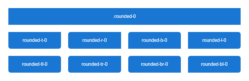
The rounded-0 class removes all border radius from an element. To remove border radius from a specific side, we can use a class of the format rounded-{side}-0, where side can be any of t, r, b, and l. For removing border radius from specific corners, we can use a class of the format rounded-{corner}-0 where corner can be any of tl, tr, br and bl.

<template>
  <v-app>
    <v-row
      justify="center"
      class="flex-grow-0 ma-4"
    >
      <v-col cols="12">
        <div
          class="pa-4 text-center primary white--text rounded-0"
          v-text="`.rounded-0`"
        ></div>
      </v-col>
      <v-col
        v-for="value in [
          't',
          'r',
          'b',
          'l',
          'tl',
          'tr',
          'br',
          'bl',
        ]"
        :key="value"
        sm="3"
      >
        <div
          :class="`pa-4 text-center primary white--text rounded-lg rounded-${value}-0`"
          v-text="`rounded-${value}-0`"
        ></div>
      </v-col>
    </v-row>
  </v-app>
</template>
Remove border radius from elements with Vuetify.

Rounding All Corners

We can use one of the rounded-sm, rounded, rounded-lg, or rounded-xl classes to apply border radius of varying sizes to all corners of an element.

<template>
  <v-app>
    <v-row class="ma-4 white--text">
      <v-col
        v-for="value in ['-sm', '', '-lg', '-xl']"
        :key="value"
        cols="3"
      >
        <div
          :class="`rounded${value}`"
          class="pa-4 text-center primary"
        >
          .rounded{{ value }}
        </div>
      </v-col>
    </v-row>
  </v-app>
</template>
Rounding all corners of an element.

Setting Border Radius By Side

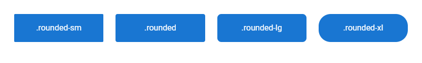
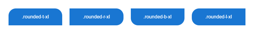
To apply border radius to a specific side, we can use a helper class of the format rounded-{side} or rounded-{side}-{size}, where side can be one of t, r, b, and l, and size can be one of sm, lg, and xl.

<template>
  <v-app>
    <v-row class="ma-4 white--text">
      <v-col
        v-for="value in ['t', 'r', 'b', 'l']"
        :key="value"
        cols="3"
      >
        <div
          :class="`rounded-${value}-xl`"
          class="pa-4 text-center primary"
        >
          .rounded-{{ value }}-xl
        </div>
      </v-col>
    </v-row>
  </v-app>
</template>
Rounding by side with Vuetify border radius helpers.

Border Radius by Corner

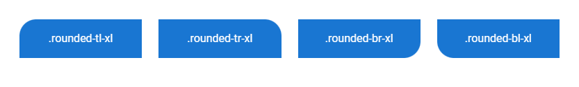
To set the border radius of a specific corner, we can use a helper class of the format rounded-{corner} or rounded-{corner}-{size}, where corner can be any of tl, tr, br and bl, and size can be any of sm, lg, and xl.

<template>
  <v-app>
    <v-row class="ma-4 white--text">
      <v-col
        v-for="value in ['tl', 'tr', 'br', 'bl']"
        :key="value"
        cols="3"
      >
        <div
          :class="`rounded-${value}-xl`"
          class="pa-4 text-center primary"
        >
          .rounded-{{ value }}-xl
        </div>
      </v-col>
    </v-row>
  </v-app>
</template>
Rounding by corner with Vuetify border radius helpers.

With these helper classes from Vuetify, we can quickly set border radius of various sizes to specific sizes and corners of elements.

How to Use the Vuetify Footer Component

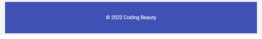
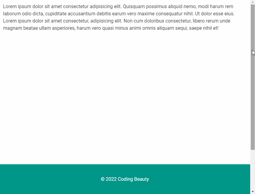
A footer is an area located at the bottom of a web page, after the main content. We can use it to display copyrights, creation dates, and top-level navigation links. In this article, we’re going to learn how to use the Vuetify footer component to easily create footers for our web pages.

Vuetify provides the v-footer component for creating a footer. It functions as a container in its simplest form.

<template>
  <v-app>
    <v-footer>
      <v-card
        tile
        flat
        width="100%"
        color="indigo"
        dark
        height="100px"
        class="d-flex align-center justify-center"
      >
        &copy; 2022 Coding Beauty
      </v-card>
    </v-footer>
  </v-app>
</template>
Creating a footer with the Vuetify footer component.

As you can see in the results of the previous example, the footer applies some padding to its content by default. We can use the padless prop to remove it:

<template>
  <v-app>
    <v-footer padless>
      <v-card
        tile
        flat
        width="100%"
        color="red accent-2"
        dark
        height="100px"
        class="d-flex align-center justify-center"
      >
        &copy; 2022 Coding Beauty
      </v-card>
    </v-footer>
  </v-app>
</template>
Creating a padless footer.

Setting the fixed prop to true will make the footer remain in the same position even if the user scrolls the page:

<template>
  <v-app>
    <v-container>
      <v-responsive height="800px">
        Lorem ipsum dolor sit amet consectetur adipisicing
        elit. Quisquam possimus aliquid nemo, modi harum rem
        laborum odio dicta, cupiditate accusantium debitis
        earum vero maxime consequatur nihil. Ut dolor esse
        eius. Lorem ipsum dolor sit amet consectetur,
        adipisicing elit. Non cum doloribus consectetur,
        libero rerum unde magnam beatae ullam asperiores,
        harum vero quasi minus animi omnis aliquam sequi,
        saepe nihil et!
      </v-responsive>
    </v-container>
    <v-footer
      fixed
      padless
    >
      <v-card
        tile
        flat
        width="100%"
        color="teal"
        dark
        height="100px"
        class="d-flex align-center justify-center"
      >
        &copy; 2022 Coding Beauty
      </v-card>
    </v-footer>
  </v-app>
</template>
Using the fixed prop of the Vuetify footer component.

We can place links in a footer so that the user can navigate to those locations from any web page.

<template>
  <v-app>
    <v-footer
      color="primary"
      dark
    >
      <v-row
        justify="center"
        class="my-4 text-center"
      >
        <v-col cols="12">
          <v-btn
            href="#"
            v-for="link in links"
            :key="link"
            text
            dark
            >{{ link }}
          </v-btn>
        </v-col>
        <v-col cols="12">&copy; 2022 Coding Beauty</v-col>
      </v-row>
    </v-footer>
  </v-app>
</template>

<script>
export default {
  data: () => {
    return { links: ['Home', 'Blog', 'About'] };
  },
};
</script>
A footer with links.

Here’s a footer with social media links and some text before the copyright:

<template>
  <v-app>
    <v-footer
      color="green"
      dark
    >
      <v-row
        justify="center"
        class="my-4 text-center"
      >
        <v-col cols="12"
          >Lorem ipsum dolor sit amet consectetur
          adipisicing elit.</v-col
        >
        <v-col cols="12">
          <v-btn
            v-for="icon in icons"
            :key="icon"
            text
            dark
          >
            <v-icon>{{ icon }}</v-icon>
          </v-btn>
        </v-col>
        <v-col
          cols="12"
          class="align-center"
          >&copy; 2022 Coding Beauty</v-col
        >
      </v-row>
    </v-footer>
  </v-app>
</template>

<script>
export default {
  data: () => {
    return {
      icons: [
        'mdi-facebook',
        'mdi-twitter',
        'mdi-instagram',
        'mdi-youtube',
      ],
    };
  },
};
</script>
Adding social links in a Vuetify footer component.

Conclusion

Footers can display general information we want to be accessible from any web page of a website. We can use the Vuetify footer component (v-footer) to create them.

How to Use Vuetify Elevation Helpers

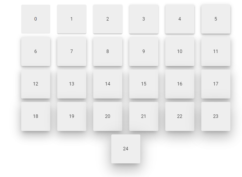
Elevation provides important visual cues about the relative distance or depth between two surfaces along the z-axis. Vuetify provides utility classes and props that allow us to easily set the elevation of an element without using creating custom CSS styles.

An elevation helper will customize the shadow elevation of an element when applied. There is a total of 25 elevation levels:

<template>
  <v-app>
    <v-container class="ma-4">
      <v-row justify="center">
        <v-col
          v-for="n in 25"
          :key="n"
          cols="auto"
        >
          <v-card
            :elevation="n - 1"
            height="100"
            width="100"
            color="grey lighten-3"
          >
            <v-row
              class="fill-height"
              align="center"
              justify="center"
              v-text="n - 1"
            ></v-row>
          </v-card>
        </v-col>
      </v-row>
    </v-container>
  </v-app>
</template>
Using Vuetify elevation helpers.

Prop Based Elevation in Vuetify

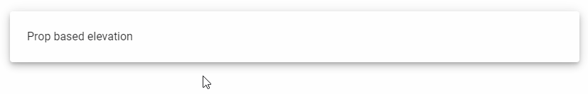
A lot of Vuetify components have an elevation prop for easily setting the elevation.

In the code example below, we use the v-hover component and the v-card elevation prop to change the shadow elevation when the user hovers over the card with the mouse:

<template>
  <v-app>
    <v-hover>
      <template v-slot:default="{ hover }">
        <v-card
          :elevation="hover ? 24 : 6"
          class="pa-6 ma-4"
        >
          Prop based elevation
        </v-card>
      </template>
    </v-hover>
  </v-app>
</template>
Prop based elevation in Vuetify.

Class Based Elevation in Vuetify

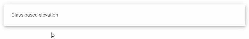
For an element without an elevation prop, we can apply one of the elevation helper classes on it to customize the elevation. The classes are of the format elevation-{value}, where value is the elevation level.

<template>
  <v-app>
    <v-hover>
      <template v-slot:default="{ hover }">
        <div
          class="pa-6 ma-4"
          :class="`elevation-${hover ? 24 : 6}`"
        >
          Class based elevation
        </div>
      </template>
    </v-hover>
  </v-app>
</template>
Class based elevation in Vuetify.

Conclusion

Vuetify provides elevation helpers that let us control the relative depth between two surfaces along the z-axis. We can do this by setting the elevation prop on supported components, or applying one of the elevation utility classes.

How to Use the Vuetify Bottom Sheet Component

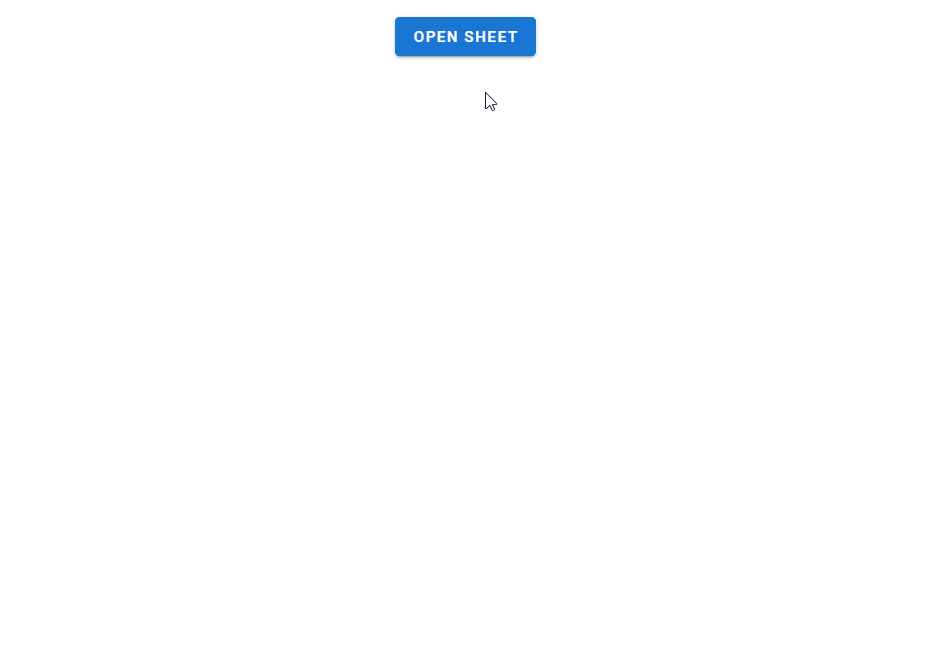
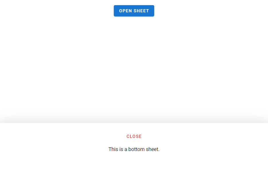
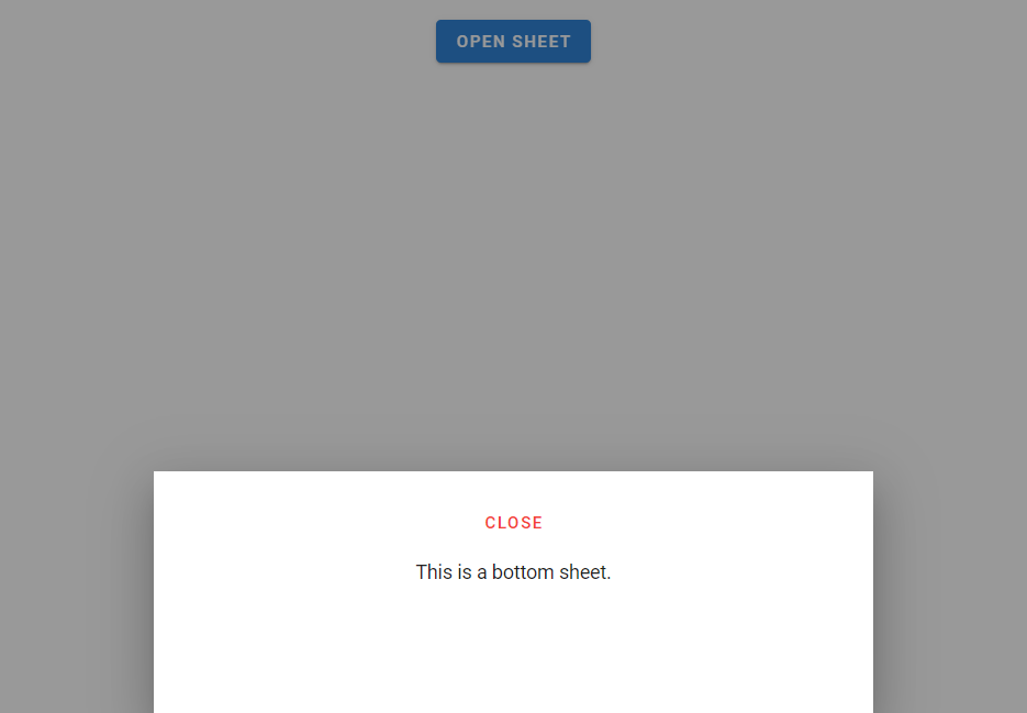
A bottom sheet is a customized v-dialog that is anchored to the bottom of the screen, like a v-bottom-navigation. They are primarily used on mobile and can contain supplementary information and actions. In this article, we’re going to learn how to easily create and customize bottom sheets with the Vuetify bottom sheet component.

The Vuetify Bottom Sheet Component (v-bottom-sheet)

Vuetify provides the v-bottom-sheet component for creating a bottom sheet. Like v-dialog, this component comes with an activator slot that we can use to set a button that will open the sheet when clicked.

<template>
  <v-app>
    <div class="ma-4 text-center">
      <v-bottom-sheet v-model="sheet">
        <template v-slot:activator="{ on, attrs }">
          <v-btn
            v-bind="attrs"
            v-on="on"
            color="primary"
          >
            Open Sheet
          </v-btn>
        </template>
        <v-sheet
          class="text-center"
          height="200px"
        >
          <v-btn
            class="mt-6"
            text
            color="red"
            @click="sheet = !sheet"
          >
            close
          </v-btn>
          <div class="my-3">This is a bottom sheet</div>
        </v-sheet>
      </v-bottom-sheet>
    </div>
  </v-app>
</template>

<script>
export default {
  name: 'App',
  data: () => ({
    sheet: false,
  }),
};
</script>

<style>
html {
  overflow-y: auto !important;
}
</style>
Creating a bottom sheet with Vuetify.

Hide Overlay

v-bottom-sheet comes with a hide-overlay prop that will remove the overlay when set to true.

<template>
  <v-app>
    <div class="ma-4 text-center">
      <v-bottom-sheet
        v-model="sheet"
        hide-overlay
      >
        <template v-slot:activator="{ on, attrs }">
          <v-btn
            v-bind="attrs"
            v-on="on"
            color="primary"
          >
            Open Sheet
          </v-btn>
        </template>
        <v-sheet
          class="text-center"
          height="200px"
        >
          <v-btn
            class="mt-6"
            text
            color="red"
            @click="sheet = !sheet"
          >
            close
          </v-btn>
          <div class="my-3">This is a bottom sheet.</div>
        </v-sheet>
      </v-bottom-sheet>
    </div>
  </v-app>
</template>

<script>
export default {
  name: 'App',
  data: () => ({
    sheet: false,
  }),
};
</script>

<style>
html {
  overflow-y: auto !important;
}
</style>
Using the hide-overlay prop of the Vuetify bottom sheet component.

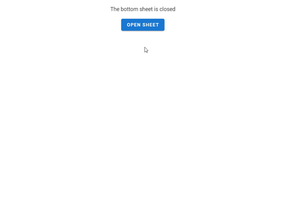
Vuetify Bottom Sheet v-model

We can set up a two-way binding between the value of the v-bottom-sheet and a variable. We can then use this variable to open/close the sheet or to display certain content conditionally.

<template>
  <v-app>
    <div class="ma-4 text-center">
      <div class="mb-4">
        The bottom sheet is {{ sheet ? 'open' : 'closed' }}
      </div>
      <v-bottom-sheet
        v-model="sheet"
        hide-overlay
      >
        <template v-slot:activator="{ on, attrs }">
          <v-btn
            v-bind="attrs"
            v-on="on"
            color="primary"
          >
            Open Sheet
          </v-btn>
        </template>
        <v-sheet
          class="text-center"
          height="200px"
        >
          <v-btn
            class="mt-6"
            text
            color="red"
            @click="sheet = !sheet"
          >
            close
          </v-btn>
          <div class="my-3">This is a bottom sheet</div>
        </v-sheet>
      </v-bottom-sheet>
    </div>
  </v-app>
</template>

<script>
export default {
  name: 'App',
  data: () => ({
    sheet: false,
  }),
};
</script>

<style>
html {
  overflow-y: auto !important;
}
</style>
Using v-model on a bottom sheet component.

Persistent Bottom Sheets

By default, an open bottom sheet closes when another element is clicked:

The bottom sheet closes when another element is clicked.

We can prevent this by setting the persistent prop to true on the v-bottom-sheet:

<template>
  <v-app>
    <div class="ma-4 text-center">
      <v-bottom-sheet
        v-model="sheet"
        persistent
      >
        <template v-slot:activator="{ on, attrs }">
          <v-btn
            v-bind="attrs"
            v-on="on"
            color="primary"
          >
            Open Sheet
          </v-btn>
        </template>
        <v-sheet
          class="text-center"
          height="200px"
        >
          <v-btn
            class="mt-6"
            text
            color="red"
            @click="sheet = !sheet"
          >
            close
          </v-btn>
          <div class="my-3">This is a bottom sheet.</div>
        </v-sheet>
      </v-bottom-sheet>
    </div>
  </v-app>
</template>

<script>
export default {
  name: 'App',
  data: () => ({
    sheet: false,
  }),
};
</script>

<style>
html {
  overflow-y: auto !important;
}
</style>
Using the persistent prop of the Vuetify bottom sheet component.

Vuetify Bottom Sheet Inset

The inset prop reduces the maximum width of the v-bottom-sheet to 70% on larger screens. We can also use the width prop to reduce the width manually.

<template>
  <v-app>
    <div class="ma-4 text-center">
      <v-bottom-sheet
        v-model="sheet"
        inset
      >
        <template v-slot:activator="{ on, attrs }">
          <v-btn
            v-bind="attrs"
            v-on="on"
            color="primary"
          >
            Open Sheet
          </v-btn>
        </template>
        <v-sheet
          class="text-center"
          height="200px"
        >
          <v-btn
            class="mt-6"
            text
            color="red"
            @click="sheet = !sheet"
          >
            close
          </v-btn>
          <div class="my-3">This is a bottom sheet.</div>
        </v-sheet>
      </v-bottom-sheet>
    </div>
  </v-app>
</template>

<script>
export default {
  name: 'App',
  data: () => ({
    sheet: false,
  }),
};
</script>

<style>
html {
  overflow-y: auto !important;
}
</style>
Using the inset prop of the Vuetify bottom sheet component.

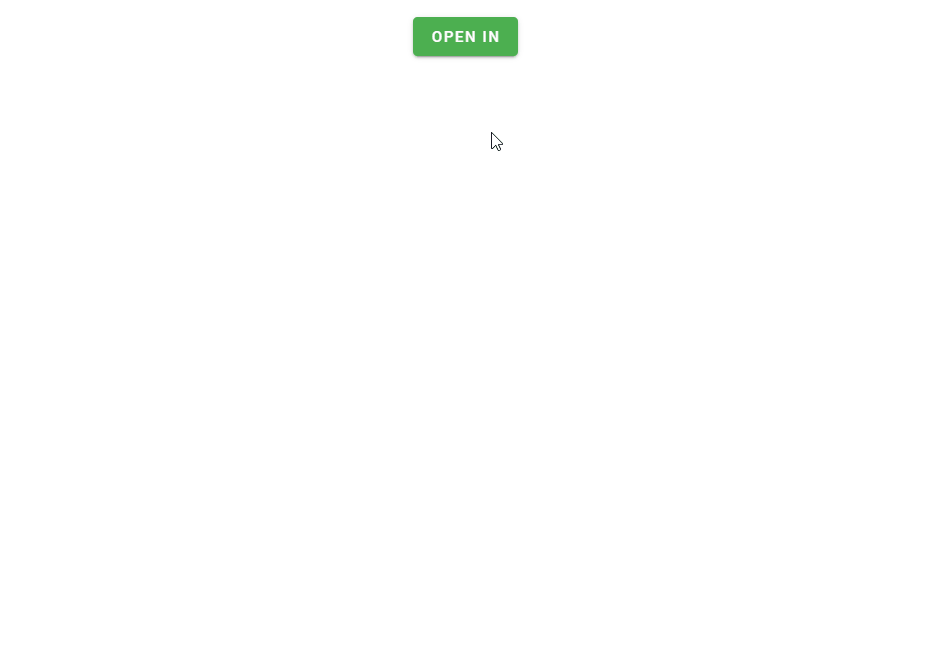
Creating an “Open In” Component

We can combine a functional list and bottom sheet to create an “open in” component.

<template>
  <v-app>
    <div class="ma-4 text-center">
      <v-bottom-sheet v-model="sheet">
        <template v-slot:activator="{ on, attrs }">
          <v-btn
            v-bind="attrs"
            v-on="on"
            color="green"
            dark
          >
            Open in
          </v-btn>
        </template>
        <v-list>
          <v-subheader>Open in</v-subheader>
          <v-list-item
            v-for="(app, i) in apps"
            :key="i"
            @click="sheet = false"
          >
            <v-list-item-title>{{ app }}</v-list-item-title>
          </v-list-item>
        </v-list>
      </v-bottom-sheet>
    </div>
  </v-app>
</template>

<script>
export default {
  name: 'App',
  data: () => ({
    sheet: false,
    apps: ['Firefox', 'Chrome', 'Edge', 'Opera'],
  }),
};
</script>

<style>
html {
  overflow-y: auto !important;
}
</style>
Creating an "open in" component with a bottom sheet and a list.

Conclusion

Bottom sheets are anchored to the bottom of the screen and can be used to display supplementary content. Vuetify provides the Vuetify bottom sheet component (v-bottom-sheet) for creating and customizing them.

How to Use the Vuetify Stepper Component

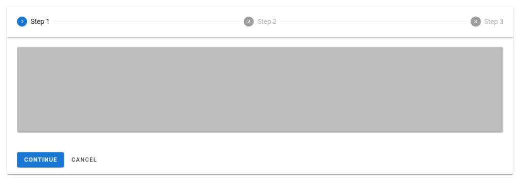
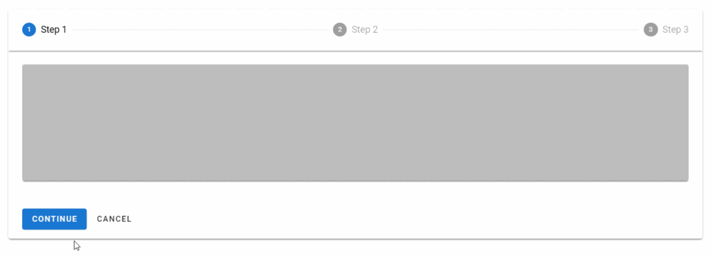
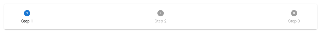
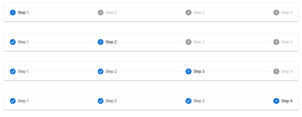
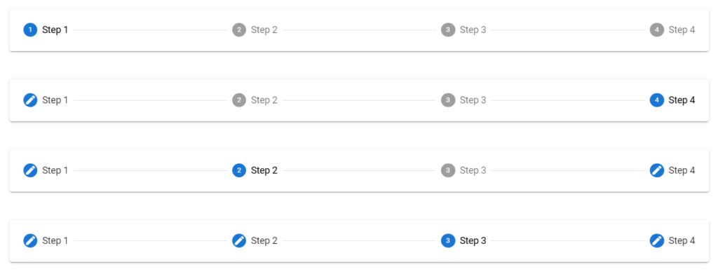
A stepper displays progress through a sequence by separating it into multiple logical and numbered steps. We can use it in scenarios like shopping carts, or cases where an input field determines a subsequent field. In this article, we’re going to learn how to use the Vuetify stepper component to easily create and customize steppers.

The Vuetify Stepper Component (v-stepper)

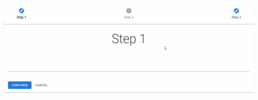
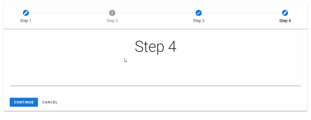
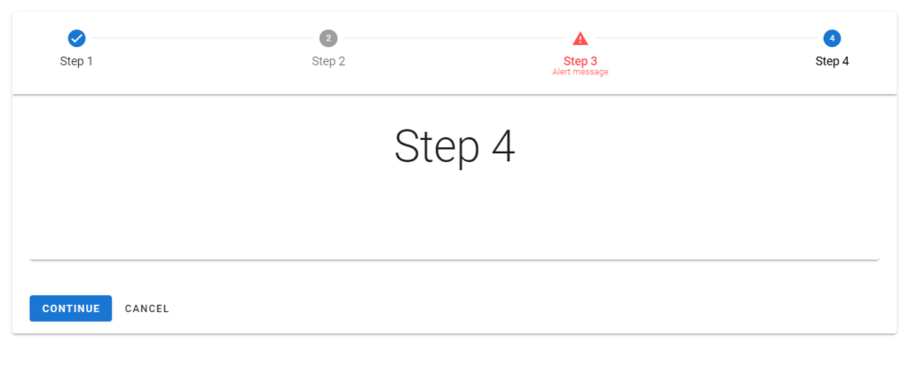
Vuetify provides the v-stepper component for creating a stepper. We indicate the steps with v-stepper-step components and display content for each step with v-stepper-content components. Every v-stepper-step or v-stepper-content has a step prop that we use to set the step it should be associated with. v-stepper-steps are typically wrapped in a v-stepper-header, while v-stepper-contents are wrapped in a v-stepper-items.

<template>
  <v-app>
    <div class="ma-4">
      <v-stepper v-model="step">
        <v-stepper-header>
          <v-stepper-step
            :complete="step > 1"
            step="1"
          >
            Step 1
          </v-stepper-step>

          <v-divider></v-divider>

          <v-stepper-step
            :complete="step > 2"
            step="2"
          >
            Step 2
          </v-stepper-step>

          <v-divider></v-divider>

          <v-stepper-step step="3"> Step 3 </v-stepper-step>
        </v-stepper-header>

        <v-stepper-items>
          <v-stepper-content step="1">
            <v-card
              class="mb-12"
              color="grey lighten-1"
              height="200px"
            ></v-card>

            <v-btn
              color="primary"
              @click="step = 2"
            >
              Continue
            </v-btn>

            <v-btn text> Cancel </v-btn>
          </v-stepper-content>

          <v-stepper-content step="2">
            <v-card
              class="mb-12"
              color="grey lighten-1"
              height="200px"
            ></v-card>

            <v-btn
              color="primary"
              @click="step = 3"
            >
              Continue
            </v-btn>

            <v-btn text> Cancel </v-btn>
          </v-stepper-content>

          <v-stepper-content step="3">
            <v-card
              class="mb-12"
              color="grey lighten-1"
              height="200px"
            ></v-card>

            <v-btn color="primary"> Continue </v-btn>

            <v-btn text> Cancel </v-btn>
          </v-stepper-content>
        </v-stepper-items>
      </v-stepper>
    </div>
  </v-app>
</template>

<script>
export default {
  name: 'App',
  data: () => ({
    step: 1,
  }),
};
</script>
Creating a stepper with the Vuetify stepper component.

Clicking the “Continue” button moves the stepper to the next step with an animation:

Clicking the continue button moves the stepper to the next step.

Smaller Screens

The name of the steps are not shown on smaller screens:

The step names of the stepper are not shown on smaller screens.

Vuetify Stepper Alt Labels

Using the alt-labels prop on the v-stepper places the name of each step under the circle representing the step.

<template>
  <v-app>
    <div class="ma-4">
      <v-stepper
        v-model="step"
        alt-labels
      >
        <v-stepper-header>
          <v-stepper-step
            :complete="step > 1"
            step="1"
          >
            Step 1
          </v-stepper-step>

          <v-divider></v-divider>

          <v-stepper-step
            :complete="step > 2"
            step="2"
          >
            Step 2
          </v-stepper-step>

          <v-divider></v-divider>

          <v-stepper-step step="3"> Step 3 </v-stepper-step>
        </v-stepper-header>
      </v-stepper>
    </div>
  </v-app>
</template>

<script>
export default {
  name: 'App',
  data: () => ({
    step: 1,
  }),
};
</script>
Using the alt-labels prop of the Vuetify stepper component.

Stepper Color

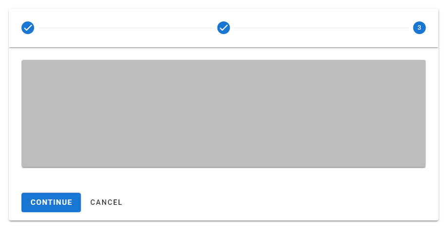
With the color prop of the v-stepper-steps, we can customize the color of completed steps or the current step. We can use any color from the Material Design specs.

<template>
  <v-app>
    <div class="ma-4">
      <v-stepper
        value="3"
      >
        <v-stepper-header>
          <v-stepper-step
            complete
            step="1"
            color="green"
          >
            Step 1
          </v-stepper-step>

          <v-divider></v-divider>

          <v-stepper-step
            complete
            step="2"
            color="green"
          >
            Step 2
          </v-stepper-step>

          <v-divider></v-divider>

          <v-stepper-step
            step="3"
            color="green"
          >
            Step 3
          </v-stepper-step>

          <v-divider></v-divider>

          <v-stepper-step
            step="4"
            color="green"
          >
            Step 4
          </v-stepper-step>
        </v-stepper-header>
      </v-stepper>
    </div>
  </v-app>
</template>

<script>
export default {
  name: 'App',
};
</script>
Customizing the color of steps on the stepper.

Editable Steps

An editable step allows the user to return later to modify it. We can make a step editable by setting the editable prop to true on the v-stepper-step associated with it.

<template>
  <v-app>
    <div class="ma-4">
      <v-stepper
        v-model="step"
        alt-labels
        non-linear
      >
        <v-stepper-header>
          <v-stepper-step
            complete
            editable
            step="1"
          >
            Step 1
          </v-stepper-step>

          <v-divider></v-divider>

          <v-stepper-step
            editable
            step="2"
          >
            Step 2
          </v-stepper-step>

          <v-divider></v-divider>

          <v-stepper-step
            step="3"
            complete
            editable
          >
            Step 3
          </v-stepper-step>
        </v-stepper-header>

        <v-stepper-items>
          <v-stepper-content step="1">
            <v-card
              class="mb-12 pa-4"
              color="text-h2 text-center"
              height="200px"
            >
              <div>Step 1</div>
            </v-card>

            <v-btn
              color="primary"
              @click="step = 2"
            >
              Continue
            </v-btn>

            <v-btn text> Cancel </v-btn>
          </v-stepper-content>

          <v-stepper-content step="2">
            <v-card
              class="mb-12 pa-4"
              color="text-h2 text-center"
              height="200px"
            >
              <div>Step 2</div>
            </v-card>

            <v-btn
              color="primary"
              @click="step = 3"
            >
              Continue
            </v-btn>

            <v-btn text> Cancel </v-btn>
          </v-stepper-content>

          <v-stepper-content step="3">
            <v-card
              class="mb-12 pa-4"
              color="text-h2 text-center"
              height="200px"
            >
              <div>Step 3</div>
            </v-card>

            <v-btn color="primary"> Continue </v-btn>

            <v-btn text> Cancel </v-btn>
          </v-stepper-content>
        </v-stepper-items>
      </v-stepper>
    </div>
  </v-app>
</template>

<script>
export default {
  name: 'App',
  data: () => ({
    step: 1,
  }),
};
</script>
Creating a stepper with editable steps.

Non-editable Steps

Non-editable steps prevent modification once completed. A step is non-editable if the associated v-stepper-step does not have its step prop set to true.

<template>
  <v-app>
    <div class="ma-4">
      <v-stepper
        v-model="step"
        alt-labels
        non-linear
      >
        <v-stepper-header>
          <v-stepper-step
            complete
            editable
            step="1"
          >
            Step 1
          </v-stepper-step>

          <v-divider></v-divider>

          <v-stepper-step
            editable
            step="2"
          >
            Step 2
          </v-stepper-step>

          <v-divider></v-divider>

          <v-stepper-step
            step="3"
            complete
          >
            Step 3
          </v-stepper-step>

          <v-divider></v-divider>

          <v-stepper-step
            step="4"
            complete
            editable
          >
            Step 4
          </v-stepper-step>
        </v-stepper-header>

        <v-stepper-items>
          <v-stepper-content step="1">
            <v-card
              class="mb-12 pa-4"
              color="text-h2 text-center"
              height="200px"
            >
              <div>Step 1</div>
            </v-card>

            <v-btn
              color="primary"
              @click="step = 2"
            >
              Continue
            </v-btn>

            <v-btn text> Cancel </v-btn>
          </v-stepper-content>

          <v-stepper-content step="2">
            <v-card
              class="mb-12 pa-4"
              color="text-h2 text-center"
              height="200px"
            >
              <div>Step 2</div>
            </v-card>

            <v-btn
              color="primary"
              @click="step = 3"
            >
              Continue
            </v-btn>

            <v-btn text> Cancel </v-btn>
          </v-stepper-content>

          <v-stepper-content step="3">
            <v-card
              class="mb-12 pa-4"
              color="text-h2 text-center"
              height="200px"
            >
              <div>Step 3</div>
            </v-card>

            <v-btn color="primary"> Continue </v-btn>

            <v-btn text> Cancel </v-btn>
          </v-stepper-content>

          <v-stepper-content step="4">
            <v-card
              class="mb-12 pa-4"
              color="text-h2 text-center"
              height="200px"
            >
              <div>Step 4</div>
            </v-card>

            <v-btn color="primary"> Continue </v-btn>

            <v-btn text> Cancel </v-btn>
          </v-stepper-content>
        </v-stepper-items>
      </v-stepper>
    </div>
  </v-app>
</template>

<script>
export default {
  name: 'App',
  data: () => ({
    step: 1,
  }),
};
</script>
Creating a stepper with non-editable steps.

Vuetify Stepper Linear

Linear steppers move users through the defined path. One step must be completed before moving on to the next.

<template>
  <v-app>
    <div class="ma-4">
      <v-stepper alt-labels>
        <v-stepper-header>
          <v-stepper-step step="1"> Step 1 </v-stepper-step>
          <v-divider></v-divider>
          <v-stepper-step step="2"> Step 2 </v-stepper-step>
          <v-divider></v-divider>
          <v-stepper-step step="3"> Step 3 </v-stepper-step>
          <v-divider></v-divider>
          <v-stepper-step step="4"> Step 4 </v-stepper-step>
        </v-stepper-header>
      </v-stepper>

      <v-stepper
        alt-labels
        value="2"
        class="mt-12"
      >
        <v-stepper-header>
          <v-stepper-step
            step="1"
            complete
          >
            Step 1
          </v-stepper-step>
          <v-divider></v-divider>
          <v-stepper-step step="2"> Step 2 </v-stepper-step>
          <v-divider></v-divider>
          <v-stepper-step step="3"> Step 3 </v-stepper-step>
          <v-divider></v-divider>
          <v-stepper-step step="4"> Step 4 </v-stepper-step>
        </v-stepper-header>
      </v-stepper>

      <v-stepper
        alt-labels
        value="3"
        class="mt-12"
      >
        <v-stepper-header>
          <v-stepper-step
            step="1"
            complete
          >
            Step 1
          </v-stepper-step>
          <v-divider></v-divider>
          <v-stepper-step
            step="2"
            complete
          >
            Step 2
          </v-stepper-step>
          <v-divider></v-divider>
          <v-stepper-step step="3"> Step 3 </v-stepper-step>
          <v-divider></v-divider>
          <v-stepper-step step="4"> Step 4 </v-stepper-step>
        </v-stepper-header>
      </v-stepper>

      <v-stepper
        alt-labels
        value="4"
        class="mt-12"
      >
        <v-stepper-header>
          <v-stepper-step
            step="1"
            complete
          >
            Step 1
          </v-stepper-step>
          <v-divider></v-divider>
          <v-stepper-step
            step="2"
            complete
          >
            Step 2
          </v-stepper-step>
          <v-divider></v-divider>
          <v-stepper-step
            step="3"
            complete
          >
            Step 3
          </v-stepper-step>
          <v-divider></v-divider>
          <v-stepper-step step="4"> Step 4 </v-stepper-step>
        </v-stepper-header>
      </v-stepper>
    </div>
  </v-app>
</template>

<script>
export default {
  name: 'App',
};
</script>
Creating a linear stepper with Vuetify.

Vuetify Stepper Non-linear

A non-linear stepper allow the user to move through your process in their preferred way.

<template>
  <v-app>
    <div class="ma-4">
      <v-stepper non-linear>
        <v-stepper-header>
          <v-stepper-step
            step="1"
            editable
          >
            Step 1
          </v-stepper-step>
          <v-divider></v-divider>
          <v-stepper-step
            step="2"
            editable
          >
            Step 2
          </v-stepper-step>
          <v-divider></v-divider>
          <v-stepper-step
            step="3"
            editable
          >
            Step 3
          </v-stepper-step>
          <v-divider></v-divider>
          <v-stepper-step
            step="4"
            editable
          >
            Step 4
          </v-stepper-step>
        </v-stepper-header>
      </v-stepper>

      <v-stepper
        value="4"
        class="mt-12"
        non-linear
      >
        <v-stepper-header>
          <v-stepper-step
            step="1"
            complete
            editable
          >
            Step 1
          </v-stepper-step>
          <v-divider></v-divider>
          <v-stepper-step
            step="2"
            editable
          >
            Step 2
          </v-stepper-step>
          <v-divider></v-divider>
          <v-stepper-step
            step="3"
            editable
          >
            Step 3
          </v-stepper-step>
          <v-divider></v-divider>
          <v-stepper-step
            step="4"
            editable
          >
            Step 4
          </v-stepper-step>
        </v-stepper-header>
      </v-stepper>

      <v-stepper
        value="2"
        class="mt-12"
        non-linear
      >
        <v-stepper-header>
          <v-stepper-step
            step="1"
            complete
            editable
          >
            Step 1
          </v-stepper-step>
          <v-divider></v-divider>
          <v-stepper-step
            step="2"
            editable
          >
            Step 2
          </v-stepper-step>
          <v-divider></v-divider>
          <v-stepper-step
            step="3"
            editable
          >
            Step 3
          </v-stepper-step>
          <v-divider></v-divider>
          <v-stepper-step
            step="4"
            editable
            complete
          >
            Step 4
          </v-stepper-step>
        </v-stepper-header>
      </v-stepper>

      <v-stepper
        value="3"
        class="mt-12"
        non-linear
      >
        <v-stepper-header>
          <v-stepper-step
            step="1"
            complete
            editable
          >
            Step 1
          </v-stepper-step>
          <v-divider></v-divider>
          <v-stepper-step
            step="2"
            complete
            editable
          >
            Step 2
          </v-stepper-step>
          <v-divider></v-divider>
          <v-stepper-step
            step="3"
            editable
          >
            Step 3
          </v-stepper-step>
          <v-divider></v-divider>
          <v-stepper-step
            step="4"
            editable
            complete
          >
            Step 4
          </v-stepper-step>
        </v-stepper-header>
      </v-stepper>
    </div>
  </v-app>
</template>

<script>
export default {
  name: 'App',
};
</script>
Creating a non-linear stepper with Vuetify.

Vuetify Stepper Vertical

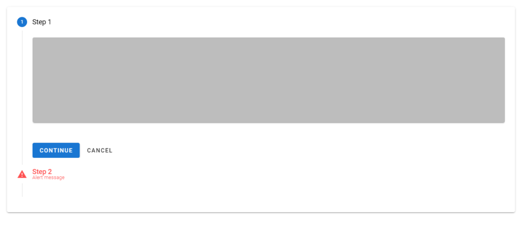
A vertical stepper moves users through the steps along the y-axis and works similarly to a horizontal stepper. We can make a stepper vertical by setting the vertical prop of the v-stepper to true.

<template>
  <v-app>
    <div class="ma-4">
      <v-stepper
        v-model="step"
        vertical
      >
        <v-stepper-items>
          <v-stepper-step
            :complete="step > 1"
            step="1"
          >
            Step 1
          </v-stepper-step>
          <v-stepper-content step="1">
            <v-card
              class="mb-12"
              color="grey lighten-1"
              height="200px"
            ></v-card>

            <v-btn
              color="primary"
              @click="step = 2"
            >
              Continue
            </v-btn>

            <v-btn text> Cancel </v-btn>
          </v-stepper-content>

          <v-stepper-step
            :complete="step > 2"
            step="2"
          >
            Step 2
          </v-stepper-step>
          <v-stepper-content step="2">
            <v-card
              class="mb-12"
              color="grey lighten-1"
              height="200px"
            ></v-card>

            <v-btn
              color="primary"
              @click="step = 3"
            >
              Continue
            </v-btn>

            <v-btn text> Cancel </v-btn>
          </v-stepper-content>

          <v-stepper-content step="3">
            <v-stepper-step step="3">
              Step 3
            </v-stepper-step>

            <v-card
              class="mb-12"
              color="grey lighten-1"
              height="200px"
            ></v-card>

            <v-btn color="primary"> Continue </v-btn>

            <v-btn text> Cancel </v-btn>
          </v-stepper-content>
        </v-stepper-items>
      </v-stepper>
    </div>
  </v-app>
</template>

<script>
export default {
  name: 'App',
  data: () => ({
    step: 1,
  }),
};
</script>
Creating a vertical stepper with Vuetify.

Vuetify Stepper Horizontal

Horizontal steppers move the user through the steps along the x-axis. v-steppers are horizontal by default.

<template>
  <v-app>
    <div class="ma-4">
      <v-stepper value="3">
        <v-stepper-header>
          <v-stepper-step
            complete
            step="1"
          >
            Step 1
          </v-stepper-step>

          <v-divider></v-divider>

          <v-stepper-step
            complete
            step="2"
          >
            Step 2
          </v-stepper-step>

          <v-divider></v-divider>

          <v-stepper-step step="3"> Step 3 </v-stepper-step>

          <v-divider></v-divider>

          <v-stepper-step step="4"> Step 4 </v-stepper-step>
        </v-stepper-header>
      </v-stepper>
    </div>
  </v-app>
</template>

<script>
export default {
  name: 'App',
};
</script>
Creating a horizontal stepper with Vuetify.

Vuetify Stepper Error Messages

We can display an error state on the stepper to indicate a compulsory action.

<template>
  <v-app>
    <div class="ma-4">
      <v-stepper
        v-model="step"
        alt-labels
        non-linear
      >
        <v-stepper-header>
          <v-stepper-step
            complete
            step="1"
          >
            Step 1
          </v-stepper-step>

          <v-divider></v-divider>

          <v-stepper-step
            editable
            step="2"
          >
            Step 2
          </v-stepper-step>

          <v-divider></v-divider>

          <v-stepper-step
            step="3"
            editable
            :rules="step3Rules"
          >
            <div class="text-center">
              Step 3
              <small>Alert message</small>
            </div>
          </v-stepper-step>

          <v-divider></v-divider>

          <v-stepper-step
            step="4"
            editable
          >
            Step 4
          </v-stepper-step>
        </v-stepper-header>
        <v-stepper-items>
          <v-stepper-content step="1">
            <v-card
              class="mb-12 pa-4"
              color="text-h2 text-center"
              height="200px"
            >
              <div>Step 1</div>
            </v-card>

            <v-btn
              color="primary"
              @click="step = 2"
            >
              Continue
            </v-btn>

            <v-btn text> Cancel </v-btn>
          </v-stepper-content>

          <v-stepper-content step="2">
            <v-card
              class="mb-12 pa-4"
              color="text-h2 text-center"
              height="200px"
            >
              <div>Step 2</div>
            </v-card>

            <v-btn
              color="primary"
              @click="step = 3"
            >
              Continue
            </v-btn>

            <v-btn text> Cancel </v-btn>
          </v-stepper-content>

          <v-stepper-content step="3">
            <v-card
              class="mb-12 pa-4"
              color="text-h2 text-center"
              height="200px"
            >
              <div>Step 3</div>
            </v-card>

            <v-btn color="primary"> Continue </v-btn>

            <v-btn text> Cancel </v-btn>
          </v-stepper-content>

          <v-stepper-content step="4">
            <v-card
              class="mb-12 pa-4"
              color="text-h2 text-center"
              height="200px"
            >
              <div>Step 4</div>
            </v-card>

            <v-btn color="primary"> Continue </v-btn>

            <v-btn text> Cancel </v-btn>
          </v-stepper-content>
        </v-stepper-items>
      </v-stepper>
    </div>
  </v-app>
</template>

<script>
export default {
  name: 'App',
  data: () => ({
    step: 1,
    step3Rules: [(value) => false],
  }),
};
</script>
Displaying an error state in a horizontal stepper.

We can also display an error state in a vertical stepper:

<template>
  <v-app>
    <div class="ma-4">
      <v-stepper
        v-model="step"
        vertical
      >
        <v-stepper-items>
          <v-stepper-step
            :complete="step > 1"
            step="1"
          >
            Step 1
          </v-stepper-step>
          <v-stepper-content step="1">
            <v-card
              class="mb-12"
              color="grey lighten-1"
              height="200px"
            ></v-card>

            <v-btn
              color="primary"
              @click="step = 2"
            >
              Continue
            </v-btn>

            <v-btn text> Cancel </v-btn>
          </v-stepper-content>

          <v-stepper-step
            step="2"
            :rules="step2Rules"
            editable
          >
            Step 2
            <small>Alert message</small>
          </v-stepper-step>
          <v-stepper-content step="2">
            <v-card
              class="mb-12"
              color="grey lighten-1"
              height="200px"
            ></v-card>

            <v-btn
              color="primary"
              @click="step = 3"
            >
              Continue
            </v-btn>

            <v-btn text> Cancel </v-btn>
          </v-stepper-content>

          <v-stepper-content step="3">
            <v-stepper-step
              step="3"
              editable
            >
              Step 3
            </v-stepper-step>

            <v-card
              class="mb-12"
              color="grey lighten-1"
              height="200px"
            ></v-card>

            <v-btn color="primary"> Continue </v-btn>

            <v-btn text> Cancel </v-btn>
          </v-stepper-content>
        </v-stepper-items>
      </v-stepper>
    </div>
  </v-app>
</template>

<script>
export default {
  name: 'App',
  data: () => ({
    step: 1,
    step2Rules: [() => false],
  }),
};
</script>
Displaying an error state in a vertical stepper.

Optional Steps

We can indicate optional steps in the stepper with sub-text.

<template>
  <v-app>
    <div class="ma-4">
      <v-stepper value="3">
        <v-stepper-header>
          <v-stepper-step
            step="1"
            complete
          >
            Step 1
          </v-stepper-step>
          <v-divider></v-divider>
          <v-stepper-step
            step="2"
            complete
          >
            Step 2
          </v-stepper-step>
          <v-divider></v-divider>
          <v-stepper-step step="3">
            Step 3 <small>Optional</small></v-stepper-step
          >
          <v-divider></v-divider>
          <v-stepper-step step="4"> Step 4 </v-stepper-step>
        </v-stepper-header>
      </v-stepper>
    </div>
  </v-app>
</template>

<script>
export default {
  name: 'App',
};
</script>
Indicate optional steps in the stepper.

Conclusion

A stepper displays progress through numbered steps. We can use the Vuetify stepper component (v-stepper) and its various sub-components to create and customize steppers.

How to Use the Vuetify Sparkline Component

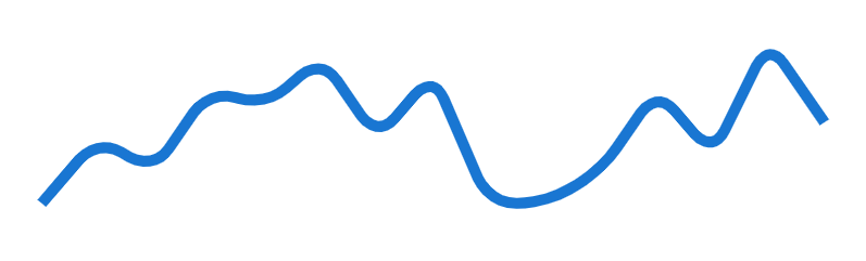
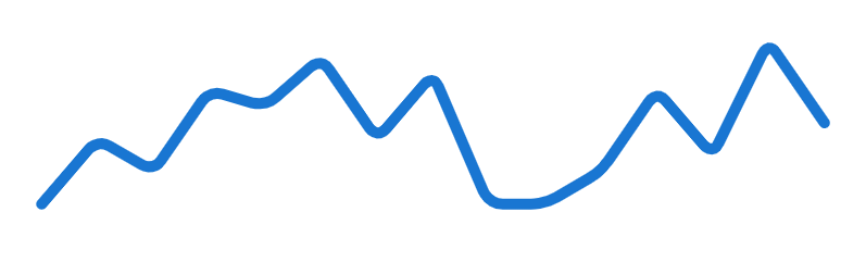
We can use a sparkline to give a visual representation of numerical or statistical information with simple graphs. In this extensive guide, we’ll learn how to use the Vuetify sparkline component to easily create and customize sparklines.

The Vuetify Sparkline Component (v-sparkline)

Vuetify provides the v-sparkline component for creating a sparkline. It has a value prop that takes an array containing the data to be represented:

<template>
  <v-app>
    <div class="ma-4">
      <v-sparkline
        :value="value"
        smooth="10"
      ></v-sparkline>
    </div>
  </v-app>
</template>

<script>
export default {
  name: 'App',
  data: () => ({
    value: [0, 4, 2, 7, 6, 9, 4, 8, 0, 0, 2, 7, 3, 10, 5],
  }),
};
</script>
Creating a sparkline with the Vuetify sparkline component.

Vuetify Sparkline Stroke Line Cap

The sparkline has a sharp line cap by default. We can make it round by setting the stroke-linecap prop to round:

<template>
  <v-app>
    <div class="ma-4">
      <v-sparkline
        :value="value"
        smooth="10"
        stroke-linecap="round"
      ></v-sparkline>
    </div>
  </v-app>
</template>

<script>
export default {
  name: 'App',
  data: () => ({
    value: [0, 4, 2, 7, 6, 9, 4, 8, 0, 0, 2, 7, 3, 10, 5],
  }),
};
</script>
Using the stroke-linecap prop of the Vuetify sparkline component.

Vuetify Sparkline Fill

We can color the region below the sparkline by setting the fill prop to true:

<template>
  <v-app>
    <div class="ma-4">
      <v-sparkline
        :value="value"
        smooth="10"
        fill
      ></v-sparkline>
    </div>
  </v-app>
</template>

<script>
export default {
  name: 'App',
  data: () => ({
    value: [0, 4, 2, 7, 6, 9, 4, 8, 0, 0, 2, 7, 3, 10, 5],
  }),
};
</script>
Using the fill prop of the Vuetify sparkline component.

Vuetify Sparkline Line Width

We can use the line-width prop to control the thickness of the sparkline.

<template>
  <v-app>
    <div class="ma-4">
      <v-sparkline
        :value="value"
        smooth="10"
        line-width="2"
        stroke-linecap="round"
      ></v-sparkline>
    </div>
  </v-app>
</template>

<script>
export default {
  name: 'App',
  data: () => ({
    value: [0, 4, 2, 7, 6, 9, 4, 8, 0, 0, 2, 7, 3, 10, 5],
  }),
};
</script>
Using the line-width prop of the Vuetify sparkline component.

Sparkline Color

v-sparkline comes with a color prop for customizing the color of the sparkline. We can use any color from the Material design specs.

<template>
  <v-app>
    <div class="ma-4">
      <v-sparkline
        :value="value"
        smooth="10"
        color="red accent-2"
        stroke-linecap="round"
      ></v-sparkline>
    </div>
  </v-app>
</template>

<script>
export default {
  name: 'App',
  data: () => ({
    value: [0, 4, 2, 7, 6, 9, 4, 8, 0, 0, 2, 7, 3, 10, 5],
  }),
};
</script>
Customizing the color of the Vuetify sparkline component.

Vuetify Sparkline Smooth

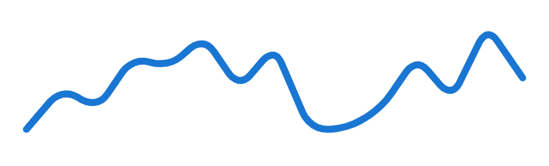
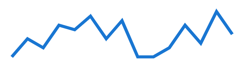
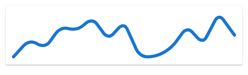
With the smooth prop, we can set the roundness of the corners formed from the sparkline tracing the data points. We can pass a number or a boolean value to smooth. Setting it to true sets a corner radius of 8px. In the code example below, we set it to 5 (for a corner radius of 5px):

<template>
  <v-app>
    <div class="ma-4">
      <v-sparkline
        :value="value"
        smooth="5"
        stroke-linecap="round"
      ></v-sparkline>
    </div>
  </v-app>
</template>

<script>
export default {
  name: 'App',
  data: () => ({
    value: [0, 4, 2, 7, 6, 9, 4, 8, 0, 0, 2, 7, 3, 10, 5],
  }),
};
</script>
Using the smooth prop of the Vuetify sparkline component.

Setting smooth to false will set the corner radius to 0px:

<template>
  <v-app>
    <div class="ma-4">
      <v-sparkline
        :value="value"
        :smooth="false"
      ></v-sparkline>
    </div>
  </v-app>
</template>

<script>
export default {
  name: 'App',
  data: () => ({
    value: [0, 4, 2, 7, 6, 9, 4, 8, 0, 0, 2, 7, 3, 10, 5],
  }),
};
</script>
Setting the smooth prop to false on the Vuetify sparkline component.

Vuetify Sparkline Padding

We can add padding to the sparkline with the padding property. It has a padding of 8 by default.

<template>
  <v-app>
    <v-card class="ma-4">
      <v-sparkline
        :value="value"
        smooth="10"
        padding="10"
        stroke-linecap="round"
      ></v-sparkline>
    </v-card>
  </v-app>
</template>

<script>
export default {
  name: 'App',
  data: () => ({
    value: [0, 4, 2, 7, 6, 9, 4, 8, 0, 0, 2, 7, 3, 10, 5],
  }),
};
</script>
Using the padding prop of the Vuetify sparkline component.

Vuetify Sparkline Auto Draw

Setting the auto-draw prop to true on a v-sparkline will make the sparkline run a trace animation when first rendered.

<template>
  <v-app>
    <div class="ma-4">
      <v-sparkline
        :value="value"
        smooth="10"
        padding="10"
        stroke-linecap="round"
        auto-draw
      ></v-sparkline>
    </div>
  </v-app>
</template>

<script>
export default {
  name: 'App',
  data: () => ({
    value: [0, 4, 2, 7, 6, 9, 4, 8, 0, 0, 2, 7, 3, 10, 5],
  }),
};
</script>
Using the auto-draw prop of the Vuetify sparkline component.

Sparkline Auto Draw Duration

The auto-draw-duration prop allows us to set the duration of the trace animation in milliseconds. It has a default value of 2000 (2 seconds).

<template>
  <v-app>
    <div class="ma-4">
      <v-sparkline
        :value="value"
        smooth="10"
        padding="10"
        stroke-linecap="round"
        auto-draw
        :auto-draw-duration="4000"
      ></v-sparkline>
    </div>
  </v-app>
</template>

<script>
export default {
  name: 'App',
  data: () => ({
    value: [0, 4, 2, 7, 6, 9, 4, 8, 0, 0, 2, 7, 3, 10, 5],
  }),
};
</script>
Using the auto-draw-duration prop of the Vuetify sparkline component.

Sparkline Auto Draw Easing

We can specify the easing function of the trace animation with the auto-draw-easing prop:

<template>
  <v-app>
    <div class="ma-4">
      <v-sparkline
        :value="value"
        smooth="10"
        padding="10"
        stroke-linecap="round"
        auto-draw
        :auto-draw-duration="4000"
        auto-draw-easing="linear"
      ></v-sparkline>
    </div>
  </v-app>
</template>

<script>
export default {
  name: 'App',
  data: () => ({
    value: [0, 4, 2, 7, 6, 9, 4, 8, 0, 0, 2, 7, 3, 10, 5],
  }),
};
</script>
Using the auto-draw-easing prop of the Vuetify sparkline component.

Vuetify Sparkline Type

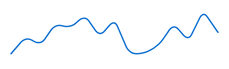
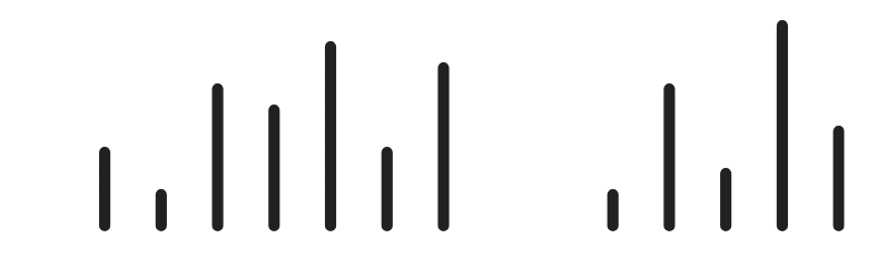
By setting the type prop to bar, we can make v-sparkline show a set of bars instead of a line. The default type is trend which shows the continuous line.

<template>
  <v-app>
    <div class="ma-4">
      <v-sparkline
        :value="value"
        smooth="10"
        padding="10"
        stroke-linecap="round"
        type="bar"
      ></v-sparkline>
    </div>
  </v-app>
</template>

<script>
export default {
  name: 'App',
  data: () => ({
    value: [0, 4, 2, 7, 6, 9, 4, 8, 0, 0, 2, 7, 3, 10, 5],
  }),
};
</script>
Using the type prop of the Vuetify sparkline component.

Vuetify Sparkline Gradient

We can set the color of the sparkline to a linear gradient with the gradient prop. gradient takes an array of colors to use for the linear gradient.

<template>
  <v-app>
    <div class="ma-4">
      <v-sparkline
        :value="value"
        smooth="10"
        padding="10"
        stroke-linecap="round"
        :gradient="gradient"
      ></v-sparkline>
    </div>
  </v-app>
</template>

<script>
export default {
  name: 'App',
  data: () => ({
    value: [0, 4, 2, 7, 6, 9, 4, 8, 0, 0, 2, 7, 3, 10, 5],
    gradient: ['red', 'orange', 'yellow'],
  }),
};
</script>
Using the gradient prop of the Vuetify sparkline component.

Vuetify Sparkline Gradient Direction

The gradient-direction property of v-sparkline sets the direction in which the color gradient should run.

<template>
  <v-app>
    <div class="ma-4">
      <v-sparkline
        :value="value"
        smooth="10"
        padding="10"
        stroke-linecap="round"
        :gradient="gradient"
        gradient-direction="bottom"
      ></v-sparkline>
    </div>
  </v-app>
</template>

<script>
export default {
  name: 'App',
  data: () => ({
    value: [0, 4, 2, 7, 6, 9, 4, 8, 0, 0, 2, 7, 3, 10, 5],
    gradient: ['red', 'orange', 'yellow'],
  }),
};
</script>

Conclusion

A sparkline displays simple graphs that visually represent numerical or statistical information. We can use the Vuetify sparkline component (v-sparkline) and its various prop to create and customize sparklines.

How to Use Vuetify Overflow Helper Classes

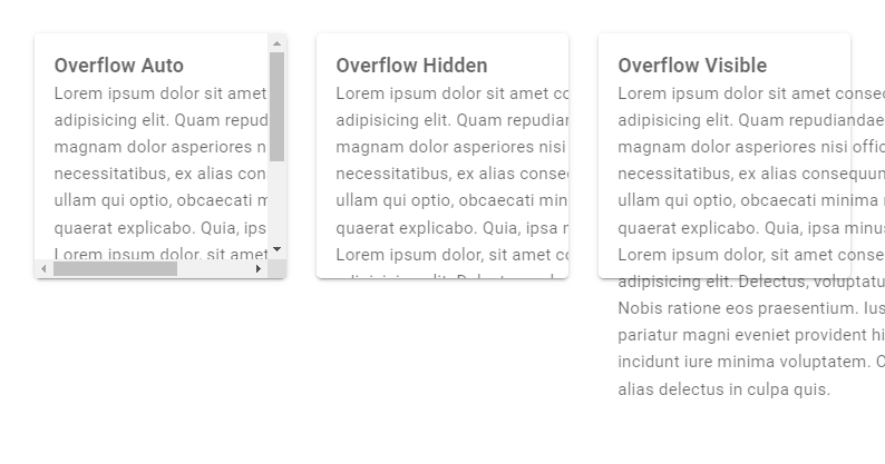
Vuetify provides utility classes that allow us to easily configure how content overflows when its size becomes greater than the bounds of its container. We’re going to learn how to use them in this article.

The classes are in the format {overflow}-{value}. overflow can be any of overflow, overflow-x and overflow-y, while value can be any of auto, hidden and visible. Here are all the overflow helper classes from Vuetify:

  • overflow-auto
  • overflow-hidden
  • overflow-visible
  • overflow-x-auto
  • overflow-x-hidden
  • overflow-x-visible
  • overflow-y-auto
  • overflow-y-hidden
  • overflow-y-visible

Vuetify Overflow Classes

  • overflow-auto: adds scrollbars to an element when its content overflows it bounds in the vertical or horizontal direction.
  • overflow-hidden: clips content that overflows the bounds of its container in the vertical or horizontal direction.
  • overflow-visible: allows content to be rendered outside the bounds of its container in the vertical or horizontal direction.
<template>
  <v-app>
    <v-row class="ma-4">
      <v-col cols="4">
        <v-card
          class="overflow-auto"
          height="200"
        >
          <v-card-text style="width: 300px">
            <h3>Overflow Auto</h3>
            Lorem ipsum dolor sit amet consectetur
            adipisicing elit. Quam repudiandae magnam dolor
            asperiores nisi officia, necessitatibus, ex
            alias consequuntur ullam qui optio, obcaecati
            minima modi quaerat explicabo. Quia, ipsa minus.
            Lorem ipsum dolor, sit amet consectetur
            adipisicing elit. Delectus, voluptatum? Nobis
            ratione eos praesentium. Iusto pariatur magni
            eveniet provident hic incidunt iure minima
            voluptatem. Corrupti alias delectus in culpa
            quis.
          </v-card-text>
        </v-card>
      </v-col>
      <v-col cols="4">
        <v-card
          class="overflow-hidden"
          height="200"
        >
          <v-card-text style="width: 300px">
            <h3>Overflow Hidden</h3>
            Lorem ipsum dolor sit amet consectetur
            adipisicing elit. Quam repudiandae magnam dolor
            asperiores nisi officia, necessitatibus, ex
            alias consequuntur ullam qui optio, obcaecati
            minima modi quaerat explicabo. Quia, ipsa minus.
            Lorem ipsum dolor, sit amet consectetur
            adipisicing elit. Delectus, voluptatum? Nobis
            ratione eos praesentium. Iusto pariatur magni
            eveniet provident hic incidunt iure minima
            voluptatem. Corrupti alias delectus in culpa
            quis.
          </v-card-text>
        </v-card>
      </v-col>
      <v-col cols="4">
        <v-card
          class="overflow-visible"
          height="200"
        >
          <v-card-text style="width: 300px">
            <h3>Overflow Visible</h3>
            Lorem ipsum dolor sit amet consectetur
            adipisicing elit. Quam repudiandae magnam dolor
            asperiores nisi officia, necessitatibus, ex
            alias consequuntur ullam qui optio, obcaecati
            minima modi quaerat explicabo. Quia, ipsa minus.
            Lorem ipsum dolor, sit amet consectetur
            adipisicing elit. Delectus, voluptatum? Nobis
            ratione eos praesentium. Iusto pariatur magni
            eveniet provident hic incidunt iure minima
            voluptatem. Corrupti alias delectus in culpa
            quis.
          </v-card-text>
        </v-card>
      </v-col>
    </v-row>
  </v-app>
</template>

<script>
export default {
  name: 'App',
};
</script>
Using the Vuetify overflow helpers for the vertical and horizontal directions.

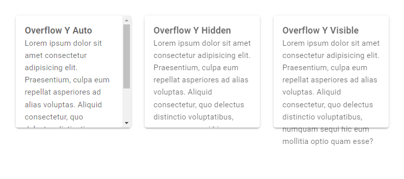
Vuetify Overflow Y Classes

  • overflow-y-auto: adds scrollbars to an element when its content overflows it bounds in the vertical direction.
  • overflow-y-hidden: clips content that overflows the bounds of its container in the vertical direction.
  • overflow-y-visible: allows content to be rendered outside the bounds of its container in the vertical direction.
<template>
  <v-app>
    <v-row class="ma-4">
      <v-col cols="4">
        <v-card
          class="overflow-y-auto"
          height="200"
        >
          <v-card-text>
            <h3>Overflow Y Auto</h3>
            Lorem ipsum dolor sit amet consectetur
            adipisicing elit. Praesentium, culpa eum
            repellat asperiores ad alias voluptas. Aliquid
            consectetur, quo delectus distinctio
            voluptatibus, numquam sequi hic eum mollitia
            optio quam esse?
          </v-card-text>
        </v-card>
      </v-col>
      <v-col cols="4">
        <v-card
          class="overflow-y-hidden"
          height="200"
        >
          <v-card-text>
            <h3>Overflow Y Hidden</h3>
            Lorem ipsum dolor sit amet consectetur
            adipisicing elit. Praesentium, culpa eum
            repellat asperiores ad alias voluptas. Aliquid
            consectetur, quo delectus distinctio
            voluptatibus, numquam sequi hic eum mollitia
            optio quam esse?
          </v-card-text>
        </v-card>
      </v-col>
      <v-col cols="4">
        <v-card
          class="overflow-y-visible"
          height="200"
        >
          <v-card-text>
            <h3>Overflow Y Visible</h3>
            Lorem ipsum dolor sit amet consectetur
            adipisicing elit. Praesentium, culpa eum
            repellat asperiores ad alias voluptas. Aliquid
            consectetur, quo delectus distinctio
            voluptatibus, numquam sequi hic eum mollitia
            optio quam esse?
          </v-card-text>
        </v-card>
      </v-col>
    </v-row>
  </v-app>
</template>

<script>
export default {
  name: 'App',
};
</script>
Using the Vuetify overflow Y helpers for the vertical direction.

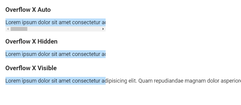
Vuetify Overflow X Classes

  • overflow-x-auto: adds scrollbars to an element when its content overflows it bounds in the horizontal direction.
  • overflow-x-hidden: clips content that overflows the bounds of its container in the horizontal direction.
  • overflow-x-visible: allows content to be rendered outside the bounds of its container in the horizontal direction.
<template>
  <v-app>
    <div style="width: 300px;white-space:nowrap" class="ma-4">
      <h3 class="mb-3">Overflow X Auto</h3>
      <p class="overflow-x-auto blue lighten-4">
        Lorem ipsum dolor sit amet consectetur adipisicing elit. Quam repudiandae magnam dolor asperiores nisi officia, necessitatibus, ex alias consequuntur ullam qui optio, obcaecati minima modi quaerat explicabo. Quia, ipsa minus.
      </p>
      <h3 class="mb-3">Overflow X Hidden</h3>
      <p class="overflow-x-hidden blue lighten-4">
        Lorem ipsum dolor sit amet consectetur adipisicing elit. Quam repudiandae magnam dolor asperiores nisi officia, necessitatibus, ex alias consequuntur ullam qui optio, obcaecati minima modi quaerat explicabo. Quia, ipsa minus.
      </p>
      <h3 class="mb-3">Overflow X Visible</h3>
      <p class="overflow-x-visible blue lighten-4">
        Lorem ipsum dolor sit amet consectetur adipisicing elit. Quam repudiandae magnam dolor asperiores nisi officia, necessitatibus, ex alias consequuntur ullam qui optio, obcaecati minima modi quaerat explicabo. Quia, ipsa minus.
      </p>
    </div>
  </v-app>
</template>

<script>
export default {
  name: 'App',
};
</script>
Using the Vuetify overflow X helpers for the horizontal direction.

Conclusion

We can use the overflow helper classes from Vuetify to control what happens to content that overflows the bounds of its container in the vertical or horizontal direction.

How to Create a Calendar With Vuetify

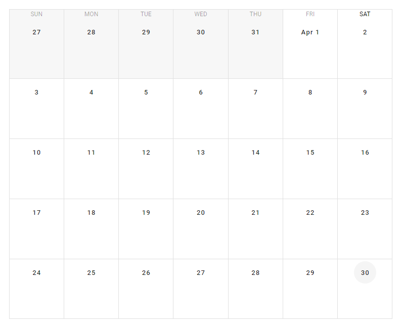
In this article, we’ll learn about the Vuetify calendar component and its various props and slots for creating and customizing calendars that can display events and other time-related information in various ways.

The Vuetify calendar component (v-calendar)

Vuetify provides the v-calendar component for displaying a calendar.

App.vue
<template> <v-app> <div class="ma-4" style="height: 100%" > <v-calendar></v-calendar> </div> </v-app> </template> <script> export default { name: 'App', }; </script> 
Displaying a calendar with the Vuetify calendar component.

Vuetify calendar events

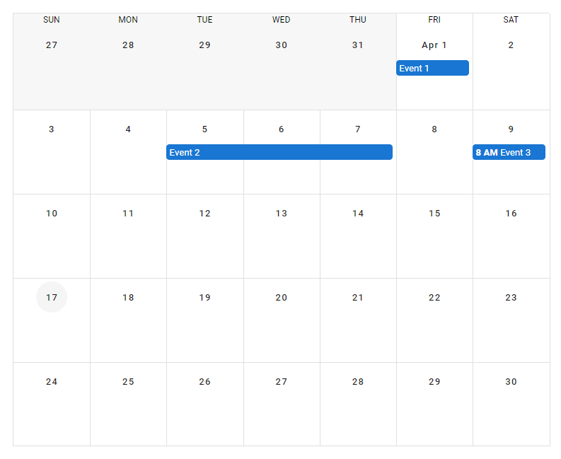
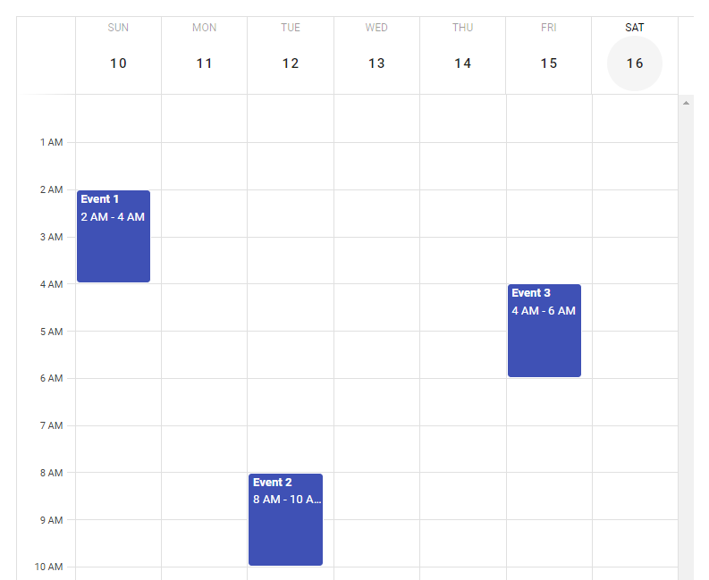
We can display events in the calendar with the events prop. This property takes an array with each element representing one event. Each item in the array is an object that has a number of properties, including:

  • name: sets the name of the event.
  • start: sets the start date of the event.
  • end: sets the end date of the event.
  • timed: specifies whether the event has a defined time range or not.
App.vue
<template> <v-app> <div class="ma-4" style="height: 100%" > <v-calendar :events="events" now="2022-04-17" ></v-calendar> </div> </v-app> </template> <script> export default { name: 'App', data: () => { return { events: [ { name: 'Event 1', start: '2022-04-01', timed: false, }, { name: 'Event 2', start: '2022-04-05', end: '2022-04-07', }, { name: 'Event 3', start: '2022-04-09T08:00:00', end: '2022-04-09T10:00:00', timed: true, }, ], }; }, }; </script> 
Using the events prop of the Vuetify calendar component.

Vuetify calendar colors

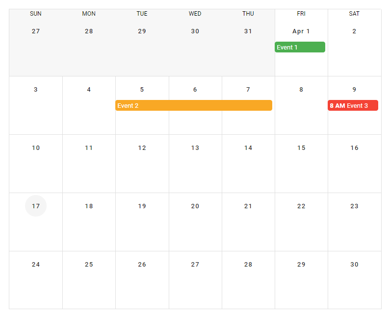
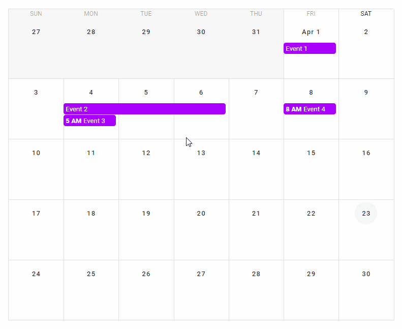
The v-calendar component provides various ways of customizing the colors of its different parts. For example, we can set the color of a single event by passing a value to the color property of the object representing the event:

App.vue
<template> <v-app> <div class="ma-4" style="height: 100%" > <v-calendar :events="events" now="2022-04-17" ></v-calendar> </div> </v-app> </template> <script> export default { name: 'App', data: () => { return { events: [ { name: 'Event 1', start: '2022-04-01', timed: false, color: 'green', }, { name: 'Event 2', start: '2022-04-05', end: '2022-04-07', color: 'yellow darken-3', }, { name: 'Event 3', start: '2022-04-09T08:00:00', end: '2022-04-09T10:00:00', timed: true, color: 'red', }, ], }; }, }; </script> 
Customizing event colors on the Vuetify calendar component.

event-color and color props

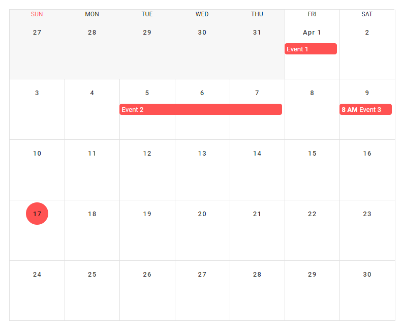
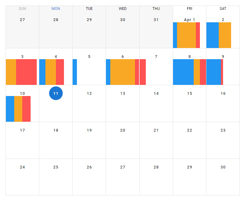
We can also the event-color prop to set the color of all events without a specified color. The color prop of v-calendar sets the color of the circle that indicates the current date in the calendar, and the color of the current day of the week.

App.vue
<template> <v-app> <div class="ma-4" style="height: 100%" > <v-calendar :events="events" now="2022-04-17" event-color="red accent-2" color="red accent-2" > </v-calendar> </div> </v-app> </template> <script> export default { name: 'App', data: () => { return { events: [ { name: 'Event 1', start: '2022-04-01', timed: false, }, { name: 'Event 2', start: '2022-04-05', end: '2022-04-07', }, { name: 'Event 3', start: '2022-04-09T08:00:00', end: '2022-04-09T10:00:00', timed: true, }, ], }; }, }; </script> 
Using the event-color and color props of the Vuetify calendar component.

Vuetify calendar day view

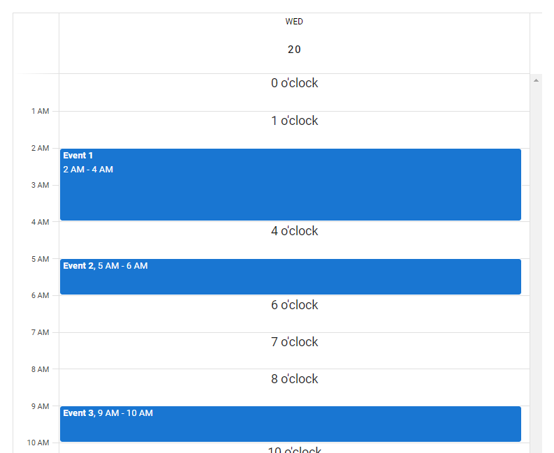
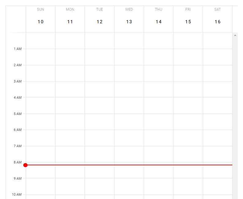
By default, the calendar component displays information for each month. We can customize the view the calendar shows with the type prop. We can display information just for a particular day by setting type to day:

JavaScript
<template> <v-app> <div class="ma-4" style="height: 100%" > <v-calendar :events="events" now="2022-04-17" value="2022-04-20" type="day" ></v-calendar> </div> </v-app> </template> <script> export default { name: 'App', data: () => { return { events: [ { name: 'Event 1', start: '2022-04-20T02:00:00', end: '2022-04-20T04:00:00', timed: true, }, { name: 'Event 2', start: '2022-04-20T05:00:00', end: '2022-04-20T06:00:00', timed: true, }, { name: 'Event 3', start: '2022-04-20T09:00:00', end: '2022-04-20T10:00:00', timed: true, }, ], }; }, }; </script> 
Displaying the day view of the Vuetify calendar component.

Calendar day view slots

day-header and interval

There are various slots of the v-calendar component that we use to customize how the calendar displays in the day view. We can use the day-header slot to customize the content that is placed in the top container in the day view. We also have the interval slot, for customizing the content that is placed in the interval space in the day view.

App.vue
<template> <v-app> <div class="ma-4" style="height: 100%" > <v-calendar :events="events" now="2022-04-17" value="2022-04-20" type="day" > <template v-slot:day-header="{ present }"> <div v-if="present" class="text-center" > Today </div> </template> <template v-slot:interval="{ hour }"> <div class="text-center">{{ hour }} o'clock</div> </template> </v-calendar> </div> </v-app> </template> <script> export default { name: 'App', data: () => { return { events: [ { name: 'Event 1', start: '2022-04-20T02:00:00', end: '2022-04-20T04:00:00', timed: true, }, { name: 'Event 2', start: '2022-04-20T05:00:00', end: '2022-04-20T06:00:00', timed: true, }, { name: 'Event 3', start: '2022-04-20T09:00:00', end: '2022-04-20T10:00:00', timed: true, }, ], }; }, }; </script> 
Using the day-header and the interval slots of the Vuetify calendar component.

day-body

The day-body slot allows us to customize the content in the scrollable interval container in the day view of the calendar.

App.vue
<template> <v-app> <div class="ma-4" style="height: 100%" > <v-calendar ref="calendar" type="week" value="2022-04-13" > <template v-slot:day-body="{ date, week }"> <div class="current-time" :class="{ first: date === week[0].date }" :style="{ top: nowY }" ></div> </template> </v-calendar> </div> </v-app> </template> <script> export default { name: 'App', data: () => ({ ready: false, }), computed: { cal() { return this.ready ? this.$refs.calendar : null; }, nowY() { return this.cal ? this.cal.timeToY({ hour: 8, minute: 10 }) + 'px' : '-10px'; }, }, mounted() { this.ready = true; this.scrollToTime(); this.updateTime(); }, methods: { getCurrentTime() { return this.cal ? this.cal.times.now.hour * 60 + this.cal.times.now.minute : 0; }, scrollToTime() { const time = this.getCurrentTime(); const first = Math.max(0, time - (time % 30) - 30); this.cal.scrollToTime(first); }, updateTime() { setInterval(() => this.cal.updateTimes(), 60 * 1000); }, }, }; </script> <style lang="scss"> .current-time { height: 2px; background-color: red; position: absolute; left: -1px; right: 0; pointer-events: none; &.first::before { content: ''; position: absolute; background-color: red; width: 12px; height: 12px; border-radius: 50%; margin-top: -5px; margin-left: -6.5px; } } </style> 
Using the day-body slot of the Vuetify calendar component.

Calendar week view

We can set the type prop to week to make the calendar display information only for a particular week:

App.vue
<template> <v-app> <div class="ma-4" style="height: 100%" > <v-calendar :events="events" type="week" event-color="indigo" value="2022-04-16" now="2022-04-16" > </v-calendar> </div> </v-app> </template> <script> export default { name: 'App', data: () => { return { events: [ { name: 'Event 1', start: '2022-04-10T02:00:00', end: '2022-04-10T04:00:00', timed: true, }, { name: 'Event 2', start: '2022-04-12T08:00:00', end: '2022-04-12T10:00:00', timed: true, }, { name: 'Event 3', start: '2022-04-15T04:00:00', end: '2022-04-15T06:00:00', timed: true, }, ], }; }, }; </script> 
Displaying the week view of the Vuetify calendar component.

Vuetify calendar click events

v-calendar comes with certain click events that we can use to add interactivity to the calendar. For example, we can listen for the @click:day event to perform an action when the user clicks a day in the calendar. Similarly, we can listen for the @click:event event to perform an action when the user clicks on an event in the calendar. We use both click events in the code example below.

App.vue
<template> <v-app> <div class="ma-4" style="height: 100%" > <!-- Event details menu --> <v-menu v-model="selectedOpen" :close-on-content-click="false" :activator="selectedElement" offset-x > <v-card min-width="200px"> <v-toolbar color="purple accent-4" dark > <v-toolbar-title> {{ selectedEvent.name }} </v-toolbar-title> </v-toolbar> <v-card-text> <div class="text-center"> {{ selectedEventStart }} to {{ selectedEventEnd }} </div> <v-checkbox readonly label="All day" :value="!selectedEvent.timed" > </v-checkbox> </v-card-text> </v-card> </v-menu> <v-calendar :events="events" event-color="purple accent-4" @click:day="viewDay" @click:event="showEvent" v-model="focus" :type="type" now="2022-04-23" ></v-calendar> </div> </v-app> </template> <script> import { format } from 'date-fns'; export default { name: 'App', data: () => { return { focus: '', type: 'month', selectedOpen: false, selectedElement: undefined, selectedEvent: {}, events: [ { name: 'Event 1', start: '2022-04-01', timed: false, }, { name: 'Event 2', start: '2022-04-04', end: '2022-04-06', }, { name: 'Event 3', start: '2022-04-04T05:00:00', end: '2022-04-04T07:00:00', timed: true, }, { name: 'Event 4', start: '2022-04-08T08:00:00', end: '2022-04-08T10:00:00', timed: true, }, ], }; }, methods: { viewDay({ date }) { this.focus = date; this.type = 'day'; }, showEvent({ nativeEvent, event }) { const open = () => { this.selectedEvent = event; this.selectedElement = nativeEvent.target; requestAnimationFrame(() => requestAnimationFrame( () => (this.selectedOpen = true) ) ); }; if (this.selectedOpen) { this.selectedOpen = false; requestAnimationFrame(() => requestAnimationFrame(() => open()) ); } else { open(); } nativeEvent.stopPropagation(); }, }, computed: { selectedEventStart() { return ( (this.selectedEvent && this.selectedEvent.start && format( new Date(this.selectedEvent.start), 'h:mm a' )) || '12:00 AM' ); }, selectedEventEnd() { return ( (this.selectedEvent && this.selectedEvent.end && format( new Date(this.selectedEvent.end), 'h:mm a' )) || '12:00 AM' ); }, }, }; </script> 

The calendar starts out in the month view. When the user clicks a day, we change the calendar to the day view:

Using the @click:day event to add interactivity to the Vuetify calendar component.

We also created a menu that will display information about an event when the user clicks it in the day or month view:

Using the @click:event event to add interactivity to the Vuetify calendar component.

Custom calendar buttons

Calendar day slot

We can use the day slot of v-calendar to customize how a day is displayed in the week or month view. In the example below, we use this slot to create a calendar that displays the percentage of a day that was used for activities of a certain category.

App.vue
<template> <v-app> <div class="ma-4" style="height: 100%" > <v-calendar :now="today" :value="today" color="primary" > <template v-slot:day="{ past, date }"> <v-row class="fill-height"> <template v-if="past && tracked[date]"> <v-sheet v-for="(percent, i) in tracked[date]" :key="i" :title="category[i]" :color="colors[i]" :width="`${percent}%`" height="100%" tile ></v-sheet> </template> </v-row> </template> </v-calendar> </div> </v-app> </template> <script> export default { name: 'App', data: () => ({ today: '2022-04-11', tracked: { '2022-04-01': [20, 45, 10], '2022-04-02': [40, 30, 0], '2022-04-03': [10, 25, 50], '2022-04-04': [25, 25, 20], '2022-04-05': [20], '2022-04-06': [20, 60, 10], '2022-04-07': [0, 0, 25], '2022-04-08': [60, 15, 20], '2022-04-09': [45, 0, 5], '2022-04-10': [30, 20, 20], }, colors: ['blue', 'yellow darken-3', 'red accent-2'], category: ['Category 1', 'Category 2', 'Category 3'], }), }; </script> 
Using the day slot of the Vuetify calendar component.

Conclusion

We can use the Vuetify calendar component (v-calendar) to create a calendar that displays events and other information for our application. This component comes with various props and slots that we can use to easily customize its appearance and behavior.