Vuetify provides a wide range of built-in transitions we can apply to various elements to produce smooth animations that improve the user experience. We can use a transition by setting the transition prop on supported components, or wrapping the component in a transition component like v-expand-transition.
Vuetify Expand Transition
To apply the expand transition to an element, we wrap it in a v-expand-transition component. This transition is used in expansion panels and list groups.
<template>
  <v-app>
    <div class="text-center ma-4">
      <v-btn
        dark
        color="primary"
        @click="expand = !expand"
      >
        Expand Transition
      </v-btn>
      <v-expand-transition>
        <v-card
          v-show="expand"
          height="100"
          width="100"
          class="blue mx-auto mt-4"
        ></v-card>
      </v-expand-transition>
    </div>
  </v-app>
</template>

<script>
export default {
  data() {
    return {
      expand: false,
    };
  },
};
</script>

Expand X Transition
We can use v-expand-x-transition in place of v-expand-transition to apply the horizontal version of the expand transition.
<template>
  <v-app>
    <div class="text-center ma-4">
      <v-btn
        dark
        color="primary"
        @click="expand = !expand"
      >
        Expand X Transition
      </v-btn>
      <v-expand-x-transition>
        <v-card
          v-show="expand"
          height="100"
          width="100"
          class="blue mx-auto mt-4"
        ></v-card>
      </v-expand-x-transition>
    </div>
  </v-app>
</template>

<script>
export default {
  data() {
    return {
      expand: false,
    };
  },
};
</script>

Vuetify FAB Transition
We can see an FAB transition in action when working with the v-speed-dial component. The target element rotates and scales up into view.
<template>
  <v-app>
    <div class="text-center ma-4">
      <v-menu transition="fab-transition">
        <template v-slot:activator="{ on, attrs }">
          <v-btn
            dark
            color="primary"
            v-bind="attrs"
            v-on="on"
          >
            Fab Transition
          </v-btn>
        </template>
        <v-list>
          <v-list-item
            v-for="n in 5"
            :key="n"
          >
            <v-list-item-title
              v-text="'Item ' + n"
            ></v-list-item-title>
          </v-list-item>
        </v-list>
      </v-menu>
    </div>
  </v-app>
</template>

Fade Transition
A fade transition acts on the opacity of the target element. We can create one by setting transition to fade-transition.
<template>
  <v-app>
    <div class="text-center ma-4">
      <v-menu transition="fade-transition">
        <template v-slot:activator="{ on, attrs }">
          <v-btn
            dark
            color="primary"
            v-bind="attrs"
            v-on="on"
          >
            Fade Transition
          </v-btn>
        </template>
        <v-list>
          <v-list-item
            v-for="n in 5"
            :key="n"
          >
            <v-list-item-title
              v-text="'Item ' + n"
            ></v-list-item-title>
          </v-list-item>
        </v-list>
      </v-menu>
    </div>
  </v-app>
</template>

Vuetify Scale Transition
Scale transitions act on the width and height of the target element. We can create them by setting transition to scale-transition.
<template>
  <v-app>
    <div class="text-center ma-4">
      <v-menu transition="scale-transition">
        <template v-slot:activator="{ on, attrs }">
          <v-btn
            dark
            color="primary"
            v-bind="attrs"
            v-on="on"
          >
            Scale Transition
          </v-btn>
        </template>
        <v-list>
          <v-list-item
            v-for="n in 5"
            :key="n"
          >
            <v-list-item-title
              v-text="'Item ' + n"
            ></v-list-item-title>
          </v-list-item>
        </v-list>
      </v-menu>
    </div>
  </v-app>
</template>

Transition Origin
Components like v-menu have an origin prop that allows us to specify the point from which a transition should start. For example, we can make the scale transition start from the center point of both the x-axis and y-axis:
<template>
  <v-app>
    <div class="text-center ma-4">
      <v-menu
        transition="scale-transition"
        origin="center center"
      >
        <template v-slot:activator="{ on, attrs }">
          <v-btn
            dark
            color="primary"
            v-bind="attrs"
            v-on="on"
          >
            Scale Transition
          </v-btn>
        </template>
        <v-list>
          <v-list-item
            v-for="n in 5"
            :key="n"
            @click="() => {}"
          >
            <v-list-item-title
              v-text="'Item ' + n"
            ></v-list-item-title>
          </v-list-item>
        </v-list>
      </v-menu>
    </div>
  </v-app>
</template>

Vuetify Scroll X Transition
Scroll X transitions work with both the opacity and horizontal position of the target element. It fades in while also moving along the x-axis.
<template>
  <v-app>
    <div class="text-center ma-4">
      <v-menu transition="scroll-x-transition">
        <template v-slot:activator="{ on, attrs }">
          <v-btn
            dark
            color="primary"
            v-bind="attrs"
            v-on="on"
          >
            Scroll X Transition
          </v-btn>
        </template>
        <v-list>
          <v-list-item
            v-for="n in 5"
            :key="n"
          >
            <v-list-item-title
              v-text="'Item ' + n"
            ></v-list-item-title>
          </v-list-item>
        </v-list>
      </v-menu>
    </div>
  </v-app>
</template>

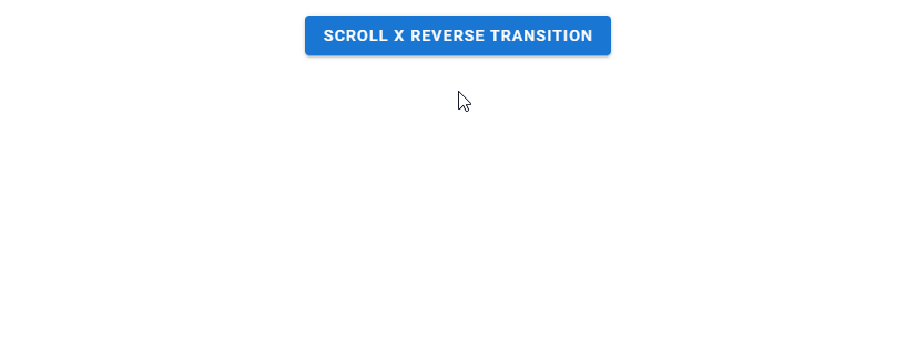
Scroll X Reverse Transition
A reverse scroll x transition makes the element slide in from the right.
<template>
  <v-app>
    <div class="text-center ma-4">
      <v-menu transition="scroll-x-reverse-transition">
        <template v-slot:activator="{ on, attrs }">
          <v-btn
            dark
            color="primary"
            v-bind="attrs"
            v-on="on"
          >
            Scroll X Reverse Transition
          </v-btn>
        </template>
        <v-list>
          <v-list-item
            v-for="n in 5"
            :key="n"
          >
            <v-list-item-title
              v-text="'Item ' + n"
            ></v-list-item-title>
          </v-list-item>
        </v-list>
      </v-menu>
    </div>
  </v-app>
</template>
Vuetify Scroll Y Transition
Scroll y transitions work similarly to scroll x transitions, but they act on the vertical position of the element instead.
<template>
  <v-app>
    <div class="text-center ma-4">
      <v-menu transition="scroll-y-transition">
        <template v-slot:activator="{ on, attrs }">
          <v-btn
            dark
            color="primary"
            v-bind="attrs"
            v-on="on"
          >
            Scroll Y Transition
          </v-btn>
        </template>
        <v-list>
          <v-list-item
            v-for="n in 5"
            :key="n"
          >
            <v-list-item-title
              v-text="'Item ' + n"
            ></v-list-item-title>
          </v-list-item>
        </v-list>
      </v-menu>
    </div>
  </v-app>
</template>

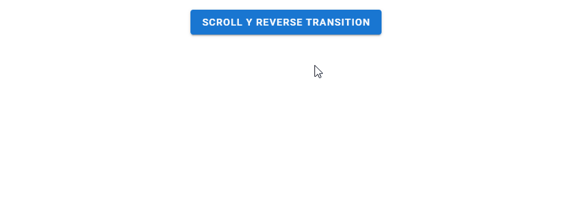
Scroll Y Reverse Transition
Reverse scroll y transitions make the element slide in from the bottom.
<template>
  <v-app>
    <div class="text-center ma-4">
      <v-menu transition="scroll-y-reverse-transition">
        <template v-slot:activator="{ on, attrs }">
          <v-btn
            dark
            color="primary"
            v-bind="attrs"
            v-on="on"
          >
            Scroll Y Reverse Transition
          </v-btn>
        </template>
        <v-list>
          <v-list-item
            v-for="n in 5"
            :key="n"
          >
            <v-list-item-title
              v-text="'Item ' + n"
            ></v-list-item-title>
          </v-list-item>
        </v-list>
      </v-menu>
    </div>
  </v-app>
</template>
Vuetify Slide X Transition
A slide x transition makes the element fade in while also sliding in along the x-axis. Unlike a scroll transition, the element slides out in the same direction it slid in from when closed.
<template>
  <v-app>
    <div class="text-center ma-4">
      <v-menu transition="slide-x-transition">
        <template v-slot:activator="{ on, attrs }">
          <v-btn
            dark
            color="primary"
            v-bind="attrs"
            v-on="on"
          >
            Slide X Transition
          </v-btn>
        </template>
        <v-list>
          <v-list-item
            v-for="n in 5"
            :key="n"
          >
            <v-list-item-title
              v-text="'Item ' + n"
            ></v-list-item-title>
          </v-list-item>
        </v-list>
      </v-menu>
    </div>
  </v-app>
</template>

Slide X Reverse Transition
Reverse slide x transitions make the element slide in from the right.
<template>
  <v-app>
    <div class="text-center ma-4">
      <v-menu transition="slide-x-reverse-transition">
        <template v-slot:activator="{ on, attrs }">
          <v-btn
            dark
            color="primary"
            v-bind="attrs"
            v-on="on"
          >
            Slide X Reverse Transition
          </v-btn>
        </template>
        <v-list>
          <v-list-item
            v-for="n in 5"
            :key="n"
          >
            <v-list-item-title
              v-text="'Item ' + n"
            ></v-list-item-title>
          </v-list-item>
        </v-list>
      </v-menu>
    </div>
  </v-app>
</template>

Vuetify Slide Y Transition
Slide y transitions work like slide x transitions, but they move the element along the y-axis instead.
<template>
  <v-app>
    <div class="text-center ma-4">
      <v-menu transition="slide-y-transition">
        <template v-slot:activator="{ on, attrs }">
          <v-btn
            dark
            color="primary"
            v-bind="attrs"
            v-on="on"
          >
            Slide Y Transition
          </v-btn>
        </template>
        <v-list>
          <v-list-item
            v-for="n in 5"
            :key="n"
          >
            <v-list-item-title
              v-text="'Item ' + n"
            ></v-list-item-title>
          </v-list-item>
        </v-list>
      </v-menu>
    </div>
  </v-app>
</template>

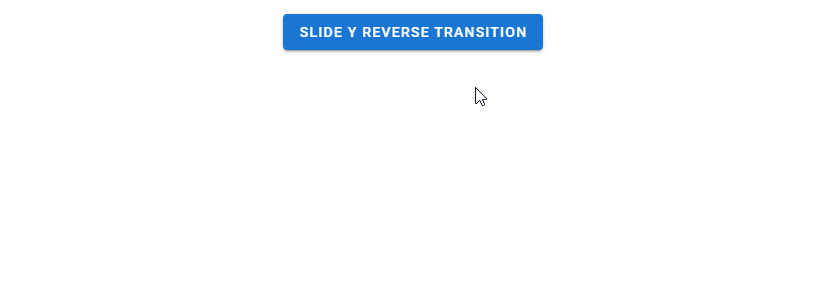
Slide Y Reverse Transition
A reverse slide y transition makes the element slide in from the bottom.
<template>
  <v-app>
    <div class="text-center ma-4">
      <v-menu transition="slide-y-reverse-transition">
        <template v-slot:activator="{ on, attrs }">
          <v-btn
            dark
            color="primary"
            v-bind="attrs"
            v-on="on"
          >
            Slide Y Reverse Transition
          </v-btn>
        </template>
        <v-list>
          <v-list-item
            v-for="n in 5"
            :key="n"
          >
            <v-list-item-title
              v-text="'Item ' + n"
            ></v-list-item-title>
          </v-list-item>
        </v-list>
      </v-menu>
    </div>
  </v-app>
</template>
Conclusion
Vuetify comes with a built-in transition system that allows us to easily create smooth animations without writing our own CSS. We can scale, fade or translate a UI element with the various transitions available.
11 Amazing New JavaScript Features in ES13
This guide will bring you up to speed with all the latest features added in ECMAScript 13. These powerful new features will modernize your JavaScript with shorter and more expressive code.
