A menu is a versatile component in a user interface. It shows a popover that can serve various functions, such as displaying a list of options. They can be used with other components like a toolbar, app bar, or a button. In this article, we’re to learn how to create and customize a menu in Vuetify.
The v-menu Component
Vuetify provides the v-menu component for creating a menu. We use the activator slot to set the component that will activate the menu when clicked. We set it to a button in this example:
<template>
  <v-app>
    <div class="text-center ma-4">
      <v-menu offset-y>
        <template v-slot:activator="{ on, attrs }">
          <v-btn color="primary" dark v-bind="attrs" v-on="on">
            Dropdown
          </v-btn>
        </template>
        <v-list>
          <v-list-item v-for="index in 4" :key="index">
            <v-list-item-title>Item {{ index }}</v-list-item-title>
          </v-list-item>
        </v-list>
      </v-menu>
    </div>
  </v-app>
</template>

<script>
export default {
  name: 'App',
};
</script>
Clicking the button will display the popover menu:

Creating an Absolute Menu in Vuetify
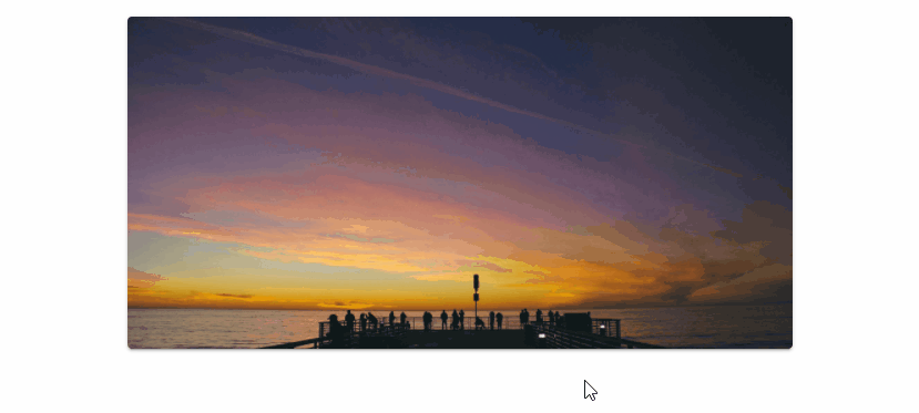
We can place a menu on the top of the element in the activator slot with the absolute prop.
<template>
  <v-app>
    <div class="d-flex justify-center ma-4">
      <v-menu offset-y absolute>
        <template v-slot:activator="{ on, attrs }">
          <v-card
            class="portrait"
            img="https://picsum.photos/1920/1080?random"
            height="300"
            width="600"
            v-bind="attrs"
            v-on="on"
          ></v-card>
        </template>
        <v-list>
          <v-list-item v-for="index in 4" :key="index">
            <v-list-item-title>Item {{ index }}</v-list-item-title>
          </v-list-item>
        </v-list>
      </v-menu>
    </div>
  </v-app>
</template>

<script>
export default {
  name: 'App',
};
</script>

Absolute Menu without Activator
We can also use a menu without an activator by using absolute together with the position-x and position-y props. This is useful for creating a context menu:
<template>
  <v-app>
    <div>
      <div class="d-flex justify-center ma-4">
        <v-card
          :ripple="false"
          class="portrait"
          img="https://picsum.photos/1920/1080?random"
          height="300"
          width="600"
          @contextmenu="show"
        ></v-card>
      </div>
      <v-menu
        v-model="showMenu"
        :position-x="x"
        :position-y="y"
        absolute
        offset-y
      >
        <v-list>
          <v-list-item v-for="index in 4" :key="index">
            <v-list-item-title>Option {{ index }}</v-list-item-title>
          </v-list-item>
        </v-list>
      </v-menu>
    </div>
  </v-app>
</template>

<script>
export default {
  name: 'App',
  data: () => ({
    showMenu: false,
    x: 0,
    y: 0,
  }),

  methods: {
    show(e) {
      e.preventDefault();
      this.showMenu = false;
      this.x = e.clientX;
      this.y = e.clientY;
      this.$nextTick(() => {
        this.showMenu = true;
      });
    },
  },
};
</script>
Closing the Menu on Click
The close-on-click prop determines whether the menu closes when it loses focus or not.
<template>
  <v-app>
    <div class="text-center ma-4">
      <v-menu offset-y :close-on-click="true">
        <template v-slot:activator="{ on, attrs }">
          <v-btn color="primary" dark v-bind="attrs" v-on="on">
            Dropdown
          </v-btn>
        </template>
        <v-list>
          <v-list-item v-for="index in 4" :key="index">
            <v-list-item-title>Item {{ index }}</v-list-item-title>
          </v-list-item>
        </v-list>
      </v-menu>
    </div>
  </v-app>
</template>

<script>
export default {
  name: 'App',
};
</script>
Here close-on-click is set to true, so clicking on another element will close the menu:

If we set it to false:
<template>
  <v-app>
    <div class="text-center ma-4">
      <v-menu offset-y :close-on-click="false">
        <template v-slot:activator="{ on, attrs }">
          <v-btn color="primary" dark v-bind="attrs" v-on="on">
            Dropdown
          </v-btn>
        </template>
        <v-list>
          <v-list-item v-for="index in 4" :key="index">
            <v-list-item-title>Item {{ index }}</v-list-item-title>
          </v-list-item>
        </v-list>
      </v-menu>
    </div>
  </v-app>
</template>

<script>
export default {
  name: 'App',
};
</script>
It will remain open even when we click on another element or remove its focus:

Close Menu on Content Click
We can use the close-on-content-click prop to determine whether the menu should be closed when its content is clicked.
Setting close-on-content-click to true:
<template>
  <v-app>
    <div class="text-center ma-4">
      <v-menu offset-y :close-on-content-click="true">
        <template v-slot:activator="{ on, attrs }">
          <v-btn color="purple accent-4" dark v-bind="attrs" v-on="on">
            Dropdown
          </v-btn>
        </template>
        <v-list>
          <v-list-item v-for="index in 4" :key="index">
            <v-list-item-title>Item {{ index }}</v-list-item-title>
          </v-list-item>
        </v-list>
      </v-menu>
    </div>
  </v-app>
</template>

<script>
export default {
  name: 'App',
};
</script>

Setting close-on-content-click to false:
<template>
  <v-app>
    <div class="text-center ma-4">
      <v-menu offset-y :close-on-content-click="false">
        <template v-slot:activator="{ on, attrs }">
          <v-btn color="purple accent-4" dark v-bind="attrs" v-on="on">
            Dropdown
          </v-btn>
        </template>
        <v-list>
          <v-list-item v-for="index in 4" :key="index">
            <v-list-item-title>Item {{ index }}</v-list-item-title>
          </v-list-item>
        </v-list>
      </v-menu>
    </div>
  </v-app>
</template>

<script>
export default {
  name: 'App',
};
</script>

Disabled Menu
We can prevent a menu from being opened with the disabled prop:
<template>
  <v-app>
    <div class="text-center ma-4">
      <v-menu offset-y disabled>
        <template v-slot:activator="{ on, attrs }">
          <v-btn color="green" dark v-bind="attrs" v-on="on"> Dropdown </v-btn>
        </template>
        <v-list>
          <v-list-item v-for="index in 4" :key="index">
            <v-list-item-title>Item {{ index }}</v-list-item-title>
          </v-list-item>
        </v-list>
      </v-menu>
    </div>
  </v-app>
</template>

<script>
export default {
  name: 'App',
};
</script>

Menu Offset
Offset X
We can use the offset-x prop to offset the menu by the X-axis to make the activator visible.
<template>
  <v-app>
    <div class="text-center ma-4">
      <v-menu offset-x>
        <template v-slot:activator="{ on, attrs }">
          <v-btn color="primary" dark v-bind="attrs" v-on="on">
            Dropdown
          </v-btn>
        </template>
        <v-list>
          <v-list-item v-for="index in 4" :key="index">
            <v-list-item-title>Item {{ index }}</v-list-item-title>
          </v-list-item>
        </v-list>
      </v-menu>
    </div>
  </v-app>
</template>

<script>
export default {
  name: 'App',
};
</script>

Offset Y
We can also offset the menu by the Y-axis to make the activator visible.
<template>
  <v-app>
    <div class="text-center ma-4">
      <v-menu offset-y>
        <template v-slot:activator="{ on, attrs }">
          <v-btn color="primary" dark v-bind="attrs" v-on="on">
            Dropdown
          </v-btn>
        </template>
        <v-list>
          <v-list-item v-for="index in 4" :key="index">
            <v-list-item-title>Item {{ index }}</v-list-item-title>
          </v-list-item>
        </v-list>
      </v-menu>
    </div>
  </v-app>
</template>

<script>
export default {
  name: 'App',
};
</script>

Offset X and Offset Y
We can also combine these two props:
<template>
  <v-app>
    <div class="text-center ma-4">
      <v-menu offset-x offset-y>
        <template v-slot:activator="{ on, attrs }">
          <v-btn color="primary" dark v-bind="attrs" v-on="on">
            Dropdown
          </v-btn>
        </template>
        <v-list>
          <v-list-item v-for="index in 4" :key="index">
            <v-list-item-title>Item {{ index }}</v-list-item-title>
          </v-list-item>
        </v-list>
      </v-menu>
    </div>
  </v-app>
</template>

<script>
export default {
  name: 'App',
};
</script>

Open Menu on Hover
Setting the open-on-hover prop to true will make the menu open when its activator is hovered over.
<template>
  <v-app>
    <div class="text-center ma-4">
      <v-menu open-on-hover offset-y>
        <template v-slot:activator="{ on, attrs }">
          <v-btn color="teal" dark v-bind="attrs" v-on="on"> Dropdown </v-btn>
        </template>
        <v-list>
          <v-list-item v-for="index in 4" :key="index">
            <v-list-item-title>Item {{ index }}</v-list-item-title>
          </v-list-item>
        </v-list>
      </v-menu>
    </div>
  </v-app>
</template>

<script>
export default {
  name: 'App',
};
</script>

Creating a Rounded Menu in Vuetify
The rounded prop allows us to customize the border-radius of a menu.
Setting it to 0 will remove the border-radius:
<template>
  <v-app>
    <div class="text-center ma-4">
      <v-menu offset-y rounded="0">
        <template v-slot:activator="{ on, attrs }">
          <v-btn color="blue" dark v-bind="attrs" v-on="on">
            Removed Radius
          </v-btn>
        </template>
        <v-list>
          <v-list-item v-for="index in 4" :key="index">
            <v-list-item-title>Item {{ index }}</v-list-item-title>
          </v-list-item>
        </v-list>
      </v-menu>
    </div>
  </v-app>
</template>

<script>
export default {
  name: 'App',
};
</script>

We can give the menu a large border-radius by setting rounded to true:
<template>
  <v-app>
    <div class="text-center ma-4">
      <v-menu offset-y rounded="lg">
        <template v-slot:activator="{ on, attrs }">
          <v-btn color="indigo" dark v-bind="attrs" v-on="on">
            Large Radius</v-btn
          >
        </template>
        <v-list>
          <v-list-item v-for="index in 4" :key="index">
            <v-list-item-title>Item {{ index }}</v-list-item-title>
          </v-list-item>
        </v-list>
      </v-menu>
    </div>
  </v-app>
</template>

<script>
export default {
  name: 'App',
};
</script>

We can also specify a custom border-radius, for example:
<template>
  <v-app>
    <div class="text-center ma-4">
      <v-menu offset-y rounded="b-xl">
        <template v-slot:activator="{ on, attrs }">
          <v-btn color="red" dark v-bind="attrs" v-on="on">
            Custom Radius</v-btn
          >
        </template>
        <v-list>
          <v-list-item v-for="index in 4" :key="index">
            <v-list-item-title>Item {{ index }}</v-list-item-title>
          </v-list-item>
        </v-list>
      </v-menu>
    </div>
  </v-app>
</template>

<script>
export default {
  name: 'App',
};
</script>

Using a Menu with a Tooltip
We can also display a tooltip for a menu. We do this by nesting activator slots with the v-slot syntax and attaching the props of the slots to the same activator component (a button in this case).
<template>
  <v-app>
    <div class="text-center ma-4">
      <v-menu>
        <template v-slot:activator="{ on: menu, attrs }">
          <v-tooltip bottom>
            <template v-slot:activator="{ on: tooltip }">
              <v-btn
                color="primary"
                dark
                v-bind="attrs"
                v-on="{ ...tooltip, ...menu }"
              >
                Dropdown w/ Tooltip</v-btn
              >
            </template>
            <span>This is a tooltip</span>
          </v-tooltip>
        </template>
        <v-list>
          <v-list-item v-for="index in 4" :key="index">
            <v-list-item-title>Item {{ index }}</v-list-item-title>
          </v-list-item>
        </v-list>
      </v-menu>
    </div>
  </v-app>
</template>

<script>
export default {
  name: 'App',
};
</script>

Custom Menu Transitions in Vuetify
We can also customize the transition that the menu will use to open and close. Vuetify comes with three standard transitions: scale, slide-x and slide-y.
Scale Transition
The scale-transition makes the menu grow in size when opening, and shrink back when closing:
<template>
  <v-app>
    <div class="text-center ma-4">
      <v-menu transition="scale-transition" origin="center center" bottom>
        <template v-slot:activator="{ on, attrs }">
          <v-btn color="primary" dark v-bind="attrs" v-on="on">
            Scale Transition</v-btn
          >
        </template>
        <v-list>
          <v-list-item v-for="index in 4" :key="index">
            <v-list-item-title>Item {{ index }}</v-list-item-title>
          </v-list-item>
        </v-list>
      </v-menu>
    </div>
  </v-app>
</template>

<script>
export default {
  name: 'App',
};
</script>

Slide X Transition
The slide-x-transition makes the menu slide in from the left when opening, and slide back out when closing:
<template>
  <v-app>
    <div class="text-center ma-4">
      <v-menu transition="slide-x-transition" bottom right>
        <template v-slot:activator="{ on, attrs }">
          <v-btn color="primary" dark v-bind="attrs" v-on="on">
            Slide X Transition</v-btn
          >
        </template>
        <v-list>
          <v-list-item v-for="index in 4" :key="index">
            <v-list-item-title>Item {{ index }}</v-list-item-title>
          </v-list-item>
        </v-list>
      </v-menu>
    </div>
  </v-app>
</template>

<script>
export default {
  name: 'App',
};
</script>

Slide Y Transition
The slide-y-transition makes the menu slide in from the top when opening, and slide back out when closing:
<template>
  <v-app>
    <div class="text-center ma-4">
      <v-menu transition="slide-y-transition" bottom>
        <template v-slot:activator="{ on, attrs }">
          <v-btn color="primary" dark v-bind="attrs" v-on="on">
            Slide X Transition</v-btn
          >
        </template>
        <v-list>
          <v-list-item v-for="index in 4" :key="index">
            <v-list-item-title>Item {{ index }}</v-list-item-title>
          </v-list-item>
        </v-list>
      </v-menu>
    </div>
  </v-app>
</template>

<script>
export default {
  name: 'App',
};
</script>

Using a Menu with an App Bar
We can use a menu with a toolbar or app bar:
<template>
  <v-app>
    <v-app-bar app color="deep-purple accent-4" dark>
      <v-app-bar-nav-icon> </v-app-bar-nav-icon>
      <v-toolbar-title>Coding Beauty</v-toolbar-title>
      <v-spacer></v-spacer>
      <v-btn icon> <v-icon> mdi-heart </v-icon> </v-btn>
      <v-btn icon>
        <v-icon>mdi-magnify</v-icon>
      </v-btn>
      <v-menu left bottom>
        <template v-slot:activator="{ on, attrs }">
          <v-btn icon v-bind="attrs" v-on="on">
            <v-icon>mdi-dots-vertical</v-icon>
          </v-btn>
        </template>

        <v-list>
          <v-list-item v-for="n in 4" :key="n" @click="() => {}">
            Option {{ n }}
          </v-list-item>
        </v-list>
      </v-menu>
    </v-app-bar>
  </v-app>
</template>

<script>
export default {
  name: 'App',
};
</script>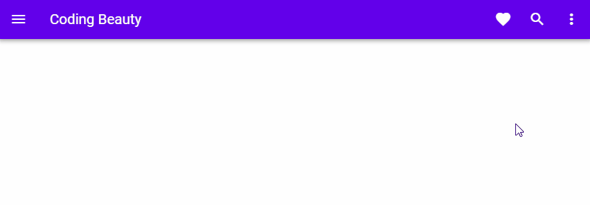
Conclusion
A menu is a versatile user interface component in a user interface that shows a popover that we can use for a variety of purposes. It can work with a button, a toolbar or an app bar. Vuetify provides the v-menu component for creating and customizing menus.
Every Crazy Thing JavaScript Does
A captivating guide to the subtle caveats and lesser-known parts of JavaScript.
