
An app bar is an important part of every user interface and is typically the primary source of site navigation. Like a toolbar, it is displayed at the top of the screen and can be combined with a navigation drawer or tabs. In this article, we’re going to learn how to create and customize app bars with Vuetify.
The v-app-bar Component
Vuetify provides the v-app-bar component for creating app bars. We use the app prop on the component to make Vuetify consider the app bar when dynamically sizing other components, such as v-main.
<template>
  <v-app>
    <v-app-bar app></v-app-bar>
  </v-app>
</template>

<script>
export default {
  name: 'App',
};
</script>
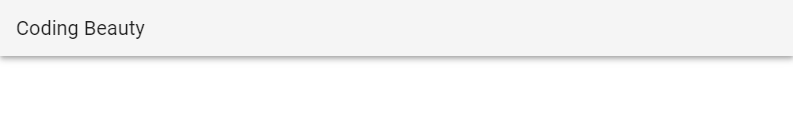
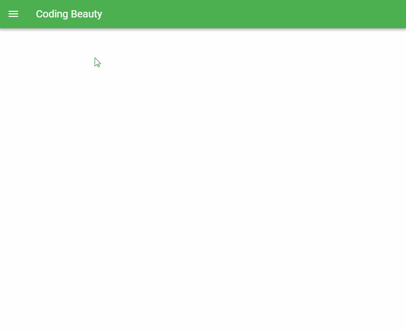
App Bar Title
We can use the v-toolbar-title component to set the app bar title.
<template>
  <v-app>
    <v-app-bar app>
      <v-toolbar-title>Coding Beauty</v-toolbar-title>
    </v-app-bar>
  </v-app>
</template>

<script>
export default {
  name: 'App',
};
</script>
Note: While we could use the v-app-bar-title component to set the app bar title, the Vuetify team does not recommend using it without the shrink-on-scroll prop (discussed later in this article), as it would add an unnecessary resize watcher and additional calculations.
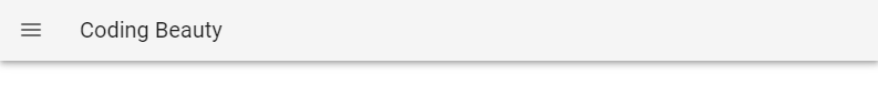
App Bar Nav Icon
v-app-bar-nav-icon is a styled icon button component created specifically for use with a toolbar or app bar. An app bar nav icon is typically placed on the left side of the toolbar or app bar as a hamburger menu, and is often used to control the state of a navigation drawer. We can customize the icon and function of this component with the default slot.
<template>
  <v-app>
    <v-app-bar app>
      <v-app-bar-nav-icon> </v-app-bar-nav-icon>
      <v-toolbar-title>Coding Beauty</v-app-bar-title>
    </v-app-bar>
  </v-app>
</template>

<script>
export default {
  name: 'App',
};
</script>
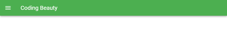
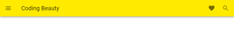
App Bar Colors
The app bar component comes with the color prop for customizing the color of the app bar. The dark prop makes the color of the text white
<template>
  <v-app>
    <v-app-bar app color="green" dark>
      <v-app-bar-nav-icon> </v-app-bar-nav-icon>
      <v-app-bar-title>Coding Beauty</v-app-bar-title>
    </v-app-bar>
  </v-app>
</template>

<script>
export default {
  name: 'App',
};
</script>
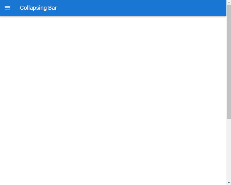
Collapsed App Bar
Setting the collapse prop to true on the v-app-bar will collapse the app bar at all times:
<template>
  <v-app>
    <v-app-bar app color="primary" dark collapse>
      <v-app-bar-nav-icon> </v-app-bar-nav-icon>
      <v-app-bar-title>Collapsing Bar</v-app-bar-title>
    </v-app-bar>
  </v-app>
</template>

<script>
export default {
  name: 'App',
};
</script>

Collapse on Scroll
We can decide to use the collapse-on-scroll prop to collapse the app bar only when the user scrolls.
<template>
  <v-app>
    <v-app-bar app color="primary" dark collapse-on-scroll>
      <v-app-bar-nav-icon> </v-app-bar-nav-icon>
      <v-toolbar-title>Collapsing Bar</v-toolbar-title>
    </v-app-bar>
    <v-sheet>
      <v-container style="height: 1000px"> </v-container>
    </v-sheet>
  </v-app>
</template>

<script>
export default {
  name: 'App',
};
</script>
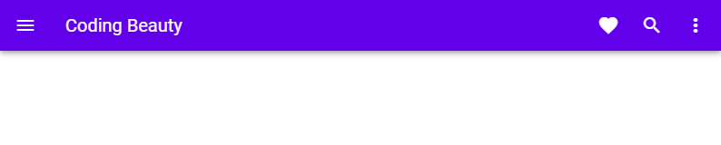
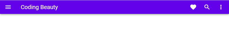
App Bar Actions
We can add functionality to the app bar that we want to be easily accessible to the user with icon buttons.
<template>
  <v-app>
    <v-app-bar app color="yellow accent-3">
      <v-app-bar-nav-icon> </v-app-bar-nav-icon>
      <v-toolbar-title>Coding Beauty</v-toolbar-title>
      <v-spacer></v-spacer>
      <v-btn icon> <v-icon> mdi-heart </v-icon> </v-btn>
      <v-btn icon>
        <v-icon>mdi-magnify</v-icon>
      </v-btn>
    </v-app-bar>
  </v-app>
</template>

<script>
export default {
  name: 'App',
};
</script>
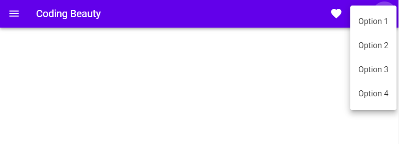
App Bar Menu
We can also extend the functionality of the app bar with a menu component (v-menu).
<template>
  <v-app>
    <v-app-bar app color="deep-purple accent-4" dark>
      <v-app-bar-nav-icon> </v-app-bar-nav-icon>
      <v-toolbar-title>Coding Beauty</v-toolbar-title>
      <v-spacer></v-spacer>
      <v-btn icon> <v-icon> mdi-heart </v-icon> </v-btn>
      <v-btn icon>
        <v-icon>mdi-magnify</v-icon>
      </v-btn>
      <v-menu left bottom>
        <template v-slot:activator="{ on, attrs }">
          <v-btn icon v-bind="attrs" v-on="on">
            <v-icon>mdi-dots-vertical</v-icon>
          </v-btn>
        </template>

        <v-list>
          <v-list-item v-for="n in 4" :key="n" @click="() => {}">
            Option {{ n }}
          </v-list-item>
        </v-list>
      </v-menu>
    </v-app-bar>
  </v-app>
</template>

<script>
export default {
  name: 'App',
};
</script>
Clicking the menu icon button will display the popup containing the options we added:
Dense App Bar
We can use the dense prop to make an app bar dense. A dense app bar has a lower height than a regular one.
<template>
  <v-app>
    <v-app-bar app color="deep-purple accent-4" dark dense>
      <v-app-bar-nav-icon> </v-app-bar-nav-icon>
      <v-toolbar-title>Coding Beauty</v-toolbar-title>
      <v-spacer></v-spacer>
      <v-btn icon> <v-icon> mdi-heart </v-icon> </v-btn>
      <v-btn icon>
        <v-icon>mdi-magnify</v-icon>
      </v-btn>
      <v-menu left bottom>
        <template v-slot:activator="{ on, attrs }">
          <v-btn icon v-bind="attrs" v-on="on">
            <v-icon>mdi-dots-vertical</v-icon>
          </v-btn>
        </template>

        <v-list>
          <v-list-item v-for="n in 4" :key="n" @click="() => {}">
            Option {{ n }}
          </v-list-item>
        </v-list>
      </v-menu>
    </v-app-bar>
  </v-app>
</template>

<script>
export default {
  name: 'App',
};
</script>
Elevate on Scroll
When we set the elevate-on-scroll prop to true, the app bar will rest at an elevation of 0dp until the user begins to scroll down. The elevation raises to 4dp once scrolling begins.
<template>
  <v-app>
    <v-app-bar app color="white" elevate-on-scroll>
      <v-app-bar-nav-icon> </v-app-bar-nav-icon>
      <v-toolbar-title>Coding Beauty</v-toolbar-title>
      <v-spacer></v-spacer>
      <v-btn icon> <v-icon> mdi-heart </v-icon> </v-btn>
      <v-btn icon>
        <v-icon>mdi-magnify</v-icon>
      </v-btn>
      <v-menu left bottom>
        <template v-slot:activator="{ on, attrs }">
          <v-btn icon v-bind="attrs" v-on="on">
            <v-icon>mdi-dots-vertical</v-icon>
          </v-btn>
        </template>

        <v-list>
          <v-list-item v-for="n in 4" :key="n" @click="() => {}">
            Option {{ n }}
          </v-list-item>
        </v-list>
      </v-menu>
    </v-app-bar>
    <v-sheet>
      <v-container style="height: 1000px"> </v-container>
    </v-sheet>
  </v-app>
</template>

<script>
export default {
  name: 'App',
};
</script>
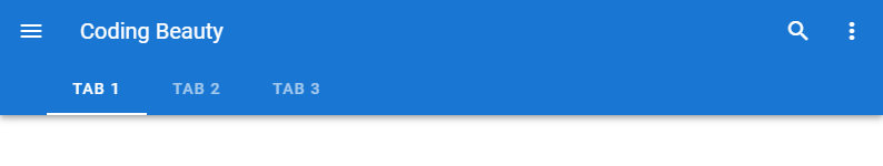
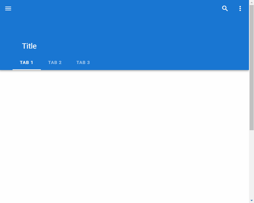
Extending the App Bar with Tabs
We can extend the app bar with tabs by including the tabs in the extension slot of v-app-bar:
<template>
  <v-app>
    <v-app-bar app color="primary" dark>
      <v-app-bar-nav-icon> </v-app-bar-nav-icon>
      <v-toolbar-title>Coding Beauty</v-toolbar-title>
      <v-spacer></v-spacer>
      <v-btn icon>
        <v-icon>mdi-magnify</v-icon>
      </v-btn>
      <v-menu left bottom>
        <template v-slot:activator="{ on, attrs }">
          <v-btn icon v-bind="attrs" v-on="on">
            <v-icon>mdi-dots-vertical</v-icon>
          </v-btn>
        </template>
      </v-menu>

      <template v-slot:extension>
        <v-tabs align-with-title>
          <v-tab>Tab 1</v-tab>
          <v-tab>Tab 2</v-tab>
          <v-tab>Tab 3</v-tab>
        </v-tabs>
      </template>
    </v-app-bar>
  </v-app>
</template>

<script>
export default {
  name: 'App',
};
</script>
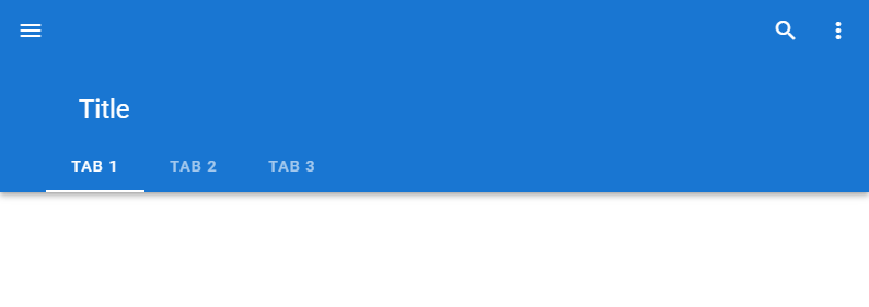
Prominent App Bar
Setting the prominent prop to true will increase its height.
<template>
  <v-app>
    <v-app-bar app color="primary" dark prominent>
      <v-app-bar-nav-icon> </v-app-bar-nav-icon>
      <v-toolbar-title>Title</v-toolbar-title>
      <v-spacer></v-spacer>
      <v-btn icon>
        <v-icon>mdi-magnify</v-icon>
      </v-btn>
      <v-menu left bottom>
        <template v-slot:activator="{ on, attrs }">
          <v-btn icon v-bind="attrs" v-on="on">
            <v-icon>mdi-dots-vertical</v-icon>
          </v-btn>
        </template>
      </v-menu>

      <template v-slot:extension>
        <v-tabs align-with-title>
          <v-tab>Tab 1</v-tab>
          <v-tab>Tab 2</v-tab>
          <v-tab>Tab 3</v-tab>
        </v-tabs>
      </template>
    </v-app-bar>
  </v-app>
</template>

<script>
export default {
  name: 'App',
};
</script>
Shrink on Scroll
With the shrink-on-scroll prop, we can a prominent app bar reduce in height as the user scrolls down. This allows for a smooth transition to taking up less visual space when the user is scrolling through content.
<template>
  <v-app>
    <v-app-bar app color="primary" dark prominent shrink-on-scroll>
      <v-app-bar-nav-icon> </v-app-bar-nav-icon>
      <v-toolbar-title>Title</v-toolbar-title>
      <v-spacer></v-spacer>
      <v-btn icon>
        <v-icon>mdi-magnify</v-icon>
      </v-btn>
      <v-menu left bottom>
        <template v-slot:activator="{ on, attrs }">
          <v-btn icon v-bind="attrs" v-on="on">
            <v-icon>mdi-dots-vertical</v-icon>
          </v-btn>
        </template>
      </v-menu>

      <template v-slot:extension>
        <v-tabs align-with-title>
          <v-tab>Tab 1</v-tab>
          <v-tab>Tab 2</v-tab>
          <v-tab>Tab 3</v-tab>
        </v-tabs>
      </template>
    </v-app-bar>
    <v-sheet>
      <v-container style="height: 1000px"></v-container>
    </v-sheet>
  </v-app>
</template>

<script>
export default {
  name: 'App',
};
</script>
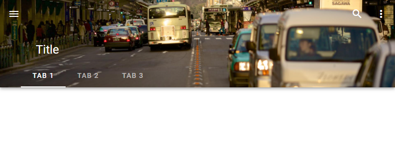
App Bar Images
We can display background images on the app bar with the src prop. When we set an image, the color prop acts as a fallback color that the app bar will display when the image has not yet loaded or fails to load.
<template>
  <v-app>
    <v-app-bar
      app
      color="primary"
      dark
      prominent
      src="https://picsum.photos/1920/1080?random"
    >
      <v-app-bar-nav-icon> </v-app-bar-nav-icon>
      <v-toolbar-title>Title</v-toolbar-title>
      <v-spacer></v-spacer>
      <v-btn icon>
        <v-icon>mdi-magnify</v-icon>
      </v-btn>
      <v-menu left bottom>
        <template v-slot:activator="{ on, attrs }">
          <v-btn icon v-bind="attrs" v-on="on">
            <v-icon>mdi-dots-vertical</v-icon>
          </v-btn>
        </template>
      </v-menu>

      <template v-slot:extension>
        <v-tabs align-with-title>
          <v-tab>Tab 1</v-tab>
          <v-tab>Tab 2</v-tab>
          <v-tab>Tab 3</v-tab>
        </v-tabs>
      </template>
    </v-app-bar>
  </v-app>
</template>

<script>
export default {
  name: 'App',
};
</script>
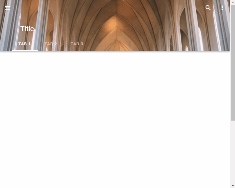
Fade Image on Scroll
We might want to make the background image on the app bar fade as the user scrolls down. We can do this with the fade-img-on-scroll prop. As we scroll, the image reduces in opacity until it totally fades away and we can only see the background color.
<template>
  <v-app>
    <v-app-bar
      app
      color="grey"
      dark
      prominent
      src="https://picsum.photos/1920/1080?random"
      fade-img-on-scroll
    >
      <v-app-bar-nav-icon> </v-app-bar-nav-icon>
      <v-app-bar-title>Title</v-app-bar-title>
      <v-spacer></v-spacer>
      <v-btn icon>
        <v-icon>mdi-magnify</v-icon>
      </v-btn>
      <v-menu left bottom>
        <template v-slot:activator="{ on, attrs }">
          <v-btn icon v-bind="attrs" v-on="on">
            <v-icon>mdi-dots-vertical</v-icon>
          </v-btn>
        </template>
      </v-menu>

      <template v-slot:extension>
        <v-tabs align-with-title>
          <v-tab>Tab 1</v-tab>
          <v-tab>Tab 2</v-tab>
          <v-tab>Tab 3</v-tab>
        </v-tabs>
      </template>
    </v-app-bar>
    <v-sheet>
      <v-container style="height: 1000px"> </v-container>
    </v-sheet>
  </v-app>
</template>

<script>
export default {
  name: 'App',
};
</script>
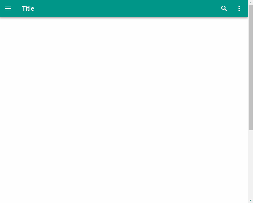
Hide on Scroll
We can hide the app bar when the user starts to scroll with the hide-on-scroll prop.
<template>
  <v-app>
    <v-app-bar app color="teal" dark hide-on-scroll>
      <v-app-bar-nav-icon> </v-app-bar-nav-icon>
      <v-app-bar-title>Title</v-app-bar-title>
      <v-spacer></v-spacer>
      <v-btn icon>
        <v-icon>mdi-magnify</v-icon>
      </v-btn>
      <v-menu left bottom>
        <template v-slot:activator="{ on, attrs }">
          <v-btn icon v-bind="attrs" v-on="on">
            <v-icon>mdi-dots-vertical</v-icon>
          </v-btn>
        </template>
      </v-menu>
    </v-app-bar>
    <v-sheet>
      <v-container style="height: 1000px"> </v-container>
    </v-sheet>
  </v-app>
</template>

<script>
export default {
  name: 'App',
};
</script>
Inverted Scroll
When the inverted-scroll prop is set to true, the app bar will hide until the user scrolls past the designated threshold. Once past the threshold, the app bar will continue to display until the user scrolls up past the threshold. If the scroll-treshold prop is not set, a default value of 0 will be used.
<template>
  <v-app>
    <v-app-bar app color="primary" dark inverted-scroll>
      <v-app-bar-nav-icon> </v-app-bar-nav-icon>
      <v-app-bar-title>Coding Beauty</v-app-bar-title>
      <v-spacer></v-spacer>
      <v-btn icon>
        <v-icon>mdi-magnify</v-icon>
      </v-btn>
      <v-menu left bottom>
        <template v-slot:activator="{ on, attrs }">
          <v-btn icon v-bind="attrs" v-on="on">
            <v-icon>mdi-dots-vertical</v-icon>
          </v-btn>
        </template>
      </v-menu>
    </v-app-bar>
    <v-sheet>
      <v-container style="height: 1000px"> </v-container>
    </v-sheet>
  </v-app>
</template>

<script>
export default {
  name: 'App',
};
</script>
Using an App Bar with a Navigation Drawer
We can add a navigation drawer to our user interface and use the functional v-nav-bar-icon component on the app bar to toggle its visibility.
<template>
  <v-app>
    <v-app-bar app color="green" dark>
      <v-app-bar-nav-icon @click="drawer = true"> </v-app-bar-nav-icon>
      <v-toolbar-title>Coding Beauty</v-toolbar-title>
    </v-app-bar>
    <v-navigation-drawer v-model="drawer" absolute temporary>
      <v-list nav dense>
        <v-list-item-group
          v-model="group"
          active-class="deep-purple--text text--accent-4"
        >
          <v-list-item>
            <v-list-item-icon>
              <v-icon>mdi-home</v-icon>
            </v-list-item-icon>
            <v-list-item-title>Home</v-list-item-title>
          </v-list-item>

          <v-list-item>
            <v-list-item-icon>
              <v-icon>mdi-account</v-icon>
            </v-list-item-icon>
            <v-list-item-title>Account</v-list-item-title>
          </v-list-item>
        </v-list-item-group>
      </v-list>
    </v-navigation-drawer>
  </v-app>
</template>

<script>
export default {
  name: 'App',
  data: () => ({
    drawer: false,
    group: null,
  }),
};
</script>
Conclusion
We can add an app bar to a user interface for quick and easy navigation. Vuetify provides the v-app-bar component for creating and customizing the behaviour and appearance of an app bar.
Every Crazy Thing JavaScript Does
A captivating guide to the subtle caveats and lesser-known parts of JavaScript.

Don’t know if this is a typo or things have changed, but in the “App Bar Images” section the v-app-bar uses an “image” prop, not a “src” prop. And when requiring a local image “require()” is not needed:
Thank you for letting us know. Indeed, things have changed in Vuetify 3, we’ll update the article to reflect these changes 👍