A toolbar is a common way of allowing navigation across a web application. In this article, we’ll learn how to create and customize toolbars with the Vuetify toolbar component.
The Toolbar Component (v-toolbar)
Vuetify provides the v-toolbar component for creating a toolbar:
<template>
  <v-app>
    <v-toolbar class="flex-grow-0"> </v-toolbar>
  </v-app>
</template>

<script>
export default {
  name: 'App',
};
</script>
We use the flex-grow-0 flex helper on the toolbar to prevent it from covering half of the screen.
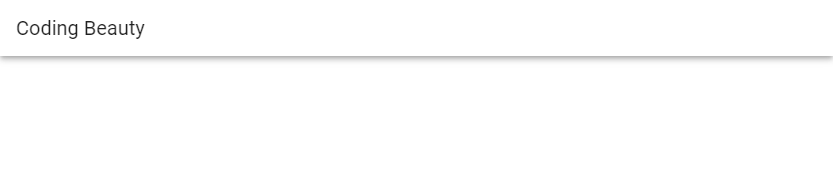
Vuetify Toolbar Title
We can use the v-toolbar-title component inside the v-toolbar to set the title of a toolbar. For example:
<template>
  <v-app>
    <v-toolbar class="flex-grow-0">
      <v-toolbar-title>Coding Beauty</v-toolbar-title>
    </v-toolbar>
  </v-app>
</template>

<script>
export default {
  name: 'App',
};
</script>
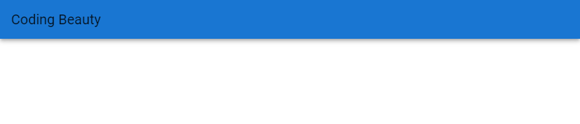
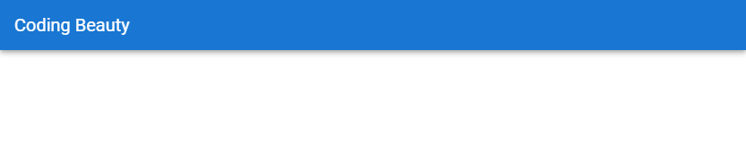
Vuetify Toolbar Colors
We can use the color prop of v-toolbar to customize the color of the toolbar.
<template>
  <v-app>
    <v-toolbar
      class="flex-grow-0"
      color="primary"
    >
      <v-toolbar-title>Coding Beauty</v-toolbar-title>
    </v-toolbar>
  </v-app>
</template>

<script>
export default {
  name: 'App',
};
</script>
Vuetify Toolbar Dark
Apply the dark property to the toolbar component will make text on the toolbar white, instead of black. This can help to create a great color contrast between the text and the background.
<template>
  <v-app>
    <v-toolbar
      class="flex-grow-0"
      color="primary"
      dark
    >
      <v-toolbar-title>Coding Beauty</v-toolbar-title>
    </v-toolbar>
  </v-app>
</template>

<script>
export default {
  name: 'App',
};
</script>
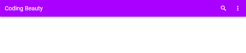
Vuetify Toolbar Actions
We can add functionality to a toolbar by placing buttons on it. In the example below, we add two icon buttons to the toolbar – one to search and another to display a menu containing more options.
<template>
  <v-app>
    <v-toolbar
      class="flex-grow-0"
      color="purple accent-4"
      dark
    >
      <v-toolbar-title>Coding Beauty</v-toolbar-title>
      <v-spacer></v-spacer>
      <v-btn icon>
        <v-icon>mdi-magnify</v-icon>
      </v-btn>

      <v-btn icon>
        <v-icon>mdi-dots-vertical</v-icon>
      </v-btn>
    </v-toolbar>
  </v-app>
</template>

<script>
export default {
  name: 'App',
};
</script>
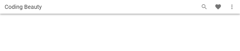
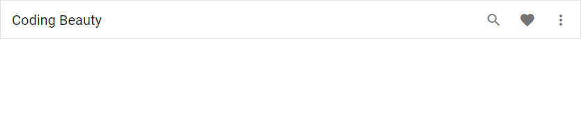
Vuetify Toolbar Dense
Setting the dense prop to true on the v-toolbar component will make it more compact:
<template>
  <v-app>
    <v-toolbar
      class="flex-grow-0"
      color="white"
      dense
    >
      <v-toolbar-title>Coding Beauty</v-toolbar-title>
      <v-spacer></v-spacer>
      <v-btn icon>
        <v-icon>mdi-magnify</v-icon>
      </v-btn>

      <v-btn icon>
        <v-icon>mdi-heart</v-icon>
      </v-btn>

      <v-btn icon>
        <v-icon>mdi-dots-vertical</v-icon>
      </v-btn>
    </v-toolbar>
  </v-app>
</template>

<script>
export default {
  name: 'App',
};
</script>
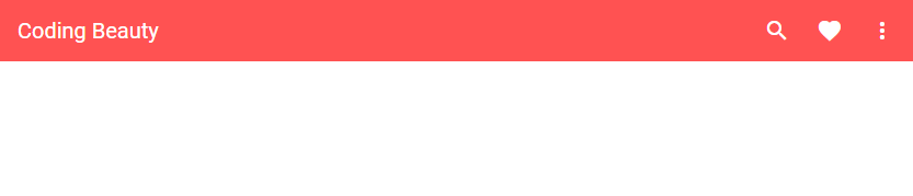
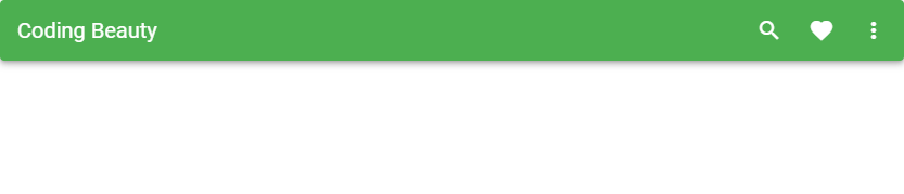
Vuetify Toolbar Flat
We can remove toolbar elevation with the flat property:
<template>
  <v-app>
    <v-toolbar
      class="flex-grow-0"
      color="red accent-2"
      dark
      flat
    >
      <v-toolbar-title>Coding Beauty</v-toolbar-title>
      <v-spacer></v-spacer>
      <v-btn icon>
        <v-icon>mdi-magnify</v-icon>
      </v-btn>

      <v-btn icon>
        <v-icon>mdi-heart</v-icon>
      </v-btn>

      <v-btn icon>
        <v-icon>mdi-dots-vertical</v-icon>
      </v-btn>
    </v-toolbar>
  </v-app>
</template>

<script>
export default {
  name: 'App',
};
</script>
Vuetify Toolbar Outlined
The outlined prop adds an outline around the toolbar.
<template>
  <v-app>
    <v-toolbar
      class="flex-grow-0"
      flat
      outlined
    >
      <v-toolbar-title>Coding Beauty</v-toolbar-title>
      <v-spacer></v-spacer>
      <v-btn icon>
        <v-icon>mdi-magnify</v-icon>
      </v-btn>

      <v-btn icon>
        <v-icon>mdi-heart</v-icon>
      </v-btn>

      <v-btn icon>
        <v-icon>mdi-dots-vertical</v-icon>
      </v-btn>
    </v-toolbar>
  </v-app>
</template>

<script>
export default {
  name: 'App',
};
</script>
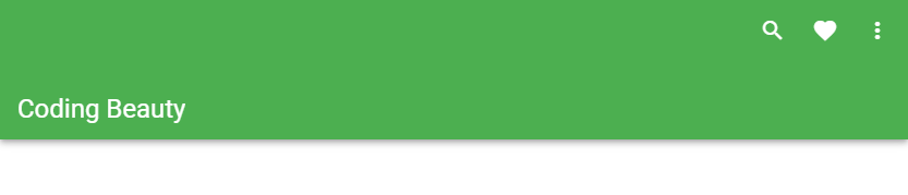
Prominent Toolbar
With the prominent prop, we can create a toolbar with an increased height of 128px. A prominent toolbar has its title positioned towards the bottom of its container.
<template>
  <v-app>
    <v-toolbar
      class="flex-grow-0"
      dark
      color="green"
      prominent
    >
      <v-toolbar-title>Coding Beauty</v-toolbar-title>
      <v-spacer></v-spacer>
      <v-btn icon>
        <v-icon>mdi-magnify</v-icon>
      </v-btn>

      <v-btn icon>
        <v-icon>mdi-heart</v-icon>
      </v-btn>

      <v-btn icon>
        <v-icon>mdi-dots-vertical</v-icon>
      </v-btn>
    </v-toolbar>
  </v-app>
</template>

<script>
export default {
  name: 'App',
};
</script>
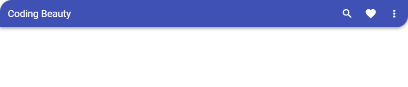
Vuetify Toolbar Rounded
Setting the rounded prop to true on v-toolbar will add make the corners of the toolbar rounded
<template>
  <v-app>
    <v-toolbar
      class="flex-grow-0"
      dark
      color="green"
      rounded
    >
      <v-toolbar-title>Coding Beauty</v-toolbar-title>
      <v-spacer></v-spacer>
      <v-btn icon>
        <v-icon>mdi-magnify</v-icon>
      </v-btn>

      <v-btn icon>
        <v-icon>mdi-heart</v-icon>
      </v-btn>

      <v-btn icon>
        <v-icon>mdi-dots-vertical</v-icon>
      </v-btn>
    </v-toolbar>
  </v-app>
</template>

<script>
export default {
  name: 'App',
};
</script>
Vuetify Toolbar Shaped
We can use the shaped prop to create a toolbar with the top-left and bottom-right corners rounded.
<template>
  <v-app>
    <v-toolbar
      class="flex-grow-0"
      dark
      color="indigo"
      shaped
    >
      <v-toolbar-title>Coding Beauty</v-toolbar-title>
      <v-spacer></v-spacer>
      <v-btn icon>
        <v-icon>mdi-magnify</v-icon>
      </v-btn>

      <v-btn icon>
        <v-icon>mdi-heart</v-icon>
      </v-btn>

      <v-btn icon>
        <v-icon>mdi-dots-vertical</v-icon>
      </v-btn>
    </v-toolbar>
  </v-app>
</template>

<script>
export default {
  name: 'App',
};
</script>
Conclusion
A toolbar is a user interface element used for site and app navigation. We can use the Vuetify toolbar component (v-toolbar) and its various props to create and customize toolbars.
Every Crazy Thing JavaScript Does
A captivating guide to the subtle caveats and lesser-known parts of JavaScript.
