Icons are useful for conveying information to the user in a concise manner. They add more context to various aspects of our web apps. In this article, we’ll learn how to show icons in our apps to users with the Material Design framework.
The v-icon Component
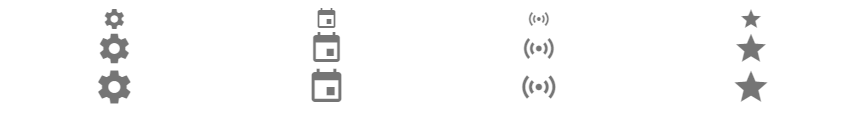
Vuetify provides the v-icon component for displaying icons. This component provides a large set of glyphs. The list of all available icons is at the official Material Design Icons page. To use an icon in this list, we simply use the mdi- prefix followed by the icon name.
<template>
  <v-app>
    <v-col class="ma-2">
      <v-row justify="space-around">
        <v-icon>mdi-cog</v-icon>
        <v-icon> mdi-calendar</v-icon>
        <v-icon> mdi-access-point </v-icon>
        <v-icon> mdi-star </v-icon>
      </v-row>
    </v-col>
  </v-app>
</template>

<script>
export default {
  name: 'App',
};
</script>
Customizing Icon Sizes in Vuetify
With the x-small, small, medium, large and x-large props, we can customize the icon sizes:
<template>
  <v-app>
    <v-col class="ma-2">
      <v-row justify="space-around">
        <v-icon> mdi-cog</v-icon>
        <v-icon> mdi-calendar</v-icon>
        <v-icon> mdi-access-point </v-icon>
        <v-icon> mdi-star </v-icon>
      </v-row>
      <v-row justify="space-around">
        <v-icon large> mdi-cog</v-icon>
        <v-icon large> mdi-calendar</v-icon>
        <v-icon large> mdi-access-point </v-icon>
        <v-icon large> mdi-star </v-icon>
      </v-row>
      <v-row justify="space-around">
        <v-icon x-large> mdi-cog</v-icon>
        <v-icon x-large> mdi-calendar</v-icon>
        <v-icon x-large> mdi-access-point </v-icon>
        <v-icon x-large> mdi-star </v-icon>
      </v-row>
    </v-col>
  </v-app>
</template>

<script>
export default {
  name: 'App',
};
</script>
Customizing Icon Colors in Vuetify
We can change the color of icons in Vuetify from the standard light and dark themes using the color prop:
<template>
  <v-app>
    <v-col class="ma-2">
      <v-row justify="space-around">
        <v-icon color="black">mdi-cog</v-icon>
        <v-icon color="primary"> mdi-calendar</v-icon>
        <v-icon color="red"> mdi-heart </v-icon>
        <v-icon color="yellow"> mdi-star </v-icon>
      </v-row>
    </v-col>
  </v-app>
</template>

<script>
export default {
  name: 'App',
};
</script>

Icon Click Events in Vuetify
We can bind click events to the icon component to enable interactivity. For example:
<template>
  <v-app>
    <v-col class="ma-2">
      <v-row justify="center">
        <v-icon :color="liked ? 'red' : 'grey'" @click="liked = !liked">
          mdi-heart
        </v-icon>
      </v-row>
    </v-col>
  </v-app>
</template>

<script>
export default {
  name: 'App',
  data: () => ({
    liked: false,
  }),
};
</script>

When the user selects the heart icon, the color changes:

Placing Icons in Buttons
We can use icons inside of buttons to add more visual emphasis to the action the button performs:
<template>
  <v-app>
    <div class="ma-2 d-flex justify-space-around">
      <v-btn color="green" dark>
        Accept <v-icon right>mdi-checkbox-marked-circle</v-icon>
      </v-btn>
      <v-btn color="red" dark>
        Decline <v-icon right>mdi-cancel</v-icon>
      </v-btn>
    </div>
  </v-app>
</template>

<script>
export default {
  name: 'App',
  data: () => ({
    liked: false,
  }),
};
</script>

Displaying Font Awesome Icons
Vuetify supports icons from Font Awesome. After including the Font Awesome icons in your project, you can show an icon with its fa- prefixed icon name:
<template>
  <v-app>
    <v-row align="start" justify="space-around" class="ma-4">
      <v-icon>fas fa-lock</v-icon>
      <v-icon>fas fa-search</v-icon>
      <v-icon>fas fa-list</v-icon>
      <v-icon>fas fa-edit</v-icon>
      <v-icon>fas fa-tachometer-alt</v-icon>
      <v-icon>fas fa-circle-notch</v-icon>
    </v-row>
  </v-app>
</template>


<script>
export default {
  name: 'App',
};
</script>

Displaying Material Design Icons
Vuetify also supports Material Design icons from material.io. We simply use the icon name inside the v-icon:
<template>
  <v-app>
    <v-row align="start" justify="space-around" class="ma-4">
      <v-icon>settings</v-icon>
      <v-icon>home</v-icon>
      <v-icon>search</v-icon>
      <v-icon>delete</v-icon>
      <v-icon>list</v-icon>
    </v-row>
  </v-app>
</template>


<script>
export default {
  name: 'App',
};
</script>

Summary
Icons are important UI elements used to concisely communicate and emphasize information to users. Vuetify provides the v-icon component for displaying icons. This component comes with various props for customization and supports Font Awesome and Material Design icons.
Every Crazy Thing JavaScript Does
A captivating guide to the subtle caveats and lesser-known parts of JavaScript.
