
Build a To-do List App with Vuetify #2 – Displaying the List of Tasks
Welcome back to our ongoing tutorial series, where we’re going to build a todo app from start to finish using Vuetify.js. In our last episode, we started by creating the toolbar of the app. Today we’re going to be displaying data and adding some interactivity.
Just getting started with Vuetify?
Creating Sample Tasks for the List
First, let’s make some sample tasks to populate the list we’ll create. In a later tutorial, we’ll let users be able to add tasks by themselves, but for now, this sample data will have to do:
src/App.vue
<template>
  <v-app>
    <v-card>
      <v-toolbar color="primary" elevation="3" dark rounded="0">
        <v-toolbar-title>Tasks</v-toolbar-title>
      </v-toolbar>
    </v-card>
  </v-app>
</template>

<script>
export default {
  name: 'App',
  data: () => ({
    tasks: [...Array(10)].map((value, index) => ({
      id: `task${index + 1}`,
      title: `Task ${index + 1}`,
      note: `Some things to note about task ${index + 1}`,
    })),
  }),
};
</script>
We use the JavaScript array map() method to automatically generate a list of 10 sample tasks, each with a unique ID, title, and note.
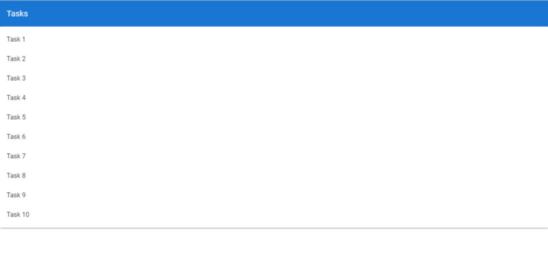
Displaying the List of Tasks
We’ll show the task list using the v-list component and some other sub-components. v-list is wrapped in a v-card component.
src/App.vue
<template>
  <v-app>
    <v-card>
      <v-toolbar color="primary" elevation="3" dark rounded="0">
        <v-toolbar-title>Tasks</v-toolbar-title>
      </v-toolbar>
    </v-card>
    <v-card>
      <v-list>
        <v-list-item v-for="(task, index) in tasks" :key="index">
          <v-list-item-content
            ><v-list-item-title>{{ task.title }}</v-list-item-title>
          </v-list-item-content>
        </v-list-item>
      </v-list>
    </v-card>
  </v-app>
</template>
...
Using the v-for directive, we loop through tasks and show a v-list-item for each array element. To display content inside each list we use the v-list-item-content component. And then we use v-list-item-title to display the title of the list item, which in this case is the task title.
Get the Source Code for this App
Sign up here to receive the latest source code for this great app!
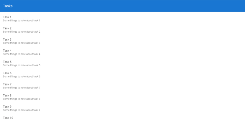
Showing the Task Notes
The v-list-item component in Vuetify is of three variants: single-line, two-line and three-line, of which the single-line variant is the default. We need to show the note for each task, so let’s set the two-line variant:
src/App.vue
<template>
  <v-app>
    <v-card>
      <v-toolbar color="primary" elevation="3" dark rounded="0">
        <v-toolbar-title>Tasks</v-toolbar-title>
      </v-toolbar>
    </v-card>
    <v-card>
      <v-list>
        <v-list-item v-for="(task, index) in tasks" :key="index" two-line>
          <v-list-item-content
            ><v-list-item-title>{{ task.title }}</v-list-item-title>
            <v-list-item-subtitle>{{ task.note }}</v-list-item-subtitle>
          </v-list-item-content>
        </v-list-item>
      </v-list>
    </v-card>
  </v-app>
</template>
...
Look closely at the toolbar — it’s flat! Didn’t we put some elevation on it in our last tutorial?
The toolbar appears flat now because the card containing the task list is just right below it. Let’s put some spacing between them, using one of Vuetify’s margin classes.
src/App.vue
<template>
  <v-app>
    <v-card>
      <v-toolbar color="primary" elevation="3" dark rounded="0">
        <v-toolbar-title>Todos</v-toolbar-title>
      </v-toolbar>
    </v-card>
    <v-card class="mt-4">
      <v-list>
        <v-list-item v-for="(todo, index) in todos" :key="index" two-line>
          <v-list-item-content
            ><v-list-item-title>{{ todo.title }}</v-list-item-title>
            <v-list-item-subtitle>{{ todo.note }}</v-list-item-subtitle>
          </v-list-item-content>
        </v-list-item>
      </v-list>
    </v-card>
  </v-app>
</template>
...
mt-4 is the margin class I was referring to. The m stands for margin, and the t stands for the top. The 4 refers to one of the 32 different margin sizes in Vuetify.
Let’s also set left, right, and bottom margins on the card component all to the same size 4:
src/App.vue
<template>
  <v-app>
    <v-card>
      <v-toolbar color="primary" elevation="3" dark rounded="0">
        <v-toolbar-title>Tasks</v-toolbar-title>
      </v-toolbar>
    </v-card>
    <v-card class="mt-4 ml-4 mr-4 mb-4">
      <v-list>
        <v-list-item v-for="(task, index) in tasks" :key="index" two-line>
          <v-list-item-content
            ><v-list-item-title>{{ task.title }}</v-list-item-title>
            <v-list-item-subtitle>{{ task.note }}</v-list-item-subtitle>
          </v-list-item-content>
        </v-list-item>
      </v-list>
    </v-card>
  </v-app>
</template>
...
But here’s a better and shorter way to do this:
src/App.vue
<template>
  <v-app>
    <v-card>
      <v-toolbar color="primary" elevation="3" dark rounded="0">
        <v-toolbar-title>Tasks</v-toolbar-title>
      </v-toolbar>
    </v-card>
    <v-card class="ma-4">
      <v-list>
        <v-list-item v-for="(task, index) in tasks" :key="index" two-line>
          <v-list-item-content
            ><v-list-item-title>{{ task.title }}</v-list-item-title>
            <v-list-item-subtitle>{{ task.note }}</v-list-item-subtitle>
          </v-list-item-content>
        </v-list-item>
      </v-list>
    </v-card>
  </v-app>
</template>
...
As you guessed correctly, the ma-4 class will set a margin of size 4 on the card in all directions.
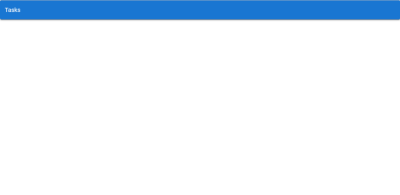
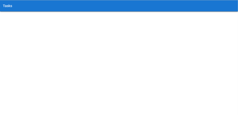
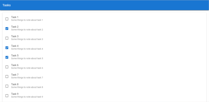
And here’s how our app should look like right now:
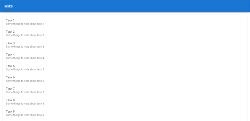
Our toolbar elevation is back, and the card containing our list stands out clearer, with the margins we’ve added.
Indicating Task Completion with Checkboxes
The essence of creating a task is actually getting it done, so let’s show a checkbox in the list for each task that indicates its completion status. We’ll do this with the v-checkbox component.
src/App.vue
<template>
  <v-app>
    <v-card>
      <v-toolbar color="primary" elevation="3" dark rounded="0">
        <v-toolbar-title>Tasks</v-toolbar-title>
      </v-toolbar>
    </v-card>
    <v-card class="ma-4">
      <v-list>
        <v-list-item v-for="(task, index) in tasks" :key="index" two-line>
          <v-checkbox hide-details v-model="task.isCompleted"></v-checkbox>
          <v-list-item-content>
            <v-list-item-title>{{ task.title }}</v-list-item-title>
            <v-list-item-subtitle>{{ task.note }}</v-list-item-subtitle>
          </v-list-item-content>
        </v-list-item>
      </v-list>
    </v-card>
  </v-app>
</template>

<script>
export default {
  name: 'App',
  data: () => ({
    tasks: [...Array(10)].map((value, index) => ({
      id: `task${index + 1}`,
      title: `Task ${index + 1}`,
      note: `Some things to note about task ${index + 1}`,
      isCompleted: false,
    })),
  }),
};
</script>
Notice we created a new isCompleted property for each task, set to false by default. Using v-model we created a two-way binding between the checkbox and isCompleted.
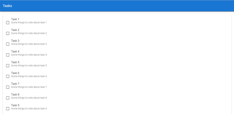
Our checkbox shows now, but its position is a little off. Let’s fix this with some of the margin classes we used earlier:
src/App.vue
<template>
  <v-app>
    <v-card>
      <v-toolbar color="primary" elevation="3" dark rounded="0">
        <v-toolbar-title>Tasks</v-toolbar-title>
      </v-toolbar>
    </v-card>
    <v-card class="ma-4">
      <v-list>
        <v-list-item v-for="(task, index) in tasks" :key="index" two-line>
          <v-checkbox hide-details v-model="task.isCompleted" class="mt-0 mr-2"></v-checkbox>
          <v-list-item-content>
            <v-list-item-title>{{ task.title }}</v-list-item-title>
            <v-list-item-subtitle>{{ task.note }}</v-list-item-subtitle>
          </v-list-item-content>
        </v-list-item>
      </v-list>
    </v-card>
  </v-app>
</template>
...
It looks much better now, as we’ve removed the top margin (by setting it to 0) and set the right margin to size 2 in Vuetify.
Using Color to Indicate Task Completion
Apart from using a checkmark to show that a task is done, let’s also change the background color and opacity of the list item to indicate completion, using Vue’s conditional class binding syntax:
src/App.vue
<template>
  <v-app>
    <v-card>
      <v-toolbar color="primary" elevation="3" dark rounded="0">
        <v-toolbar-title>Tasks</v-toolbar-title>
      </v-toolbar>
    </v-card>
    <v-card class="ma-4">
      <v-list>
        <v-list-item
          v-for="(task, index) in tasks"
          :key="index"
          v-bind:class="{ 'task-completed': task.isCompleted }"
          two-line
        >
          <v-checkbox
            hide-details
            v-model="task.isCompleted"
            class="mt-0 mr-2"
          ></v-checkbox>
          <v-list-item-content>
            <v-list-item-title>{{ task.title }}</v-list-item-title>
            <v-list-item-subtitle>{{ task.note }}</v-list-item-subtitle>
          </v-list-item-content>
        </v-list-item>
      </v-list>
    </v-card>
  </v-app>
</template>

<script>
...
</script>

<style scoped>
.task-completed {
  background-color: #d8d8d8;
  opacity: 0.6;
}
</style>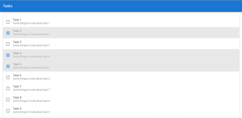
To Be Continued…
Today we learned how lists work in Vuetify, and we were able to use it to display a sample list of tasks in the app. We also utilized some ready-made Vuetify classes meant for setting the margins of elements. Stay tuned for our next episode, as together we build this to-do list app all the way from start to finish using this fantastic Material Design framework.