A button is one of those elements you find in just about every UI. It is the most common way of adding interactivity to an application. Vuetify provides the v-btn component for creating a button. Let’s see how we can use this component and the various customizations we can apply.
Vuetify Regular Button
Here, we’ve created three evenly spaced buttons of different colors. One way of setting the color of most components in Vuetify is with the color prop. For the green button, we add the dark property to make its text white.
<template>
  <v-app>
    <v-row class="ma-4 justify-space-around">
      <v-btn>Button</v-btn>
      <v-btn color="red">Button</v-btn>
      <v-btn color="green" dark>Button</v-btn>
    </v-row>
  </v-app>
</template>

<script>
export default {
  name: 'App',
};
</script>
Vuetify Block Button
We create a block button by setting the block prop to true:
<template>
  <v-app>
    <v-row class="ma-4">
      <v-btn block>Block Button</v-btn>
    </v-row>
  </v-app>
</template>
...
This makes the button extend to its full available width:

Vuetify Depressed Button
Using the depressed prop to make a button depressed removes the box-shadow:
<template>
  <v-app>
    <v-row class="ma-4 justify-space-around">
      <v-btn depressed>Depressed Button</v-btn>
      <v-btn depressed color="yellow">Depressed Button</v-btn>
      <v-btn depressed color="red">Depressed Button</v-btn>
    </v-row>
  </v-app>
</template>
...
Vuetify Icon Button
We are not limited to just text, we can also create icon buttons in Vuetify. The icon prop makes the button rounded, and applies the same styles that would be applied if we set the text prop (more on this prop later in this post).
<template>
  <v-app>
    <v-row class="ma-4 justify-space-around">
      <v-btn color="blue" icon><v-icon>mdi-thumb-up</v-icon></v-btn>
      <v-btn color="red" icon><v-icon>mdi-heart</v-icon></v-btn>
      <v-btn color="yellow" icon><v-icon>mdi-star</v-icon></v-btn>
    </v-row>
  </v-app>
</template>
...
Vuetify Outlined Button
We can create outlined buttons with the outlined prop. These type of buttons inherit their borders from the current color applied:
<template>
  <v-app>
    <v-row class="ma-4 justify-space-around">
      <v-btn outlined>Outlined Button</v-btn>
      <v-btn color="green" outlined>Outlined Button</v-btn>
      <v-btn color="orange" outlined>Outlined Button</v-btn>
    </v-row>
  </v-app>
</template>
...
Vuetify Plain Button
Plain buttons are created with the plain prop. They have a low baseline opacity that increases when you hover or focus on them:
<template>
  <v-app>
    <v-row class="ma-4 justify-space-around">
      <v-btn plain>Plain Button</v-btn>
      <v-btn color="red" plain>Plain Button</v-btn>
      <v-btn color="blue" plain>Plain Button</v-btn>
    </v-row>
  </v-app>
</template>
...
Vuetify Rounded Button
Using the rounded prop, we can create buttons that behave the same as regular buttons, but have rounded edges:
<template>
  <v-app>
    <v-row class="ma-4 justify-space-around">
      <v-btn rounded>Rounded Button</v-btn>
      <v-btn rounded color="blue">Rounded Button</v-btn>
      <v-btn rounded color="green">Rounded Button</v-btn>
    </v-row>
  </v-app>
</template>
...
Vuetify Text Button
Text buttons, created with the text prop, have no box shadow and no background. The container for the button is only shown on hover, and the color set for the button is applied to its text instead of its background:
<template>
  <v-app>
    <v-row class="ma-4" justify="space-around">
      <v-btn text> Normal </v-btn>
      <v-btn text color="primary"> Primary </v-btn>
      <v-btn text color="error"> Error </v-btn>
      <v-btn text disabled> Disabled </v-btn>
    </v-row>
  </v-app>
</template>
...
Vuetify Tile Button
Tile buttons act like regular buttons but have no border-radius. You can create them with the tile prop:
<template>
  <v-app>
    <v-row class="ma-4" justify="space-around">
      <v-btn tile> Tile Button </v-btn>
      <v-btn tile color="yellow"> Tile Button </v-btn>
      <v-btn tile color="blue"> Tile Button</v-btn>
    </v-row>
  </v-app>
</template>
...
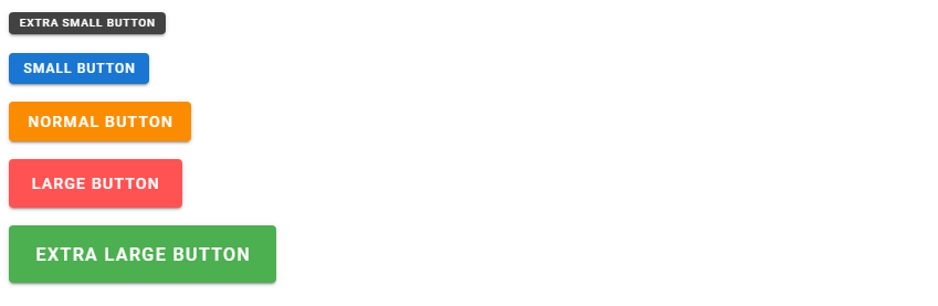
Sizing Buttons in Vuetify
Apart from these variants, Vuetify also provides us with a range of button sizing options to fit a multitude of scenarios:
<template>
  <v-app>
    <div class="ma-2">
      <v-btn x-small color="secondary" dark> Extra small Button </v-btn>
    </div>
    <div class="ma-2">
      <v-btn small color="primary" dark> Small Button </v-btn>
    </div>
    <div class="ma-2">
      <v-btn color="warning" dark> Normal Button </v-btn>
    </div>
    <div class="ma-2">
      <v-btn color="error" dark large> Large Button </v-btn>
    </div>
    <div class="ma-2">
      <v-btn x-large color="success" dark> Extra large Button </v-btn>
    </div>
  </v-app>
</template>
...
Conclusion
Buttons are everywhere. The v-btn component from Vuetify allows us to create them and enables various customization options, such as altering the variant or modifying the size.
Every Crazy Thing JavaScript Does
A captivating guide to the subtle caveats and lesser-known parts of JavaScript.
