
Welcome to this brand new tutorial series, where we’re going to be creating a to-do list app all the way from start to finish using the popular Vuetify.js UI library. You can create a new Vuetify project now and follow along if you want. By the time we’re done, you should have a broader knowledge of the features offered by the framework. We’ll go through a notable amount of Vuetify components, including toolbars, cards, forms, lists, navigation drawers and more.
Just getting started with Vuetify?
Creating the Toolbar
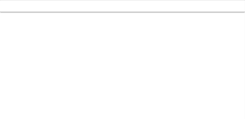
Vuetify uses the v-toolbar component for toolbars. To create one, we’ll need to wrap it in a card component — although we can also use it in conjunction with the v-navigation-drawer component.
src/App.vue
<template>
  <v-app>
    <v-card>
      <v-toolbar></v-toolbar>
    </v-card>
  </v-app>
</template>
...
Changing the Toolbar Colour
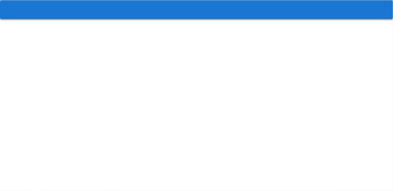
Similar to some other UI libraries, Vuetify uses themes to specify styles that affect all its components. In the following code, we set the colour of the toolbar to primary, which is a colour determined by Vuetify theme settings. We haven’t customized the theme, so this colour will be the default blue.
src/App.vue
<template>
  <v-app>
    <v-card>
      <v-toolbar color="primary"></v-toolbar>
    </v-card>
  </v-app>
</template>
...
Get the Full Source Code for This App
Sign up here to receive the latest source code for this great app!
Changing the Toolbar Elevation
We can change the amount of elevation the toolbar has, by adjusting the aptly named elevation property. Let’s set it to 3:
src/App.vue
<template>
  <v-app>
    <v-card>
      <v-toolbar color="primary" elevation="3"></v-toolbar>
    </v-card>
  </v-app>
</template>
...
Let’s set the toolbar title using the v-toolbar-title component inside of v-toolbar :
<template>
  <v-app>
    <v-card>
      <v-toolbar color="primary" elevation="3">
        <v-toolbar-title>Tasks</v-toolbar-title>
      </v-toolbar>
    </v-card>
  </v-app>
</template>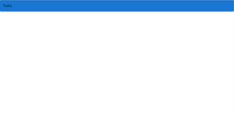
Applying the Dark Theme Variant
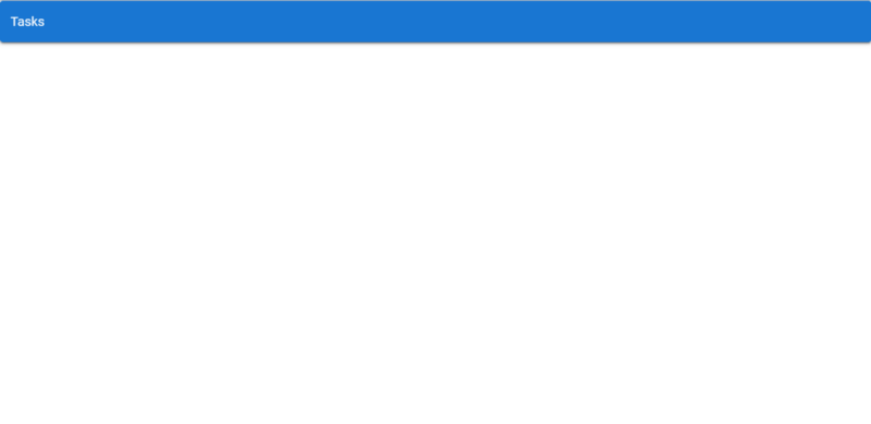
The title shows now, but observe that its colour is black. We should make it white so it stands out clearer against the blue toolbar background by using the dark property to apply Vuetify’s dark theme variant to v-toolbar .
src/App.vue
<template>
<v-app>
<v-card>
<v-toolbar color="primary" elevation="3" dark>
<v-toolbar-title>Tasks</v-toolbar-title>
</v-toolbar>
</v-card>
</v-app>
</template>
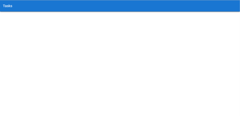
...Many other Vuetify components also have this property, to allow them to be changed to their dark mode. Certain colours of different parts of the component might change, depending on the component. For v-toolbar-title, the colour of any text inside of it becomes white, as you can see:
Removing the Toolbar Roundness
Looking closely at the toolbar, you’ll see that it has a little curvature at each of its corners. This curvature is controlled by the rounded property. We’ll remove the roundness by setting rounded to 0:
src/App.vue
<template>
  <v-app>
    <v-card>
      <v-toolbar color="primary" elevation="3" dark rounded="0">
        <v-toolbar-title>Tasks</v-toolbar-title>
      </v-toolbar>
    </v-card>
  </v-app>
</template>
...
To Be Continued…
We’re off to a great start! Let’s move on to our next episode in this series, where we learn how to use lists, margins and checkboxes to display a list of tasks and add interactivity to our new app.
Every Crazy Thing JavaScript Does
A captivating guide to the subtle caveats and lesser-known parts of JavaScript.
