vuetify

How to Use the Vuetify Toggle Button Component

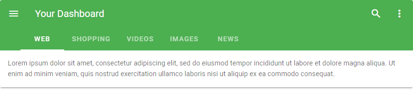
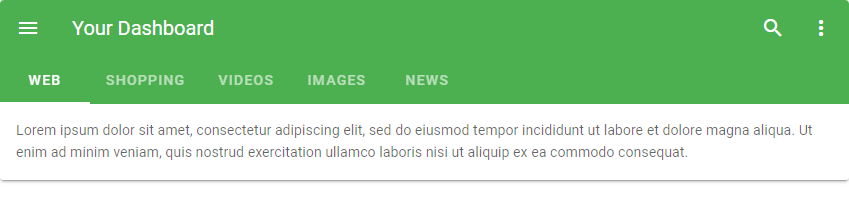
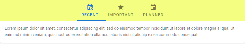
Toggle buttons are useful for creating a group of buttons whose individual selection states all depend on a single variable. In this article, we’ll see the ways in which we can create and customize this component in Vuetify.

The v-btn-toggle Component

We can create a button group (or toggle button) in Vuetify with the v-btn-toggle component. The group of buttons can be selected or toggled under a single v-model, which is bound to the format variable:

<template>
  <v-app>
    <v-row class="ma-2" justify="center">
      <v-btn-toggle v-model="format" borderless>
        <v-btn value="left">
          <span>Left</span><v-icon right>mdi-format-align-left</v-icon>
        </v-btn>
        <v-btn value="center">
          <span>Center</span><v-icon right>mdi-format-align-center</v-icon>
        </v-btn>
        <v-btn value="right">
          <span>Right</span><v-icon right>mdi-format-align-right</v-icon>
        </v-btn>
      </v-btn-toggle>
    </v-row>
  </v-app>
</template>

<script>
export default {
  name: 'App',
  data: () => ({
    format: 'center',
  }),
};
</script>
Creating a Vuetify toggle button.

Clicking one of the buttons in the group unselects the currently selected one:

Clicking another button in the button group.

Ensuring a Toggle Button Value with the mandatory Prop

Vuetify provides the mandatory prop, used to make sure that a toggle button will always have a value:

<template>
  <v-app>
    <v-row class="ma-2" justify="center">
      <v-btn-toggle v-model="format" borderless mandatory>
        <v-btn value="left">
          <span>Left</span><v-icon right>mdi-format-align-left</v-icon>
        </v-btn>
        <v-btn value="center">
          <span>Center</span><v-icon right>mdi-format-align-center</v-icon>
        </v-btn>
        <v-btn value="right">
          <span>Right</span><v-icon right>mdi-format-align-right</v-icon>
        </v-btn>
      </v-btn-toggle>
    </v-row>
  </v-app>
</template>

<script>
export default {
  name: 'App',
  data: () => ({
    format: null,
  }),
};
</script>
Vuetify toggle button with the mandatory prop.

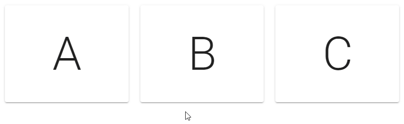
Vuetify Toggle Button Multiple Selection

The multiple prop allows us to select more than one button in the group:

<template>
  <v-app>
    <v-row class="ma-2" justify="center">
      <v-btn-toggle v-model="selectedLetters" multiple>
        <v-btn v-for="(ch, index) in word" :key="index">{{ch}}</v-btn>
      </v-btn-toggle>
    </v-row>
  </v-app>
</template>

<script>
export default {
  name: 'App',
  data: () => ({
    word: 'Beauty'.split(''),
    selectedLetters: []
  }),
};
</script>
Vuetify toggle button with multiple selection enabled.

Vuetify Rounded Toggle Buttons

We can make toggle buttons in Vuetify rounded with the rounded prop:

<template>
  <v-app>
    <v-row class="ma-2" justify="center">
      <v-btn-toggle v-model="letter" rounded>
        <v-btn v-for="(ch, index) in word" :key="index">{{ ch }}</v-btn>
      </v-btn-toggle>
    </v-row>
  </v-app>
</template>

<script>
export default {
  name: 'App',
  data: () => ({
    word: 'Coding'.split(''),
    letter: '',
  }),
};
</script>
Rounded Vuetify button group.

Vuetify Borderless Toggle Buttons

Setting the borderless prop to true on a v-btn-toggle will remove the borders from each button in the group.

<template>
  <v-app>
    <v-row class="ma-2" justify="center">
      <v-btn-toggle v-model="letter" rounded borderless>
        <v-btn v-for="(ch, index) in word" :key="index">{{ ch }}</v-btn>
      </v-btn-toggle>
    </v-row>
  </v-app>
</template>

<script>
export default {
  name: 'App',
  data: () => ({
    word: 'Coding'.split(''),
    letter: '',
  }),
};
</script>
Borderless Vuetify button group component.

Customizing Toggle Button Colors in Vuetify

We can change the color of the selected button(s) in a button group with the color prop:

<template>
  <v-app>
    <v-row class="ma-2" justify="center">
      <v-btn-toggle v-model="selectedLetters" rounded multiple color="blue">
        <v-btn v-for="(ch, index) in word" :key="index">{{ ch }}</v-btn>
      </v-btn-toggle>
    </v-row>
  </v-app>
</template>

<script>
export default {
  name: 'App',
  data: () => ({
    word: 'Beauty'.split(''),
    selectedLetters: [],
  }),
};
</script>
Customizing a toggle button in Vuetify.

Summary

Toggle buttons are useful when we have a group of logically related buttons whose selection states need to be controlled by a single variable. Vuetify provides the v-btn-toggle component for creating them and various props for customization.

How to Use the Vuetify Textarea Component

Vuetify provides the textarea component, very similar to a text field, but better for collecting large amounts of text input from users. Let us explore some features of this component in this article.

The Vuetify Textarea Component

We can create a textarea in Vuetify with the v-text-area component.

<template>
  <v-app>
    <v-row class="ma-2" justify="center">
      <v-col cols="6">
        <v-textarea
          label="Default style"
          value="Learning about textareas at Coding Beauty!"
        >
        </v-textarea>
      </v-col>
    </v-row>
  </v-app>
</template>

<script>
export default {
  name: 'App',
};
</script>
The default textarea variant in Vuetify.

Vuetify Textarea Solo Variant

To use the alternative solo design for textareas, we can set the solo prop to true:

<template>
  <v-app>
    <v-row class="ma-2" justify="center">
      <v-col cols="6">
        <v-textarea label="Solo textarea" solo> </v-textarea>
      </v-col>
    </v-row>
  </v-app>
</template>

<script>
export default {
  name: 'App',
};
</script>
Vuetify text area with the solo design.
Solo textarea.
Vuetify solo textarea with focus.
Solo textarea with focus.

Vuetify Text Area Filled Variant

Similar to Vuetify text fields, we can use the filled prop to activate the filled variant of the text area.

<template>
  <v-app>
    <v-row class="ma-2" justify="center">
      <v-col cols="6">
        <v-textarea
          label="Filled textarea"
          value="Learning about textareas at Coding Beauty!"
          filled
        >
        </v-textarea>
      </v-col>
    </v-row>
  </v-app>
</template>

<script>
export default {
  name: 'App',
};
</script>
Vuetify textarea filled variant.

Vuetify Textarea Outlined Variant

We also have the outlined variant. We can change a textarea to this alternative style with the outlined prop:

<template>
  <v-app>
    <v-row class="ma-2" justify="center">
      <v-col cols="6">
        <v-textarea
          label="Outlined textarea"
          value="Learning about textareas at Coding Beauty!"
          outlined
        >
        </v-textarea>
      </v-col>
    </v-row>
  </v-app>
</template>

<script>
export default {
  name: 'App',
};
</script>
Vuetify textarea outlined variant.

Vuetify Textarea Auto Grow

With the auto-grow prop, we can make a textarea automatically increase in size when the text in it exceeds its height.

Vuetify text area with 4 rows.
Textarea with four rows
Textarea expands to accommodate six rows of text

Vuetify Textarea Custom Colors

We can style the textarea colors with the background-color and color prop:

<template>
  <v-app>
    <v-row class="ma-2" justify="center">
      <v-col cols="6">
        <v-textarea label="Label" background-color="gray lighten-2" color="indigo">
        </v-textarea>
      </v-col>
    </v-row>
  </v-app>
</template>

<script>
export default {
  name: 'App',
};
</script>

Clearable Textareas in Vuetify

We can clear the text from a textarea with the clearable prop, and customize the icon used with the clearable-icon prop:

<template>
  <v-app>
    <v-row class="ma-2" justify="center">
      <v-col cols="6">
        <v-textarea
          clearable
          clear-icon="mdi-close"
          label="Text"
          value="You can clear all the text in this textarea."
        ></v-textarea>
      </v-col>
    </v-row>
  </v-app>
</template>

<script>
export default {
  name: 'App',
};
</script>
Clearable textarea.
Clearable textarea.
Clicking the icon clears the text in the text area.
Clicking the icon clears the text.

Vuetify Textarea Character Limits

We can inform the user of the number of characters entered in a textarea with the counter prop. This is useful for enforcing character limits.

<template>
  <v-app>
    <v-row class="ma-2" justify="center">
      <v-col cols="6">
        <v-textarea counter label="Text"></v-textarea>
      </v-col>
    </v-row>
  </v-app>
</template>

<script>
export default {
  name: 'App',
};
</script>
Textarea with 27 characters.
Adding “Coding Beauty” takes the textarea character count to 42.

Vuetify Textarea Icons

We can include an icon with the textarea to add more context. Here, we use the preprend-icon prop to include the icon before the textarea:

<template>
  <v-app>
    <v-row class="ma-2" justify="center">
      <v-col cols="6">
        <v-textarea
          prepend-icon="mdi-note"
          label="prepend-icon"
          value="Learning about textareas at Coding Beauty!"
        ></v-textarea>
      </v-col>
    </v-row>
  </v-app>
</template>

<script>
export default {
  name: 'App',
};
</script>
Using the prepend-icon prop of v-textarea

The append-icon prop shows the icon after the textarea:

<template>
  <v-app>
    <v-row class="ma-2" justify="center">
      <v-col cols="6">
        <v-textarea
          append-icon="mdi-note"
          label="append-icon"
          value="Learning about textareas at Coding Beauty!"
        ></v-textarea>
      </v-col>
    </v-row>
  </v-app>
</template>

<script>
export default {
  name: 'App',
};
</script>
Using the append-icon prop of v-textarea

We also have the prepend-inner-icon and append-inner-icon props:

Preventing a TextArea from Growing

The no-resize prop makes the textarea remain the same size no matter how much content it contains:

<template>
  <v-app>
    <v-row class="ma-2" justify="center">
      <v-col cols="6">
        <v-textarea
          label="no-resize"
          rows="1"
          no-resize
          value="Just as we can make Vuetify textareas grow automatically, we can also make them to always remain the same size."
        ></v-textarea>
      </v-col>
    </v-row>
  </v-app>
</template>

<script>
export default {
  name: 'App',
};
</script>
Use the no-resize prop on a text area in Vuetify.

Summary

Textareas take textual data like text fields, but in larger amounts. Vuetify provides the v-textarea component.

How to Use the Vuetify Text Field Component

Text fields are the most common way of accepting text input in a UI. They can collect user information like emails, addresses, phone numbers, etc. Let’s see how we can use them in Vuetify.

The v-text-field Component

We create text fields in Vuetify with the v-text-field component:

<template>
  <v-app>
    <v-row justify="center" class="ma-2">
      <v-col cols="4"><v-text-field label="Regular"></v-text-field></v-col>
    </v-row>
  </v-app>
</template>

<script>
export default {
  name: 'App',
};
</script>
A regular Vuetify text field.
Regular text field without focus.
Focusing on a regular Vuetify text field.
Focusing on a regular text field.

Vuetify Text Field Placeholders

We can indicate an expected value for the text field with the placeholder prop:

<template>
  <v-app>
    <v-row justify="center" class="ma-2">
      <v-col cols="4"
        ><v-text-field label="Regular" placeholder="Placeholder"></v-text-field
      ></v-col>
    </v-row>
  </v-app>
</template>

<script>
export default {
  name: 'App',
};
</script>
A Vuetify text field with a placeholder.

Customizing Text Field Colors in Vuetify

We can customize the color of text fields by setting the color prop to a color in the Material Design palette:

<template>
  <v-app>
    <v-row justify="center" class="ma-2">
      <v-col cols="4"
        ><v-text-field
          label="Username"
          color="green"
        ></v-text-field
      ></v-col>
    </v-row>
  </v-app>
</template>

<script>
export default {
  name: 'App',
};
</script>
A Vuetify text field with the colour customized.
Customizing the colour of a text field.

Vuetify Text Field Filled Variant

We can use the filled variant of the text field with the filled prop:

<template>
  <v-app>
    <v-row justify="center" class="ma-2">
      <v-col cols="4"
        ><v-text-field label="Filled" filled></v-text-field
      ></v-col>
    </v-row>
  </v-app>
</template>

<script>
export default {
  name: 'App',
};
</script>
Vuetify text field filled variant

Vuetify Text Field Outlined Variant

Setting the outlined prop to true on the text field component will use its outlined variant:

<template>
  <v-app>
    <v-row justify="center" class="ma-2">
      <v-col cols="4"
        ><v-text-field label="Outlined" outlined></v-text-field
      ></v-col>
    </v-row>
  </v-app>
</template>

<script>
export default {
  name: 'App',
};
</script>
Vuetify text field outlined variant.

Vuetify Shaped Text Fields

Text fields with the shaped prop have an increased border radius for the top two corners:

<template>
  <v-app>
    <v-row class="ma-2">
      <v-col cols="6"
        ><v-text-field label="First Name" filled shaped></v-text-field
      ></v-col>
      <v-col cols="6"
        ><v-text-field label="Last Name" outlined shaped></v-text-field
      ></v-col>
    </v-row>
  </v-app>
</template>

<script>
export default {
  name: 'App',
};
</script>
Vuetify shaped text fields.

Disabling Text Fields in Vuetify

We can stop a text field from accepting any input by setting the disabled prop to true.

<template>
  <v-app>
    <v-row class="ma-2">
      <v-col cols="4"
        ><v-text-field label="Address" disabled></v-text-field
      ></v-col>
      <v-col cols="4"
        ><v-text-field label="Address" filled disabled></v-text-field
      ></v-col>
      <v-col cols="4"
        ><v-text-field label="Address" outlined disabled></v-text-field
      ></v-col>
    </v-row>
  </v-app>
</template>

<script>
export default {
  name: 'App',
};
</script>
Disabling text fields in Vuetify

Readonly Text Fields

We can also prevent text field input with the readonly prop:

<template>
  <v-app>
    <v-row class="ma-2" justify="center">
      <v-col cols="4"
        ><v-text-field label="Regular" value="Regular" readonly></v-text-field
      ></v-col>
    </v-row>
  </v-app>
</template>

<script>
export default {
  name: 'App',
};
</script>

Solo Text Fields

We can style text fields with an alternative solo design with the solo prop:


<template>
  <v-app>
    <v-row class="ma-2" justify="center">
      <v-col cols="4"
        ><v-text-field
          label="Solo"
          solo
        ></v-text-field
      ></v-col>
    </v-row>
  </v-app>
</template>

<script>
export default {
  name: 'App',
};
</script>
Vuetify solo text fields
Solo text field without focus.
Focusing on a Vuetify solo text fields.
Focusing on a solo text field.

Single-line Text Fields

To prevent text field labels from floating when focused, we can use the single-line prop:

<template>
  <v-app>
    <v-row class="ma-2" justify="center">
      <v-col cols="4"
        ><v-text-field label="Single-line" single-line></v-text-field
      ></v-col>
    </v-row>
  </v-app>
</template>

<script>
export default {
  name: 'App',
};
</script>
A single-line text field without focus.
Focusing on a single-line text field.

Summary

Vuetify provides the v-text-field component for creating text fields, which are useful for getting text input from users.

How to Use the Vuetify Snackbar Component

A snackbar helps to display quick messages. We can use it to notify users of certain events that occur in an app (for example, deleting an item from a list). It might also contain actions related to the information shown that users can take. In this article, we’re going to learn how to create a snackbar using the Vuetify framework.

The Vuetify Snackbar Component

We can create a snackbar in Vuetify using the v-snackbar component. In the code below, we create a “Close” button in the action slot of the snackbar. When this button is clicked, the snackbar variable is set to false to hide the snackbar.

<template>
  <v-app>
    <div class="text-center ma-2">
      <v-btn @click="snackbar = true"> Open Snackbar </v-btn>
      <v-snackbar v-model="snackbar">
        {{ text }}

        <template v-slot:action="{ attrs }">
          <v-btn text v-bind="attrs" @click="snackbar = false"> Close </v-btn>
        </template>
      </v-snackbar>
    </div>
  </v-app>
</template>

<script>
export default {
  name: 'App',
  data: () => ({
    snackbar: false,
    text: 'You opened the snackbar!',
  }),
};
</script>

snackbar is false by default, so at first we can only see the button that opens the snackbar:

The snackbar is currently hidden.

Clicking on the button sets snackbar to true, which displays the snackbar component:

Clicking the button displays the snackbar.

Multi line Snackbars in Vuetify

With the multi-line prop, we can increase the height of the v-snackbar component to make some room for more content.

<template>
  <v-app>
    <div class="text-center ma-2">
      <v-btn dark color="blue" @click="snackbar = true"> Open Snackbar </v-btn>

      <v-snackbar v-model="snackbar" multi-line>
        {{ text }}

        <template v-slot:action="{ attrs }">
          <v-btn color="red" text v-bind="attrs" @click="snackbar = false">
            Close
          </v-btn>
        </template>
      </v-snackbar>
    </div>
  </v-app>
</template>

<script>
export default {
  name: 'App',
  data: () => ({
    snackbar: false,
    text: 'This is a multiline snackbar',
  }),
};
</script>

Snackbar Timeouts in Vuetify

The timeout prop allows us to customize the delay before the snackbar is hidden:

<template>
  <v-app>
    <div class="text-center ma-2">
      <v-btn dark color="indigo darken-2 ma-4" @click="snackbar = true">
        Open Snackbar
      </v-btn>

      <v-snackbar v-model="snackbar">
        {{ text }}

        <template v-slot:action="{ attrs }">
          <v-btn color="blue" text v-bind="attrs" @click="snackbar = false">
            Close
          </v-btn>
        </template>
      </v-snackbar>
    </div>
  </v-app>
</template>

<script>
export default {
  name: 'App',
  data: () => ({
    snackbar: false,

    text: 'This snackbar has a timeout of 3000.',
  }),
};
</script>

Vuetify Snackbar Shaped Variant

We can create the shaped snackbar variant with the shaped prop:

<template>
  <v-app>
    <div class="text-center ma-2">
      <v-btn dark color="indigo darken-2 ma-4" @click="snackbar = true">
        Open Snackbar
      </v-btn>

      <v-snackbar v-model="snackbar" shaped>
        {{ text }}

        <template v-slot:action="{ attrs }">
          <v-btn color="blue" text v-bind="attrs" @click="snackbar = false">
            Close
          </v-btn>
        </template>
      </v-snackbar>
    </div>
  </v-app>
</template>

<script>
export default {
  name: 'App',
  data: () => ({
    snackbar: false,
    text: 'Welcome to Coding Beauty!',
  }),
};
</script>
Creating shaped snackbars in Vuetify

Rounded Snackbars in Vuetify

Setting the rounded prop to true on a snackbar will make it rounded:

<template>
  <v-app>
    <div class="text-center ma-2">
      <v-btn dark color="indigo darken-2 ma-4" @click="snackbar = true">
        Open Snackbar
      </v-btn>

      <v-snackbar v-model="snackbar" rounded="pill">
        {{ text }}

        <template v-slot:action="{ attrs }">
          <v-btn color="green" text v-bind="attrs" @click="snackbar = false">
            Close
          </v-btn>
        </template>
      </v-snackbar>
    </div>
  </v-app>
</template>

<script>
export default {
  name: 'App',
  data: () => ({
    snackbar: false,
    text: 'Welcome to Coding Beauty!',
  }),
};
</script>
Creating a rounded snackbar with Vuetify.

Snackbar Elevation in Vuetify

We can increase the degree of elevation on a snackbar with the elevation prop. Here, we’ve set it to 24:

<template>
  <v-app>
    <div class="text-center ma-2">
      <v-btn dark color="indigo darken-2 ma-4" @click="snackbar = true">
        Open Snackbar
      </v-btn>

      <v-snackbar v-model="snackbar" color="blue" elevation="24">
        {{ text }}

        <template v-slot:action="{ attrs }">
          <v-btn dark text v-bind="attrs" @click="snackbar = false">
            Close
          </v-btn>
        </template>
      </v-snackbar>
    </div>
  </v-app>
</template>

<script>
export default {
  name: 'App',
  data: () => ({
    snackbar: false,
    text: 'Welcome to Coding Beauty!',
  }),
};
</script>
Customizing snackbar elevation in Vuetify.

Vuetify Snackbar Tile Variant

Setting the tile prop on the snackbar removes the default border radius:

<template>
  <v-app>
    <div class="text-center ma-2">
      <v-btn dark color="ma-4" @click="snackbar = true"> Open Snackbar </v-btn>

      <v-snackbar v-model="snackbar" color="red accent-2" tile>
        {{ text }}

        <template v-slot:action="{ attrs }">
          <v-btn dark text v-bind="attrs" @click="snackbar = false">
            Close
          </v-btn>
        </template>
      </v-snackbar>
    </div>
  </v-app>
</template>

<script>
export default {
  name: 'App',
  data: () => ({
    snackbar: false,
    text: 'Welcome to Coding Beauty!',
  }),
};
</script>
Creating a tile snackbar with Vuetify.

Vuetify Snackbar Text Variant

Vuetify also provides the text prop for using the snackbar’s text variant:

<template>
  <v-app>
    <div class="text-center ma-2">
      <v-btn dark color="ma-4" @click="snackbar = true"> Open Snackbar </v-btn>

      <v-snackbar v-model="snackbar" color="indigo" text>
        {{ text }}
      </v-snackbar>
    </div>
  </v-app>
</template>

<script>
export default {
  name: 'App',
  data: () => ({
    snackbar: false,
    text: 'Welcome to Coding Beauty!',
  }),
};
</script>
Creating a snackbar with the text variant with Vuetify.

Vuetify Snackbar Outlined Variant

We can activate the outlined variant on the Vuetify snackbar component with the outlined prop:

<template>
  <v-app>
    <div class="text-center ma-2">
      <v-btn dark color="ma-4" @click="snackbar = true"> Open Snackbar </v-btn>

      <v-snackbar v-model="snackbar" color="primary" outlined>
        {{ text }}
      </v-snackbar>
    </div>
  </v-app>
</template>

<script>
export default {
  name: 'App',
  data: () => ({
    snackbar: false,
    text: 'Welcome to Coding Beauty!',
  }),
};
</script>
Use the Vuetify snackbar outlined variant

Summary

Vuetify provides the v-snackbar component for creating snackbars, along with various customization options and variants.

How to Easily Create Beautiful Tabs with Vuetify

Tabs are a great way of organizing your content and adding an additional hierarchy of navigation to your app. We’re going to learn how to create them in Vuetify in this article.

v-tabs and v-tab

A Vuetify tab is created with the v-tab component, wrapped inside a v-tabs component:

<template>
  <v-app>
    <v-tabs>
      <v-tab>Tab 1</v-tab>
      <v-tab>Tab 2</v-tab>
      <v-tab>Tab 3</v-tab>
    </v-tabs>
  </v-app>
</template>

<script>
export default {
  name: 'App',
};
</script>
Creating three tabs with Vuetify tab component.

Aligning Tabs with the Toolbar Title

We can line up v-tabs with the v-toolbar-title component using the align-with-title prop:

<template>
  <v-app>
    <v-card>
      <v-toolbar color="green" dark flat>
        <v-app-bar-nav-icon></v-app-bar-nav-icon>

        <v-toolbar-title>Your Dashboard</v-toolbar-title>

        <v-spacer></v-spacer>

        <v-btn icon>
          <v-icon>mdi-magnify</v-icon>
        </v-btn>

        <v-btn icon>
          <v-icon>mdi-dots-vertical</v-icon>
        </v-btn>

        <template v-slot:extension>
          <v-tabs v-model="tab" align-with-title>
            <v-tabs-slider color="white"></v-tabs-slider>

            <v-tab v-for="item in items" :key="item">
              {{ item }}
            </v-tab>
          </v-tabs>
        </template>
      </v-toolbar>

      <v-tabs-items v-model="tab">
        <v-tab-item v-for="item in items" :key="item">
          <v-card flat>
            <v-card-text v-text="text"></v-card-text>
          </v-card>
        </v-tab-item>
      </v-tabs-items>
    </v-card>
  </v-app>
</template>

<script>
export default {
  name: 'App',
  data() {
    return {
      tab: null,
      items: ['web', 'shopping', 'videos', 'images', 'news'],
      text: 'Lorem ipsum dolor sit amet, consectetur adipiscing elit, sed do eiusmod tempor incididunt ut labore et dolore magna aliqua. Ut enim ad minim veniam, quis nostrud exercitation ullamco laboris nisi ut aliquip ex ea commodo consequat.',
    };
  },
};
</script>
The effects of using the align-with-title prop on the tab.

Without setting the align-with-title prop on the v-tabs component, it would have looked like this:

Creating tabs in Vuetify with the tab component.

The center-active Prop

Setting the center-active prop to true on the v-tabs component will make the active tab always centred. For example:

<template>
  <v-app>
    <v-card>
      <v-tabs background-color="primary" center-active dark>
        <v-tab>One</v-tab>
        <v-tab>Two</v-tab>
        <v-tab>Three</v-tab>
        <v-tab>Four</v-tab>
        <v-tab>Five</v-tab>
        <v-tab>Six</v-tab>
        <v-tab>Seven</v-tab>
        <v-tab>Eight</v-tab>
        <v-tab>Nine</v-tab>
        <v-tab>Ten</v-tab>
        <v-tab>Eleven</v-tab>
        <v-tab>Twelve</v-tab>
        <v-tab>Thirteen</v-tab>
        <v-tab>Fourteen</v-tab>
        <v-tab>Fifteen</v-tab>
        <v-tab>Sixteen</v-tab>
        <v-tab>Seventeen</v-tab>
        <v-tab>Eighteen</v-tab>
        <v-tab>Nineteen</v-tab>
        <v-tab>Twenty</v-tab>
      </v-tabs>
    </v-card>
  </v-app>
</template>

<script>
export default {
  name: 'App',
};
</script>
A group of tabs created with v-tabs with the center-active prop set to true.

Clicking on another tab will make it active and centre it:

The center-active prop makes the active tab to always be centred.

Custom Tab Icons

With the next-icon and prev-icon props, we can customize the icon used to navigate through all the tab titles.

<template>
  <v-app>
    <v-sheet elevation="6">
      <v-tabs
        background-color="red"
        dark
        next-icon="mdi-arrow-right-bold-box-outline"
        prev-icon="mdi-arrow-left-bold-box-outline"
        show-arrows
      >
        <v-tabs-slider color="orange"></v-tabs-slider>
        <v-tab v-for="i in 20" :key="i" :href="'#tab-' + i">
          Item {{ i }}
        </v-tab>
      </v-tabs>
    </v-sheet>
  </v-app>
</template>
...
Customizing tab icons

Fixed Tabs

With the fixed-tabs prop, we can make the v-tab components to fill up all the available space until they get to their maximum width (300px):

<template>
  <v-app>

    <v-tabs fixed-tabs dark>
      <v-tab> City </v-tab>
      <v-tab> Nature </v-tab>
      <v-tab> Art </v-tab>
      <v-tab> Sky </v-tab>
    </v-tabs>

  </v-app>
</template>
...

The grow Prop

Setting the grow prop to true on a v-tabs component does the same thing as setting the fixed-tabs prop. It makes the tabs take up all the available space up to the maximum width of 300px:

<template>
  <v-app>
    <v-tabs grow dark>
      <v-tab> City </v-tab>
      <v-tab> Nature </v-tab>
      <v-tab> Art </v-tab>
      <v-tab> Sky </v-tab>
    </v-tabs>
  </v-app>
</template>
...

Using Icons in Tab Titles

We can customize the Vuetify tab components to allow icons to be used in their titles with the icons-with-text prop. Setting this prop to true will increase the height of the v-tabs component to 72px to allow for both icons and text to be used.

Summary

Vuetify allows us to create and customize tabs with the v-tabs and v-tab component. We can customize certain properties of these tabs, such as styling their color and width.

How to Handle Hover Events With Vuetify

While we could use the CSS :hover pseudo-class to customize element styles on mouse hover, Vuetify provides a neat way of doing this, with the v-hover component. Let’s see how we can use it in this article.

Vuetify hover component (v-hover)

<template>
  <v-app>
    <div class="d-flex justify-center">
      <v-hover v-slot="{ hover }">
        <v-card
          class="ma-4 pa-4"
          width="200"
          height="200"
          :elevation="hover ? 12 : 2"
        >
          Hover over me!
        </v-card>
      </v-hover>
    </div>
  </v-app>
</template>

<script>
export default {
  name: 'App',
};
</script>

The v-hover default slot provides a hover prop, whose value changes depending on the current hover state of the child of the hover component; when the mouse has not hovered over it, hover remains false. For our case, that will set the elevation of the card to 2:

Using the Vuetify hover component.

And when we hover over it, hover becomes true and the card elevation becomes 12:

Vuetify hover open delay

We can delay the hover prop change from false to true with the open-delay prop. In the code below, we use open-delay to set a delay of 200ms for the hover prop to become true from mouse hover:

<template>
  <v-app>
    <div class="d-flex justify-center">
      <v-hover v-slot="{ hover }" open-delay="200">
        <v-card
          :elevation="hover ? 16 : 2"
          :class="{ 'on-hover': hover }"
          class="ma-4"
          height="100"
          max-width="250"
        >
          <v-card-text> Open Delay (Mouse enter) </v-card-text>
        </v-card>
      </v-hover>
    </div>
  </v-app>
</template>

<script>
export default {
  name: 'App',
};
</script>
Setting a hover open delay on the card.

Vuetify hover close delay

Similarly, we can delay the hover prop from true to false after the mouse leaves it, with the close-delay prop. So after the mouse leaves the card, it would take 200ms for its elevation to be reduced:

<template>
  <v-app>
    <div class="d-flex justify-center">
      <v-hover v-slot="{ hover }" close-delay="200">
        <v-card
          :elevation="hover ? 16 : 2"
          :class="{ 'on-hover': hover }"
          class="ma-4"
          height="100"
          max-width="250"
        >
          <v-card-text> Close Delay (Mouse leave) </v-card-text>
        </v-card>
      </v-hover>
    </div>
  </v-app>
</template>

<script>
export default {
  name: 'App',
};
</script>
Setting a hover close delay on the card.

Disable hover

We can disable the hover functionality with the disabled prop:

<template>
  <v-app>
    <div class="d-flex justify-center ma-4">
      <v-hover v-slot="{ hover }" disabled>
        <v-card
          :elevation="hover ? 12 : 2"
          height="100"
          max-width="250"
        >
          <v-card-text class="my-4 text-center text-h6">
            Hover disabled
          </v-card-text>
        </v-card>
      </v-hover>
    </div>
  </v-app>
</template>

<script>
export default {
  name: 'App',
};
</script>

Nothing will happen when you hover over the card:

Disabling hover state.

Vuetify hover list

We can combine v-hover and v-for to make a single item stand out when the user interacts with the list:

<template>
  <v-app>
    <v-container>
      <v-row class="fill-height" align="center" justify="center">
        <v-col v-for="(letter, index) in letters" :key="index">
          <v-hover v-slot="{ hover }">
            <v-card
              height="200"
              :elevation="hover ? 12 : 2"
              :class="{ 'on-hover': hover }"
            >
              <div
                class="text-h1 d-flex justify-center align-center fill-height"
              >
                {{ letter }}
              </div>
            </v-card>
          </v-hover>
        </v-col>
      </v-row>
    </v-container>
  </v-app>
</template>

<script>
export default {
  name: 'App',
  data() {
    return {
      letters: ['A', 'B', 'C'],
    };
  },
};
</script>

Now each card stands out when hovered over:

Creating a hover list with Vuetify.

Hover transitions in Vuetify

With the hover component, we can create components that respond in highly customized ways to user interaction. For example:

<template>
  <v-app>
    <div class="d-flex justify-center">
      <v-hover v-slot="{ hover }">
        <v-card class="ma-4 pa-4" width="300">
          <p class="mb-4">Sign up to get started</p>
          <v-expand-transition>
            <div v-if="hover"><v-btn color="primary" dark>Sign up</v-btn></div>
          </v-expand-transition>
        </v-card>
      </v-hover>
    </div>
  </v-app>
</template>

<script>
export default {
  name: 'App',
};
</script>

When you hover over the card, the extra portion containing the “Sign Up” button slides out (thanks to the v-expand-transition component):

Creating hover transitions with Vuetify.

Conclusion

Vuetify provides the v-hover component for handling toggling component styles based on their current hover state. It provides customization options, such as creating hover event delays and displaying transitions on hover.

How to Create Dialogs with Vuetify

We can a dialog to interact with users. They convey messages and allow certain actions to be taken on them. Vuetify provides the v-dialog component for creating a dialog. Let’s see how we can use this component in practice.

In the code below, we’ve created a dialog and a button of color red:

<template>
  <v-app>
    <div class="text-center">
      <v-dialog v-model="dialog" width="500">
        <template v-slot:activator="{ on, attrs }">
          <v-btn v-bind="attrs" v-on="on" class="mt-2" color="red" dark>
            Delete
          </v-btn>
        </template>

        <v-card>
          <v-card-title class="text-h5"> Delete file? </v-card-title>

          <v-card-text> Do you really want to delete this file? </v-card-text>

          <v-card-actions>
            <v-spacer></v-spacer>
            <v-btn text @click="dialog = false"> Cancel </v-btn>
            <v-btn color="red" text @click="dialog = false"> Delete </v-btn>
          </v-card-actions>
        </v-card>
      </v-dialog>
    </div>
  </v-app>
</template>

<script>
export default {
  name: 'App',
  data: () => ({
    dialog: false,
  }),
};
</script>

We’ve placed the button in the activator slot of the v-dialog component. This slot provides some props – on and attrs, which we used to set the props and the event handlers of the button. We use a card to create the body of the dialog.

Creating a dialog in Vuetify.

The dialog shows up when the button is clicked:

The dialog opens when the button is clicked.

Using the “hide-overlay” Prop

The dialog opens with an overlay, as we can see in the image above. We can hide this overlay, by setting the hide-overlay prop to true:

<template>
  <v-app>
    <div class="text-center">
      <v-dialog v-model="dialog" width="500" hide-overlay>
        <template v-slot:activator="{ on, attrs }">
          <v-btn v-bind="attrs" v-on="on" class="mt-2" color="red" dark>
            Delete
          </v-btn>
        </template>

        <v-card>
          <v-card-title class="text-h5"> Delete file? </v-card-title>

          <v-card-text> Do you really want to delete this file? </v-card-text>

          <v-card-actions>
            <v-spacer></v-spacer>
            <v-btn text @click="dialog = false"> Cancel </v-btn>
            <v-btn color="red" text @click="dialog = false"> Delete </v-btn>
          </v-card-actions>
        </v-card>
      </v-dialog>
    </div>
  </v-app>
</template>

It would look like this:

Setting the "hide-overlay" prop to true on v-dialog removes the dialog overlay.

Creating Fullscreen Dialogs

We can make the dialog cover up the entire viewport of the page, by setting the fullscreen prop to true:

<template>
  <v-app>
    <div class="text-center">
      <v-dialog v-model="dialog" width="500" fullscreen>
        <template v-slot:activator="{ on, attrs }">
          <v-btn v-bind="attrs" v-on="on" class="mt-2" color="red" dark>
            Delete
          </v-btn>
        </template>

        <v-card>
          <v-card-title class="text-h5"> Delete file? </v-card-title>

          <v-card-text> Do you really want to delete this file? </v-card-text>

          <v-card-actions>
            <v-spacer></v-spacer>
            <v-btn text @click="dialog = false"> Cancel </v-btn>
            <v-btn color="red" text @click="dialog = false"> Delete </v-btn>
          </v-card-actions>
        </v-card>
      </v-dialog>
    </div>
  </v-app>
</template>
...
Setting the "fullscreen" prop on "v-dialog" makes the dialog fullscreen.

Using Custom Dialog Transitions

We can customize the transition that a dialog uses to appear on the screen using the transition prop. In the code below, we’ve set it to dialog-bottom-transition, which will make the dialog slide in from the bottom when opened:

<template>
  <v-app>
    <div class="text-center">
      <v-dialog
        v-model="dialog"
        width="500"
        transition="dialog-bottom-transition"
      >
        <template v-slot:activator="{ on, attrs }">
          <v-btn v-bind="attrs" v-on="on" class="mt-2" color="red" dark>
            Delete
          </v-btn>
        </template>

        <v-card>
          <v-card-title class="text-h5"> Delete file? </v-card-title>

          <v-card-text> Do you really want to delete this file? </v-card-text>

          <v-card-actions>
            <v-spacer></v-spacer>
            <v-btn text @click="dialog = false"> Cancel </v-btn>
            <v-btn color="red" text @click="dialog = false"> Delete </v-btn>
          </v-card-actions>
        </v-card>
      </v-dialog>
    </div>
  </v-app>
</template>
...

If we wanted to make it slide in from the top, we could have set the same prop to dialog-top-transition:


<template>
  <v-app>
    <div class="text-center">
      <v-dialog
        v-model="dialog"
        width="500"
        transition="dialog-bottom-transition"
      >
        <template v-slot:activator="{ on, attrs }">
          <v-btn v-bind="attrs" v-on="on" class="mt-2" color="red" dark>
            Delete
          </v-btn>
        </template>

        <v-card>
          <v-card-title class="text-h5"> Delete file? </v-card-title>

          <v-card-text> Do you really want to delete this file? </v-card-text>

          <v-card-actions>
            <v-spacer></v-spacer>
            <v-btn text @click="dialog = false"> Cancel </v-btn>
            <v-btn color="red" text @click="dialog = false"> Delete </v-btn>
          </v-card-actions>
        </v-card>
      </v-dialog>
    </div>
  </v-app>
</template>
...

How to Make Dialogs Persistent

By default, Vuetify dialogs can be dismissed by clicking or tapping somewhere outside of it. If we don’t want this to be the case, we can set the persistent prop to true:


<template>
  <v-app>
    <div class="text-center">
      <v-dialog
        v-model="dialog"
        width="500"
        persistent
      >
        <template v-slot:activator="{ on, attrs }">
          <v-btn v-bind="attrs" v-on="on" class="mt-2" color="red" dark>
            Delete
          </v-btn>
        </template>

        <v-card>
          <v-card-title class="text-h5"> Delete file? </v-card-title>

          <v-card-text> Do you really want to delete this file? </v-card-text>

          <v-card-actions>
            <v-spacer></v-spacer>
            <v-btn text @click="dialog = false"> Cancel </v-btn>
            <v-btn color="red" text @click="dialog = false"> Delete </v-btn>
          </v-card-actions>
        </v-card>
      </v-dialog>
    </div>
  </v-app>
</template>
...

Summary

Vuetify provides the v-dialog component for creating dialogs in a user interface. We can change certain properties of these dialogs, such as making them fullscreen or changing the transition they used to appear on the screen.

How to Use the Vuetify Card Component

The Card component in Vuetify is one that can be used for a wide range of things. We can use it to wrap a toolbar component, to contain a list, or just to display a static image. We can customize certain card features, such as color, elevation, and size. In this article, you’ll learn how to create a simple card with the UI library.

The v-card Component

v-card is the name of the component provided by Vuetify for creating cards. We’ve created one in the code below and customized its height and width with the respective props:

<template>
  <v-app>
    <div class="d-flex justify-center ma-4">
      <v-card height="150" width="350"></v-card>
    </div>
  </v-app>
</template>
Create a simple card in Vuetify with the v-card component.

The v-card-title Component

v-card comes along with certain supplementary components meant to be used in it (as children). One of such is the v-card-title component. As the name implies, it allows us to set the title of a card. For example:

<template>
  <v-app>
    <div class="d-flex justify-center ma-4">
      <v-card height="150" width="350">
        <v-card-title>data.zip</v-card-title>
      </v-card>
    </div>
  </v-app>
</template>
Setting the title of card with the v-card-title component in Vuetify.

The v-card-subtitle Component

We can also set card subtitles with the v-card-subtitle component. Being a subtitle, it is styled with a regular font weight and smaller font size than the title.

<template>
  <v-app>
    <div class="d-flex justify-center ma-4">
      <v-card height="150" width="350">
        <v-card-title>data.zip</v-card-title>
        <v-card-subtitle>Your data is ready</v-card-subtitle>
      </v-card>
    </div>
  </v-app>
</template>
Setting the subtitle of a card with the v-card-subtitle component in Vuetify.

The v-card-text Component

We can use the v-card-text component to add text for the card body:

<template>
  <v-app>
    <div class="d-flex justify-center ma-4">
      <v-card width="350">
        <v-card-title>data.zip</v-card-title>
        <v-card-subtitle>Your data is ready</v-card-subtitle>
        <v-card-text>
          You can now download an archive of all
          your data within the next 24 hours.
        </v-card-text>
      </v-card>
    </div>
  </v-app>
</template>
Creating text for the body of a card with the v-card-text component in Vuetify.

The v-card-actions Component

The v-card-actions component serves as a container for interactive components (like buttons) that let us take certain actions related to the information on the card:

<template>
  <v-app>
    <div class="d-flex justify-center ma-4">
      <v-card width="350">
        <v-card-title>data.zip</v-card-title>
        <v-card-subtitle>Your data is ready</v-card-subtitle>
        <v-card-text>
          You can now download an archive of all
          your data within the next 24 hours.
        </v-card-text>
        <v-card-actions>
          <v-btn text color="primary">Download</v-btn>
          <v-btn text>Cancel</v-btn>
        </v-card-actions>
      </v-card>
    </div>
  </v-app>
</template>
Creating card actions with buttons and the v-card-actions component in Vuetify.

Outlined Cards

Setting the outlined property of the v-card component to true will remove the elevation of the card:

<template>
  <v-app>
    <div class="d-flex justify-center ma-4">
      <v-card width="350" outlined>
        <v-card-title>data.zip</v-card-title>
        <v-card-subtitle>Your data is ready</v-card-subtitle>
        <v-card-text>
          You can now download an archive of all
          your data within the next 24 hours.
        </v-card-text>
        <v-card-actions>
          <v-btn text color="primary">Download</v-btn>
          <v-btn text>Cancel</v-btn>
        </v-card-actions>
      </v-card>
    </div>
  </v-app>
</template>

The elevation Prop

We can also set the specific amount of elevation we want for a card with the elevation prop:

<template>
  <v-app>
    <div class="d-flex justify-center ma-4">
      <v-card width="350" elevation="5">
        <v-card-title>data.zip</v-card-title>
        <v-card-subtitle>Your data is ready</v-card-subtitle>
        <v-card-text>
          You can now download an archive of all
          your data within the next 24 hours.
        </v-card-text>
        <v-card-actions>
          <v-btn text color="primary">Download</v-btn>
          <v-btn text>Cancel</v-btn>
        </v-card-actions>
      </v-card>
    </div>
  </v-app>
</template>

How to Use the Vuetify Button Component

A button is one of those elements you find in just about every UI. It is the most common way of adding interactivity to an application. Vuetify provides the v-btn component for creating a button. Let’s see how we can use this component and the various customizations we can apply.

Vuetify Regular Button

Here, we’ve created three evenly spaced buttons of different colors. One way of setting the color of most components in Vuetify is with the color prop. For the green button, we add the dark property to make its text white.

<template>
  <v-app>
    <v-row class="ma-4 justify-space-around">
      <v-btn>Button</v-btn>
      <v-btn color="red">Button</v-btn>
      <v-btn color="green" dark>Button</v-btn>
    </v-row>
  </v-app>
</template>

<script>
export default {
  name: 'App',
};
</script>
Regular Vuetify button components.

Vuetify Block Button

We create a block button by setting the block prop to true:

<template>
  <v-app>
    <v-row class="ma-4">
      <v-btn block>Block Button</v-btn>
    </v-row>
  </v-app>
</template>
...

This makes the button extend to its full available width:

Creating a block button in Vuetify

Vuetify Depressed Button

Using the depressed prop to make a button depressed removes the box-shadow:

<template>
  <v-app>
    <v-row class="ma-4 justify-space-around">
      <v-btn depressed>Depressed Button</v-btn>
      <v-btn depressed color="yellow">Depressed Button</v-btn>
      <v-btn depressed color="red">Depressed Button</v-btn>
    </v-row>
  </v-app>
</template>
...
Creating depressed Vuetify button components.

Vuetify Icon Button

We are not limited to just text, we can also create icon buttons in Vuetify. The icon prop makes the button rounded, and applies the same styles that would be applied if we set the text prop (more on this prop later in this post).

<template>
  <v-app>
    <v-row class="ma-4 justify-space-around">
      <v-btn color="blue" icon><v-icon>mdi-thumb-up</v-icon></v-btn>
      <v-btn color="red" icon><v-icon>mdi-heart</v-icon></v-btn>
      <v-btn color="yellow" icon><v-icon>mdi-star</v-icon></v-btn>
    </v-row>
  </v-app>
</template>
...
Vuetify icon button components.

Vuetify Outlined Button

We can create outlined buttons with the outlined prop. These type of buttons inherit their borders from the current color applied:

<template>
  <v-app>
    <v-row class="ma-4 justify-space-around">
      <v-btn outlined>Outlined Button</v-btn>
      <v-btn color="green" outlined>Outlined Button</v-btn>
      <v-btn color="orange" outlined>Outlined Button</v-btn>
    </v-row>
  </v-app>
</template>
...
Vuetify outlined button components.

Vuetify Plain Button

Plain buttons are created with the plain prop. They have a low baseline opacity that increases when you hover or focus on them:

<template>
  <v-app>
    <v-row class="ma-4 justify-space-around">
      <v-btn plain>Plain Button</v-btn>
      <v-btn color="red" plain>Plain Button</v-btn>
      <v-btn color="blue" plain>Plain Button</v-btn>
    </v-row>
  </v-app>
</template>
...
Vuetify plain button components.

Vuetify Rounded Button

Using the rounded prop, we can create buttons that behave the same as regular buttons, but have rounded edges:

<template>
  <v-app>
    <v-row class="ma-4 justify-space-around">
      <v-btn rounded>Rounded Button</v-btn>
      <v-btn rounded color="blue">Rounded Button</v-btn>
      <v-btn rounded color="green">Rounded Button</v-btn>
    </v-row>
  </v-app>
</template>
...
Vuetify rounded button components.

Vuetify Text Button

Text buttons, created with the text prop, have no box shadow and no background. The container for the button is only shown on hover, and the color set for the button is applied to its text instead of its background:

<template>
  <v-app>
    <v-row class="ma-4" justify="space-around">
      <v-btn text> Normal </v-btn>
      <v-btn text color="primary"> Primary </v-btn>
      <v-btn text color="error"> Error </v-btn>
      <v-btn text disabled> Disabled </v-btn>
    </v-row>
  </v-app>
</template>
...
Creating text buttons in Vuetify.

Vuetify Tile Button

Tile buttons act like regular buttons but have no border-radius. You can create them with the tile prop:

<template>
  <v-app>
    <v-row class="ma-4" justify="space-around">
      <v-btn tile> Tile Button </v-btn>
      <v-btn tile color="yellow"> Tile Button </v-btn>
      <v-btn tile color="blue"> Tile Button</v-btn>
    </v-row>
  </v-app>
</template>
...
Vuetify tile button components.

Sizing Buttons in Vuetify

Apart from these variants, Vuetify also provides us with a range of button sizing options to fit a multitude of scenarios:

<template>
  <v-app>
    <div class="ma-2">
      <v-btn x-small color="secondary" dark> Extra small Button </v-btn>
    </div>
    <div class="ma-2">
      <v-btn small color="primary" dark> Small Button </v-btn>
    </div>
    <div class="ma-2">
      <v-btn color="warning" dark> Normal Button </v-btn>
    </div>
    <div class="ma-2">
      <v-btn color="error" dark large> Large Button </v-btn>
    </div>
    <div class="ma-2">
      <v-btn x-large color="success" dark> Extra large Button </v-btn>
    </div>
  </v-app>
</template>
...
Sizing button components in Vuetify.

Conclusion

Buttons are everywhere. The v-btn component from Vuetify allows us to create them and enables various customization options, such as altering the variant or modifying the size.

How to Use Colors in Vuetify

Vuetify comes fully loaded with lots of color options for our use. All the colors from the Material Design spec are available. There are different ways of using Vuetify colors to style components. To demonstrate them, let’s create a card:

<template>
  <v-app>
    <v-card class="pa-4 ma-4">The quick brown fox jumped over the lazy dogs</v-card>
  </v-app>
</template>

<script>
export default {
  name: 'App',
};
</script>

Here’s what it looks like for now:

The Vuetify v-card component, with its default color

Setting Vuetify Colors with the color Prop

Most Vuetify components come with a color prop for customizing the look of the component. Let’s change the card color to see how it works:

<template>
  <v-app>
    <v-card class="pa-4 ma-4" color="yellow"
      >The quick brown fox jumped over the lazy dogs</v-card
    >
  </v-app>
</template>
...
Setting Vuetify colors with the color prop.
Changing the color of the card to yellow

We can make the color lighter or darker by using appending lighten-{n} or darker-{n} where n stands for how much lighter or darker you want the card to become. We can make it just a little darker:

<template>
  <v-app>
    <v-card class="pa-4 ma-4" color="yellow darken-1"
      >The quick brown fox jumped over the lazy dogs</v-card
    >
  </v-app>
</template>
...
Making Vuetify colors darker.
Using darken-1 to darken the yellow color

Or very dark:

<template>
  <v-app>
    <v-card class="pa-4 ma-4" color="yellow darken-4"
      >The quick brown fox jumped over the lazy dogs</v-card
    >
  </v-app>
</template>
...
Making Vuetify colors much darker.
The card is much darker with the darken-4 class

With the color prop we can also set the card to a more general color set from the Vuetify theme, such as primary. Here, the primary theme color is blue:

<template>
  <v-app>
    <v-card class="pa-4 ma-4" color="primary"
      >The quick brown fox jumped over the lazy dogs</v-card
    >
  </v-app>
</template>
Using Vuetify theme colors.
Setting the card to the primary theme color (blue).

Setting Colors with Vuetify Color Classes

An alternative way of setting a component color is by using one of the many classes in Vuetify for adding color to a component. So for the example where we made the card yellow, instead of doing that with the color prop, we could have done it by adding the yellow class to the card:

<template>
  <v-app>
    <v-card class="pa-4 ma-4 yellow"
      >The quick brown fox jumped over the lazy dogs</v-card
    >
  </v-app>
</template>

Of course, we can also use one of the lighten-{n} or darken-{n} classes. Let’s lighten things up:

<template>
  <v-app>
    <v-card class="pa-4 ma-4" color="yellow lighten-2"
      >The quick brown fox jumped over the lazy dogs</v-card
    >
  </v-app>
</template>
Making Vuetify colors lighter.
Using the lighten-2 class to make the card lighter

Apart from these modifying classes, there is also the accent-{n} class for specifying up to 4 different accents for one color group, which can be used as follows:

<template>
  <v-app>
    <v-card class="pa-4 ma-4" color="yellow accent-4"
      >The quick brown fox jumped over the lazy dogs</v-card
    >
  </v-app>
</template>
Use a Vuetify color accent class.
Using a different yellow accent color for the card

Summary

We are definitely not limited to just yellow. By picking a color group (yellow, red, blue, and so on) and combining it with one of the modifying classes (lighten-{n}, darken-{n}, accent-{n}) you can get hundreds of colors to add to your Vue app and reflect your brand or style.