
Text fields are the most common way of accepting text input in a UI. They can collect user information like emails, addresses, phone numbers, etc. Let’s see how we can use them in Vuetify.
The v-text-field Component
We create text fields in Vuetify with the v-text-field component:
<template>
  <v-app>
    <v-row justify="center" class="ma-2">
      <v-col cols="4"><v-text-field label="Regular"></v-text-field></v-col>
    </v-row>
  </v-app>
</template>

<script>
export default {
  name: 'App',
};
</script>


Vuetify Text Field Placeholders
We can indicate an expected value for the text field with the placeholder prop:
<template>
  <v-app>
    <v-row justify="center" class="ma-2">
      <v-col cols="4"
        ><v-text-field label="Regular" placeholder="Placeholder"></v-text-field
      ></v-col>
    </v-row>
  </v-app>
</template>

<script>
export default {
  name: 'App',
};
</script>
Customizing Text Field Colors in Vuetify
We can customize the color of text fields by setting the color prop to a color in the Material Design palette:
<template>
  <v-app>
    <v-row justify="center" class="ma-2">
      <v-col cols="4"
        ><v-text-field
          label="Username"
          color="green"
        ></v-text-field
      ></v-col>
    </v-row>
  </v-app>
</template>

<script>
export default {
  name: 'App',
};
</script>

Vuetify Text Field Filled Variant
We can use the filled variant of the text field with the filled prop:
<template>
  <v-app>
    <v-row justify="center" class="ma-2">
      <v-col cols="4"
        ><v-text-field label="Filled" filled></v-text-field
      ></v-col>
    </v-row>
  </v-app>
</template>

<script>
export default {
  name: 'App',
};
</script>

Vuetify Text Field Outlined Variant
Setting the outlined prop to true on the text field component will use its outlined variant:
<template>
  <v-app>
    <v-row justify="center" class="ma-2">
      <v-col cols="4"
        ><v-text-field label="Outlined" outlined></v-text-field
      ></v-col>
    </v-row>
  </v-app>
</template>

<script>
export default {
  name: 'App',
};
</script>

Vuetify Shaped Text Fields
Text fields with the shaped prop have an increased border radius for the top two corners:
<template>
  <v-app>
    <v-row class="ma-2">
      <v-col cols="6"
        ><v-text-field label="First Name" filled shaped></v-text-field
      ></v-col>
      <v-col cols="6"
        ><v-text-field label="Last Name" outlined shaped></v-text-field
      ></v-col>
    </v-row>
  </v-app>
</template>

<script>
export default {
  name: 'App',
};
</script>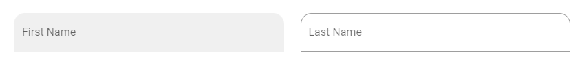
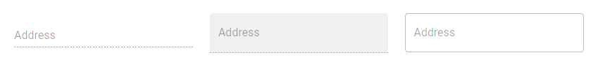
Disabling Text Fields in Vuetify
We can stop a text field from accepting any input by setting the disabled prop to true.
<template>
  <v-app>
    <v-row class="ma-2">
      <v-col cols="4"
        ><v-text-field label="Address" disabled></v-text-field
      ></v-col>
      <v-col cols="4"
        ><v-text-field label="Address" filled disabled></v-text-field
      ></v-col>
      <v-col cols="4"
        ><v-text-field label="Address" outlined disabled></v-text-field
      ></v-col>
    </v-row>
  </v-app>
</template>

<script>
export default {
  name: 'App',
};
</script>
Readonly Text Fields
We can also prevent text field input with the readonly prop:
<template>
  <v-app>
    <v-row class="ma-2" justify="center">
      <v-col cols="4"
        ><v-text-field label="Regular" value="Regular" readonly></v-text-field
      ></v-col>
    </v-row>
  </v-app>
</template>

<script>
export default {
  name: 'App',
};
</script>
Solo Text Fields
We can style text fields with an alternative solo design with the solo prop:
<template>
  <v-app>
    <v-row class="ma-2" justify="center">
      <v-col cols="4"
        ><v-text-field
          label="Solo"
          solo
        ></v-text-field
      ></v-col>
    </v-row>
  </v-app>
</template>

<script>
export default {
  name: 'App',
};
</script>


Single-line Text Fields
To prevent text field labels from floating when focused, we can use the single-line prop:
<template>
  <v-app>
    <v-row class="ma-2" justify="center">
      <v-col cols="4"
        ><v-text-field label="Single-line" single-line></v-text-field
      ></v-col>
    </v-row>
  </v-app>
</template>

<script>
export default {
  name: 'App',
};
</script>


Summary
Vuetify provides the v-text-field component for creating text fields, which are useful for getting text input from users.
11 Amazing New JavaScript Features in ES13
This guide will bring you up to speed with all the latest features added in ECMAScript 13. These powerful new features will modernize your JavaScript with shorter and more expressive code.
