Tabs are a great way of organizing your content and adding an additional hierarchy of navigation to your app. We’re going to learn how to create them in Vuetify in this article.
v-tabs and v-tab
A Vuetify tab is created with the v-tab component, wrapped inside a v-tabs component:
<template>
  <v-app>
    <v-tabs>
      <v-tab>Tab 1</v-tab>
      <v-tab>Tab 2</v-tab>
      <v-tab>Tab 3</v-tab>
    </v-tabs>
  </v-app>
</template>

<script>
export default {
  name: 'App',
};
</script>
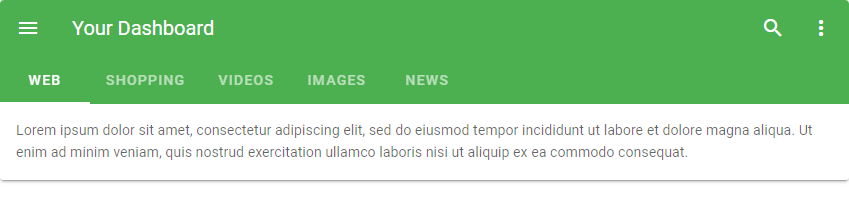
Aligning Tabs with the Toolbar Title
We can line up v-tabs with the v-toolbar-title component using the align-with-title prop:
<template>
  <v-app>
    <v-card>
      <v-toolbar color="green" dark flat>
        <v-app-bar-nav-icon></v-app-bar-nav-icon>

        <v-toolbar-title>Your Dashboard</v-toolbar-title>

        <v-spacer></v-spacer>

        <v-btn icon>
          <v-icon>mdi-magnify</v-icon>
        </v-btn>

        <v-btn icon>
          <v-icon>mdi-dots-vertical</v-icon>
        </v-btn>

        <template v-slot:extension>
          <v-tabs v-model="tab" align-with-title>
            <v-tabs-slider color="white"></v-tabs-slider>

            <v-tab v-for="item in items" :key="item">
              {{ item }}
            </v-tab>
          </v-tabs>
        </template>
      </v-toolbar>

      <v-tabs-items v-model="tab">
        <v-tab-item v-for="item in items" :key="item">
          <v-card flat>
            <v-card-text v-text="text"></v-card-text>
          </v-card>
        </v-tab-item>
      </v-tabs-items>
    </v-card>
  </v-app>
</template>

<script>
export default {
  name: 'App',
  data() {
    return {
      tab: null,
      items: ['web', 'shopping', 'videos', 'images', 'news'],
      text: 'Lorem ipsum dolor sit amet, consectetur adipiscing elit, sed do eiusmod tempor incididunt ut labore et dolore magna aliqua. Ut enim ad minim veniam, quis nostrud exercitation ullamco laboris nisi ut aliquip ex ea commodo consequat.',
    };
  },
};
</script>
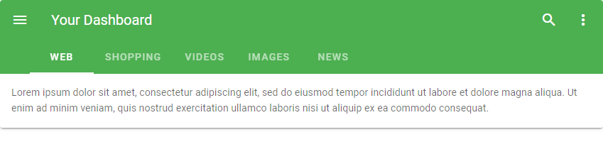
Without setting the align-with-title prop on the v-tabs component, it would have looked like this:
The center-active Prop
Setting the center-active prop to true on the v-tabs component will make the active tab always centred. For example:
<template>
  <v-app>
    <v-card>
      <v-tabs background-color="primary" center-active dark>
        <v-tab>One</v-tab>
        <v-tab>Two</v-tab>
        <v-tab>Three</v-tab>
        <v-tab>Four</v-tab>
        <v-tab>Five</v-tab>
        <v-tab>Six</v-tab>
        <v-tab>Seven</v-tab>
        <v-tab>Eight</v-tab>
        <v-tab>Nine</v-tab>
        <v-tab>Ten</v-tab>
        <v-tab>Eleven</v-tab>
        <v-tab>Twelve</v-tab>
        <v-tab>Thirteen</v-tab>
        <v-tab>Fourteen</v-tab>
        <v-tab>Fifteen</v-tab>
        <v-tab>Sixteen</v-tab>
        <v-tab>Seventeen</v-tab>
        <v-tab>Eighteen</v-tab>
        <v-tab>Nineteen</v-tab>
        <v-tab>Twenty</v-tab>
      </v-tabs>
    </v-card>
  </v-app>
</template>

<script>
export default {
  name: 'App',
};
</script>

Clicking on another tab will make it active and centre it:

Custom Tab Icons
With the next-icon and prev-icon props, we can customize the icon used to navigate through all the tab titles.
<template>
  <v-app>
    <v-sheet elevation="6">
      <v-tabs
        background-color="red"
        dark
        next-icon="mdi-arrow-right-bold-box-outline"
        prev-icon="mdi-arrow-left-bold-box-outline"
        show-arrows
      >
        <v-tabs-slider color="orange"></v-tabs-slider>
        <v-tab v-for="i in 20" :key="i" :href="'#tab-' + i">
          Item {{ i }}
        </v-tab>
      </v-tabs>
    </v-sheet>
  </v-app>
</template>
...

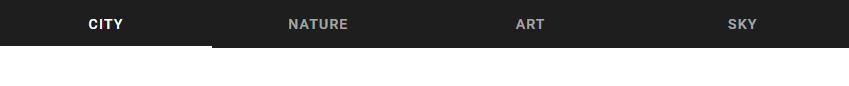
Fixed Tabs
With the fixed-tabs prop, we can make the v-tab components to fill up all the available space until they get to their maximum width (300px):
<template>
  <v-app>

    <v-tabs fixed-tabs dark>
      <v-tab> City </v-tab>
      <v-tab> Nature </v-tab>
      <v-tab> Art </v-tab>
      <v-tab> Sky </v-tab>
    </v-tabs>

  </v-app>
</template>
...
The grow Prop
Setting the grow prop to true on a v-tabs component does the same thing as setting the fixed-tabs prop. It makes the tabs take up all the available space up to the maximum width of 300px:
<template>
  <v-app>
    <v-tabs grow dark>
      <v-tab> City </v-tab>
      <v-tab> Nature </v-tab>
      <v-tab> Art </v-tab>
      <v-tab> Sky </v-tab>
    </v-tabs>
  </v-app>
</template>
...
Using Icons in Tab Titles
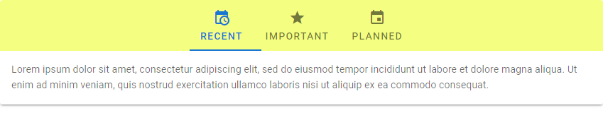
We can customize the Vuetify tab components to allow icons to be used in their titles with the icons-with-text prop. Setting this prop to true will increase the height of the v-tabs component to 72px to allow for both icons and text to be used.
Summary
Vuetify allows us to create and customize tabs with the v-tabs and v-tab component. We can customize certain properties of these tabs, such as styling their color and width.
Every Crazy Thing JavaScript Does
A captivating guide to the subtle caveats and lesser-known parts of JavaScript.
