
While we could use the CSS :hover pseudo-class to customize element styles on mouse hover, Vuetify provides a neat way of doing this, with the v-hover component. Let’s see how we can use it in this article.
Vuetify hover component (v-hover)
<template>
  <v-app>
    <div class="d-flex justify-center">
      <v-hover v-slot="{ hover }">
        <v-card
          class="ma-4 pa-4"
          width="200"
          height="200"
          :elevation="hover ? 12 : 2"
        >
          Hover over me!
        </v-card>
      </v-hover>
    </div>
  </v-app>
</template>

<script>
export default {
  name: 'App',
};
</script>
The v-hover default slot provides a hover prop, whose value changes depending on the current hover state of the child of the hover component; when the mouse has not hovered over it, hover remains false. For our case, that will set the elevation of the card to 2:

And when we hover over it, hover becomes true and the card elevation becomes 12:

Vuetify hover open delay
We can delay the hover prop change from false to true with the open-delay prop. In the code below, we use open-delay to set a delay of 200ms for the hover prop to become true from mouse hover:
<template>
  <v-app>
    <div class="d-flex justify-center">
      <v-hover v-slot="{ hover }" open-delay="200">
        <v-card
          :elevation="hover ? 16 : 2"
          :class="{ 'on-hover': hover }"
          class="ma-4"
          height="100"
          max-width="250"
        >
          <v-card-text> Open Delay (Mouse enter) </v-card-text>
        </v-card>
      </v-hover>
    </div>
  </v-app>
</template>

<script>
export default {
  name: 'App',
};
</script>

Vuetify hover close delay
Similarly, we can delay the hover prop from true to false after the mouse leaves it, with the close-delay prop. So after the mouse leaves the card, it would take 200ms for its elevation to be reduced:
<template>
  <v-app>
    <div class="d-flex justify-center">
      <v-hover v-slot="{ hover }" close-delay="200">
        <v-card
          :elevation="hover ? 16 : 2"
          :class="{ 'on-hover': hover }"
          class="ma-4"
          height="100"
          max-width="250"
        >
          <v-card-text> Close Delay (Mouse leave) </v-card-text>
        </v-card>
      </v-hover>
    </div>
  </v-app>
</template>

<script>
export default {
  name: 'App',
};
</script>

Disable hover
We can disable the hover functionality with the disabled prop:
<template>
  <v-app>
    <div class="d-flex justify-center ma-4">
      <v-hover v-slot="{ hover }" disabled>
        <v-card
          :elevation="hover ? 12 : 2"
          height="100"
          max-width="250"
        >
          <v-card-text class="my-4 text-center text-h6">
            Hover disabled
          </v-card-text>
        </v-card>
      </v-hover>
    </div>
  </v-app>
</template>

<script>
export default {
  name: 'App',
};
</script>
Nothing will happen when you hover over the card:

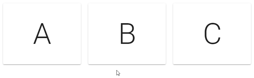
Vuetify hover list
We can combine v-hover and v-for to make a single item stand out when the user interacts with the list:
<template>
  <v-app>
    <v-container>
      <v-row class="fill-height" align="center" justify="center">
        <v-col v-for="(letter, index) in letters" :key="index">
          <v-hover v-slot="{ hover }">
            <v-card
              height="200"
              :elevation="hover ? 12 : 2"
              :class="{ 'on-hover': hover }"
            >
              <div
                class="text-h1 d-flex justify-center align-center fill-height"
              >
                {{ letter }}
              </div>
            </v-card>
          </v-hover>
        </v-col>
      </v-row>
    </v-container>
  </v-app>
</template>

<script>
export default {
  name: 'App',
  data() {
    return {
      letters: ['A', 'B', 'C'],
    };
  },
};
</script>
Now each card stands out when hovered over:
Hover transitions in Vuetify
With the hover component, we can create components that respond in highly customized ways to user interaction. For example:
<template>
  <v-app>
    <div class="d-flex justify-center">
      <v-hover v-slot="{ hover }">
        <v-card class="ma-4 pa-4" width="300">
          <p class="mb-4">Sign up to get started</p>
          <v-expand-transition>
            <div v-if="hover"><v-btn color="primary" dark>Sign up</v-btn></div>
          </v-expand-transition>
        </v-card>
      </v-hover>
    </div>
  </v-app>
</template>

<script>
export default {
  name: 'App',
};
</script>
When you hover over the card, the extra portion containing the “Sign Up” button slides out (thanks to the v-expand-transition component):

Conclusion
Vuetify provides the v-hover component for handling toggling component styles based on their current hover state. It provides customization options, such as creating hover event delays and displaying transitions on hover.
Every Crazy Thing JavaScript Does
A captivating guide to the subtle caveats and lesser-known parts of JavaScript.
