A snackbar helps to display quick messages. We can use it to notify users of certain events that occur in an app (for example, deleting an item from a list). It might also contain actions related to the information shown that users can take. In this article, we’re going to learn how to create a snackbar using the Vuetify framework.
The Vuetify Snackbar Component
We can create a snackbar in Vuetify using the v-snackbar component. In the code below, we create a “Close” button in the action slot of the snackbar. When this button is clicked, the snackbar variable is set to false to hide the snackbar.
<template>
<v-app>
<div class="text-center ma-2">
<v-btn @click="snackbar = true"> Open Snackbar </v-btn>
<v-snackbar v-model="snackbar">
{{ text }}
<template v-slot:action="{ attrs }">
<v-btn text v-bind="attrs" @click="snackbar = false"> Close </v-btn>
</template>
</v-snackbar>
</div>
</v-app>
</template>
<script>
export default {
name: 'App',
data: () => ({
snackbar: false,
text: 'You opened the snackbar!',
}),
};
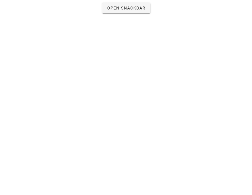
</script>snackbar is false by default, so at first we can only see the button that opens the snackbar:
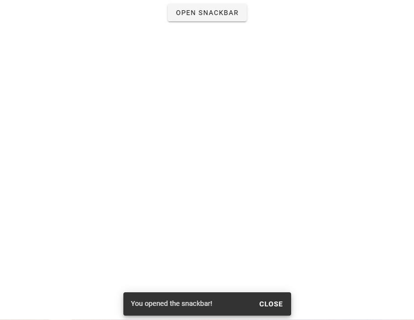
Clicking on the button sets snackbar to true, which displays the snackbar component:
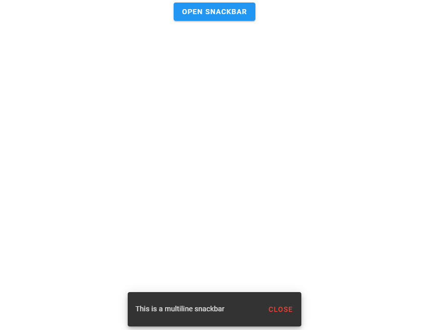
Multi line Snackbars in Vuetify
With the multi-line prop, we can increase the height of the v-snackbar component to make some room for more content.
<template>
  <v-app>
    <div class="text-center ma-2">
      <v-btn dark color="blue" @click="snackbar = true"> Open Snackbar </v-btn>

      <v-snackbar v-model="snackbar" multi-line>
        {{ text }}

        <template v-slot:action="{ attrs }">
          <v-btn color="red" text v-bind="attrs" @click="snackbar = false">
            Close
          </v-btn>
        </template>
      </v-snackbar>
    </div>
  </v-app>
</template>

<script>
export default {
  name: 'App',
  data: () => ({
    snackbar: false,
    text: 'This is a multiline snackbar',
  }),
};
</script>
Snackbar Timeouts in Vuetify
The timeout prop allows us to customize the delay before the snackbar is hidden:
<template>
  <v-app>
    <div class="text-center ma-2">
      <v-btn dark color="indigo darken-2 ma-4" @click="snackbar = true">
        Open Snackbar
      </v-btn>

      <v-snackbar v-model="snackbar">
        {{ text }}

        <template v-slot:action="{ attrs }">
          <v-btn color="blue" text v-bind="attrs" @click="snackbar = false">
            Close
          </v-btn>
        </template>
      </v-snackbar>
    </div>
  </v-app>
</template>

<script>
export default {
  name: 'App',
  data: () => ({
    snackbar: false,

    text: 'This snackbar has a timeout of 3000.',
  }),
};
</script>
Vuetify Snackbar Shaped Variant
We can create the shaped snackbar variant with the shaped prop:
<template>
  <v-app>
    <div class="text-center ma-2">
      <v-btn dark color="indigo darken-2 ma-4" @click="snackbar = true">
        Open Snackbar
      </v-btn>

      <v-snackbar v-model="snackbar" shaped>
        {{ text }}

        <template v-slot:action="{ attrs }">
          <v-btn color="blue" text v-bind="attrs" @click="snackbar = false">
            Close
          </v-btn>
        </template>
      </v-snackbar>
    </div>
  </v-app>
</template>

<script>
export default {
  name: 'App',
  data: () => ({
    snackbar: false,
    text: 'Welcome to Coding Beauty!',
  }),
};
</script>

Rounded Snackbars in Vuetify
Setting the rounded prop to true on a snackbar will make it rounded:
<template>
  <v-app>
    <div class="text-center ma-2">
      <v-btn dark color="indigo darken-2 ma-4" @click="snackbar = true">
        Open Snackbar
      </v-btn>

      <v-snackbar v-model="snackbar" rounded="pill">
        {{ text }}

        <template v-slot:action="{ attrs }">
          <v-btn color="green" text v-bind="attrs" @click="snackbar = false">
            Close
          </v-btn>
        </template>
      </v-snackbar>
    </div>
  </v-app>
</template>

<script>
export default {
  name: 'App',
  data: () => ({
    snackbar: false,
    text: 'Welcome to Coding Beauty!',
  }),
};
</script>

Snackbar Elevation in Vuetify
We can increase the degree of elevation on a snackbar with the elevation prop. Here, we’ve set it to 24:
<template>
  <v-app>
    <div class="text-center ma-2">
      <v-btn dark color="indigo darken-2 ma-4" @click="snackbar = true">
        Open Snackbar
      </v-btn>

      <v-snackbar v-model="snackbar" color="blue" elevation="24">
        {{ text }}

        <template v-slot:action="{ attrs }">
          <v-btn dark text v-bind="attrs" @click="snackbar = false">
            Close
          </v-btn>
        </template>
      </v-snackbar>
    </div>
  </v-app>
</template>

<script>
export default {
  name: 'App',
  data: () => ({
    snackbar: false,
    text: 'Welcome to Coding Beauty!',
  }),
};
</script>

Vuetify Snackbar Tile Variant
Setting the tile prop on the snackbar removes the default border radius:
<template>
  <v-app>
    <div class="text-center ma-2">
      <v-btn dark color="ma-4" @click="snackbar = true"> Open Snackbar </v-btn>

      <v-snackbar v-model="snackbar" color="red accent-2" tile>
        {{ text }}

        <template v-slot:action="{ attrs }">
          <v-btn dark text v-bind="attrs" @click="snackbar = false">
            Close
          </v-btn>
        </template>
      </v-snackbar>
    </div>
  </v-app>
</template>

<script>
export default {
  name: 'App',
  data: () => ({
    snackbar: false,
    text: 'Welcome to Coding Beauty!',
  }),
};
</script>

Vuetify Snackbar Text Variant
Vuetify also provides the text prop for using the snackbar’s text variant:
<template>
  <v-app>
    <div class="text-center ma-2">
      <v-btn dark color="ma-4" @click="snackbar = true"> Open Snackbar </v-btn>

      <v-snackbar v-model="snackbar" color="indigo" text>
        {{ text }}
      </v-snackbar>
    </div>
  </v-app>
</template>

<script>
export default {
  name: 'App',
  data: () => ({
    snackbar: false,
    text: 'Welcome to Coding Beauty!',
  }),
};
</script>

Vuetify Snackbar Outlined Variant
We can activate the outlined variant on the Vuetify snackbar component with the outlined prop:
<template>
  <v-app>
    <div class="text-center ma-2">
      <v-btn dark color="ma-4" @click="snackbar = true"> Open Snackbar </v-btn>

      <v-snackbar v-model="snackbar" color="primary" outlined>
        {{ text }}
      </v-snackbar>
    </div>
  </v-app>
</template>

<script>
export default {
  name: 'App',
  data: () => ({
    snackbar: false,
    text: 'Welcome to Coding Beauty!',
  }),
};
</script>

Summary
Vuetify provides the v-snackbar component for creating snackbars, along with various customization options and variants.
Every Crazy Thing JavaScript Does
A captivating guide to the subtle caveats and lesser-known parts of JavaScript.
