We can a dialog to interact with users. They convey messages and allow certain actions to be taken on them. Vuetify provides the v-dialog component for creating a dialog. Let’s see how we can use this component in practice.
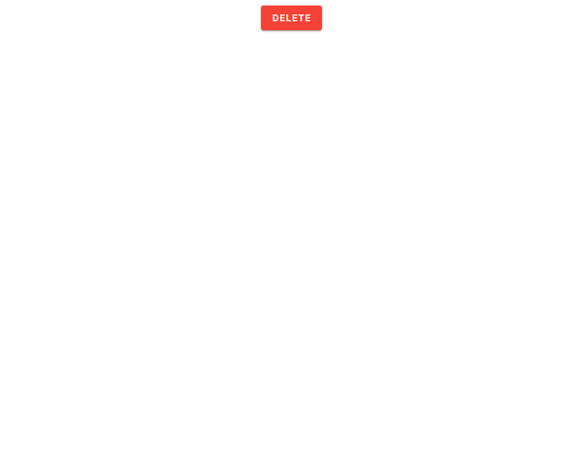
In the code below, we’ve created a dialog and a button of color red:
<template>
  <v-app>
    <div class="text-center">
      <v-dialog v-model="dialog" width="500">
        <template v-slot:activator="{ on, attrs }">
          <v-btn v-bind="attrs" v-on="on" class="mt-2" color="red" dark>
            Delete
          </v-btn>
        </template>

        <v-card>
          <v-card-title class="text-h5"> Delete file? </v-card-title>

          <v-card-text> Do you really want to delete this file? </v-card-text>

          <v-card-actions>
            <v-spacer></v-spacer>
            <v-btn text @click="dialog = false"> Cancel </v-btn>
            <v-btn color="red" text @click="dialog = false"> Delete </v-btn>
          </v-card-actions>
        </v-card>
      </v-dialog>
    </div>
  </v-app>
</template>

<script>
export default {
  name: 'App',
  data: () => ({
    dialog: false,
  }),
};
</script>
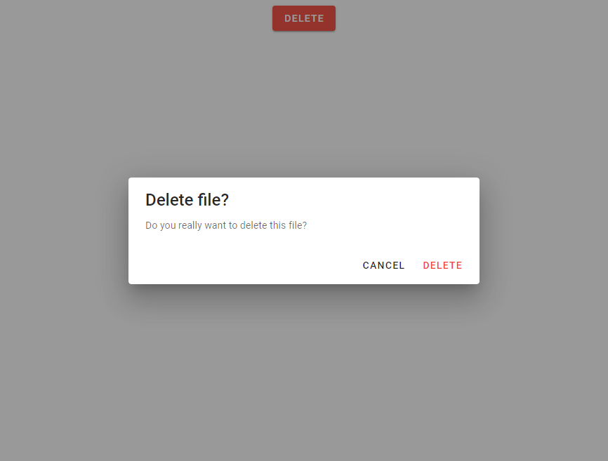
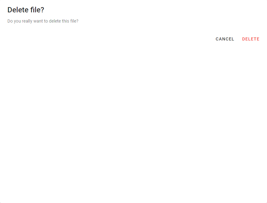
We’ve placed the button in the activator slot of the v-dialog component. This slot provides some props – on and attrs, which we used to set the props and the event handlers of the button. We use a card to create the body of the dialog.
The dialog shows up when the button is clicked:
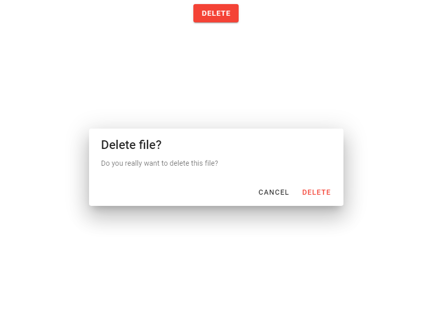
Using the “hide-overlay” Prop
The dialog opens with an overlay, as we can see in the image above. We can hide this overlay, by setting the hide-overlay prop to true:
<template>
  <v-app>
    <div class="text-center">
      <v-dialog v-model="dialog" width="500" hide-overlay>
        <template v-slot:activator="{ on, attrs }">
          <v-btn v-bind="attrs" v-on="on" class="mt-2" color="red" dark>
            Delete
          </v-btn>
        </template>

        <v-card>
          <v-card-title class="text-h5"> Delete file? </v-card-title>

          <v-card-text> Do you really want to delete this file? </v-card-text>

          <v-card-actions>
            <v-spacer></v-spacer>
            <v-btn text @click="dialog = false"> Cancel </v-btn>
            <v-btn color="red" text @click="dialog = false"> Delete </v-btn>
          </v-card-actions>
        </v-card>
      </v-dialog>
    </div>
  </v-app>
</template>
It would look like this:
Creating Fullscreen Dialogs
We can make the dialog cover up the entire viewport of the page, by setting the fullscreen prop to true:
<template>
  <v-app>
    <div class="text-center">
      <v-dialog v-model="dialog" width="500" fullscreen>
        <template v-slot:activator="{ on, attrs }">
          <v-btn v-bind="attrs" v-on="on" class="mt-2" color="red" dark>
            Delete
          </v-btn>
        </template>

        <v-card>
          <v-card-title class="text-h5"> Delete file? </v-card-title>

          <v-card-text> Do you really want to delete this file? </v-card-text>

          <v-card-actions>
            <v-spacer></v-spacer>
            <v-btn text @click="dialog = false"> Cancel </v-btn>
            <v-btn color="red" text @click="dialog = false"> Delete </v-btn>
          </v-card-actions>
        </v-card>
      </v-dialog>
    </div>
  </v-app>
</template>
...
Using Custom Dialog Transitions
We can customize the transition that a dialog uses to appear on the screen using the transition prop. In the code below, we’ve set it to dialog-bottom-transition, which will make the dialog slide in from the bottom when opened:
<template>
  <v-app>
    <div class="text-center">
      <v-dialog
        v-model="dialog"
        width="500"
        transition="dialog-bottom-transition"
      >
        <template v-slot:activator="{ on, attrs }">
          <v-btn v-bind="attrs" v-on="on" class="mt-2" color="red" dark>
            Delete
          </v-btn>
        </template>

        <v-card>
          <v-card-title class="text-h5"> Delete file? </v-card-title>

          <v-card-text> Do you really want to delete this file? </v-card-text>

          <v-card-actions>
            <v-spacer></v-spacer>
            <v-btn text @click="dialog = false"> Cancel </v-btn>
            <v-btn color="red" text @click="dialog = false"> Delete </v-btn>
          </v-card-actions>
        </v-card>
      </v-dialog>
    </div>
  </v-app>
</template>
...
If we wanted to make it slide in from the top, we could have set the same prop to dialog-top-transition:
<template>
  <v-app>
    <div class="text-center">
      <v-dialog
        v-model="dialog"
        width="500"
        transition="dialog-bottom-transition"
      >
        <template v-slot:activator="{ on, attrs }">
          <v-btn v-bind="attrs" v-on="on" class="mt-2" color="red" dark>
            Delete
          </v-btn>
        </template>

        <v-card>
          <v-card-title class="text-h5"> Delete file? </v-card-title>

          <v-card-text> Do you really want to delete this file? </v-card-text>

          <v-card-actions>
            <v-spacer></v-spacer>
            <v-btn text @click="dialog = false"> Cancel </v-btn>
            <v-btn color="red" text @click="dialog = false"> Delete </v-btn>
          </v-card-actions>
        </v-card>
      </v-dialog>
    </div>
  </v-app>
</template>
...
How to Make Dialogs Persistent
By default, Vuetify dialogs can be dismissed by clicking or tapping somewhere outside of it. If we don’t want this to be the case, we can set the persistent prop to true:
<template>
  <v-app>
    <div class="text-center">
      <v-dialog
        v-model="dialog"
        width="500"
        persistent
      >
        <template v-slot:activator="{ on, attrs }">
          <v-btn v-bind="attrs" v-on="on" class="mt-2" color="red" dark>
            Delete
          </v-btn>
        </template>

        <v-card>
          <v-card-title class="text-h5"> Delete file? </v-card-title>

          <v-card-text> Do you really want to delete this file? </v-card-text>

          <v-card-actions>
            <v-spacer></v-spacer>
            <v-btn text @click="dialog = false"> Cancel </v-btn>
            <v-btn color="red" text @click="dialog = false"> Delete </v-btn>
          </v-card-actions>
        </v-card>
      </v-dialog>
    </div>
  </v-app>
</template>
...
Summary
Vuetify provides the v-dialog component for creating dialogs in a user interface. We can change certain properties of these dialogs, such as making them fullscreen or changing the transition they used to appear on the screen.
Every Crazy Thing JavaScript Does
A captivating guide to the subtle caveats and lesser-known parts of JavaScript.
