
A stepper displays progress through a sequence by separating it into multiple logical and numbered steps. We can use it in scenarios like shopping carts, or cases where an input field determines a subsequent field. In this article, we’re going to learn how to use the Vuetify stepper component to easily create and customize steppers.
The Vuetify Stepper Component (v-stepper)
Vuetify provides the v-stepper component for creating a stepper. We indicate the steps with v-stepper-step components and display content for each step with v-stepper-content components. Every v-stepper-step or v-stepper-content has a step prop that we use to set the step it should be associated with. v-stepper-steps are typically wrapped in a v-stepper-header, while v-stepper-contents are wrapped in a v-stepper-items.
<template>
  <v-app>
    <div class="ma-4">
      <v-stepper v-model="step">
        <v-stepper-header>
          <v-stepper-step
            :complete="step > 1"
            step="1"
          >
            Step 1
          </v-stepper-step>

          <v-divider></v-divider>

          <v-stepper-step
            :complete="step > 2"
            step="2"
          >
            Step 2
          </v-stepper-step>

          <v-divider></v-divider>

          <v-stepper-step step="3"> Step 3 </v-stepper-step>
        </v-stepper-header>

        <v-stepper-items>
          <v-stepper-content step="1">
            <v-card
              class="mb-12"
              color="grey lighten-1"
              height="200px"
            ></v-card>

            <v-btn
              color="primary"
              @click="step = 2"
            >
              Continue
            </v-btn>

            <v-btn text> Cancel </v-btn>
          </v-stepper-content>

          <v-stepper-content step="2">
            <v-card
              class="mb-12"
              color="grey lighten-1"
              height="200px"
            ></v-card>

            <v-btn
              color="primary"
              @click="step = 3"
            >
              Continue
            </v-btn>

            <v-btn text> Cancel </v-btn>
          </v-stepper-content>

          <v-stepper-content step="3">
            <v-card
              class="mb-12"
              color="grey lighten-1"
              height="200px"
            ></v-card>

            <v-btn color="primary"> Continue </v-btn>

            <v-btn text> Cancel </v-btn>
          </v-stepper-content>
        </v-stepper-items>
      </v-stepper>
    </div>
  </v-app>
</template>

<script>
export default {
  name: 'App',
  data: () => ({
    step: 1,
  }),
};
</script>
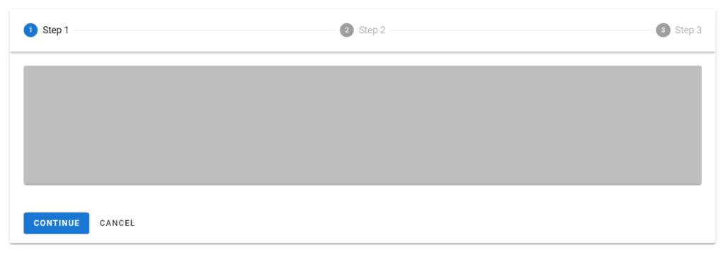
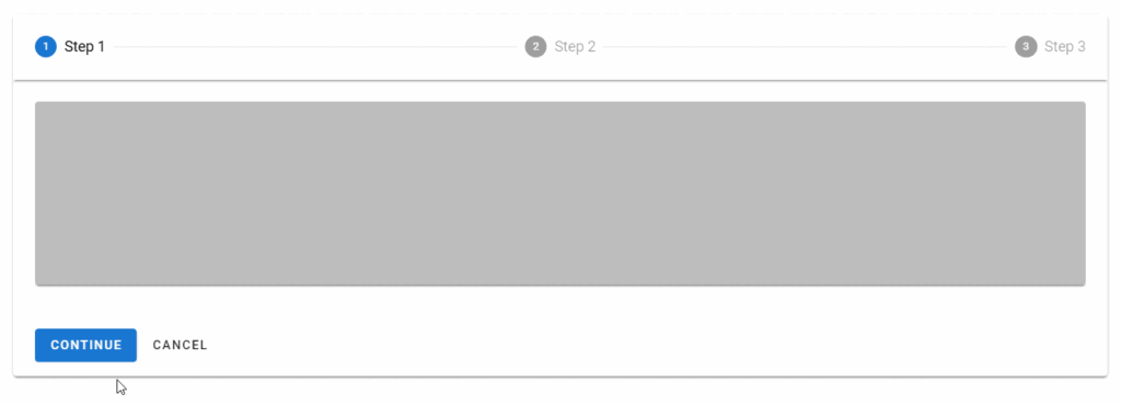
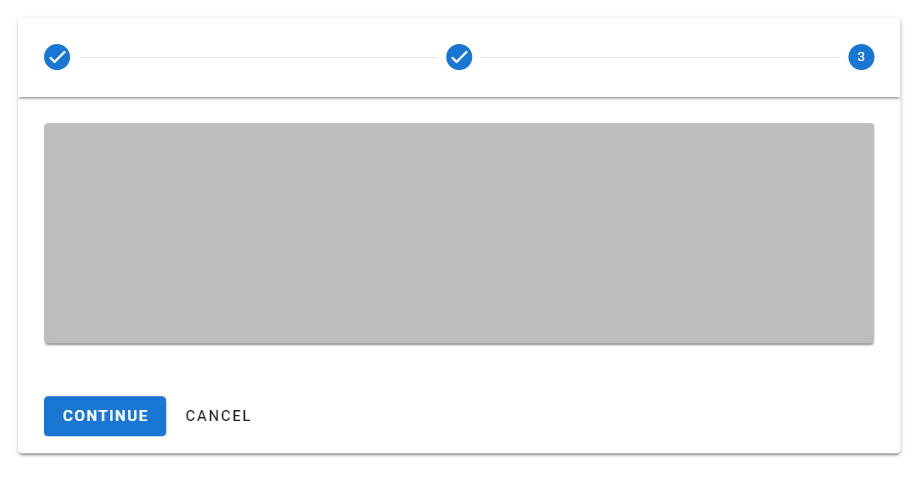
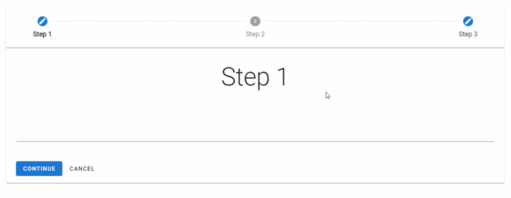
Clicking the “Continue” button moves the stepper to the next step with an animation:
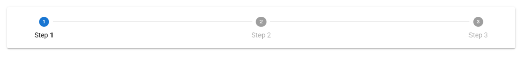
Smaller Screens
The name of the steps are not shown on smaller screens:
Vuetify Stepper Alt Labels
Using the alt-labels prop on the v-stepper places the name of each step under the circle representing the step.
<template>
  <v-app>
    <div class="ma-4">
      <v-stepper
        v-model="step"
        alt-labels
      >
        <v-stepper-header>
          <v-stepper-step
            :complete="step > 1"
            step="1"
          >
            Step 1
          </v-stepper-step>

          <v-divider></v-divider>

          <v-stepper-step
            :complete="step > 2"
            step="2"
          >
            Step 2
          </v-stepper-step>

          <v-divider></v-divider>

          <v-stepper-step step="3"> Step 3 </v-stepper-step>
        </v-stepper-header>
      </v-stepper>
    </div>
  </v-app>
</template>

<script>
export default {
  name: 'App',
  data: () => ({
    step: 1,
  }),
};
</script>
Stepper Color
With the color prop of the v-stepper-steps, we can customize the color of completed steps or the current step. We can use any color from the Material Design specs.
<template>
  <v-app>
    <div class="ma-4">
      <v-stepper
        value="3"
      >
        <v-stepper-header>
          <v-stepper-step
            complete
            step="1"
            color="green"
          >
            Step 1
          </v-stepper-step>

          <v-divider></v-divider>

          <v-stepper-step
            complete
            step="2"
            color="green"
          >
            Step 2
          </v-stepper-step>

          <v-divider></v-divider>

          <v-stepper-step
            step="3"
            color="green"
          >
            Step 3
          </v-stepper-step>

          <v-divider></v-divider>

          <v-stepper-step
            step="4"
            color="green"
          >
            Step 4
          </v-stepper-step>
        </v-stepper-header>
      </v-stepper>
    </div>
  </v-app>
</template>

<script>
export default {
  name: 'App',
};
</script>

Editable Steps
An editable step allows the user to return later to modify it. We can make a step editable by setting the editable prop to true on the v-stepper-step associated with it.
<template>
  <v-app>
    <div class="ma-4">
      <v-stepper
        v-model="step"
        alt-labels
        non-linear
      >
        <v-stepper-header>
          <v-stepper-step
            complete
            editable
            step="1"
          >
            Step 1
          </v-stepper-step>

          <v-divider></v-divider>

          <v-stepper-step
            editable
            step="2"
          >
            Step 2
          </v-stepper-step>

          <v-divider></v-divider>

          <v-stepper-step
            step="3"
            complete
            editable
          >
            Step 3
          </v-stepper-step>
        </v-stepper-header>

        <v-stepper-items>
          <v-stepper-content step="1">
            <v-card
              class="mb-12 pa-4"
              color="text-h2 text-center"
              height="200px"
            >
              <div>Step 1</div>
            </v-card>

            <v-btn
              color="primary"
              @click="step = 2"
            >
              Continue
            </v-btn>

            <v-btn text> Cancel </v-btn>
          </v-stepper-content>

          <v-stepper-content step="2">
            <v-card
              class="mb-12 pa-4"
              color="text-h2 text-center"
              height="200px"
            >
              <div>Step 2</div>
            </v-card>

            <v-btn
              color="primary"
              @click="step = 3"
            >
              Continue
            </v-btn>

            <v-btn text> Cancel </v-btn>
          </v-stepper-content>

          <v-stepper-content step="3">
            <v-card
              class="mb-12 pa-4"
              color="text-h2 text-center"
              height="200px"
            >
              <div>Step 3</div>
            </v-card>

            <v-btn color="primary"> Continue </v-btn>

            <v-btn text> Cancel </v-btn>
          </v-stepper-content>
        </v-stepper-items>
      </v-stepper>
    </div>
  </v-app>
</template>

<script>
export default {
  name: 'App',
  data: () => ({
    step: 1,
  }),
};
</script>
Non-editable Steps
Non-editable steps prevent modification once completed. A step is non-editable if the associated v-stepper-step does not have its step prop set to true.
<template>
  <v-app>
    <div class="ma-4">
      <v-stepper
        v-model="step"
        alt-labels
        non-linear
      >
        <v-stepper-header>
          <v-stepper-step
            complete
            editable
            step="1"
          >
            Step 1
          </v-stepper-step>

          <v-divider></v-divider>

          <v-stepper-step
            editable
            step="2"
          >
            Step 2
          </v-stepper-step>

          <v-divider></v-divider>

          <v-stepper-step
            step="3"
            complete
          >
            Step 3
          </v-stepper-step>

          <v-divider></v-divider>

          <v-stepper-step
            step="4"
            complete
            editable
          >
            Step 4
          </v-stepper-step>
        </v-stepper-header>

        <v-stepper-items>
          <v-stepper-content step="1">
            <v-card
              class="mb-12 pa-4"
              color="text-h2 text-center"
              height="200px"
            >
              <div>Step 1</div>
            </v-card>

            <v-btn
              color="primary"
              @click="step = 2"
            >
              Continue
            </v-btn>

            <v-btn text> Cancel </v-btn>
          </v-stepper-content>

          <v-stepper-content step="2">
            <v-card
              class="mb-12 pa-4"
              color="text-h2 text-center"
              height="200px"
            >
              <div>Step 2</div>
            </v-card>

            <v-btn
              color="primary"
              @click="step = 3"
            >
              Continue
            </v-btn>

            <v-btn text> Cancel </v-btn>
          </v-stepper-content>

          <v-stepper-content step="3">
            <v-card
              class="mb-12 pa-4"
              color="text-h2 text-center"
              height="200px"
            >
              <div>Step 3</div>
            </v-card>

            <v-btn color="primary"> Continue </v-btn>

            <v-btn text> Cancel </v-btn>
          </v-stepper-content>

          <v-stepper-content step="4">
            <v-card
              class="mb-12 pa-4"
              color="text-h2 text-center"
              height="200px"
            >
              <div>Step 4</div>
            </v-card>

            <v-btn color="primary"> Continue </v-btn>

            <v-btn text> Cancel </v-btn>
          </v-stepper-content>
        </v-stepper-items>
      </v-stepper>
    </div>
  </v-app>
</template>

<script>
export default {
  name: 'App',
  data: () => ({
    step: 1,
  }),
};
</script>
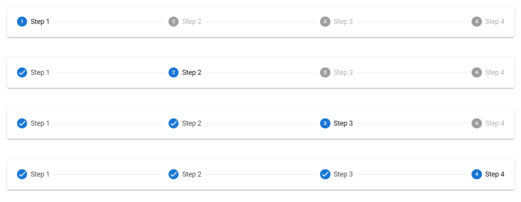
Vuetify Stepper Linear
Linear steppers move users through the defined path. One step must be completed before moving on to the next.
<template>
  <v-app>
    <div class="ma-4">
      <v-stepper alt-labels>
        <v-stepper-header>
          <v-stepper-step step="1"> Step 1 </v-stepper-step>
          <v-divider></v-divider>
          <v-stepper-step step="2"> Step 2 </v-stepper-step>
          <v-divider></v-divider>
          <v-stepper-step step="3"> Step 3 </v-stepper-step>
          <v-divider></v-divider>
          <v-stepper-step step="4"> Step 4 </v-stepper-step>
        </v-stepper-header>
      </v-stepper>

      <v-stepper
        alt-labels
        value="2"
        class="mt-12"
      >
        <v-stepper-header>
          <v-stepper-step
            step="1"
            complete
          >
            Step 1
          </v-stepper-step>
          <v-divider></v-divider>
          <v-stepper-step step="2"> Step 2 </v-stepper-step>
          <v-divider></v-divider>
          <v-stepper-step step="3"> Step 3 </v-stepper-step>
          <v-divider></v-divider>
          <v-stepper-step step="4"> Step 4 </v-stepper-step>
        </v-stepper-header>
      </v-stepper>

      <v-stepper
        alt-labels
        value="3"
        class="mt-12"
      >
        <v-stepper-header>
          <v-stepper-step
            step="1"
            complete
          >
            Step 1
          </v-stepper-step>
          <v-divider></v-divider>
          <v-stepper-step
            step="2"
            complete
          >
            Step 2
          </v-stepper-step>
          <v-divider></v-divider>
          <v-stepper-step step="3"> Step 3 </v-stepper-step>
          <v-divider></v-divider>
          <v-stepper-step step="4"> Step 4 </v-stepper-step>
        </v-stepper-header>
      </v-stepper>

      <v-stepper
        alt-labels
        value="4"
        class="mt-12"
      >
        <v-stepper-header>
          <v-stepper-step
            step="1"
            complete
          >
            Step 1
          </v-stepper-step>
          <v-divider></v-divider>
          <v-stepper-step
            step="2"
            complete
          >
            Step 2
          </v-stepper-step>
          <v-divider></v-divider>
          <v-stepper-step
            step="3"
            complete
          >
            Step 3
          </v-stepper-step>
          <v-divider></v-divider>
          <v-stepper-step step="4"> Step 4 </v-stepper-step>
        </v-stepper-header>
      </v-stepper>
    </div>
  </v-app>
</template>

<script>
export default {
  name: 'App',
};
</script>
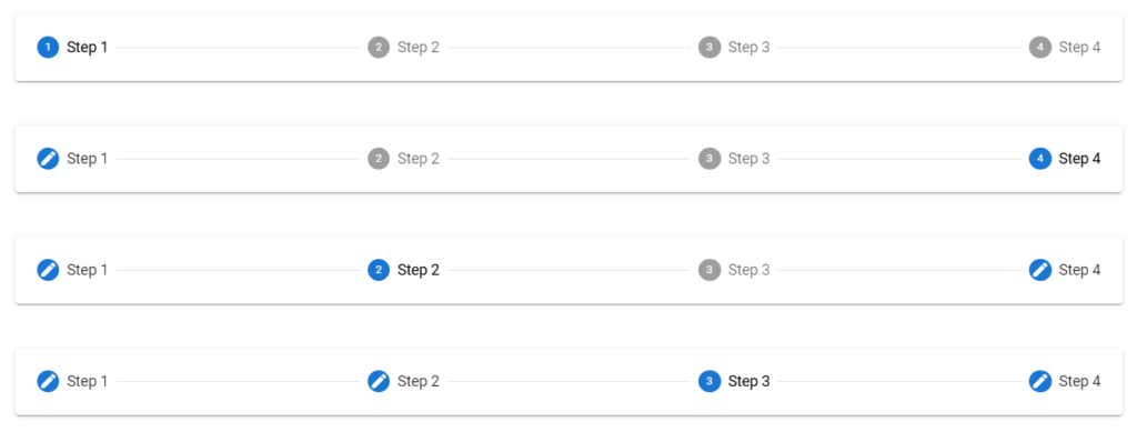
Vuetify Stepper Non-linear
A non-linear stepper allow the user to move through your process in their preferred way.
<template>
  <v-app>
    <div class="ma-4">
      <v-stepper non-linear>
        <v-stepper-header>
          <v-stepper-step
            step="1"
            editable
          >
            Step 1
          </v-stepper-step>
          <v-divider></v-divider>
          <v-stepper-step
            step="2"
            editable
          >
            Step 2
          </v-stepper-step>
          <v-divider></v-divider>
          <v-stepper-step
            step="3"
            editable
          >
            Step 3
          </v-stepper-step>
          <v-divider></v-divider>
          <v-stepper-step
            step="4"
            editable
          >
            Step 4
          </v-stepper-step>
        </v-stepper-header>
      </v-stepper>

      <v-stepper
        value="4"
        class="mt-12"
        non-linear
      >
        <v-stepper-header>
          <v-stepper-step
            step="1"
            complete
            editable
          >
            Step 1
          </v-stepper-step>
          <v-divider></v-divider>
          <v-stepper-step
            step="2"
            editable
          >
            Step 2
          </v-stepper-step>
          <v-divider></v-divider>
          <v-stepper-step
            step="3"
            editable
          >
            Step 3
          </v-stepper-step>
          <v-divider></v-divider>
          <v-stepper-step
            step="4"
            editable
          >
            Step 4
          </v-stepper-step>
        </v-stepper-header>
      </v-stepper>

      <v-stepper
        value="2"
        class="mt-12"
        non-linear
      >
        <v-stepper-header>
          <v-stepper-step
            step="1"
            complete
            editable
          >
            Step 1
          </v-stepper-step>
          <v-divider></v-divider>
          <v-stepper-step
            step="2"
            editable
          >
            Step 2
          </v-stepper-step>
          <v-divider></v-divider>
          <v-stepper-step
            step="3"
            editable
          >
            Step 3
          </v-stepper-step>
          <v-divider></v-divider>
          <v-stepper-step
            step="4"
            editable
            complete
          >
            Step 4
          </v-stepper-step>
        </v-stepper-header>
      </v-stepper>

      <v-stepper
        value="3"
        class="mt-12"
        non-linear
      >
        <v-stepper-header>
          <v-stepper-step
            step="1"
            complete
            editable
          >
            Step 1
          </v-stepper-step>
          <v-divider></v-divider>
          <v-stepper-step
            step="2"
            complete
            editable
          >
            Step 2
          </v-stepper-step>
          <v-divider></v-divider>
          <v-stepper-step
            step="3"
            editable
          >
            Step 3
          </v-stepper-step>
          <v-divider></v-divider>
          <v-stepper-step
            step="4"
            editable
            complete
          >
            Step 4
          </v-stepper-step>
        </v-stepper-header>
      </v-stepper>
    </div>
  </v-app>
</template>

<script>
export default {
  name: 'App',
};
</script>
Vuetify Stepper Vertical
A vertical stepper moves users through the steps along the y-axis and works similarly to a horizontal stepper. We can make a stepper vertical by setting the vertical prop of the v-stepper to true.
<template>
  <v-app>
    <div class="ma-4">
      <v-stepper
        v-model="step"
        vertical
      >
        <v-stepper-items>
          <v-stepper-step
            :complete="step > 1"
            step="1"
          >
            Step 1
          </v-stepper-step>
          <v-stepper-content step="1">
            <v-card
              class="mb-12"
              color="grey lighten-1"
              height="200px"
            ></v-card>

            <v-btn
              color="primary"
              @click="step = 2"
            >
              Continue
            </v-btn>

            <v-btn text> Cancel </v-btn>
          </v-stepper-content>

          <v-stepper-step
            :complete="step > 2"
            step="2"
          >
            Step 2
          </v-stepper-step>
          <v-stepper-content step="2">
            <v-card
              class="mb-12"
              color="grey lighten-1"
              height="200px"
            ></v-card>

            <v-btn
              color="primary"
              @click="step = 3"
            >
              Continue
            </v-btn>

            <v-btn text> Cancel </v-btn>
          </v-stepper-content>

          <v-stepper-content step="3">
            <v-stepper-step step="3">
              Step 3
            </v-stepper-step>

            <v-card
              class="mb-12"
              color="grey lighten-1"
              height="200px"
            ></v-card>

            <v-btn color="primary"> Continue </v-btn>

            <v-btn text> Cancel </v-btn>
          </v-stepper-content>
        </v-stepper-items>
      </v-stepper>
    </div>
  </v-app>
</template>

<script>
export default {
  name: 'App',
  data: () => ({
    step: 1,
  }),
};
</script>

Vuetify Stepper Horizontal
Horizontal steppers move the user through the steps along the x-axis. v-steppers are horizontal by default.
<template>
  <v-app>
    <div class="ma-4">
      <v-stepper value="3">
        <v-stepper-header>
          <v-stepper-step
            complete
            step="1"
          >
            Step 1
          </v-stepper-step>

          <v-divider></v-divider>

          <v-stepper-step
            complete
            step="2"
          >
            Step 2
          </v-stepper-step>

          <v-divider></v-divider>

          <v-stepper-step step="3"> Step 3 </v-stepper-step>

          <v-divider></v-divider>

          <v-stepper-step step="4"> Step 4 </v-stepper-step>
        </v-stepper-header>
      </v-stepper>
    </div>
  </v-app>
</template>

<script>
export default {
  name: 'App',
};
</script>

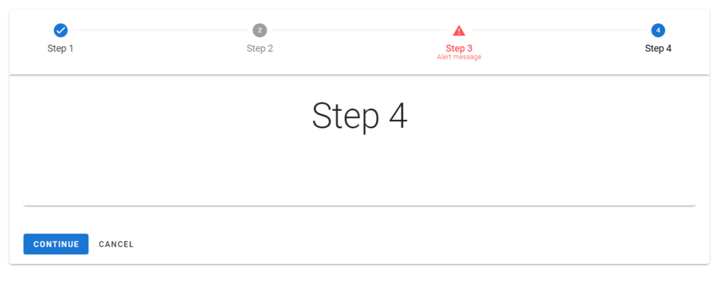
Vuetify Stepper Error Messages
We can display an error state on the stepper to indicate a compulsory action.
<template>
  <v-app>
    <div class="ma-4">
      <v-stepper
        v-model="step"
        alt-labels
        non-linear
      >
        <v-stepper-header>
          <v-stepper-step
            complete
            step="1"
          >
            Step 1
          </v-stepper-step>

          <v-divider></v-divider>

          <v-stepper-step
            editable
            step="2"
          >
            Step 2
          </v-stepper-step>

          <v-divider></v-divider>

          <v-stepper-step
            step="3"
            editable
            :rules="step3Rules"
          >
            <div class="text-center">
              Step 3
              <small>Alert message</small>
            </div>
          </v-stepper-step>

          <v-divider></v-divider>

          <v-stepper-step
            step="4"
            editable
          >
            Step 4
          </v-stepper-step>
        </v-stepper-header>
        <v-stepper-items>
          <v-stepper-content step="1">
            <v-card
              class="mb-12 pa-4"
              color="text-h2 text-center"
              height="200px"
            >
              <div>Step 1</div>
            </v-card>

            <v-btn
              color="primary"
              @click="step = 2"
            >
              Continue
            </v-btn>

            <v-btn text> Cancel </v-btn>
          </v-stepper-content>

          <v-stepper-content step="2">
            <v-card
              class="mb-12 pa-4"
              color="text-h2 text-center"
              height="200px"
            >
              <div>Step 2</div>
            </v-card>

            <v-btn
              color="primary"
              @click="step = 3"
            >
              Continue
            </v-btn>

            <v-btn text> Cancel </v-btn>
          </v-stepper-content>

          <v-stepper-content step="3">
            <v-card
              class="mb-12 pa-4"
              color="text-h2 text-center"
              height="200px"
            >
              <div>Step 3</div>
            </v-card>

            <v-btn color="primary"> Continue </v-btn>

            <v-btn text> Cancel </v-btn>
          </v-stepper-content>

          <v-stepper-content step="4">
            <v-card
              class="mb-12 pa-4"
              color="text-h2 text-center"
              height="200px"
            >
              <div>Step 4</div>
            </v-card>

            <v-btn color="primary"> Continue </v-btn>

            <v-btn text> Cancel </v-btn>
          </v-stepper-content>
        </v-stepper-items>
      </v-stepper>
    </div>
  </v-app>
</template>

<script>
export default {
  name: 'App',
  data: () => ({
    step: 1,
    step3Rules: [(value) => false],
  }),
};
</script>
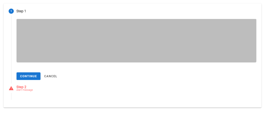
We can also display an error state in a vertical stepper:
<template>
  <v-app>
    <div class="ma-4">
      <v-stepper
        v-model="step"
        vertical
      >
        <v-stepper-items>
          <v-stepper-step
            :complete="step > 1"
            step="1"
          >
            Step 1
          </v-stepper-step>
          <v-stepper-content step="1">
            <v-card
              class="mb-12"
              color="grey lighten-1"
              height="200px"
            ></v-card>

            <v-btn
              color="primary"
              @click="step = 2"
            >
              Continue
            </v-btn>

            <v-btn text> Cancel </v-btn>
          </v-stepper-content>

          <v-stepper-step
            step="2"
            :rules="step2Rules"
            editable
          >
            Step 2
            <small>Alert message</small>
          </v-stepper-step>
          <v-stepper-content step="2">
            <v-card
              class="mb-12"
              color="grey lighten-1"
              height="200px"
            ></v-card>

            <v-btn
              color="primary"
              @click="step = 3"
            >
              Continue
            </v-btn>

            <v-btn text> Cancel </v-btn>
          </v-stepper-content>

          <v-stepper-content step="3">
            <v-stepper-step
              step="3"
              editable
            >
              Step 3
            </v-stepper-step>

            <v-card
              class="mb-12"
              color="grey lighten-1"
              height="200px"
            ></v-card>

            <v-btn color="primary"> Continue </v-btn>

            <v-btn text> Cancel </v-btn>
          </v-stepper-content>
        </v-stepper-items>
      </v-stepper>
    </div>
  </v-app>
</template>

<script>
export default {
  name: 'App',
  data: () => ({
    step: 1,
    step2Rules: [() => false],
  }),
};
</script>
Optional Steps
We can indicate optional steps in the stepper with sub-text.
<template>
  <v-app>
    <div class="ma-4">
      <v-stepper value="3">
        <v-stepper-header>
          <v-stepper-step
            step="1"
            complete
          >
            Step 1
          </v-stepper-step>
          <v-divider></v-divider>
          <v-stepper-step
            step="2"
            complete
          >
            Step 2
          </v-stepper-step>
          <v-divider></v-divider>
          <v-stepper-step step="3">
            Step 3 <small>Optional</small></v-stepper-step
          >
          <v-divider></v-divider>
          <v-stepper-step step="4"> Step 4 </v-stepper-step>
        </v-stepper-header>
      </v-stepper>
    </div>
  </v-app>
</template>

<script>
export default {
  name: 'App',
};
</script>

Conclusion
A stepper displays progress through numbered steps. We can use the Vuetify stepper component (v-stepper) and its various sub-components to create and customize steppers.
11 Amazing New JavaScript Features in ES13
This guide will bring you up to speed with all the latest features added in ECMAScript 13. These powerful new features will modernize your JavaScript with shorter and more expressive code.
