
Vuetify comes with helper classes for easily customizing the border radius of an element without creating our own CSS. We’re going to explore these classes in this article.
Pill Class
We can use the rounded-pill class to create a rectangle with rounded corners.
<template>
  <v-app>
    <v-row
      class="text-center ma-2"
      justify="center"
    >
      <v-col cols="3">
        <div class="pa-4 primary white--text rounded-pill">
          .rounded-pill
        </div>
      </v-col>
    </v-row>
  </v-app>
</template>

Circle Class
The rounded-circle class creates a circle out of an element when applied.
<template>
  <v-app>
    <v-row
      class="text-center ma-2"
      justify="center"
    >
      <v-col cols="3">
        <div
          class="pa-7 primary rounded-circle d-inline-block"
        ></div>
        <div>.rounded-circle</div>
      </v-col>
    </v-row>
  </v-app>
</template>

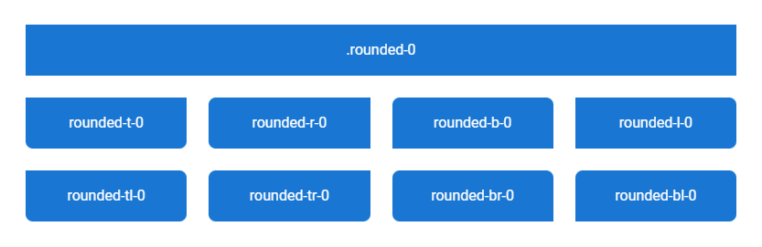
Removing Border Radius
The rounded-0 class removes all border radius from an element. To remove border radius from a specific side, we can use a class of the format rounded-{side}-0, where side can be any of t, r, b, and l. For removing border radius from specific corners, we can use a class of the format rounded-{corner}-0 where corner can be any of tl, tr, br and bl.
<template>
  <v-app>
    <v-row
      justify="center"
      class="flex-grow-0 ma-4"
    >
      <v-col cols="12">
        <div
          class="pa-4 text-center primary white--text rounded-0"
          v-text="`.rounded-0`"
        ></div>
      </v-col>
      <v-col
        v-for="value in [
          't',
          'r',
          'b',
          'l',
          'tl',
          'tr',
          'br',
          'bl',
        ]"
        :key="value"
        sm="3"
      >
        <div
          :class="`pa-4 text-center primary white--text rounded-lg rounded-${value}-0`"
          v-text="`rounded-${value}-0`"
        ></div>
      </v-col>
    </v-row>
  </v-app>
</template>
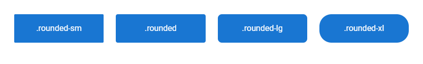
Rounding All Corners
We can use one of the rounded-sm, rounded, rounded-lg, or rounded-xl classes to apply border radius of varying sizes to all corners of an element.
<template>
  <v-app>
    <v-row class="ma-4 white--text">
      <v-col
        v-for="value in ['-sm', '', '-lg', '-xl']"
        :key="value"
        cols="3"
      >
        <div
          :class="`rounded${value}`"
          class="pa-4 text-center primary"
        >
          .rounded{{ value }}
        </div>
      </v-col>
    </v-row>
  </v-app>
</template>
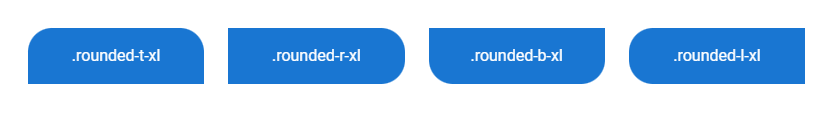
Setting Border Radius By Side
To apply border radius to a specific side, we can use a helper class of the format rounded-{side} or rounded-{side}-{size}, where side can be one of t, r, b, and l, and size can be one of sm, lg, and xl.
<template>
  <v-app>
    <v-row class="ma-4 white--text">
      <v-col
        v-for="value in ['t', 'r', 'b', 'l']"
        :key="value"
        cols="3"
      >
        <div
          :class="`rounded-${value}-xl`"
          class="pa-4 text-center primary"
        >
          .rounded-{{ value }}-xl
        </div>
      </v-col>
    </v-row>
  </v-app>
</template>
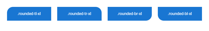
Border Radius by Corner
To set the border radius of a specific corner, we can use a helper class of the format rounded-{corner} or rounded-{corner}-{size}, where corner can be any of tl, tr, br and bl, and size can be any of sm, lg, and xl.
<template>
  <v-app>
    <v-row class="ma-4 white--text">
      <v-col
        v-for="value in ['tl', 'tr', 'br', 'bl']"
        :key="value"
        cols="3"
      >
        <div
          :class="`rounded-${value}-xl`"
          class="pa-4 text-center primary"
        >
          .rounded-{{ value }}-xl
        </div>
      </v-col>
    </v-row>
  </v-app>
</template>
With these helper classes from Vuetify, we can quickly set border radius of various sizes to specific sizes and corners of elements.
11 Amazing New JavaScript Features in ES13
This guide will bring you up to speed with all the latest features added in ECMAScript 13. These powerful new features will modernize your JavaScript with shorter and more expressive code.
