In this article, we’ll learn about the Vuetify calendar component and its various props and slots for creating and customizing calendars that can display events and other time-related information in various ways.
The Vuetify calendar component (v-calendar)
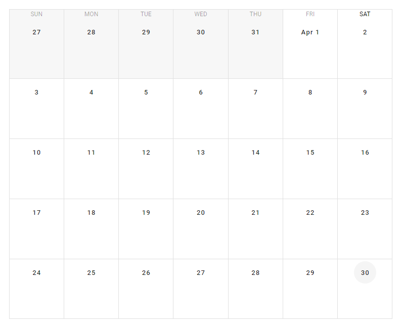
Vuetify provides the v-calendar component for displaying a calendar.
<template>
  <v-app>
    <div
      class="ma-4"
      style="height: 100%"
    >
      <v-calendar></v-calendar>
    </div>
  </v-app>
</template>

<script>
export default {
  name: 'App',
};
</script>
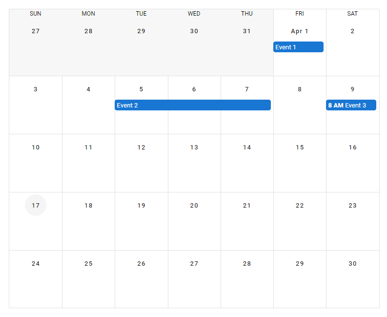
Vuetify calendar events
We can display events in the calendar with the events prop. This property takes an array with each element representing one event. Each item in the array is an object that has a number of properties, including:
name: sets the name of the event.start: sets the start date of the event.end: sets the end date of the event.timed: specifies whether the event has a defined time range or not.
<template>
  <v-app>
    <div
      class="ma-4"
      style="height: 100%"
    >
      <v-calendar
        :events="events"
        now="2022-04-17"
      ></v-calendar>
    </div>
  </v-app>
</template>

<script>
export default {
  name: 'App',
  data: () => {
    return {
      events: [
        {
          name: 'Event 1',
          start: '2022-04-01',
          timed: false,
        },
        {
          name: 'Event 2',
          start: '2022-04-05',
          end: '2022-04-07',
        },
        {
          name: 'Event 3',
          start: '2022-04-09T08:00:00',
          end: '2022-04-09T10:00:00',
          timed: true,
        },
      ],
    };
  },
};
</script>
Vuetify calendar colors
The v-calendar component provides various ways of customizing the colors of its different parts. For example, we can set the color of a single event by passing a value to the color property of the object representing the event:
<template>
  <v-app>
    <div
      class="ma-4"
      style="height: 100%"
    >
      <v-calendar
        :events="events"
        now="2022-04-17"
      ></v-calendar>
    </div>
  </v-app>
</template>

<script>
export default {
  name: 'App',
  data: () => {
    return {
      events: [
        {
          name: 'Event 1',
          start: '2022-04-01',
          timed: false,
          color: 'green',
        },
        {
          name: 'Event 2',
          start: '2022-04-05',
          end: '2022-04-07',
          color: 'yellow darken-3',
        },
        {
          name: 'Event 3',
          start: '2022-04-09T08:00:00',
          end: '2022-04-09T10:00:00',
          timed: true,
          color: 'red',
        },
      ],
    };
  },
};
</script>
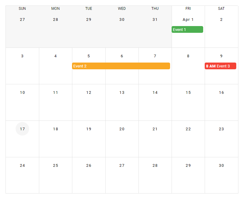
event-color and color props
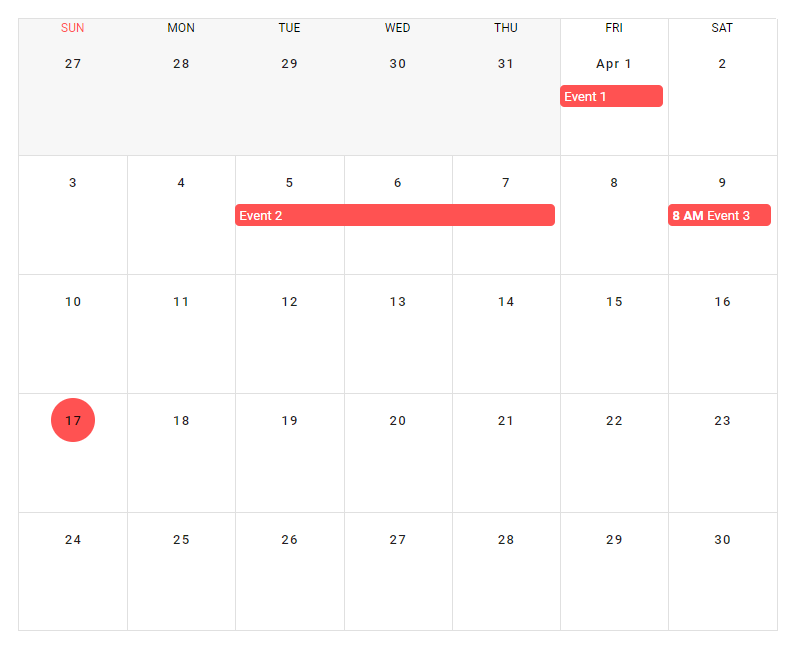
We can also the event-color prop to set the color of all events without a specified color. The color prop of v-calendar sets the color of the circle that indicates the current date in the calendar, and the color of the current day of the week.
<template>
  <v-app>
    <div
      class="ma-4"
      style="height: 100%"
    >
      <v-calendar
        :events="events"
        now="2022-04-17"
        event-color="red accent-2"
        color="red accent-2"
      >
      </v-calendar>
    </div>
  </v-app>
</template>

<script>
export default {
  name: 'App',
  data: () => {
    return {
      events: [
        {
          name: 'Event 1',
          start: '2022-04-01',
          timed: false,
        },
        {
          name: 'Event 2',
          start: '2022-04-05',
          end: '2022-04-07',
        },
        {
          name: 'Event 3',
          start: '2022-04-09T08:00:00',
          end: '2022-04-09T10:00:00',
          timed: true,
        },
      ],
    };
  },
};
</script>
Vuetify calendar day view
By default, the calendar component displays information for each month. We can customize the view the calendar shows with the type prop. We can display information just for a particular day by setting type to day:
<template>
  <v-app>
    <div
      class="ma-4"
      style="height: 100%"
    >
      <v-calendar
        :events="events"
        now="2022-04-17"
        value="2022-04-20"
        type="day"
      ></v-calendar>
    </div>
  </v-app>
</template>

<script>
export default {
  name: 'App',
  data: () => {
    return {
      events: [
        {
          name: 'Event 1',
          start: '2022-04-20T02:00:00',
          end: '2022-04-20T04:00:00',
          timed: true,
        },
        {
          name: 'Event 2',
          start: '2022-04-20T05:00:00',
          end: '2022-04-20T06:00:00',
          timed: true,
        },
        {
          name: 'Event 3',
          start: '2022-04-20T09:00:00',
          end: '2022-04-20T10:00:00',
          timed: true,
        },
      ],
    };
  },
};
</script>

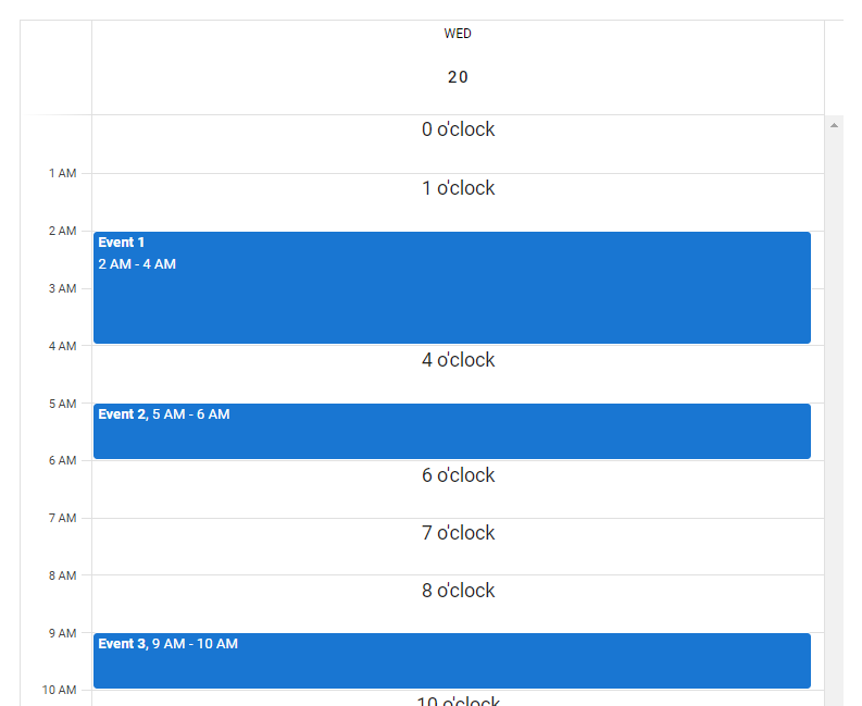
Calendar day view slots
day-header and interval
There are various slots of the v-calendar component that we use to customize how the calendar displays in the day view. We can use the day-header slot to customize the content that is placed in the top container in the day view. We also have the interval slot, for customizing the content that is placed in the interval space in the day view.
<template>
  <v-app>
    <div
      class="ma-4"
      style="height: 100%"
    >
      <v-calendar
        :events="events"
        now="2022-04-17"
        value="2022-04-20"
        type="day"
      >
        <template v-slot:day-header="{ present }">
          <div
            v-if="present"
            class="text-center"
          >
            Today
          </div>
        </template>

        <template v-slot:interval="{ hour }">
          <div class="text-center">{{ hour }} o'clock</div>
        </template>
      </v-calendar>
    </div>
  </v-app>
</template>

<script>
export default {
  name: 'App',
  data: () => {
    return {
      events: [
        {
          name: 'Event 1',
          start: '2022-04-20T02:00:00',
          end: '2022-04-20T04:00:00',
          timed: true,
        },
        {
          name: 'Event 2',
          start: '2022-04-20T05:00:00',
          end: '2022-04-20T06:00:00',
          timed: true,
        },
        {
          name: 'Event 3',
          start: '2022-04-20T09:00:00',
          end: '2022-04-20T10:00:00',
          timed: true,
        },
      ],
    };
  },
};
</script>
day-body
The day-body slot allows us to customize the content in the scrollable interval container in the day view of the calendar.
<template>
  <v-app>
    <div
      class="ma-4"
      style="height: 100%"
    >
      <v-calendar
        ref="calendar"
        type="week"
        value="2022-04-13"
      >
        <template v-slot:day-body="{ date, week }">
          <div
            class="current-time"
            :class="{ first: date === week[0].date }"
            :style="{ top: nowY }"
          ></div>
        </template>
      </v-calendar>
    </div>
  </v-app>
</template>

<script>
export default {
  name: 'App',
  data: () => ({
    ready: false,
  }),
  computed: {
    cal() {
      return this.ready ? this.$refs.calendar : null;
    },
    nowY() {
      return this.cal
        ? this.cal.timeToY({ hour: 8, minute: 10 }) + 'px'
        : '-10px';
    },
  },
  mounted() {
    this.ready = true;
    this.scrollToTime();
    this.updateTime();
  },
  methods: {
    getCurrentTime() {
      return this.cal
        ? this.cal.times.now.hour * 60 +
            this.cal.times.now.minute
        : 0;
    },
    scrollToTime() {
      const time = this.getCurrentTime();
      const first = Math.max(0, time - (time % 30) - 30);
      this.cal.scrollToTime(first);
    },
    updateTime() {
      setInterval(() => this.cal.updateTimes(), 60 * 1000);
    },
  },
};
</script>

<style lang="scss">
.current-time {
  height: 2px;
  background-color: red;
  position: absolute;
  left: -1px;
  right: 0;
  pointer-events: none;

  &.first::before {
    content: '';
    position: absolute;
    background-color: red;
    width: 12px;
    height: 12px;
    border-radius: 50%;
    margin-top: -5px;
    margin-left: -6.5px;
  }
}
</style>
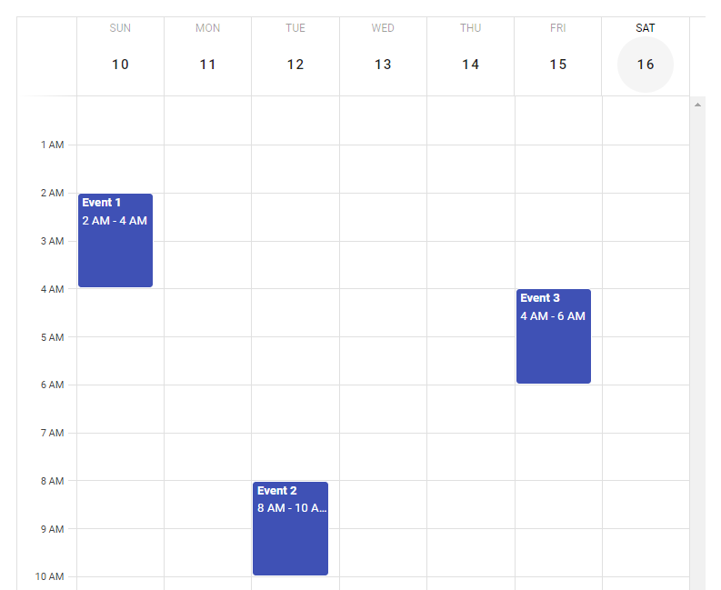
Calendar week view
We can set the type prop to week to make the calendar display information only for a particular week:
<template>
  <v-app>
    <div
      class="ma-4"
      style="height: 100%"
    >
      <v-calendar
        :events="events"
        type="week"
        event-color="indigo"
        value="2022-04-16"
        now="2022-04-16"
      >
      </v-calendar>
    </div>
  </v-app>
</template>

<script>
export default {
  name: 'App',
  data: () => {
    return {
      events: [
        {
          name: 'Event 1',
          start: '2022-04-10T02:00:00',
          end: '2022-04-10T04:00:00',
          timed: true,
        },
        {
          name: 'Event 2',
          start: '2022-04-12T08:00:00',
          end: '2022-04-12T10:00:00',
          timed: true,
        },
        {
          name: 'Event 3',
          start: '2022-04-15T04:00:00',
          end: '2022-04-15T06:00:00',
          timed: true,
        },
      ],
    };
  },
};
</script>
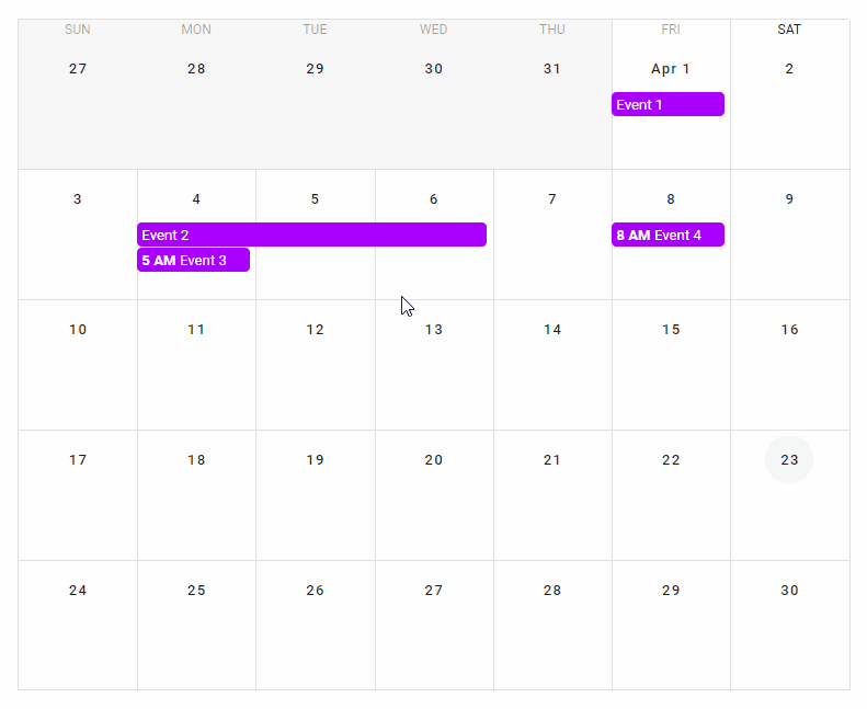
Vuetify calendar click events
v-calendar comes with certain click events that we can use to add interactivity to the calendar. For example, we can listen for the @click:day event to perform an action when the user clicks a day in the calendar. Similarly, we can listen for the @click:event event to perform an action when the user clicks on an event in the calendar. We use both click events in the code example below.
<template>
  <v-app>
    <div
      class="ma-4"
      style="height: 100%"
    >
      <!-- Event details menu -->
      <v-menu
        v-model="selectedOpen"
        :close-on-content-click="false"
        :activator="selectedElement"
        offset-x
      >
        <v-card min-width="200px">
          <v-toolbar
            color="purple accent-4"
            dark
          >
            <v-toolbar-title>
              {{ selectedEvent.name }}
            </v-toolbar-title>
          </v-toolbar>
          <v-card-text>
            <div class="text-center">
              {{ selectedEventStart }}
              to
              {{ selectedEventEnd }}
            </div>
            <v-checkbox
              readonly
              label="All day"
              :value="!selectedEvent.timed"
            >
            </v-checkbox>
          </v-card-text>
        </v-card>
      </v-menu>
      <v-calendar
        :events="events"
        event-color="purple accent-4"
        @click:day="viewDay"
        @click:event="showEvent"
        v-model="focus"
        :type="type"
        now="2022-04-23"
      ></v-calendar>
    </div>
  </v-app>
</template>

<script>
import { format } from 'date-fns';

export default {
  name: 'App',
  data: () => {
    return {
      focus: '',
      type: 'month',
      selectedOpen: false,
      selectedElement: undefined,
      selectedEvent: {},
      events: [
        {
          name: 'Event 1',
          start: '2022-04-01',
          timed: false,
        },
        {
          name: 'Event 2',
          start: '2022-04-04',
          end: '2022-04-06',
        },
        {
          name: 'Event 3',
          start: '2022-04-04T05:00:00',
          end: '2022-04-04T07:00:00',
          timed: true,
        },
        {
          name: 'Event 4',
          start: '2022-04-08T08:00:00',
          end: '2022-04-08T10:00:00',
          timed: true,
        },
      ],
    };
  },
  methods: {
    viewDay({ date }) {
      this.focus = date;
      this.type = 'day';
    },
    showEvent({ nativeEvent, event }) {
      const open = () => {
        this.selectedEvent = event;
        this.selectedElement = nativeEvent.target;
        requestAnimationFrame(() =>
          requestAnimationFrame(
            () => (this.selectedOpen = true)
          )
        );
      };

      if (this.selectedOpen) {
        this.selectedOpen = false;
        requestAnimationFrame(() =>
          requestAnimationFrame(() => open())
        );
      } else {
        open();
      }

      nativeEvent.stopPropagation();
    },
  },
  computed: {
    selectedEventStart() {
      return (
        (this.selectedEvent &&
          this.selectedEvent.start &&
          format(
            new Date(this.selectedEvent.start),
            'h:mm a'
          )) ||
        '12:00 AM'
      );
    },
    selectedEventEnd() {
      return (
        (this.selectedEvent &&
          this.selectedEvent.end &&
          format(
            new Date(this.selectedEvent.end),
            'h:mm a'
          )) ||
        '12:00 AM'
      );
    },
  },
};
</script>
The calendar starts out in the month view. When the user clicks a day, we change the calendar to the day view:

We also created a menu that will display information about an event when the user clicks it in the day or month view:
Custom calendar buttons
Calendar day slot
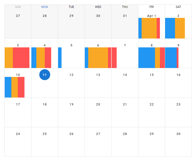
We can use the day slot of v-calendar to customize how a day is displayed in the week or month view. In the example below, we use this slot to create a calendar that displays the percentage of a day that was used for activities of a certain category.
<template>
  <v-app>
    <div
      class="ma-4"
      style="height: 100%"
    >
      <v-calendar
        :now="today"
        :value="today"
        color="primary"
      >
        <template v-slot:day="{ past, date }">
          <v-row class="fill-height">
            <template v-if="past && tracked[date]">
              <v-sheet
                v-for="(percent, i) in tracked[date]"
                :key="i"
                :title="category[i]"
                :color="colors[i]"
                :width="`${percent}%`"
                height="100%"
                tile
              ></v-sheet>
            </template>
          </v-row>
        </template>
      </v-calendar>
    </div>
  </v-app>
</template>

<script>
export default {
  name: 'App',
  data: () => ({
    today: '2022-04-11',
    tracked: {
      '2022-04-01': [20, 45, 10],
      '2022-04-02': [40, 30, 0],
      '2022-04-03': [10, 25, 50],
      '2022-04-04': [25, 25, 20],
      '2022-04-05': [20],
      '2022-04-06': [20, 60, 10],
      '2022-04-07': [0, 0, 25],
      '2022-04-08': [60, 15, 20],
      '2022-04-09': [45, 0, 5],
      '2022-04-10': [30, 20, 20],
    },
    colors: ['blue', 'yellow darken-3', 'red accent-2'],
    category: ['Category 1', 'Category 2', 'Category 3'],
  }),

};
</script>
Conclusion
We can use the Vuetify calendar component (v-calendar) to create a calendar that displays events and other information for our application. This component comes with various props and slots that we can use to easily customize its appearance and behavior.
11 Amazing New JavaScript Features in ES13
This guide will bring you up to speed with all the latest features added in ECMAScript 13. These powerful new features will modernize your JavaScript with shorter and more expressive code.
