A bottom navigation bar is an alternative to a sidebar or navigation drawer. It is used mainly in mobile applications and enables quick navigation to the top-level destinations of an app. In this article, we’re going to learn about the Vuetify bottom navigation component and how we can use it to easily create and customize bottom navigation bars.
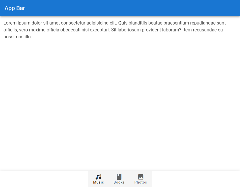
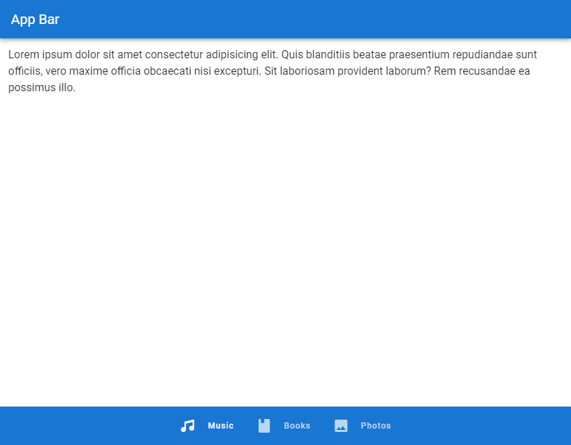
The Vuetify Bottom Navigation Component (v-bottom-navigation)
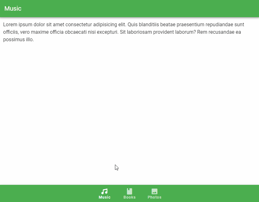
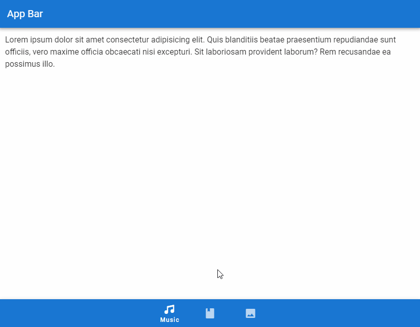
Vuetify provides the v-bottom-navigation component for creating bottom navigation bars. It includes a set of v-btns for navigation. We can use the value prop of v-bottom-navigation to set the currently active button programmatically. The button with a matching value prop will be made active. By default, the value of each button is set to its zero-based index in the set of buttons on the bottom navigation bar, i.e., the first button has its value set to 0, the second button to 1, the third to 2, and so on. But we can set a custom value to the value prop of a v-btn to change this.
<template>
  <v-app>
    <v-app-bar
      color="primary"
      app
      dark
    >
      <v-toolbar-title>App Bar</v-toolbar-title>
    </v-app-bar>
    <v-main>
      <v-container
        >Lorem ipsum dolor sit amet consectetur adipisicing
        elit. Quis blanditiis beatae praesentium repudiandae
        sunt officiis, vero maxime officia obcaecati nisi
        excepturi. Sit laboriosam provident laborum? Rem
        recusandae ea possimus illo.</v-container
      >
    </v-main>
    <v-bottom-navigation
      v-model="value"
      app
    >
      <v-btn
        value="music"
        height="100%"
      >
        <span>Music</span>
        <v-icon>mdi-music</v-icon>
      </v-btn>

      <v-btn
        value="books"
        height="100%"
      >
        <span>Books</span>
        <v-icon>mdi-book</v-icon>
      </v-btn>

      <v-btn
        value="photos"
        height="100%"
      >
        <span>Photos</span>
        <v-icon>mdi-image</v-icon>
      </v-btn>
    </v-bottom-navigation>
  </v-app>
</template>

<script>
export default {
  name: 'App',
  data: () => ({ value: 'music' }),
};
</script>
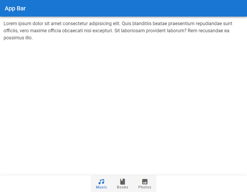
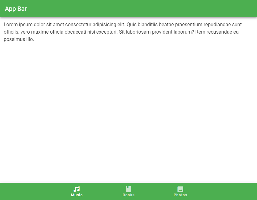
Vuetify Bottom Navigation Color
We can use the color prop of v-bottom-navigation to set the color of the active button on the bottom navigation bar. We can use any color from the Material Design specs.
<template>
  <v-app>
    <v-app-bar
      color="primary"
      app
      dark
    >
      <v-toolbar-title>App Bar</v-toolbar-title>
    </v-app-bar>
    <v-main>
      <v-container
        >Lorem ipsum dolor sit amet consectetur adipisicing
        elit. Quis blanditiis beatae praesentium repudiandae
        sunt officiis, vero maxime officia obcaecati nisi
        excepturi. Sit laboriosam provident laborum? Rem
        recusandae ea possimus illo.</v-container
      >
    </v-main>
    <v-bottom-navigation
      v-model="value"
      app
      color="primary"
    >
      <v-btn
        value="music"
        height="100%"
      >
        <span>Music</span>
        <v-icon>mdi-music</v-icon>
      </v-btn>

      <v-btn
        value="books"
        height="100%"
      >
        <span>Books</span>
        <v-icon>mdi-book</v-icon>
      </v-btn>

      <v-btn
        value="photos"
        height="100%"
      >
        <span>Photos</span>
        <v-icon>mdi-image</v-icon>
      </v-btn>
    </v-bottom-navigation>
  </v-app>
</template>

<script>
export default {
  name: 'App',
  data: () => ({ value: 'music' }),
};
</script>
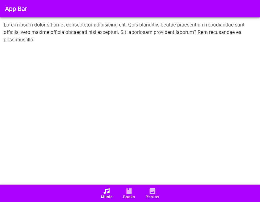
Background Color
Use the background-color prop to set the background color of the bottom navigation bar.
<template>
  <v-app>
    <v-app-bar
      :color="color"
      app
      dark
    >
      <v-toolbar-title>App Bar</v-toolbar-title>
    </v-app-bar>
    <v-main>
      <v-container
        >Lorem ipsum dolor sit amet consectetur adipisicing
        elit. Quis blanditiis beatae praesentium repudiandae
        sunt officiis, vero maxime officia obcaecati nisi
        excepturi. Sit laboriosam provident laborum? Rem
        recusandae ea possimus illo.</v-container
      >
    </v-main>
    <v-bottom-navigation
      v-model="value"
      app
      :background-color="color"
      dark
    >
      <v-btn
        value="music"
        height="100%"
        :color="color"
      >
        <span>Music</span>
        <v-icon>mdi-music</v-icon>
      </v-btn>

      <v-btn
        value="books"
        height="100%"
        :color="color"
      >
        <span>Books</span>
        <v-icon>mdi-book</v-icon>
      </v-btn>

      <v-btn
        value="photos"
        height="100%"
        :color="color"
      >
        <span>Photos</span>
        <v-icon>mdi-image</v-icon>
      </v-btn>
    </v-bottom-navigation>
  </v-app>
</template>

<script>
export default {
  name: 'App',
  data: () => ({
    value: 'music',
    color: 'purple accent-4',
  }),
};
</script>
v-model
We can use v-model to set up a two-way binding between the currently active button and a variable. In the code example below, we change the title of the app bar to the text of the button that becomes active when clicked.
<template>
  <v-app>
    <v-app-bar
      :color="color"
      app
      dark
    >
      <v-toolbar-title>
        {{ capitalize(value) }}
      </v-toolbar-title>
    </v-app-bar>
    <v-main>
      <v-container
        >Lorem ipsum dolor sit amet consectetur adipisicing
        elit. Quis blanditiis beatae praesentium repudiandae
        sunt officiis, vero maxime officia obcaecati nisi
        excepturi. Sit laboriosam provident laborum? Rem
        recusandae ea possimus illo.</v-container
      >
    </v-main>
    <v-bottom-navigation
      v-model="value"
      app
      :background-color="color"
      dark
    >
      <v-btn
        value="music"
        height="100%"
        :color="color"
      >
        <span>Music</span>
        <v-icon>mdi-music</v-icon>
      </v-btn>

      <v-btn
        value="books"
        height="100%"
        :color="color"
      >
        <span>Books</span>
        <v-icon>mdi-book</v-icon>
      </v-btn>

      <v-btn
        value="photos"
        height="100%"
        :color="color"
      >
        <span>Photos</span>
        <v-icon>mdi-image</v-icon>
      </v-btn>
    </v-bottom-navigation>
  </v-app>
</template>

<script>
export default {
  name: 'App',
  data: () => ({
    value: 'music',
    color: 'green',
  }),
  methods: {
    capitalize(str) {
      return str.charAt(0).toUpperCase() + str.slice(1);
    },
  },
};
</script>
Vuetify Bottom Navigation Grow
We can set the grow prop to true on the v-bottom-navigation to force the v-btn components to fill all the available space. The buttons can have a maximum width of 168px, according to the Bottom Navigation Material Design specs.
<template>
  <v-app>
    <v-app-bar
      :color="color"
      app
      dark
    >
      <v-toolbar-title> App Bar </v-toolbar-title>
    </v-app-bar>
    <v-main>
      <v-container
        >Lorem ipsum dolor sit amet consectetur adipisicing
        elit. Quis blanditiis beatae praesentium repudiandae
        sunt officiis, vero maxime officia obcaecati nisi
        excepturi. Sit laboriosam provident laborum? Rem
        recusandae ea possimus illo.</v-container
      >
    </v-main>
    <v-bottom-navigation
      v-model="value"
      app
      :background-color="color"
      dark
      grow
    >
      <v-btn
        value="music"
        height="100%"
        :color="color"
      >
        <span>Music</span>
        <v-icon>mdi-music</v-icon>
      </v-btn>

      <v-btn
        value="books"
        height="100%"
        :color="color"
      >
        <span>Books</span>
        <v-icon>mdi-book</v-icon>
      </v-btn>

      <v-btn
        value="photos"
        height="100%"
        :color="color"
      >
        <span>Photos</span>
        <v-icon>mdi-image</v-icon>
      </v-btn>
    </v-bottom-navigation>
  </v-app>
</template>

<script>
export default {
  name: 'App',
  data: () => ({
    value: 'music',
    color: 'green',
  }),
};
</script>
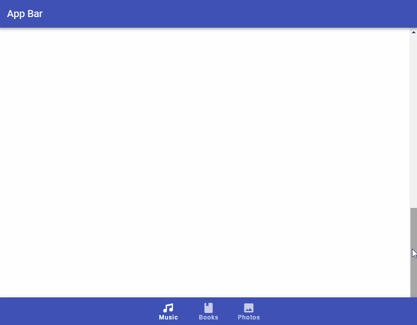
Vuetify Bottom Navigation Hide on Scroll
The hide-on-scroll prop hides the bottom navigation bar when scrolling up, and displays it when scrolling down. This is similar to the scrolling techniques supported by the v-app-bar component.
<template>
  <v-app>
    <v-app-bar
      :color="color"
      app
      dark
    >
      <v-toolbar-title> App Bar </v-toolbar-title>
    </v-app-bar>
    <v-main>
      <v-responsive
        max-height="600"
        id="hide-on-scroll-example"
        class="overflow-y-auto"
      >
        <v-responsive
          height="1500"
          class="ma-4"
        >
          Lorem ipsum dolor sit amet consectetur adipisicing
          elit. Quis blanditiis beatae praesentium
          repudiandae sunt officiis, vero maxime officia
          obcaecati nisi excepturi. Sit laboriosam provident
          laborum? Rem recusandae ea possimus illo.
        </v-responsive>
      </v-responsive>
    </v-main>
    <v-bottom-navigation
      v-model="value"
      app
      :background-color="color"
      dark
      hide-on-scroll
      scroll-target="#hide-on-scroll-example"
    >
      <v-btn
        value="music"
        height="100%"
        :color="color"
      >
        <span>Music</span>
        <v-icon>mdi-music</v-icon>
      </v-btn>

      <v-btn
        value="books"
        height="100%"
        :color="color"
      >
        <span>Books</span>
        <v-icon>mdi-book</v-icon>
      </v-btn>

      <v-btn
        value="photos"
        height="100%"
        :color="color"
      >
        <span>Photos</span>
        <v-icon>mdi-image</v-icon>
      </v-btn>
    </v-bottom-navigation>
  </v-app>
</template>

<script>
export default {
  name: 'App',
  data: () => ({
    value: 'music',
    color: 'indigo',
  }),
};
</script>
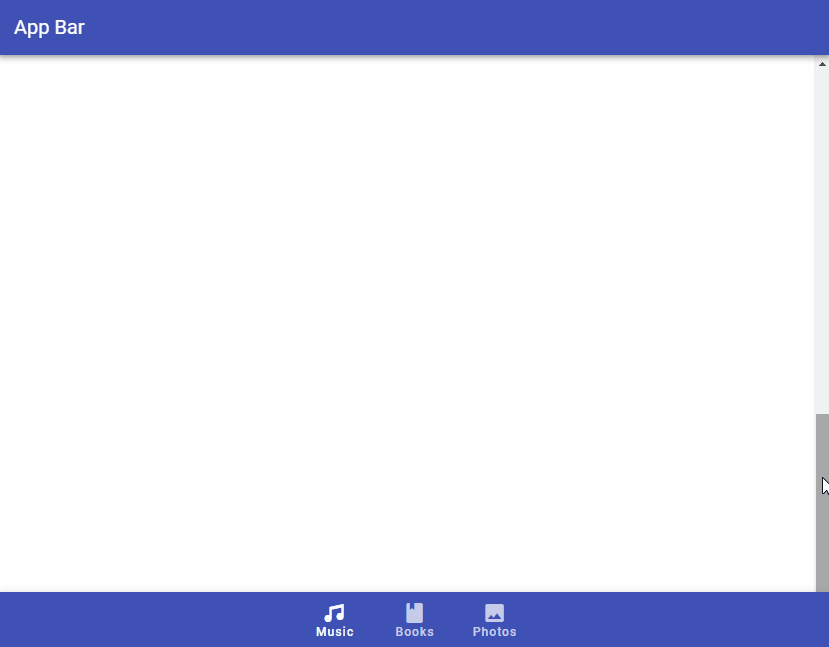
Vuetify Bottom Navigation Scroll Threshold
The scroll-threshold prop sets the distance a user must scroll up to before the bottom navigation bar is hidden. For example, setting scroll-treshold to 0 means the v-bottom-navigation will only get hidden when the user scrolls up to the very top of the page:
<template>
  <v-app>
    <v-app-bar
      :color="color"
      app
      dark
    >
      <v-toolbar-title> App Bar </v-toolbar-title>
    </v-app-bar>
    <v-main>
      <v-responsive
        max-height="600"
        id="hide-on-scroll-example"
        class="overflow-y-auto"
      >
        <v-responsive
          height="1500"
          class="ma-4"
        >
          Lorem ipsum dolor sit amet consectetur adipisicing
          elit. Quis blanditiis beatae praesentium
          repudiandae sunt officiis, vero maxime officia
          obcaecati nisi excepturi. Sit laboriosam provident
          laborum? Rem recusandae ea possimus illo.
        </v-responsive>
      </v-responsive>
    </v-main>
    <v-bottom-navigation
      v-model="value"
      app
      :background-color="color"
      dark
      hide-on-scroll
      scroll-target="#hide-on-scroll-example"
      scroll-threshold="0"
    >
      <v-btn
        value="music"
        height="100%"
        :color="color"
      >
        <span>Music</span>
        <v-icon>mdi-music</v-icon>
      </v-btn>

      <v-btn
        value="books"
        height="100%"
        :color="color"
      >
        <span>Books</span>
        <v-icon>mdi-book</v-icon>
      </v-btn>

      <v-btn
        value="photos"
        height="100%"
        :color="color"
      >
        <span>Photos</span>
        <v-icon>mdi-image</v-icon>
      </v-btn>
    </v-bottom-navigation>
  </v-app>
</template>

<script>
export default {
  name: 'App',
  data: () => ({
    value: 'music',
    color: 'indigo',
  }),
};
</script>
Vuetify Bottom Navigation Horizontal
With the horizontal prop, we can position the button text inline with the provided v-icon.
<template>
  <v-app>
    <v-app-bar
      :color="color"
      app
      dark
    >
      <v-toolbar-title> App Bar </v-toolbar-title>
    </v-app-bar>
    <v-main>
      <v-container>
        Lorem ipsum dolor sit amet consectetur adipisicing
        elit. Quis blanditiis beatae praesentium repudiandae
        sunt officiis, vero maxime officia obcaecati nisi
        excepturi. Sit laboriosam provident laborum? Rem
        recusandae ea possimus illo.
      </v-container>
    </v-main>
    <v-bottom-navigation
      v-model="value"
      app
      :background-color="color"
      dark
      horizontal
    >
      <v-btn
        value="music"
        height="100%"
        :color="color"
      >
        <span>Music</span>
        <v-icon>mdi-music</v-icon>
      </v-btn>

      <v-btn
        value="books"
        height="100%"
        :color="color"
      >
        <span>Books</span>
        <v-icon>mdi-book</v-icon>
      </v-btn>

      <v-btn
        value="photos"
        height="100%"
        :color="color"
      >
        <span>Photos</span>
        <v-icon>mdi-image</v-icon>
      </v-btn>
    </v-bottom-navigation>
  </v-app>
</template>

<script>
export default {
  name: 'App',
  data: () => ({
    value: 'music',
    color: 'primary',
  }),
};
</script>
Vuetify Bottom Navigation Shift
We can the shift prop to hide the text of the navigation bar buttons that are not active.
<template>
  <v-app>
    <v-app-bar
      :color="color"
      app
      dark
    >
      <v-toolbar-title> App Bar </v-toolbar-title>
    </v-app-bar>
    <v-main>
      <v-container>
        Lorem ipsum dolor sit amet consectetur adipisicing
        elit. Quis blanditiis beatae praesentium repudiandae
        sunt officiis, vero maxime officia obcaecati nisi
        excepturi. Sit laboriosam provident laborum? Rem
        recusandae ea possimus illo.
      </v-container>
    </v-main>
    <v-bottom-navigation
      v-model="value"
      app
      :background-color="color"
      dark
      shift
    >
      <v-btn
        value="music"
        height="100%"
        :color="color"
      >
        <span>Music</span>
        <v-icon>mdi-music</v-icon>
      </v-btn>

      <v-btn
        value="books"
        height="100%"
        :color="color"
      >
        <span>Books</span>
        <v-icon>mdi-book</v-icon>
      </v-btn>

      <v-btn
        value="photos"
        height="100%"
        :color="color"
      >
        <span>Photos</span>
        <v-icon>mdi-image</v-icon>
      </v-btn>
    </v-bottom-navigation>
  </v-app>
</template>

<script>
export default {
  name: 'App',
  data: () => ({
    value: 'music',
    color: 'primary',
  }),
};
</script>
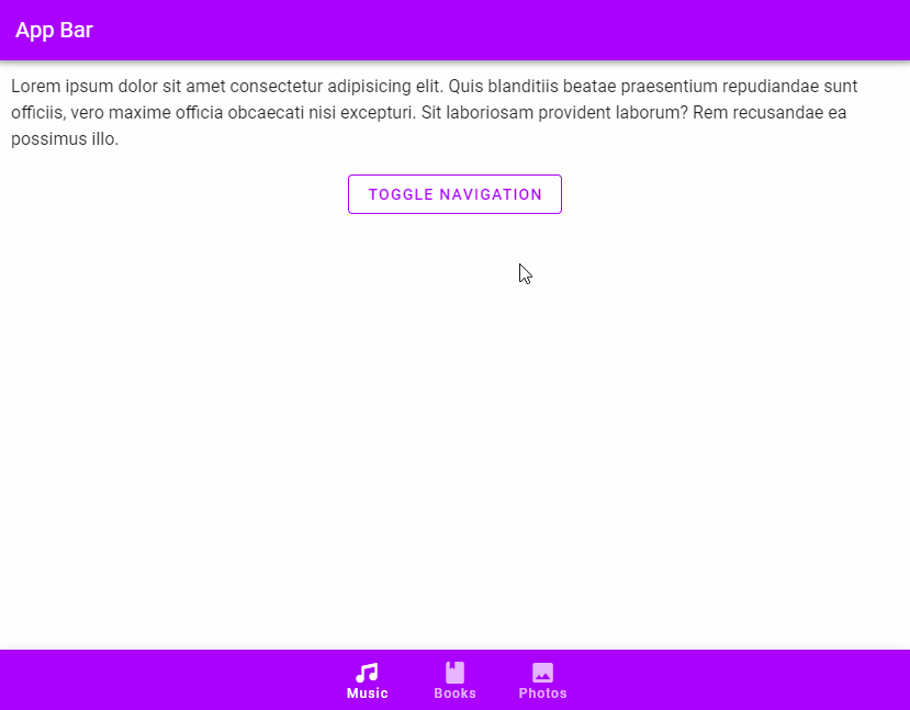
Vuetify Bottom Navigation Toggle
We can use the input-value prop of v-bottom-navigation to toggle the visibility of the bottom navigation bar:
<template>
  <v-app>
    <v-app-bar
      :color="color"
      app
      dark
    >
      <v-toolbar-title> App Bar </v-toolbar-title>
    </v-app-bar>
    <v-main>
      <v-container>
        Lorem ipsum dolor sit amet consectetur adipisicing
        elit. Quis blanditiis beatae praesentium repudiandae
        sunt officiis, vero maxime officia obcaecati nisi
        excepturi. Sit laboriosam provident laborum? Rem
        recusandae ea possimus illo.
        <v-row justify="center">
          <v-btn
            class="ma-8"
            outlined
            :color="color"
            @click="active = !active"
          >
            Toggle Navigation
          </v-btn>
        </v-row>
      </v-container>
    </v-main>
    <v-bottom-navigation
      v-model="value"
      app
      :background-color="color"
      dark
      :input-value="active"
    >
      <v-btn
        value="music"
        height="100%"
        :color="color"
      >
        <span>Music</span>
        <v-icon>mdi-music</v-icon>
      </v-btn>

      <v-btn
        value="books"
        height="100%"
        :color="color"
      >
        <span>Books</span>
        <v-icon>mdi-book</v-icon>
      </v-btn>

      <v-btn
        value="photos"
        height="100%"
        :color="color"
      >
        <span>Photos</span>
        <v-icon>mdi-image</v-icon>
      </v-btn>
    </v-bottom-navigation>
  </v-app>
</template>

<script>
export default {
  name: 'App',
  data: () => ({
    value: 'music',
    color: 'purple accent-4',
    active: true,
  }),
};
</script>
Conclusion
We can use a bottom navigation bar in place of a sidebar or navigation drawer for quick and easy navigation to important destinations in our app. Vuetify provides the bottom navigation component (v-bottom-navigation) for creating bottom navigation bars.
11 Amazing New JavaScript Features in ES13
This guide will bring you up to speed with all the latest features added in ECMAScript 13. These powerful new features will modernize your JavaScript with shorter and more expressive code.
