
Images are an indispensable part of every user interface. They improve the user experience and increase engagement. An image can be used along with text to explain a concept or convey information quickly, as people tend to process visual information faster. In this article, we’re going to learn how to display an image in Vuetify with the v-img component.
The Vuetify Image Component
Vuetify provides the v-img component for presenting an image. This component comes with various props to customize the appearance of the image.
<template>
  <v-app>
    <div class="d-flex justify-center ma-4">
      <v-img
        contain
        max-height="300"
        min-height="300"
        src="https://picsum.photos/1920/1080?random"
      ></v-img>
    </div>
  </v-app>
</template>

<script>
export default {
  name: 'App',
};
</script>
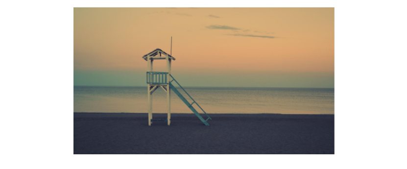
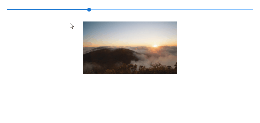
Image Aspect Ratios in Vuetify
Use the aspect-ratio prop of the v-img component to set a fixed aspect ratio. The ratio between the height and width stays the same when the image is resized.
<template>
  <v-app>
    <div class="d-flex flex-column justify-space-between align-center ma-4">
      <v-slider
        v-model="width"
        class="align-self-stretch"
        min="200"
        max="500"
      ></v-slider>

      <v-img
        :aspect-ratio="16 / 9"
        :width="width"
        src="https://picsum.photos/1920/1080?random"
      ></v-img>
    </div>
  </v-app>
</template>

<script>
export default {
  name: 'App',
  data: () => ({
    width: 300,
  }),
};
</script>
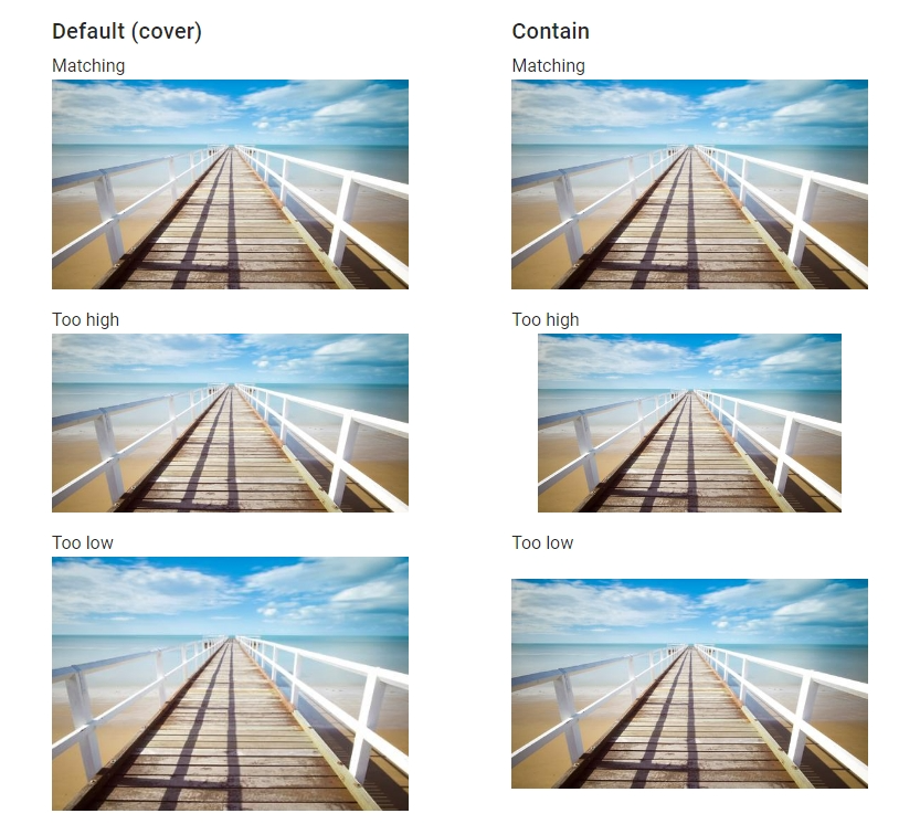
Vuetify Image Contain
When the provided aspect ratio doesn’t match that of the actual image, the v-img component will fill as much space and clip the sides of the image. Setting the contain prop to true will stop this from happening, but will result in empty space at the sides.
<template>
  <v-app>
    <v-container fluid>
      <v-row justify="space-around">
        <v-col cols="5">
          <div class="text-h6 mb-1">Default (cover)</div>
          <div class="subheading">Matching</div>
          <v-img
            src="https://picsum.photos/510/300?random"
            aspect-ratio="1.7"
          ></v-img>
          <div class="subheading pt-4">Too high</div>
          <v-img
            src="https://picsum.photos/510/300?random"
            aspect-ratio="2"
          ></v-img>
          <div class="subheading pt-4">Too low</div>
          <v-img
            src="https://picsum.photos/510/300?random"
            aspect-ratio="1.4"
          ></v-img>
        </v-col>

        <v-col cols="5">
          <div class="text-h6 mb-1">Contain</div>
          <div class="subheading">Matching</div>
          <v-img
            src="https://picsum.photos/510/300?random"
            aspect-ratio="1.7"
            contain
          ></v-img>
          <div class="subheading pt-4">Too high</div>
          <v-img
            src="https://picsum.photos/510/300?random"
            aspect-ratio="2"
            contain
          ></v-img>
          <div class="subheading pt-4">Too low</div>
          <v-img
            src="https://picsum.photos/510/300?random"
            aspect-ratio="1.4"
            contain
          ></v-img>
        </v-col>
      </v-row>
    </v-container>
  </v-app>
</template>

<script>
export default {
  name: 'App',
};
</script>
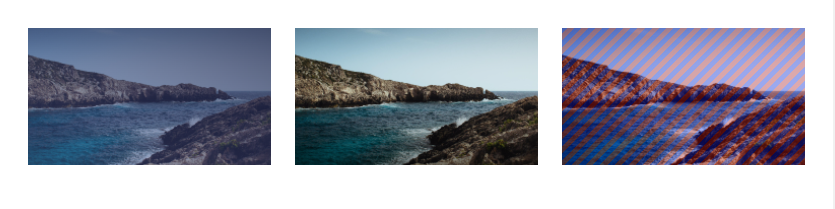
Vuetify Image Gradient
Use the gradient prop to apply a simple gradient overlay to the image. For more complex gradients, we can use a CSS class instead.
<template>
  <v-app>
    <v-row class="ma-4">
      <v-col cols="6" sm="4">
        <v-img
          src="https://picsum.photos/1920/1080?random"
          gradient="to top right, rgba(100,115,201,.33), rgba(25,32,72,.7)"
        ></v-img>
      </v-col>

      <v-col cols="6" sm="4">
        <v-img src="https://picsum.photos/1920/1080?random">
          <div class="fill-height bottom-gradient"></div>
        </v-img>
      </v-col>

      <v-col cols="6" sm="4">
        <v-img src="https://picsum.photos/1920/1080?random">
          <div class="fill-height repeating-gradient"></div>
        </v-img>
      </v-col>
    </v-row>
  </v-app>
</template>

<script>
export default {
  name: 'App',

};
</script>

<style scoped>
.bottom-gradient {
  background-image: linear-gradient(
    to top,
    rgba(0, 0, 0, 0.4) 0%,
    transparent 72px
  );
}

.repeating-gradient {
  background-image: repeating-linear-gradient(
    -45deg,
    rgba(255, 0, 0, 0.25),
    rgba(255, 0, 0, 0.25) 5px,
    rgba(0, 0, 255, 0.25) 5px,
    rgba(0, 0, 255, 0.25) 10px
  );
}
</style>
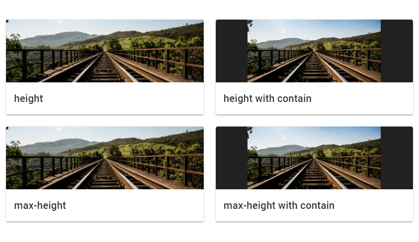
Vuetify Image Height
The Vuetify image component automatically grows to the size of its src and preserves the correct aspect ratio. We can use the height and max-height props to limit this:
<template>
  <v-app>
    <v-container class="fill-height" fluid>
      <v-fade-transition mode="out-in">
        <v-row>
          <v-col cols="6">
            <v-card>
              <v-img
                src="https://picsum.photos/350/165?random"
                height="125"
                class="grey darken-4"
              ></v-img>
              <v-card-title class="text-h6"> height </v-card-title>
            </v-card>
          </v-col>

          <v-col cols="6">
            <v-card>
              <v-img
                src="https://picsum.photos/350/165?random"
                height="125"
                contain
                class="grey darken-4"
              ></v-img>
              <v-card-title class="text-h6"> height with contain </v-card-title>
            </v-card>
          </v-col>

          <v-col cols="6">
            <v-card>
              <v-img
                src="https://picsum.photos/350/165?random"
                max-height="125"
                class="grey darken-4"
              ></v-img>
              <v-card-title class="text-h6"> max-height </v-card-title>
            </v-card>
          </v-col>

          <v-col cols="6">
            <v-card>
              <v-img
                src="https://picsum.photos/350/165?random"
                max-height="125"
                contain
                class="grey darken-4"
              ></v-img>
              <v-card-title class="text-h6">
                max-height with contain
              </v-card-title>
            </v-card>
          </v-col>
        </v-row>
      </v-fade-transition>
    </v-container>
  </v-app>
</template>

<script>
export default {
  name: 'App',
};
</script>
Vuetify Image Placeholder
We can use the v-img placeholder slot to display custom content while the image is loading. The image in the example below has a bad src and it won’t load so we can see the placeholder.
<template>
  <v-app>
    <v-row justify="center" class="ma-4">
      <v-img
        src="https://bad.src/not/valid"
        lazy-src="https://picsum.photos/id/12/100/60"
        max-width="500"
        max-height="300"
      >
        <template v-slot:placeholder>
          <v-row class="fill-height ma-0" align="center" justify="center">
            <v-progress-circular
              indeterminate
              color="grey lighten-5"
            ></v-progress-circular>
          </v-row>
        </template>
      </v-img>
    </v-row>
  </v-app>
</template>

<script>
export default {
  name: 'App',
};
</script>

Creating an Image Gallery
We can use the v-img component to make an image gallery.
<template>
  <v-app>
    <v-row class="ma-4">
      <v-col v-for="n in 6" :key="n" class="d-flex child-flex" cols="4">
        <v-img
          :src="`https://picsum.photos/500/300?image=${n * 12 + 5}`"
          :lazy-src="`https://picsum.photos/10/6?image=${n * 12 + 10}`"
          aspect-ratio="1"
          class="grey lighten-2"
        >
          <template v-slot:placeholder>
            <v-row class="fill-height ma-0" align="center" justify="center">
              <v-progress-circular
                indeterminate
                color="grey lighten-5"
              ></v-progress-circular>
            </v-row>
          </template>
        </v-img>
      </v-col>
    </v-row>
  </v-app>
</template>

<script>
export default {
  name: 'App',
};
</script>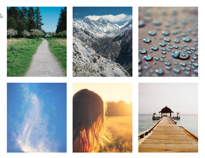
Conclusion
Images are an important part of every interface that can help to increase engagement, decorate the UI and enable users to process information faster. We can use the Vuetify image component (v-img) to show images and customize the way they are displayed.
Every Crazy Thing JavaScript Does
A captivating guide to the subtle caveats and lesser-known parts of JavaScript.
