
One of the first components you encounter when first getting started with Vuetify is v-app. The Vuetify v-app component is required for all applications created with Vuetify. It enables many of the functionality that Vuetify provides. With v-app, child components can access global data from Vuetify, like the application theme colors or the theme variant (light/dark). v-app also ensures proper cross-browser compatibility, such as support for certain click events in browsers like Safari. We can use the app prop on other components like v-navigation-drawer, v-app-bar and v-footer and more, to help set up our application with proper sizing around the v-main component. This way, we can focus on building our application without needing to manually manage layout sizing.
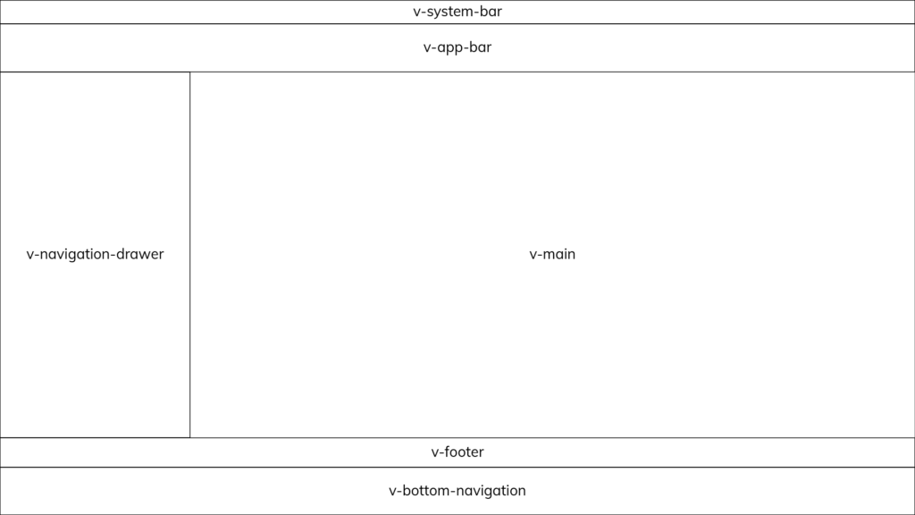
Vuetify Application Markup with v-app and v-main
Thanks to automatic layout sizing, we can place our major layout elements anywhere in our markup, as long we set the app prop to true. The v-main component is important for making our page content work properly with our layout elements. v-main will be dynamically sized based on the structure of layout elements that have the app prop applied.
Here’s an example of typical Vuetify application markup:
<!-- App.vue -->

<v-app>
  <v-navigation-drawer app>
    <!-- -->
  </v-navigation-drawer>

  <v-app-bar app>
    <!-- -->
  </v-app-bar>

  <!-- Sizes your content based upon application components -->
  <v-main>

    <!-- Provides the application the proper gutter -->
    <v-container fluid>

      <!-- If using vue-router -->
      <router-view></router-view>
    </v-container>
  </v-main>

  <v-footer app>
    <!-- -->
  </v-footer>
</v-app>
Note: Applying the app prop automatically applies sets the position CSS property of the element to fixed. If we want absolute positioning, you can overwrite this functionality with the absolute prop.
Vuetify Application Components
Here is the list of all the Vuetify components that support automatic layout sizing with the app prop:
v-app-bar: The app bar component is always placed at the top of an application with a lower priority thanv-system-bar.v-bottom-navigation: The bottom navigation component is always placed at the bottom of an application with a higher priority thanv-footer.v-footer: The footer component is always placed at the bottom of an application with a lower priority thanv-bottom-navigation.v-navigation-drawer: The navigation drawer component can be placed on the left or right side of an application and can be configured to sit next to or below v-app-barv-system-bar: The system bar component is always placed at the top of an application with a higher priority thanv-app.
Vuetify Application Service
We can configure our layout with the Vuetify application service. The service communicates with the v-main component so that it’s able to properly size the application content. It comes with a number of accessible properties:
{
bar: number
bottom: number
footer: number
insetFooter: number
left: number
right: number
top: number
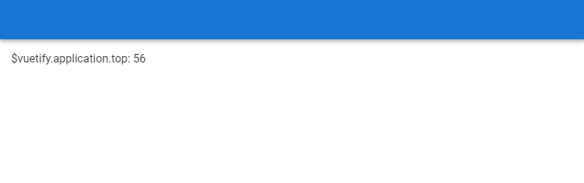
}These properties are readonly, so we can’t edit them. We can access them from the application property of the $vuetify object. The service uses them for the layout sizing of our main content and automatically updates them when we add or remove one of the application components with the app prop applied. For example, the top property changes when v-app-bar is added or removed from the markup:
With v-app-bar:
<template>
  <v-app>
    <v-app-bar
      color="primary"
      app
    ></v-app-bar>
    <v-main>
      $vuetify.application.top:
      {{ this.$vuetify.application.top }}
    </v-main>
  </v-app>
</template>

<script>
export default {
  name: 'App',
};
</script>
Without v-app-bar:
<template>
  <v-app>
    <v-main>
      <div class="ma-4">
        $vuetify.application.top:
        {{ this.$vuetify.application.top }}
      </div>
    </v-main>
  </v-app>
</template>

<script>
export default {
  name: 'App',
};
</script>

Conclusion
The Vuetify v-app component is an essential component and required in all applications made with the framework. It provides features such as automatic layout sizing, theming functionality and cross-browser compatibility.
11 Amazing New JavaScript Features in ES13
This guide will bring you up to speed with all the latest features added in ECMAScript 13. These powerful new features will modernize your JavaScript with shorter and more expressive code.
