
We use an alert to pass on important information to users by using contextual icons and colors. The icon and color match the type of message it conveys to the user. In this article, we’re going to learn how to create and customize alert notifications with the Vuetify alert component.
The Vuetify Alert Component (v-alert)
Vuetify provides the v-alert component for creating alerts:
<template>
  <v-app>
    <div class="d-flex justify-center ma-4">
      <v-alert> Alert Component </v-alert>
    </div>
  </v-app>
</template>

<script>
export default {
  name: 'App',
};
</script>
Using v-alert without any props creates a simple alert containing the text, without any color, border or icon:

Vuetify Alert Colors
The color prop of v-alert allows us to customize the color of an alert component.
<template>
  <v-app>
    <div class="d-flex justify-center ma-4">
      <v-col sm="6">
        <v-alert color="indigo" dark> Alert Component </v-alert>
      </v-col>
    </div>
  </v-app>
</template>

<script>
export default {
  name: 'App',
};
</script>

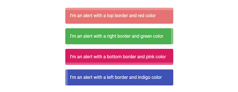
Vuetify Alert Border
The border prop adds a border to one of the 4 sides of the alert. They are four possible values for each of the sides: top, bottom, left, and right.
<template>
  <v-app>
    <div class="d-flex justify-center ma-4">
      <v-col sm="6">
        <v-alert border="top" color="red lighten-2" dark>
          I'm an alert with a top border and red color
        </v-alert>
        <v-alert border="right" color="green" dark>
          I'm an alert with a right border and green color
        </v-alert>
        <v-alert border="bottom" color="pink darken-1" dark>
          I'm an alert with a bottom border and pink color
        </v-alert>
        <v-alert border="left" color="indigo" dark>
          I'm an alert with a left border and indigo color
        </v-alert>
      </v-col>
    </div>
  </v-app>
</template>

<script>
export default {
  name: 'App',
};
</script>
Vuetify Alert Colored Border
The colored-prop will remove the alert background in order to emphasize the border, whose color is set to the value of the color prop:
<template>
  <v-app>
    <div class="d-flex justify-center ma-4">
      <v-col sm="6">
        <v-alert border="left" color="indigo" colored-border elevation="2">
          An alert with a colored border
        </v-alert>
      </v-col>
    </div>
  </v-app>
</template>

<script>
export default {
  name: 'App',
};
</script>

Dense Alert
Setting the dense prop to true on the v-alert will make it more compact by decreasing its height.
<template>
  <v-app>
    <div class="d-flex justify-center ma-4">
      <v-col sm="6">
        <v-alert dense type="info">
          Dense alert of type info
        </v-alert>
      </v-col>
    </div>
  </v-app>
</template>

<script>
export default {
  name: 'App',
};
</script>

When a border is set, the border thickness will be decreased to stay consistent with the dense style:
<template>
  <v-app>
    <div class="d-flex justify-center ma-4">
      <v-col sm="6">
        <v-alert dense type="info" border="right">
          Dense alert of type info
        </v-alert>
      </v-col>
    </div>
  </v-app>
</template>

<script>
export default {
  name: 'App',
};
</script>

Vuetify Alert Dismissable
The dimissable prop adds a close icon button at the end of the alert component.
<template>
  <v-app>
    <div class="d-flex justify-center ma-4">
      <v-col sm="6">
        <v-alert border="top" color="green" dismissible dark>
          Dismissable alert
        </v-alert>
      </v-col>
    </div>
  </v-app>
</template>

<script>
export default {
  name: 'App',
};
</script>

Clicking the close button will set the alert value to false, which will hide the alert:

Vuetify Alert v-model
We can also directly control the visibility of the alert from code by using v-model to create a two-way binding between a variable and the alert value.
To see how to do this in practice, let’s create a button below the now hidden alert from our previous code sample. We’ll also set up the two-way binding between an alert variable and the visibility of the alert.
<template>
  <v-app>
    <div class="d-flex justify-center ma-4">
      <v-col sm="6">
        <v-alert border="top" color="green" dismissible dark v-model="alert">
          Dismissable alert
        </v-alert>
      </v-col>
    </div>
    <div class="d-flex justify-center ma-4">
      <v-btn color="primary" @click="alert = true">Reset</v-btn>
    </div>
  </v-app>
</template>

<script>
export default {
  name: 'App',
  data: () => ({
    alert: true,
  }),
};
</script>

Clicking the button will set alert to true, which will restore the visibility of the alert.

Alert Icons
We can include an icon at the beginning of an alert with the icon prop.
<template>
  <v-app>
    <div class="d-flex justify-center ma-4">
      <v-col sm="6">
        <v-alert border="top" color="red accent-2" dark icon="mdi-star">
          An alert with an icon
        </v-alert>
      </v-col>
    </div>
  </v-app>
</template>

<script>
export default {
  name: 'App',
};
</script>

Vuetify Alert Elevation
We can customize the amount of elevation an alert component has using the elevation prop. This prop can take any value between 0 and 24.
<template>
  <v-app>
    <div class="d-flex justify-center ma-4">
      <v-col sm="6">
        <v-alert border="top" color="orange" colored-border elevation="5">
          Elevated alert
        </v-alert>
      </v-col>
    </div>
  </v-app>
</template>

<script>
export default {
  name: 'App',
};
</script>

Vuetify Alert Outlined
Setting the outlined prop to true will display the outlined variant of an alert. This outlined style makes the alert background transparent and sets the color of its border and text to the value of the color prop.
<template>
  <v-app>
    <div class="d-flex justify-center ma-4">
      <v-col sm="6">
        <v-alert color="green" outlined> Outlined alert </v-alert>
      </v-col>
    </div>
  </v-app>
</template>

<script>
export default {
  name: 'App',
};
</script>

Vuetify Alert Prominent
The prominent prop makes the alert more pronounced by increasing the height and applying a halo to the icon:
<template>
  <v-app>
    <div class="d-flex justify-center ma-4">
      <v-col sm="6">
        <v-alert color="red accent-2" prominent icon="mdi-school" dark>
          Prominent alert
        </v-alert>
      </v-col>
    </div>
  </v-app>
</template>

<script>
export default {
  name: 'App',
};
</script>

Text Alert
The text alert variant has a reduced background opacity. We can set an alert to this alternative style with the text prop:
<template>
  <v-app>
    <div class="d-flex justify-center ma-4">
      <v-col sm="6">
        <v-alert color="teal" text> Text alert </v-alert>
      </v-col>
    </div>
  </v-app>
</template>

<script>
export default {
  name: 'App',
};
</script>

Vuetify Alert Shaped
Setting the shaped prop to true on an alert will add a border-radius at the top-left and bottom-right of the alert:
<template>
  <v-app>
    <div class="d-flex justify-center ma-4">
      <v-col sm="6">
        <v-alert color="blue" shaped dark> Shaped alert </v-alert>
      </v-col>
    </div>
  </v-app>
</template>

<script>
export default {
  name: 'App',
};
</script>

Vuetify Alert Custom Transitions
We can customize the transition an alert shows when toggling its visibility, using the transition prop. For example, in the code below we set the transition prop to scale-transition, which will make the alert display a scale transition when it is being hidden or shown.
<template>
  <v-app>
    <div class="d-flex justify-center ma-4">
      <v-btn color="primary" @click="alert = !alert"> Toggle </v-btn>
    </div>
    <div class="d-flex justify-center ma-4">
      <v-col sm="6">
        <v-alert
          color="indigo"
          dark
          transition="scale-transition"
          v-model="alert"
        >
          Shaped alert
        </v-alert>
      </v-col>
    </div>
  </v-app>
</template>

<script>
export default {
  name: 'App',
  data: () => ({
    alert: false,
  }),
};
</script>
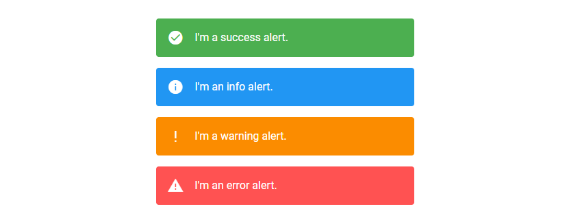
Vuetify Alert Type
v-alert comes with a type prop which provides 4 styles that modify the icon and color of the alert. These styles are success, info, warning, and error.
<template>
  <v-app>
    <div class="d-flex justify-center ma-4">
      <v-col sm="6">
        <v-alert type="success"> I'm a success alert. </v-alert>
        <v-alert type="info"> I'm an info alert. </v-alert>
        <v-alert type="warning"> I'm a warning alert. </v-alert>
        <v-alert type="error"> I'm an error alert. </v-alert>
      </v-col>
    </div>
  </v-app>
</template>

<script>
export default {
  name: 'App',
};
</script>
Summary
An alert is useful for conveying important information to our users using contextual icons and colors. Vuetify provides the v-alert component for creating and customizing alerts.
Every Crazy Thing JavaScript Does
A captivating guide to the subtle caveats and lesser-known parts of JavaScript.
