Progress bars are used in an interface to pass on information to users related to the known progression of a certain operation. They visually signify how far the operation has advanced and can be circular or horizontal. They can also be indefinite to indicate the loading or processing of data. In this article, we’re going to learn how to create a horizontal progress bar with the Vuetify progress linear component.
The v-progress-linear Component
Vuetify provides the v-progress-linear component for creating a horizontal progress bar.
<template>
  <v-app>
    <v-progress-linear></v-progress-linear>
  </v-app>
</template>

<script>
export default {
  name: 'App',
};
</script>
Progress Bar Value
The progress linear component comes with the value prop that we can use to set the progress bar to a determinate value between 0 and 100 inclusive:
<template>
  <v-app>
    <v-row justify="center" class="ma-4">
      <v-col sm="6">
        <v-progress-linear value="40"></v-progress-linear>
      </v-col>
    </v-row>
  </v-app>
</template>

<script>
export default {
  name: 'App',
};
</script>

Progress Linear v-model
We can set up a two-way binding between the value of the progress bar and a variable using v-model:
<template>
  <v-app>
    <v-row justify="center" class="ma-4">
      <v-col sm="6">
        <v-progress-linear v-model="value"></v-progress-linear>
      </v-col>
    </v-row>
  </v-app>
</template>

<script>
export default {
  name: 'App',
  data: () => ({
    value: 30,
  }),
};
</script>

To see this two-way binding in action, let’s create two buttons to change the progress bar value and some text to display this value. We spaced the buttons apart with one of the Vuetify spacing helper classes (ma-2).
<template>
  <v-app>
    <v-row justify="center" class="ma-4">
      <v-col sm="6">
        <v-row>
          <v-progress-linear v-model="value"></v-progress-linear>
        </v-row>
        <v-row justify="center">{{ value }}%</v-row>
        <v-row justify="center">
          <v-btn class="ma-2" @click="value -= 10" color="red" dark>
            -10
          </v-btn>
          <v-btn class="ma-2" @click="value += 10" color="green" dark>
            +10
          </v-btn>
        </v-row>
      </v-col>
    </v-row>
  </v-app>
</template>

<script>
export default {
  name: 'App',
  data: () => ({
    value: 30,
  }),
};
</script>

Progress Linear Buffer Value
A buffer state simultaneously represents two values. The primary value is controlled by v-model, while the buffer value is controlled by the buffer-value prop:
<template>
  <v-app>
    <v-row justify="center" class="ma-4">
      <v-col sm="8">
        <v-progress-linear
          v-model="value"
          :buffer-value="bufferValue"
        ></v-progress-linear>
        <br />
        <v-progress-linear
          v-model="value"
          :buffer-value="bufferValue"
          color="green"
        ></v-progress-linear>
        <br />
        <v-progress-linear
          v-model="value"
          :buffer-value="bufferValue"
          color="orange"
        ></v-progress-linear>
        <br />
        <v-progress-linear
          v-model="value"
          :buffer-value="bufferValue"
          color="purple accent-4"
        ></v-progress-linear>
      </v-col>
    </v-row>
  </v-app>
</template>

<script>
export default {
  name: 'App',
  data() {
    return {
      value: 10,
      bufferValue: 20,
      interval: 0,
    };
  },

  watch: {
    value(val) {
      if (val < 100) return;

      this.value = 0;
      this.bufferValue = 10;
      this.startBuffer();
    },
  },

  mounted() {
    this.startBuffer();
  },

  beforeDestroy() {
    clearInterval(this.interval);
  },

  methods: {
    startBuffer() {
      clearInterval(this.interval);

      this.interval = setInterval(() => {
        this.value += Math.random() * (15 - 5) + 5;
        this.bufferValue += Math.random() * (15 - 5) + 6;
      }, 1000);
    },
  },
};
</script>

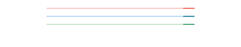
Progress Bar Custom Colors
The Vuetify progress linear component comes with a color prop that allows us to customize the color of the horizontal progress bar:
<template>
  <v-app>
    <v-row justify="center" class="ma-4">
      <v-col sm="8">
        <v-progress-linear
          background-color="blue"
          color="red accent-2"
          value="20"
        ></v-progress-linear>
        <br />
        <v-progress-linear
          background-color="grey"
          color="yellow"
          value="40"
        ></v-progress-linear>
        <br />
        <v-progress-linear
          background-color="green lighten-3"
          color="green"
          value="60"
        ></v-progress-linear>
      </v-col>
    </v-row>
  </v-app>
</template>

<script>
export default {
  name: 'App',
};
</script>

Progress Linear Indeterminate
We can display an indeterminate progress bar with the indeterminate prop.
<template>
  <v-app>
    <v-row justify="center" class="ma-4">
      <v-col sm="8">
        <v-progress-linear indeterminate color="red"></v-progress-linear>
        <br />
        <v-progress-linear indeterminate color="primary"></v-progress-linear>
        <br />
        <v-progress-linear indeterminate color="green"></v-progress-linear>
      </v-col>
    </v-row>
  </v-app>
</template>

<script>
export default {
  name: 'App',
};
</script>
The progress bar will animate continuously when indeterminate:
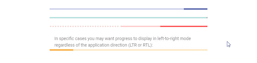
Reversed Progress Bar
Setting the reverse prop to true will display a reversed progress bar (right to left in LTR mode and left to right in RTL).
<template>
  <v-app>
    <v-row justify="center" class="ma-4">
      <v-col sm="8">
        <v-progress-linear
          color="indigo"
          value="15"
          reverse
        ></v-progress-linear>

        <br />

        <v-progress-linear
          color="teal"
          indeterminate
          reverse
        ></v-progress-linear>

        <br />

        <v-progress-linear
          buffer-value="55"
          color="red accent-2"
          reverse
          stream
          value="30"
        ></v-progress-linear>

        <br />

        <v-subheader
          >In specific cases you may want progress to display in left-to-right
          mode regardless of the application direction (LTR or
          RTL):</v-subheader
        >

        <v-progress-linear
          :reverse="$vuetify.rtl"
          value="15"
          color="yellow darken-3"
        ></v-progress-linear>
      </v-col>
    </v-row>
  </v-app>
</template>

<script>
export default {
  name: 'App',
};
</script>
Progress Linear Rounded
We can add a border radius to the Vuetify progress linear component by setting the rounded prop to true:
<template>
  <v-app>
    <v-row justify="center" class="ma-4">
      <v-col sm="8">
        <v-progress-linear
          color="blue accent-2"
          rounded
          value="100"
        ></v-progress-linear>

        <br />

        <v-progress-linear color="pink" rounded value="100"></v-progress-linear>

        <br />

        <v-progress-linear
          color="orange"
          rounded
          value="100"
        ></v-progress-linear>

        <br />

        <v-progress-linear
          color="purple accent-4"
          rounded
          value="100"
        ></v-progress-linear>
      </v-col>
    </v-row>
  </v-app>
</template>

<script>
export default {
  name: 'App',
};
</script>

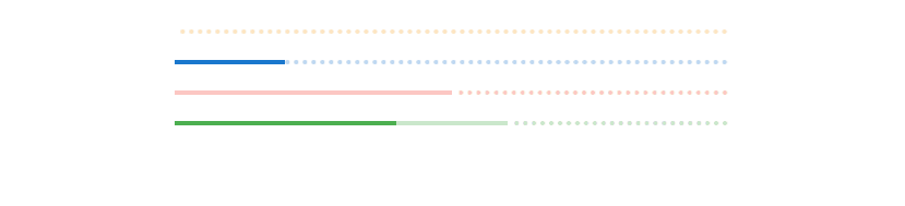
Progress Bar Stream
The stream prop works with buffer-value to inform the user that some action is taking place.
<template>
  <v-app>
    <v-row justify="center" class="ma-4">
      <v-col sm="8">
        <v-progress-linear
          color="yellow darken-3"
          buffer-value="0"
          stream
        ></v-progress-linear>
        <br />
        <v-progress-linear
          color="primary"
          buffer-value="0"
          value="20"
          stream
        ></v-progress-linear>
        <br />
        <v-progress-linear
          buffer-value="50"
          stream
          color="red"
        ></v-progress-linear>
        <br />
        <v-progress-linear
          buffer-value="60"
          value="40"
          stream
          color="green"
        ></v-progress-linear>
      </v-col>
    </v-row>
  </v-app>
</template>

<script>
export default {
  name: 'App',
};
</script>
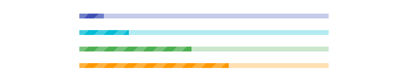
Striped Progress Bar
The striped prop applies a striped background over the value portion of the horizontal progress bar.
<template>
  <v-app>
    <v-row justify="center" class="ma-4">
      <v-col sm="8">
        <v-progress-linear
          color="indigo"
          height="10"
          value="10"
          striped
        ></v-progress-linear>
        <br />
        <v-progress-linear
          color="cyan"
          height="10"
          value="20"
          striped
        ></v-progress-linear>
        <br />
        <v-progress-linear
          height="10"
          value="45"
          striped
          color="green"
        ></v-progress-linear>
        <br />
        <v-progress-linear
          value="60"
          height="10"
          striped
          color="orange"
        ></v-progress-linear>
      </v-col>
    </v-row>
  </v-app>
</template>

<script>
export default {
  name: 'App',
};
</script>
Default Slot
With the default slot of the progress linear component, we can display custom components inside the progress bar.
<template>
  <v-app>
    <v-row justify="center" class="ma-4">
      <v-col sm="8">
        <v-progress-linear
          :indeterminate="query"
          :query="true"
          height="25"
          value="30"
        >
          <template v-slot:default="{ value }">
            <strong>{{ value }}%</strong>
          </template>
        </v-progress-linear>
      </v-col>
    </v-row>
  </v-app>
</template>

<script>
export default {
  name: 'App',
  data: () => ({
    query: false,
  }),
};
</script>
Here, we simply display the progress bar value as a percentage:

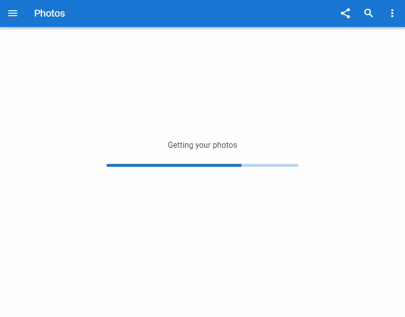
Using a Progress Bar as a Loading Indicator
One instance where the progress linear component is useful is in communicating to the user that a response is pending. Like when fetching the user’s photos from a server in a sample photo app.
<template>
  <v-app>
    <v-app-bar app color="primary" dark>
      <v-app-bar-nav-icon></v-app-bar-nav-icon>
      <v-toolbar-title>Photos</v-toolbar-title>
      <v-spacer></v-spacer>
      <v-btn icon>
        <v-icon>mdi-share-variant</v-icon>
      </v-btn>
      <v-btn icon>
        <v-icon>mdi-magnify</v-icon>
      </v-btn>
      <v-btn icon>
        <v-icon>mdi-dots-vertical</v-icon>
      </v-btn>
    </v-app-bar>
    <v-container style="flex: 1">
      <v-row class="fill-height" align-content="center" justify="center">
        <v-col class="text-subtitle-1 text-center" cols="12">
          Getting your photos
        </v-col>
        <v-col cols="6">
          <v-progress-linear
            color="primary"
            indeterminate
            rounded
            height="6"
          ></v-progress-linear>
        </v-col>
      </v-row>
    </v-container>
  </v-app>
</template>

<script>
export default {
  name: 'App',

};
</script>
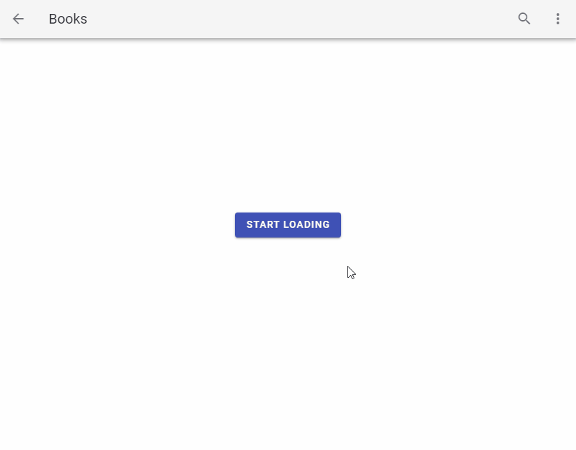
Using a Progress Bar as an App Bar Loader
A progress bar can also function as an app bar loader. With the absolute and bottom props, we can position it at the bottom of the app bar and control its visibility with the active prop:
<template>
  <v-app>
    <v-system-bar>
      <v-spacer></v-spacer>
      <v-icon>mdi-square</v-icon>
      <v-icon>mdi-circle</v-icon>
      <v-icon>mdi-triangle</v-icon>
    </v-system-bar>

    <v-app-bar app color>
      <v-btn icon>
        <v-icon>mdi-arrow-left</v-icon>
      </v-btn>

      <v-toolbar-title>Books</v-toolbar-title>

      <v-progress-linear
        :active="loading"
        :indeterminate="loading"
        absolute
        bottom
        color="indigo"
      ></v-progress-linear>

      <v-spacer></v-spacer>

      <v-btn icon>
        <v-icon>mdi-magnify</v-icon>
      </v-btn>

      <v-btn icon>
        <v-icon>mdi-dots-vertical</v-icon>
      </v-btn>
    </v-app-bar>

    <v-container style="flex: 1">
      <v-row class="fill-height" align="center" justify="center">
        <v-scale-transition>
          <div v-if="!loading" class="text-center">
            <v-btn color="indigo" dark @click="loading = true">
              Start loading
            </v-btn>
          </div>
        </v-scale-transition>
      </v-row>
    </v-container>
  </v-app>
</template>

<script>
export default {
  name: 'App',
  data: () => ({
    loading: false,
  }),
  watch: {
    loading(val) {
      if (!val) return;

      setTimeout(() => (this.loading = false), 3000);
    },
  },
};
</script>
Conclusion
A progress bar conveys information to the user about the current progress of an ongoing event in an application. Use the Vuetify progress linear component (v-progress-linear) and its various props to create and customize horizontal linear progress bars.
Every Crazy Thing JavaScript Does
A captivating guide to the subtle caveats and lesser-known parts of JavaScript.
