
We use a date picker to let users select a date or a range of dates. In this article, we’re going to learn about the Vuetify date picker component and how it lets us create and customize date pickers.
The v-date-picker Component
Vuetify provides the v-date-picker component for creating date pickers.
<template>
  <v-app>
    <div class="d-flex justify-center mt-2">
      <v-date-picker></v-date-picker>
    </div>
  </v-app>
</template>

<script>
export default {
  name: 'App',
};
</script>
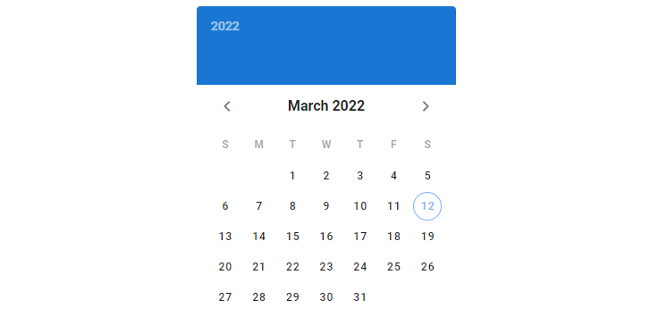
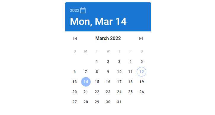
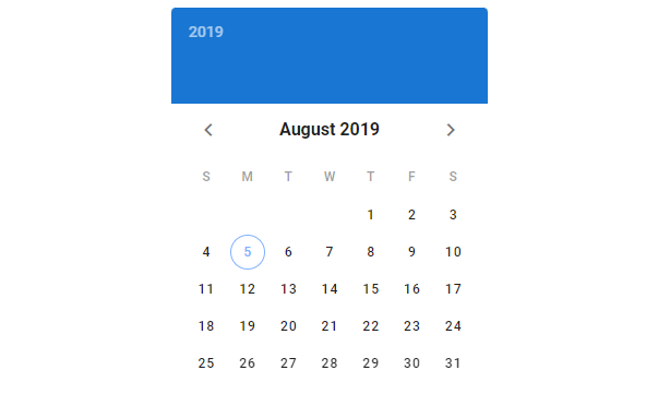
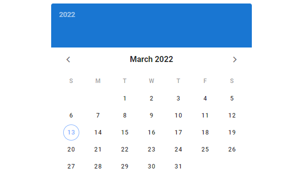
The current date is shown by default:
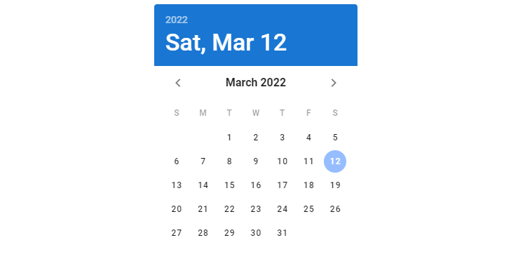
We can select this current date if we want:
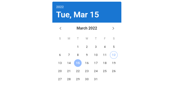
Or another date:
Two-way Binding with v-model
We can use v-model on the date picker component to set up a two-way binding between the picker and a variable. In the code below, we create a date picker and add some text below it to display the value of the date variable, which is the date selected on the picker.
<template>
  <v-app>
    <div class="d-flex justify-center mt-2">
      <v-date-picker v-model="date"></v-date-picker>
    </div>
    <div class="d-flex justify-center mt-2">Date: {{ date || 'No date' }}</div>
  </v-app>
</template>

<script>
export default {
  name: 'App',
  data: () => ({
    date: null,
  }),
};
</script>
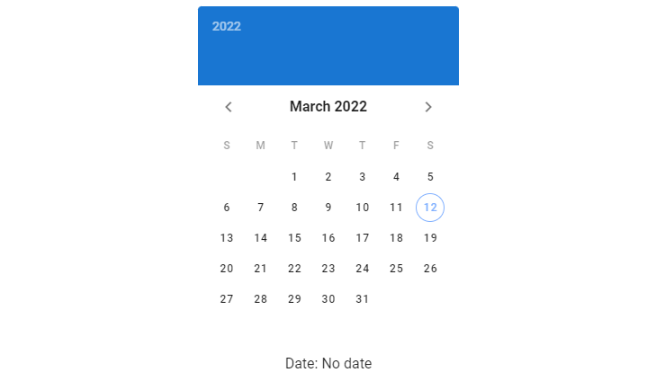
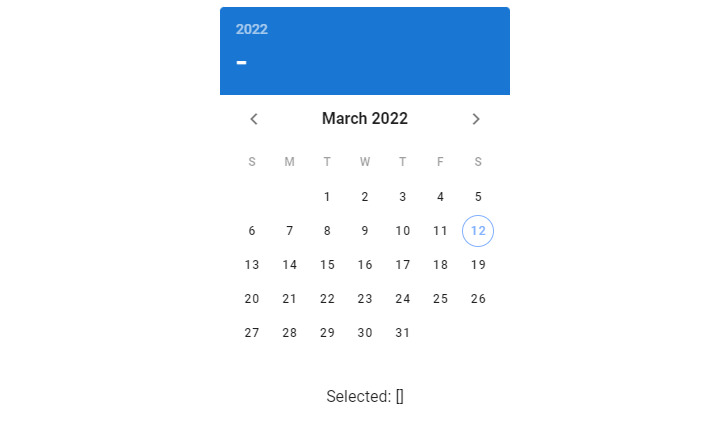
Initially, date is null, meaning that no date has been selected. We display a text “No date” to indicate this:
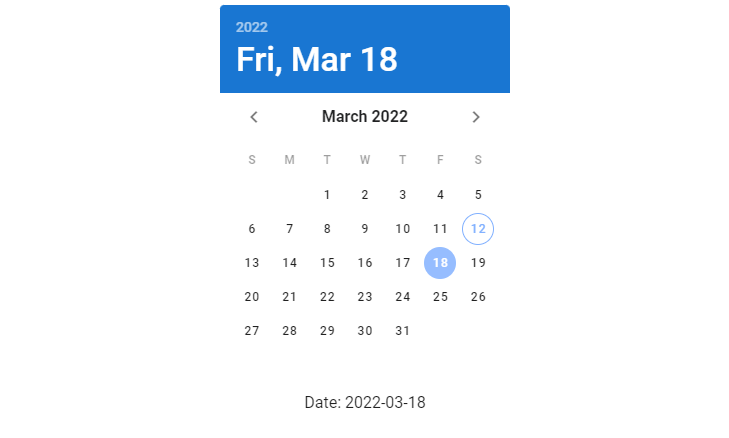
Once we select a date, date is updated by the binding and the text shows it. The date is set to a string in the YYYY-MM-DD format:
Allowed Dates
We can specify allowed dates on the date picker with the allowed-dates prop. Here, we’re passing a function to it that takes the string value of the date and returns a boolean value that indicates whether the date should be allowed or not.
<template>
  <v-app>
    <div class="d-flex justify-center mt-2">
      <v-date-picker
        v-model="date"
        :allowed-dates="allowedDates"
      ></v-date-picker>
    </div>
  </v-app>
</template>

<script>
export default {
  name: 'App',
  data: () => ({
    date: null,
  }),
  methods: {
    allowedDates: (val) => parseInt(val.split('-')[2], 10) % 2 === 1,
  },
};
</script>
The function we wrote will only allow a date with an odd day to be selectable on the picker:

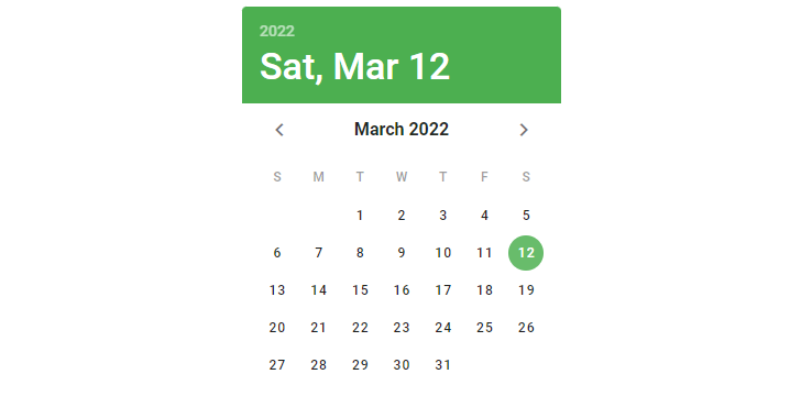
Date Picker Colors
We can customize the color of the date picker with the color and header-color props.
<template>
  <v-app>
    <div class="d-flex justify-center mt-2">
      <v-date-picker v-model="date" color="green"></v-date-picker>
    </div>
  </v-app>
</template>

<script>
export default {
  name: 'App',
  data: () => ({
    date: null,
  }),
};
</script>
We don’t specify a header-color in the code above, so the header color will be set to the value of the color prop:
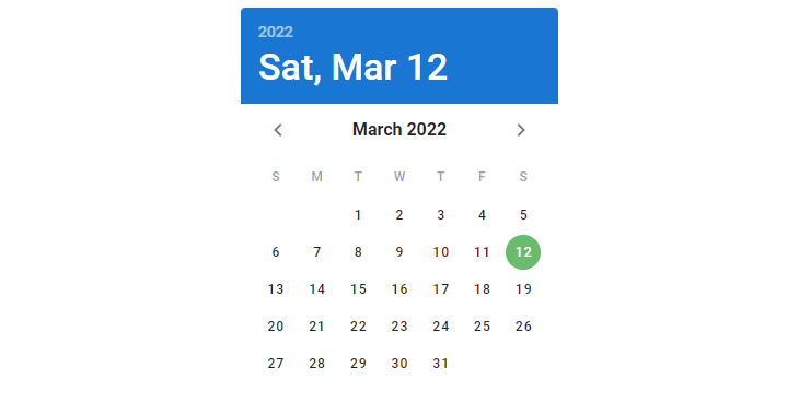
Here we do set a header-color, and the color of the date picker reflects this:
<template>
  <v-app>
    <div class="d-flex justify-center mt-2">
      <v-date-picker
        v-model="date"
        color="green"
        header-color="primary"
      ></v-date-picker>
    </div>
  </v-app>
</template>

<script>
export default {
  name: 'App',
  data: () => ({
    date: null,
  }),
};
</script>
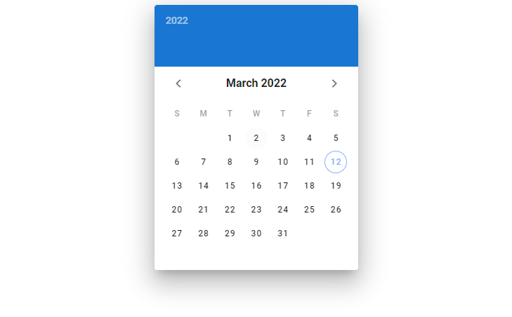
Date Picker Elevation
We can set the elevation of a date picker with the elevation prop. The v-date-picker component supports elevation up to a maximum of 24.
<template>
  <v-app>
    <div class="d-flex justify-center mt-2">
      <v-date-picker v-model="date" elevation="20"></v-date-picker>
    </div>
  </v-app>
</template>

<script>
export default {
  name: 'App',
  data: () => ({
    date: null,
  }),
};
</script>
Date Picker Icons
We can override the default icons the date picker uses with the year-icon, prev-icon and next-icon props.
<template>
  <v-app>
    <div class="d-flex justify-center mt-2">
      <v-date-picker
        v-model="date"
        year-icon="mdi-calendar-blank"
        prev-icon="mdi-skip-previous"
        next-icon="mdi-skip-next"
      ></v-date-picker>
    </div>
  </v-app>
</template>

<script>
export default {
  name: 'App',
  data: () => ({
    date: null,
  }),
};
</script>
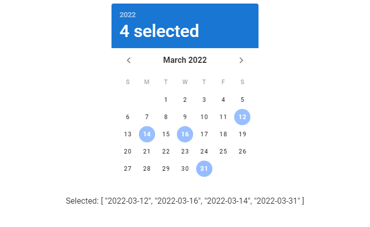
Multiple Selection
We use the multiple prop to allow users to select multiple dates from the picker. When the multiple prop is set to true, the date picker component will expect the variable passed to its v-model to be an array.
<template>
  <v-app>
    <div class="d-flex justify-center mt-2">
      <v-date-picker v-model="dates" multiple></v-date-picker>
    </div>
    <div class="d-flex justify-center">Selected: {{ dates }}</div>
  </v-app>
</template>

<script>
export default {
  name: 'App',
  data: () => ({
    dates: [],
  }),
};
</script>
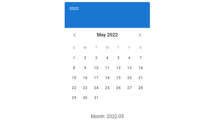
picker-date Sync
We can use the .sync modifier to watch the picker-date, which is the displayed month/year (depending on the picker type and active view). In the code below, we create a date picker and text below it that displays pickerDate, a variable synced to the picker-date prop using picker-date.sync.
<template>
  <v-app>
    <div class="d-flex justify-center mt-2">
      <v-date-picker
        v-model="date"
        :picker-date.sync="pickerDate"
      ></v-date-picker>
    </div>
    <div class="d-flex justify-center">Month: {{ pickerDate }}</div>
  </v-app>
</template>

<script>
export default {
  name: 'App',
  data: () => ({
    date: null,
    pickerDate: null,
  }),
};
</script>
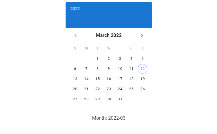
When we change the month on the date picker (using the arrows), pickerDate is updated:
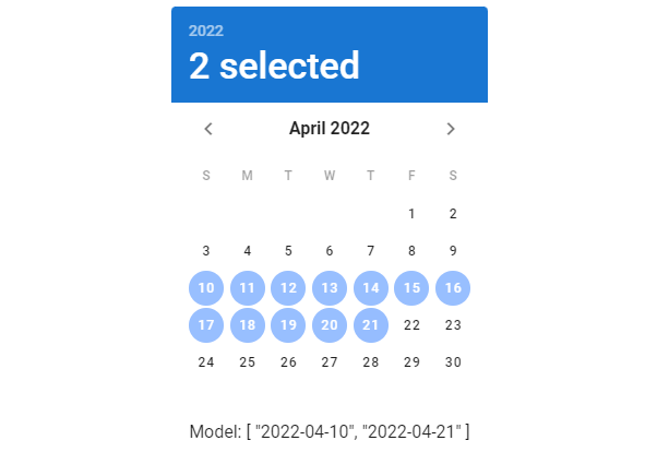
Date Picker Range
Use the range prop on a date picker component to allow users select a range of dates from it. When using the range prop, v-date-picker expects the value passed to its v-model to be an array of length 2 or empty.
<template>
  <v-app>
    <div class="d-flex justify-center mt-2">
      <v-date-picker v-model="dates" range></v-date-picker>
    </div>
    <div class="d-flex justify-center">Model: {{ dates }}</div>
  </v-app>
</template>

<script>
export default {
  name: 'App',
  data: () => ({
    dates: ['2022-03-05', '2022-03-15'],
  }),
};
</script>
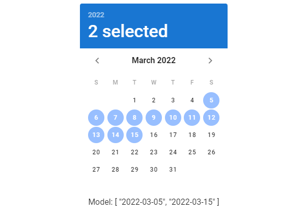
We can select another date range if we want:
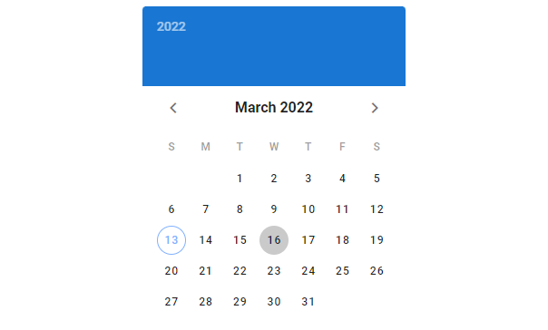
Readonly Date Picker
We can use the readonly prop to turn off interactivity with a date picker:
<template>
  <v-app>
    <div class="d-flex justify-center mt-2">
      <v-date-picker v-model="date" readonly></v-date-picker>
    </div>
  </v-app>
</template>

<script>
export default {
  name: 'App',
  data: () => ({
    date: null,
  }),
};
</script>
Here’s how it looks when its readonly and you try to pick another date, say March 16:
Show Current
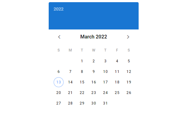
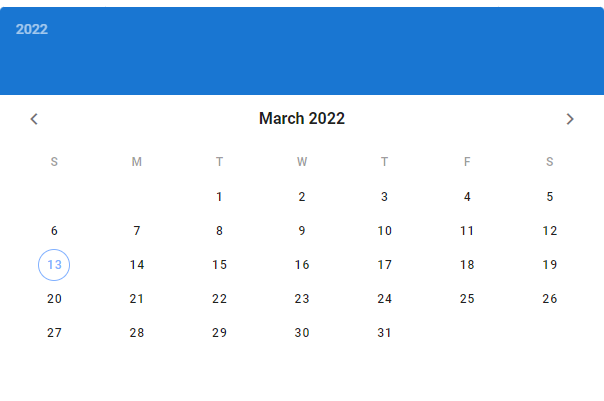
By default, the date picker indicates the current date with the outline of a circle:
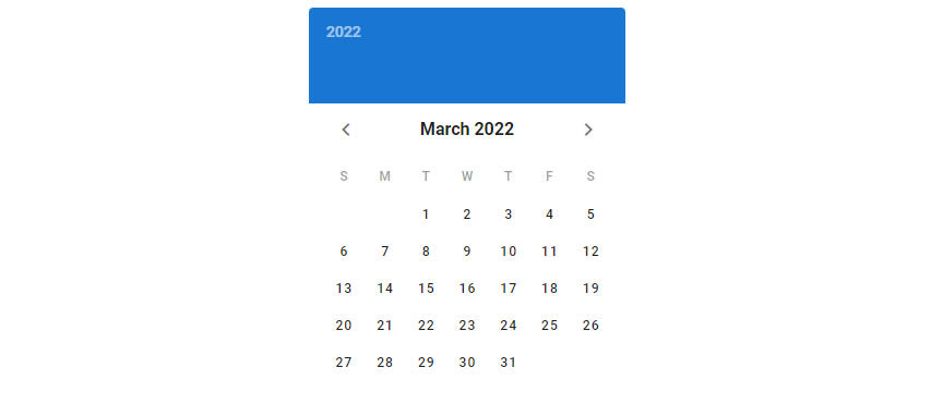
We can remove this outline by setting the show-current prop to false:
<template>
  <v-app>
    <div class="d-flex justify-center mt-2">
      <v-date-picker v-model="date" :show-current="false"></v-date-picker>
    </div>
  </v-app>
</template>

<script>
export default {
  name: 'App',
  data: () => ({
    date: null,
  }),
};
</script>
We can also make the date picker indicate another date as the current date. We do this by setting the show-current prop to a date string in the YYYY-MM-DD format:
Showing Sibling Months
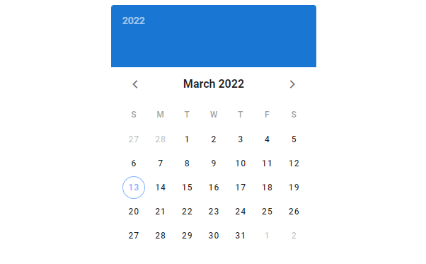
By default, days from the previous and next months are not visible. Use the show-adjacent-months prop to display them:
<template>
  <v-app>
    <div class="d-flex justify-center mt-2">
      <v-date-picker v-model="date" show-adjacent-months></v-date-picker>
    </div>
  </v-app>
</template>

<script>
export default {
  name: 'App',
  data: () => ({
    date: null,
  }),
};
</script>
Customizing the Date Picker Width
We can customize the width of the date picker using the width prop:
<template>
  <v-app>
    <div class="d-flex justify-center mt-2">
      <v-date-picker v-model="date" width="400"></v-date-picker>
    </div>
  </v-app>
</template>

<script>
export default {
  name: 'App',
  data: () => ({
    date: null,
  }),
};
</script>
Full Width
We can also use the full-width prop to make the date picker take up all the available width of its parent:
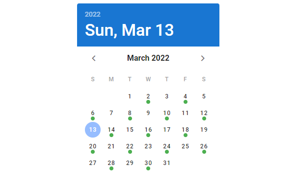
Date Picker Event Dates
We can specify events by assigning arrays, objects or functions to the events prop. And we can the event-color prop to change the default color of the mark the date picker uses to indicate the events. Here, we set events to all the odd number days in the month of March 2022 to mark them.
<template>
  <v-app>
    <div class="d-flex justify-center mt-2">
      <v-date-picker
        v-model="date"
        :events="eventDates"
        event-color="green"
      ></v-date-picker>
    </div>
  </v-app>
</template>

<script>
export default {
  name: 'App',
  data: () => ({
    date: null,
    eventDates: null,
  }),
  mounted() {
    this.eventDates = [...Array(31)]
      .map((value, index) => index + 1)
      .filter((value) => value % 2 === 0)
      .map((value) => {
        const date = new Date();
        date.setDate(value);
        return date.toISOString().substr(0, 10);
      });
  },
};
</script>
Summary
We use date pickers to allow users select a date or a range of dates. Vuetify provides the v-date-picker component for creating and customizing date pickers.
11 Amazing New JavaScript Features in ES13
This guide will bring you up to speed with all the latest features added in ECMAScript 13. These powerful new features will modernize your JavaScript with shorter and more expressive code.
