How to Use the Vuetify Sparkline Component
We can use a sparkline to give a visual representation of numerical or statistical information with simple graphs. In this extensive guide, we’ll learn how to use the Vuetify sparkline component to easily create and customize sparklines.
The Vuetify Sparkline Component (v-sparkline)
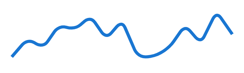
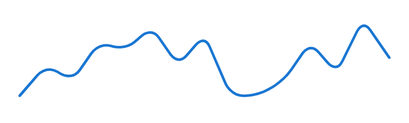
Vuetify provides the v-sparkline component for creating a sparkline. It has a value prop that takes an array containing the data to be represented:
<template>
  <v-app>
    <div class="ma-4">
      <v-sparkline
        :value="value"
        smooth="10"
      ></v-sparkline>
    </div>
  </v-app>
</template>

<script>
export default {
  name: 'App',
  data: () => ({
    value: [0, 4, 2, 7, 6, 9, 4, 8, 0, 0, 2, 7, 3, 10, 5],
  }),
};
</script>
Vuetify Sparkline Stroke Line Cap
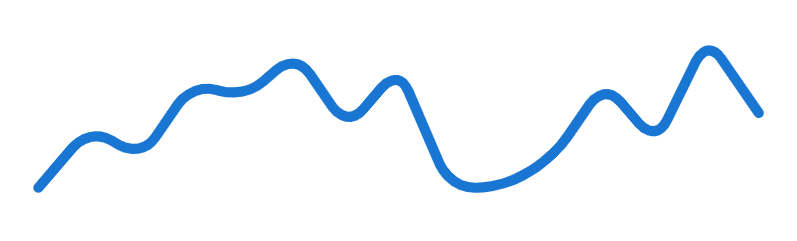
The sparkline has a sharp line cap by default. We can make it round by setting the stroke-linecap prop to round:
<template>
  <v-app>
    <div class="ma-4">
      <v-sparkline
        :value="value"
        smooth="10"
        stroke-linecap="round"
      ></v-sparkline>
    </div>
  </v-app>
</template>

<script>
export default {
  name: 'App',
  data: () => ({
    value: [0, 4, 2, 7, 6, 9, 4, 8, 0, 0, 2, 7, 3, 10, 5],
  }),
};
</script>
Vuetify Sparkline Fill
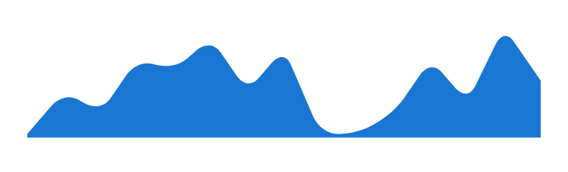
We can color the region below the sparkline by setting the fill prop to true:
<template>
  <v-app>
    <div class="ma-4">
      <v-sparkline
        :value="value"
        smooth="10"
        fill
      ></v-sparkline>
    </div>
  </v-app>
</template>

<script>
export default {
  name: 'App',
  data: () => ({
    value: [0, 4, 2, 7, 6, 9, 4, 8, 0, 0, 2, 7, 3, 10, 5],
  }),
};
</script>
Vuetify Sparkline Line Width
We can use the line-width prop to control the thickness of the sparkline.
<template>
  <v-app>
    <div class="ma-4">
      <v-sparkline
        :value="value"
        smooth="10"
        line-width="2"
        stroke-linecap="round"
      ></v-sparkline>
    </div>
  </v-app>
</template>

<script>
export default {
  name: 'App',
  data: () => ({
    value: [0, 4, 2, 7, 6, 9, 4, 8, 0, 0, 2, 7, 3, 10, 5],
  }),
};
</script>
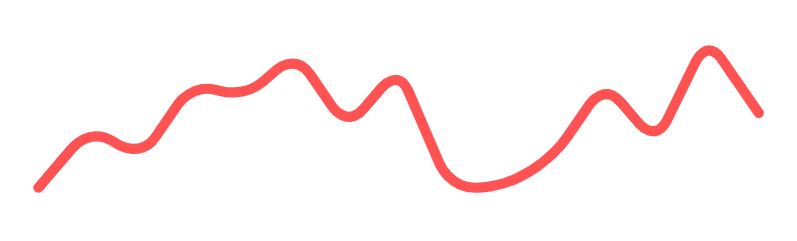
Sparkline Color
v-sparkline comes with a color prop for customizing the color of the sparkline. We can use any color from the Material design specs.
<template>
  <v-app>
    <div class="ma-4">
      <v-sparkline
        :value="value"
        smooth="10"
        color="red accent-2"
        stroke-linecap="round"
      ></v-sparkline>
    </div>
  </v-app>
</template>

<script>
export default {
  name: 'App',
  data: () => ({
    value: [0, 4, 2, 7, 6, 9, 4, 8, 0, 0, 2, 7, 3, 10, 5],
  }),
};
</script>
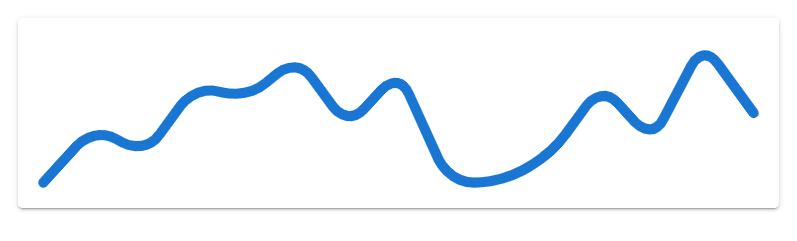
Vuetify Sparkline Smooth
With the smooth prop, we can set the roundness of the corners formed from the sparkline tracing the data points. We can pass a number or a boolean value to smooth. Setting it to true sets a corner radius of 8px. In the code example below, we set it to 5 (for a corner radius of 5px):
<template>
  <v-app>
    <div class="ma-4">
      <v-sparkline
        :value="value"
        smooth="5"
        stroke-linecap="round"
      ></v-sparkline>
    </div>
  </v-app>
</template>

<script>
export default {
  name: 'App',
  data: () => ({
    value: [0, 4, 2, 7, 6, 9, 4, 8, 0, 0, 2, 7, 3, 10, 5],
  }),
};
</script>
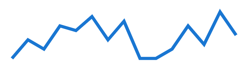
Setting smooth to false will set the corner radius to 0px:
<template>
  <v-app>
    <div class="ma-4">
      <v-sparkline
        :value="value"
        :smooth="false"
      ></v-sparkline>
    </div>
  </v-app>
</template>

<script>
export default {
  name: 'App',
  data: () => ({
    value: [0, 4, 2, 7, 6, 9, 4, 8, 0, 0, 2, 7, 3, 10, 5],
  }),
};
</script>
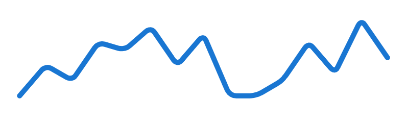
Vuetify Sparkline Padding
We can add padding to the sparkline with the padding property. It has a padding of 8 by default.
<template>
  <v-app>
    <v-card class="ma-4">
      <v-sparkline
        :value="value"
        smooth="10"
        padding="10"
        stroke-linecap="round"
      ></v-sparkline>
    </v-card>
  </v-app>
</template>

<script>
export default {
  name: 'App',
  data: () => ({
    value: [0, 4, 2, 7, 6, 9, 4, 8, 0, 0, 2, 7, 3, 10, 5],
  }),
};
</script>
Vuetify Sparkline Auto Draw
Setting the auto-draw prop to true on a v-sparkline will make the sparkline run a trace animation when first rendered.
<template>
  <v-app>
    <div class="ma-4">
      <v-sparkline
        :value="value"
        smooth="10"
        padding="10"
        stroke-linecap="round"
        auto-draw
      ></v-sparkline>
    </div>
  </v-app>
</template>

<script>
export default {
  name: 'App',
  data: () => ({
    value: [0, 4, 2, 7, 6, 9, 4, 8, 0, 0, 2, 7, 3, 10, 5],
  }),
};
</script>

Sparkline Auto Draw Duration
The auto-draw-duration prop allows us to set the duration of the trace animation in milliseconds. It has a default value of 2000 (2 seconds).
<template>
  <v-app>
    <div class="ma-4">
      <v-sparkline
        :value="value"
        smooth="10"
        padding="10"
        stroke-linecap="round"
        auto-draw
        :auto-draw-duration="4000"
      ></v-sparkline>
    </div>
  </v-app>
</template>

<script>
export default {
  name: 'App',
  data: () => ({
    value: [0, 4, 2, 7, 6, 9, 4, 8, 0, 0, 2, 7, 3, 10, 5],
  }),
};
</script>

Sparkline Auto Draw Easing
We can specify the easing function of the trace animation with the auto-draw-easing prop:
<template>
  <v-app>
    <div class="ma-4">
      <v-sparkline
        :value="value"
        smooth="10"
        padding="10"
        stroke-linecap="round"
        auto-draw
        :auto-draw-duration="4000"
        auto-draw-easing="linear"
      ></v-sparkline>
    </div>
  </v-app>
</template>

<script>
export default {
  name: 'App',
  data: () => ({
    value: [0, 4, 2, 7, 6, 9, 4, 8, 0, 0, 2, 7, 3, 10, 5],
  }),
};
</script>

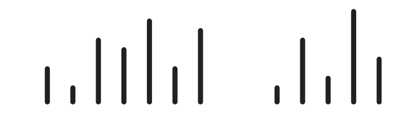
Vuetify Sparkline Type
By setting the type prop to bar, we can make v-sparkline show a set of bars instead of a line. The default type is trend which shows the continuous line.
<template>
  <v-app>
    <div class="ma-4">
      <v-sparkline
        :value="value"
        smooth="10"
        padding="10"
        stroke-linecap="round"
        type="bar"
      ></v-sparkline>
    </div>
  </v-app>
</template>

<script>
export default {
  name: 'App',
  data: () => ({
    value: [0, 4, 2, 7, 6, 9, 4, 8, 0, 0, 2, 7, 3, 10, 5],
  }),
};
</script>
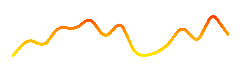
Vuetify Sparkline Gradient
We can set the color of the sparkline to a linear gradient with the gradient prop. gradient takes an array of colors to use for the linear gradient.
<template>
  <v-app>
    <div class="ma-4">
      <v-sparkline
        :value="value"
        smooth="10"
        padding="10"
        stroke-linecap="round"
        :gradient="gradient"
      ></v-sparkline>
    </div>
  </v-app>
</template>

<script>
export default {
  name: 'App',
  data: () => ({
    value: [0, 4, 2, 7, 6, 9, 4, 8, 0, 0, 2, 7, 3, 10, 5],
    gradient: ['red', 'orange', 'yellow'],
  }),
};
</script>
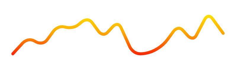
Vuetify Sparkline Gradient Direction
The gradient-direction property of v-sparkline sets the direction in which the color gradient should run.
<template>
  <v-app>
    <div class="ma-4">
      <v-sparkline
        :value="value"
        smooth="10"
        padding="10"
        stroke-linecap="round"
        :gradient="gradient"
        gradient-direction="bottom"
      ></v-sparkline>
    </div>
  </v-app>
</template>

<script>
export default {
  name: 'App',
  data: () => ({
    value: [0, 4, 2, 7, 6, 9, 4, 8, 0, 0, 2, 7, 3, 10, 5],
    gradient: ['red', 'orange', 'yellow'],
  }),
};
</script>
Conclusion
A sparkline displays simple graphs that visually represent numerical or statistical information. We can use the Vuetify sparkline component (v-sparkline) and its various prop to create and customize sparklines.