tutorial

How to Handle Hover Events With Vuetify

While we could use the CSS :hover pseudo-class to customize element styles on mouse hover, Vuetify provides a neat way of doing this, with the v-hover component. Let’s see how we can use it in this article.

Vuetify hover component (v-hover)

<template>
  <v-app>
    <div class="d-flex justify-center">
      <v-hover v-slot="{ hover }">
        <v-card
          class="ma-4 pa-4"
          width="200"
          height="200"
          :elevation="hover ? 12 : 2"
        >
          Hover over me!
        </v-card>
      </v-hover>
    </div>
  </v-app>
</template>

<script>
export default {
  name: 'App',
};
</script>

The v-hover default slot provides a hover prop, whose value changes depending on the current hover state of the child of the hover component; when the mouse has not hovered over it, hover remains false. For our case, that will set the elevation of the card to 2:

Using the Vuetify hover component.

And when we hover over it, hover becomes true and the card elevation becomes 12:

Vuetify hover open delay

We can delay the hover prop change from false to true with the open-delay prop. In the code below, we use open-delay to set a delay of 200ms for the hover prop to become true from mouse hover:

<template>
  <v-app>
    <div class="d-flex justify-center">
      <v-hover v-slot="{ hover }" open-delay="200">
        <v-card
          :elevation="hover ? 16 : 2"
          :class="{ 'on-hover': hover }"
          class="ma-4"
          height="100"
          max-width="250"
        >
          <v-card-text> Open Delay (Mouse enter) </v-card-text>
        </v-card>
      </v-hover>
    </div>
  </v-app>
</template>

<script>
export default {
  name: 'App',
};
</script>
Setting a hover open delay on the card.

Vuetify hover close delay

Similarly, we can delay the hover prop from true to false after the mouse leaves it, with the close-delay prop. So after the mouse leaves the card, it would take 200ms for its elevation to be reduced:

<template>
  <v-app>
    <div class="d-flex justify-center">
      <v-hover v-slot="{ hover }" close-delay="200">
        <v-card
          :elevation="hover ? 16 : 2"
          :class="{ 'on-hover': hover }"
          class="ma-4"
          height="100"
          max-width="250"
        >
          <v-card-text> Close Delay (Mouse leave) </v-card-text>
        </v-card>
      </v-hover>
    </div>
  </v-app>
</template>

<script>
export default {
  name: 'App',
};
</script>
Setting a hover close delay on the card.

Disable hover

We can disable the hover functionality with the disabled prop:

<template>
  <v-app>
    <div class="d-flex justify-center ma-4">
      <v-hover v-slot="{ hover }" disabled>
        <v-card
          :elevation="hover ? 12 : 2"
          height="100"
          max-width="250"
        >
          <v-card-text class="my-4 text-center text-h6">
            Hover disabled
          </v-card-text>
        </v-card>
      </v-hover>
    </div>
  </v-app>
</template>

<script>
export default {
  name: 'App',
};
</script>

Nothing will happen when you hover over the card:

Disabling hover state.

Vuetify hover list

We can combine v-hover and v-for to make a single item stand out when the user interacts with the list:

<template>
  <v-app>
    <v-container>
      <v-row class="fill-height" align="center" justify="center">
        <v-col v-for="(letter, index) in letters" :key="index">
          <v-hover v-slot="{ hover }">
            <v-card
              height="200"
              :elevation="hover ? 12 : 2"
              :class="{ 'on-hover': hover }"
            >
              <div
                class="text-h1 d-flex justify-center align-center fill-height"
              >
                {{ letter }}
              </div>
            </v-card>
          </v-hover>
        </v-col>
      </v-row>
    </v-container>
  </v-app>
</template>

<script>
export default {
  name: 'App',
  data() {
    return {
      letters: ['A', 'B', 'C'],
    };
  },
};
</script>

Now each card stands out when hovered over:

Creating a hover list with Vuetify.

Hover transitions in Vuetify

With the hover component, we can create components that respond in highly customized ways to user interaction. For example:

<template>
  <v-app>
    <div class="d-flex justify-center">
      <v-hover v-slot="{ hover }">
        <v-card class="ma-4 pa-4" width="300">
          <p class="mb-4">Sign up to get started</p>
          <v-expand-transition>
            <div v-if="hover"><v-btn color="primary" dark>Sign up</v-btn></div>
          </v-expand-transition>
        </v-card>
      </v-hover>
    </div>
  </v-app>
</template>

<script>
export default {
  name: 'App',
};
</script>

When you hover over the card, the extra portion containing the “Sign Up” button slides out (thanks to the v-expand-transition component):

Creating hover transitions with Vuetify.

Conclusion

Vuetify provides the v-hover component for handling toggling component styles based on their current hover state. It provides customization options, such as creating hover event delays and displaying transitions on hover.

How to Create Dialogs with Vuetify

We can a dialog to interact with users. They convey messages and allow certain actions to be taken on them. Vuetify provides the v-dialog component for creating a dialog. Let’s see how we can use this component in practice.

In the code below, we’ve created a dialog and a button of color red:

<template>
  <v-app>
    <div class="text-center">
      <v-dialog v-model="dialog" width="500">
        <template v-slot:activator="{ on, attrs }">
          <v-btn v-bind="attrs" v-on="on" class="mt-2" color="red" dark>
            Delete
          </v-btn>
        </template>

        <v-card>
          <v-card-title class="text-h5"> Delete file? </v-card-title>

          <v-card-text> Do you really want to delete this file? </v-card-text>

          <v-card-actions>
            <v-spacer></v-spacer>
            <v-btn text @click="dialog = false"> Cancel </v-btn>
            <v-btn color="red" text @click="dialog = false"> Delete </v-btn>
          </v-card-actions>
        </v-card>
      </v-dialog>
    </div>
  </v-app>
</template>

<script>
export default {
  name: 'App',
  data: () => ({
    dialog: false,
  }),
};
</script>

We’ve placed the button in the activator slot of the v-dialog component. This slot provides some props – on and attrs, which we used to set the props and the event handlers of the button. We use a card to create the body of the dialog.

Creating a dialog in Vuetify.

The dialog shows up when the button is clicked:

The dialog opens when the button is clicked.

Using the “hide-overlay” Prop

The dialog opens with an overlay, as we can see in the image above. We can hide this overlay, by setting the hide-overlay prop to true:

<template>
  <v-app>
    <div class="text-center">
      <v-dialog v-model="dialog" width="500" hide-overlay>
        <template v-slot:activator="{ on, attrs }">
          <v-btn v-bind="attrs" v-on="on" class="mt-2" color="red" dark>
            Delete
          </v-btn>
        </template>

        <v-card>
          <v-card-title class="text-h5"> Delete file? </v-card-title>

          <v-card-text> Do you really want to delete this file? </v-card-text>

          <v-card-actions>
            <v-spacer></v-spacer>
            <v-btn text @click="dialog = false"> Cancel </v-btn>
            <v-btn color="red" text @click="dialog = false"> Delete </v-btn>
          </v-card-actions>
        </v-card>
      </v-dialog>
    </div>
  </v-app>
</template>

It would look like this:

Setting the "hide-overlay" prop to true on v-dialog removes the dialog overlay.

Creating Fullscreen Dialogs

We can make the dialog cover up the entire viewport of the page, by setting the fullscreen prop to true:

<template>
  <v-app>
    <div class="text-center">
      <v-dialog v-model="dialog" width="500" fullscreen>
        <template v-slot:activator="{ on, attrs }">
          <v-btn v-bind="attrs" v-on="on" class="mt-2" color="red" dark>
            Delete
          </v-btn>
        </template>

        <v-card>
          <v-card-title class="text-h5"> Delete file? </v-card-title>

          <v-card-text> Do you really want to delete this file? </v-card-text>

          <v-card-actions>
            <v-spacer></v-spacer>
            <v-btn text @click="dialog = false"> Cancel </v-btn>
            <v-btn color="red" text @click="dialog = false"> Delete </v-btn>
          </v-card-actions>
        </v-card>
      </v-dialog>
    </div>
  </v-app>
</template>
...
Setting the "fullscreen" prop on "v-dialog" makes the dialog fullscreen.

Using Custom Dialog Transitions

We can customize the transition that a dialog uses to appear on the screen using the transition prop. In the code below, we’ve set it to dialog-bottom-transition, which will make the dialog slide in from the bottom when opened:

<template>
  <v-app>
    <div class="text-center">
      <v-dialog
        v-model="dialog"
        width="500"
        transition="dialog-bottom-transition"
      >
        <template v-slot:activator="{ on, attrs }">
          <v-btn v-bind="attrs" v-on="on" class="mt-2" color="red" dark>
            Delete
          </v-btn>
        </template>

        <v-card>
          <v-card-title class="text-h5"> Delete file? </v-card-title>

          <v-card-text> Do you really want to delete this file? </v-card-text>

          <v-card-actions>
            <v-spacer></v-spacer>
            <v-btn text @click="dialog = false"> Cancel </v-btn>
            <v-btn color="red" text @click="dialog = false"> Delete </v-btn>
          </v-card-actions>
        </v-card>
      </v-dialog>
    </div>
  </v-app>
</template>
...

If we wanted to make it slide in from the top, we could have set the same prop to dialog-top-transition:


<template>
  <v-app>
    <div class="text-center">
      <v-dialog
        v-model="dialog"
        width="500"
        transition="dialog-bottom-transition"
      >
        <template v-slot:activator="{ on, attrs }">
          <v-btn v-bind="attrs" v-on="on" class="mt-2" color="red" dark>
            Delete
          </v-btn>
        </template>

        <v-card>
          <v-card-title class="text-h5"> Delete file? </v-card-title>

          <v-card-text> Do you really want to delete this file? </v-card-text>

          <v-card-actions>
            <v-spacer></v-spacer>
            <v-btn text @click="dialog = false"> Cancel </v-btn>
            <v-btn color="red" text @click="dialog = false"> Delete </v-btn>
          </v-card-actions>
        </v-card>
      </v-dialog>
    </div>
  </v-app>
</template>
...

How to Make Dialogs Persistent

By default, Vuetify dialogs can be dismissed by clicking or tapping somewhere outside of it. If we don’t want this to be the case, we can set the persistent prop to true:


<template>
  <v-app>
    <div class="text-center">
      <v-dialog
        v-model="dialog"
        width="500"
        persistent
      >
        <template v-slot:activator="{ on, attrs }">
          <v-btn v-bind="attrs" v-on="on" class="mt-2" color="red" dark>
            Delete
          </v-btn>
        </template>

        <v-card>
          <v-card-title class="text-h5"> Delete file? </v-card-title>

          <v-card-text> Do you really want to delete this file? </v-card-text>

          <v-card-actions>
            <v-spacer></v-spacer>
            <v-btn text @click="dialog = false"> Cancel </v-btn>
            <v-btn color="red" text @click="dialog = false"> Delete </v-btn>
          </v-card-actions>
        </v-card>
      </v-dialog>
    </div>
  </v-app>
</template>
...

Summary

Vuetify provides the v-dialog component for creating dialogs in a user interface. We can change certain properties of these dialogs, such as making them fullscreen or changing the transition they used to appear on the screen.

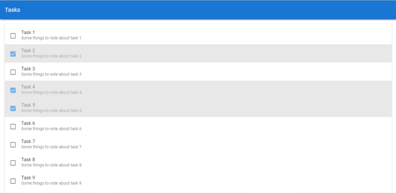
How to Use the Vuetify Card Component

The Card component in Vuetify is one that can be used for a wide range of things. We can use it to wrap a toolbar component, to contain a list, or just to display a static image. We can customize certain card features, such as color, elevation, and size. In this article, you’ll learn how to create a simple card with the UI library.

The v-card Component

v-card is the name of the component provided by Vuetify for creating cards. We’ve created one in the code below and customized its height and width with the respective props:

<template>
  <v-app>
    <div class="d-flex justify-center ma-4">
      <v-card height="150" width="350"></v-card>
    </div>
  </v-app>
</template>
Create a simple card in Vuetify with the v-card component.

The v-card-title Component

v-card comes along with certain supplementary components meant to be used in it (as children). One of such is the v-card-title component. As the name implies, it allows us to set the title of a card. For example:

<template>
  <v-app>
    <div class="d-flex justify-center ma-4">
      <v-card height="150" width="350">
        <v-card-title>data.zip</v-card-title>
      </v-card>
    </div>
  </v-app>
</template>
Setting the title of card with the v-card-title component in Vuetify.

The v-card-subtitle Component

We can also set card subtitles with the v-card-subtitle component. Being a subtitle, it is styled with a regular font weight and smaller font size than the title.

<template>
  <v-app>
    <div class="d-flex justify-center ma-4">
      <v-card height="150" width="350">
        <v-card-title>data.zip</v-card-title>
        <v-card-subtitle>Your data is ready</v-card-subtitle>
      </v-card>
    </div>
  </v-app>
</template>
Setting the subtitle of a card with the v-card-subtitle component in Vuetify.

The v-card-text Component

We can use the v-card-text component to add text for the card body:

<template>
  <v-app>
    <div class="d-flex justify-center ma-4">
      <v-card width="350">
        <v-card-title>data.zip</v-card-title>
        <v-card-subtitle>Your data is ready</v-card-subtitle>
        <v-card-text>
          You can now download an archive of all
          your data within the next 24 hours.
        </v-card-text>
      </v-card>
    </div>
  </v-app>
</template>
Creating text for the body of a card with the v-card-text component in Vuetify.

The v-card-actions Component

The v-card-actions component serves as a container for interactive components (like buttons) that let us take certain actions related to the information on the card:

<template>
  <v-app>
    <div class="d-flex justify-center ma-4">
      <v-card width="350">
        <v-card-title>data.zip</v-card-title>
        <v-card-subtitle>Your data is ready</v-card-subtitle>
        <v-card-text>
          You can now download an archive of all
          your data within the next 24 hours.
        </v-card-text>
        <v-card-actions>
          <v-btn text color="primary">Download</v-btn>
          <v-btn text>Cancel</v-btn>
        </v-card-actions>
      </v-card>
    </div>
  </v-app>
</template>
Creating card actions with buttons and the v-card-actions component in Vuetify.

Outlined Cards

Setting the outlined property of the v-card component to true will remove the elevation of the card:

<template>
  <v-app>
    <div class="d-flex justify-center ma-4">
      <v-card width="350" outlined>
        <v-card-title>data.zip</v-card-title>
        <v-card-subtitle>Your data is ready</v-card-subtitle>
        <v-card-text>
          You can now download an archive of all
          your data within the next 24 hours.
        </v-card-text>
        <v-card-actions>
          <v-btn text color="primary">Download</v-btn>
          <v-btn text>Cancel</v-btn>
        </v-card-actions>
      </v-card>
    </div>
  </v-app>
</template>

The elevation Prop

We can also set the specific amount of elevation we want for a card with the elevation prop:

<template>
  <v-app>
    <div class="d-flex justify-center ma-4">
      <v-card width="350" elevation="5">
        <v-card-title>data.zip</v-card-title>
        <v-card-subtitle>Your data is ready</v-card-subtitle>
        <v-card-text>
          You can now download an archive of all
          your data within the next 24 hours.
        </v-card-text>
        <v-card-actions>
          <v-btn text color="primary">Download</v-btn>
          <v-btn text>Cancel</v-btn>
        </v-card-actions>
      </v-card>
    </div>
  </v-app>
</template>

How to Use the Vuetify Button Component

A button is one of those elements you find in just about every UI. It is the most common way of adding interactivity to an application. Vuetify provides the v-btn component for creating a button. Let’s see how we can use this component and the various customizations we can apply.

Vuetify Regular Button

Here, we’ve created three evenly spaced buttons of different colors. One way of setting the color of most components in Vuetify is with the color prop. For the green button, we add the dark property to make its text white.

<template>
  <v-app>
    <v-row class="ma-4 justify-space-around">
      <v-btn>Button</v-btn>
      <v-btn color="red">Button</v-btn>
      <v-btn color="green" dark>Button</v-btn>
    </v-row>
  </v-app>
</template>

<script>
export default {
  name: 'App',
};
</script>
Regular Vuetify button components.

Vuetify Block Button

We create a block button by setting the block prop to true:

<template>
  <v-app>
    <v-row class="ma-4">
      <v-btn block>Block Button</v-btn>
    </v-row>
  </v-app>
</template>
...

This makes the button extend to its full available width:

Creating a block button in Vuetify

Vuetify Depressed Button

Using the depressed prop to make a button depressed removes the box-shadow:

<template>
  <v-app>
    <v-row class="ma-4 justify-space-around">
      <v-btn depressed>Depressed Button</v-btn>
      <v-btn depressed color="yellow">Depressed Button</v-btn>
      <v-btn depressed color="red">Depressed Button</v-btn>
    </v-row>
  </v-app>
</template>
...
Creating depressed Vuetify button components.

Vuetify Icon Button

We are not limited to just text, we can also create icon buttons in Vuetify. The icon prop makes the button rounded, and applies the same styles that would be applied if we set the text prop (more on this prop later in this post).

<template>
  <v-app>
    <v-row class="ma-4 justify-space-around">
      <v-btn color="blue" icon><v-icon>mdi-thumb-up</v-icon></v-btn>
      <v-btn color="red" icon><v-icon>mdi-heart</v-icon></v-btn>
      <v-btn color="yellow" icon><v-icon>mdi-star</v-icon></v-btn>
    </v-row>
  </v-app>
</template>
...
Vuetify icon button components.

Vuetify Outlined Button

We can create outlined buttons with the outlined prop. These type of buttons inherit their borders from the current color applied:

<template>
  <v-app>
    <v-row class="ma-4 justify-space-around">
      <v-btn outlined>Outlined Button</v-btn>
      <v-btn color="green" outlined>Outlined Button</v-btn>
      <v-btn color="orange" outlined>Outlined Button</v-btn>
    </v-row>
  </v-app>
</template>
...
Vuetify outlined button components.

Vuetify Plain Button

Plain buttons are created with the plain prop. They have a low baseline opacity that increases when you hover or focus on them:

<template>
  <v-app>
    <v-row class="ma-4 justify-space-around">
      <v-btn plain>Plain Button</v-btn>
      <v-btn color="red" plain>Plain Button</v-btn>
      <v-btn color="blue" plain>Plain Button</v-btn>
    </v-row>
  </v-app>
</template>
...
Vuetify plain button components.

Vuetify Rounded Button

Using the rounded prop, we can create buttons that behave the same as regular buttons, but have rounded edges:

<template>
  <v-app>
    <v-row class="ma-4 justify-space-around">
      <v-btn rounded>Rounded Button</v-btn>
      <v-btn rounded color="blue">Rounded Button</v-btn>
      <v-btn rounded color="green">Rounded Button</v-btn>
    </v-row>
  </v-app>
</template>
...
Vuetify rounded button components.

Vuetify Text Button

Text buttons, created with the text prop, have no box shadow and no background. The container for the button is only shown on hover, and the color set for the button is applied to its text instead of its background:

<template>
  <v-app>
    <v-row class="ma-4" justify="space-around">
      <v-btn text> Normal </v-btn>
      <v-btn text color="primary"> Primary </v-btn>
      <v-btn text color="error"> Error </v-btn>
      <v-btn text disabled> Disabled </v-btn>
    </v-row>
  </v-app>
</template>
...
Creating text buttons in Vuetify.

Vuetify Tile Button

Tile buttons act like regular buttons but have no border-radius. You can create them with the tile prop:

<template>
  <v-app>
    <v-row class="ma-4" justify="space-around">
      <v-btn tile> Tile Button </v-btn>
      <v-btn tile color="yellow"> Tile Button </v-btn>
      <v-btn tile color="blue"> Tile Button</v-btn>
    </v-row>
  </v-app>
</template>
...
Vuetify tile button components.

Sizing Buttons in Vuetify

Apart from these variants, Vuetify also provides us with a range of button sizing options to fit a multitude of scenarios:

<template>
  <v-app>
    <div class="ma-2">
      <v-btn x-small color="secondary" dark> Extra small Button </v-btn>
    </div>
    <div class="ma-2">
      <v-btn small color="primary" dark> Small Button </v-btn>
    </div>
    <div class="ma-2">
      <v-btn color="warning" dark> Normal Button </v-btn>
    </div>
    <div class="ma-2">
      <v-btn color="error" dark large> Large Button </v-btn>
    </div>
    <div class="ma-2">
      <v-btn x-large color="success" dark> Extra large Button </v-btn>
    </div>
  </v-app>
</template>
...
Sizing button components in Vuetify.

Conclusion

Buttons are everywhere. The v-btn component from Vuetify allows us to create them and enables various customization options, such as altering the variant or modifying the size.

How to Use Colors in Vuetify

Vuetify comes fully loaded with lots of color options for our use. All the colors from the Material Design spec are available. There are different ways of using Vuetify colors to style components. To demonstrate them, let’s create a card:

<template>
  <v-app>
    <v-card class="pa-4 ma-4">The quick brown fox jumped over the lazy dogs</v-card>
  </v-app>
</template>

<script>
export default {
  name: 'App',
};
</script>

Here’s what it looks like for now:

The Vuetify v-card component, with its default color

Setting Vuetify Colors with the color Prop

Most Vuetify components come with a color prop for customizing the look of the component. Let’s change the card color to see how it works:

<template>
  <v-app>
    <v-card class="pa-4 ma-4" color="yellow"
      >The quick brown fox jumped over the lazy dogs</v-card
    >
  </v-app>
</template>
...
Setting Vuetify colors with the color prop.
Changing the color of the card to yellow

We can make the color lighter or darker by using appending lighten-{n} or darker-{n} where n stands for how much lighter or darker you want the card to become. We can make it just a little darker:

<template>
  <v-app>
    <v-card class="pa-4 ma-4" color="yellow darken-1"
      >The quick brown fox jumped over the lazy dogs</v-card
    >
  </v-app>
</template>
...
Making Vuetify colors darker.
Using darken-1 to darken the yellow color

Or very dark:

<template>
  <v-app>
    <v-card class="pa-4 ma-4" color="yellow darken-4"
      >The quick brown fox jumped over the lazy dogs</v-card
    >
  </v-app>
</template>
...
Making Vuetify colors much darker.
The card is much darker with the darken-4 class

With the color prop we can also set the card to a more general color set from the Vuetify theme, such as primary. Here, the primary theme color is blue:

<template>
  <v-app>
    <v-card class="pa-4 ma-4" color="primary"
      >The quick brown fox jumped over the lazy dogs</v-card
    >
  </v-app>
</template>
Using Vuetify theme colors.
Setting the card to the primary theme color (blue).

Setting Colors with Vuetify Color Classes

An alternative way of setting a component color is by using one of the many classes in Vuetify for adding color to a component. So for the example where we made the card yellow, instead of doing that with the color prop, we could have done it by adding the yellow class to the card:

<template>
  <v-app>
    <v-card class="pa-4 ma-4 yellow"
      >The quick brown fox jumped over the lazy dogs</v-card
    >
  </v-app>
</template>

Of course, we can also use one of the lighten-{n} or darken-{n} classes. Let’s lighten things up:

<template>
  <v-app>
    <v-card class="pa-4 ma-4" color="yellow lighten-2"
      >The quick brown fox jumped over the lazy dogs</v-card
    >
  </v-app>
</template>
Making Vuetify colors lighter.
Using the lighten-2 class to make the card lighter

Apart from these modifying classes, there is also the accent-{n} class for specifying up to 4 different accents for one color group, which can be used as follows:

<template>
  <v-app>
    <v-card class="pa-4 ma-4" color="yellow accent-4"
      >The quick brown fox jumped over the lazy dogs</v-card
    >
  </v-app>
</template>
Use a Vuetify color accent class.
Using a different yellow accent color for the card

Summary

We are definitely not limited to just yellow. By picking a color group (yellow, red, blue, and so on) and combining it with one of the modifying classes (lighten-{n}, darken-{n}, accent-{n}) you can get hundreds of colors to add to your Vue app and reflect your brand or style.

Build a To-do List App with Vuetify #2 – Displaying the List of Tasks


Welcome back to our ongoing tutorial series, where we’re going to build a todo app from start to finish using Vuetify.js. In our last episode, we started by creating the toolbar of the app. Today we’re going to be displaying data and adding some interactivity.

Just getting started with Vuetify?

Creating Sample Tasks for the List

First, let’s make some sample tasks to populate the list we’ll create. In a later tutorial, we’ll let users be able to add tasks by themselves, but for now, this sample data will have to do:

src/App.vue

<template>
  <v-app>
    <v-card>
      <v-toolbar color="primary" elevation="3" dark rounded="0">
        <v-toolbar-title>Tasks</v-toolbar-title>
      </v-toolbar>
    </v-card>
  </v-app>
</template>

<script>
export default {
  name: 'App',
  data: () => ({
    tasks: [...Array(10)].map((value, index) => ({
      id: `task${index + 1}`,
      title: `Task ${index + 1}`,
      note: `Some things to note about task ${index + 1}`,
    })),
  }),
};
</script>

We use the JavaScript array map() method to automatically generate a list of 10 sample tasks, each with a unique ID, title, and note.

Displaying the List of Tasks

We’ll show the task list using the v-list component and some other sub-components. v-list is wrapped in a v-card component.

src/App.vue

<template>
  <v-app>
    <v-card>
      <v-toolbar color="primary" elevation="3" dark rounded="0">
        <v-toolbar-title>Tasks</v-toolbar-title>
      </v-toolbar>
    </v-card>
    <v-card>
      <v-list>
        <v-list-item v-for="(task, index) in tasks" :key="index">
          <v-list-item-content
            ><v-list-item-title>{{ task.title }}</v-list-item-title>
          </v-list-item-content>
        </v-list-item>
      </v-list>
    </v-card>
  </v-app>
</template>
...

Using the v-for directive, we loop through tasks and show a v-list-item for each array element. To display content inside each list we use the v-list-item-content component. And then we use v-list-item-title to display the title of the list item, which in this case is the task title.


Get the Source Code for this App

Sign up here to receive the latest source code for this great app!


Showing the Task Notes

The v-list-item component in Vuetify is of three variants: single-line, two-line and three-line, of which the single-line variant is the default. We need to show the note for each task, so let’s set the two-line variant:

src/App.vue

<template>
  <v-app>
    <v-card>
      <v-toolbar color="primary" elevation="3" dark rounded="0">
        <v-toolbar-title>Tasks</v-toolbar-title>
      </v-toolbar>
    </v-card>
    <v-card>
      <v-list>
        <v-list-item v-for="(task, index) in tasks" :key="index" two-line>
          <v-list-item-content
            ><v-list-item-title>{{ task.title }}</v-list-item-title>
            <v-list-item-subtitle>{{ task.note }}</v-list-item-subtitle>
          </v-list-item-content>
        </v-list-item>
      </v-list>
    </v-card>
  </v-app>
</template>
...

Look closely at the toolbar — it’s flat! Didn’t we put some elevation on it in our last tutorial?

The toolbar appears flat now because the card containing the task list is just right below it. Let’s put some spacing between them, using one of Vuetify’s margin classes.

src/App.vue

<template>
  <v-app>
    <v-card>
      <v-toolbar color="primary" elevation="3" dark rounded="0">
        <v-toolbar-title>Todos</v-toolbar-title>
      </v-toolbar>
    </v-card>
    <v-card class="mt-4">
      <v-list>
        <v-list-item v-for="(todo, index) in todos" :key="index" two-line>
          <v-list-item-content
            ><v-list-item-title>{{ todo.title }}</v-list-item-title>
            <v-list-item-subtitle>{{ todo.note }}</v-list-item-subtitle>
          </v-list-item-content>
        </v-list-item>
      </v-list>
    </v-card>
  </v-app>
</template>
...

mt-4 is the margin class I was referring to. The m stands for margin, and the t stands for the top. The 4 refers to one of the 32 different margin sizes in Vuetify.

Let’s also set left, right, and bottom margins on the card component all to the same size 4:

src/App.vue

<template>
  <v-app>
    <v-card>
      <v-toolbar color="primary" elevation="3" dark rounded="0">
        <v-toolbar-title>Tasks</v-toolbar-title>
      </v-toolbar>
    </v-card>
    <v-card class="mt-4 ml-4 mr-4 mb-4">
      <v-list>
        <v-list-item v-for="(task, index) in tasks" :key="index" two-line>
          <v-list-item-content
            ><v-list-item-title>{{ task.title }}</v-list-item-title>
            <v-list-item-subtitle>{{ task.note }}</v-list-item-subtitle>
          </v-list-item-content>
        </v-list-item>
      </v-list>
    </v-card>
  </v-app>
</template>
...

But here’s a better and shorter way to do this:

src/App.vue

<template>
  <v-app>
    <v-card>
      <v-toolbar color="primary" elevation="3" dark rounded="0">
        <v-toolbar-title>Tasks</v-toolbar-title>
      </v-toolbar>
    </v-card>
    <v-card class="ma-4">
      <v-list>
        <v-list-item v-for="(task, index) in tasks" :key="index" two-line>
          <v-list-item-content
            ><v-list-item-title>{{ task.title }}</v-list-item-title>
            <v-list-item-subtitle>{{ task.note }}</v-list-item-subtitle>
          </v-list-item-content>
        </v-list-item>
      </v-list>
    </v-card>
  </v-app>
</template>
...

As you guessed correctly, the ma-4 class will set a margin of size 4 on the card in all directions.

And here’s how our app should look like right now:

Our toolbar elevation is back, and the card containing our list stands out clearer, with the margins we’ve added.

Indicating Task Completion with Checkboxes

The essence of creating a task is actually getting it done, so let’s show a checkbox in the list for each task that indicates its completion status. We’ll do this with the v-checkbox component.

src/App.vue

<template>
  <v-app>
    <v-card>
      <v-toolbar color="primary" elevation="3" dark rounded="0">
        <v-toolbar-title>Tasks</v-toolbar-title>
      </v-toolbar>
    </v-card>
    <v-card class="ma-4">
      <v-list>
        <v-list-item v-for="(task, index) in tasks" :key="index" two-line>
          <v-checkbox hide-details v-model="task.isCompleted"></v-checkbox>
          <v-list-item-content>
            <v-list-item-title>{{ task.title }}</v-list-item-title>
            <v-list-item-subtitle>{{ task.note }}</v-list-item-subtitle>
          </v-list-item-content>
        </v-list-item>
      </v-list>
    </v-card>
  </v-app>
</template>

<script>
export default {
  name: 'App',
  data: () => ({
    tasks: [...Array(10)].map((value, index) => ({
      id: `task${index + 1}`,
      title: `Task ${index + 1}`,
      note: `Some things to note about task ${index + 1}`,
      isCompleted: false,
    })),
  }),
};
</script>

Notice we created a new isCompleted property for each task, set to false by default. Using v-model we created a two-way binding between the checkbox and isCompleted.

Our checkbox shows now, but its position is a little off. Let’s fix this with some of the margin classes we used earlier:

src/App.vue

<template>
  <v-app>
    <v-card>
      <v-toolbar color="primary" elevation="3" dark rounded="0">
        <v-toolbar-title>Tasks</v-toolbar-title>
      </v-toolbar>
    </v-card>
    <v-card class="ma-4">
      <v-list>
        <v-list-item v-for="(task, index) in tasks" :key="index" two-line>
          <v-checkbox hide-details v-model="task.isCompleted" class="mt-0 mr-2"></v-checkbox>
          <v-list-item-content>
            <v-list-item-title>{{ task.title }}</v-list-item-title>
            <v-list-item-subtitle>{{ task.note }}</v-list-item-subtitle>
          </v-list-item-content>
        </v-list-item>
      </v-list>
    </v-card>
  </v-app>
</template>
...

It looks much better now, as we’ve removed the top margin (by setting it to 0) and set the right margin to size 2 in Vuetify.

Using Color to Indicate Task Completion

Apart from using a checkmark to show that a task is done, let’s also change the background color and opacity of the list item to indicate completion, using Vue’s conditional class binding syntax:

src/App.vue

<template>
  <v-app>
    <v-card>
      <v-toolbar color="primary" elevation="3" dark rounded="0">
        <v-toolbar-title>Tasks</v-toolbar-title>
      </v-toolbar>
    </v-card>
    <v-card class="ma-4">
      <v-list>
        <v-list-item
          v-for="(task, index) in tasks"
          :key="index"
          v-bind:class="{ 'task-completed': task.isCompleted }"
          two-line
        >
          <v-checkbox
            hide-details
            v-model="task.isCompleted"
            class="mt-0 mr-2"
          ></v-checkbox>
          <v-list-item-content>
            <v-list-item-title>{{ task.title }}</v-list-item-title>
            <v-list-item-subtitle>{{ task.note }}</v-list-item-subtitle>
          </v-list-item-content>
        </v-list-item>
      </v-list>
    </v-card>
  </v-app>
</template>

<script>
...
</script>

<style scoped>
.task-completed {
  background-color: #d8d8d8;
  opacity: 0.6;
}
</style>

To Be Continued…

Today we learned how lists work in Vuetify, and we were able to use it to display a sample list of tasks in the app. We also utilized some ready-made Vuetify classes meant for setting the margins of elements. Stay tuned for our next episode, as together we build this to-do list app all the way from start to finish using this fantastic Material Design framework.

Build a To-do List App with Vuetify #1 – Toolbars

Welcome to this brand new tutorial series, where we’re going to be creating a to-do list app all the way from start to finish using the popular Vuetify.js UI library. You can create a new Vuetify project now and follow along if you want. By the time we’re done, you should have a broader knowledge of the features offered by the framework. We’ll go through a notable amount of Vuetify components, including toolbars, cards, forms, lists, navigation drawers and more.

Just getting started with Vuetify?

Creating the Toolbar

Vuetify uses the v-toolbar component for toolbars. To create one, we’ll need to wrap it in a card component — although we can also use it in conjunction with the v-navigation-drawer component.

src/App.vue

<template>
  <v-app>
    <v-card>
      <v-toolbar></v-toolbar>
    </v-card>
  </v-app>
</template>
...

Changing the Toolbar Colour

Similar to some other UI libraries, Vuetify uses themes to specify styles that affect all its components. In the following code, we set the colour of the toolbar to primary, which is a colour determined by Vuetify theme settings. We haven’t customized the theme, so this colour will be the default blue.

src/App.vue

<template>
  <v-app>
    <v-card>
      <v-toolbar color="primary"></v-toolbar>
    </v-card>
  </v-app>
</template>
...

Get the Full Source Code for This App

Sign up here to receive the latest source code for this great app!


Changing the Toolbar Elevation

We can change the amount of elevation the toolbar has, by adjusting the aptly named elevation property. Let’s set it to 3:

src/App.vue

<template>
  <v-app>
    <v-card>
      <v-toolbar color="primary" elevation="3"></v-toolbar>
    </v-card>
  </v-app>
</template>
...

Let’s set the toolbar title using the v-toolbar-title component inside of v-toolbar :

<template>
  <v-app>
    <v-card>
      <v-toolbar color="primary" elevation="3">
        <v-toolbar-title>Tasks</v-toolbar-title>
      </v-toolbar>
    </v-card>
  </v-app>
</template>

Applying the Dark Theme Variant

The title shows now, but observe that its colour is black. We should make it white so it stands out clearer against the blue toolbar background by using the dark property to apply Vuetify’s dark theme variant to v-toolbar .

src/App.vue

<template>
  <v-app>
    <v-card>
      <v-toolbar color="primary" elevation="3" dark>
        <v-toolbar-title>Tasks</v-toolbar-title>
      </v-toolbar>
    </v-card>
  </v-app>
</template>
...

Many other Vuetify components also have this property, to allow them to be changed to their dark mode. Certain colours of different parts of the component might change, depending on the component. For v-toolbar-title, the colour of any text inside of it becomes white, as you can see:

Removing the Toolbar Roundness

Looking closely at the toolbar, you’ll see that it has a little curvature at each of its corners. This curvature is controlled by the rounded property. We’ll remove the roundness by setting rounded to 0:

src/App.vue

<template>
  <v-app>
    <v-card>
      <v-toolbar color="primary" elevation="3" dark rounded="0">
        <v-toolbar-title>Tasks</v-toolbar-title>
      </v-toolbar>
    </v-card>
  </v-app>
</template>
...

To Be Continued…

We’re off to a great start! Let’s move on to our next episode in this series, where we learn how to use lists, margins and checkboxes to display a list of tasks and add interactivity to our new app.

Create a Colorful Rainbow Carousel App with Vuetify

Here’s what we’ll be creating today:

You’ll see how easy it is to build something like this, with the awesome power of Vuetify.

Just getting started with Vuetify?

Displaying the Colors

To start, we’ll display the colors. We’ll create a colors variable, initialized to an array of all the colors of the rainbow — red, orange, yellow, green, blue, indigo, and violet.

To create the carousel we’ll use the v-carousel component. We’ll use v-carousel-item to add a slide to the carousel. Using the v-for directive we loop through each color in colors and add an item to the carousel to show it. We’ll do this by creating a v-sheet component and setting its color property.

src/App.vue

<template>
  <v-app>
    <v-carousel>
      <v-carousel-item v-for="color in colors" :key="color">
        <v-sheet :color="color" height="100%" tile>
        </v-sheet>
      </v-carousel-item>
    </v-carousel>
  </v-app>
</template>
<script>
export default {
  name: 'App',
  data: () => ({
    carousel: 0,
    colors: ['red', 'orange', 'yellow', 'green', 'blue', 'indigo', '#7f00ff'],
  }),
};
</script>

Showing the words

Now let’s display the sentence. It’s a 7-word sentence, so each word is displayed in one slide. We’ll position the word at the vertical and horizontal centre of the slide using v-row. With the JavaScript string split() method, we’ll divide the sentence into an array of the seven words.

src/App.vue

<template>
  <v-app>
    <v-carousel>
      <v-carousel-item v-for="(color, i) in colors" :key="color">
        <v-sheet :color="color" height="100%" tile>
          <v-row class="fill-height" align="center" justify="center">
            <div class="text-h2">
              {{ words[i] }}
            </div>
          </v-row>
        </v-sheet>
      </v-carousel-item>
    </v-carousel>
  </v-app>
</template>
<script>
export default {
  name: 'App',
  data: () => ({
    carousel: 0,
    colors: ['red', 'orange', 'yellow', 'green', 'blue', 'indigo', '#7f00ff'],
    words: 'These are the colours of the rainbow'.split(' '),
  }),
};
</script>

Changing the Delimiter Icon

Look at the icons that indicate each slide. They’re round. Let’s change them to short rectangles each, by changing the delimiter-icon property of the carousel to mdi-minus:

src/App.vue

<template>
  <v-app>
    <v-carousel delimiter-icon="mdi-minus">
      <v-carousel-item v-for="(color, i) in colors" :key="color">
        <v-sheet :color="color" height="100%" tile>
          <v-row class="fill-height" align="center" justify="center">
            <div class="text-h2">
              {{ words[i] }}
            </div>
          </v-row>
        </v-sheet>
      </v-carousel-item>
    </v-carousel>
  </v-app>
</template>
...

Displaying Arrows on Hover

Currently, the carousel arrows are always displayed. Let’s make them visible only when the user hovers over them with the mouse:

src/App.vue

<template>
  <v-app>
    <v-carousel delimiter-icon="mdi-minus" show-arrows-on-hover>
      <v-carousel-item v-for="(color, i) in colors" :key="color">
        <v-sheet :color="color" height="100%" tile>
          <v-row class="fill-height" align="center" justify="center">
            <div class="text-h2">
              {{ words[i] }}
            </div>
          </v-row>
        </v-sheet>
      </v-carousel-item>
    </v-carousel>
  </v-app>
</template>
...

Hiding the delimiter background

You can see there’s a grey rectangle at the bottom of the carousel. This is the background of the delimiters. We don’t want this rectangle to be visible so let’s set the hide-delimiter-background property to hide it:

src/App.vue

<template>
  <v-app>
    <v-carousel
      delimiter-icon="mdi-minus"
      show-arrows-on-hover
      hide-delimiter-background
    >
      <v-carousel-item v-for="(color, i) in colors" :key="color">
        <v-sheet :color="color" height="100%" tile>
          <v-row class="fill-height" align="center" justify="center">
            <div class="text-h2">
              {{ words[i] }}
            </div>
          </v-row>
        </v-sheet>
      </v-carousel-item>
    </v-carousel>
  </v-app>
</template>
...

Setting Automatic Transitions

To make the carousel automatically transition to the next slide without having to click the right arrow, let’s set the cycle property. The interval determines the amount of time the carousel remains on one of its items before moving on to the next. Here we set an interval of one second.

src/App.vue

<template>
  <v-app>
    <v-carousel
      delimiter-icon="mdi-minus"
      show-arrows-on-hover
      hide-delimiter-background
      cycle
      interval="1000"
    >
      <v-carousel-item v-for="(color, i) in colors" :key="color">
        <v-sheet :color="color" height="100%" tile>
          <v-row class="fill-height" align="center" justify="center">
            <div class="text-h2">
              {{ words[i] }}
            </div>
          </v-row>
        </v-sheet>
      </v-carousel-item>
    </v-carousel>
  </v-app>
</template>
...

Changing the Transition

We can also change the animation the carousel uses when it wants to switch out the item it is currently displaying. By default, the current item slides out to the left as the next one simultaneously slides in. Let us make the current item fade out instead, while the incoming one fades in. This is the fade-transition we set to the transition property of the v-carousel-item. We’ll also do the same for the reverse transition — the current slide will fade out as the previous one fades in.

<template>
  <v-app>
    <v-carousel
      delimiter-icon="mdi-minus"
      show-arrows-on-hover
      hide-delimiter-background
      cycle
      interval="1000"
    >
      <v-carousel-item
        v-for="(color, i) in colors"
        :key="color"
        transition="fade-transition"
        reverse-transition="fade-transition"
      >
        <v-sheet :color="color" height="100%" tile>
          <v-row class="fill-height" align="center" justify="center">
            <div class="text-h2">
              {{ words[i] }}
            </div>
          </v-row>
        </v-sheet>
      </v-carousel-item>
    </v-carousel>
  </v-app>
</template>
...

And just like that, we’ve made ourselves a nice rainbow carousel app with Vuetify!

Getting started with Vuetify

Designing a great user interface from scratch can take a lot of effort. Apart from the skill required for constructing a delightful user experience, you’ll have to worry about things like creating your own design system —with its own icons, colour combinations, typography, etc. while ensuring that the system is fairly consistent with what your users are used to so they don’t get disoriented with the style. Of course, you’ll also have to remember to make sure your apps are mobile responsive so they remain functional and aesthetically pleasing on devices of all sizes.

Luckily there are tons of CSS UI libraries that help simplify this process and work with different JavaScript frameworks. For Vue.js in particular, Vuetify is one of the most popular frameworks out there that you can use to quickly build good-looking and responsive applications.

Introducing Vuetify

Vuetify is an open-source UI component library that allows you to create web apps with stunning visuals without much effort. You can easily add common UI features such as carousels, toolbars, navigation drawers, dialogs, cards, and tables, that already look great to your app. such It has over 33,000 stars on GitHub and is frequently updated by developers. It is based on the well-known Material Design system developed by Google and used by the company in practically all its apps and websites. As stated on its official website:

Material is an adaptable system of guidelines, components, and tools that support the best practices of user interface design. Backed by open-source code, Material streamlines collaboration between designers and developers, and helps teams quickly build beautiful products.

That says it all. Using Material Design for your websites and apps would be a smart move indeed. It has been the design language of every major non-customized version of Android since Android Lollipop (5.1), which was released as far back as 2014. Because of its popularity, adopting the Material Design guidelines will give your apps a consistent design that a huge number of people out there are already familiar with.

Creating the app

In this tutorial, we’re going to be getting started with Vuetify by creating a simple Vue.js project which makes use of some features the framework provides. Here’s what our homepage is going to look like when we’re done:

A sample app created with Vuetify.

When the user enters a message and clicks the Shout button, a notification will appear with a shouty form of the message.

Creating a new project

To get started, use the Vue CLI to create a new Vue project in a shell window. Let’s call it vuetify-app:

vue create vuetify-app

Let’s move to our project directory in the shell using this command:

cd vuetify-app

Let’s add Vuetify to our project using the Vue CLI. While there are other ways to include Vuetify in a Vue.js app, this is one of the easiest and most straightforward:

vue add vuetify

When asked to choose a preset, choose Default. This preset is okay and recommended for most projects, including the one we’ll be building.

Choosing a Vuetify preset.

After installing Vuetify, run the project using npm start or yarn start and navigate to localhost:8080 in a new tab in your browser. You’ll see that the standard Vue.js boilerplate has been altered to the one of Vuetify:

A web page made with the standard Vuetify app boilerplate.

Let’s open up src/App.vue in our project directory and clear out this boilerplate until we’re left with this:

src/App.vue

<template>
  <v-app>
    <v-main>
    </v-main>
  </v-app>
</template>

<script>
export default {
  name: 'App',
  data: () => ({
    //
  }),
};
</script>

The v-app component is now the root of our application. It replaced the default Vue entry point (which was <div id=”app”> in the Vue.js boilerplate). The v-main component is supposed to serve as the root of the main content of our app — just like the main HTML element.

One thing you notice right away is the v- prefix in the component names. All the components that come from Vuetify have this prefix. This is the naming convention used to indicate that the components are part of its library, similar to how custom directives are named in Vue.

Let’s add a text field to the app, using the v-text-field component. We’ll use the label property to set a placeholder value. We also create a message property for a two-way input binding with the text field, so whenever a user edits the text in the text field, message will be updated accordingly. This variable will come in handy for eventually displaying the notification.

src/App.vue

<template>
  <v-app>
    <v-main>
      <v-container>
        <v-text-field label="Message" v-model="message"></v-text-field>
      </v-container>
    </v-main>
  </v-app>
</template>

<script>
export default {
  name: 'App',
  data: () => ({
    message: '',
  }),
};
</script>

Notice we wrapped v-text-field in a v-container component. v-container adds some padding between its children components and other components outside it.

Creating a text field in the Vuetify app.

Adding the Button and the Snackbar

Next, let’s add a button using the v-btn component. We’ll center this element by wrapping it in a div and assigning a text-center class to the div. This class is made available by Vuetify for centering text, as the name implies. We’ll supply a method named shout() to handle clicks on the button.

We’ll also add a snackbar for the notifications using the v-snackbar component. In the shout() click handler, we’ll set a new showSnackbar property to true. v-snackbar is bound to this property. Setting it to true will make the snackbar pop up. After a few seconds, v-snackbar will set this variable back to false so the snackbar can be hidden again.

src/App.vue


<template>
  <v-app>
    <v-main>
      <v-container>
        <v-text-field label="Message" v-model="message"></v-text-field>
        <div class="text-center">
          <v-btn color="primary" @click="shout">Shout</v-btn>
        </div>
      </v-container>
    </v-main>
    <v-snackbar v-model="showSnackbar"></v-snackbar>
  </v-app>
</template>
<script>
export default {
  name: 'App',
  data: () => ({
    message: '',
    showSnackbar: false,
  }),
  methods: {
    shout() {
      this.showSnackbar = true;
    },
  },
};
</script>
Add the button and the snackbar to the Vuetify app.

Displaying the Shouty Message

Right now, clicking the button just displays an empty notification. To make the snackbar show the shouty version of the message the user entered, we’ll create a new variable, loudMessage . In the shout() click handler, we’ll set this variable to the capitalized form of the value of message using the JavaScript toUpperCase() string method, and concatenate it with three exclamation marks. We’ll make this message a text child of the v-snackbar element.

src/App.vue

<template>
  <v-app>
    <v-main>
      <v-container>
        <v-text-field label="Message" v-model="message"></v-text-field>
        <div class="text-center">
          <v-btn color="primary" @click="shout">Shout</v-btn>
        </div>
      </v-container>
    </v-main>
    <v-snackbar v-model="showSnackbar">{{loudMessage}}</v-snackbar>
  </v-app>
</template>
<script>
export default {
  name: 'App',
  data: () => ({
    message: '',
    showSnackbar: false,
    loudMessage: '',
  }),
  methods: {
    shout() {
      this.loudMessage = `${this.message.toUpperCase()}!!!`;
      this.showSnackbar = true;
    },
  },
};
</script>

Changing the Snackbar Transition and Position

Let’s customize the snackbar. Currently, it fades in at the bottom centre of the screen. Let’s make it slide in from the bottom left by modifying some properties of the element. There are many other values we could set the transition property to, but for our purposes, we need to set it to slide-y-reverse-transition . To move the snackbar to left we’ll set the left property to true. Notice we use a colon (: ) before left so that true gets evaluated as the boolean value true, instead of the string “true”.

src/App.vue
<template>
  <v-app>
    <v-main>
      <v-container>
        <v-text-field label="Message" v-model="message"></v-text-field>
        <div class="text-center">
          <v-btn color="primary" @click="shout">Shout</v-btn>
        </div>
      </v-container>
    </v-main>
    <v-snackbar
      v-model="showSnackbar"
      transition="slide-y-reverse-transition"
      :left="true"
      >{{ loudMessage }}</v-snackbar
    >
  </v-app>
</template>
...

And our Vuetify app is complete!

Even with this small app, I hope you’ve been able to see for yourself how much work UI libraries like Vuetify can save you. Without using any CSS or custom styles we’ve been able to design a nice-looking and fully functional web app in a short time.