Vuetify Transition: How to Easily Create Transitions
Vuetify provides a wide range of built-in transitions we can apply to various elements to produce smooth animations that improve the user experience. We can use a transition by setting the transition prop on supported components, or wrapping the component in a transition component like v-expand-transition.
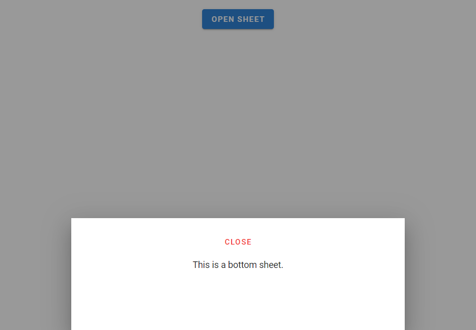
Vuetify Expand Transition
To apply the expand transition to an element, we wrap it in a v-expand-transition component. This transition is used in expansion panels and list groups.
<template>
  <v-app>
    <div class="text-center ma-4">
      <v-btn
        dark
        color="primary"
        @click="expand = !expand"
      >
        Expand Transition
      </v-btn>
      <v-expand-transition>
        <v-card
          v-show="expand"
          height="100"
          width="100"
          class="blue mx-auto mt-4"
        ></v-card>
      </v-expand-transition>
    </div>
  </v-app>
</template>

<script>
export default {
  data() {
    return {
      expand: false,
    };
  },
};
</script>

Expand X Transition
We can use v-expand-x-transition in place of v-expand-transition to apply the horizontal version of the expand transition.
<template>
  <v-app>
    <div class="text-center ma-4">
      <v-btn
        dark
        color="primary"
        @click="expand = !expand"
      >
        Expand X Transition
      </v-btn>
      <v-expand-x-transition>
        <v-card
          v-show="expand"
          height="100"
          width="100"
          class="blue mx-auto mt-4"
        ></v-card>
      </v-expand-x-transition>
    </div>
  </v-app>
</template>

<script>
export default {
  data() {
    return {
      expand: false,
    };
  },
};
</script>

Vuetify FAB Transition
We can see an FAB transition in action when working with the v-speed-dial component. The target element rotates and scales up into view.
<template>
  <v-app>
    <div class="text-center ma-4">
      <v-menu transition="fab-transition">
        <template v-slot:activator="{ on, attrs }">
          <v-btn
            dark
            color="primary"
            v-bind="attrs"
            v-on="on"
          >
            Fab Transition
          </v-btn>
        </template>
        <v-list>
          <v-list-item
            v-for="n in 5"
            :key="n"
          >
            <v-list-item-title
              v-text="'Item ' + n"
            ></v-list-item-title>
          </v-list-item>
        </v-list>
      </v-menu>
    </div>
  </v-app>
</template>

Fade Transition
A fade transition acts on the opacity of the target element. We can create one by setting transition to fade-transition.
<template>
  <v-app>
    <div class="text-center ma-4">
      <v-menu transition="fade-transition">
        <template v-slot:activator="{ on, attrs }">
          <v-btn
            dark
            color="primary"
            v-bind="attrs"
            v-on="on"
          >
            Fade Transition
          </v-btn>
        </template>
        <v-list>
          <v-list-item
            v-for="n in 5"
            :key="n"
          >
            <v-list-item-title
              v-text="'Item ' + n"
            ></v-list-item-title>
          </v-list-item>
        </v-list>
      </v-menu>
    </div>
  </v-app>
</template>

Vuetify Scale Transition
Scale transitions act on the width and height of the target element. We can create them by setting transition to scale-transition.
<template>
  <v-app>
    <div class="text-center ma-4">
      <v-menu transition="scale-transition">
        <template v-slot:activator="{ on, attrs }">
          <v-btn
            dark
            color="primary"
            v-bind="attrs"
            v-on="on"
          >
            Scale Transition
          </v-btn>
        </template>
        <v-list>
          <v-list-item
            v-for="n in 5"
            :key="n"
          >
            <v-list-item-title
              v-text="'Item ' + n"
            ></v-list-item-title>
          </v-list-item>
        </v-list>
      </v-menu>
    </div>
  </v-app>
</template>

Transition Origin
Components like v-menu have an origin prop that allows us to specify the point from which a transition should start. For example, we can make the scale transition start from the center point of both the x-axis and y-axis:
<template>
  <v-app>
    <div class="text-center ma-4">
      <v-menu
        transition="scale-transition"
        origin="center center"
      >
        <template v-slot:activator="{ on, attrs }">
          <v-btn
            dark
            color="primary"
            v-bind="attrs"
            v-on="on"
          >
            Scale Transition
          </v-btn>
        </template>
        <v-list>
          <v-list-item
            v-for="n in 5"
            :key="n"
            @click="() => {}"
          >
            <v-list-item-title
              v-text="'Item ' + n"
            ></v-list-item-title>
          </v-list-item>
        </v-list>
      </v-menu>
    </div>
  </v-app>
</template>

Vuetify Scroll X Transition
Scroll X transitions work with both the opacity and horizontal position of the target element. It fades in while also moving along the x-axis.
<template>
  <v-app>
    <div class="text-center ma-4">
      <v-menu transition="scroll-x-transition">
        <template v-slot:activator="{ on, attrs }">
          <v-btn
            dark
            color="primary"
            v-bind="attrs"
            v-on="on"
          >
            Scroll X Transition
          </v-btn>
        </template>
        <v-list>
          <v-list-item
            v-for="n in 5"
            :key="n"
          >
            <v-list-item-title
              v-text="'Item ' + n"
            ></v-list-item-title>
          </v-list-item>
        </v-list>
      </v-menu>
    </div>
  </v-app>
</template>

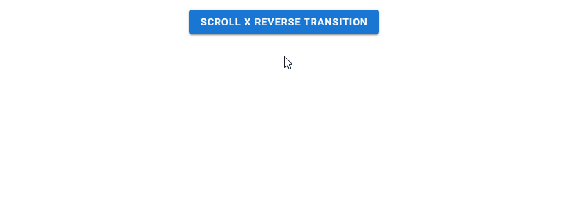
Scroll X Reverse Transition
A reverse scroll x transition makes the element slide in from the right.
<template>
  <v-app>
    <div class="text-center ma-4">
      <v-menu transition="scroll-x-reverse-transition">
        <template v-slot:activator="{ on, attrs }">
          <v-btn
            dark
            color="primary"
            v-bind="attrs"
            v-on="on"
          >
            Scroll X Reverse Transition
          </v-btn>
        </template>
        <v-list>
          <v-list-item
            v-for="n in 5"
            :key="n"
          >
            <v-list-item-title
              v-text="'Item ' + n"
            ></v-list-item-title>
          </v-list-item>
        </v-list>
      </v-menu>
    </div>
  </v-app>
</template>
Vuetify Scroll Y Transition
Scroll y transitions work similarly to scroll x transitions, but they act on the vertical position of the element instead.
<template>
  <v-app>
    <div class="text-center ma-4">
      <v-menu transition="scroll-y-transition">
        <template v-slot:activator="{ on, attrs }">
          <v-btn
            dark
            color="primary"
            v-bind="attrs"
            v-on="on"
          >
            Scroll Y Transition
          </v-btn>
        </template>
        <v-list>
          <v-list-item
            v-for="n in 5"
            :key="n"
          >
            <v-list-item-title
              v-text="'Item ' + n"
            ></v-list-item-title>
          </v-list-item>
        </v-list>
      </v-menu>
    </div>
  </v-app>
</template>

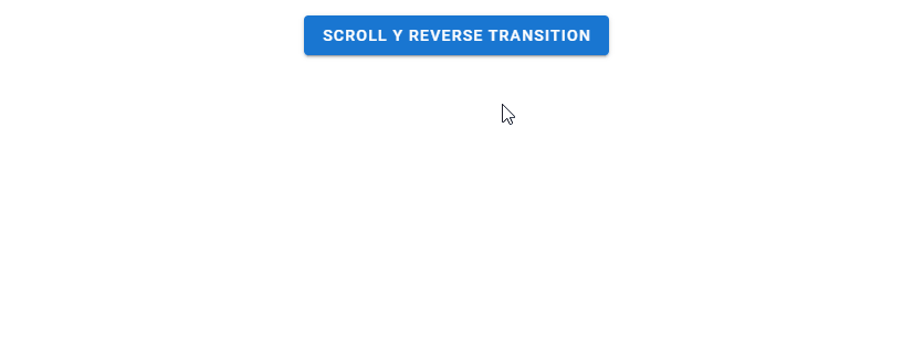
Scroll Y Reverse Transition
Reverse scroll y transitions make the element slide in from the bottom.
<template>
  <v-app>
    <div class="text-center ma-4">
      <v-menu transition="scroll-y-reverse-transition">
        <template v-slot:activator="{ on, attrs }">
          <v-btn
            dark
            color="primary"
            v-bind="attrs"
            v-on="on"
          >
            Scroll Y Reverse Transition
          </v-btn>
        </template>
        <v-list>
          <v-list-item
            v-for="n in 5"
            :key="n"
          >
            <v-list-item-title
              v-text="'Item ' + n"
            ></v-list-item-title>
          </v-list-item>
        </v-list>
      </v-menu>
    </div>
  </v-app>
</template>
Vuetify Slide X Transition
A slide x transition makes the element fade in while also sliding in along the x-axis. Unlike a scroll transition, the element slides out in the same direction it slid in from when closed.
<template>
  <v-app>
    <div class="text-center ma-4">
      <v-menu transition="slide-x-transition">
        <template v-slot:activator="{ on, attrs }">
          <v-btn
            dark
            color="primary"
            v-bind="attrs"
            v-on="on"
          >
            Slide X Transition
          </v-btn>
        </template>
        <v-list>
          <v-list-item
            v-for="n in 5"
            :key="n"
          >
            <v-list-item-title
              v-text="'Item ' + n"
            ></v-list-item-title>
          </v-list-item>
        </v-list>
      </v-menu>
    </div>
  </v-app>
</template>

Slide X Reverse Transition
Reverse slide x transitions make the element slide in from the right.
<template>
  <v-app>
    <div class="text-center ma-4">
      <v-menu transition="slide-x-reverse-transition">
        <template v-slot:activator="{ on, attrs }">
          <v-btn
            dark
            color="primary"
            v-bind="attrs"
            v-on="on"
          >
            Slide X Reverse Transition
          </v-btn>
        </template>
        <v-list>
          <v-list-item
            v-for="n in 5"
            :key="n"
          >
            <v-list-item-title
              v-text="'Item ' + n"
            ></v-list-item-title>
          </v-list-item>
        </v-list>
      </v-menu>
    </div>
  </v-app>
</template>

Vuetify Slide Y Transition
Slide y transitions work like slide x transitions, but they move the element along the y-axis instead.
<template>
  <v-app>
    <div class="text-center ma-4">
      <v-menu transition="slide-y-transition">
        <template v-slot:activator="{ on, attrs }">
          <v-btn
            dark
            color="primary"
            v-bind="attrs"
            v-on="on"
          >
            Slide Y Transition
          </v-btn>
        </template>
        <v-list>
          <v-list-item
            v-for="n in 5"
            :key="n"
          >
            <v-list-item-title
              v-text="'Item ' + n"
            ></v-list-item-title>
          </v-list-item>
        </v-list>
      </v-menu>
    </div>
  </v-app>
</template>

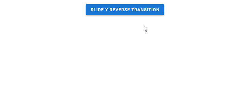
Slide Y Reverse Transition
A reverse slide y transition makes the element slide in from the bottom.
<template>
  <v-app>
    <div class="text-center ma-4">
      <v-menu transition="slide-y-reverse-transition">
        <template v-slot:activator="{ on, attrs }">
          <v-btn
            dark
            color="primary"
            v-bind="attrs"
            v-on="on"
          >
            Slide Y Reverse Transition
          </v-btn>
        </template>
        <v-list>
          <v-list-item
            v-for="n in 5"
            :key="n"
          >
            <v-list-item-title
              v-text="'Item ' + n"
            ></v-list-item-title>
          </v-list-item>
        </v-list>
      </v-menu>
    </div>
  </v-app>
</template>
Conclusion
Vuetify comes with a built-in transition system that allows us to easily create smooth animations without writing our own CSS. We can scale, fade or translate a UI element with the various transitions available.