How to quickly detect the hover event in Vue.js
To detect mouse hover in Vue.js, use a hover state variable and the mouseenter & mouseleave events to detect when the mouse enters and leaves the element’s bounds.
<template>
  <div @mouseenter="hover = true" @mouseleave="hover = false"></div>
</template>

<script>
export default {
  data() {
    return {
      hover: false,
    };
  },
};
</script>
The mouseenter event runs when the mouse pointer enters the bounds of an element, while mouseleave runs when it leaves.
We could also listen to the mouseover event to detect hover, this event runs for an element and every single one of its ancestor elements in the DOM tree (i.e. it bubbles) and this could cause serious performance problems in deep hierarchies. mouseenter doesn’t bubble so we can use it without worrying about this.
Change style on hover in Vue.js
To change the style of an element on hover in Vue.js, we can combine the hover state variable and the :class directive:
<template>
  <div
    @mouseenter="hover = true"
    @mouseleave="hover = false"
    class="div"
    :class="{ 'div-hover': hover }"
  ></div>
</template>

<script>
export default {
  data() {
    return {
      hover: false,
    };
  },
};
</script>

<style>
.div {
  background-color: blue;
  width: 200px;
  height: 100px;
}

.div-hover {
  background-color: yellow;
}
</style>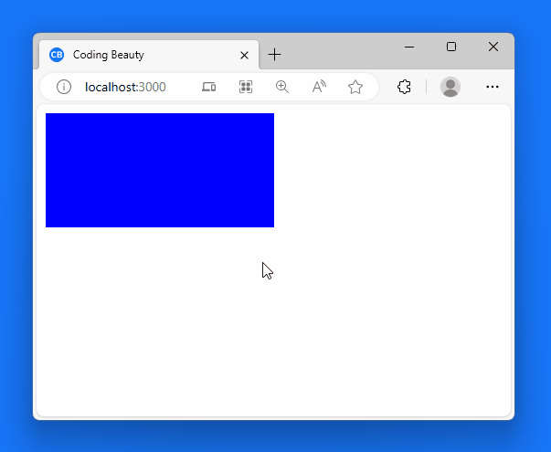
Display another element on hover in Vue.js
We could also display another element in the UI when we detect hover. For example: a tooltip to display more info on a particular UI element.
To do this, you can pass the state variable to a v-if state directive you set on the element. This ensures that the element only displays when the hover state is true.
<template>
  <button
    @mouseenter="hover = true"
    @mouseleave="hover = false"
    class="div"
    :class="{ 'div-hover': hover }"
  >
    Button
  </button>
  <p v-if="hover">Tooltip</p>
</template>

<script>
export default {
  data() {
    return {
      hover: false,
    };
  },
};
</script>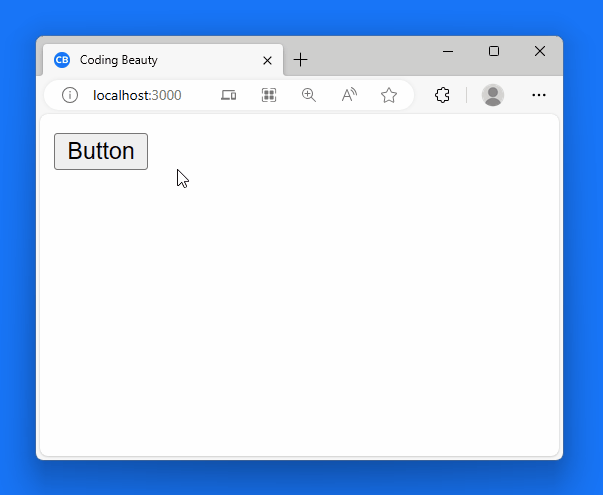
Detect hover on Vue component
You can also use the mouseenter and mouseleave approach to detect hover on a custom Vue component.
<template>
  <div>
    <button>Styled button</button>
  </div>
</template>

<style>
button {
  height: 30px;
  width: 100px;
  background-color: lightgreen;
}
</style><template>
<styled-button
@mouseenter="hover = true"
@mouseleave="hover = false"
></styled-button>
<p v-if="hover">Tooltip</p>
</template>
<script>
import StyledButton from './components/StyledButton.vue';
export default {
components: {
StyledButton,
},
data() {
return {
hover: false,
};
},
};
</script>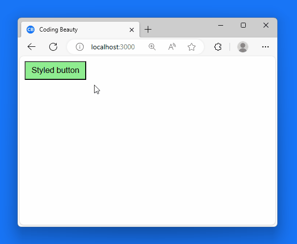
If you’re using Vue 2.x, you’ll need to use the .native event modifier to listen for native DOM events on the Vue component:
<styled-button
  @mouseenter.native="hover = true"
  @mouseleave.native="hover = false"
></styled-button>
Key takeaways
- Detect mouse hover in Vue.js using a hover state variable and
mouseenter&mouseleaveevents. mouseoverevent can cause performance issues in deep hierarchies,mouseenteris safer.- Use hover state to conditionally apply CSS classes, changing element appearance on hover.
- Use hover state with
v-ifto conditionally display elements like tooltips on hover. mouseenterandmouseleavecan detect hover on custom Vue components. Use.nativemodifier in Vue 2.x.