
How to Get the Value of a Form Input on Submit in React
To get the value of form input on submit in React:
- Create a state variable to store the value of the input.
- Set an
onChangeevent handler on the input to update the state variable when the input’s value changes. - Set an
onSubmitevent handler on theformelement. - Access the value of the input field in the
onSubmitevent handler.
For example:
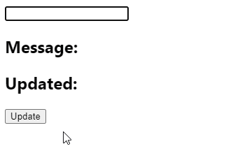
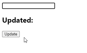
App.js
import { useState } from 'react';
export default function App() {
const [firstName, setFirstName] = useState('');
const [lastName, setLastName] = useState('');
const [message, setMessage] = useState('');
const handleSubmit = (event) => {
event.preventDefault();
setMessage(`Hello ${firstName} ${lastName}!`);
setFirstName('');
setLastName('');
};
return (
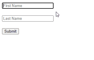
<form onSubmit={handleSubmit}>
<input
type="text"
id="firstName"
name="firstName"
value={firstName}
placeholder="First Name"
onChange={(event) =>
setFirstName(event.target.value)
}
/>
<br />
<br />
<input
type="text"
id="lastName"
name="lastName"
value={lastName}
placeholder="Last Name"
onChange={(event) => {
setLastName(event.target.value);
}}
/>
<br />
<br />
<button type="submit">Submit</button>
<br />
<br />
<h2>{message}</h2>
</form>
);
}
With the useState() hook we create a state variable to store the current value of each input field. We also created another state variable (message) that will be updated with the values of the input fields after the user submits the form.
We set an inline onChange event handler on each input field to make the handler get called whenever the input field changes. In each handler, we use the target property of the Event object the handler receives to access the input element object. The value property of this object contains the input value, so we pass it to the state update function to update the value of that particular input.
The button element in the form has a type of submit, so every time the user clicks it, the submit event is triggered. We set an onSubmit event handler on the form to listen to this event. In this handler, we call preventDefault() on the Event object, to prevent the page from refreshing when the form is submitted.
To get the input values in this event handler after the form is submitted, we simply access the firstName and lastName state variables.
Get input value on form submit with event.target
We can also get the value of a form input on submit using the target property of the Event object. This is useful in cases where we don’t track the input value with a state variable, i.e., an uncontrolled input.
App.js
import { useState } from 'react';

export default function App() {
  const [message, setMessage] = useState('');

  const handleSubmit = (event) => {
    event.preventDefault();

    const firstName = event.target.firstName.value;
    const lastName = event.target.lastName.value;
    setMessage(`Hello ${firstName} ${lastName}!`);

    event.target.reset();
  };

  return (
    <form onSubmit={handleSubmit}>
      <input
        type="text"
        id="firstName"
        name="firstName"
        placeholder="First Name"
      />

      <br />
      <br />

      <input
        type="text"
        id="lastName"
        name="lastName"
        placeholder="Last Name"
      />

      <br />
      <br />

      <button type="submit">Submit</button>

      <br />
      <br />

      <h2>{message}</h2>
    </form>
  );
}
In an onSubmit event handler, the target property of the Event object returns the form element object (of type HTMLFormElement).
Because we set the name prop on the input element, the form element object will contain a property with the same name that returns the input element object, i.e., after setting name to firstName on an input element, we can access the element object for this input with the firstName property on the form element object.
After getting the value of each input and displaying the message, we call the reset() method on the form element object to restore the default values of the form’s input elements. This is how we clear the text in the input fields in this example since they’re not controlled by state variables.
Get input value on form submit with ref
We can also use a component ref to get the value of an uncontrolled form input on submit in React.
App.js
import { useState, useRef } from 'react';

export default function App() {
  const [message, setMessage] = useState('');
  const firstNameRef = useRef(undefined);
  const lastNameRef = useRef(undefined);

  const handleSubmit = (event) => {
    event.preventDefault();

    const firstName = firstNameRef.current.value;
    const lastName = lastNameRef.current.value;

    setMessage(`Hello ${firstName} ${lastName}!`);

    event.target.reset();
  };

  return (
    <form onSubmit={handleSubmit}>
      <input
        type="text"
        id="firstName"
        name="firstName"
        placeholder="First Name"
        ref={firstNameRef}
      />

      <br />
      <br />

      <input
        type="text"
        id="lastName"
        name="lastName"
        placeholder="Last Name"
        ref={lastNameRef}
      />

      <br />
      <br />

      <button type="submit">Submit</button>

      <br />
      <br />

      <h2>{message}</h2>
    </form>
  );
}
The data in a controlled input is handled by React state, but for an uncontrolled input, it is handled by the DOM itself. This is why the input in this example above doesn’t have a value prop or onChange event handler set. Instead, we access the input field’s value with a React ref. The DOM updates this value when the text in the input is changed.
For each input, we create a ref object with the useRef() hook and set it to the ref prop of the input. Doing this sets the current property of the ref object to the DOM object that represents the input element.
useRef() returns a mutable ref object that doesn’t change value when a component is updated. Also, modifying the value of this object’s current property doesn’t cause a re-render. This is in contrast to the setState update function returned from useState().
Although the React documentation recommends using controlled components, uncontrolled components offer some advantages. You might prefer them if the form is very simple and doesn’t need instant validation, and values only need to be accessed when the form is submitted.