A button is a commonly used component that adds interactivity to a UI. In this article, we’re going to learn how to easily create and customize buttons in Material UI.
The Material UI Button Component
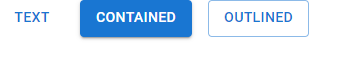
We can use the Button component from Material UI to create buttons. It has a variant prop used to display a text, contained, or outlined button.
import { Box, Button, Stack } from '@mui/material';

export default function App() {
  return (
    <Box>
      <Stack
        spacing={2}
        direction="row"
      >
        <Button variant="text">Text</Button>
        <Button variant="contained">Contained</Button>
        <Button variant="outlined">Outlined</Button>
      </Stack>
    </Box>
  );
}
Text Button
Text buttons are suitable for actions of low significance in an app, like the closing of a dialog. Setting the variant prop to text displays a text button.
<Button>Primary</Button>
<Button disabled>Disabled</Button>
<Button href="#text-buttons">Link</Button>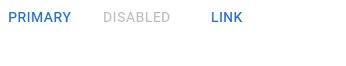
Contained Button
Contained buttons indicate the primary and essential actions in our apps. Setting the variant prop to contained displays a contained button.
<Button variant="contained">Contained</Button>
<Button variant="contained" disabled>
  Disabled
</Button>
<Button variant="contained" href="#contained-buttons">
  Link
</Button>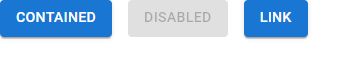
Outlined Button
Outlined buttons indicate actions of mid-level significance. They are a lower emphasis alternative to contained buttons and a higher emphasis alternative to text buttons. Setting the variant prop to outlined displays and outlined button.
<Button variant="outlined">Primary</Button>
<Button variant="outlined" disabled>
  Disabled
</Button>
<Button variant="outlined" href="#outlined-buttons">
  Link
</Button>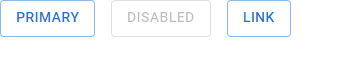
Disabled Button Elevation
We can prevent a button from being clicked by setting the disableElevation prop to true.
<Button
  variant="contained"
  disableElevation
>
  Elevation disabled
</Button>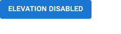
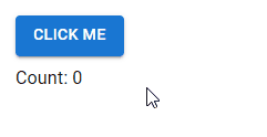
Handling Button Clicks in Material UI
We can assign a listener function to the onClick prop to perform an action when the button is clicked.
In the following example, we attach a listener that increments a count by one, to display the total number of times the button has been clicked.
import { Box, Button, Typography } from '@mui/material';
import { useState } from 'react';

export default function App() {
  const [count, setCount] = useState(0);
  return (
    <Box sx={{ margin: 2 }}>
      <Button
        onClick={() => {
          setCount(count + 1);
        }}
        variant="contained"
      >
        Click me
      </Button>
      <Typography sx={{ marginTop: 1 }}>Count: {count}</Typography>
    </Box>
  );
}
Material UI Button Colors
We can use the color prop to apply a color from the theme palette.
<Button color="secondary">Secondary</Button>
<Button variant="contained" color="success">
  Success
</Button>
<Button variant="outlined" color="error">
  Error
</Button>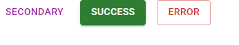
Custom Colors
The color prop only allows values from the theme palette. To apply a color not available in the theme, we can use custom CSS and the sx prop.
import { Stack, Button } from '@mui/material';
import { green } from '@mui/material/colors';
export default function App() {
return (
<Stack
spacing={2}
direction="row"
>
<Button
sx={{
backgroundColor: green[500],
'&:hover': { backgroundColor: green[700] },
}}
variant="contained"
>
Primary
</Button>
<Button
sx={{
color: green[500],
borderColor: green[500],
'&:hover': { color: green[500], borderColor: green[500] },
}}
variant="outlined"
>
Secondary
</Button>
</Stack>
);
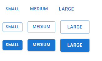
}Button Sizes
The size prop of the Button component allows us to create buttons of different sizes.
import { Box, Button } from '@mui/material';

export default function App() {
  return (
    <Box>
      <Box sx={{ '& button': { m: 1 } }}>
        <div>
          <Button size="small">Small</Button>
          <Button size="medium">Medium</Button>
          <Button size="large">Large</Button>
        </div>
        <div>
          <Button
            variant="outlined"
            size="small"
          >
            Small
          </Button>
          <Button
            variant="outlined"
            size="medium"
          >
            Medium
          </Button>
          <Button
            variant="outlined"
            size="large"
          >
            Large
          </Button>
        </div>
        <div>
          <Button
            variant="contained"
            size="small"
          >
            Small
          </Button>
          <Button
            variant="contained"
            size="medium"
          >
            Medium
          </Button>
          <Button
            variant="contained"
            size="large"
          >
            Large
          </Button>
        </div>
      </Box>
    </Box>
  );
}
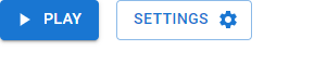
Icon and Label Buttons
Including an icon in a button can make clearer to the user the action the button performs. Assigning the icon component to the startIcon or endIcon prop aligns the icon to the left or right of the label respectively.
import { Button, Stack } from '@mui/material';
import {
  Settings as SettingsIcon,
  PlayArrow as PlayArrowIcon,
} from '@mui/icons-material';

export default function App() {
  return (
    <Stack
      spacing={2}
      direction="row"
    >
      <Button
        variant="contained"
        startIcon={<PlayArrowIcon />}
      >
        Play
      </Button>
      <Button
        variant="outlined"
        endIcon={<SettingsIcon />}
      >
        Settings
      </Button>
    </Stack>
  );
}
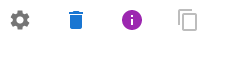
Icon Buttons in Material UI
Icon buttons can help save screen space and ease user recognition. We can use the IconButton component from Material UI to create them.
import { IconButton, Stack } from '@mui/material';
import { Settings, Delete, Info, ContentCopy } from '@mui/icons-material';

export default function App() {
  return (
    <Stack
      spacing={2}
      direction="row"
    >
      <IconButton>
        <Settings />
      </IconButton>
      <IconButton color="primary">
        <Delete />
      </IconButton>
      <IconButton color="secondary">
        <Info />
      </IconButton>
      <IconButton
        disabled
        color="primary"
      >
        <ContentCopy />
      </IconButton>
    </Stack>
  );
}
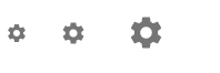
Icon Button Sizes
Like Button, IconButton also comes with a size prop for customizing its size.
<IconButton size="small">
  <Settings fontSize="small" />
</IconButton>
<IconButton size="medium">
  <Settings fontSize="medium" />
</IconButton>
<IconButton size="large">
  <Settings fontSize="large" />
</IconButton>
Icon Button Colors
The color prop lets us apply a color from the theme palette to an IconButton.
import { IconButton, Stack } from '@mui/material';
import { Settings as SettingsIcon } from '@mui/icons-material';

export default function App() {
  return (
    <Stack
      spacing={1}
      direction="row"
    >
      <IconButton color="primary">
        <SettingsIcon />
      </IconButton>
      <IconButton color="secondary">
        <SettingsIcon />
      </IconButton>
      <IconButton color="success">
        <SettingsIcon />
      </IconButton>
      <IconButton color="error">
        <SettingsIcon />
      </IconButton>
      <IconButton color="warning">
        <SettingsIcon />
      </IconButton>
    </Stack>
  );
}
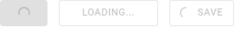
Loading Buttons in Material UI
A loading button can indicate an ongoing operation and temporarily disable interaction. We can create one with the LoadingButton component.
import { Stack } from '@mui/material';
import { LoadingButton } from '@mui/lab';
import { Save as SaveIcon } from '@mui/icons-material';

export default function App() {
  return (
    <Stack
      spacing={2}
      direction="row"
    >
      <LoadingButton
        loading
        variant="contained"
      >
        Play
      </LoadingButton>
      <LoadingButton
        loading
        loadingIndicator="Loading..."
        variant="outlined"
      >
        Send message
      </LoadingButton>
      <LoadingButton
        loading
        loadingPosition="start"
        startIcon={<SaveIcon />}
        variant="outlined"
      >
        Save
      </LoadingButton>
    </Stack>
  );
}
Every Crazy Thing JavaScript Does
A captivating guide to the subtle caveats and lesser-known parts of JavaScript.
