Chips are used to pass on small amounts of information to users. They can be interactive and perform certain actions when clicked like buttons, or we can use them to display selected data in a select field. In this article, we’ll learn how to create and customize chips with Vuetify.
The v-chip Component
Vuetify provides the v-chip component for creating a chip.
In the code above, we’ve created three closable chips. Three variables control the visibility of the chips with v-if:
Clicking the close button of a chip, say “Chip 2”, will set its visibility variable to false and hide it:
Chip Colors
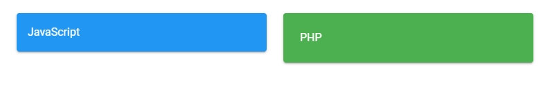
Like many Vuetify components, v-chip comes with the color prop, which we can use to customize its color. We can use any color from the Material Design palette.
The v-chip component comes with a filter prop that when set to true, will show an icon on the chip if the chip is active. You can make a chip active by setting its input-value prop to true:
Chips are useful for conveying small pieces of information to users. Vuetify provides the v-chip component for creating a chip with various props for customization.
A carousel is useful for displaying many images in a cyclic view. It comes with functionality that allows users to view the images one after the other. It allows multiple pieces of related visual content to occupy the same screen space. In this article, we’re to learn how to create and customize carousels using Vuetify.
The v-carousel component
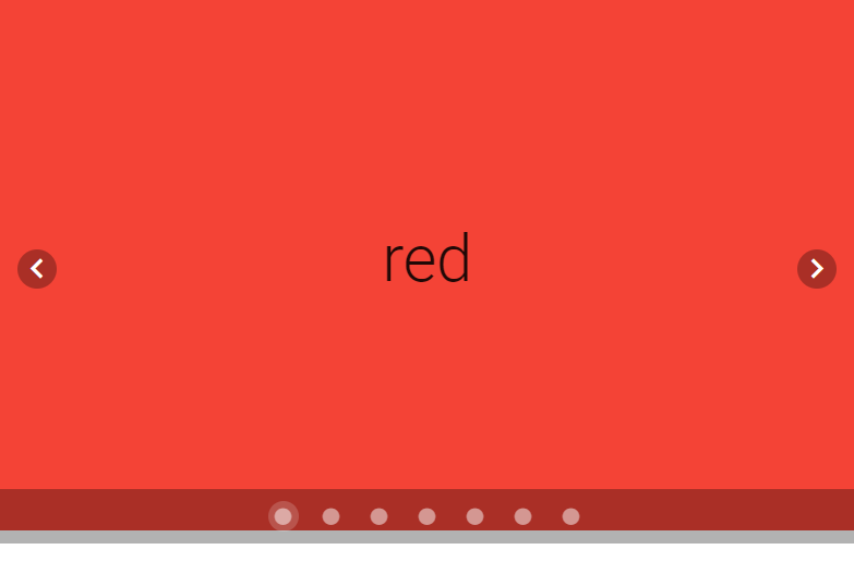
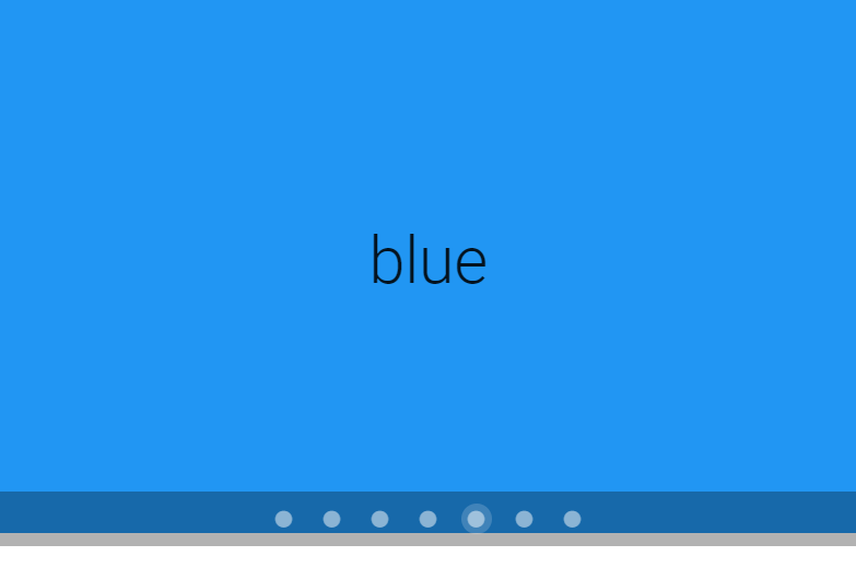
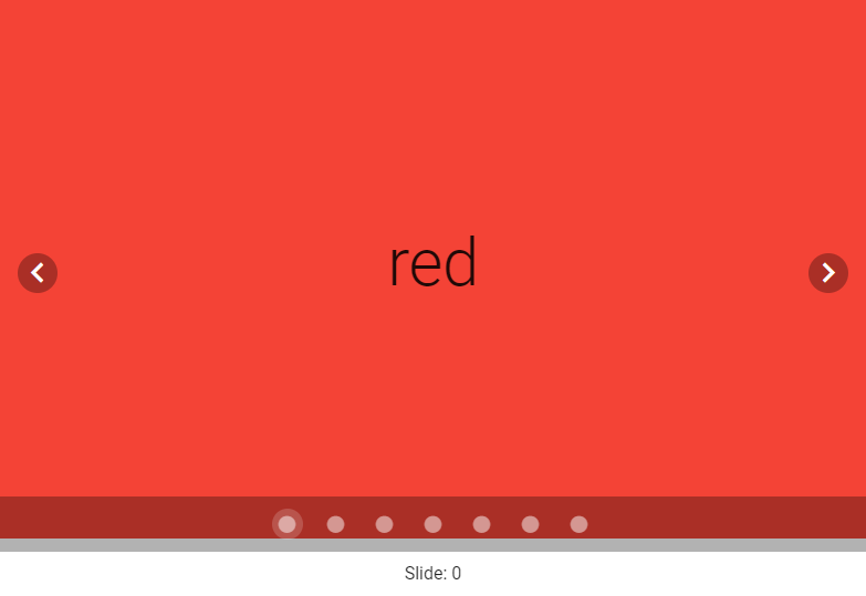
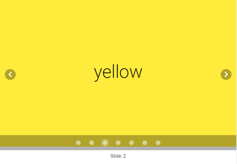
Vuetify provides the v-carousel component for creating carousels. We can create a slide in the carousel by adding a new v-carousel-item component to the v-carousel. Here we’re creating 7 slides, each for a color of the rainbow.
The carousel will always show the first slide by default:
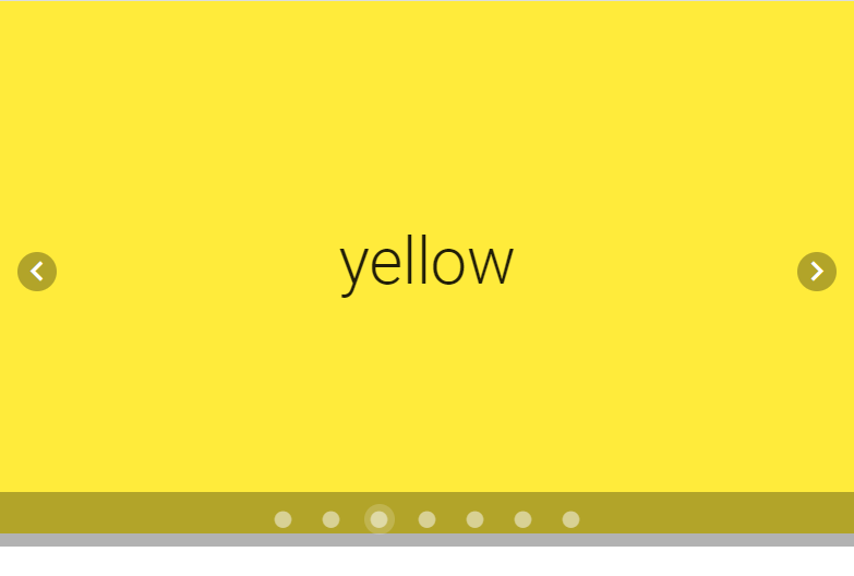
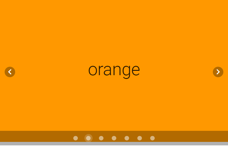
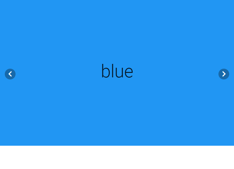
We can change the current slide with the displayed arrows. The left arrow will show the previous slide, while the right arrow will show the next slide:
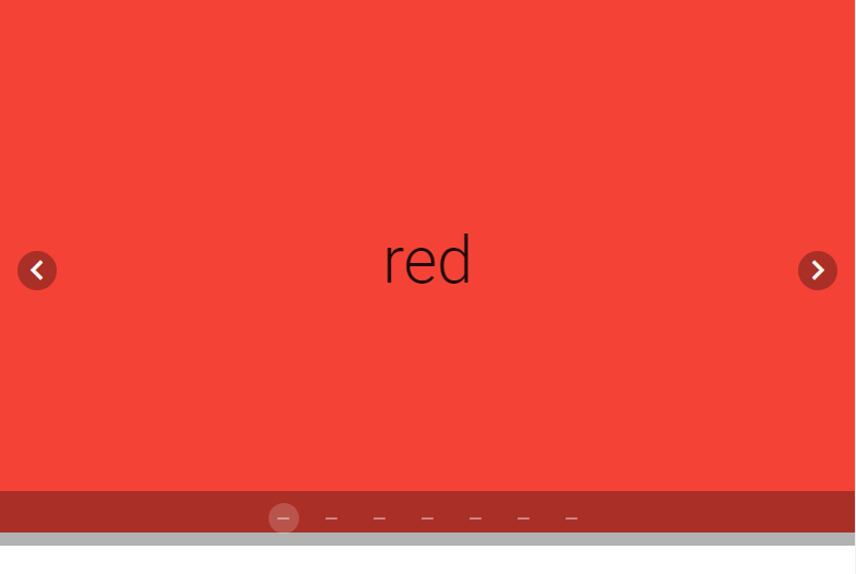
Carousel delimiter icons
The carousel comes with delimiters that indicate the number of slides the carousel has and the one it is currently showing. v-carousel comes with the delimiter-icon prop which allows us to customize the delimiter icons with any of the available icons.
By default, the carousel shows each slide for an interval of 6 seconds before automatically transitioning to the next slide when the cycle prop is set to true. We can modify this interval with the interval prop.
We might want to have the carousel only display its navigation controls when the mouse hovers over it. We can do this by setting the show-arrows-on-hover prop to true:
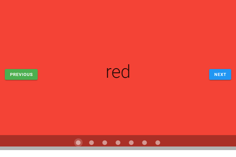
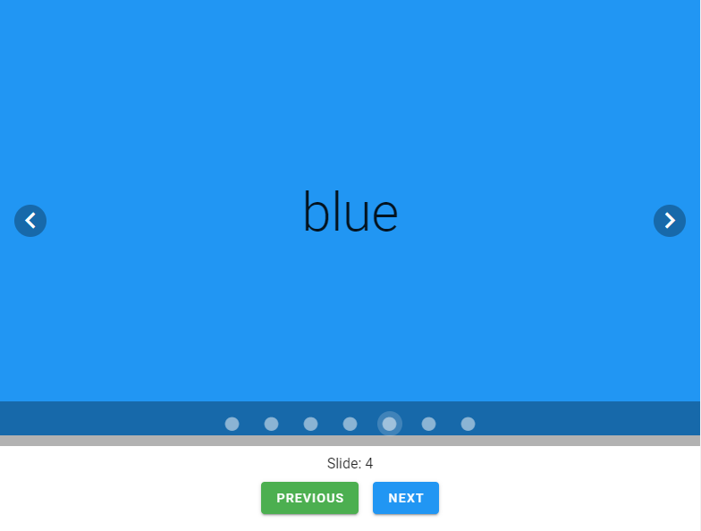
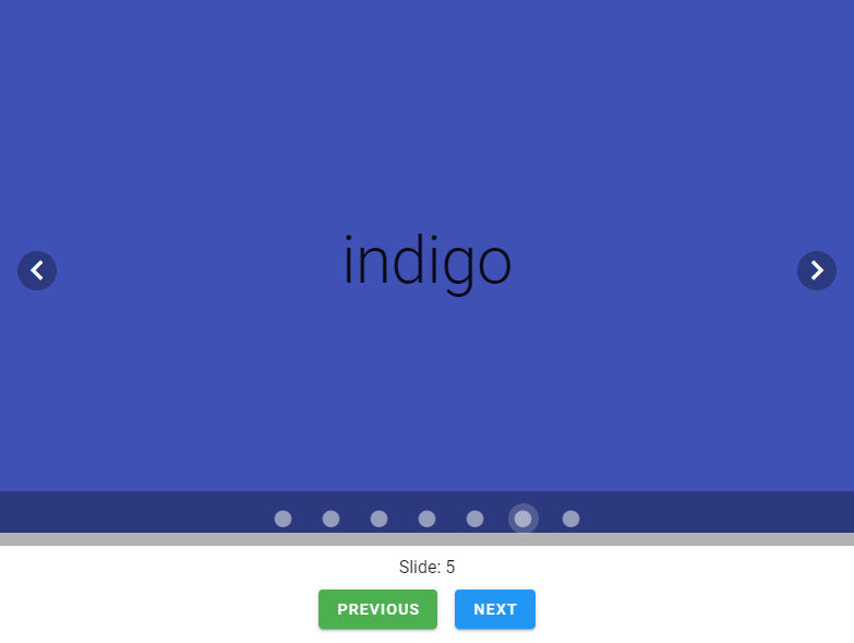
We can use v-model on the v-carousel to set up a two-way binding between the current carousel slide and a variable. In the code below, we create a carousel and some text below it that displays the index of the current slide with the carousel variable:
The “Previous” button decrements carousel which takes the carousel to the previous slide, while the “Next” button increments carousel to transition the carousel to the next slide:
Conclusion
We use a carousel in a user interface to display a number of related visual content in the same screen space. Use the v-carousel and v-carousel-item components to create a carousel and customize its behavior and appearance.
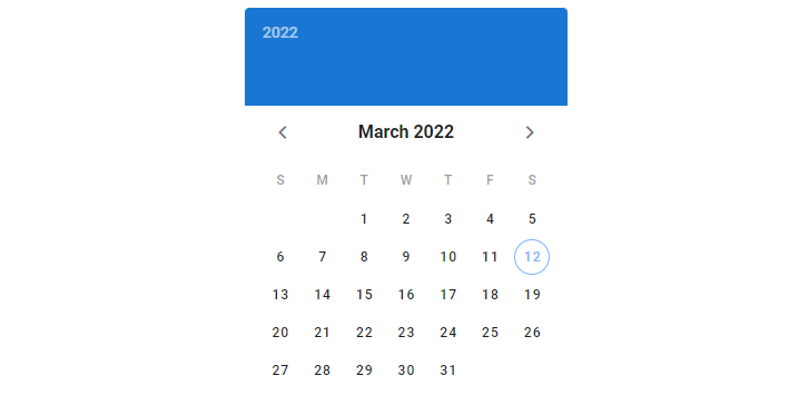
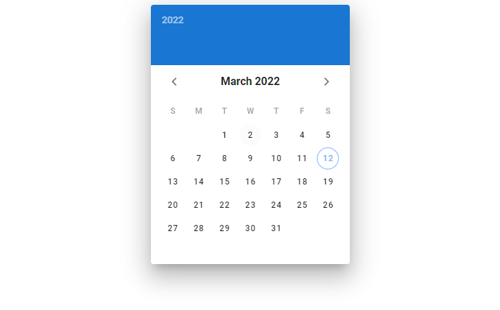
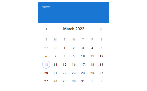
We use a date picker to let users select a date or a range of dates. In this article, we’re going to learn about the Vuetify date picker component and how it lets us create and customize date pickers.
The v-date-picker Component
Vuetify provides the v-date-picker component for creating date pickers.
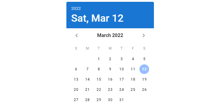
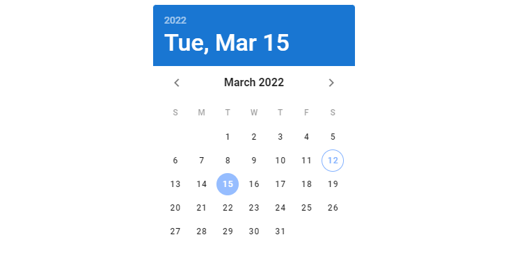
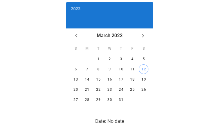
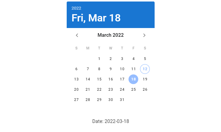
We can use v-model on the date picker component to set up a two-way binding between the picker and a variable. In the code below, we create a date picker and add some text below it to display the value of the date variable, which is the date selected on the picker.
Initially, date is null, meaning that no date has been selected. We display a text “No date” to indicate this:
Once we select a date, date is updated by the binding and the text shows it. The date is set to a string in the YYYY-MM-DD format:
Allowed Dates
We can specify allowed dates on the date picker with the allowed-dates prop. Here, we’re passing a function to it that takes the string value of the date and returns a boolean value that indicates whether the date should be allowed or not.
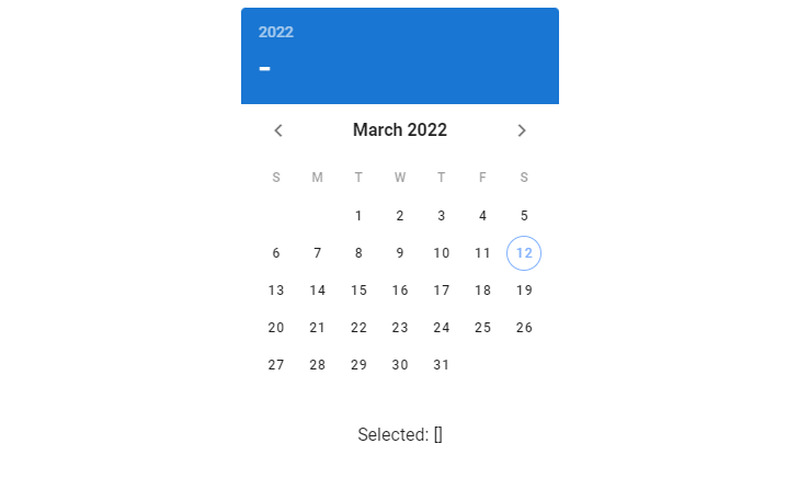
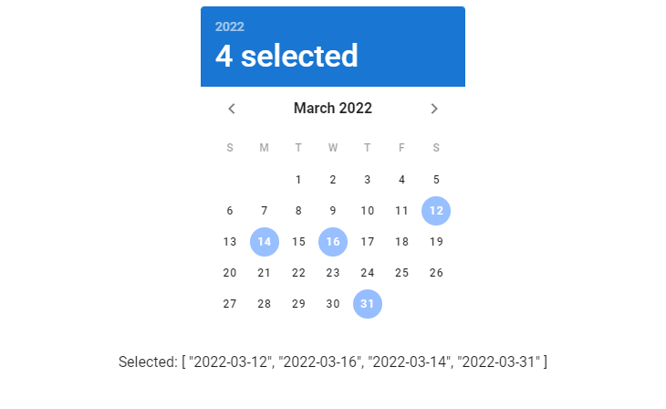
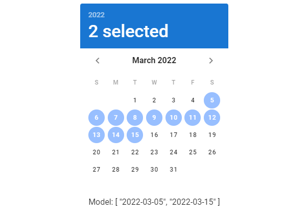
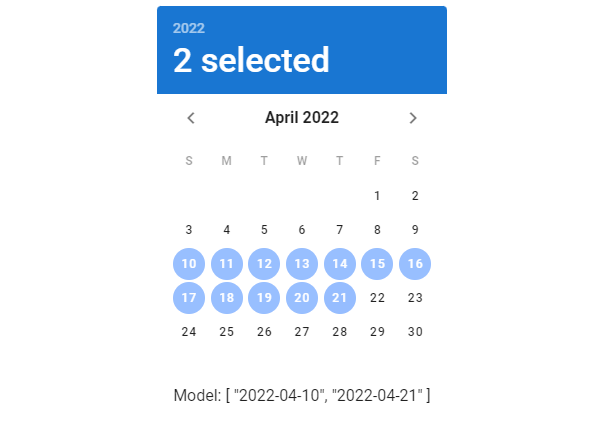
We use the multiple prop to allow users to select multiple dates from the picker. When the multiple prop is set to true, the date picker component will expect the variable passed to its v-model to be an array.
A date picker with no dates selected.A date picker with 4 dates selected.
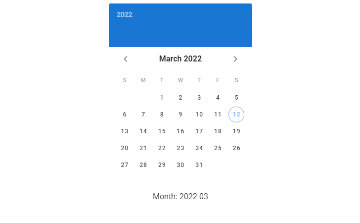
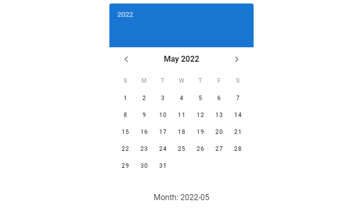
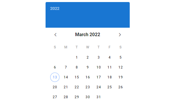
picker-date Sync
We can use the .sync modifier to watch the picker-date, which is the displayed month/year (depending on the picker type and active view). In the code below, we create a date picker and text below it that displays pickerDate, a variable synced to the picker-date prop using picker-date.sync.
When we change the month on the date picker (using the arrows), pickerDate is updated:
Date Picker Range
Use the range prop on a date picker component to allow users select a range of dates from it. When using the range prop, v-date-picker expects the value passed to its v-model to be an array of length 2 or empty.
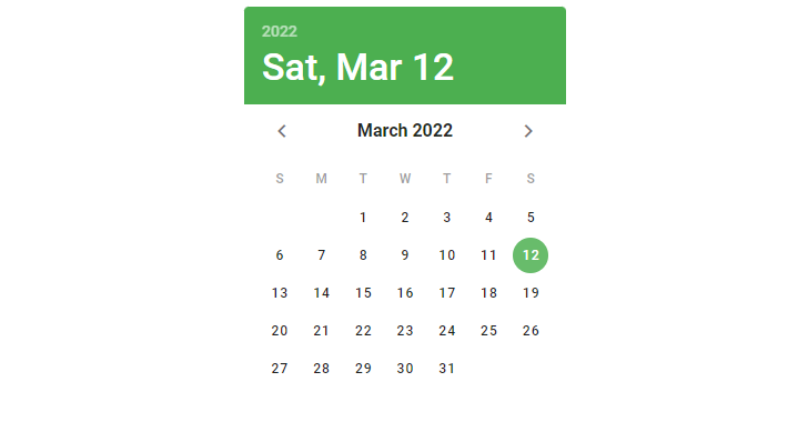
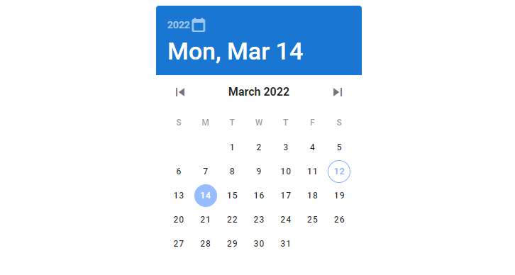
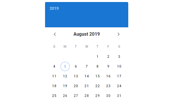
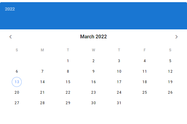
We can also make the date picker indicate another date as the current date. We do this by setting the show-current prop to a date string in the YYYY-MM-DD format:
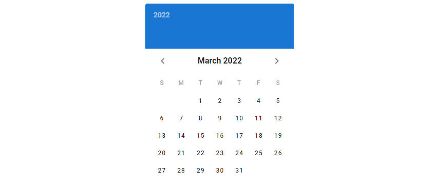
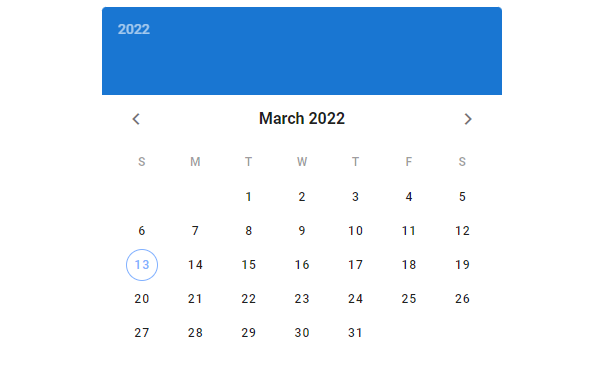
Showing Sibling Months
By default, days from the previous and next months are not visible. Use the show-adjacent-months prop to display them:
We can also use the full-width prop to make the date picker take up all the available width of its parent:
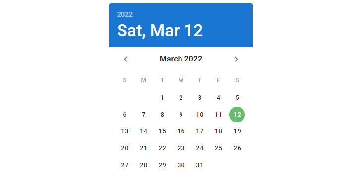
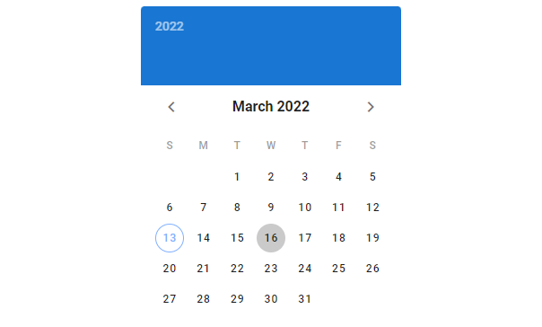
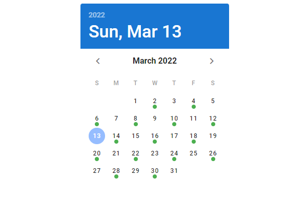
Date Picker Event Dates
We can specify events by assigning arrays, objects or functions to the events prop. And we can the event-color prop to change the default color of the mark the date picker uses to indicate the events. Here, we set events to all the odd number days in the month of March 2022 to mark them.
We use date pickers to allow users select a date or a range of dates. Vuetify provides the v-date-picker component for creating and customizing date pickers.
We can set up a two-way binding between the value of the switch and a variable with v-model. In the code below, we’ve created a switch and a button below it for turning it off. We added a click handler to the button that will set switch1 to false, which will turn the switch off due to the v-model. The two-way binding also ensures that toggling the switch in the user interface will update switch1.
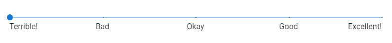
A radio button is useful when you need to obtain user input from a group of options. For example, a user can select a preferred language or country with it. In this article, we’re going to learn how to create and customize a radio button using Vuetify.
The Vuetify Radio Button Component
Use the v-radio component to create a basic radio button:
Radio buttons are typically used with radio groups in Vuetify. We can do this by wrapping all the v-radios in a v-radio-group. We can then set up a two-way binding with the radio group component through v-model, which will allow us to access and set the currently selected radio button in the group:
We can create a group of radio buttons when we want to receive user input from a predefined set of options. Vuetify provides the v-radio component to create radio buttons and the v-radio-group component to add groupable functionality to them. These components come with various props for customization.
Sliders are a great way of getting user input from a range of values. There are used for various functions like adjusting the brightness of a display or tuning speaker volumes. In this post, we’re going to explore the various ways we can create and customize sliders with Vuetify.
The v-slider Component
Vuetify provides the v-slider component for creating sliders:
By default Vuetify sliders have a step value of 1. These type of sliders are called continuous sliders because the thumb moves smoothly from its min to max value. In cases where we need less precision we can increase this step value, with the step prop:
v-slider offers certain props for customizing the behaviour and display of the thumb. Set the thumb-label prop to true to display to only display the thumb label when the slider is being used:
The thumb normally displays the current numeric value of the slider, but we change what it shows by providing an element to the thumb-label slot of v-slider:
Ticks visually represent the values the user can move the slider to. Setting the ticks prop to true will show the slider only when the slider is being used:
Space is a fundamental element of visual design and is important in every user interface. When building web apps, we usually space out elements from one another by modifying their paddings and margins. Vuetify provides spacing helper classes for adjusting the padding and margin of elements without having to create new classes. We’re going to learn how to use them in this post.
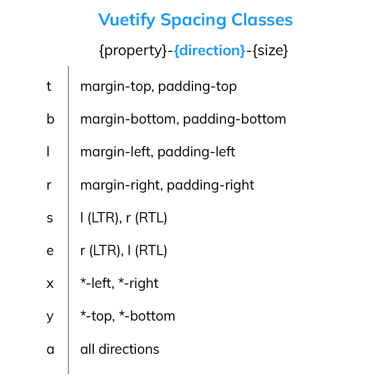
All the Vuetify helper classes are of the following format: {property}{direction}-{size}.
property
The property specifies the type of spacing to apply to the element. There are two possible values:
m – applies a margin.
p – applies padding.
direction
The direction indicates the margin or padding direction to apply the spacing. There are nine available directions in Vuetify:
t – applies the spacing for the margin-top or padding-top CSS properties of the element.
b – applies the spacing for margin-bottom or padding-bottom.
l – applies the spacing for margin-left or padding-left.
r – applies the spacing for margin-right or padding-right.
s – When Vuetify is in the default LTR mode, s acts similar to l. But in RTL mode, it behaves like r.
e – When Vuetify is in the default LTR mode, e acts similar to r. But in RTL mode, it behaves like l.
x – applies the spacing for both *-left and *-right.
y – applies the spacing for both *-top and *-bottom.
a – applies the spacing for the property in all four directions.
size
The size sets the actual value of the spacing in pixels. A size0 will remove the margin or padding from the element in the specified direction. To get the number of pixels for positive values, simply multiply the size number by 4px. Vuetify provides 16 possible positive spacing values:
1 – sets the margin or padding to 4px.
2 – sets the margin or padding to 8px.
3 – sets the margin or padding to 12px.
4 – sets the margin or padding to 16px.
5 – sets the margin or padding to 20px.
6 – sets the margin or padding to 24px.
7 – sets the margin or padding to 28px.
8 – sets the margin or padding to 32px.
9 – sets the margin or padding to 36px.
10 – sets the margin or padding to 40px.
11 – sets the margin or padding to 44px.
12 – sets the margin or padding to 48px.
13 – sets the margin or padding to 52px.
14 – sets the margin or padding to 56px.
15 – sets the margin or padding to 60px.
16 – sets the margin or padding to 64px.
We can specify negative spacing values by prefixing the number with an n. To get the number of pixels for negative values, multiply the size by -4px. Negative spacing values only apply to margins, and there are also 16 of them in Vuetify:
n1 – sets the margin to -4px.
n2 – sets the margin to -8px.
n3 – set the margin to -12px.
n4 – sets the margin to -16px.
n5 – sets the margin to -20px.
n6 – sets the margin to -24px.
n7 – sets the margin to -28px.
n8 – sets the margin to -32px.
n9 – sets the margin to -36px.
n10 – sets the margin to -40px.
n11 – sets the margin to -44px.
n12 – sets the margin to -48px.
n13 – sets the margin to -52px.
n14 – sets the margin to -56px.
n15 – sets the margin to -60px.
n16 – sets the margin to -64px.
Apart from the above available spacing values, we also have the auto spacing, which sets margins or paddings of elements to the auto value.
Examples
Now that we know the Vuetify spacing helper classes, let’s see how to use them in practice.
If you understood everything we covered previously, you’ll know that the mt-2 class will set the top margin of the v-row to 8px. When you run this code, you’ll see that there’s now some spacing between the two cards and the top of the page:
With the mx-3 class we’ll also create left and right margins (of 12px):
Vuetify provides spacing helper classes to allow us to space out and pad our UI elements without using custom classes or inline CSS. These classes can alter the margins or paddings of the elements in different directions and to various sizes.
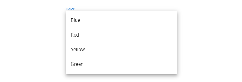
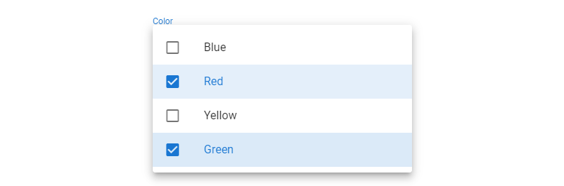
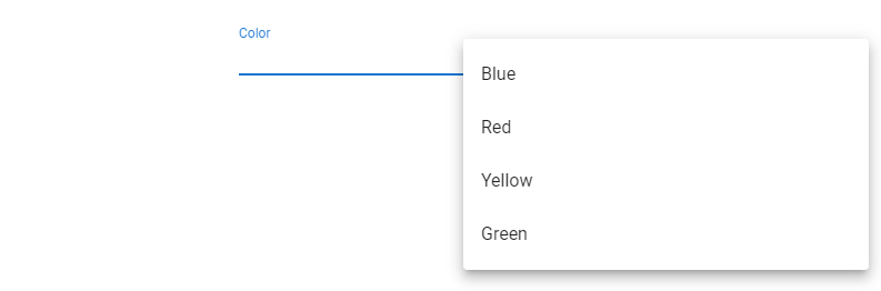
Dropdown lists are useful for getting user input from a known group of options, e.g., selecting a country among all the countries in the world, or choosing the hour of the day for an alarm. There are also known as select fields. In this article, we’re going to learn how use the Vuetify Select component to start creating dropdown lists in our apps.
The v-select Component
Vuetify provides the v-select component for creating select fields:
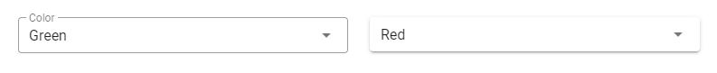
To set a default value for a dropdown list, we can use v-model to create a two-way binding between the current value of the dropdown list and a variable. The initial value of this variable will be the default value of the select field:
We can customize certain properties of the menu that pops up when the dropdown list is clicked. Modifiable properties include top, bottom, offsetX and offsetY.
Dropdown lists come in handy when we want to provide a finite list of known options to the user to choose from. Vuetify provides the v-select component to create and customize them in diverse ways.
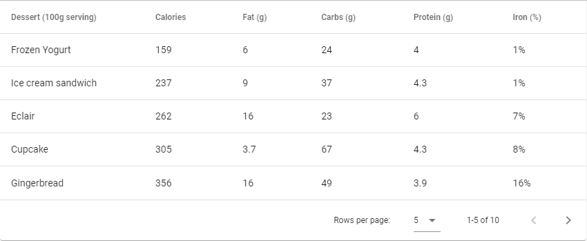
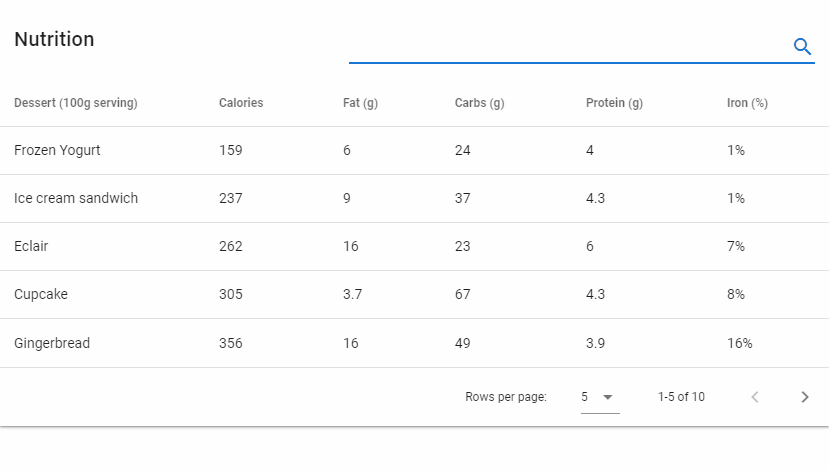
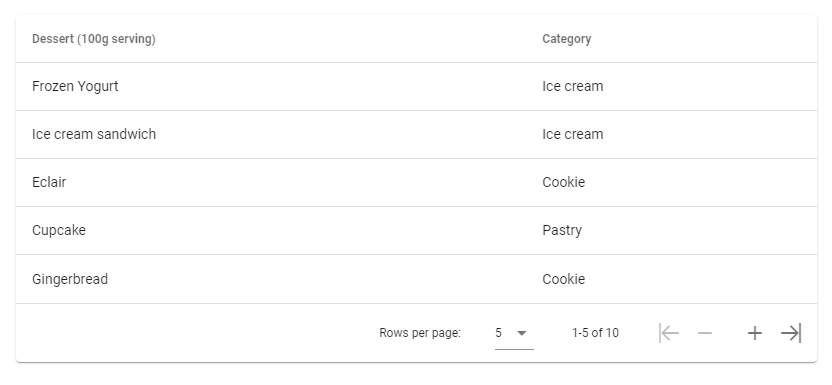
A table is a great way of presenting structured information in an easily understandable format. In this post, we’re going to learn how to use the Vuetify data table component, which is used for displaying tabular data and comes with useful features such as sorting, searching, pagination, and more.
The Vuetify Data Table Component (v-data-table)
Vuetify provides the v-data-table component for creating data tables. The headers prop of this component is an array of objects used to configure the data table headers. Each object in this array has a text property, which determines the header name that shows up for a particular column. We also pass an array of objects (desserts) to the items prop. Each object in desserts corresponds to a row in the data table, and each property represents a table cell for that row. The property names of these objects have to match one of the value property values of the objects in the headers array, i.e. (a key name must be one of name, calories, fat, carbs, protein, and iron).
We use the items-per-page property to paginate the data table. Here we set it to 5, so we have 2 pages for the 10 desserts.
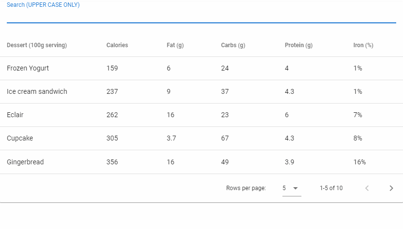
We can filter data on the data table with the search prop. Here, we’re binding whatever value entered in the text field with the input used for searching the table:
We can specify our custom filter function by passing a method to the custom-filter prop that has the signature (value: any, search: string | null, item: any) => boolean.
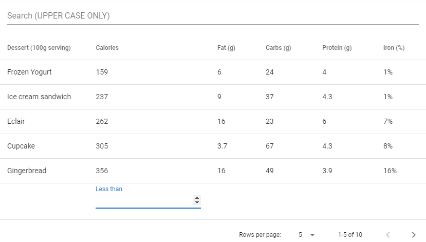
We can also customize the filtering of a specific column by supplying a function to the filter property on an item in the array passed to the headers prop. In the code example below, we add a text field below the rows of the data table (with the body.append slot) which can be used to display all the desserts with calories less than a certain value.
We can prevent specific columns from being included when searching through the table rows by setting the filterable property to false on the element of the array passed to headers that is associated with the column. In the code example below, we’ve turned off searching for the dessert name column:
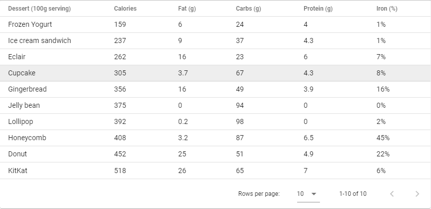
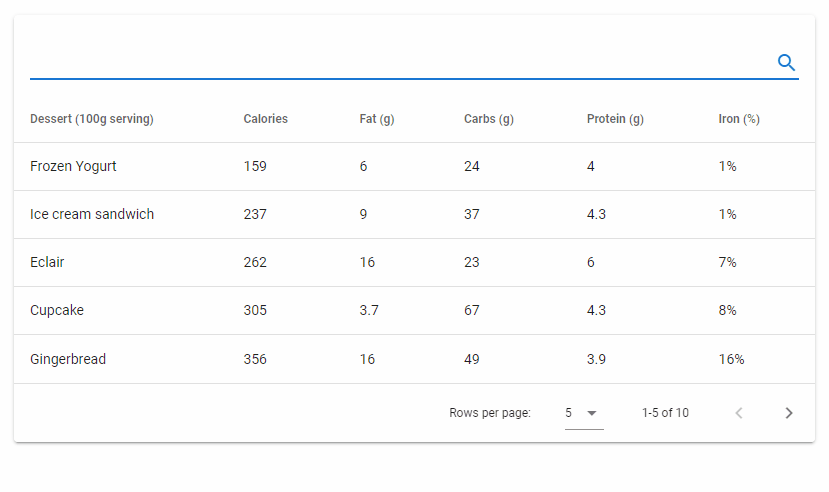
By default, the data table component displays a default footer using the v-data-footer component. We can pass props to this component with the footer-props prop of v-data-table:
The Vuetify data table component (v-data-table) comes in handy for laying out data in a digestible format. We can not only display data but perform searching and other operations. It also allows UI customizations like making the table more compact and functional customizations such as specifying a custom filter function.
A checkbox allows a user to select between two values. They are useful for getting boolean input (true or false), perhaps checking off a task in a to-do list app to show completion or deciding whether or not to accept a license agreement during software installation. In this article, we’re going to learn how to create a checkbox in Vuetify.
The v-checkbox Component
Vuetify provides the v-checkbox component for creating a checkbox:
We can use a checkbox when we need to accept boolean input. Vuetify provides the v-checkbox component to create it and provides various props for customization.