
Sliders are a great way of getting user input from a range of values. There are used for various functions like adjusting the brightness of a display or tuning speaker volumes. In this post, we’re going to explore the various ways we can create and customize sliders with Vuetify.
The v-slider Component
Vuetify provides the v-slider component for creating sliders:
<template>
  <v-app>
    <v-row justify="center" class="mt-2">
      <v-col sm="6">
        <v-slider></v-slider>
      </v-col>
    </v-row>
  </v-app>
</template>

<script>
export default {
  name: 'App',
};
</script>

A basic slider consists of a track (the long line) and a thumb (the circle). Clicking somewhere on the track moves the thumb to that location:

Slider Labels
To describe our sliders to users, we can specify a label with the label prop:
<template>
  <v-app>
    <v-row justify="center" class="mt-2">
      <v-col sm="6">
        <v-slider label="Slider"></v-slider>
      </v-col>
    </v-row>
  </v-app>
</template>

<script>
export default {
  name: 'App',
};
</script>

Slider Hints
We can show hints for a slider with the hint prop.
<template>
  <v-app>
    <v-row justify="center" class="mt-2">
      <v-col sm="6">
        <v-slider label="Slider" hint="hint"></v-slider>
      </v-col>
    </v-row>
  </v-app>
</template>

<script>
export default {
  name: 'App',
};
</script>
The hint shows up when you click the thumb:

Two-way Binding with v-model
We can use v-model to create a two-way binding between the slider value and a variable.
<template>
  <v-app>
    <div class="d-flex justify-center mt-2">
      <v-col sm="6">
        <v-slider label="Slider" hint="hint" v-model="sliderValue"></v-slider>
      </v-col>
    </div>
    <div class="d-flex justify-center">
      <v-col sm="6">Slider value: {{ sliderValue }}</v-col>
    </div>
  </v-app>
</template>

<script>
export default {
  name: 'App',
  data: () => ({
    sliderValue: 0,
  }),
};
</script>
In the code above, we’re adding in some text to display the current value of the slider (determined by sliderValue):

When the slider receives input sliderValue is updated and the text reflects this:

Let’s add a “Reset” button:
<template>
  <v-app>
    <div class="d-flex justify-center mt-2">
      <v-col sm="6">
        <v-slider label="Slider" hint="hint" v-model="sliderValue"></v-slider>
      </v-col>
    </div>
    <div class="d-flex justify-center">
      <v-col sm="6">Slider value: {{ sliderValue }}</v-col>
    </div>
    <div class="d-flex justify-center">
      <v-col sm="6"
        ><v-btn color="primary" @click="sliderValue = 0"
          >Reset slider</v-btn
        ></v-col
      >
    </div>
  </v-app>
</template>

<script>
export default {
  name: 'App',
  data: () => ({
    sliderValue: 0,
  }),
};
</script>

We added a click handler to the button that sets sliderValue to 0 when it is clicked:

Slider Min and Max Values
Vuetify sliders have default min and max values of 0 and 100 respectively. We can change them to something else with the min and max props:
<template>
  <v-app>
    <div class="d-flex justify-center mt-2">
      <v-col sm="6">
        <v-slider
          label="Slider"
          hint="hint"
          v-model="sliderValue"
          min="20"
          max="60"
        ></v-slider>
      </v-col>
    </div>
    <div class="d-flex justify-center">
      <v-col sm="6">Slider value: {{ sliderValue }}</v-col>
    </div>
  </v-app>
</template>

<script>
export default {
  name: 'App',
  data: () => ({
    sliderValue: null,
  }),
};
</script>
Now the minimum value of the slider is 20:

And the maximum value is now 60:

Slider Custom Colors
v-slider comes with props that allow us to modify the colors of its various elements.
Use the color prop to change the color of the part of the track before the thumb:
<template>
  <v-app>
    <div class="d-flex justify-center mt-2">
      <v-col sm="6">
        <v-slider label="color" v-model="sliderValue" color="green"></v-slider>
      </v-col>
    </div>
  </v-app>
</template>

<script>
export default {
  name: 'App',
  data: () => ({
    sliderValue: 0,
  }),
};
</script>

The track-color prop will modify the color of the part of the track after the thumb:
<template>
  <v-app>
    <div class="d-flex justify-center mt-2">
      <v-col sm="6">
        <v-slider
          label="track-color"
          v-model="sliderValue"
          track-color="red"
        ></v-slider>
      </v-col>
    </div>
  </v-app>
</template>

<script>
export default {
  name: 'App',
  data: () => ({
    sliderValue: 0,
  }),
};
</script>

To change the color of the thumb, use the thumb-color prop:
<template>
  <v-app>
    <div class="d-flex justify-center mt-2">
      <v-col sm="6">
        <v-slider
          label="thumb-color"
          v-model="sliderValue"
          thumb-color="orange"
          thumb-label="always"
        ></v-slider>
      </v-col>
    </div>
  </v-app>
</template>

<script>
export default {
  name: 'App',
  data: () => ({
    sliderValue: 0,
  }),
};
</script>

Disabled Sliders
Set the disabled prop to true to turn off interactivity with the slider:
<template>
  <v-app>
    <div class="d-flex justify-center mt-2">
      <v-col sm="6">
        <v-slider disabled value="50" label="Disabled"></v-slider>
      </v-col>
    </div>
  </v-app>
</template>

<script>
export default {
  name: 'App',
};
</script>

Discrete Sliders
By default Vuetify sliders have a step value of 1. These type of sliders are called continuous sliders because the thumb moves smoothly from its min to max value. In cases where we need less precision we can increase this step value, with the step prop:
<template>
  <v-app>
    <div class="d-flex justify-center mt-10">
      <v-col sm="6">
        <v-slider
          v-model="sliderValue"
          step="10"
          thumb-label="always"
        ></v-slider>
      </v-col>
    </div>
  </v-app>
</template>

<script>
export default {
  name: 'App',
  data: () => ({
    sliderValue: 0,
  }),
};
</script>

Slider Icons
v-slider provides props to display icons along with the slider, useful for adding more context.
The prepend-icon prop will display the accompanying icon before the slider:
<template>
  <v-app>
    <div class="d-flex justify-center mt-2">
      <v-col sm="6">
        <v-slider v-model="volume" prepend-icon="mdi-volume-high"></v-slider>
      </v-col>
    </div>
  </v-app>
</template>

<script>
export default {
  name: 'App',
  data: () => ({
    volume: 0,
  }),
};
</script>

The append-icon will show the icon after the slider:
<template>
  <v-app>
    <div class="d-flex justify-center mt-2">
      <v-col sm="6">
        <v-slider v-model="volume" append-icon="mdi-volume-high"></v-slider>
      </v-col>
    </div>
  </v-app>
</template>

<script>
export default {
  name: 'App',
  data: () => ({
    volume: 0,
  }),
};
</script>

Readonly Sliders
Readonly sliders also prevent interactivity like disable sliders, but they don’t lose their color:
<template>
  <v-app>
    <div class="d-flex justify-center mt-2">
      <v-col sm="6">
        <v-slider readonly value="30" label="Readonly"></v-slider>
      </v-col>
    </div>
  </v-app>
</template>

<script>
export default {
  name: 'App',
};
</script>

Inverse Labels
To display the slider label at the end of the slider, use the inverse-label prop:
<template>
  <v-app>
    <div class="d-flex justify-center mt-2">
      <v-col sm="6">
        <v-slider label="Inverse label" inverse-label></v-slider>
      </v-col>
    </div>
  </v-app>
</template>

<script>
export default {
  name: 'App',
};
</script>

Slider Thumbs
v-slider offers certain props for customizing the behaviour and display of the thumb. Set the thumb-label prop to true to display to only display the thumb label when the slider is being used:
<template>
  <v-app>
    <div class="d-flex justify-center mt-10">
      <v-col sm="6">
        <v-slider v-model="value" label="Slider" thumb-label></v-slider>
      </v-col>
    </div>
  </v-app>
</template>

<script>
export default {
  name: 'App',
  data: () => ({
    value: 0,
  }),
};
</script>

To always show the thumb label whether the user is using the slider or not, set the thumb-label prop to always:
<template>
  <v-app>
    <div class="d-flex justify-center mt-10">
      <v-col sm="6">
        <v-slider v-model="value" label="Slider" thumb-label="always"></v-slider>
      </v-col>
    </div>
  </v-app>
</template>

<script>
export default {
  name: 'App',
  data: () => ({
    value: 0,
  }),
};
</script>

Custom Thumb Sizes
The thumb-size prop lets us modify the thumb size:
<template>
  <v-app>
    <div class="d-flex justify-center mt-16">
      <v-col sm="6">
        <v-slider
          v-model="value"
          label="Slider"
          thumb-label="always"
          thumb-size="50"
        ></v-slider>
      </v-col>
    </div>
  </v-app>
</template>

<script>
export default {
  name: 'App',
  data: () => ({
    value: 0,
  }),
};
</script>

Custom Thumb Labels
The thumb normally displays the current numeric value of the slider, but we change what it shows by providing an element to the thumb-label slot of v-slider:
<template>
  <v-app>
    <div class="d-flex justify-center mt-16">
      <v-col sm="6">
        <v-slider
          v-model="value"
          label="Volume"
          thumb-label="always"
          thumb-size="50"
        >
          <template v-slot:thumb-label>
            <v-icon dark>mdi-volume-high</v-icon>
          </template>
        </v-slider>
      </v-col>
    </div>
  </v-app>
</template>

<script>
export default {
  name: 'App',
  data: () => ({
    value: 0,
  }),
};
</script>

Slider Ticks
Ticks visually represent the values the user can move the slider to. Setting the ticks prop to true will show the slider only when the slider is being used:
<template>
  <v-app>
    <div class="d-flex justify-center mt-2">
      <v-col sm="6">
        <v-slider v-model="value" step="10" ticks> </v-slider>
      </v-col>
    </div>
  </v-app>
</template>

<script>
export default {
  name: 'App',
  data: () => ({
    value: 0,
  }),
};
</script>
Set ticks to always to make the ticks display all the time:
<template>
  <v-app>
    <div class="d-flex justify-center mt-2">
      <v-col sm="6">
        <v-slider v-model="value" step="10" ticks="always"> </v-slider>
      </v-col>
    </div>
  </v-app>
</template>

<script>
export default {
  name: 'App',
  data: () => ({
    value: 0,
  }),
};
</script>

Custom Tick Sizes
We can also customize the tick size, with the tick-size prop:
<template>
  <v-app>
    <div class="d-flex justify-center mt-2">
      <v-col sm="6">
        <v-slider v-model="value" step="10" ticks="always" tick-size="4">
        </v-slider>
      </v-col>
    </div>
  </v-app>
</template>

<script>
export default {
  name: 'App',
  data: () => ({
    value: 0,
  }),
};
</script>

Tick Labels
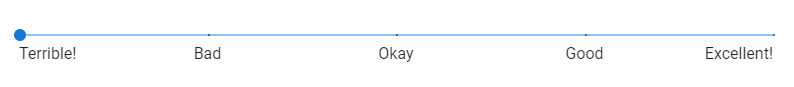
We can add text to describe the ticks. To do this, set the tick-labels prop to an array of strings.
<template>
  <v-app>
    <div class="d-flex justify-center mt-2">
      <v-col sm="12">
        <v-slider
          v-model="value"
          step="10"
          ticks="always"
          :tick-labels="tickLabels"
        >
        </v-slider>
      </v-col>
    </div>
  </v-app>
</template>

<script>
export default {
  name: 'App',
  data: () => ({
    value: 0,
    tickLabels: ['Terrible!', 'Bad', 'Okay', 'Good', 'Excellent!'],
  }),
};
</script>
Each item of the array will be assigned to a tick:
Summary
Vuetify provides the v-slider component to create sliders. We can use its props to customize various aspects of its behaviour and appearance.
11 Amazing New JavaScript Features in ES13
This guide will bring you up to speed with all the latest features added in ECMAScript 13. These powerful new features will modernize your JavaScript with shorter and more expressive code.
