
[SOLVED] ERR_REQUIRE_ESM: require() of ES Modules is not supported
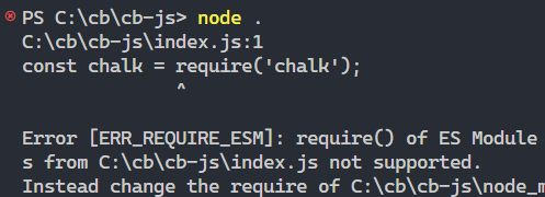
Are you experiencing the “require() of ES modules is not supported” error (ERR_REQUIRE_ESM) in Node.js? This error happens when you try to import a package that is an ES-only module with the CommonJS require() syntax:
To fix it, use the ES module import syntax for the module, or install a previous version of the package that supports require().
Use ES module import syntax
The ES module system is now the standard method for bundling JavaScript code for sharing and reusing. An ES module can only be used by other ES modules.
So to import ES modules into our project, we first have to define the project as an ES module too. We do this by setting the type field in our package.json file to "module".
{
  "type": "module",
  // other fields...
}
Once we do this, we can use the ES import syntax for the module, like this:
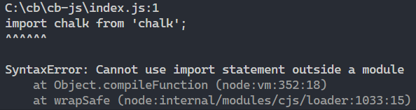
import chalk from 'chalk';Note
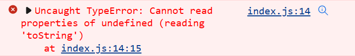
If we don’t make our project an ES module, you’ll get another error:
So this step is required.
Use async import() function
Another way you can fix the “require() of ES modules is not supported” error is to use the async import function that allows you to dynamically load modules:
For example, here’s how we can do it for chalk:
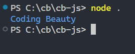
(async () => {
const chalk = (await import('chalk')).default;
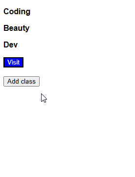
console.log(chalk.blue('Coding Beauty'));
})();
And this works:
Install previous version of package
It’s possible that the package used to support require() but no longer does. Maybe a popular package like chalk or node-fetch. In that case, you can also fix “require() of ES modules is not supported” error in Node.js by installing one of those versions that support require().
As the ES module format become more popular and we saw all the benefits, many popular libraries on NPM started to drop support for CommonJS. Unlike CommonJS, ES modules provide more flexible and powerful module system features like asynchronous loading and tree shaking (removing unused code at build time).
Here are the versions you should install for various well-known NPM packages to use CommonJS and require():
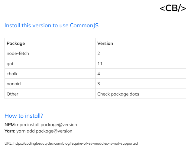
node-fetch
Install node-fetch version 2:
npm install node-fetch@2
# Yarn
yarn add node-fetch@2Note: Specify only the major version (use 2, not 2.x.x) so you can get all the latest important bug fixes published for version 2.
got
Install got version 11:
npm install got@11
# Yarn
yarn add got@11
Note: Unlike node-fetch, got v11 is not being maintained anymore.
chalk
Install chalk version 4:
npm install chalk@4
# Yarn
yarn add got@4
nanoid
Install nanoid version 3:
npm install nanoid@3
# Yarn
yarn add nanoid@3
Others
If the package isn’t among the ones above, try browsing through its homepage or NPM package page to find any notices of dropped CommonJS support.
Conclusion
The “require() of ES modules is not supported” error occurs in Node.js when we attempt to use CommonJS require() on a package that is now an ES module. To fix it, we can use the ES module import syntax for the module, use the async import() function, or install a previous version of the package that supports require(). The ES module system is better as it provides powerful features like asynchronous loading and tree shaking, making it the preferred method for bundling JavaScript code.