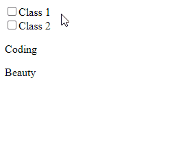
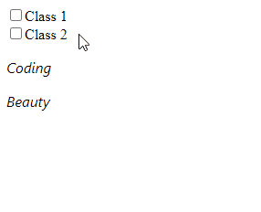
To add a class conditionally to an element in Vue, set the class prop to a JavaScript object where for each property, the key is the class name, and the value is the boolean condition that must be true for the class to be set on the element.
The classes are only applied when their respective checkboxes are checked.
The class-1 class will only present on the element if the class1 variable is true, and the class-2 class will only be present if the class2 variable is true. The values of these variables are determined by the current checked state of their respective checkboxes since we use v-model to set up a two-way binding between the variables and the checkboxes.
Use :class shorthand
We can use :class as a shorthand for v-bind:class.
We can set the class prop on the same element twice, once to add static classes, and once to add the dynamic classes that will be present based on certain conditions.
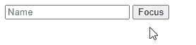
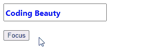
First, we create a new Vue instance ref by setting the inputref prop to a value (name).
<input
  ref="name"
  placeholder="Name"
/>
After doing this, we are able to access the $refs property of the Vue instance to access the object that represents the input element. We then call the focus() method on this object to set focus on the input.
this.$refs.name.focus();
We set the focusInput() method as a handler for the click event of the Focus button. So when the button is clicked, focusInput() is called and the input gains focus.
<button @click="focusInput">Focus</button>
Set focus on custom input component
Custom input components are useful for abstracting logic built around an input element and for reusing an input element styled in a particular way.
For custom components, calling focus() on its ref object will cause an error. For it to work, we’ll need to add a focus() method to the custom component that calls the focus() method of its root input element.
Now we can set focus on the custom input component when the button is clicked.
Clicking the button sets focus on the custom input component.
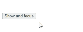
Set focus on input after page load
To give the input focus immediately after the page loads, we can call the focus() method from the mounted lifecycle hook of the Vue instance with the input ref. The mounted method is called after a component is added to the DOM, which happens when a page is loading.
There are scenarios where we’ll need to wait for the DOM to be updated before calling focus() to give the input element focus.
For example, we might be using a boolean variable to determine whether an input element should be present in the DOM or not.
Because Vue batches state updates, the input element might not be added to the DOM immediately, and we won’t be able to access its ref right away.
We can use the nextTick() instance method to ensure that the DOM has been updated to include the input after modifying the boolean variable before calling focus().
<template>
  <div id="app">
    <!-- 👇 conditional rendering with "v-if" directive -->
    <input
      v-if="showInput"
      ref="name"
      placeholder="Name"
    />
    <br /><br />
    <button @click="focusInput">Show and focus</button>
  </div>
</template>

<script>
export default {
  data() {
    return {
      showInput: false,
    };
  },
  methods: {
    focusInput() {
      // 👇 Set boolean variable to show input
      this.showInput = true;

      this.$nextTick(() => {
        // This callback will only be called after the
        // DOM has been updated
        this.$refs.name.focus();
      });
    },
  },
};
</script>
The input gains focus after the DOM is updated to include it.
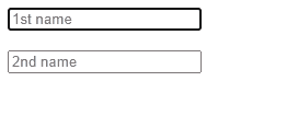
Set focus on next input after Enter press
Let’s say we have multiple input elements that need to be filled on the page. We could improve the UX by focusing on the succeeding text input when the user presses the Enter key to signify that they are done with filling in one input.
We do this by assigning a listener to the keypress event on the first input. Because of the enter event modifier, the event listener is only called when a key is pressed and the key is Enter.
We create a ref for the second input, and in the keypress.enter event listener we call the focus() method on the ref object to set focus on the second input.
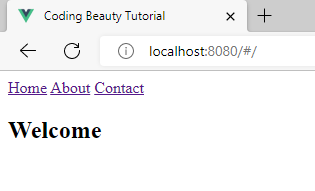
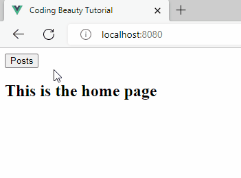
Here’s what the home page of this web app will look like:
There is a hash character before the index route path.
You can see that there is a hash character (#) before the index path (/) in the URL of the page. This happens because Vue Router uses hash history mode to represent the URLs of different routes. In hash mode, a hash character is placed before the route path, and this prevents the page from reloading when a Router link is clicked.
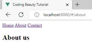
There is a hash character before the “/about” path.
The createRouter() function from vue-router creates a Router instance to be used by the Vue app. We can pass an object with a bunch of options to the function to customize the behavior of the router.
Setting the history option to the result of the createWebHistory() function from vue-router switches the router from hash history mode to HTML5 history mode. This removes the hash from the URLs.
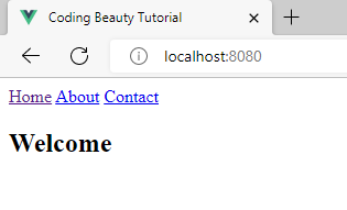
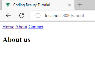
There is no hash character before the index route path.There is no hash character before the “/about” route path.
Remove hash from URL in Vue 2 and Vue Router 3
Vue 2 apps use Vue Router 3, so the Router initialization logic will differ.
Your main.js file might look like this at the moment:
main.js
import Vue from 'vue';
import App from './App.vue';
import VueRouter from 'vue-router';
import HomePage from '@/views/HomePage.vue';
import ContactPage from '@/views/ContactPage.vue';
import AboutPage from '@/views/AboutPage.vue';

Vue.config.productionTip = false;
Vue.use(VueRouter);

const routes = [
  { path: '/', component: HomePage },
  { path: '/about', component: AboutPage },
  { path: '/contact', component: ContactPage },
];

const router = new VueRouter({
  routes,
});

new Vue({
  router,
  render: (h) => h(App),
}).$mount('#app');
Here we use a VueRouter() constructor to create a new router instance. Like createRouter(), we can pass a set of options to customize its behavior. To change from hash history mode to HTML5 history mode and remove the hash from the URLs, set the mode option to 'history'.
main.js
import Vue from 'vue';
import App from './App.vue';
import VueRouter from 'vue-router';
import HomePage from '@/views/HomePage.vue';
import ContactPage from '@/views/ContactPage.vue';
import AboutPage from '@/views/AboutPage.vue';

Vue.config.productionTip = false;
Vue.use(VueRouter);

const routes = [
  { path: '/', component: HomePage },
  { path: '/about', component: AboutPage },
  { path: '/contact', component: ContactPage },
];

// 👇
const router = new VueRouter({
  mode: 'history',
  routes,
});

new Vue({
  router,
  render: (h) => h(App),
}).$mount('#app');
By Tari Ibaba
/ Last updated on September 10, 2022
A spinner is used to indicate an ongoing process to the user. They are suitable for operations that don’t take very long to complete, and they help to enhance the responsiveness of an application. Read on to learn more about the Vue Bootstrap spinner component and the various customization options it provides.
The Boostrap Vue Spinner Component (b-spinner)
Boostrap Vue provides the b-spinner component for creating spinners. It starts spinning as soon as it has been rendered on the page.
We can use the type prop to display a particular type of spinner. By default the type is set to border, which makes the spinner transparent and gives it a thick circle border.
b-spinner comes with a variant prop that lets us customize the color of the spinner. There are a bunch of values it can take, including primary, secondary, danger, warning, success, and info.
Here we create multiple border spinners with many different colors:
We can add any of the Bootstrap Vue margin utility classes to a b-spinner to adjust its spacing. Here we use the ms-4 class from Bootstrap to add a left margin to the second spinner:
Here’s a more practical example of using spinners within buttons. When the button is clicked to save, it changes its text and shows the spinner to indicate the ongoing save operation (simulated with a timeout). Then it hides the spinner and changes the text again after the save.
We use the status data property to track the current save state, and we create a buttonText computed property to determine what the button label should be from status.
Conclusion
A spinner is useful for indicating app operations in the process of being completed. In this article, we learned how to use the spinner component from Bootstrap Vue (b-spinner) to easily create and customize spinners.
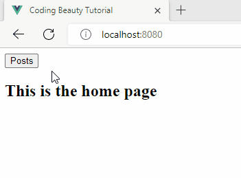
To use a button as a Vue Router link, wrap the button element in a router-link component. When the button is clicked, the browser will navigate to the specified route without refreshing the page.
Navigating the the /posts route without refreshing the page.
The router-link component has a default slot with a navigate function property.
The to prop is used to set the route that the browser should navigate to when this navigate function is called.
We make navigate an event handler of the buttonclick event, so it is called when the button is clicked, making the browser navigate to the route specified with the to prop.
Setting the custom prop to true tells the router-link not to wrap its content in an <a> element, and allow us to create a custom router link.
Use button as Vue Router link in Vue 2.x
The above method only works for Vue 3.x though. If working with Vue 2.x, you can use a button as a router link by setting the tag prop to the name of the button component, and setting the to prop to the specific route.
To use a button as a link in Vue, you can wrap the button in an anchor (<a>) element. Clicking a link button makes the browser navigate to the specified URL.
Navigating to the /posts route without refreshing the page.
We use navigate as a handler for the click event, so it is called when the button is clicked, making the browser navigate to the specified route without refreshing the page.
The above method only works for Vue 3.x though. If working with Vue 2.x, you can use a button as a router link by setting the tag prop to the name of the button component, and setting the to prop to the specific route.
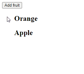
To add an item to an array in Vue, call the push() method in the array with the item as an argument. The push() method will add the item to the end of the array.
The Array push() method adds one or more items to the end of an array and returns the length of the array.
We use the v-for Vue directive to display the items in the array. These rendered items are automatically updated in the view when the array is modified with push().
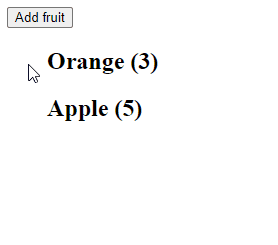
Add Object Item to Array in Vue
We can use the same approach to add an object to an array and display more complex data. We just have to make sure that we render the properties of each object in the array, not the object itself.
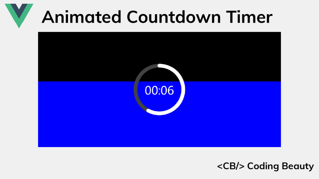
Timer apps are everywhere, and they each have their unique appearance and design. Some opt for a minimalistic design, using only text to indicate the time left, while others try to be more visual by displaying a slowly decreasing pie shape or even playing audio at regular intervals to notify of the time remaining.
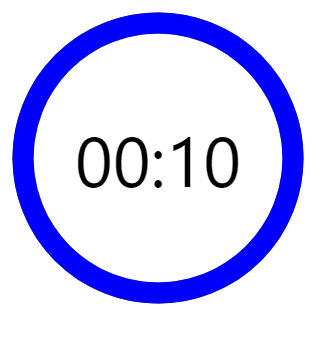
Well here’s the sort of timer we’ll be building in this article:
It indicates the time left with length, text, and color, which makes it very demonstrative.
We’ll be using Vue, so set up your project and let’s get started!
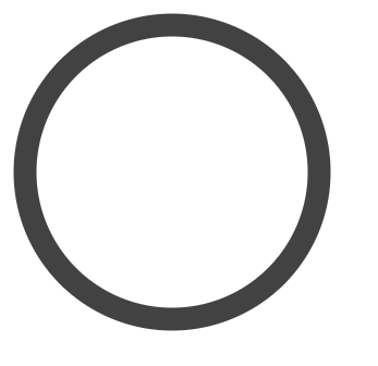
Creating the Timer Ring
We’ll start by creating the timer ring using an svg element. It will contain a circle element that we’ll use to create the timer ring. The circle will be drawn at the center of the svg container, with a radius of 45 pixels.
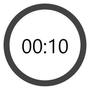
The AppTimer now has two props. The elapsed prop will be used to set how much time has elapsed, and the limit prop will specify the total time.
timeLeft() is a computed property that will be automatically updated when elapsed changes.
timeLeftString() is another computed property that will return a string in the MM:SS format indicating the timer left. Its values will be updated whenever timeLeft() changes.
Let’s add the following CSS to AppTimer.vue, which will style the label and overlay it on top of the timer ring:
src/components/AppTimer.vue
...
<style>
...
.time-left-container {
  /* Size should be the same as that of parent container */
  height: inherit;
  width: inherit;

  /* Place container on top of circle ring */
  position: absolute;
  top: 0;

  /* Center content (label) vertically and horizontally  */
  display: flex;
  align-items: center;
  justify-content: center;
}

.time-left-label {
  font-size: 70px;
  font-family: 'Segoe UI';
  color: black;
}
</style>
Let’s set the AppTimer props we created, from App.vue:
A timer has no use if it can’t count down, let’s add some logic to enable this functionality.
We’ll use a state variable (timeElapsed) to keep track of the total time elapsed so far in seconds. Using the setInterval() method, we will increment this variable by 1 every 1000 milliseconds (1 second). We’ll also ensure that we stop the regular increments once all the timer has elapsed, using the clearInterval() method.
All this logic will be contained in the startTimer() method. We’ll call startTimer() in the mounted() hook, so that the countdown starts immediately after the page loads.
src/App.vue
<template>
  <AppTimer
    :elapsed="timeElapsed"
    :limit="timeLimit"
  />
</template>

<script>
import AppTimer from './components/AppTimer.vue';

export default {
  name: 'App',
  data() {
    return {
      timeElapsed: 0,
      timerInterval: undefined,
      timeLimit: 10,
    };
  },
  methods: {
    startTimer() {
      this.timerInterval = setInterval(() => {
        // Stop counting when there is no more time left
        if (++this.timeElapsed === this.timeLimit) {
          clearInterval(this.timerInterval);
        }
      }, 1000);
    },
  },
  // Start timer immediately
  mounted() {
    this.startTimer();
  },
  components: {
    AppTimer,
  },
};
</script>
And now we have a functional timer.
Creating the Timer Progress Ring
Now we need to add a ring that will be animated to visualize the time remaining. We’ll give this ring a distinctive color and place it on the gray ring. As time passes it will animate to reveal more and more of the gray ring until only the gray ring is visible when no time is remaining.
We’ll create the ring using a path element and style it with CSS:
src/components/AppTimer.vue
<template>
  <div class="root">
    <svg
      class="svg"
      viewBox="0 0 100 100"
      xmlns="http://www.w3.org/2000/svg"
    >
      <g class="circle">
        ...
        <path
          class="time-left-path"
          d="
            M 50, 50
            m -45, 0
            a 45,45 0 1,0 90,0
            a 45,45 0 1,0 -90,0
          "
        ></path>
      </g>
    </svg>
    ...
  </div>
</template>

<script>
...
</script>

<style>
...
.time-left-path {
  /* Same thickness as the original ring */
  stroke-width: 7px;

  /* Rounds the path endings  */
  stroke-linecap: round;

  /* Makes sure the animation starts at the top of the circle */
  transform: rotate(90deg);
  transform-origin: center;

  /* One second aligns with the speed of the countdown timer */
  transition: 1s linear all;

  /* Colors the ring */
  stroke: blue;
}

.svg {
  /* Flips the svg and makes the animation to move left-to-right */
  transform: scaleX(-1);
}
</style>
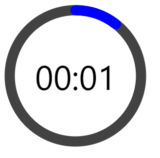
So now this blue ring covers the gray ring.
Animating the Timer Progress Ring
To animate the ring, we are going to use the stroke-dasharray attribute of the path.
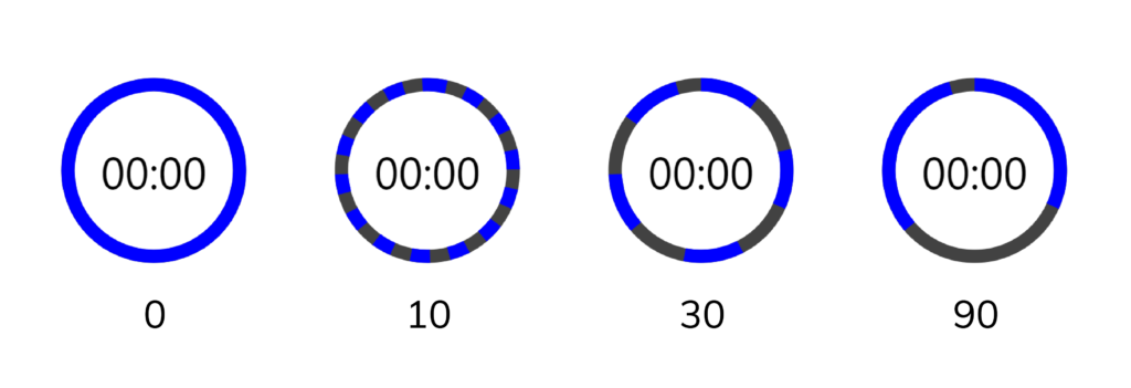
Here’s how the ring will look with different stroke-dasharray values:
We can see that setting stroke-dasharray to a single value creates a pattern of dashes (the blue arcs) and gaps (spaces between the dashes) that have the same length. stroke-dasharray adds as many dashes as possible to fill up the entire length of the path.
As the name suggests, stroke-dasharray can also take multiple values. Let’s see what happens when we specify two:
stroke-dasharray: 10 30
When two values are specified, the first value will determine the length of the dashes, and the second value will determine the length of the gaps.
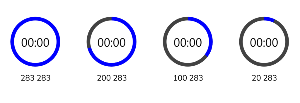
We can use this behavior to make the blue path visualize the time left. To do this, first, let us calculate the total length of the circle made by the blue path using the circle circumference formula (2πr):
Full path length = 2 x π x r = 2 x π x 45 = 282.6 ≈ 283
So to display the time left with the path, we’ll specify two values, the first value will start at 283 and gradually reduce to 0, while the second value will be constant at 283. This ensures that there is only one dash and one gap at all times, since 283 is as long as the entire path.
Here’s how the path will change in length as the first value changes:
We use a computed property (strokeDasharray) to calculate the new value for the stroke-dasharray attribute whenever the time left changes.
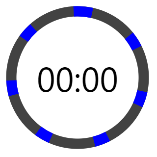
We use v-if to stop showing the blue ring entirely when there is no more time remaining.
And now the blue ring animates in line with the label to indicate the time left.
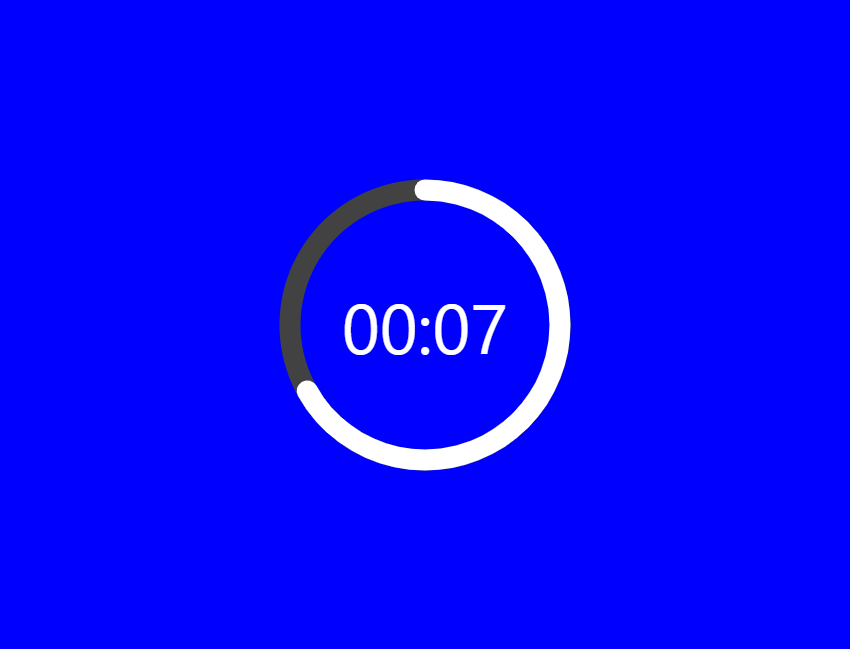
There’s one issue though: if you watch closely, the blue ring suddenly disappears when the timer reaches zero.
The blue path suddenly disappears at this length as the timer reaches zero.
This happens because the animation duration is set to one second. When the value of the remaining time is set to zero, it still takes one second to actually animate the blue ring to zero.
To fix this, we can use a formula that will reduce the length of a ring by an additional amount (separate from the animation) every time one second passes. Let’s modify AppTimer.vue to do this:
The background is nice, but it’s just static. Let’s add some code to animate its height as time passes.
src/App.vue
<template>
  <div class="background">
    <div
      class="elapsed"
      :style="{ height: backgroundHeight, backgroundColor: 'blue' }"
      v-if="timeLeft > 0"
    ></div>
  </div>
  <AppTimer
    :elapsed="timeElapsed"
    :limit="timeLimit"
  />
</template>

<script>
...
export default {
  ...
  computed: {
    timeLeft() {
      return this.timeLimit - this.timeElapsed;
    },
    timeFraction() {
      return this.timeLeft / this.timeLimit;
    },
    backgroundHeight() {
      const timeFraction = this.timeFraction;

      // Adjust time fraction to prevent lag when the time left
      // is 0, like we did for the time left progress ring
      const adjTimeFraction =
        timeFraction - (1 - timeFraction) / this.timeLimit;

      const height = Math.floor(adjTimeFraction * 100);

      return `${height}%`;
    },
  },
  ...
};
</script>
...
And now we have a background animation, which serves as another indicator of the time left.
Changing the Background Color at Certain Points in Time
It would be great if we could also use color to indicate the time left.
We’ll define certain points in time at which the background color will change, using a thresholds array. The background color will be blue at the start of the countdown. It will change to orange at 50% percent of the total time, and red at 20% of the total time.
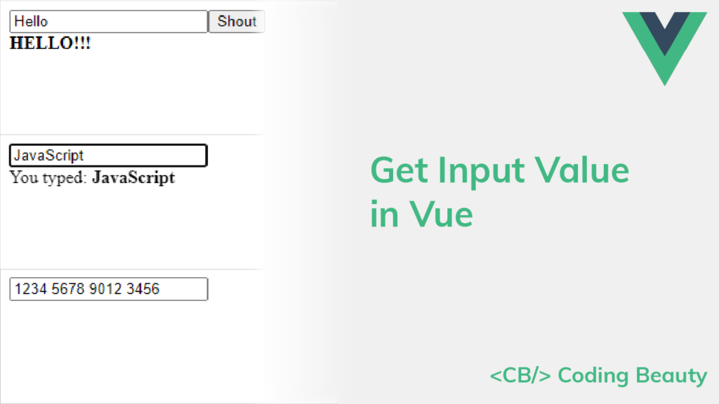
After taking input from users with a text field, there has to be a way to retrieve the data and do something with it. In this article, we’ll learn how to easily get the value of an input field in Vue.
The v-model Directive
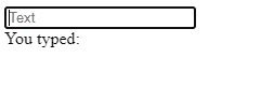
To get an input value in Vue, we can use the v-model directive to set up a two-way binding between the value and a variable.
Every time the user changes the text in the input field, the text variable will be updated automatically. We can then use this variable to perform an action or display information. In this example, we simply display the value of the input below it.
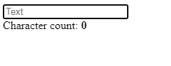
Using Vue Computed Properties with an Input Value
Instead of just displaying the value in the input field as it is, we could use a computed property to show information derived from the value.
For example, we could display the number of characters the value has:
We can create a handler for the input event of the input component to perform an action with the input value when it is changed. We can listen for the event using the v-on directive (v-on:input), which can be shortened to the @ symbol (@input).
In the following example, we use the input event to log the new input value in the developer console when it changes.
We can also the input event to implement a custom one-way binding between the input field value and a variable. Instead of v-model, we can use the value prop to set the text in the input manually.
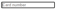
In the following example, we use the input event and the value prop to space out the digits of the card number entered in the input field and provide a better user experience.
<template>
  <div id="app">
    <input
      type="text"
      :value="cardNo"
      placeholder="Card number"
      @input="handleInput"
      @keypress="handleKeyPress"
    />
    <br />
  </div>
</template>

<script>
export default {
  data() {
    return {
      cardNo: '',
    };
  },
  methods: {
    handleInput(event) {
      this.cardNo = event.target.value
        // Remove spaces from previous value
        .replace(/\s/g, '')
        // Add a space after every set of 4 digits
        .replace(/(.{4})/g, '$1 ')
        // Remove the space after the last set of digits
        .trim();
    },
    handleKeyPress(event) {
      const num = Number(event.key);
      const value = event.target.value;
      // Only allow 16 digits
      if ((!num && num !== 0) || value.length >= 16 + 3) {
        event.preventDefault();
      }
    },
  },
};
</script>
Spacing out the entered card number
How to Get an Input Value with a Ref
In most scenarios, v-model and @input/value will be sufficient for reading or updating the value of an input field. However, we can also use the ref attribute to get the input value. We can set this attribute on any DOM element and use the $refs property of the Vue instance to access the object that represents the element.
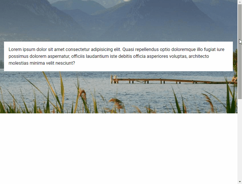
Parallax scrolling is a visual effect used on web pages where the background content moves at a slower rate than the foreground content. In this article, we’re going to learn how to use the parallax component from Vuetify to create the parallax scrolling effect with background images.
The Vuetify Parallax Component (v-parallax)
We use v-parallax to create a parallax component. It has a src prop for specifying the URL of the image to use for the background.