Timer apps are everywhere, and they each have their unique appearance and design. Some opt for a minimalistic design, using only text to indicate the time left, while others try to be more visual by displaying a slowly decreasing pie shape or even playing audio at regular intervals to notify of the time remaining.
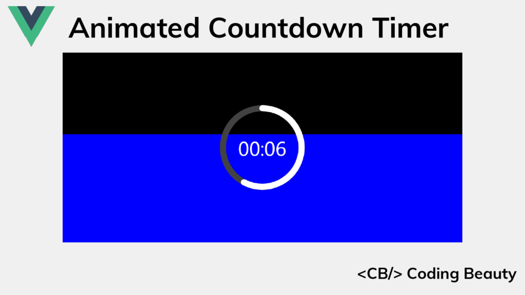
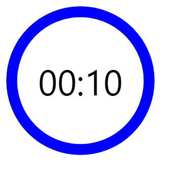
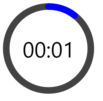
Well here’s the sort of timer we’ll be building in this article:

It indicates the time left with length, text, and color, which makes it very demonstrative.
We’ll be using Vue, so set up your project and let’s get started!
Creating the Timer Ring
We’ll start by creating the timer ring using an svg element. It will contain a circle element that we’ll use to create the timer ring. The circle will be drawn at the center of the svg container, with a radius of 45 pixels.
src/components/AppTimer.vue
<template>
  <div class="root">
    <svg class="svg" viewBox="0 0 100 100" xmlns="http://www.w3.org/2000/svg">
      <g class="circle">
        <circle class="time-elapsed-path" cx="50" cy="50" r="45" />
      </g>
    </svg>
  </div>
</template>
We’ll wrap the circle element in a g element so that we’ll be able to group the circle with other elements that’ll be added later in the tutorial.
We’ve created the basic HTML markup, now let’s add CSS that will display the ring.
src/components/AppTimer.vue
...
<style>
/* Sets the container's height and width */
.root {
  height: 300px;
  width: 300px;
  position: relative;
}

/* Removes SVG styling that would hide the time label */
.circle {
  fill: none;
  stroke: none;
}

/* The SVG path that displays the timer's progress */
.time-elapsed-path {
  stroke-width: 7px;
  stroke: #424242;
}
</style>
Let’s register the AppTimer component in App.vue and display it:
src/App.vue
<template>
  <AppTimer />
</template>

<script>
import AppTimer from './components/AppTimer.vue';

export default {
  name: 'App',
  components: {
    AppTimer,
  },
};
</script>
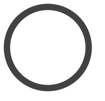
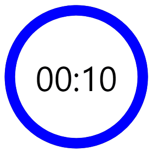
So this is what we have right now. Just a basic ring. Let’s keep moving.
Displaying the Timer Label
The next thing to do after creating the timer ring is to show the label that indicates how much time is left.
src/components/AppTimer.vue
<template>
  <div class="root">
    ...
    <div class="time-left-container">
      <span class="time-left-label">{{ timeLeftString }}</span>
    </div>
  </div>
</template>

<script>
export default {
  methods: {
    padToTwo(num) {
      // e.g. 4 -> '04'
      return String(num).padStart(2, '0');
    },
  },
  computed: {
    // e.g. timeLeft of 100 -> '01:40'
    timeLeftString() {
      const timeLeft = this.timeLeft;
      const minutes = Math.floor(timeLeft / 60);
      const seconds = timeLeft % 60;
      return `${this.padToTwo(minutes)}:${this.padToTwo(seconds)}`;
    },
    timeLeft() {
      return this.limit - this.elapsed;
    },
  },
  // Register props to be set from App.vue
  props: {
    elapsed: {
      type: Number,
      required: true,
    },
    limit: {
      type: Number,
      required: true,
    },
  },
};
</script>
...
The AppTimer now has two props. The elapsed prop will be used to set how much time has elapsed, and the limit prop will specify the total time.
timeLeft() is a computed property that will be automatically updated when elapsed changes.
timeLeftString() is another computed property that will return a string in the MM:SS format indicating the timer left. Its values will be updated whenever timeLeft() changes.
Let’s add the following CSS to AppTimer.vue, which will style the label and overlay it on top of the timer ring:
src/components/AppTimer.vue
...
<style>
...
.time-left-container {
  /* Size should be the same as that of parent container */
  height: inherit;
  width: inherit;

  /* Place container on top of circle ring */
  position: absolute;
  top: 0;

  /* Center content (label) vertically and horizontally  */
  display: flex;
  align-items: center;
  justify-content: center;
}

.time-left-label {
  font-size: 70px;
  font-family: 'Segoe UI';
  color: black;
}
</style>
Let’s set the AppTimer props we created, from App.vue:
src/App.vue
<template>
<AppTimer :elapsed="0" :limit="10" />
</template>
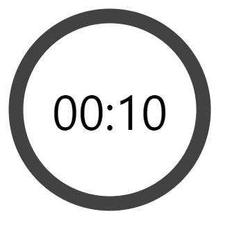
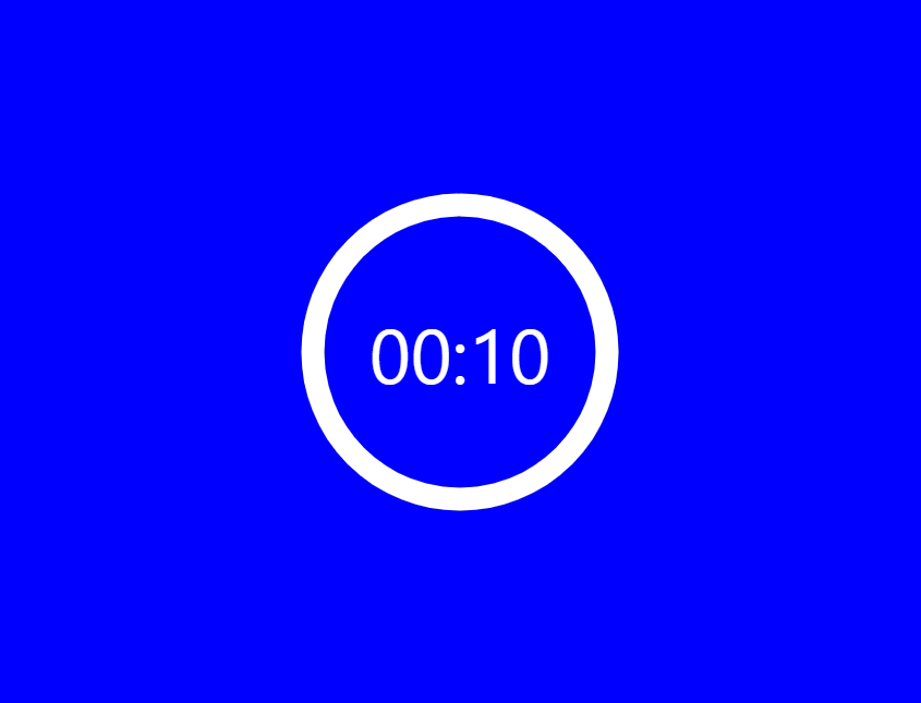
...Now we can see the label.
Enabling Timer Countdown
A timer has no use if it can’t count down, let’s add some logic to enable this functionality.
We’ll use a state variable (timeElapsed) to keep track of the total time elapsed so far in seconds. Using the setInterval() method, we will increment this variable by 1 every 1000 milliseconds (1 second). We’ll also ensure that we stop the regular increments once all the timer has elapsed, using the clearInterval() method.
All this logic will be contained in the startTimer() method. We’ll call startTimer() in the mounted() hook, so that the countdown starts immediately after the page loads.
src/App.vue
<template>
  <AppTimer
    :elapsed="timeElapsed"
    :limit="timeLimit"
  />
</template>

<script>
import AppTimer from './components/AppTimer.vue';

export default {
  name: 'App',
  data() {
    return {
      timeElapsed: 0,
      timerInterval: undefined,
      timeLimit: 10,
    };
  },
  methods: {
    startTimer() {
      this.timerInterval = setInterval(() => {
        // Stop counting when there is no more time left
        if (++this.timeElapsed === this.timeLimit) {
          clearInterval(this.timerInterval);
        }
      }, 1000);
    },
  },
  // Start timer immediately
  mounted() {
    this.startTimer();
  },
  components: {
    AppTimer,
  },
};
</script>
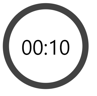
And now we have a functional timer.
Creating the Timer Progress Ring
Now we need to add a ring that will be animated to visualize the time remaining. We’ll give this ring a distinctive color and place it on the gray ring. As time passes it will animate to reveal more and more of the gray ring until only the gray ring is visible when no time is remaining.
We’ll create the ring using a path element and style it with CSS:
src/components/AppTimer.vue
<template>
  <div class="root">
    <svg
      class="svg"
      viewBox="0 0 100 100"
      xmlns="http://www.w3.org/2000/svg"
    >
      <g class="circle">
        ...
        <path
          class="time-left-path"
          d="
            M 50, 50
            m -45, 0
            a 45,45 0 1,0 90,0
            a 45,45 0 1,0 -90,0
          "
        ></path>
      </g>
    </svg>
    ...
  </div>
</template>

<script>
...
</script>

<style>
...
.time-left-path {
  /* Same thickness as the original ring */
  stroke-width: 7px;

  /* Rounds the path endings  */
  stroke-linecap: round;

  /* Makes sure the animation starts at the top of the circle */
  transform: rotate(90deg);
  transform-origin: center;

  /* One second aligns with the speed of the countdown timer */
  transition: 1s linear all;

  /* Colors the ring */
  stroke: blue;
}

.svg {
  /* Flips the svg and makes the animation to move left-to-right */
  transform: scaleX(-1);
}
</style>
So now this blue ring covers the gray ring.
Animating the Timer Progress Ring
To animate the ring, we are going to use the stroke-dasharray attribute of the path.
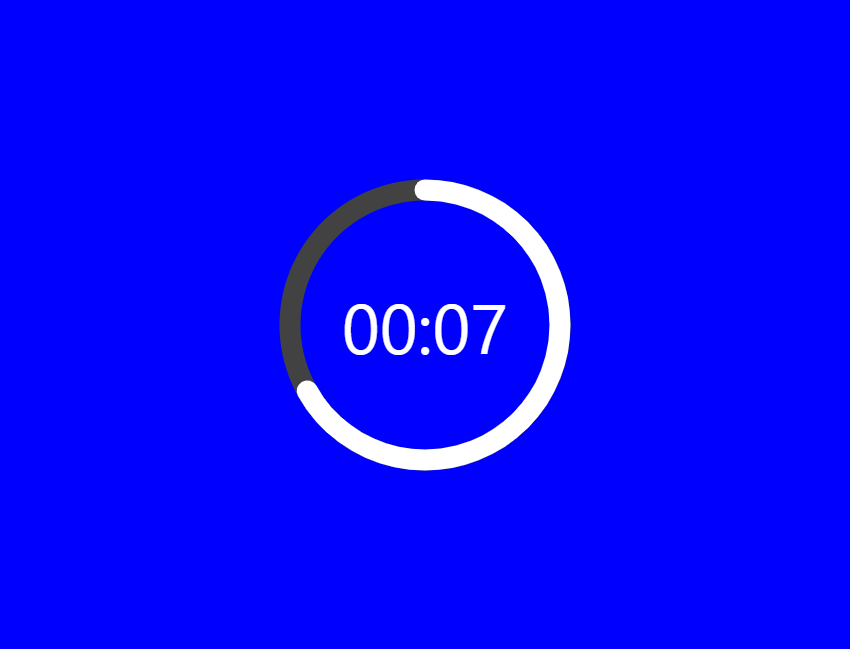
Here’s how the ring will look with different stroke-dasharray values:
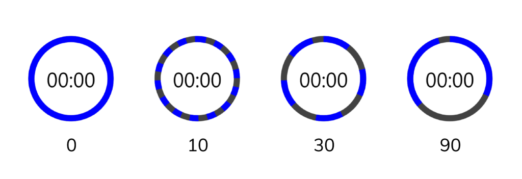
We can see that setting stroke-dasharray to a single value creates a pattern of dashes (the blue arcs) and gaps (spaces between the dashes) that have the same length. stroke-dasharray adds as many dashes as possible to fill up the entire length of the path.
As the name suggests, stroke-dasharray can also take multiple values. Let’s see what happens when we specify two:
stroke-dasharray: 10 30When two values are specified, the first value will determine the length of the dashes, and the second value will determine the length of the gaps.
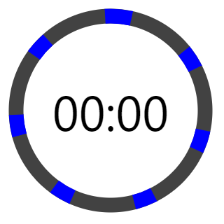
We can use this behavior to make the blue path visualize the time left. To do this, first, let us calculate the total length of the circle made by the blue path using the circle circumference formula (2πr):
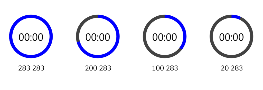
Full path length = 2 x π x r = 2 x π x 45 = 282.6 ≈ 283So to display the time left with the path, we’ll specify two values, the first value will start at 283 and gradually reduce to 0, while the second value will be constant at 283. This ensures that there is only one dash and one gap at all times, since 283 is as long as the entire path.
Here’s how the path will change in length as the first value changes:
Let’s implement this in our code:
src/components/AppTimer.vue
<template>
  <div class="root">
    <svg
      class="svg"
      viewBox="0 0 100 100"
      xmlns="http://www.w3.org/2000/svg"
    >
      <g class="circle">
        ...
        <path
          class="time-left-path"
          v-if="timeLeft > 0"
          d="
            M 50, 50
            m -45, 0
            a 45,45 0 1,0 90,0
            a 45,45 0 1,0 -90,0
          "
          :style="{ strokeDasharray }"
        ></path>
      </g>
    </svg>
    ...
  </div>
</template>

<script>
export default {
  ...
  computed: {
    ...
    strokeDasharray() {
      const radius = 45;
      const totalLength = 2 * Math.PI * radius;
      const timeFraction = this.timeLeft / this.limit;
      const elapsedDash = Math.floor(timeFraction * totalLength);
      return `${elapsedDash} ${totalLength}`;
    },
  },
  ...
};
</script>

<style>
...
</style>
We use a computed property (strokeDasharray) to calculate the new value for the stroke-dasharray attribute whenever the time left changes.
We use v-if to stop showing the blue ring entirely when there is no more time remaining.
And now the blue ring animates in line with the label to indicate the time left.

There’s one issue though: if you watch closely, the blue ring suddenly disappears when the timer reaches zero.
This happens because the animation duration is set to one second. When the value of the remaining time is set to zero, it still takes one second to actually animate the blue ring to zero.
To fix this, we can use a formula that will reduce the length of a ring by an additional amount (separate from the animation) every time one second passes. Let’s modify AppTimer.vue to do this:
src/AppTimer.vue
<template>
...
</template>

<script>
export default {
  ...
  computed: {
    ...
    strokeDasharray() {
      const radius = 45;
      const total = 2 * Math.PI * radius;
      const timeFraction = this.timeLeft / this.limit;
      const adjTimeFraction = timeFraction - (1 - timeFraction) / this.limit;
      const elapsedDash = Math.floor(adjTimeFraction * total);
      return `${elapsedDash} ${total}`;
    },
  },
  ...
};
</script>

<style>
...
</style>
Now the blue ring is reduced to the end before being removed by v-if:
Creating the Background
We’re done with the timer now, so we need to work on the background. We’ll create and style it in App.vue:
src/App.vue
<template>
  <div class="background">
    <div
      class="elapsed"
      :style="{ height: '100%', backgroundColor: 'blue' }"
    ></div>
  </div>
  <AppTimer
    :elapsed="timeElapsed"
    :limit="timeLimit"
  />
</template>

<script>
...
</script>

<style scoped>
.background {
  height: 100%;
  position: absolute;
  top: 0;
  width: 100%;
  display: flex;
  flex-direction: column;
  justify-content: end;
  background-color: black;
}

.background .elapsed {
  /* For the height animation */
  transition: all 1s linear;
}
</style>

<style>
html,
body,
#app {
  height: 100%;
  margin: 0;
}

#app {

  /* Center timer vertically and horizontally */
  display: flex;
  justify-content: center;
  align-items: center;

  position: relative;
}
</style>
Since we set the background color to blue, we’ll need to change the color of the timer ring and the timer label for them to still be visible.
We’ll use white:
src/components/AppTimer.vue
...
<style>
...
.time-left-label {
  ...
  color: white;
}

.time-left-path {
  ...
  /* Colors the ring */
  stroke: white;
}
...
</style>
We can now see the background:
Animating the Background
The background is nice, but it’s just static. Let’s add some code to animate its height as time passes.
src/App.vue
<template>
  <div class="background">
    <div
      class="elapsed"
      :style="{ height: backgroundHeight, backgroundColor: 'blue' }"
      v-if="timeLeft > 0"
    ></div>
  </div>
  <AppTimer
    :elapsed="timeElapsed"
    :limit="timeLimit"
  />
</template>

<script>
...
export default {
  ...
  computed: {
    timeLeft() {
      return this.timeLimit - this.timeElapsed;
    },
    timeFraction() {
      return this.timeLeft / this.timeLimit;
    },
    backgroundHeight() {
      const timeFraction = this.timeFraction;

      // Adjust time fraction to prevent lag when the time left
      // is 0, like we did for the time left progress ring
      const adjTimeFraction =
        timeFraction - (1 - timeFraction) / this.timeLimit;

      const height = Math.floor(adjTimeFraction * 100);

      return `${height}%`;
    },
  },
  ...
};
</script>
...
And now we have a background animation, which serves as another indicator of the time left.
Changing the Background Color at Certain Points in Time
It would be great if we could also use color to indicate the time left.
We’ll define certain points in time at which the background color will change, using a thresholds array. The background color will be blue at the start of the countdown. It will change to orange at 50% percent of the total time, and red at 20% of the total time.
src/components/App.vue
...
<script>
...
export default {
  ...
  data() {
    return {
      ...
      thresholds: [
        {
          color: 'blue',
          threshold: 1,
        },
        {
          color: 'orange',
          threshold: 0.5,
        },
        {
          color: 'red',
          threshold: 0.2,
        },
      ],
    };
  },
  ...
};
</script>
...
We’ll use the reduce() method to get the color for the current time from the thresholds array.
src/components/App.vue
<template>
  <div class="background">
    <div
      class="elapsed"
      :style="{ height: backgroundHeight, backgroundColor }"
      v-if="timeLeft > 0"
    ></div>
  </div>
  ...
</template>

<script>
...
export default {
  ...
  computed: {
    ...
    backgroundColor() {
      return this.thresholds.reduce(
        (color, item) =>
          item.threshold >= this.timeFraction ? item.color : color,
        undefined
      );
    },
  },
  ...
};
</script>
...
And we’re done! We have a functional timer, that counts down and displays how much time is left in 4 different ways.
Explore the Source Code for This App
You can view the complete source code of this mini-app here on GitHub.
Every Crazy Thing JavaScript Does
A captivating guide to the subtle caveats and lesser-known parts of JavaScript.
