In this article, we’ll look at different ways to call an async function in the useEffect() hook, along with pitfalls to avoid when working with async/await.
Calling async Functions With then/catch in useEffect()
async functions perform an asynchronous operation in JavaScript. To wait for the Promise the async function returns to be settled (fulfilled or rejected) in the React useEffect() hook, we could use its then() and catch() methods:
In the following example, we call the fetchBooks() async method to fetch and display stored books in a sample reading app:
async/await Problem: async Callbacks Can’t Be Passed to useEffect()
Perhaps you would prefer to use the async/await syntax in place of then/catch. You might try doing this by making the callback passed to useEffect()async.
This isn’t a good idea though, and if you’re using a linter it will inform you of this right away.
// ❌ Your linter: don't do this!
useEffect(async () => {
  try {
    const books = await fetchBooks();
    setBooks(books);
  } catch {
    console.log('Error occured when fetching books');
  }
}, []);
Your linter complains because the first argument of useEffect() is supposed to be a function that either returns nothing or returns a function to clean up side effects. But async functions always return a Promise (implicitly or explicitly), and Promise objects can’t be called as functions. This could cause real issues in your React app, such as memory leaks.
In this example, because the callback function is async, it doesn’t actually return the defined clean-up function, but rather a Promise object that is resolved with the clean-up function. Hence, this clean-up function is never called, and the observer never unsubscribed from the observable, resulting in a memory leak.
So how can we fix this? How can we use the await operator with an async function in the useEffect() hook?
async/await Solution 1: Call async Function in IIFE
As the name suggests, an IIFE is a function that runs as soon as it is defined. They are used to avoid polluting the global namespace and in scenarios where trying an await call could cause problems in the scope containing the IIFE (e.g., in the useEffect() hook).
async/await Solution 2: Call async Function in Named Function
Alternatively, you can await the async function inside a named function:
useEffect(() => {

  // Named function "getBooks"
  async function getBooks() {
    try {
      const books = await fetchBooks();
      setBooks(books);
    } catch (err) {
      console.log('Error occured when fetching books');
    }
  }

  // Call named function
  getBooks();
}, []);
Remember the example using the observable pattern? Here’s how we can use a named async function to prevent the memory leak that occurred:
// ✅ Callback is not async
useEffect(() => {
  const observer = () => {
    // do stuff
  };

  // Named function "fetchDataAndSubscribe"
  async function fetchDataAndSubscribe() {
    await fetchData();
    observable.subscribe(observer);
  }

  fetchDataAndSubscribe();

  // ✅ No memory leak
  return () => {
    observable.unsubscribe(observer);
  };
}, []);
async/await Solution 3: Create Custom Hook
We can also create a custom hook that behaves similarly to useEffect() and can accept an async callback without causing any issues.
This article was republished here: https://plainenglish.io/blog/javascript-rotate-image-ad2f05eafeb2
To rotate an image with JavaScript, access the image element with a method like getElementById(), then set the style.transform property to a string in the format rotate({value}deg), where {value} is the clockwise angle of rotation in degrees.
Here’s how we can easily rotate the #rotated image element from JavaScript:
index.js
// Access DOM element object
const rotated = document.getElementById('rotated');

// Rotate element by 90 degrees clockwise
rotated.style.transform = 'rotate(90deg)';
And this will be the result on the web page:
The image on the right is rotated 90 degrees clockwise.
First, we access the DOM element object with the document.getElementById() method.
Then, we use the style.transform property of the object to set the transform CSS property of the element from JavaScript.
We can specify any angle between 1 and 359 for the rotation:
// Access DOM element object
const rotated = document.getElementById('rotated');

// Rotate element by 180 degrees clockwise
rotated.style.transform = 'rotate(180deg)';
The image on the right is rotated 180 degrees clockwise.
Rotate Image Counter-Clockwise
We can rotate an image in the counter-clockwise direction by specifying a negative angle.
// Access DOM element object
const rotated = document.getElementById('rotated');

// Rotate image by 90 degrees counter-clockwise
rotated.style.transform = 'rotate(-90deg)';
The image on the right is rotated by 90 degrees counter-clockwise.
We can specify any angle between -1 and -359 degrees for counter-clockwise rotation.
// Access DOM element object
const rotated = document.getElementById('rotated');

// Rotate image by 135 degrees counter-clockwise
rotated.style.transform = 'rotate(-135deg)';
The image on the right is rotated 135 degrees counter-clockwise.
Customize Image Transform Origin
We can use the transform-origin CSS property to set the point that the image will be rotated about. transform-origin is center by default, which means the element will be rotated about its center point.
In the following example, we rotate the image 90 degrees clockwise, as we did in the first example in this article.
// Access DOM element object
const rotated = document.getElementById('rotated');

// Rotate image by 90 degrees clockwise
rotated.style.transform = 'rotate(90deg)';

// Rotate image about top-left corner
rotated.style.transformOrigin = 'top left';
But this time we customize the transform-origin property, so the image element ends up at a different position after the rotation.
The image on the right is rotated about its top-left point.
Rotate Image on Button Click
To rotate the image at the click of a button, assign an event handler function to the onclick attribute of the button element.
For example:
index.html
<!DOCTYPE html>
<html>
  <head>
    <title>JavaScript Rotate Image</title>
  </head>
  <body>
    <div>
      <!-- Assign "rotateImage()" to "onclick" attribute -->
      <button id="rotate" onclick="rotateImage()">Rotate image</button>

      <!-- The image element to be rotated -->
      <img id="rotated" src="my-image.jpg" width="300" />
    </div>

    <script src="index.js"></script>
  </body>
</html>
Here the rotateImage() function serves as the click event handler. It contains the logic for rotating the image, and will be called when the button is clicked.
index.js
// Access DOM element object
const rotated = document.getElementById('rotated');

function rotateImage() {
  // Rotate image by 90 degrees clockwise
  rotated.style.transform = 'rotate(90deg)';
}
Now when the button is clicked, the image will be rotated 90 degrees in the clockwise direction.
Rotate Image Incrementally
We can incrementally rotate the image on button click by storing the angle of rotation in a variable and using this variable to get and update the current angle. Many image editing apps allow you to rotate images in 90-degree angle increments.
index.js
// Access DOM element object
const rotated = document.getElementById('rotated');

// Variable to hold the current angle of rotation
let rotation = 0;

// How much to rotate the image at a time
const angle = 90;

function rotateImage() {
  // Ensure angle range of 0 to 359 with "%" operator,
  // e.g., 450 -> 90, 360 -> 0, 540 -> 180, etc.
  rotation = (rotation + angle) % 360;

  rotated.style.transform = `rotate(${rotation}deg)`;
}
Are you experiencing the “cannot read property ‘length’ of undefined” error in JavaScript? This error occurs when you attempt to access the length property from a variable that has a value of undefined.
To fix the “cannot read property ‘length’ of undefined” error, perform an undefined check on the variable before accessing the length property from it. There are various ways to do this.
1. Use an if Statement
We can use an if statement to check if the variable is truthy before accessing the length property:
const arr = undefined;

let arrLength = undefined;

// Check if "arr" is truthy
if (arr) {
  arrLength = arr.length;
}

console.log(arrLength); // undefined


const str = undefined;

let strLength = undefined;

// Check if "str" is truthy
if (str) {
  strLength = str.length;
}

console.log(strLength); // undefined
2. Use Optional Chaining
We can use the optional chaining operator (?.) to return undefined and prevent the method call if the variable is nullish (null or undefined):
const arr = undefined;

// Use optional chaining on "arr" variable
const arrLength = arr?.length;

console.log(arrLength); // undefined


const str = undefined;

// Use optional chaining on "str" variable
const strLength = str?.length;

console.log(strLength); // undefined
3. Access the length Property of a Fallback Value
We can use the nullish coalescing operator (??) to provide a fallback value to access the length property from.
Like the ?? operator, || returns the value to its left if it is not null or undefined. If it is, then || returns the value to its right.
4. Use a Fallback Value Instead of Accessing the length Property
We can also combine the optional chaining operator (?.) and the nullish coalescing operator (??) to provide a fallback value to use as the result, instead of accessing the length property from the undefined value.
const arr = undefined;

// Using "0" as a fallback value
const arrLength = arr?.length ?? 0;

console.log(arrLength); // 0


const str = undefined;

// Using "0" as a fallback value
const strLength = str?.length ?? 0;

console.log(strLength); // 0
As we saw earlier, the logical OR operator (||) can replace the ?? operator in cases like this:
const arr = undefined;

// Using "0" as a fallback value
const arrLength = arr?.length || 0;

console.log(arrLength); // 0

const str = undefined;

// Using "0" as a fallback value
const strLength = str?.length || 0;

console.log(strLength); // 0
We can use the Turndown library to easily convert HTML to markdown in JavaScript.
To get started with Turndown, we can install it from NPM using this command:
ShellCopied!
npm i turndown
After the installation, we’ll be able to import it into a JavaScript module like this:
JavaScriptCopied!
import TurndownService from 'turndown'
For a Common JS module, we’ll import it like this instead:
JavaScriptCopied!
const TurndownService = require('turndown');
Now we can use the turndown module to easily convert any HTML string to markdown:
JavaScriptCopied!
import TurndownService from 'turndown';

const html = `
<h1>Learn Web Development</h1>
<p>Check out <a href="https://codingbeautydev.com/blog">Coding Beauty</a> for some great tutorials!</p>
`;

// Create an instance of the Turndown service
const turndownService = new TurndownService();

const markdown = turndownService.turndown(html);

console.log(markdown);
This code will have the following output:
MarkdownCopied!
Learn Web Development
=====================

Check out [Coding Beauty](https://codingbeautydev.com/blog) for some great tutorials!
Use Turndown in browser with script tag
We can also use Turndown in a browser by importing the Turndown script using a script tag:
After including the script, we’ll be able to convert HTML to Markdown just as easily as we did in the previous code example:
JavaScriptCopied!
const html = `
<h1>Learn Web Development</h1>
<p>Check out <a href="https://codingbeautydev.com/blog">Coding Beauty</a> for some great tutorials!</p>
`;

// Create an instance of the Turndown service
const turndownService = new TurndownService();

const markdown = turndownService.turndown(html);

console.log(markdown);
In the browser, we can also pass DOM nodes as input to Turndown:
JavaScriptCopied!
// convert document <body> to Markdown
const bodyMarkdown = turndownService.turndown(document.body);

// convert first <div> tag to Markdown
const divMarkdown = turndownService.turndown(document.body);
Customize HTML to Markdown conversion
We can pass options to Turndown to customize how it should convert an HTML string to Markdown. Options can be specified in the constructor when creating a new instance of the Turndown service.
JavaScriptCopied!
import TurndownService from 'turndown';

const html = `
<ul>
<li>HTML</li>
<li>CSS</li>
<li>JavaScript<li>`;

// Specifying options when creating an instance of the
// Turndown service
const turndownService = new TurndownService({ bulletListMarker: '-' });

const markdown = turndownService.turndown(html);

console.log(markdown);
Here, we use the bulletListMarker property to specify that Turndown should use the - symbol to indicate a list item in the Markdown. So this will be the output of the code:
MarkdownCopied!
-   HTML
-   CSS
-   JavaScript
The bulletListMarker also accepts other values, like the * character:
JavaScriptCopied!
import TurndownService from 'turndown';

const html = `
<ul>
<li>HTML</li>
<li>CSS</li>
<li>JavaScript<li>`;

// Specifying options when creating an instance of the
// Turndown service
const turndownService = new TurndownService({ bulletListMarker: '*' });

const markdown = turndownService.turndown(html);

console.log(markdown);
To add seconds to a date in JavaScript, use the getSeconds() method to get the seconds, then call the setSeconds() method on the date, passing as an argument the sum of getSeconds() and the number of seconds to add.
For example:
function addSeconds(date, seconds) {
  date.setSeconds(date.getSeconds() + seconds);
  return date;
}

// 12:00:00 AM on April 17, 2022
const date = new Date('2022-04-17T00:00:00.000Z');

// 12:00:20 AM on April 17, 2022
const newDate = addSeconds(date, 20);

console.log(newDate); // 2022-04-17T00:00:20.000Z
Our addSeconds() function takes a Date object and the seconds to add as arguments. It returns a new Date object with the newly added seconds.
The Date getSeconds() method returns a number between 0 and 59 that represents the seconds of a particular date.
The Date setSeconds() sets the seconds of a date to a specified number.
If the seconds added would increase the minutes, hour, day, or year of the Date, setSeconds() automatically updates the Date information to reflect this.
// 12:00:00 AM on April 17, 2022
const date = new Date('2022-04-17T00:00:00.000Z');

// Add 100 seconds to date
date.setSeconds(date.getSeconds() + 100);

// 12:01:40 AM on April 17, 2022
console.log(date); // 2022-04-17T00:01:40.000Z
In this example, passing 100 to setSeconds() increments the minutes of the date by 1 (60 seconds) and sets the seconds to 40.
Avoiding Side Effects
The setSeconds() method mutates the Date object it is called on. This introduces a side effect into our addSeconds() function. To avoid modifying the passed date and create a pure function, make a copy of the date and call setSeconds() on this copy, instead of the original:
function addSeconds(date, seconds) {
  // Making a copy with the Date() constructor
  const dateCopy = new Date(date);
  dateCopy.setSeconds(date.getSeconds() + seconds);

  return dateCopy;
}

const date = new Date('2022-04-17T00:00:00.000Z');

const newDate = addSeconds(date, 20);
console.log(newDate); // 2022-04-17T00:00:20.000Z

// Original not modified
console.log(date); // 2022-04-17T00:00:00.000Z
Tip
Functions that don’t modify external state (i.e., pure functions) tend to be more predictable and easier to reason about. This makes it a good practice to limit the number of side effects in your programs.
2. date-fns addSeconds()
Alternatively, you can use the pure addSeconds() function from the date-fns NPM package to quickly add seconds to a date in JavaScript.
import { addSeconds } from 'date-fns';

const date = new Date('2022-04-17T00:00:00.000Z');

const newDate = addSeconds(date, 20);
console.log(newDate); // 2022-04-17T00:00:20.000Z

// Original not modified
console.log(date); // 2022-04-17T00:00:00.000Z
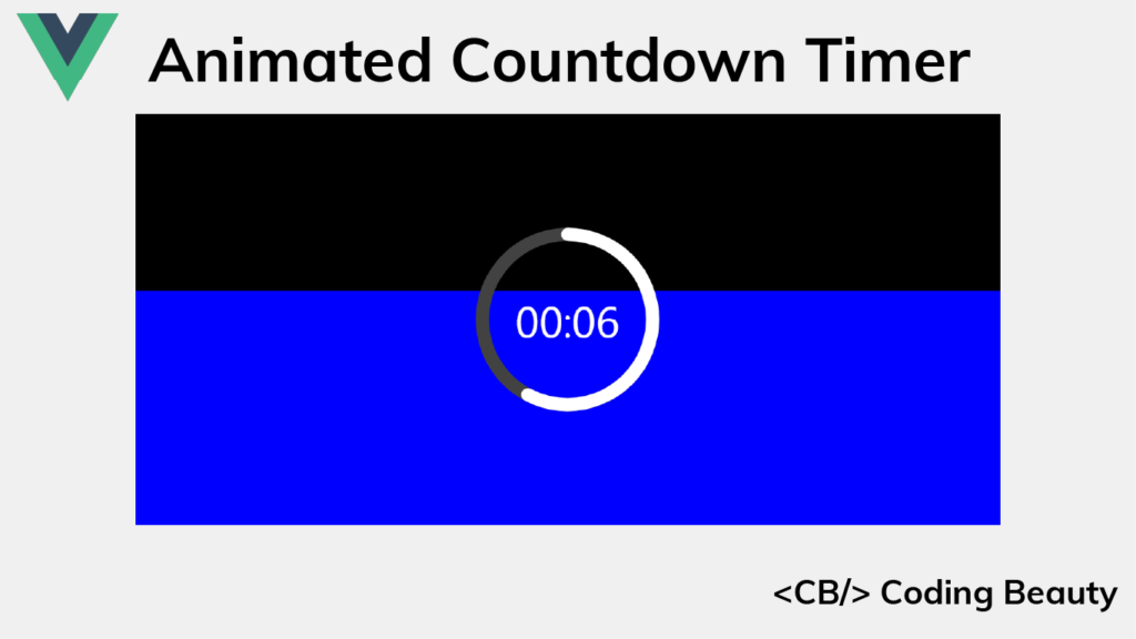
Timer apps are everywhere, and they each have their unique appearance and design. Some opt for a minimalistic design, using only text to indicate the time left, while others try to be more visual by displaying a slowly decreasing pie shape or even playing audio at regular intervals to notify of the time remaining.
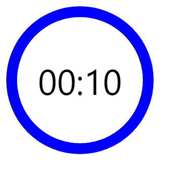
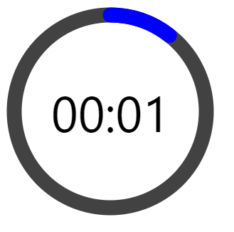
Well here’s the sort of timer we’ll be building in this article:
It indicates the time left with length, text, and color, which makes it very demonstrative.
We’ll be using Vue, so set up your project and let’s get started!
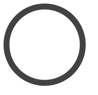
Creating the Timer Ring
We’ll start by creating the timer ring using an svg element. It will contain a circle element that we’ll use to create the timer ring. The circle will be drawn at the center of the svg container, with a radius of 45 pixels.
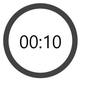
The AppTimer now has two props. The elapsed prop will be used to set how much time has elapsed, and the limit prop will specify the total time.
timeLeft() is a computed property that will be automatically updated when elapsed changes.
timeLeftString() is another computed property that will return a string in the MM:SS format indicating the timer left. Its values will be updated whenever timeLeft() changes.
Let’s add the following CSS to AppTimer.vue, which will style the label and overlay it on top of the timer ring:
src/components/AppTimer.vue
...
<style>
...
.time-left-container {
  /* Size should be the same as that of parent container */
  height: inherit;
  width: inherit;

  /* Place container on top of circle ring */
  position: absolute;
  top: 0;

  /* Center content (label) vertically and horizontally  */
  display: flex;
  align-items: center;
  justify-content: center;
}

.time-left-label {
  font-size: 70px;
  font-family: 'Segoe UI';
  color: black;
}
</style>
Let’s set the AppTimer props we created, from App.vue:
A timer has no use if it can’t count down, let’s add some logic to enable this functionality.
We’ll use a state variable (timeElapsed) to keep track of the total time elapsed so far in seconds. Using the setInterval() method, we will increment this variable by 1 every 1000 milliseconds (1 second). We’ll also ensure that we stop the regular increments once all the timer has elapsed, using the clearInterval() method.
All this logic will be contained in the startTimer() method. We’ll call startTimer() in the mounted() hook, so that the countdown starts immediately after the page loads.
src/App.vue
<template>
  <AppTimer
    :elapsed="timeElapsed"
    :limit="timeLimit"
  />
</template>

<script>
import AppTimer from './components/AppTimer.vue';

export default {
  name: 'App',
  data() {
    return {
      timeElapsed: 0,
      timerInterval: undefined,
      timeLimit: 10,
    };
  },
  methods: {
    startTimer() {
      this.timerInterval = setInterval(() => {
        // Stop counting when there is no more time left
        if (++this.timeElapsed === this.timeLimit) {
          clearInterval(this.timerInterval);
        }
      }, 1000);
    },
  },
  // Start timer immediately
  mounted() {
    this.startTimer();
  },
  components: {
    AppTimer,
  },
};
</script>
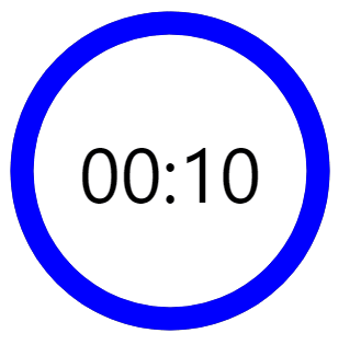
And now we have a functional timer.
Creating the Timer Progress Ring
Now we need to add a ring that will be animated to visualize the time remaining. We’ll give this ring a distinctive color and place it on the gray ring. As time passes it will animate to reveal more and more of the gray ring until only the gray ring is visible when no time is remaining.
We’ll create the ring using a path element and style it with CSS:
src/components/AppTimer.vue
<template>
  <div class="root">
    <svg
      class="svg"
      viewBox="0 0 100 100"
      xmlns="http://www.w3.org/2000/svg"
    >
      <g class="circle">
        ...
        <path
          class="time-left-path"
          d="
            M 50, 50
            m -45, 0
            a 45,45 0 1,0 90,0
            a 45,45 0 1,0 -90,0
          "
        ></path>
      </g>
    </svg>
    ...
  </div>
</template>

<script>
...
</script>

<style>
...
.time-left-path {
  /* Same thickness as the original ring */
  stroke-width: 7px;

  /* Rounds the path endings  */
  stroke-linecap: round;

  /* Makes sure the animation starts at the top of the circle */
  transform: rotate(90deg);
  transform-origin: center;

  /* One second aligns with the speed of the countdown timer */
  transition: 1s linear all;

  /* Colors the ring */
  stroke: blue;
}

.svg {
  /* Flips the svg and makes the animation to move left-to-right */
  transform: scaleX(-1);
}
</style>
So now this blue ring covers the gray ring.
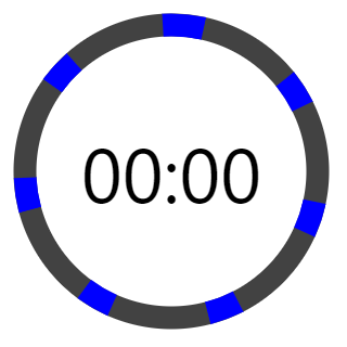
Animating the Timer Progress Ring
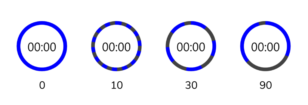
To animate the ring, we are going to use the stroke-dasharray attribute of the path.
Here’s how the ring will look with different stroke-dasharray values:
We can see that setting stroke-dasharray to a single value creates a pattern of dashes (the blue arcs) and gaps (spaces between the dashes) that have the same length. stroke-dasharray adds as many dashes as possible to fill up the entire length of the path.
As the name suggests, stroke-dasharray can also take multiple values. Let’s see what happens when we specify two:
stroke-dasharray: 10 30
When two values are specified, the first value will determine the length of the dashes, and the second value will determine the length of the gaps.
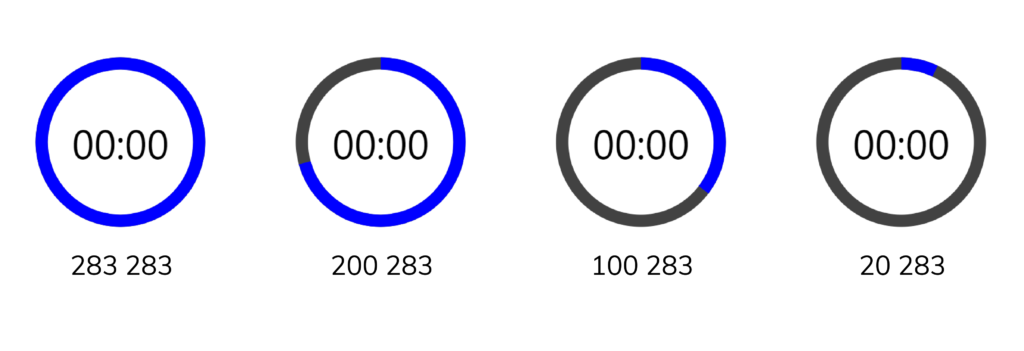
We can use this behavior to make the blue path visualize the time left. To do this, first, let us calculate the total length of the circle made by the blue path using the circle circumference formula (2πr):
Full path length = 2 x π x r = 2 x π x 45 = 282.6 ≈ 283
So to display the time left with the path, we’ll specify two values, the first value will start at 283 and gradually reduce to 0, while the second value will be constant at 283. This ensures that there is only one dash and one gap at all times, since 283 is as long as the entire path.
Here’s how the path will change in length as the first value changes:
We use a computed property (strokeDasharray) to calculate the new value for the stroke-dasharray attribute whenever the time left changes.
We use v-if to stop showing the blue ring entirely when there is no more time remaining.
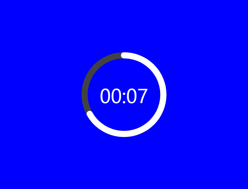
And now the blue ring animates in line with the label to indicate the time left.
There’s one issue though: if you watch closely, the blue ring suddenly disappears when the timer reaches zero.
The blue path suddenly disappears at this length as the timer reaches zero.
This happens because the animation duration is set to one second. When the value of the remaining time is set to zero, it still takes one second to actually animate the blue ring to zero.
To fix this, we can use a formula that will reduce the length of a ring by an additional amount (separate from the animation) every time one second passes. Let’s modify AppTimer.vue to do this:
The background is nice, but it’s just static. Let’s add some code to animate its height as time passes.
src/App.vue
<template>
  <div class="background">
    <div
      class="elapsed"
      :style="{ height: backgroundHeight, backgroundColor: 'blue' }"
      v-if="timeLeft > 0"
    ></div>
  </div>
  <AppTimer
    :elapsed="timeElapsed"
    :limit="timeLimit"
  />
</template>

<script>
...
export default {
  ...
  computed: {
    timeLeft() {
      return this.timeLimit - this.timeElapsed;
    },
    timeFraction() {
      return this.timeLeft / this.timeLimit;
    },
    backgroundHeight() {
      const timeFraction = this.timeFraction;

      // Adjust time fraction to prevent lag when the time left
      // is 0, like we did for the time left progress ring
      const adjTimeFraction =
        timeFraction - (1 - timeFraction) / this.timeLimit;

      const height = Math.floor(adjTimeFraction * 100);

      return `${height}%`;
    },
  },
  ...
};
</script>
...
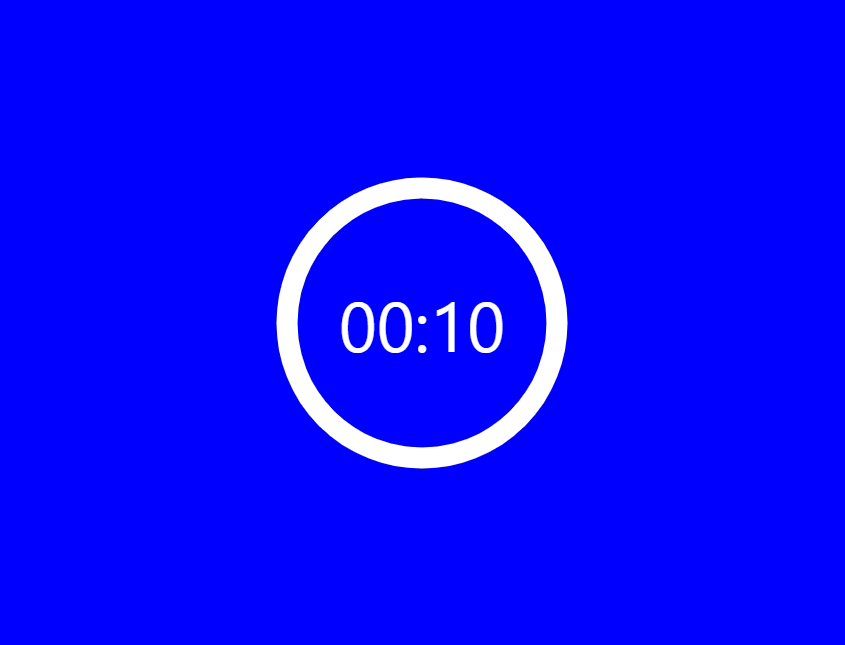
And now we have a background animation, which serves as another indicator of the time left.
Changing the Background Color at Certain Points in Time
It would be great if we could also use color to indicate the time left.
We’ll define certain points in time at which the background color will change, using a thresholds array. The background color will be blue at the start of the countdown. It will change to orange at 50% percent of the total time, and red at 20% of the total time.
Here’s how we can create a video element from JavaScript:
index.js
// Create video element
const video = document.createElement('video');

// Use local file
// video.src = 'video.mp4';

// Use remote file
video.src =
  'https://archive.org/download/C.E.PriceCatWalksTowardCamera/cat_walks_toward_camera_512kb.mp4';


video.controls = true;
video.muted = false;
video.height = 240; // in px
video.width = 320; // in px

const box = document.getElementById('box');

// Include in HTML as child of #box
box.appendChild(video);
Now the video will be visible on the web page:
We can the controls to play the video if we want:
The document.createElement() method creates an HTML element specified by a tag name and returns the element. By passing a video tag, we create a video element.
The video element comes with a number of attributes that we can use to customize its appearance and behavior. Here are some of the most commonly used ones:
src: The most important attribute, which is set to a URL or file path to determine the video to be played.
autoplay: This attribute specifies if the video should start playing automatically as soon as possible, without stopping to finish loading the data.
controls: The controls attribute determines if the browser should show controls that allow the user to control video playback, i.e., adjusting volume, moving to a new position in the video (seeking), pausing/resuming, etc.
poster: A URL for an image to be displayed while the image is still downloading.
muted: This is a boolean attribute used to specify if the video should be muted by default.
height: Sets the height of the video’s display area, in pixels.
width: Sets the width of the video’s display area, in pixels.
The appendChild() method can add a DOM element to the end of the list of children of a specified parent node. After accessing the #box element from our HTML with getElementById(), we call the appendChild() method on it to include the video element in the HTML by adding it as a child of the #box.
Ensuring Cross-Browser Compatibility for the Video Element
As browsers don’t all support the same video formats, when embedding video we’ll need to specify different formats depending on the one the user’s browser supports.
To check if the browser supports a particular video type, we can use the canPlayType() method.
// Create video element
const video = document.createElement('video');

video.autoplay = false;
video.controls = true;
video.muted = false;
video.height = 240; // in px
video.width = 320; // in px

if (video.canPlayType('video/mp4')) {
  video.src = 'video.mp4';
} else if (video.canPlayType('video/ogg')) {
  video.src = 'video.ogg';
} else {
  // Provide video link to user
}

const box = document.getElementById('box');

// Include in HTML as child of box
box.appendChild(video);
If the browser doesn’t support any of the video formats, the best thing to do is to provide the user with the link to the video for them to download it and watch it offline. That way, every user will be able to watch your video, regardless of the level of video support their browser has.
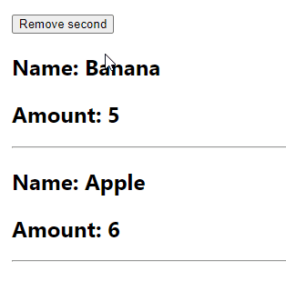
In this article, we’re going to learn how to easily remove an item from a state array in React.
The Array filter() Method
To remove an item from a state array in React, call the filter() method on the array, specifying a test that every item in the array apart from the one to be removed will pass, then update the state with the result of filter() with setState.
We remove the fruit object with the id2 by returning a condition from the filter() callback that is true only for the items in the array that don’t have an id of 2. Doing this excludes the target item from the array returned from filter().
Since App here is a functional component, we use the useState() React hook to create the initial state array. The first value useState() returns lets us access the state data. The second value is a function used to update the state (generically called setState). We pass a function to setState (named setFruits here) to ensure that we get the current/latest state.
Tip: Always pass a function to setState when the new state is computed from the current state data.
Don’t Modify State Directly in React
Note that trying to remove the item from the array by modifying it directly using a function like splice() will not work:
const removeSecond = () => {
  // Find the index of the object to be removed
  const secondIndex = fruits.findIndex((fruit) => fruit.id === 2);

  // Mutating the array like this will not update the view
  fruits.splice(secondIndex, 1);
};
State is meant to be immutable in React, so we can’t update the array by mutating it. It has to be replaced with a new array returned from filter() for the view to update.
Remove Items from a State Array Based on Multiple Conditions
If you need to remove an item from the state array based on multiple conditions, you can use the logical AND (&&) or logical OR (&&) operator.
Using the Logical OR (||) Operator
Here is an example of using the logical OR (||) operator to remove an item from a state array.
Combining a set of operands with the || operator will result in trueif at least one of the operands evaluates to true. By using this operator with the filter() method, we return a new array containing only the fruit objects with a name equal to 'Orange' or 'Apple'.
Using the Logical AND (&&) Operator
Here is an example of using the logical AND (&&) operator to remove an item from a state array:
Combining operands with the && operator will result in trueonly if all the operands are true.
By combining the filter() method with the && operator, we are able to specify a compound boolean expression that removes the fruit objects with ids of 2 and 4.
Simplifying Compound Boolean Expressions with De Morgan’s Laws
We can use one of De Morgan’s laws to convert the AND condition from our previous example to an OR condition and reduce the number of negations.
The Arraysplice() method changes the contents of an array by removing existing elements, while possibly adding new elements in their place.
const arr1 = ['a', 'b', 'c'];

// Removing elements
arr1.splice(1, 2);
console.log(arr1); // [ 'a' ]

// Removing and adding new elements
const arr2 = ['a', 'b', 'c'];
arr2.splice(1, 2, 'd', 'e');
console.log(arr2); // [ 'a', 'd', 'e' ]
In order to swap the array elements, we specify certain arguments for three of the parameters that splice() has:
start: This specifies the index from which to start changing the array from. We use the index of the second element for this as the argument for the parameter.
deleteCount: This is a number that indicates the number of elements to remove from start. Our passing 1 means that only the element at the start index (the second element to be swapped) will be removed.
item1, …, itemN: These are a variable number of arguments to add to the array. We only pass one value for this – the first element to be swapped.
So the three arguments we pass to splice() replace the first element with the second.
To complete the swap, we take advantage of the fact that splice() returns an array containing removed elements.
So for our scenario, the second element to be swapped will be in this array, hence we access it from the array and assign its value to the first element.