Tari Ibaba is a software developer with years of experience building websites and apps. He has written extensively on a wide range of programming topics and has created dozens of apps and open-source libraries.
Breadcrumbs are navigation helpers that allow users to keep track and maintain awareness of their location within a website. They serve as a navigational aid that enables the user to understand the relation between the current page and higher-level pages. In this article, we’re going to learn how to create breadcrumbs with the Vuetify breadcrumbs component.
The Vuetify Breadcrumbs Component (v-breadcrumbs)
Vuetify provides the v-breadcrumbs component for creating and displaying breadcrumbs. The breadcrumbs component comes with an items prop that takes an array containing information about each item of the breadcrumbs. Each array element is an object that represents one item. Here are some of the properties of this object that we can set:
text: sets the text that will be displayed for that item.
href: sets the location that the user can navigate to by clicking on the breadcrumbs item.
disabled: determines whether the user can click on the breadcrumb to navigate to the location specified with href.
We can increase the font size of the breadcrumbs by setting the large prop to true. large increases the font-size of each item from the default 14px to 16px.
We can use the divider slot of v-breadcrumbs to display custom HTML between each item of the breadcrumbs. For example, we can display any of the icons from Material Design Icons with the Vuetify icon component (v-icon):
Breadcrumbs serve as a navigation aid that helps users to maintain awareness of their location within a website. We can the Vuetify breadcrumbs component (v-breadcrumbs) to create breadcrumbs.
In web development, lazy loading is a practice of deferring the loading or initialization of the resources of a web page until they’re actually needed. It is a useful technique for reducing page load times, saving system resources, and improving performance. In this article, we’re going to learn how to implement lazy loading and speed up our web pages with the Vuetify lazy component.
The Vuetify Lazy Component (v-lazy)
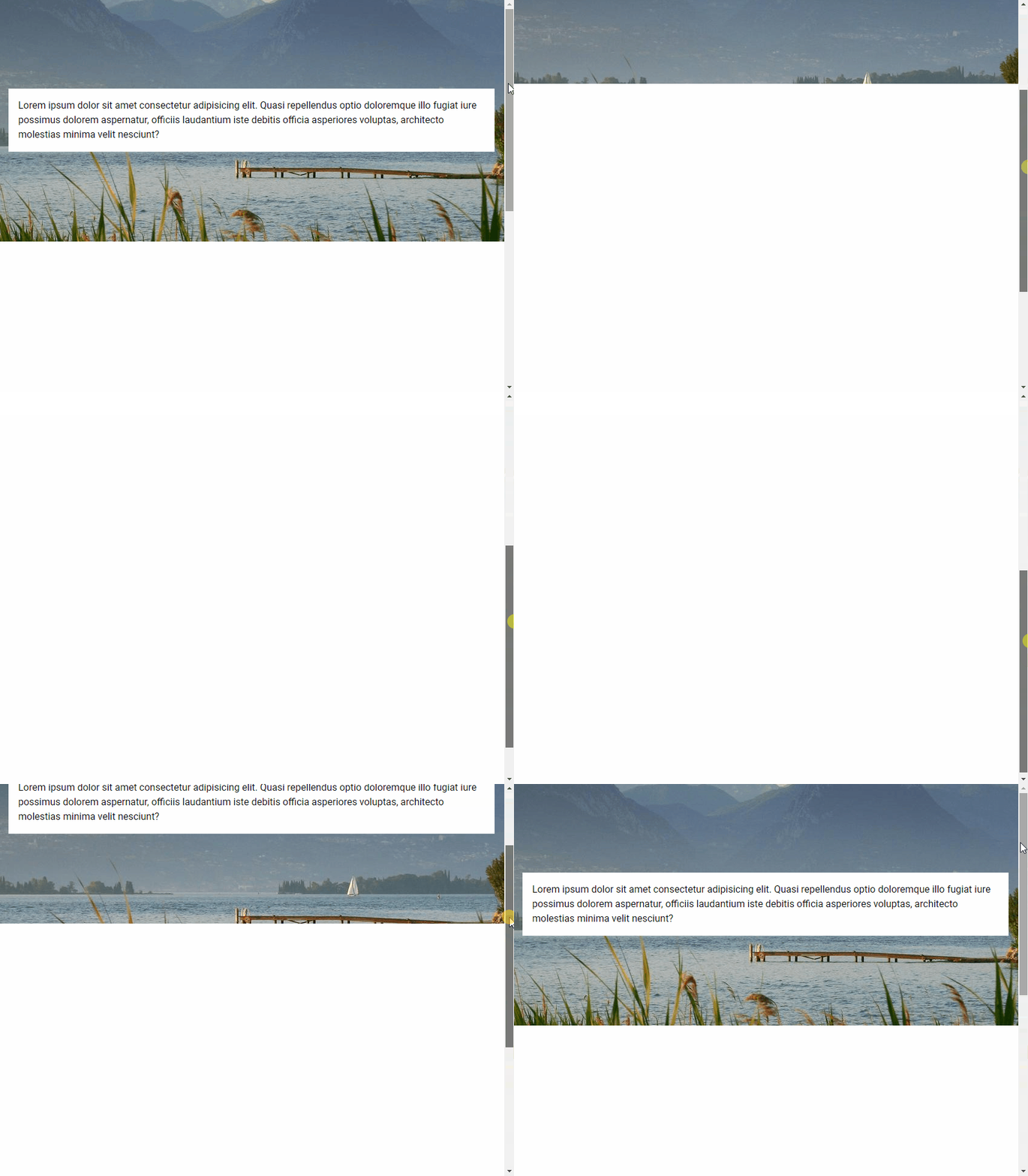
Vuetify provides the v-lazy component for dynamically loading a UI element based on its visibility. In this example, we’ll be lazy loading a card:
<template>
<v-app>
<v-responsive class="overflow-y-auto" max-height="400">
<div class="pa-6 text-center">Scroll down</div>
<v-responsive height="200vh" class="text-center pa-2">
<v-responsive min-height="50vh"></v-responsive>
<div class="text-center text-body-2 mb-12">
The card will appear below:
</div>
<v-lazy min-height="200" :options="{ threshold: 0.5 }">
<v-card class="mx-auto" max-width="336" color="indigo" dark>
<v-card-title>Card Title</v-card-title>
<v-card-text>
Lorem ipsum dolor sit amet, consectetur adipisicing elit. Ducimus
totam aperiam, necessitatibus facilis vitae, ratione officiis
animi earum veritatis repellat enim, dolore sed atque vero?
Aliquid, pariatur. Cumque, ad voluptate! Lorem ipsum dolor sit
amet consectetur adipisicing elit. Error vitae, illo tempore
quisquam velit distinctio ullam illum sint atque impedit suscipit?
Modi magni quae accusantium iusto ut explicabo sit facere?
</v-card-text>
</v-card>
</v-lazy>
</v-responsive>
</v-responsive>
</v-app>
</template>
<script>
export default {
name: 'App',
};
</script>
v-model
We can use v-model to set up a binding between the render visibility of the root element of v-lazy and a variable. In this code example below, the variable (cardVisible) will be set to true when the card comes into view.
<template>
<v-app>
<v-banner class="text-center">Card visible: {{ cardVisible }} </v-banner>
<v-responsive class="overflow-y-auto" max-height="400">
<div class="pa-6 text-center">Scroll down</div>
<v-responsive height="200vh" class="text-center pa-2">
<v-responsive min-height="50vh"></v-responsive>
<div class="text-center text-body-2 mb-12">
The card will appear below:
</div>
<v-lazy
min-height="200"
v-model="cardVisible"
:options="{ threshold: 0.5 }"
>
<v-card class="mx-auto" max-width="336" color="green" dark>
<v-card-title>Card Title</v-card-title>
<v-card-text>
Lorem ipsum dolor sit amet, consectetur adipisicing elit. Ducimus
totam aperiam, necessitatibus facilis vitae, ratione officiis
animi earum veritatis repellat enim, dolore sed atque vero?
Aliquid, pariatur. Cumque, ad voluptate! Lorem ipsum dolor sit
amet consectetur adipisicing elit. Error vitae, illo tempore
quisquam velit distinctio ullam illum sint atque impedit suscipit?
Modi magni quae accusantium iusto ut explicabo sit facere?
</v-card-text>
</v-card>
</v-lazy>
</v-responsive>
</v-responsive>
</v-app>
</template>
<script>
export default {
name: 'App',
data: () => ({
cardVisible: false,
}),
};
</script>
Vuetify Lazy Threshold
The Vuetify lazy component comes with the options prop for customizing its behaviours. These options are passed to the constructor of the Intersection Observer class that v-lazy uses internally. One of such options is threshold. We can set threshold to a number to indicate how much of the root element of v-lazy should come into the viewport before it is displayed. The default threshold is 0, which means that the element will be rendered as soon as even a single pixel enters the viewport.
<template>
<v-app>
<v-banner class="text-center">
<v-row>
<v-col> 0% </v-col>
<v-col> 50% </v-col>
<v-col> 100% </v-col>
</v-row>
</v-banner>
<v-responsive class="overflow-y-auto" max-height="400">
<div class="pa-6 text-center">Scroll down</div>
<v-responsive height="200vh" class="text-center pa-2">
<v-responsive min-height="50vh"></v-responsive>
<div class="text-center text-body-2 mb-12">
The cards will appear below:
</div>
<v-row>
<v-col>
<v-lazy min-height="200" :options="{ threshold: 0 }">
<v-card class="mx-auto" color="red" dark>
<v-card-title>Card Title</v-card-title>
<v-card-text>
Lorem ipsum dolor sit amet, consectetur adipisicing elit.
Ducimus totam aperiam, necessitatibus facilis vitae, ratione
officiis animi earum veritatis repellat enim, dolore sed atque
vero? Aliquid, pariatur. Cumque, ad voluptate!
</v-card-text>
</v-card>
</v-lazy>
</v-col>
<v-col>
<v-lazy min-height="200" :options="{ threshold: 0.5 }">
<v-card class="mx-auto" color="yellow darken-3" dark>
<v-card-title>Card Title</v-card-title>
<v-card-text>
Lorem ipsum dolor sit amet, consectetur adipisicing elit.
Ducimus totam aperiam, necessitatibus facilis vitae, ratione
officiis animi earum veritatis repellat enim, dolore sed atque
vero? Aliquid, pariatur. Cumque, ad voluptate!
</v-card-text>
</v-card>
</v-lazy>
</v-col>
<v-col>
<v-lazy min-height="200" :options="{ threshold: 1 }">
<v-card class="mx-auto" color="blue" dark>
<v-card-title>Card Title</v-card-title>
<v-card-text>
Lorem ipsum dolor sit amet, consectetur adipisicing elit.
Ducimus totam aperiam, necessitatibus facilis vitae, ratione
officiis animi earum veritatis repellat enim, dolore sed atque
vero? Aliquid, pariatur. Cumque, ad voluptate!
</v-card-text>
</v-card>
</v-lazy>
</v-col>
</v-row>
</v-responsive>
</v-responsive>
</v-app>
</template>
<script>
export default {
name: 'App',
};
</script>
Custom Transition
v-lazy also comes with the transition prop that we can use to customize the transition the root element uses to come into view (the default is a fade-transition). For example, we can set a scale-transition to make it grow into view:
<template>
<v-app>
<v-responsive class="overflow-y-auto" max-height="400">
<div class="pa-6 text-center">Scroll down</div>
<v-responsive height="200vh" class="text-center pa-2">
<v-responsive min-height="50vh"></v-responsive>
<div class="text-center text-body-2 mb-12">
The card will appear below:
</div>
<v-lazy
min-height="200"
:options="{ threshold: 1 }"
transition="scale-transition"
>
<v-card class="mx-auto" color="purple accent-4" dark max-width="300">
<v-card-title>Card Title</v-card-title>
<v-card-text>
Lorem ipsum dolor sit amet, consectetur adipisicing elit. Ducimus
totam aperiam, necessitatibus facilis vitae, ratione officiis
animi earum veritatis repellat enim, dolore sed atque vero?
Aliquid, pariatur. Cumque, ad voluptate!
</v-card-text>
</v-card>
</v-lazy>
</v-responsive>
</v-responsive>
</v-app>
</template>
<script>
export default {
name: 'App',
};
</script>
Conclusion
Lazy loading is a useful technique for reducing page loading times and optimizing performance. We can use the Vuetify lazy component (v-lazy) to implement lazy loading.
Tooltips are useful for passing on information when a user hovers over an element in an interface. When a tooltip is activated, it displays a text label that identifies its associated element, for example, describing its function. Read on to find out more about the Vuetify tooltip component and the different customization options provided.
The v-tooltip Component
Vuetify provides the v-tooltip component for creating a tooltip. v-tooltip can wrap any element.
We can use one of the position props (top, bottom, left, or right) of the v-tooltip component to set the tooltip alignment. Note that it is required to set one of these props.
<template>
<v-app>
<div class="d-flex ma-4 justify-space-around">
<v-tooltip left>
<template v-slot:activator="{ on, attrs }">
<v-btn color="primary" dark v-bind="attrs" v-on="on"> Left </v-btn>
</template>
<span>Left tooltip</span>
</v-tooltip>
<v-tooltip top>
<template v-slot:activator="{ on, attrs }">
<v-btn color="primary" dark v-bind="attrs" v-on="on"> Top </v-btn>
</template>
<span>Top tooltip</span>
</v-tooltip>
<v-tooltip bottom>
<template v-slot:activator="{ on, attrs }">
<v-btn color="primary" dark v-bind="attrs" v-on="on"> Bottom </v-btn>
</template>
<span>Bottom tooltip</span>
</v-tooltip>
<v-tooltip right>
<template v-slot:activator="{ on, attrs }">
<v-btn color="primary" dark v-bind="attrs" v-on="on"> Right </v-btn>
</template>
<span>Right tooltip</span>
</v-tooltip>
</div>
</v-app>
</template>
<script>
export default {
name: 'App',
};
</script>
Vuetify Tooltip Colors
Like many other components in Vuetify, the v-tooltip component comes with the color prop for customizing the color of the tooltip.
Using v-model on a v-tooltip allows us to set up a two-way binding between the visibility of the tooltip and a variable. For example, in the code below, we’ve created a button and a tooltip below it. Clicking the button will negate the show variable and toggle the visibility of the tooltip.
A tooltip is useful for conveying information when the user hovers over an element. Use the Vuetify tooltip component (v-tooltip) and its various props to create and customize tooltips.
Images are an indispensable part of every user interface. They improve the user experience and increase engagement. An image can be used along with text to explain a concept or convey information quickly, as people tend to process visual information faster. In this article, we’re going to learn how to display an image in Vuetify with the v-img component.
The Vuetify Image Component
Vuetify provides the v-img component for presenting an image. This component comes with various props to customize the appearance of the image.
Use the aspect-ratio prop of the v-img component to set a fixed aspect ratio. The ratio between the height and width stays the same when the image is resized.
When the provided aspect ratio doesn’t match that of the actual image, the v-img component will fill as much space and clip the sides of the image. Setting the contain prop to true will stop this from happening, but will result in empty space at the sides.
The Vuetify image component automatically grows to the size of its src and preserves the correct aspect ratio. We can use the height and max-height props to limit this:
We can use the v-img placeholder slot to display custom content while the image is loading. The image in the example below has a bad src and it won’t load so we can see the placeholder.
Images are an important part of every interface that can help to increase engagement, decorate the UI and enable users to process information faster. We can use the Vuetify image component (v-img) to show images and customize the way they are displayed.
A circular progress bar is used to pass on information to the user about some ongoing operation. Just like horizontal progress bars, they visually signify how far the operation has advanced. Read on to learn about the Vuetify progress circular component and the various ways in which we can customize it.
The Vuetify Progress Circular Component
Vuetify provides the v-progress-circular component for creating circular progress bars. We use the value prop to set the progress bar value to a number between 0 and 100 inclusive.
Similar to the Vuetify progress linear component, v-progress-circular can be set to an indeterminate mode. It animates continuously when indeterminate:
The size prop of v-progress-circular allows us to modify the height of the circular progress bar, while the width prop enables customization of the thickness of the progress bar.
A circular progress bar conveys information to the user about the current progress on an ongoing process in an application. Use the Vuetify progress circular component (v-progress-circular) to create and customize circular progress bars.
Progress bars are used in an interface to pass on information to users related to the known progression of a certain operation. They visually signify how far the operation has advanced and can be circular or horizontal. They can also be indefinite to indicate the loading or processing of data. In this article, we’re going to learn how to create a horizontal progress bar with the Vuetify progress linear component.
The v-progress-linear Component
Vuetify provides the v-progress-linear component for creating a horizontal progress bar.
To see this two-way binding in action, let’s create two buttons to change the progress bar value and some text to display this value. We spaced the buttons apart with one of the Vuetify spacing helper classes (ma-2).
A buffer state simultaneously represents two values. The primary value is controlled by v-model, while the buffer value is controlled by the buffer-value prop:
Here, we simply display the progress bar value as a percentage:
Using a Progress Bar as a Loading Indicator
One instance where the progress linear component is useful is in communicating to the user that a response is pending. Like when fetching the user’s photos from a server in a sample photo app.
A progress bar can also function as an app bar loader. With the absolute and bottom props, we can position it at the bottom of the app bar and control its visibility with the active prop:
A progress bar conveys information to the user about the current progress of an ongoing event in an application. Use the Vuetify progress linear component (v-progress-linear) and its various props to create and customize horizontal linear progress bars.
A menu is a versatile component in a user interface. It shows a popover that can serve various functions, such as displaying a list of options. They can be used with other components like a toolbar, app bar, or a button. In this article, we’re to learn how to create and customize a menu in Vuetify.
The v-menu Component
Vuetify provides the v-menu component for creating a menu. We use the activator slot to set the component that will activate the menu when clicked. We set it to a button in this example:
We can also use a menu without an activator by using absolute together with the position-x and position-y props. This is useful for creating a context menu:
We can also display a tooltip for a menu. We do this by nesting activator slots with the v-slot syntax and attaching the props of the slots to the same activator component (a button in this case).
<template>
<v-app>
<div class="text-center ma-4">
<v-menu>
<template v-slot:activator="{ on: menu, attrs }">
<v-tooltip bottom>
<template v-slot:activator="{ on: tooltip }">
<v-btn
color="primary"
dark
v-bind="attrs"
v-on="{ ...tooltip, ...menu }"
>
Dropdown w/ Tooltip</v-btn
>
</template>
<span>This is a tooltip</span>
</v-tooltip>
</template>
<v-list>
<v-list-item v-for="index in 4" :key="index">
<v-list-item-title>Item {{ index }}</v-list-item-title>
</v-list-item>
</v-list>
</v-menu>
</div>
</v-app>
</template>
<script>
export default {
name: 'App',
};
</script>
Custom Menu Transitions in Vuetify
We can also customize the transition that the menu will use to open and close. Vuetify comes with three standard transitions: scale, slide-x and slide-y.
Scale Transition
The scale-transition makes the menu grow in size when opening, and shrink back when closing:
A menu is a versatile user interface component in a user interface that shows a popover that we can use for a variety of purposes. It can work with a button, a toolbar or an app bar. Vuetify provides the v-menu component for creating and customizing menus.
An app bar is an important part of every user interface and is typically the primary source of site navigation. Like a toolbar, it is displayed at the top of the screen and can be combined with a navigation drawer or tabs. In this article, we’re going to learn how to create and customize app bars with Vuetify.
The v-app-bar Component
Vuetify provides the v-app-bar component for creating app bars. We use the app prop on the component to make Vuetify consider the app bar when dynamically sizing other components, such as v-main.
Note: While we could use the v-app-bar-title component to set the app bar title, the Vuetify team does not recommend using it without the shrink-on-scroll prop (discussed later in this article), as it would add an unnecessary resize watcher and additional calculations.
App Bar Nav Icon
v-app-bar-nav-icon is a styled icon button component created specifically for use with a toolbar or app bar. An app bar nav icon is typically placed on the left side of the toolbar or app bar as a hamburger menu, and is often used to control the state of a navigation drawer. We can customize the icon and function of this component with the default slot.
When we set the elevate-on-scroll prop to true, the app bar will rest at an elevation of 0dp until the user begins to scroll down. The elevation raises to 4dp once scrolling begins.
With the shrink-on-scroll prop, we can a prominent app bar reduce in height as the user scrolls down. This allows for a smooth transition to taking up less visual space when the user is scrolling through content.
We can display background images on the app bar with the src prop. When we set an image, the color prop acts as a fallback color that the app bar will display when the image has not yet loaded or fails to load.
We might want to make the background image on the app bar fade as the user scrolls down. We can do this with the fade-img-on-scroll prop. As we scroll, the image reduces in opacity until it totally fades away and we can only see the background color.
When the inverted-scroll prop is set to true, the app bar will hide until the user scrolls past the designated threshold. Once past the threshold, the app bar will continue to display until the user scrolls up past the threshold. If the scroll-treshold prop is not set, a default value of 0 will be used.
We can add an app bar to a user interface for quick and easy navigation. Vuetify provides the v-app-bar component for creating and customizing the behaviour and appearance of an app bar.
Every user interface contains some text. Different texts have different styles according to their purpose in the UI. Vuetify provides various classes that we can use to control various text properties such as size, alignment, wrapper, overflow and transforms. We’re going to learn about these typography helper classes in this article.
Font Size
Vuetify comes with classes for modifying the font size and style of a text. They are of the following formats:
.text-{value} for the xs breakpoint.
.text-{breakpoint}-{value} for the sm, md, lg and xl breakpoints.
Vuetify also provides typography classes that control the font emphasis of the text. Material Design supports italicized text and font weights of 100, 300, 400, 500, 700 and 900.
text-left, text-center, and text-right are typography classes used to set the alignment of text:
<template>
<v-app>
<div class="ma-4">
<p class="text-left">Left aligned text on all viewport sizes.</p>
<p class="text-center">Center aligned text on all viewport sizes.</p>
<p class="text-right">Right aligned text on all viewport sizes.</p>
</div>
</v-app>
</template>
<script>
export default {
name: 'App',
};
</script>
Just like with font weights, Vuetify also comes with typography classes for targeting certain viewport width ranges. They include:
text-sm-{value}
text-md-{value}
text-lg-{value}
text-xl-{value}
value can be left, center or right.
Text Decoration
In addition, Vuetify has typography classes for adding text decorations. There are of the form text-decoration-{value}, where value can be none, overline, underline or line-through.
Opacity typography helper classes are another handy way of adjusting text emphasis with Vuetify. text--primary has the same opacity as default text, text--secondary is used for hints and helper text. De-emphasize text with text--disabled.
<template>
<v-app>
<div class="ma-4">
<p class="text--primary">
High-emphasis has an opacity of 87% in light theme and 100% in dark.
</p>
<p class="text--secondary">
Medium-emphasis text and hint text have opacities of 60% in light theme
and 70% in dark.
</p>
<p class="text--disabled">
Disabled text has an opacity of 38% in light theme and 50% in dark.
</p>
</div>
</v-app>
</template>
<script>
export default {
name: 'App',
};
</script>
Text Transform
We can transform text with Vuetify using the text capitalization typography classes. They are text-lowercase, text-uppercase, and text-capitalize.
The text-no-wrap typography class allows us to prevent text wrapping:
<template>
<v-app>
<div class="text-no-wrap blue ma-4" style="width: 8rem">
This text should overflow the parent.
</div>
</v-app>
</template>
<script>
export default {
name: 'App',
};
</script>
Summary
Typography is an important aspect of every user interface. Vuetify provides various helper classes to allow us easily modify text properties.
We use an alert to pass on important information to users by using contextual icons and colors. The icon and color match the type of message it conveys to the user. In this article, we’re going to learn how to create and customize alert notifications with the Vuetify alert component.
The Vuetify Alert Component (v-alert)
Vuetify provides the v-alert component for creating alerts:
The border prop adds a border to one of the 4 sides of the alert. They are four possible values for each of the sides: top, bottom, left, and right.
<template>
<v-app>
<div class="d-flex justify-center ma-4">
<v-col sm="6">
<v-alert border="top" color="red lighten-2" dark>
I'm an alert with a top border and red color
</v-alert>
<v-alert border="right" color="green" dark>
I'm an alert with a right border and green color
</v-alert>
<v-alert border="bottom" color="pink darken-1" dark>
I'm an alert with a bottom border and pink color
</v-alert>
<v-alert border="left" color="indigo" dark>
I'm an alert with a left border and indigo color
</v-alert>
</v-col>
</div>
</v-app>
</template>
<script>
export default {
name: 'App',
};
</script>
Vuetify Alert Colored Border
The colored-prop will remove the alert background in order to emphasize the border, whose color is set to the value of the color prop:
Clicking the close button will set the alert value to false, which will hide the alert:
The alert is no longer visible.
Vuetify Alert v-model
We can also directly control the visibility of the alert from code by using v-model to create a two-way binding between a variable and the alert value.
To see how to do this in practice, let’s create a button below the now hidden alert from our previous code sample. We’ll also set up the two-way binding between an alert variable and the visibility of the alert.
Setting the outlined prop to true will display the outlined variant of an alert. This outlined style makes the alert background transparent and sets the color of its border and text to the value of the color prop.
We can customize the transition an alert shows when toggling its visibility, using the transition prop. For example, in the code below we set the transition prop to scale-transition, which will make the alert display a scale transition when it is being hidden or shown.
v-alert comes with a type prop which provides 4 styles that modify the icon and color of the alert. These styles are success, info, warning, and error.
<template>
<v-app>
<div class="d-flex justify-center ma-4">
<v-col sm="6">
<v-alert type="success"> I'm a success alert. </v-alert>
<v-alert type="info"> I'm an info alert. </v-alert>
<v-alert type="warning"> I'm a warning alert. </v-alert>
<v-alert type="error"> I'm an error alert. </v-alert>
</v-col>
</div>
</v-app>
</template>
<script>
export default {
name: 'App',
};
</script>
Summary
An alert is useful for conveying important information to our users using contextual icons and colors. Vuetify provides the v-alert component for creating and customizing alerts.