Tari Ibaba is a software developer with years of experience building websites and apps. He has written extensively on a wide range of programming topics and has created dozens of apps and open-source libraries.
To get the key of an object by value in JavaScript, call the Object.keys() method to get the object keys, then use the find() to find the key associated with the specified value. For example:
The Arrayfind() method searches for the element in an array for which a certain condition is true. The condition is specified in the callback testing function passed to find(). The condition we specified only evaluates to true for a key in the array if its corresponding value is equal the value passed to the getObjectKey() function.
Info
If the find() method can’t find any element that satisfies the condition, it returns undefined:
The find() method only returns the first element in the array that satisfies the testing function. If the object containing multiple keys with the same value, it will return only the first key it finds:
In this article, we’ll be looking at some ways to quickly get the last character of a string in JavaScript.
1. String at() Method
The get the last character of a string, we can call the at() method on the string, passing -1 as an argument. For example, str.at(-1) returns a new string containing the last character of str.
The Stringat() method returns the character of a string at the specified index. When negative integers are passed to at(), it counts back from the last string character.
2. String charAt() Method
Alternatively, to get the last character of a string, we can call the charAt() method on the string, passing the last character index as an argument. For example, str.charAt(str.length - 1) returns a new string containing the last character of str.
The StringcharAt() method takes an index and returns the character of the string at that index.
Tip
In JavaScript, arrays use zero-based indexing. This means that the first character has an index of 0, and the last character has an index of str.length - 1.
Note
If we pass an index to charAt() that doesn’t exist on the string, it returns an empty string (''):
We can also use the bracket notation ([]) to access the last character of a string. Just like with the charAt() method we use str.length - 1 as an index to access the last character.
With this method, we call the split() method on the string to get an array of characters, then we call pop() on this array to get the last character of the string.
The Array pop() method removes the last element from an array and returns that element. We call it on the array of characters to get the last character.
The “cannot read property ‘constructor’ of undefined” error occurs when you attempt to access the constructor property of a variable that is undefined. To fix it, perform an undefined check on the variable before trying to access the constructor property.
const user = undefined;

// TypeError: Cannot read properties of undefined (reading 'constructor')
const User = user.constructor;
const newUser = new User();
In this example, the user variable is undefined, so we get an error when we try to access a property from it. We fix it by checking if the variable is nullish before accessing the constructor property. We can do this with the optional chaining operator (?.):
const user = undefined;

// Optional chaining in if statement
if (user?.constructor) {
  const User = user?.constructor;
  const newUser = new User();
}
Using the optional chaining operator on a variable will return undefined and prevent the property access if the variable is nullish (null or undefined).
We can also use an if statement to check if the variable is truthy:
const user = undefined;

// Check if 'user' is truthy
if (user && user.constructor) {
  const User = user.constructor;
  const newUser = new User();
}
Tip
In JavaScript, the constructor property of an instance object returns a reference to the Object constructor function that created the object.
let obj1 = {};
obj1.constructor === Object; // -> true

let obj2 = new Object();
obj2.constructor === Object; // -> true

let arr1 = [];
arr1.constructor === Array; // -> true

let arr2 = new Array();
arr2.constructor === Array; // -> true

let num = new Number(3)
num.constructor === Number; // -> true
Are you experiencing the “cannot read property ‘replace’ of undefined” error in JavaScript? This error occurs when you attempt to call the replace() method on a variable that has a value of undefined.
To fix the “cannot read property ‘replace’ of undefined” error, perform an undefined check on the variable before calling the replace() method on it. There are various ways to do this, and we’ll cover 4 of them in this article.
1. Use an if Statement
We can use an if statement to check if the variable is truthy before calling the replace() method:
const str = undefined;

let result = undefined;
// Check if truthy
if (str) {
  result = str.replace('old', 'new');
}

console.log(result); // undefined
2. Use Optional Chaining
We can use the optional chaining operator (?.) to return undefined and prevent the method call if the variable is nullish (null or undefined):
4. Use a Fallback Result Instead of Calling replace()
We can combine the optional chaining operator (?.) and the nullish coalescing operator (??) to provide a fallback value to use as the result, instead of performing the replacement.
We can fix the error by adding an optional chaining operator (?.) on the variable before accessing a property. If the variable is undefined or null, the operator will return undefined immediately and prevent property access.
Before the optional chaining was available, the only way we could avoid this error was to manually check for the truthiness of every containing object of the property in the nested hierarchy, for example:
JavaScriptCopied!
const a = undefined;

// Optional chaining
if (a?.b?.c?.d?.e) {
  console.log(`e: ${e}`);
}

// No optional chaining
if (a && a.b && a.b.c && a.b.c.d && a.b.c.d.e) {
  console.log(`e: ${e}`);
}
2. Use replacement for undefined variable
In the first approach, we don’t access the property or method when the variable turns out to be undefined. In this solution, we provide a fallback value that we’ll access the property or method on.
const arr = undefined;

// Using "0" as a fallback value
const arrLength = arr?.length ?? 0;

console.log(arrLength); // 0


const str = undefined;

// Using "0" as a fallback value
const strLength = str?.length ?? 0;

console.log(strLength); // 0
4. Find out why the variable is undefined
The solutions above are handy when we don’t know beforehand if the variable will be undefined or not. But there are situations where the “cannot read property of undefined” error is caused by a coding error that led to the variable being undefined.
Make sure variables are initialized
It could be that you forgot to initialize the variable:
JavaScriptCopied!
let doubles;
const nums = [1, 2, 3, 4, 5];
for (const num of nums) {
let double = num * 2;
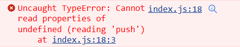
// ❌ TypeError: cannot read properties of undefined (reading 'push')
doubles.push(double);
}
console.log(doubles);
Because an uninitialized variable has a default value of undefined in JavaScript, accessing a property/method causes the error to be thrown.
The obvious fix for the error, in this case, is to assign the variable to a defined value.
JavaScriptCopied!
// ✅ "doubles" initialized before use
let doubles = [];

let nums = [1, 2, 3, 4, 5];

for (const num of nums) {
  let double = num * 2;

  //  push() called - no error thrown
  doubles.push(double);
}

console.log(doubles); // [ 2, 4, 6, 8, 10 ]
Make sure called function returns value
If the property you’re accessing is from a function call result, the error may have occurred because you forgot to actually return a value in the function.
To fix the error in this case, we’ll simply return fetch()‘s Promise:
JavaScriptCopied!
async function getUserData(userId) {
  if (userId) {
    const response = await fetch(`/api/users/${userId}`);
    return response.json();
  }
  // 😕 No return if userId is absent
}

// ❌ Cannot read property 'then' of undefined if userId is absent
getUserData().then(data => console.log(data));
Make sure type is correct
Another common mistake that causes this error is accessing an element from an array variable before accessing an Array property/method instead of accessing the property/method on the actual array variable.
Accessing the 0 property with bracket indexing gives us the element at the index 0 of the array. The array has no element, so arr[0] evaluates to undefined and calling push() on it causes the error.
To fix this, we need to call the method on the array variable, not one of its elements.
We first convert the string to an object and then to an array, because we can’t parse a JSON string to a Map directly. The Object.entries() method takes an object and returns a list of key-value pairs that correspond to the key and value of each property of the object:
The Map() constructor can take an iterable of key-value pairs to create the Map elements, so we pass the result of the Object.entries() directly to it.
Convert Map to JSON
To convert the Map back to a JSON string, call the Object.fromEntries() method with the Map as an argument, and pass the result to the JSON.stringify() method:
We first transform the Map with Object.fromEntries(), because we can’t serialize a Map to a JSON string directly. The Object.fromEntries() method transforms any list of key-value pairs into an object:
In this article, we’ll be exploring some ways to quickly get the first element of a Map object in JavaScript.
1. Call next() on Map entries()
To get the first element of a Map, we can call the entries() on the Map to get an iterable object, then call the next() method on this iterable. For example:
The Mapentries() method returns an iterable of key-value pairs for all elements of the Map. The next() method returns the next element in the iterable sequence. Since it’s the first time we’re calling it on the iterable, it returns the first element in the sequence. We use the value property of the element to get the key-value pair representing the first element of the Map.
2. Array.from()
We can also use the Array.from() method to get the first element of the Map:
On a Map with many elements, this method is significantly slower than the first, as it creates a new array from all the Map elements. We conducted a performance comparison between the two methods on a Map with 1 million elements, and these were the results on average: