A menu is a versatile component in a user interface. It shows a popover that can serve various functions, such as displaying a list of options. They can be used with other components like a toolbar, app bar, or a button. In this article, we’re to learn how to create and customize a menu in Vuetify.
The v-menu Component
Vuetify provides the v-menu component for creating a menu. We use the activator slot to set the component that will activate the menu when clicked. We set it to a button in this example:
<template>
  <v-app>
    <div class="text-center ma-4">
      <v-menu offset-y>
        <template v-slot:activator="{ on, attrs }">
          <v-btn color="primary" dark v-bind="attrs" v-on="on">
            Dropdown
          </v-btn>
        </template>
        <v-list>
          <v-list-item v-for="index in 4" :key="index">
            <v-list-item-title>Item {{ index }}</v-list-item-title>
          </v-list-item>
        </v-list>
      </v-menu>
    </div>
  </v-app>
</template>

<script>
export default {
  name: 'App',
};
</script>
Clicking the button will display the popover menu:

Creating an Absolute Menu in Vuetify
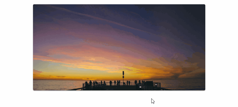
We can place a menu on the top of the element in the activator slot with the absolute prop.
<template>
  <v-app>
    <div class="d-flex justify-center ma-4">
      <v-menu offset-y absolute>
        <template v-slot:activator="{ on, attrs }">
          <v-card
            class="portrait"
            img="https://picsum.photos/1920/1080?random"
            height="300"
            width="600"
            v-bind="attrs"
            v-on="on"
          ></v-card>
        </template>
        <v-list>
          <v-list-item v-for="index in 4" :key="index">
            <v-list-item-title>Item {{ index }}</v-list-item-title>
          </v-list-item>
        </v-list>
      </v-menu>
    </div>
  </v-app>
</template>

<script>
export default {
  name: 'App',
};
</script>

Absolute Menu without Activator
We can also use a menu without an activator by using absolute together with the position-x and position-y props. This is useful for creating a context menu:
<template>
  <v-app>
    <div>
      <div class="d-flex justify-center ma-4">
        <v-card
          :ripple="false"
          class="portrait"
          img="https://picsum.photos/1920/1080?random"
          height="300"
          width="600"
          @contextmenu="show"
        ></v-card>
      </div>
      <v-menu
        v-model="showMenu"
        :position-x="x"
        :position-y="y"
        absolute
        offset-y
      >
        <v-list>
          <v-list-item v-for="index in 4" :key="index">
            <v-list-item-title>Option {{ index }}</v-list-item-title>
          </v-list-item>
        </v-list>
      </v-menu>
    </div>
  </v-app>
</template>

<script>
export default {
  name: 'App',
  data: () => ({
    showMenu: false,
    x: 0,
    y: 0,
  }),

  methods: {
    show(e) {
      e.preventDefault();
      this.showMenu = false;
      this.x = e.clientX;
      this.y = e.clientY;
      this.$nextTick(() => {
        this.showMenu = true;
      });
    },
  },
};
</script>
Closing the Menu on Click
The close-on-click prop determines whether the menu closes when it loses focus or not.
<template>
  <v-app>
    <div class="text-center ma-4">
      <v-menu offset-y :close-on-click="true">
        <template v-slot:activator="{ on, attrs }">
          <v-btn color="primary" dark v-bind="attrs" v-on="on">
            Dropdown
          </v-btn>
        </template>
        <v-list>
          <v-list-item v-for="index in 4" :key="index">
            <v-list-item-title>Item {{ index }}</v-list-item-title>
          </v-list-item>
        </v-list>
      </v-menu>
    </div>
  </v-app>
</template>

<script>
export default {
  name: 'App',
};
</script>
Here close-on-click is set to true, so clicking on another element will close the menu:

If we set it to false:
<template>
  <v-app>
    <div class="text-center ma-4">
      <v-menu offset-y :close-on-click="false">
        <template v-slot:activator="{ on, attrs }">
          <v-btn color="primary" dark v-bind="attrs" v-on="on">
            Dropdown
          </v-btn>
        </template>
        <v-list>
          <v-list-item v-for="index in 4" :key="index">
            <v-list-item-title>Item {{ index }}</v-list-item-title>
          </v-list-item>
        </v-list>
      </v-menu>
    </div>
  </v-app>
</template>

<script>
export default {
  name: 'App',
};
</script>
It will remain open even when we click on another element or remove its focus:

Close Menu on Content Click
We can use the close-on-content-click prop to determine whether the menu should be closed when its content is clicked.
Setting close-on-content-click to true:
<template>
  <v-app>
    <div class="text-center ma-4">
      <v-menu offset-y :close-on-content-click="true">
        <template v-slot:activator="{ on, attrs }">
          <v-btn color="purple accent-4" dark v-bind="attrs" v-on="on">
            Dropdown
          </v-btn>
        </template>
        <v-list>
          <v-list-item v-for="index in 4" :key="index">
            <v-list-item-title>Item {{ index }}</v-list-item-title>
          </v-list-item>
        </v-list>
      </v-menu>
    </div>
  </v-app>
</template>

<script>
export default {
  name: 'App',
};
</script>

Setting close-on-content-click to false:
<template>
  <v-app>
    <div class="text-center ma-4">
      <v-menu offset-y :close-on-content-click="false">
        <template v-slot:activator="{ on, attrs }">
          <v-btn color="purple accent-4" dark v-bind="attrs" v-on="on">
            Dropdown
          </v-btn>
        </template>
        <v-list>
          <v-list-item v-for="index in 4" :key="index">
            <v-list-item-title>Item {{ index }}</v-list-item-title>
          </v-list-item>
        </v-list>
      </v-menu>
    </div>
  </v-app>
</template>

<script>
export default {
  name: 'App',
};
</script>

Disabled Menu
We can prevent a menu from being opened with the disabled prop:
<template>
  <v-app>
    <div class="text-center ma-4">
      <v-menu offset-y disabled>
        <template v-slot:activator="{ on, attrs }">
          <v-btn color="green" dark v-bind="attrs" v-on="on"> Dropdown </v-btn>
        </template>
        <v-list>
          <v-list-item v-for="index in 4" :key="index">
            <v-list-item-title>Item {{ index }}</v-list-item-title>
          </v-list-item>
        </v-list>
      </v-menu>
    </div>
  </v-app>
</template>

<script>
export default {
  name: 'App',
};
</script>

Menu Offset
Offset X
We can use the offset-x prop to offset the menu by the X-axis to make the activator visible.
<template>
  <v-app>
    <div class="text-center ma-4">
      <v-menu offset-x>
        <template v-slot:activator="{ on, attrs }">
          <v-btn color="primary" dark v-bind="attrs" v-on="on">
            Dropdown
          </v-btn>
        </template>
        <v-list>
          <v-list-item v-for="index in 4" :key="index">
            <v-list-item-title>Item {{ index }}</v-list-item-title>
          </v-list-item>
        </v-list>
      </v-menu>
    </div>
  </v-app>
</template>

<script>
export default {
  name: 'App',
};
</script>

Offset Y
We can also offset the menu by the Y-axis to make the activator visible.
<template>
  <v-app>
    <div class="text-center ma-4">
      <v-menu offset-y>
        <template v-slot:activator="{ on, attrs }">
          <v-btn color="primary" dark v-bind="attrs" v-on="on">
            Dropdown
          </v-btn>
        </template>
        <v-list>
          <v-list-item v-for="index in 4" :key="index">
            <v-list-item-title>Item {{ index }}</v-list-item-title>
          </v-list-item>
        </v-list>
      </v-menu>
    </div>
  </v-app>
</template>

<script>
export default {
  name: 'App',
};
</script>

Offset X and Offset Y
We can also combine these two props:
<template>
  <v-app>
    <div class="text-center ma-4">
      <v-menu offset-x offset-y>
        <template v-slot:activator="{ on, attrs }">
          <v-btn color="primary" dark v-bind="attrs" v-on="on">
            Dropdown
          </v-btn>
        </template>
        <v-list>
          <v-list-item v-for="index in 4" :key="index">
            <v-list-item-title>Item {{ index }}</v-list-item-title>
          </v-list-item>
        </v-list>
      </v-menu>
    </div>
  </v-app>
</template>

<script>
export default {
  name: 'App',
};
</script>

Open Menu on Hover
Setting the open-on-hover prop to true will make the menu open when its activator is hovered over.
<template>
  <v-app>
    <div class="text-center ma-4">
      <v-menu open-on-hover offset-y>
        <template v-slot:activator="{ on, attrs }">
          <v-btn color="teal" dark v-bind="attrs" v-on="on"> Dropdown </v-btn>
        </template>
        <v-list>
          <v-list-item v-for="index in 4" :key="index">
            <v-list-item-title>Item {{ index }}</v-list-item-title>
          </v-list-item>
        </v-list>
      </v-menu>
    </div>
  </v-app>
</template>

<script>
export default {
  name: 'App',
};
</script>

Creating a Rounded Menu in Vuetify
The rounded prop allows us to customize the border-radius of a menu.
Setting it to 0 will remove the border-radius:
<template>
  <v-app>
    <div class="text-center ma-4">
      <v-menu offset-y rounded="0">
        <template v-slot:activator="{ on, attrs }">
          <v-btn color="blue" dark v-bind="attrs" v-on="on">
            Removed Radius
          </v-btn>
        </template>
        <v-list>
          <v-list-item v-for="index in 4" :key="index">
            <v-list-item-title>Item {{ index }}</v-list-item-title>
          </v-list-item>
        </v-list>
      </v-menu>
    </div>
  </v-app>
</template>

<script>
export default {
  name: 'App',
};
</script>

We can give the menu a large border-radius by setting rounded to true:
<template>
  <v-app>
    <div class="text-center ma-4">
      <v-menu offset-y rounded="lg">
        <template v-slot:activator="{ on, attrs }">
          <v-btn color="indigo" dark v-bind="attrs" v-on="on">
            Large Radius</v-btn
          >
        </template>
        <v-list>
          <v-list-item v-for="index in 4" :key="index">
            <v-list-item-title>Item {{ index }}</v-list-item-title>
          </v-list-item>
        </v-list>
      </v-menu>
    </div>
  </v-app>
</template>

<script>
export default {
  name: 'App',
};
</script>

We can also specify a custom border-radius, for example:
<template>
  <v-app>
    <div class="text-center ma-4">
      <v-menu offset-y rounded="b-xl">
        <template v-slot:activator="{ on, attrs }">
          <v-btn color="red" dark v-bind="attrs" v-on="on">
            Custom Radius</v-btn
          >
        </template>
        <v-list>
          <v-list-item v-for="index in 4" :key="index">
            <v-list-item-title>Item {{ index }}</v-list-item-title>
          </v-list-item>
        </v-list>
      </v-menu>
    </div>
  </v-app>
</template>

<script>
export default {
  name: 'App',
};
</script>

Using a Menu with a Tooltip
We can also display a tooltip for a menu. We do this by nesting activator slots with the v-slot syntax and attaching the props of the slots to the same activator component (a button in this case).
<template>
  <v-app>
    <div class="text-center ma-4">
      <v-menu>
        <template v-slot:activator="{ on: menu, attrs }">
          <v-tooltip bottom>
            <template v-slot:activator="{ on: tooltip }">
              <v-btn
                color="primary"
                dark
                v-bind="attrs"
                v-on="{ ...tooltip, ...menu }"
              >
                Dropdown w/ Tooltip</v-btn
              >
            </template>
            <span>This is a tooltip</span>
          </v-tooltip>
        </template>
        <v-list>
          <v-list-item v-for="index in 4" :key="index">
            <v-list-item-title>Item {{ index }}</v-list-item-title>
          </v-list-item>
        </v-list>
      </v-menu>
    </div>
  </v-app>
</template>

<script>
export default {
  name: 'App',
};
</script>

Custom Menu Transitions in Vuetify
We can also customize the transition that the menu will use to open and close. Vuetify comes with three standard transitions: scale, slide-x and slide-y.
Scale Transition
The scale-transition makes the menu grow in size when opening, and shrink back when closing:
<template>
  <v-app>
    <div class="text-center ma-4">
      <v-menu transition="scale-transition" origin="center center" bottom>
        <template v-slot:activator="{ on, attrs }">
          <v-btn color="primary" dark v-bind="attrs" v-on="on">
            Scale Transition</v-btn
          >
        </template>
        <v-list>
          <v-list-item v-for="index in 4" :key="index">
            <v-list-item-title>Item {{ index }}</v-list-item-title>
          </v-list-item>
        </v-list>
      </v-menu>
    </div>
  </v-app>
</template>

<script>
export default {
  name: 'App',
};
</script>

Slide X Transition
The slide-x-transition makes the menu slide in from the left when opening, and slide back out when closing:
<template>
  <v-app>
    <div class="text-center ma-4">
      <v-menu transition="slide-x-transition" bottom right>
        <template v-slot:activator="{ on, attrs }">
          <v-btn color="primary" dark v-bind="attrs" v-on="on">
            Slide X Transition</v-btn
          >
        </template>
        <v-list>
          <v-list-item v-for="index in 4" :key="index">
            <v-list-item-title>Item {{ index }}</v-list-item-title>
          </v-list-item>
        </v-list>
      </v-menu>
    </div>
  </v-app>
</template>

<script>
export default {
  name: 'App',
};
</script>

Slide Y Transition
The slide-y-transition makes the menu slide in from the top when opening, and slide back out when closing:
<template>
  <v-app>
    <div class="text-center ma-4">
      <v-menu transition="slide-y-transition" bottom>
        <template v-slot:activator="{ on, attrs }">
          <v-btn color="primary" dark v-bind="attrs" v-on="on">
            Slide X Transition</v-btn
          >
        </template>
        <v-list>
          <v-list-item v-for="index in 4" :key="index">
            <v-list-item-title>Item {{ index }}</v-list-item-title>
          </v-list-item>
        </v-list>
      </v-menu>
    </div>
  </v-app>
</template>

<script>
export default {
  name: 'App',
};
</script>

Using a Menu with an App Bar
We can use a menu with a toolbar or app bar:
<template>
  <v-app>
    <v-app-bar app color="deep-purple accent-4" dark>
      <v-app-bar-nav-icon> </v-app-bar-nav-icon>
      <v-toolbar-title>Coding Beauty</v-toolbar-title>
      <v-spacer></v-spacer>
      <v-btn icon> <v-icon> mdi-heart </v-icon> </v-btn>
      <v-btn icon>
        <v-icon>mdi-magnify</v-icon>
      </v-btn>
      <v-menu left bottom>
        <template v-slot:activator="{ on, attrs }">
          <v-btn icon v-bind="attrs" v-on="on">
            <v-icon>mdi-dots-vertical</v-icon>
          </v-btn>
        </template>

        <v-list>
          <v-list-item v-for="n in 4" :key="n" @click="() => {}">
            Option {{ n }}
          </v-list-item>
        </v-list>
      </v-menu>
    </v-app-bar>
  </v-app>
</template>

<script>
export default {
  name: 'App',
};
</script>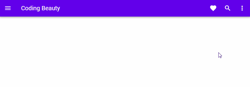
Conclusion
A menu is a versatile user interface component in a user interface that shows a popover that we can use for a variety of purposes. It can work with a button, a toolbar or an app bar. Vuetify provides the v-menu component for creating and customizing menus.
11 Amazing New JavaScript Features in ES13
This guide will bring you up to speed with all the latest features added in ECMAScript 13. These powerful new features will modernize your JavaScript with shorter and more expressive code.
