material-ui

How to Build an Advanced Space Remover Tool With React

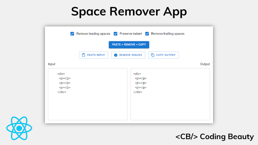
In this article, we’re going to learn how to build a web app that will let us easily remove leading and trailing spaces from any text, with the ability to optionally preserve the indentation of the text. We’ll be using the React.js library to build this tool, let’s get started.

Setting up the Project

Let’s begin by creating a new React app using Create React App. We’ll be using Yarn.

yarn create-react-app remove-spaces

We’ll also be using a bit of TypeScript, you can set it up using the instructions here.

Writing the removeSpaces() Function

The core part of the app will be a removeSpaces() function that takes a string as input and returns a new string with the spaces removed. Let’s write this function in a new remove-spaces.ts file.

src/remove-spaces.ts

export default function removeSpaces(params: {
  text: string;
  leading: boolean;
  trailing: boolean;
  preserveIndent: boolean;
}) {
  let regex: RegExp;
  const { text, leading, trailing, preserveIndent } = params;
  let spaceCountPattern: string | undefined;

  let leadingMatch: string;
  if (leading) {
    if (preserveIndent) {
      const firstSpacePattern = new RegExp(String.raw`^(\s*).+?((\r\n)|\n|$)`);
      const firstSpaces = text.match(firstSpacePattern)?.[1];
      const spaceCount = firstSpaces?.length;
      spaceCountPattern = `{0,${spaceCount}}`;
    } else {
      spaceCountPattern = '*';
    }
    leadingMatch = String.raw`\s${spaceCountPattern}`;
  } else {
    leadingMatch = '';
  }

  const trailingMatch = trailing ? String.raw`\s*?` : '';
  regex = new RegExp(String.raw`((()((\r\n)|\n))|(.*?((\r\n)|\n|$)))`, 'g');
  const lines = text.match(regex);
  const lineRegex = new RegExp(
    String.raw`^${leadingMatch}(.*?)${trailingMatch}((\r\n)|\n|$)`,
    'g'
  );

  const result = lines
    ?.map((line) => {
      if (line === '\r\n' || line === '\n') return line;
      return line.replace(lineRegex, '$1$2');
    })
    .join('');
  return result;
}

Apart from the input string, the function accepts options that will allow the user to customize how the spaces are removed.

When leading is true and preserveIndent is false, the leading spaces are removed from the text, apart from the spaces that add indentation.

When leading is true and preserveIndent is false, all the leading spaces are removed from the text.

When trailing is true, all the trailing spaces are removed from the text.

The function creates a regular expression from the combination of these options. It uses the String replace() method to replace each line of the text with captured groups from the regex.

Testing the removeSpaces() function

We can test this function to be sure it works as intended. Let’s install the Jest testing framework to do this.

yarn add --dev jest ts-jest @types/jest

Initialize ts-jest with the following command:

yarn ts-jest config:init

Let’s write some tests for the function in a new remove-spaces.test.ts file:

src/remove-spaces.test.ts

import removeSpaces from './remove-spaces';

const s2 = '  ';
const s4 = '    ';

const text = `${s4}<div>${s4}
${s4}${s2}<p></p>${s4}
${s4}</div>${s4}`;

it('removes leading spaces without preserving indent', () => {
  const expectation = `<div>${s4}
<p></p>${s4}
</div>${s4}`;
  const result = removeSpaces({
    text,
    leading: true,
    trailing: false,
    preserveIndent: false,
  });
  expect(result).toBe(expectation);
});

it('removes leading spaces and preserves indent', () => {
  const expectation = `<div>${s4}
${s2}<p></p>${s4}
</div>${s4}`;
  const result = removeSpaces({
    text,
    leading: true,
    trailing: false,
    preserveIndent: true,
  });
  expect(result).toBe(expectation);
});

it('removes trailing spaces', () => {
  const expectation = `${s4}<div>
${s4}${s2}<p></p>
${s4}</div>`;
  const result = removeSpaces({
    text,
    leading: false,
    trailing: true,
    preserveIndent: false,
  });
  expect(result).toBe(expectation);
});

it('removes leading and trailing spaces', () => {
  const expectation = `<div>
<p></p>
</div>`;
  const result = removeSpaces({
    text,
    leading: true,
    preserveIndent: false,
    trailing: true,
  });
  expect(result).toBe(expectation);
});

The function should pass all these tests if it was written correctly.

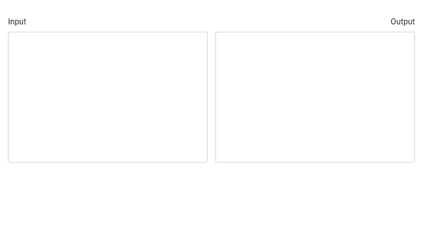
Creating the Text Inputs

It’s time for us to start creating the user interface with React. We’ll begin with the text inputs. We’ll create two – one will take will user input, and the other will be readonly and display the output.

We’ll be using the Material UI framework to make the app look great, you can set it up using the instructions here.

src/App.js

import { Box, Typography, TextField } from '@mui/material';
import { useState } from 'react';

function App() {
  const [input, setInput] = useState('');
  const [output, setOutput] = useState('');

  const handleInputChange = (event) => {
    setInput(event.target.value);
  };

  return (
    <Box
      sx={{
        height: '100%',
        display: 'flex',
        flexDirection: 'column',
        padding: 2,
        boxSizing: 'border-box',
      }}
    >
      <Box
        sx={{
          display: 'grid',
          gridTemplateColumns: 'repeat(auto-fit, minmax(400px, 1fr))',
          justifyContent: 'stretch',
          marginTop: 2,
          rowGap: '16px',
        }}
      >
        <Box sx={{ flex: 1, marginRight: 1, textAlign: 'left' }}>
          <Typography>Input</Typography>
          <TextField
            sx={{ width: '100%', marginTop: 1, minWidth: '300px' }}
            multiline
            value={input}
            minRows={10}
            inputProps={{
              style: { maxHeight: '300px', overflow: 'auto' },
            }}
            onChange={handleInputChange}
          ></TextField>
        </Box>
        <Box sx={{ flex: 1, marginLeft: 1, textAlign: 'right' }}>
          <Typography>Output</Typography>
          <TextField
            sx={{
              width: '100%',
              marginTop: 1,
              minWidth: '300px',
            }}
            multiline
            value={output}
            readOnly
            minRows={10}
            inputProps={{
              style: { maxHeight: '300px', overflow: 'auto' },
            }}
          ></TextField>
        </Box>
      </Box>
    </Box>
  );
}

export default App;
Creating the text inputs.

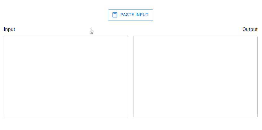
Pasting Input from the Clipboard

Let’s create a button that will paste text from the system clipboard to the input text field when clicked.

src/App.js

// ...
import { Box, Typography, TextField, Stack, Button } from '@mui/material';
import { ContentPaste } from '@mui/icons-material';

function App() {
  // ...

  const pasteInput = async () => {
    setInput(await navigator.clipboard.readText());
  };

  const handlePasteInput = async () => {
    await pasteInput();
  };

  return (
    <Box
      sx={{
        height: '100%',
        display: 'flex',
        flexDirection: 'column',
        padding: 2,
        boxSizing: 'border-box',
      }}
    >
      <Stack
        direction="row"
        spacing={2}
        justifyContent="center"
        sx={{ flexWrap: 'wrap', marginTop: 2 }}
      >
        <Box>
          <Button
            onClick={handlePasteInput}
            variant="outlined"
            startIcon={<ContentPaste />}
          >
            Paste input
          </Button>
        </Box>
      </Stack>
      {/* ... */}
    </Box>
  );
}

export default App;
Pasting input from the clipboard.

Adding Options

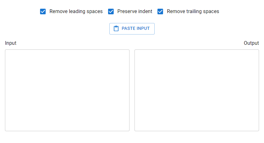
Let’s create the options that will let the user decide how the spaces will be removed from the text. There will be three boolean options, each represented with a checkbox:

  1. Remove leading spaces
  2. Remove trailing spaces
  3. Preserve indent

We’ll pass the options directly to the removeSpaces() function when the user decides to remove the spaces.

import {
  Box,
  Typography,
  TextField,
  Stack,
  Button,
  FormControlLabel,
  Checkbox,
} from '@mui/material';
import { useState } from 'react';
import { ContentPaste } from '@mui/icons-material';

function App() {
  // ...

  const [leading, setLeading] = useState(true);
  const [trailing, setTrailing] = useState(true);
  const [preserveIndent, setPreserveIndent] = useState(true);

  const handleLeadingChange = (event) => {
    setLeading(event.target.checked);
  };

  const handleTrailingChange = (event) => {
    setTrailing(event.target.checked);
  };

  const handlePreserveIndentChange = (event) => {
    setPreserveIndent(event.target.checked);
  };

  return (
    <Box
      sx={{
        height: '100%',
        display: 'flex',
        flexDirection: 'column',
        padding: 2,
        boxSizing: 'border-box',
      }}
    >
      <Box sx={{ display: 'flex', justifyContent: 'center' }}>
        <FormControlLabel
          control={
            <Checkbox checked={leading} onChange={handleLeadingChange} />
          }
          label="Remove leading spaces"
        />
        <FormControlLabel
          control={
            <Checkbox
              checked={preserveIndent}
              onChange={handlePreserveIndentChange}
            />
          }
          label="Preserve indent"
        />
        <FormControlLabel
          control={
            <Checkbox checked={trailing} onChange={handleTrailingChange} />
          }
          label="Remove trailing spaces"
        />
      </Box>
     {/* ... */}
    </Box>
  );
}

export default App;
Adding options.

Removing the Spaces

Now let’s add a button that will cause the spaces to be removed from the input text when clicked.


// ...
import removeSpaces from './remove-spaces';

function App() {
  const handleRemoveSpaces = () => {
    setOutput(removeSpaces({ text: input, leading, trailing, preserveIndent }));
  };

  return (
    <Box
      sx={{
        height: '100%',
        display: 'flex',
        flexDirection: 'column',
        padding: 2,
        boxSizing: 'border-box',
      }}
    >
      <Box sx={{ display: 'flex', justifyContent: 'center' }}>
        {/* ... */}
        
        <Box>
          <Button
            onClick={handlePasteInput}
            variant="outlined"
            startIcon={<ContentPaste />}
          >
            Paste input
          </Button>
        </Box>

        {/* Button to remove spaces */}
        <Box>
          <Button
            onClick={handleRemoveSpaces}
            variant="outlined"
            startIcon={<RemoveCircle />}
          >
            Remove spaces
          </Button>
        </Box>
      </Stack>
      {/* ... */}
      </Box>
    </Box>
  );
}

export default App;
Removing the spaces.

Copying Output to Clipboard

Let’s create another button that will copy the text in the output text field to the system clipboard when clicked.


// ...
import { ContentCopy, ContentPaste, RemoveCircle } from '@mui/icons-material';
import removeSpaces from './remove-spaces';

function App() {
  // ...

  const handleCopyOutput = () => {
    navigator.clipboard.writeText(output);
  };

  return (
    <Box
      sx={{
        height: '100%',
        display: 'flex',
        flexDirection: 'column',
        padding: 2,
        boxSizing: 'border-box',
      }}
    >
      {/* ... */}
      <Stack
        direction="row"
        spacing={2}
        justifyContent="center"
        sx={{ flexWrap: 'wrap', marginTop: 2 }}
      >
        {/* ... */}
        <Box>
          <Button
            onClick={handleRemoveSpaces}
            variant="outlined"
            startIcon={<RemoveCircle />}
          >
            Remove spaces
          </Button>
        </Box>

        {/* Button to copy output */}        
        <Box>
          <Button
            startIcon={<ContentCopy />}
            onClick={handleCopyOutput}
            variant="outlined"
          >
            Copy output
          </Button>
        </Box>
      </Stack>
          
    </Box>
  );
}

export default App;
Copying output to clipboard.

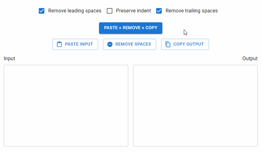
Combining Paste, Remove, and Copy Actions

It’s quite likely that users will use this tool by performing the following actions in order:

  1. Click the Paste Input button to put the text from the clipboard in the input text field
  2. Click the Remove Spaces button to remove the spaces from the input text and put the result in the output text field
  3. Click the Copy Output to copy the text from the output text field to the clipboard.

To make things easier, we’ll create a button that will let the user perform these three actions at once:

// ...

function App() {
  // ...

  const handlePasteRemoveCopy = async () => {
    const input = await navigator.clipboard.readText();
    const output = removeSpaces({
      text: input,
      leading,
      trailing,
      preserveIndent,
    });
    navigator.clipboard.writeText(output);
    setInput(input);
    setOutput(output);
  };

  return (
    <Box
      sx={{
        height: '100%',
        display: 'flex',
        flexDirection: 'column',
        padding: 2,
        boxSizing: 'border-box',
      }}
    >
      <Box sx={{ display: 'flex', justifyContent: 'center' }}>
        {/* ... */}
        <FormControlLabel
          control={
            <Checkbox checked={trailing} onChange={handleTrailingChange} />
          }
          label="Remove trailing spaces"
        />
      </Box>

      {/* Button to perform past, remove, and copy actions at once */}
      <Box sx={{ display: 'flex', justifyContent: 'center', marginTop: 2 }}>
        <Button onClick={handlePasteRemoveCopy} variant="contained">
          Paste + Remove + Copy
        </Button>
      </Box>

      <Stack
        direction="row"
        spacing={2}
        justifyContent="center"
        sx={{ flexWrap: 'wrap', marginTop: 2 }}
      >
        <Box>
          <Button
            onClick={handlePasteInput}
            variant="outlined"
            startIcon={<ContentPaste />}
          >
            Paste input
          </Button>
        </Box>
        {/* ... */}
      </Stack>
    </Box>
  );
}

export default App;

Our space remover app is complete! We’ve been able to build a handy utility for removing leading and trailing spaces from any text and preserving indentation if necessary.

What Can This Tool Be Used for?

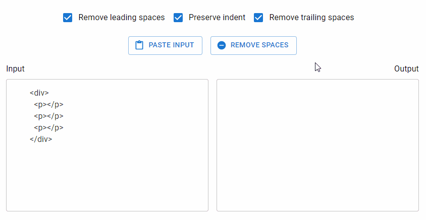
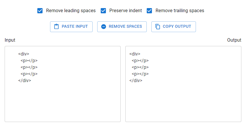
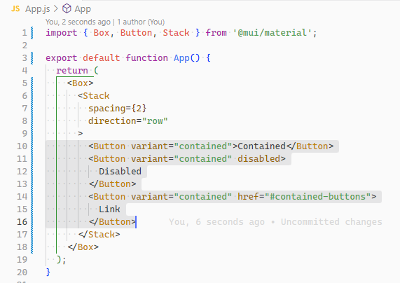
At Coding Beauty, we found this tool useful when creating code snippets displaying a portion of code from an HTML or JSX markup that was indented by some amount. For example, in our Material UI button tutorial, there were times when the file for an example contained markup like this:

The complete source code for an example in the tutorial.

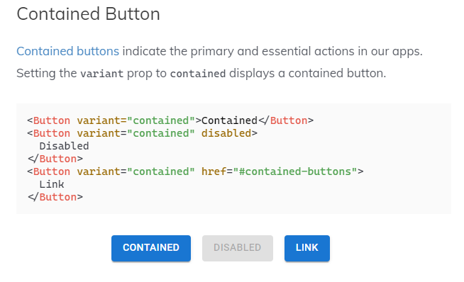
But we would only want to show the section of the file relevant to the example:

Explaining contained buttons in the Material UI button tutorial.

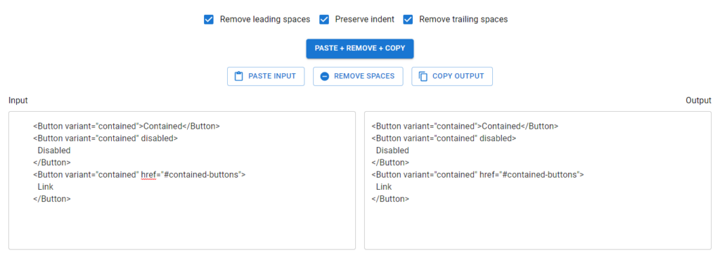
This tool helped format the relevant section properly by removing the spaces.

What about String trim()?

We couldn’t use the trim() or trimStart() string methods because then it wouldn’t be possible to preserve the indent of the entire text. These methods can only remove all the leading spaces in a given string.

How to Use the Material UI Button Component

A button is a commonly used component that adds interactivity to a UI. In this article, we’re going to learn how to easily create and customize buttons in Material UI.

The Material UI Button Component

We can use the Button component from Material UI to create buttons. It has a variant prop used to display a text, contained, or outlined button.

App.jsx
import { Box, Button, Stack } from '@mui/material'; export default function App() { return ( <Box> <Stack spacing={2} direction="row" > <Button variant="text">Text</Button> <Button variant="contained">Contained</Button> <Button variant="outlined">Outlined</Button> </Stack> </Box> ); }

Text Button

Text buttons are suitable for actions of low significance in an app, like the closing of a dialog. Setting the variant prop to text displays a text button.

App.jsx
<Button>Primary</Button> <Button disabled>Disabled</Button> <Button href="#text-buttons">Link</Button>
Creating text buttons in Material UI.

Contained Button

Contained buttons indicate the primary and essential actions in our apps. Setting the variant prop to contained displays a contained button.

JavaScript
<Button variant="contained">Contained</Button> <Button variant="contained" disabled> Disabled </Button> <Button variant="contained" href="#contained-buttons"> Link </Button>
Creating contained buttons in Material UI.

Outlined Button

Outlined buttons indicate actions of mid-level significance. They are a lower emphasis alternative to contained buttons and a higher emphasis alternative to text buttons. Setting the variant prop to outlined displays and outlined button.

JavaScript
<Button variant="outlined">Primary</Button> <Button variant="outlined" disabled> Disabled </Button> <Button variant="outlined" href="#outlined-buttons"> Link </Button>
Creating outlined buttons in Material UI.

Disabled Button Elevation

We can prevent a button from being clicked by setting the disableElevation prop to true.

JavaScript
<Button variant="contained" disableElevation > Elevation disabled </Button>
Disabling button elevation.

Handling Button Clicks in Material UI

We can assign a listener function to the onClick prop to perform an action when the button is clicked.

In the following example, we attach a listener that increments a count by one, to display the total number of times the button has been clicked.

JavaScript
import { Box, Button, Typography } from '@mui/material'; import { useState } from 'react'; export default function App() { const [count, setCount] = useState(0); return ( <Box sx={{ margin: 2 }}> <Button onClick={() => { setCount(count + 1); }} variant="contained" > Click me </Button> <Typography sx={{ marginTop: 1 }}>Count: {count}</Typography> </Box> ); }
Handling button clicks in Material UI.

Material UI Button Colors

We can use the color prop to apply a color from the theme palette.

JavaScript
<Button color="secondary">Secondary</Button> <Button variant="contained" color="success"> Success </Button> <Button variant="outlined" color="error"> Error </Button>
Applying color to buttons.

Custom Colors

The color prop only allows values from the theme palette. To apply a color not available in the theme, we can use custom CSS and the sx prop.

JavaScript
import { Stack, Button } from '@mui/material'; import { green } from '@mui/material/colors'; export default function App() { return ( <Stack spacing={2} direction="row" > <Button sx={{ backgroundColor: green[500], '&:hover': { backgroundColor: green[700] }, }} variant="contained" > Primary </Button> <Button sx={{ color: green[500], borderColor: green[500], '&:hover': { color: green[500], borderColor: green[500] }, }} variant="outlined" > Secondary </Button> </Stack> ); }

Button Sizes

The size prop of the Button component allows us to create buttons of different sizes.

JavaScript
import { Box, Button } from '@mui/material'; export default function App() { return ( <Box> <Box sx={{ '& button': { m: 1 } }}> <div> <Button size="small">Small</Button> <Button size="medium">Medium</Button> <Button size="large">Large</Button> </div> <div> <Button variant="outlined" size="small" > Small </Button> <Button variant="outlined" size="medium" > Medium </Button> <Button variant="outlined" size="large" > Large </Button> </div> <div> <Button variant="contained" size="small" > Small </Button> <Button variant="contained" size="medium" > Medium </Button> <Button variant="contained" size="large" > Large </Button> </div> </Box> </Box> ); }
Creating buttons of different sizes in Material UI.

Icon and Label Buttons

Including an icon in a button can make clearer to the user the action the button performs. Assigning the icon component to the startIcon or endIcon prop aligns the icon to the left or right of the label respectively.

JavaScript
import { Button, Stack } from '@mui/material'; import { Settings as SettingsIcon, PlayArrow as PlayArrowIcon, } from '@mui/icons-material'; export default function App() { return ( <Stack spacing={2} direction="row" > <Button variant="contained" startIcon={<PlayArrowIcon />} > Play </Button> <Button variant="outlined" endIcon={<SettingsIcon />} > Settings </Button> </Stack> ); }
Creating a button with an icon and a label.

Icon Buttons in Material UI

Icon buttons can help save screen space and ease user recognition. We can use the IconButton component from Material UI to create them.

JavaScript
import { IconButton, Stack } from '@mui/material'; import { Settings, Delete, Info, ContentCopy } from '@mui/icons-material'; export default function App() { return ( <Stack spacing={2} direction="row" > <IconButton> <Settings /> </IconButton> <IconButton color="primary"> <Delete /> </IconButton> <IconButton color="secondary"> <Info /> </IconButton> <IconButton disabled color="primary" > <ContentCopy /> </IconButton> </Stack> ); }
Creating icon buttons in Material UI.

Icon Button Sizes

Like Button, IconButton also comes with a size prop for customizing its size.

JavaScript
<IconButton size="small"> <Settings fontSize="small" /> </IconButton> <IconButton size="medium"> <Settings fontSize="medium" /> </IconButton> <IconButton size="large"> <Settings fontSize="large" /> </IconButton>
Create icon button components of different sizes.

Icon Button Colors

The color prop lets us apply a color from the theme palette to an IconButton.

JavaScript
import { IconButton, Stack } from '@mui/material'; import { Settings as SettingsIcon } from '@mui/icons-material'; export default function App() { return ( <Stack spacing={1} direction="row" > <IconButton color="primary"> <SettingsIcon /> </IconButton> <IconButton color="secondary"> <SettingsIcon /> </IconButton> <IconButton color="success"> <SettingsIcon /> </IconButton> <IconButton color="error"> <SettingsIcon /> </IconButton> <IconButton color="warning"> <SettingsIcon /> </IconButton> </Stack> ); }
Customizing icon button colors.

Loading Buttons in Material UI

A loading button can indicate an ongoing operation and temporarily disable interaction. We can create one with the LoadingButton component.

JavaScript
import { Stack } from '@mui/material'; import { LoadingButton } from '@mui/lab'; import { Save as SaveIcon } from '@mui/icons-material'; export default function App() { return ( <Stack spacing={2} direction="row" > <LoadingButton loading variant="contained" > Play </LoadingButton> <LoadingButton loading loadingIndicator="Loading..." variant="outlined" > Send message </LoadingButton> <LoadingButton loading loadingPosition="start" startIcon={<SaveIcon />} variant="outlined" > Save </LoadingButton> </Stack> ); }
Creating a loading button in Material UI.

How to Use Tabs in Material UI

Tabs let users explore and switch between groups of related content and add an additional layer of navigation to apps.

In this article, we’re going to learn how to easily create tabs in Material UI with the Tabs and Tab components.

The Material UI Tabs Component

We can use the Tabs component from Material UI to create a group of tabs. It has a value prop that sets the currently selected tab using its zero-based index.

The Tab component creates each tab. Its label prop sets the tab title.

import { Box, Tab, Tabs } from '@mui/material';
import { useState } from 'react';

function App() {
  const [tabIndex, setTabIndex] = useState(0);

  const handleTabChange = (event, newTabIndex) => {
    setTabIndex(newTabIndex);
  };

  return (
    <Box>
      <Tabs value={tabIndex} onChange={handleTabChange}>
        <Tab label="Tab 1" />
        <Tab label="Tab 2" />
        <Tab label="Tab 3" />
      </Tabs>
    </Box>
  );
}

export default App;
Creating tabs in Material UI.

We add a listener to the onChange prop to perform an action when the user tries to select another tab. We can access the index of the new tab in the listener. In the above example, we use React state simply set a new Tabs value in the listener.

Changing the currently selected tab in Material UI.

We can display different content for each tab using the Tabs value. For example:

import { Box, Tab, Tabs, Typography } from '@mui/material';
import { useState } from 'react';

function App() {
  const [tabIndex, setTabIndex] = useState(0);

  const handleTabChange = (event, newTabIndex) => {
    setTabIndex(newTabIndex);
  };

  return (
    <Box>
      <Box>
        <Tabs value={tabIndex} onChange={handleTabChange}>
          <Tab label="Tab 1" />
          <Tab label="Tab 2" />
          <Tab label="Tab 3" />
        </Tabs>
      </Box>
      <Box sx={{ padding: 2 }}>
        {tabIndex === 0 && (
          <Box>
            <Typography>The first tab</Typography>
          </Box>
        )}
        {tabIndex === 1 && (
          <Box>
            <Typography>The second tab</Typography>
          </Box>
        )}
        {tabIndex === 2 && (
          <Box>
            <Typography>The third tab</Typography>
          </Box>
        )}
      </Box>
    </Box>
  );
}

export default App;
Displaying different content for each tab.

Material UI Tab Colors

The Tabs component comes with certain props that set the colors of different parts of the tabs. The textColor prop sets the color of each tab title, and the indicatorColor prop sets the indicator color.

<Tabs
  value={tabIndex}
  onChange={handleTabChange}
  textColor="secondary"
  indicatorColor="secondary"
>
  <Tab label="Tab 1" />
  <Tab label="Tab 2" />
  <Tab label="Tab 3" />
</Tabs>
Customizing tab colors in Material UI.

Custom Tab Colors

textColor only allows a value of primary, secondary, or inherit. This means we can only use the color of the Tabs parent component, or one of the primary and secondary theme colors. Similarly, indicatorColor only allows values of primary and secondary. To set custom colors, we can override the styles of certain classes from Material UI:

  • MuiTabs-indicator: styles the tab indicator.
  • MuiTab-root: styles each tab.
  • MuiSelected: styles the currently selected tab.
import { Box, Tab, Tabs } from '@mui/material';
import { blue, red } from '@mui/material/colors';
import { useState } from 'react';

function App() {
  const [tabIndex, setTabIndex] = useState(0);

  const handleTabChange = (event, newTabIndex) => {
    setTabIndex(newTabIndex);
  };

  return (
    <Box>
      <Box>
        <Tabs
          value={tabIndex}
          onChange={handleTabChange}
          sx={{
            '& .MuiTabs-indicator': { backgroundColor: red[500] },
            '& .MuiTab-root': { color: blue[700] },
            '& .Mui-selected': { color: red[500] },
          }}
        >
          <Tab label="Tab 1" />
          <Tab label="Tab 2" />
          <Tab label="Tab 3" />
        </Tabs>
      </Box>
    </Box>
  );
}

export default App;
Using custom colors for the tabs.

Wrapped Tab Labels

We can set the wrapped prop to true for a Tab to make the tab label wrap if it is too long.

<Tabs
  value={tabIndex}
  onChange={handleTabChange}
>
  <Tab
    label="Lorem ipsum, dolor sit amet consectetur adipisicing elit"
    wrapped
  />
  <Tab label="Tab 2" />
  <Tab label="Tab 3" />
</Tabs>
Using a wrapped label for a tab.

Disabled Tabs

Setting the disabled prop to true on a Tab prevents it from being selected.

<Tabs
  value={tabIndex}
  onChange={handleTabChange}
>
  <Tab label="Active" />
  <Tab
    label="Disabled"
    disabled
  />
  <Tab label="Active" />
</Tabs>

Full Width Tabs in Material UI

We can set the fullWidth prop of a Tabs to true to make the tabs occupy the entire width of the viewport. This is useful for smaller views.

<Tabs
  value={tabIndex}
  onChange={handleTabChange}
  variant="fullWidth"
>
  <Tab label="Tab 1" />
  <Tab label="Tab 2" />
  <Tab label="Tab 3" />
</Tabs>
Creating full-width tabs in Material UI.

Centered Tabs

For larger views, we can use the centered prop to position the tabs at the center.

<Tabs
  value={tabIndex}
  onChange={handleTabChange}
  centered
>
  <Tab label="Tab 1" />
  <Tab label="Tab 2" />
  <Tab label="Tab 3" />
</Tabs>
Centering tabs.

Scrollable Tabs in Material UI

The scrollable prop lets the user scroll through the tabs if they overflow their container.

<Tabs
  value={tabIndex}
  onChange={handleTabChange}
  variant="scrollable"
  scrollButtons="auto"
  sx={{ width: 500 }}
>
  <Tab label="Tab 1" />
  <Tab label="Tab 2" />
  <Tab label="Tab 3" />
  <Tab label="Tab 4" />
  <Tab label="Tab 5" />
  <Tab label="Tab 6" />
  <Tab label="Tab 7" />
  <Tab label="Tab 8" />
  <Tab label="Tab 9" />
  <Tab label="Tab 10" />
</Tabs>
Scrollable tabs in Material UI.

The scroll buttons let the user scroll towards the right or left.

Scrolling towards the right and left.

The scrollButtons prop controls the display of the scroll buttons. It can take three possible values:

  1. auto – only displays the scroll buttons when not all the items are visible. Hides them below a certain viewport width.
  2. true – always displays the scroll buttons.
  3. false – never displays the scroll buttons.

In the following example, we set scrollButtons to false to hide the scroll buttons.

<Tabs
  value={tabIndex}
  onChange={handleTabChange}
  variant="scrollable"
  scrollButtons={false}
  sx={{ width: 500 }}
>
  <Tab label="Tab 1" />
  <Tab label="Tab 2" />
  <Tab label="Tab 3" />
  <Tab label="Tab 4" />
  <Tab label="Tab 5" />
  <Tab label="Tab 6" />
  <Tab label="Tab 7" />
  <Tab label="Tab 8" />
  <Tab label="Tab 9" />
  <Tab label="Tab 10" />
</Tabs>
Hiding the scroll buttons.

Vertical Tabs in Material UI

To display vertical tabs, we can set the Tabs orientation prop to vertical. It is horizontal by default.

import { Box, Tab, Tabs, Typography } from '@mui/material';
import { useState } from 'react';

function App() {
  const [tabIndex, setTabIndex] = useState(0);

  const handleTabChange = (event, newTabIndex) => {
    setTabIndex(newTabIndex);
  };

  return (
    <Box>
      <Box sx={{ display: 'flex' }}>
        <Tabs
          value={tabIndex}
          onChange={handleTabChange}

          orientation="vertical"
        >
          <Tab label="Tab 1" />
          <Tab label="Tab 2" />
          <Tab label="Tab 3" />
        </Tabs>
        <Box sx={{ margin: 2 }}>
          {tabIndex === 0 && (
            <Box>
              <Typography>The first tab</Typography>
            </Box>
          )}
          {tabIndex === 1 && (
            <Box>
              <Typography>The second tab</Typography>
            </Box>
          )}
          {tabIndex === 2 && (
            <Box>
              <Typography>The third tab</Typography>
            </Box>
          )}
        </Box>
      </Box>
    </Box>
  );
}

export default App;
Vertical tabs in Material UI.

Icon Tabs

We can the icon prop to display an icon label for a tab instead of text.

<Tabs
  value={tabIndex}
  onChange={handleTabChange}
>
  <Tab icon={<SearchIcon />} />
  <Tab icon={<StarIcon />} />
  <Tab icon={<SettingsIcon />} />
</Tabs>
Tabs with only icons used for the labels.

We could also use it with the label prop to display both icon and text for the label.

<Tabs
  value={tabIndex}
  onChange={handleTabChange}
>
  <Tab
    icon={<SearchIcon />}
    label="Search"
  />
  <Tab
    icon={<StarIcon />}
    label="Favorites"
  />
  <Tab
    icon={<SettingsIcon />}
    label="Settings"
  />
</Tabs>
Tabs with both icons and text displayed for the labels.

Tab Icon Position

The iconPosition prop sets the position of the icon in the tab content. It can be top, bottom, start, or end.

<Tabs
  value={tabIndex}
  onChange={handleTabChange}
>
  <Tab
    icon={<AlarmIcon />}
    label="top"
  />
  <Tab
    icon={<SearchIcon />}
    iconPosition="start"
    label="start"
  />
  <Tab
    icon={<StarIcon />}
    iconPosition="end"
    label="end"
  />
  <Tab
    icon={<FavoriteIcon />}
    iconPosition="bottom"
    label="bottom"
  />
</Tabs>
Tabs with different icon positions set.

Conclusion

Tabs organize groups of related content into separate views where only one view can be visible at a time. We can use the Tabs and Tab components from Material UI to easily create and customize them in our apps.