
Tabs let users explore and switch between groups of related content and add an additional layer of navigation to apps.
In this article, we’re going to learn how to easily create tabs in Material UI with the Tabs and Tab components.
The Material UI Tabs Component
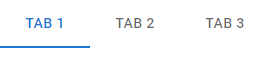
We can use the Tabs component from Material UI to create a group of tabs. It has a value prop that sets the currently selected tab using its zero-based index.
The Tab component creates each tab. Its label prop sets the tab title.
import { Box, Tab, Tabs } from '@mui/material';
import { useState } from 'react';

function App() {
  const [tabIndex, setTabIndex] = useState(0);

  const handleTabChange = (event, newTabIndex) => {
    setTabIndex(newTabIndex);
  };

  return (
    <Box>
      <Tabs value={tabIndex} onChange={handleTabChange}>
        <Tab label="Tab 1" />
        <Tab label="Tab 2" />
        <Tab label="Tab 3" />
      </Tabs>
    </Box>
  );
}

export default App;
We add a listener to the onChange prop to perform an action when the user tries to select another tab. We can access the index of the new tab in the listener. In the above example, we use React state simply set a new Tabs value in the listener.
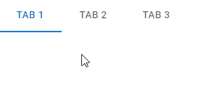
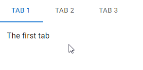
We can display different content for each tab using the Tabs value. For example:
import { Box, Tab, Tabs, Typography } from '@mui/material';
import { useState } from 'react';

function App() {
  const [tabIndex, setTabIndex] = useState(0);

  const handleTabChange = (event, newTabIndex) => {
    setTabIndex(newTabIndex);
  };

  return (
    <Box>
      <Box>
        <Tabs value={tabIndex} onChange={handleTabChange}>
          <Tab label="Tab 1" />
          <Tab label="Tab 2" />
          <Tab label="Tab 3" />
        </Tabs>
      </Box>
      <Box sx={{ padding: 2 }}>
        {tabIndex === 0 && (
          <Box>
            <Typography>The first tab</Typography>
          </Box>
        )}
        {tabIndex === 1 && (
          <Box>
            <Typography>The second tab</Typography>
          </Box>
        )}
        {tabIndex === 2 && (
          <Box>
            <Typography>The third tab</Typography>
          </Box>
        )}
      </Box>
    </Box>
  );
}

export default App;
Material UI Tab Colors
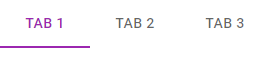
The Tabs component comes with certain props that set the colors of different parts of the tabs. The textColor prop sets the color of each tab title, and the indicatorColor prop sets the indicator color.
<Tabs
  value={tabIndex}
  onChange={handleTabChange}
  textColor="secondary"
  indicatorColor="secondary"
>
  <Tab label="Tab 1" />
  <Tab label="Tab 2" />
  <Tab label="Tab 3" />
</Tabs>
Custom Tab Colors
textColor only allows a value of primary, secondary, or inherit. This means we can only use the color of the Tabs parent component, or one of the primary and secondary theme colors. Similarly, indicatorColor only allows values of primary and secondary. To set custom colors, we can override the styles of certain classes from Material UI:
MuiTabs-indicator: styles the tab indicator.MuiTab-root: styles each tab.MuiSelected: styles the currently selected tab.
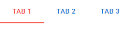
import { Box, Tab, Tabs } from '@mui/material';
import { blue, red } from '@mui/material/colors';
import { useState } from 'react';

function App() {
  const [tabIndex, setTabIndex] = useState(0);

  const handleTabChange = (event, newTabIndex) => {
    setTabIndex(newTabIndex);
  };

  return (
    <Box>
      <Box>
        <Tabs
          value={tabIndex}
          onChange={handleTabChange}
          sx={{
            '& .MuiTabs-indicator': { backgroundColor: red[500] },
            '& .MuiTab-root': { color: blue[700] },
            '& .Mui-selected': { color: red[500] },
          }}
        >
          <Tab label="Tab 1" />
          <Tab label="Tab 2" />
          <Tab label="Tab 3" />
        </Tabs>
      </Box>
    </Box>
  );
}

export default App;
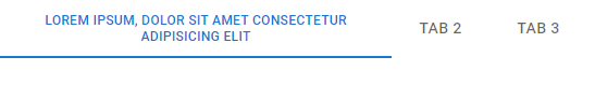
Wrapped Tab Labels
We can set the wrapped prop to true for a Tab to make the tab label wrap if it is too long.
<Tabs
  value={tabIndex}
  onChange={handleTabChange}
>
  <Tab
    label="Lorem ipsum, dolor sit amet consectetur adipisicing elit"
    wrapped
  />
  <Tab label="Tab 2" />
  <Tab label="Tab 3" />
</Tabs>
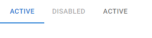
Disabled Tabs
Setting the disabled prop to true on a Tab prevents it from being selected.
<Tabs
  value={tabIndex}
  onChange={handleTabChange}
>
  <Tab label="Active" />
  <Tab
    label="Disabled"
    disabled
  />
  <Tab label="Active" />
</Tabs>
Full Width Tabs in Material UI
We can set the fullWidth prop of a Tabs to true to make the tabs occupy the entire width of the viewport. This is useful for smaller views.
<Tabs
  value={tabIndex}
  onChange={handleTabChange}
  variant="fullWidth"
>
  <Tab label="Tab 1" />
  <Tab label="Tab 2" />
  <Tab label="Tab 3" />
</Tabs>
Centered Tabs
For larger views, we can use the centered prop to position the tabs at the center.
<Tabs
  value={tabIndex}
  onChange={handleTabChange}
  centered
>
  <Tab label="Tab 1" />
  <Tab label="Tab 2" />
  <Tab label="Tab 3" />
</Tabs>

Scrollable Tabs in Material UI
The scrollable prop lets the user scroll through the tabs if they overflow their container.
<Tabs
  value={tabIndex}
  onChange={handleTabChange}
  variant="scrollable"
  scrollButtons="auto"
  sx={{ width: 500 }}
>
  <Tab label="Tab 1" />
  <Tab label="Tab 2" />
  <Tab label="Tab 3" />
  <Tab label="Tab 4" />
  <Tab label="Tab 5" />
  <Tab label="Tab 6" />
  <Tab label="Tab 7" />
  <Tab label="Tab 8" />
  <Tab label="Tab 9" />
  <Tab label="Tab 10" />
</Tabs>
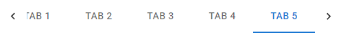
The scroll buttons let the user scroll towards the right or left.
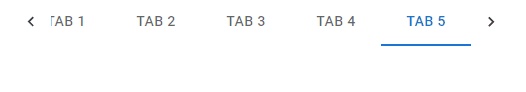
The scrollButtons prop controls the display of the scroll buttons. It can take three possible values:
auto– only displays the scroll buttons when not all the items are visible. Hides them below a certain viewport width.true– always displays the scroll buttons.false– never displays the scroll buttons.
In the following example, we set scrollButtons to false to hide the scroll buttons.
<Tabs
  value={tabIndex}
  onChange={handleTabChange}
  variant="scrollable"
  scrollButtons={false}
  sx={{ width: 500 }}
>
  <Tab label="Tab 1" />
  <Tab label="Tab 2" />
  <Tab label="Tab 3" />
  <Tab label="Tab 4" />
  <Tab label="Tab 5" />
  <Tab label="Tab 6" />
  <Tab label="Tab 7" />
  <Tab label="Tab 8" />
  <Tab label="Tab 9" />
  <Tab label="Tab 10" />
</Tabs>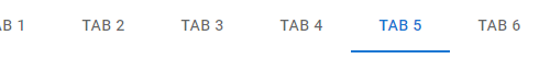
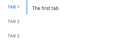
Vertical Tabs in Material UI
To display vertical tabs, we can set the Tabs orientation prop to vertical. It is horizontal by default.
import { Box, Tab, Tabs, Typography } from '@mui/material';
import { useState } from 'react';

function App() {
  const [tabIndex, setTabIndex] = useState(0);

  const handleTabChange = (event, newTabIndex) => {
    setTabIndex(newTabIndex);
  };

  return (
    <Box>
      <Box sx={{ display: 'flex' }}>
        <Tabs
          value={tabIndex}
          onChange={handleTabChange}

          orientation="vertical"
        >
          <Tab label="Tab 1" />
          <Tab label="Tab 2" />
          <Tab label="Tab 3" />
        </Tabs>
        <Box sx={{ margin: 2 }}>
          {tabIndex === 0 && (
            <Box>
              <Typography>The first tab</Typography>
            </Box>
          )}
          {tabIndex === 1 && (
            <Box>
              <Typography>The second tab</Typography>
            </Box>
          )}
          {tabIndex === 2 && (
            <Box>
              <Typography>The third tab</Typography>
            </Box>
          )}
        </Box>
      </Box>
    </Box>
  );
}

export default App;
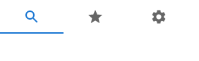
Icon Tabs
We can the icon prop to display an icon label for a tab instead of text.
<Tabs
  value={tabIndex}
  onChange={handleTabChange}
>
  <Tab icon={<SearchIcon />} />
  <Tab icon={<StarIcon />} />
  <Tab icon={<SettingsIcon />} />
</Tabs>
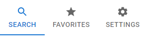
We could also use it with the label prop to display both icon and text for the label.
<Tabs
  value={tabIndex}
  onChange={handleTabChange}
>
  <Tab
    icon={<SearchIcon />}
    label="Search"
  />
  <Tab
    icon={<StarIcon />}
    label="Favorites"
  />
  <Tab
    icon={<SettingsIcon />}
    label="Settings"
  />
</Tabs>
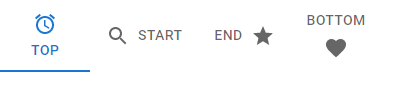
Tab Icon Position
The iconPosition prop sets the position of the icon in the tab content. It can be top, bottom, start, or end.
<Tabs
  value={tabIndex}
  onChange={handleTabChange}
>
  <Tab
    icon={<AlarmIcon />}
    label="top"
  />
  <Tab
    icon={<SearchIcon />}
    iconPosition="start"
    label="start"
  />
  <Tab
    icon={<StarIcon />}
    iconPosition="end"
    label="end"
  />
  <Tab
    icon={<FavoriteIcon />}
    iconPosition="bottom"
    label="bottom"
  />
</Tabs>
Conclusion
Tabs organize groups of related content into separate views where only one view can be visible at a time. We can use the Tabs and Tab components from Material UI to easily create and customize them in our apps.
11 Amazing New JavaScript Features in ES13
This guide will bring you up to speed with all the latest features added in ECMAScript 13. These powerful new features will modernize your JavaScript with shorter and more expressive code.
