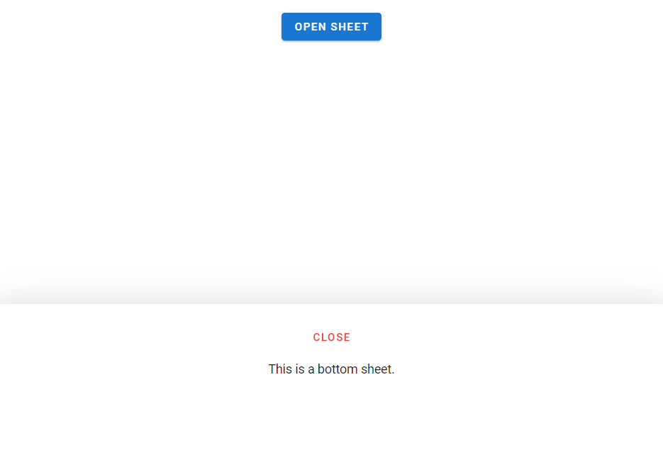
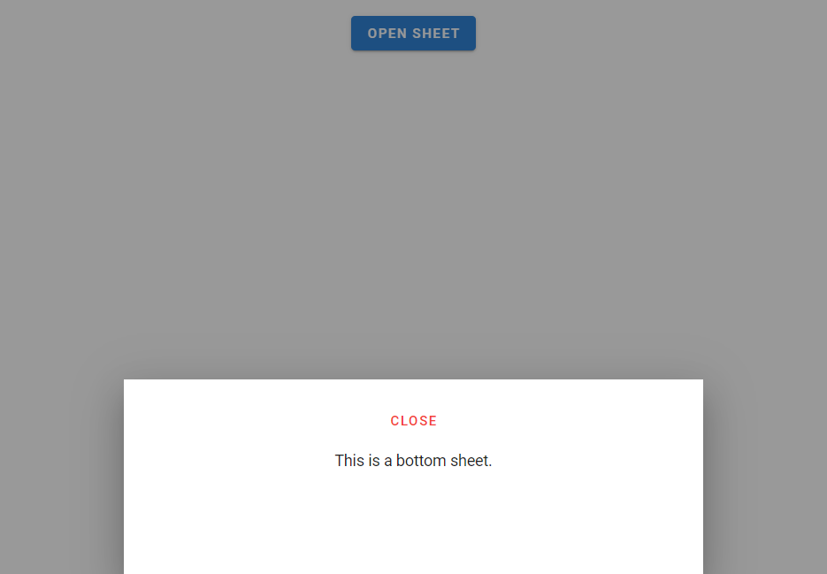
A bottom sheet is a customized v-dialog that is anchored to the bottom of the screen, like a v-bottom-navigation. They are primarily used on mobile and can contain supplementary information and actions. In this article, we’re going to learn how to easily create and customize bottom sheets with the Vuetify bottom sheet component.
The Vuetify Bottom Sheet Component (v-bottom-sheet)
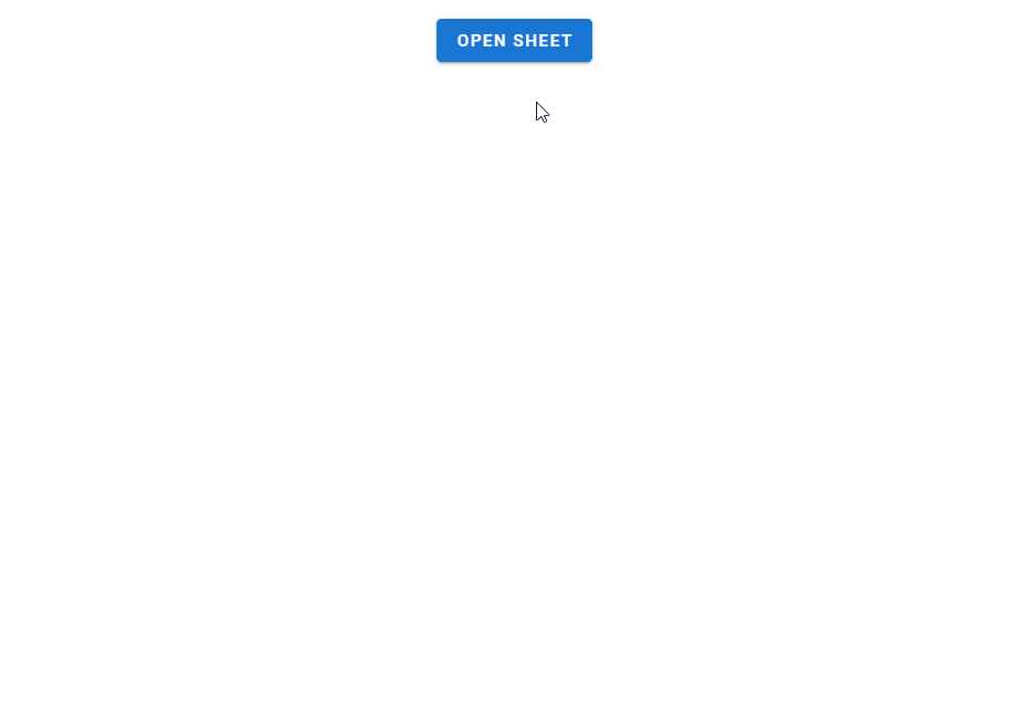
Vuetify provides the v-bottom-sheet component for creating a bottom sheet. Like v-dialog, this component comes with an activator slot that we can use to set a button that will open the sheet when clicked.
<template>
  <v-app>
    <div class="ma-4 text-center">
      <v-bottom-sheet v-model="sheet">
        <template v-slot:activator="{ on, attrs }">
          <v-btn
            v-bind="attrs"
            v-on="on"
            color="primary"
          >
            Open Sheet
          </v-btn>
        </template>
        <v-sheet
          class="text-center"
          height="200px"
        >
          <v-btn
            class="mt-6"
            text
            color="red"
            @click="sheet = !sheet"
          >
            close
          </v-btn>
          <div class="my-3">This is a bottom sheet</div>
        </v-sheet>
      </v-bottom-sheet>
    </div>
  </v-app>
</template>

<script>
export default {
  name: 'App',
  data: () => ({
    sheet: false,
  }),
};
</script>

<style>
html {
  overflow-y: auto !important;
}
</style>
Hide Overlay
v-bottom-sheet comes with a hide-overlay prop that will remove the overlay when set to true.
<template>
  <v-app>
    <div class="ma-4 text-center">
      <v-bottom-sheet
        v-model="sheet"
        hide-overlay
      >
        <template v-slot:activator="{ on, attrs }">
          <v-btn
            v-bind="attrs"
            v-on="on"
            color="primary"
          >
            Open Sheet
          </v-btn>
        </template>
        <v-sheet
          class="text-center"
          height="200px"
        >
          <v-btn
            class="mt-6"
            text
            color="red"
            @click="sheet = !sheet"
          >
            close
          </v-btn>
          <div class="my-3">This is a bottom sheet.</div>
        </v-sheet>
      </v-bottom-sheet>
    </div>
  </v-app>
</template>

<script>
export default {
  name: 'App',
  data: () => ({
    sheet: false,
  }),
};
</script>

<style>
html {
  overflow-y: auto !important;
}
</style>
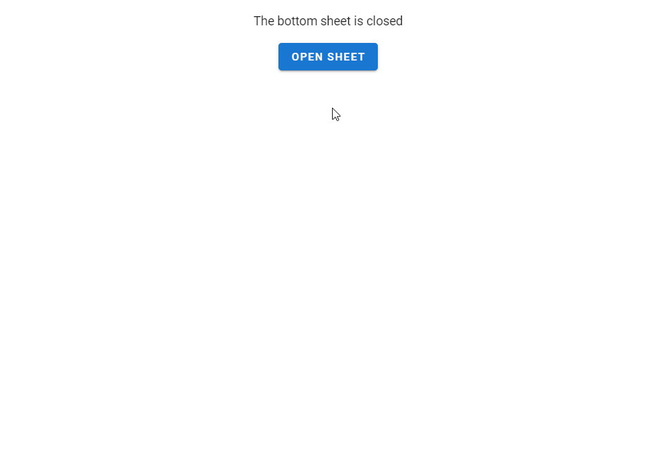
Vuetify Bottom Sheet v-model
We can set up a two-way binding between the value of the v-bottom-sheet and a variable. We can then use this variable to open/close the sheet or to display certain content conditionally.
<template>
  <v-app>
    <div class="ma-4 text-center">
      <div class="mb-4">
        The bottom sheet is {{ sheet ? 'open' : 'closed' }}
      </div>
      <v-bottom-sheet
        v-model="sheet"
        hide-overlay
      >
        <template v-slot:activator="{ on, attrs }">
          <v-btn
            v-bind="attrs"
            v-on="on"
            color="primary"
          >
            Open Sheet
          </v-btn>
        </template>
        <v-sheet
          class="text-center"
          height="200px"
        >
          <v-btn
            class="mt-6"
            text
            color="red"
            @click="sheet = !sheet"
          >
            close
          </v-btn>
          <div class="my-3">This is a bottom sheet</div>
        </v-sheet>
      </v-bottom-sheet>
    </div>
  </v-app>
</template>

<script>
export default {
  name: 'App',
  data: () => ({
    sheet: false,
  }),
};
</script>

<style>
html {
  overflow-y: auto !important;
}
</style>
Persistent Bottom Sheets
By default, an open bottom sheet closes when another element is clicked:
We can prevent this by setting the persistent prop to true on the v-bottom-sheet:
<template>
  <v-app>
    <div class="ma-4 text-center">
      <v-bottom-sheet
        v-model="sheet"
        persistent
      >
        <template v-slot:activator="{ on, attrs }">
          <v-btn
            v-bind="attrs"
            v-on="on"
            color="primary"
          >
            Open Sheet
          </v-btn>
        </template>
        <v-sheet
          class="text-center"
          height="200px"
        >
          <v-btn
            class="mt-6"
            text
            color="red"
            @click="sheet = !sheet"
          >
            close
          </v-btn>
          <div class="my-3">This is a bottom sheet.</div>
        </v-sheet>
      </v-bottom-sheet>
    </div>
  </v-app>
</template>

<script>
export default {
  name: 'App',
  data: () => ({
    sheet: false,
  }),
};
</script>

<style>
html {
  overflow-y: auto !important;
}
</style>
Vuetify Bottom Sheet Inset
The inset prop reduces the maximum width of the v-bottom-sheet to 70% on larger screens. We can also use the width prop to reduce the width manually.
<template>
  <v-app>
    <div class="ma-4 text-center">
      <v-bottom-sheet
        v-model="sheet"
        inset
      >
        <template v-slot:activator="{ on, attrs }">
          <v-btn
            v-bind="attrs"
            v-on="on"
            color="primary"
          >
            Open Sheet
          </v-btn>
        </template>
        <v-sheet
          class="text-center"
          height="200px"
        >
          <v-btn
            class="mt-6"
            text
            color="red"
            @click="sheet = !sheet"
          >
            close
          </v-btn>
          <div class="my-3">This is a bottom sheet.</div>
        </v-sheet>
      </v-bottom-sheet>
    </div>
  </v-app>
</template>

<script>
export default {
  name: 'App',
  data: () => ({
    sheet: false,
  }),
};
</script>

<style>
html {
  overflow-y: auto !important;
}
</style>
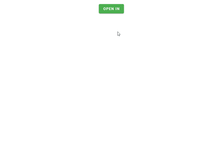
Creating an “Open In” Component
We can combine a functional list and bottom sheet to create an “open in” component.
<template>
  <v-app>
    <div class="ma-4 text-center">
      <v-bottom-sheet v-model="sheet">
        <template v-slot:activator="{ on, attrs }">
          <v-btn
            v-bind="attrs"
            v-on="on"
            color="green"
            dark
          >
            Open in
          </v-btn>
        </template>
        <v-list>
          <v-subheader>Open in</v-subheader>
          <v-list-item
            v-for="(app, i) in apps"
            :key="i"
            @click="sheet = false"
          >
            <v-list-item-title>{{ app }}</v-list-item-title>
          </v-list-item>
        </v-list>
      </v-bottom-sheet>
    </div>
  </v-app>
</template>

<script>
export default {
  name: 'App',
  data: () => ({
    sheet: false,
    apps: ['Firefox', 'Chrome', 'Edge', 'Opera'],
  }),
};
</script>

<style>
html {
  overflow-y: auto !important;
}
</style>
Conclusion
Bottom sheets are anchored to the bottom of the screen and can be used to display supplementary content. Vuetify provides the Vuetify bottom sheet component (v-bottom-sheet) for creating and customizing them.
11 Amazing New JavaScript Features in ES13
This guide will bring you up to speed with all the latest features added in ECMAScript 13. These powerful new features will modernize your JavaScript with shorter and more expressive code.
