A snackbar helps to display quick messages. We can use it to notify users of certain events that occur in an app (for example, deleting an item from a list). It might also contain actions related to the information shown that users can take. In this article, we’re going to learn how to create a snackbar using the Vuetify framework.
The Vuetify Snackbar Component
We can create a snackbar in Vuetify using the v-snackbar component. In the code below, we create a “Close” button in the action slot of the snackbar. When this button is clicked, the snackbar variable is set to false to hide the snackbar.
<template>
<v-app>
<div class="text-center ma-2">
<v-btn @click="snackbar = true"> Open Snackbar </v-btn>
<v-snackbar v-model="snackbar">
{{ text }}
<template v-slot:action="{ attrs }">
<v-btn text v-bind="attrs" @click="snackbar = false"> Close </v-btn>
</template>
</v-snackbar>
</div>
</v-app>
</template>
<script>
export default {
name: 'App',
data: () => ({
snackbar: false,
text: 'You opened the snackbar!',
}),
};
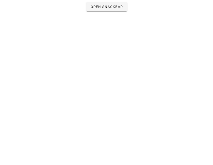
</script>snackbar is false by default, so at first we can only see the button that opens the snackbar:
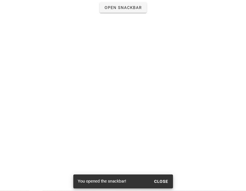
Clicking on the button sets snackbar to true, which displays the snackbar component:
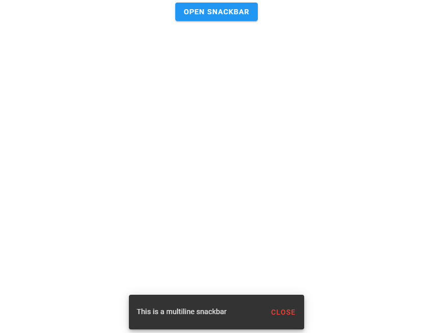
Multi line Snackbars in Vuetify
With the multi-line prop, we can increase the height of the v-snackbar component to make some room for more content.
<template>
  <v-app>
    <div class="text-center ma-2">
      <v-btn dark color="blue" @click="snackbar = true"> Open Snackbar </v-btn>

      <v-snackbar v-model="snackbar" multi-line>
        {{ text }}

        <template v-slot:action="{ attrs }">
          <v-btn color="red" text v-bind="attrs" @click="snackbar = false">
            Close
          </v-btn>
        </template>
      </v-snackbar>
    </div>
  </v-app>
</template>

<script>
export default {
  name: 'App',
  data: () => ({
    snackbar: false,
    text: 'This is a multiline snackbar',
  }),
};
</script>
Snackbar Timeouts in Vuetify
The timeout prop allows us to customize the delay before the snackbar is hidden:
<template>
  <v-app>
    <div class="text-center ma-2">
      <v-btn dark color="indigo darken-2 ma-4" @click="snackbar = true">
        Open Snackbar
      </v-btn>

      <v-snackbar v-model="snackbar">
        {{ text }}

        <template v-slot:action="{ attrs }">
          <v-btn color="blue" text v-bind="attrs" @click="snackbar = false">
            Close
          </v-btn>
        </template>
      </v-snackbar>
    </div>
  </v-app>
</template>

<script>
export default {
  name: 'App',
  data: () => ({
    snackbar: false,

    text: 'This snackbar has a timeout of 3000.',
  }),
};
</script>
Vuetify Snackbar Shaped Variant
We can create the shaped snackbar variant with the shaped prop:
<template>
  <v-app>
    <div class="text-center ma-2">
      <v-btn dark color="indigo darken-2 ma-4" @click="snackbar = true">
        Open Snackbar
      </v-btn>

      <v-snackbar v-model="snackbar" shaped>
        {{ text }}

        <template v-slot:action="{ attrs }">
          <v-btn color="blue" text v-bind="attrs" @click="snackbar = false">
            Close
          </v-btn>
        </template>
      </v-snackbar>
    </div>
  </v-app>
</template>

<script>
export default {
  name: 'App',
  data: () => ({
    snackbar: false,
    text: 'Welcome to Coding Beauty!',
  }),
};
</script>

Rounded Snackbars in Vuetify
Setting the rounded prop to true on a snackbar will make it rounded:
<template>
  <v-app>
    <div class="text-center ma-2">
      <v-btn dark color="indigo darken-2 ma-4" @click="snackbar = true">
        Open Snackbar
      </v-btn>

      <v-snackbar v-model="snackbar" rounded="pill">
        {{ text }}

        <template v-slot:action="{ attrs }">
          <v-btn color="green" text v-bind="attrs" @click="snackbar = false">
            Close
          </v-btn>
        </template>
      </v-snackbar>
    </div>
  </v-app>
</template>

<script>
export default {
  name: 'App',
  data: () => ({
    snackbar: false,
    text: 'Welcome to Coding Beauty!',
  }),
};
</script>

Snackbar Elevation in Vuetify
We can increase the degree of elevation on a snackbar with the elevation prop. Here, we’ve set it to 24:
<template>
  <v-app>
    <div class="text-center ma-2">
      <v-btn dark color="indigo darken-2 ma-4" @click="snackbar = true">
        Open Snackbar
      </v-btn>

      <v-snackbar v-model="snackbar" color="blue" elevation="24">
        {{ text }}

        <template v-slot:action="{ attrs }">
          <v-btn dark text v-bind="attrs" @click="snackbar = false">
            Close
          </v-btn>
        </template>
      </v-snackbar>
    </div>
  </v-app>
</template>

<script>
export default {
  name: 'App',
  data: () => ({
    snackbar: false,
    text: 'Welcome to Coding Beauty!',
  }),
};
</script>

Vuetify Snackbar Tile Variant
Setting the tile prop on the snackbar removes the default border radius:
<template>
  <v-app>
    <div class="text-center ma-2">
      <v-btn dark color="ma-4" @click="snackbar = true"> Open Snackbar </v-btn>

      <v-snackbar v-model="snackbar" color="red accent-2" tile>
        {{ text }}

        <template v-slot:action="{ attrs }">
          <v-btn dark text v-bind="attrs" @click="snackbar = false">
            Close
          </v-btn>
        </template>
      </v-snackbar>
    </div>
  </v-app>
</template>

<script>
export default {
  name: 'App',
  data: () => ({
    snackbar: false,
    text: 'Welcome to Coding Beauty!',
  }),
};
</script>

Vuetify Snackbar Text Variant
Vuetify also provides the text prop for using the snackbar’s text variant:
<template>
  <v-app>
    <div class="text-center ma-2">
      <v-btn dark color="ma-4" @click="snackbar = true"> Open Snackbar </v-btn>

      <v-snackbar v-model="snackbar" color="indigo" text>
        {{ text }}
      </v-snackbar>
    </div>
  </v-app>
</template>

<script>
export default {
  name: 'App',
  data: () => ({
    snackbar: false,
    text: 'Welcome to Coding Beauty!',
  }),
};
</script>

Vuetify Snackbar Outlined Variant
We can activate the outlined variant on the Vuetify snackbar component with the outlined prop:
<template>
  <v-app>
    <div class="text-center ma-2">
      <v-btn dark color="ma-4" @click="snackbar = true"> Open Snackbar </v-btn>

      <v-snackbar v-model="snackbar" color="primary" outlined>
        {{ text }}
      </v-snackbar>
    </div>
  </v-app>
</template>

<script>
export default {
  name: 'App',
  data: () => ({
    snackbar: false,
    text: 'Welcome to Coding Beauty!',
  }),
};
</script>

Summary
Vuetify provides the v-snackbar component for creating snackbars, along with various customization options and variants.
11 Amazing New JavaScript Features in ES13
This guide will bring you up to speed with all the latest features added in ECMAScript 13. These powerful new features will modernize your JavaScript with shorter and more expressive code.
