A flexbox layout simplifies the process of designing a flexible and responsive page layout structure without using float or manual positioning. It allows responsive elements within a container to be automatically arranged depending on the size of the viewport. In this article, we’re going to learn about the various helper classes Vuetify provides to control the layout of flex containers with alignment, justification, wrapping, and more.
Vuetify Flexbox Container
Applying the d-flex helper class to an element sets its display to flex, which turns it into a flexbox container transforming its direct children into flex items. As we’ll see later on, we can customize the interaction of these child elements with additional flex property utilities.
<template>
  <v-app>
    <div class="ma-4">
      <v-card
        class="d-flex pa-2"
        outlined
        tile
      >
        <div>A flexbox container</div>
      </v-card>
    </div>
  </v-app>
</template>

<script>
export default {
  name: 'App',
};
</script>

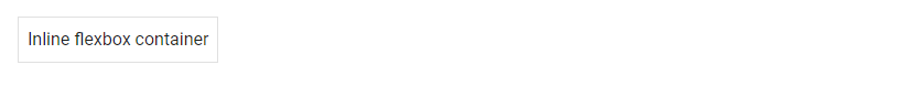
Inline Flex
The d-inline-flex class turns an element into an inline flexbox container.
<template>
  <v-app>
    <div class="ma-4">
      <v-card
        class="d-inline-flex pa-2"
        outlined
        tile
      >
        <div>Inline flexbox container</div>
      </v-card>
    </div>
  </v-app>
</template>

<script>
export default {
  name: 'App',
};
</script>
We can also customize the flex utilities to apply only for specific breakpoints with the following classes:
d-sm-flexd-sm-inline-flexd-md-flexd-md-inline-flexd-lg-flexd-lg-inline-flexd-xl-flexd-xl-inline-flex
Vuetify Flex Direction
Vuetify provides flex helper classes for specifying the direction of the flex items within the container. These classes modify the flex-direction CSS property of the element. They are:
- flex-row
- flex-row-reverse
- flex-column
- flex-column-reverse
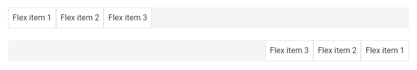
flex-row and flex-row-reverse
The flex-row utility class displays the flexible items horizontally, as a row. flex-row-reverse does the same, but in reverse order:
<template>
  <v-app>
    <div class="ma-4">
      <v-card
        class="d-flex flex-row mb-6"
        color="grey lighten-4"
        flat
        tile
      >
        <v-card
          v-for="n in 3"
          :key="n"
          class="pa-2"
          outlined
          tile
        >
          Flex item {{ n }}
        </v-card>
      </v-card>
      <v-card
        class="d-flex flex-row-reverse"
        color="grey lighten-4"
        flat
        tile
      >
        <v-card
          v-for="n in 3"
          :key="n"
          class="pa-2"
          outlined
          tile
        >
          Flex item {{ n }}
        </v-card>
      </v-card>
    </div>
  </v-app>
</template>

<script>
export default {
  name: 'App',
};
</script>
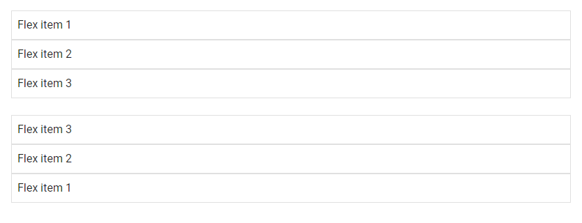
flex-column and flex-column-reverse
The flex-column utility class displays the flex items vertically, in a column. flex-column-reverse does the same, but in reverse order:
<template>
  <v-app>
    <div class="ma-4">
      <div class="d-flex flex-column mb-6">
        <v-card
          v-for="n in 3"
          :key="n"
          class="pa-2"
          outlined
          tile
        >
          Flex item {{ n }}
        </v-card>
      </div>
      <div class="d-flex flex-column-reverse">
        <v-card
          v-for="n in 3"
          :key="n"
          class="pa-2"
          outlined
          tile
        >
          Flex item {{ n }}
        </v-card>
      </div>
    </div>
  </v-app>
</template>

<script>
export default {
  name: 'App',
};
</script>
There are also responsive variations of these classes that set the flex-direction property for certain breakpoints.
flex-sm-rowflex-sm-row-reverseflex-sm-columnflex-sm-column-reverseflex-md-rowflex-md-row-reverseflex-md-columnflex-md-column-reverseflex-lg-rowflex-lg-row-reverseflex-lg-columnflex-lg-column-reverseflex-xl-rowflex-xl-row-reverseflex-xl-columnflex-xl-column-reverse
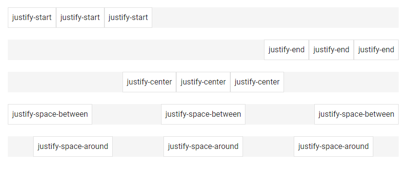
Flex Justify Classes
We can modify the justify-content flex property of the flexible container with the flex justify classes from Vuetify. justify-content modifies the flexbox items on the x-axis or y-axis for a flex-direction of row or column respectively. The helper classes can set justify-content to start (browser default), end, center, space-between, or space-around. They are:
justify-startjustify-endjustify-centerjustify-space-betweenjustify-space-around
<template>
  <v-app>
    <div class="ma-4">
      <v-card
        class="d-flex justify-start mb-6"
        color="grey lighten-4"
        flat
        tile
      >
        <v-card
          v-for="n in 3"
          :key="n"
          class="pa-2"
          outlined
          tile
        >
          justify-start
        </v-card>
      </v-card>

      <v-card
        class="d-flex justify-end mb-6"
        color="grey lighten-4"
        flat
        tile
      >
        <v-card
          v-for="n in 3"
          :key="n"
          class="pa-2"
          outlined
          tile
        >
          justify-end
        </v-card>
      </v-card>

      <v-card
        class="d-flex justify-center mb-6"
        color="grey lighten-4"
        flat
        tile
      >
        <v-card
          v-for="n in 3"
          :key="n"
          class="pa-2"
          outlined
          tile
        >
          justify-center
        </v-card>
      </v-card>

      <v-card
        class="d-flex justify-space-between mb-6"
        color="grey lighten-4"
        flat
        tile
      >
        <v-card
          v-for="n in 3"
          :key="n"
          class="pa-2"
          outlined
          tile
        >
          justify-space-between
        </v-card>
      </v-card>

      <v-card
        class="d-flex justify-space-around mb-6"
        color="grey lighten-4"
        flat
        tile
      >
        <v-card
          v-for="n in 3"
          :key="n"
          class="pa-2"
          outlined
          tile
        >
          justify-space-around
        </v-card>
      </v-card>
    </div>
  </v-app>
</template>

<script>
export default {
  name: 'App',
};
</script>
There are also responsive variations of these classes that set the justify-content property for certain breakpoints:
justify-sm-startjustify-sm-endjustify-sm-centerjustify-sm-space-betweenjustify-sm-space-aroundjustify-md-startjustify-md-endjustify-md-centerjustify-md-space-betweenjustify-md-space-aroundjustify-lg-startjustify-lg-endjustify-lg-centerjustify-lg-space-betweenjustify-lg-space-aroundjustify-xl-startjustify-xl-endjustify-xl-centerjustify-xl-space-betweenjustify-xl-space-around
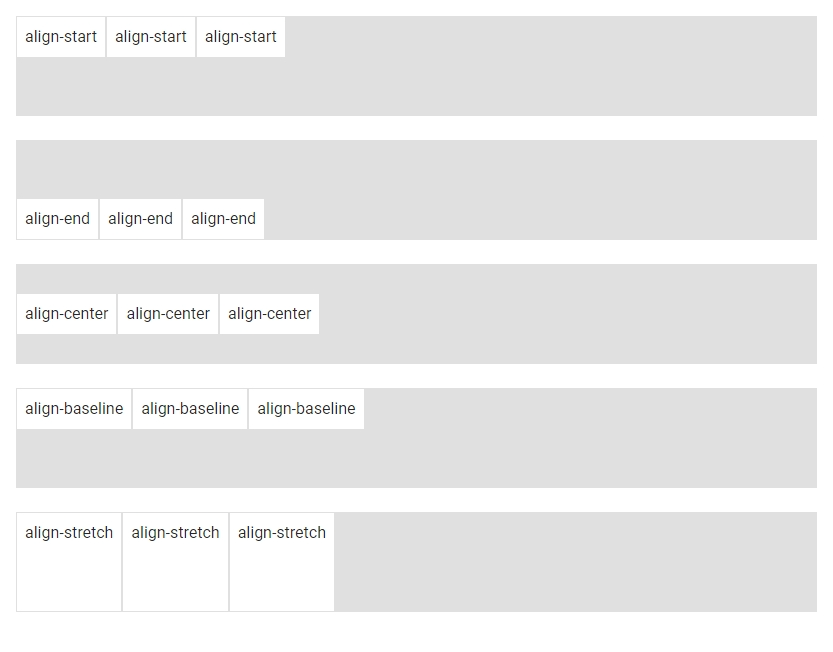
Vuetify Flex Align Classes
We also have flex utility classes from Vuetify that modify the align-items CSS property of the flex container. align-items modifies the flexbox items on the y-axis or x-axis for a flex-direction of row or column respectively. The helper classes can set align-items to start, end, center, baseline or stretch (browser default). They are:
align-startalign-endalign-centeralign-baselinealign-stretch
<template>
  <v-app>
    <div class="ma-4">
      <v-card
        class="d-flex align-start mb-6"
        color="grey lighten-2"
        flat
        height="100"
        tile
      >
        <v-card
          v-for="n in 3"
          :key="n"
          class="pa-2"
          outlined
          tile
        >
          align-start
        </v-card>
      </v-card>

      <v-card
        class="d-flex align-end mb-6"
        color="grey lighten-2"
        flat
        height="100"
        tile
      >
        <v-card
          v-for="n in 3"
          :key="n"
          class="pa-2"
          outlined
          tile
        >
          align-end
        </v-card>
      </v-card>

      <v-card
        class="d-flex align-center mb-6"
        color="grey lighten-2"
        flat
        height="100"
        tile
      >
        <v-card
          v-for="n in 3"
          :key="n"
          class="pa-2"
          outlined
          tile
        >
          align-center
        </v-card>
      </v-card>

      <v-card
        class="d-flex align-baseline mb-6"
        color="grey lighten-2"
        flat
        height="100"
        tile
      >
        <v-card
          v-for="n in 3"
          :key="n"
          class="pa-2"
          outlined
          tile
        >
          align-baseline
        </v-card>
      </v-card>

      <v-card
        class="d-flex align-stretch mb-6"
        color="grey lighten-2"
        flat
        height="100"
        tile
      >
        <v-card
          v-for="n in 3"
          :key="n"
          class="pa-2"
          outlined
          tile
        >
          align-stretch
        </v-card>
      </v-card>
    </div>
  </v-app>
</template>

<script>
export default {
  name: 'App',
};
</script>
They are also responsive variations of these classes that set the align-items property for certain breakpoints:
align-sm-startalign-sm-endalign-sm-centeralign-sm-baselinealign-sm-stretchalign-md-startalign-md-endalign-md-centeralign-md-baselinealign-md-stretchalign-lg-startalign-lg-endalign-lg-centeralign-lg-baselinealign-lg-stretchalign-xl-startalign-xl-endalign-xl-centeralign-xl-baselinealign-xl-stretch
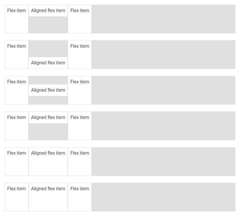
Flex Align Self Classes
We use the flex align self helper classes to modify the align-self flex property of the element. align-self modifies the flexbox items on the x-axis or y-axis for a flex-direction of row or column respectively. The helper classes can set align-self to start, end, center, baseline or stretch (browser default). They are:
align-self-startalign-self-endalign-self-centeralign-self-baselinealign-self-stretch
<template>
  <v-app>
    <div class="ma-4">
      <v-card
        v-for="j in justify"
        :key="j"
        class="d-flex mb-6"
        color="grey lighten-2"
        flat
        height="100"
        tile
      >
        <v-card
          v-for="n in 3"
          :key="n"
          class="pa-2"
          :class="[n === 2 && `align-self-${j}`]"
          outlined
          tile
        >
          {{ n === 2 ? 'Aligned flex item' : 'Flex item' }}
        </v-card>
      </v-card>
    </div>
  </v-app>
</template>

<script>
export default {
  name: 'App',
  data: () => ({
    justify: [
      'start',
      'end',
      'center',
      'baseline',
      'auto',
      'stretch',
    ],
  }),
};
</script>
Vuetify also provides responsive variations of these classes that set the align-self property for certain breakpoints:
align-self-sm-startalign-self-sm-endalign-self-sm-centeralign-self-sm-baselinealign-self-sm-autoalign-self-sm-stretchalign-self-md-startalign-self-md-endalign-self-md-centeralign-self-md-baselinealign-self-md-autoalign-self-md-stretchalign-self-lg-startalign-self-lg-endalign-self-lg-centeralign-self-lg-baselinealign-self-lg-autoalign-self-lg-stretchalign-self-xl-startalign-self-xl-endalign-self-xl-centeralign-self-xl-baselinealign-self-xl-autoalign-self-xl-stretch
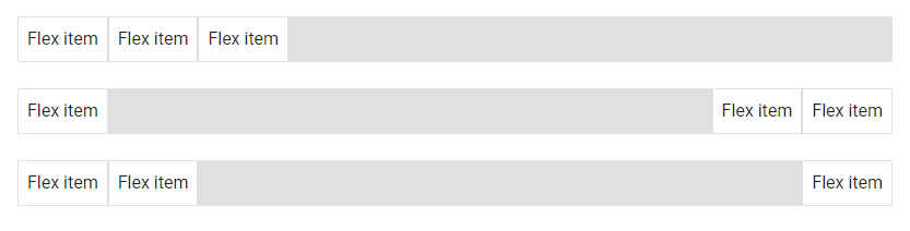
Auto Margins
We can apply one of the margin helper classes from Vuetify to a flex container to control the positioning of flex items on the x-axis or y-axis for a flex direction of row or column respectively.
<template>
  <v-app>
    <div class="ma-4">
      <v-card
        class="d-flex mb-6"
        color="grey lighten-2"
        flat
        tile
      >
        <v-card
          v-for="n in 3"
          :key="n"
          class="pa-2"
          outlined
          tile
        >
          Flex item
        </v-card>
      </v-card>

      <v-card
        class="d-flex mb-6"
        color="grey lighten-2"
        flat
        tile
      >
        <v-card
          v-for="n in 3"
          :key="n"
          :class="n === 1 && 'mr-auto'"
          class="pa-2"
          outlined
          tile
        >
          Flex item
        </v-card>
      </v-card>

      <v-card
        class="d-flex mb-6"
        color="grey lighten-2"
        flat
        tile
      >
        <v-card
          v-for="n in 3"
          :key="n"
          :class="n === 3 && 'ml-auto'"
          class="pa-2"
          outlined
          tile
        >
          Flex item
        </v-card>
      </v-card>
    </div>
  </v-app>
</template>

<script>
export default {
  name: 'App',
};
</script>
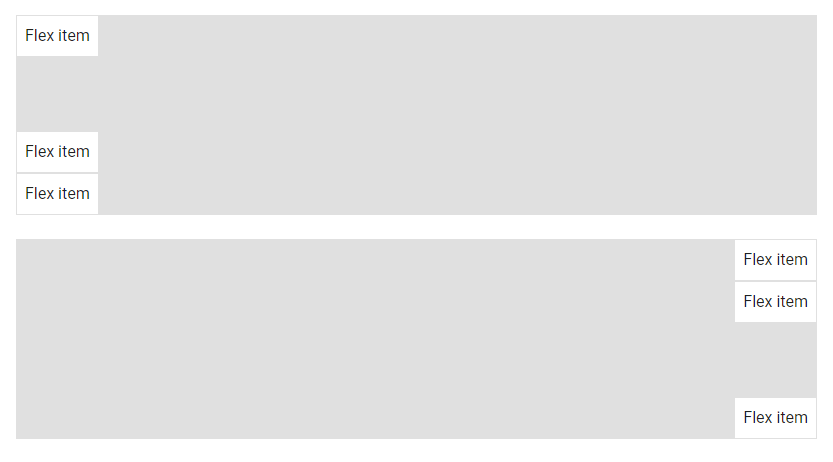
Using align-items
If we set flex-direction to column and specify a value for align-items, we can use either the mb-auto or mt-auto helper class to adjust flex item positioning:
<template>
  <v-app>
    <div class="ma-4">
      <v-card
        class="d-flex align-start flex-column mb-6"
        color="grey lighten-2"
        flat
        tile
        height="200"
      >
        <v-card
          v-for="n in 3"
          :key="n"
          :class="n === 1 && 'mb-auto'"
          class="pa-2"
          outlined
          tile
        >
          Flex item
        </v-card>
      </v-card>
      <v-card
        class="d-flex align-end flex-column"
        color="grey lighten-2"
        flat
        tile
        height="200"
      >
        <v-card
          v-for="n in 3"
          :key="n"
          :class="n === 3 && 'mt-auto'"
          class="pa-2"
          outlined
          tile
        >
          Flex item
        </v-card>
      </v-card>
    </div>
  </v-app>
</template>

<script>
export default {
  name: 'App',
};
</script>
Vuetify Flex Wrap Classes
By default, the d-flex class does not provide wrapping (it behaves similar to setting flex-wrap to nowrap). We can change this by applying one of the flex-wrap helper classes to the container. The classes are:
flex-nowrapflex-wrapflex-wrap-reverse
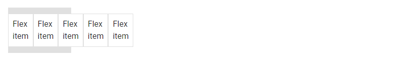
flex-nowrap
flex-nowrap specifies that the items should not wrap.
<template>
  <v-app>
    <div class="ma-4">
      <v-card
        class="d-flex flex-nowrap py-3"
        color="grey lighten-2"
        flat
        tile
        width="125"
      >
        <v-card
          v-for="n in 5"
          :key="n"
          class="pa-2"
          outlined
          tile
        >
          Flex item
        </v-card>
      </v-card>
    </div>
  </v-app>
</template>

<script>
export default {
  name: 'App',
};
</script>
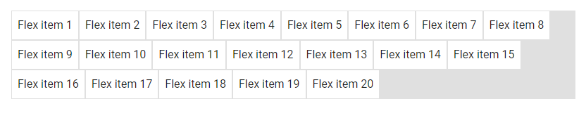
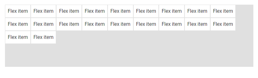
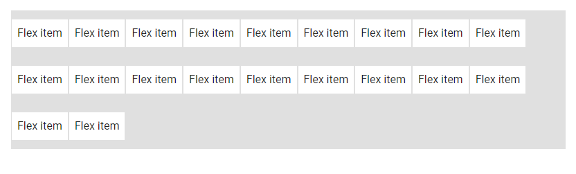
flex-wrap
flex-wrap makes the items wrap if necessary.
<template>
  <v-app>
    <div class="ma-4">
      <v-card
        class="d-flex flex-wrap"
        color="grey lighten-2"
        flat
        tile
      >
        <v-card
          v-for="n in 20"
          :key="n"
          class="pa-2"
          outlined
          tile
        >
          Flex item {{ n }}
        </v-card>
      </v-card>
    </div>
  </v-app>
</template>

<script>
export default {
  name: 'App',
};
</script>
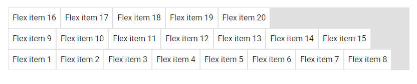
flex-wrap-reverse
flex-wrap-reverse specifies that the flex items will wrap if necessary, in reverse order.
<template>
  <v-app>
    <div class="ma-4">
      <v-card
        class="d-flex flex-wrap-reverse"
        color="grey lighten-2"
        flat
        tile
      >
        <v-card
          v-for="n in 20"
          :key="n"
          class="pa-2"
          outlined
          tile
        >
          Flex item {{ n }}
        </v-card>
      </v-card>
    </div>
  </v-app>
</template>

<script>
export default {
  name: 'App',
};
</script>
Vuetify also provides responsive variations of these classes to set the flex-wrap property for certain breakpoints:
flex-sm-nowrapflex-sm-wrapflex-sm-wrap-reverseflex-md-nowrapflex-md-wrapflex-md-wrap-reverseflex-lg-nowrapflex-lg-wrapflex-lg-wrap-reverseflex-xl-nowrapflex-xl-wrapflex-xl-wrap-reverse
Vuetify Flex Order Classes
We can use one of the flex order utility classes to customize the visual order of the flexbox items within their container.
<template>
  <v-app>
    <div class="ma-4">
      <v-card
        class="d-flex flex-wrap"
        color="grey lighten-2"
        flat
        tile
      >
        <v-card
          class="order-2 pa-2"
          outlined
          tile
        >
          First flex item
        </v-card>
        <v-card
          class="order-3 pa-2"
          outlined
          tile
        >
          Second flex item
        </v-card>
        <v-card
          class="order-1 pa-2"
          outlined
          tile
        >
          Third flex item
        </v-card>
      </v-card>
    </div>
  </v-app>
</template>

<script>
export default {
  name: 'App',
};
</script>

These classes set the order flex property of the container. They are:
order-firstorder-0order-1order-2order-3order-4order-5order-6order-7order-8order-9order-10order-11order-12order-last
Vuetify also provides responsive variants of these classes that set the order property for certain breakpoints:
order-sm-firstorder-sm-0order-sm-1order-sm-2order-sm-3order-sm-4order-sm-5order-sm-6order-sm-7order-sm-8order-sm-9order-sm-10order-sm-11order-sm-12order-sm-lastorder-md-firstorder-md-0order-md-1order-md-2order-md-3order-md-4order-md-5order-md-6order-md-7order-md-8order-md-9order-md-10order-md-11order-md-12order-md-lastorder-lg-firstorder-lg-0order-lg-1order-lg-2order-lg-3order-lg-4order-lg-5order-lg-6order-lg-7order-lg-8order-lg-9order-lg-10order-lg-11order-lg-12order-lg-last- order-xl-first
order-xl-0order-xl-1order-xl-2order-xl-3order-xl-4order-xl-5order-xl-6order-xl-7order-xl-8order-xl-9order-xl-10order-xl-11order-xl-12order-xl-last
Vuetify Flex Align Content
Vuetify provides flex align content classes that we can use to set the align-content CSS property of the flex container. The align-content modifies the flexbox items on the x-axis or y-axis for a flex-direction of row or column respectively. The helper classes can set align-content to start (browser default), end, center, between, around or stretch. They are:
align-content-startalign-content-endalign-content-centeralign-content-betweenalign-content-aroundalign-content-stretch
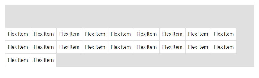
align-content-start
<template>
  <v-app>
    <div class="ma-4">
      <v-card
        class="d-flex align-content-start flex-wrap"
        color="grey lighten-2"
        flat
        tile
        min-height="200"
      >
        <v-card
          v-for="n in 20"
          :key="n"
          class="pa-2"
          outlined
          tile
        >
          Flex item
        </v-card>
      </v-card>
    </div>
  </v-app>
</template>

<script>
export default {
  name: 'App',
};
</script>
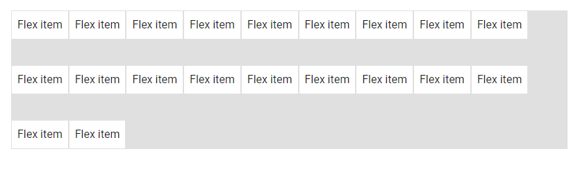
align-content-end
<template>
  <v-app>
    <div class="ma-4">
      <v-card
        class="d-flex align-content-end flex-wrap"
        color="grey lighten-2"
        flat
        tile
        min-height="200"
      >
        <v-card
          v-for="n in 20"
          :key="n"
          class="pa-2"
          outlined
          tile
        >
          Flex item
        </v-card>
      </v-card>
    </div>
  </v-app>
</template>

<script>
export default {
  name: 'App',
};
</script>
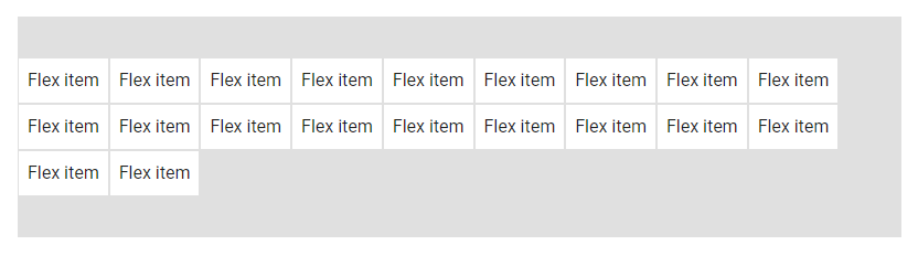
align-content-center
<template>
  <v-app>
    <div class="ma-4">
      <v-card
        class="d-flex align-content-center flex-wrap"
        color="grey lighten-2"
        flat
        tile
        min-height="200"
      >
        <v-card
          v-for="n in 20"
          :key="n"
          class="pa-2"
          outlined
          tile
        >
          Flex item
        </v-card>
      </v-card>
    </div>
  </v-app>
</template>

<script>
export default {
  name: 'App',
};
</script>
align-content-space-between
<template>
  <v-app>
    <div class="ma-4">
      <v-card
        class="d-flex align-content-space-between flex-wrap"
        color="grey lighten-2"
        flat
        tile
        min-height="200"
      >
        <v-card
          v-for="n in 20"
          :key="n"
          class="pa-2"
          outlined
          tile
        >
          Flex item
        </v-card>
      </v-card>
    </div>
  </v-app>
</template>

<script>
export default {
  name: 'App',
};
</script>
align-content-space-around
<template>
  <v-app>
    <div class="ma-4">
      <v-card
        class="d-flex align-content-space-around flex-wrap"
        color="grey lighten-2"
        flat
        tile
        min-height="200"
      >
        <v-card
          v-for="n in 20"
          :key="n"
          class="pa-2"
          outlined
          tile
        >
          Flex item
        </v-card>
      </v-card>
    </div>
  </v-app>
</template>

<script>
export default {
  name: 'App',
};
</script>
There are also responsive variations of theses classes that set the align-content property for certain breakpoints:
align-sm-content-startalign-sm-content-endalign-sm-content-centeralign-sm-content-space-betweenalign-sm-content-space-aroundalign-sm-content-stretchalign-md-content-startalign-md-content-endalign-md-content-centeralign-md-content-space-betweenalign-md-content-space-aroundalign-md-content-stretchalign-lg-content-startalign-lg-content-endalign-lg-content-centeralign-lg-content-space-betweenalign-lg-content-space-aroundalign-xl-content-startalign-xl-content-endalign-xl-content-centeralign-xl-content-space-betweenalign-xl-content-space-aroundalign-xl-content-stretch
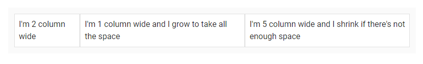
Vuetify Flex Grow and Shrink Classes
Vuetify also comes with helper classes that set the flex-grow and flex-shrink of a flexbox container. These utility classes are in the form flex-{condition}-{value}, where condition can be either grow or shrink and value can be either 0 or 1. The grow condition will allow an element to grow to fill available space, while shrink will allow an element to shrink down only to the space needed for its contents if there is not enough space in its container. The value 0 will prevent the condition from happening, while 1 will allow it. The classes are:
flex-grow-0flex-grow-1flex-shrink-0flex-shrink-1
<template>
  <v-app>
    <div class="ma-4">
      <v-container class="grey lighten-5">
        <v-row
          no-gutters
          style="flex-wrap: nowrap"
        >
          <v-col
            cols="2"
            class="flex-grow-0 flex-shrink-0"
          >
            <v-card
              class="pa-2"
              outlined
              tile
            >
              I'm 2 column wide
            </v-card>
          </v-col>
          <v-col
            cols="1"
            style="min-width: 100px; max-width: 100%"
            class="flex-grow-1 flex-shrink-0"
          >
            <v-card
              class="pa-2"
              outlined
              tile
            >
              I'm 1 column wide and I grow to take all the
              space
            </v-card>
          </v-col>
          <v-col
            cols="5"
            style="min-width: 100px"
            class="flex-grow-0 flex-shrink-1"
          >
            <v-card
              class="pa-2"
              outlined
              tile
            >
              I'm 5 column wide and I shrink if there's not
              enough space
            </v-card>
          </v-col>
        </v-row>
      </v-container>
    </div>
  </v-app>
</template>

<script>
export default {
  name: 'App',
};
</script>
There are also responsive variations of these classes that set the flex-grow and flex-shrink properties for certain breakpoints:
flex-sm-grow-0flex-sm-grow-1flex-sm-shrink-0flex-sm-shrink-1flex-md-grow-0flex-md-grow-1flex-md-shrink-0flex-md-shrink-1flex-lg-grow-0flex-lg-grow-1flex-lg-shrink-0flex-lg-shrink-1flex-xl-grow-0flex-xl-grow-1flex-xl-shrink-0flex-xl-shrink-1
Conclusion
Flexbox layouts allow responsive items inside a container to be automatically arranged depending on the screen size. Vuetify comes with various flexbox utility classes for controlling the layout of flex containers with alignment, justification, wrapping, and more.
11 Amazing New JavaScript Features in ES13
This guide will bring you up to speed with all the latest features added in ECMAScript 13. These powerful new features will modernize your JavaScript with shorter and more expressive code.
